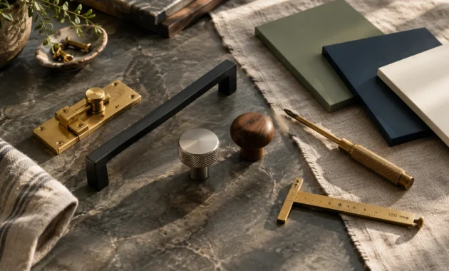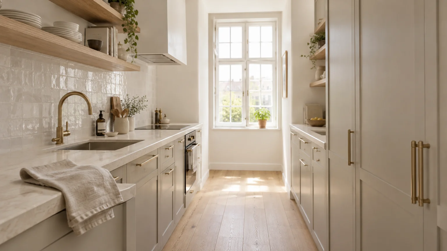
You can dramatically expand your compact kitchen without knocking down a single structural wall. The right kitchen color schemes manipulate ambient light and blur tight architectural boundaries to create immediate visual breathing room.
Strategic tonal shifts direct the human eye upward, transforming cramped galleys into luminous, expansive culinary spaces. By prioritizing light kitchen colors with high light reflectance values, you maximize natural illumination throughout the entire day.
Modern small kitchen color palettes celebrate nuanced depth rather than sterile, one-dimensional hospital whites. These curated pairings bring quiet luxury, warmth, and tailored character directly to your home.
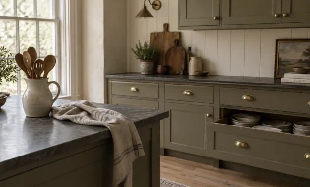
Trend #1: Alabaster White and Warm Greige
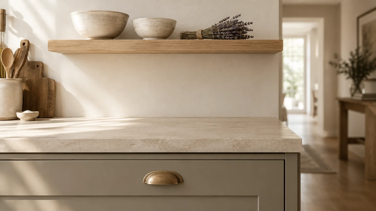
Alabaster white paired with warm greige embodies the quiet luxury movement, stripping away visual chaos while avoiding clinical starkness. When exploring small kitchen paint ideas, prioritize shades that soften hard architectural edges.
Greige introduces subtle earthiness to base cabinets, anchoring the floor plan without imposing heavy mass. Meanwhile, creamy alabaster walls dissolve boundary lines between your tile backsplash and the ceiling.
Coat your perimeter walls in flat or eggshell alabaster to diffuse natural glare evenly. Paint your cabinetry in a durable satin greige to reflect ambient rays softly across narrow pathways.
Natural white oak floating shelves and unlacquered brass hardware enhance this understated palette. They introduce tactile warmth, ensuring your monochromatic composition feels curated rather than spartan.
Avoid cool, blue-based whites in this pairing. Blue undertones cause adjacent greige paint to read murky under standard artificial kitchen task lighting.
Lay down honed limestone flooring or light oak floorboards to extend this gentle continuum from floor to ceiling. The uninterrupted neutral flow visually expands your available footprint.
Trend #2: Biophilic Sage and Pale Oak
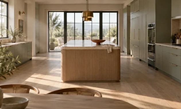
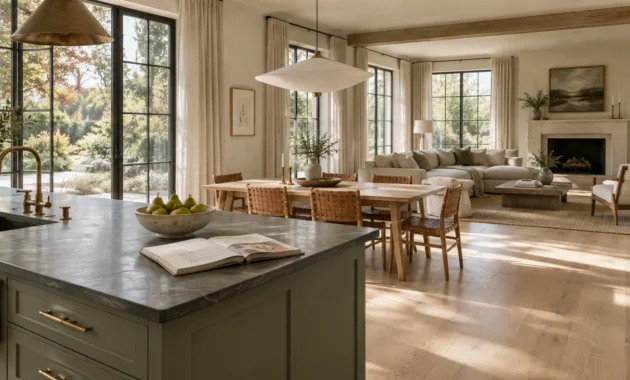
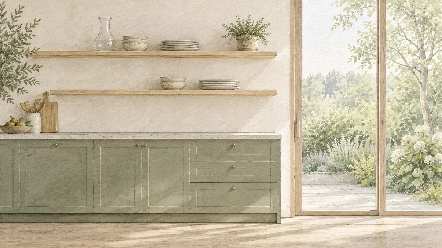
Biophilic design bridges our innate biological need for nature with tailored residential architecture. Soft sage green brings an organic calm that subtly pushes perimeter walls outward.
When you pair muted sage cabinetry with pale white oak millwork, you introduce a restorative Scandinavian elegance. The wood’s visible horizontal grain lines guide the gaze across the narrow room.
This combination functions brilliantly because light sage mimics atmospheric horizon hues, tricking the brain into perceiving greater distance. It captures daylight gracefully without producing harsh glare.
Complement this palette with honed limestone countertops and brushed nickel fixtures. The matte textures absorb direct glare while celebrating organic provenance.
Reserve the deeper sage tones for lower base cabinetry to ground your floor plan. Paint your upper walls in an ultra-pale tint to draw sightlines toward the ceiling.
Keep window treatments minimal or entirely bare to pull outdoor greenery into your kitchen. Unobstructed glass amplifies the organic tones and erases the barrier between interior and exterior spaces.
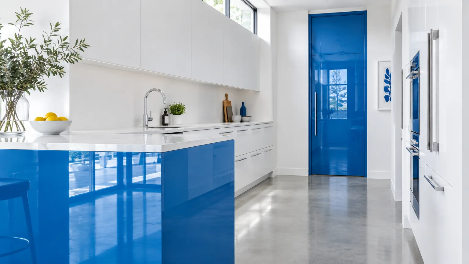
Trend #3: Crisp Chalk and High-Gloss Cerulean
Strategic high-contrast accents can expand perceived depth just as effectively as all-pale schemes. Crisp chalk white walls paired with high-gloss cerulean accents create an intoxicating sense of architectural dimension.
High-gloss lacquer acts like a mirror, bouncing available daylight back into dark corners. Painting a small focal island or a pantry door in cerulean draws the eye inward, establishing a deep visual anchor.
Keep the vast majority of vertical surfaces cloaked in chalk white to maximize overall luminance. This intentional imbalance makes the saturated blue read as an intentional luxury rather than an overwhelming presence.
Pair this lively scheme with polished chrome fixtures and crystalline reeded glass cabinet inserts. These luminous surfaces multiply specular highlights across your cooking zone.
Never wrap an entire enclosed kitchen in dark gloss cerulean. Confining high-sheen jewel tones to targeted architectural elements prevents visual claustrophobia.
Select thin white quartz countertops with minimal veining to maintain clean, crisp sightlines. This pristine surface keeps the focus squarely on your dramatic glossy statement piece.
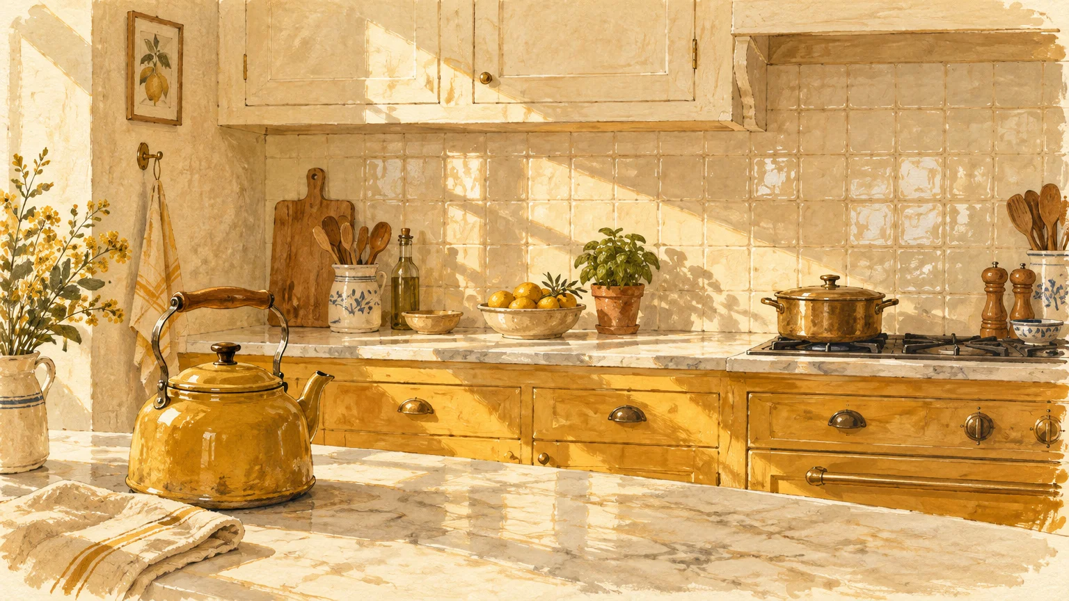
Trend #4: Sun-Drenched Ochre and Cream
Compact kitchens that face north often feel chilly, cramped, and perpetually shadowed. Infusing your space with sun-drenched ochre and warm cream counteracts weak natural light with radiant warmth.
Soft ochre mimics early morning sunlight, lifting flat interior planes into three-dimensional vibrancy. When layered over rich buttermilk cream, the room adopts an inviting, sun-bleached Mediterranean ambiance.
Apply warm cream across your upper cabinetry and walls to maximize upward light bounce. Then, introduce ochre on lower cabinetry, open display shelves, or handmade ceramic wall tiles.
Integrate natural cane cabinet inserts, butcher block prep surfaces, and aged bronze drawer pulls. These artisanal textures ground the golden hues in everyday functional elegance.
Be cautious of overly saturated mustard paints that contain murky brown bases. Select ochres with clear yellow undertones to keep your kitchen bright and cheerful.
Install warm under-cabinet LED strips to illuminate your cream backsplash tiles. The focused beam creates an inviting wash of golden light that pushes your back wall visually outward.
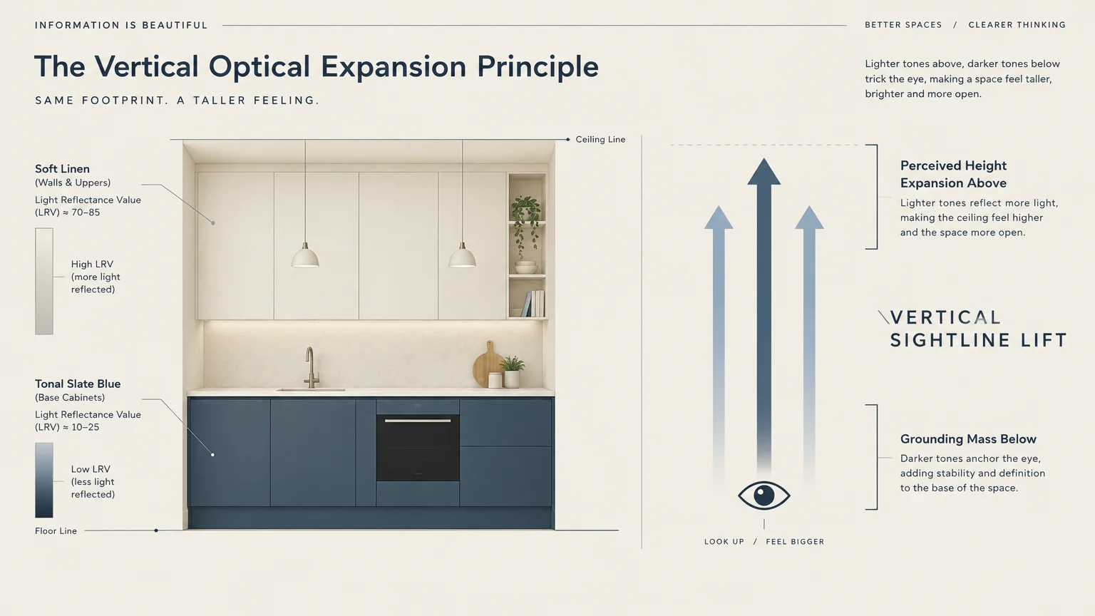
Trend #5: Tonal Slate Blue and Soft Linen
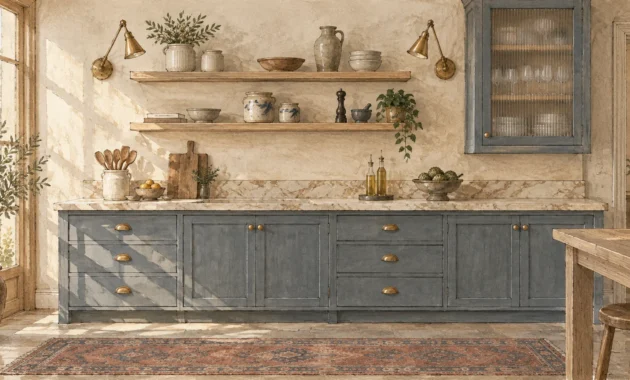
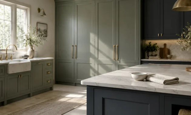
Color psychology proves that cool tones visually recede from the viewer. Soft slate blue capitalizes on this optical effect, making narrow galley walls seem farther apart than they actually stand.
Learning how specific cool colors make kitchen look bigger allows you to redesign tight layouts with supreme confidence. Slate blue base units paired with soft linen walls prevent cool temperatures from feeling detached or sterile.
This palette creates a seamless visual bridge to adjoining dining spaces and living rooms. That fluid color continuity eliminates jarring stops and starts across an open-concept layout.
Enhance this pairing with matte black plumbing fixtures and pale composite quartz counters. The tailored contrast sharpens the design while keeping the overall envelope light and airy.
Avoid heavy, dark navy stains in cramped layouts. Slate blue preserves spatial openness because it carries high gray and white undertones that reflect ambient light.
Lay light gray porcelain floor tiles in a large format to reduce distracting grout lines. Fewer grid intersections create an expansive floor plane that lets the slate cabinetry shine.
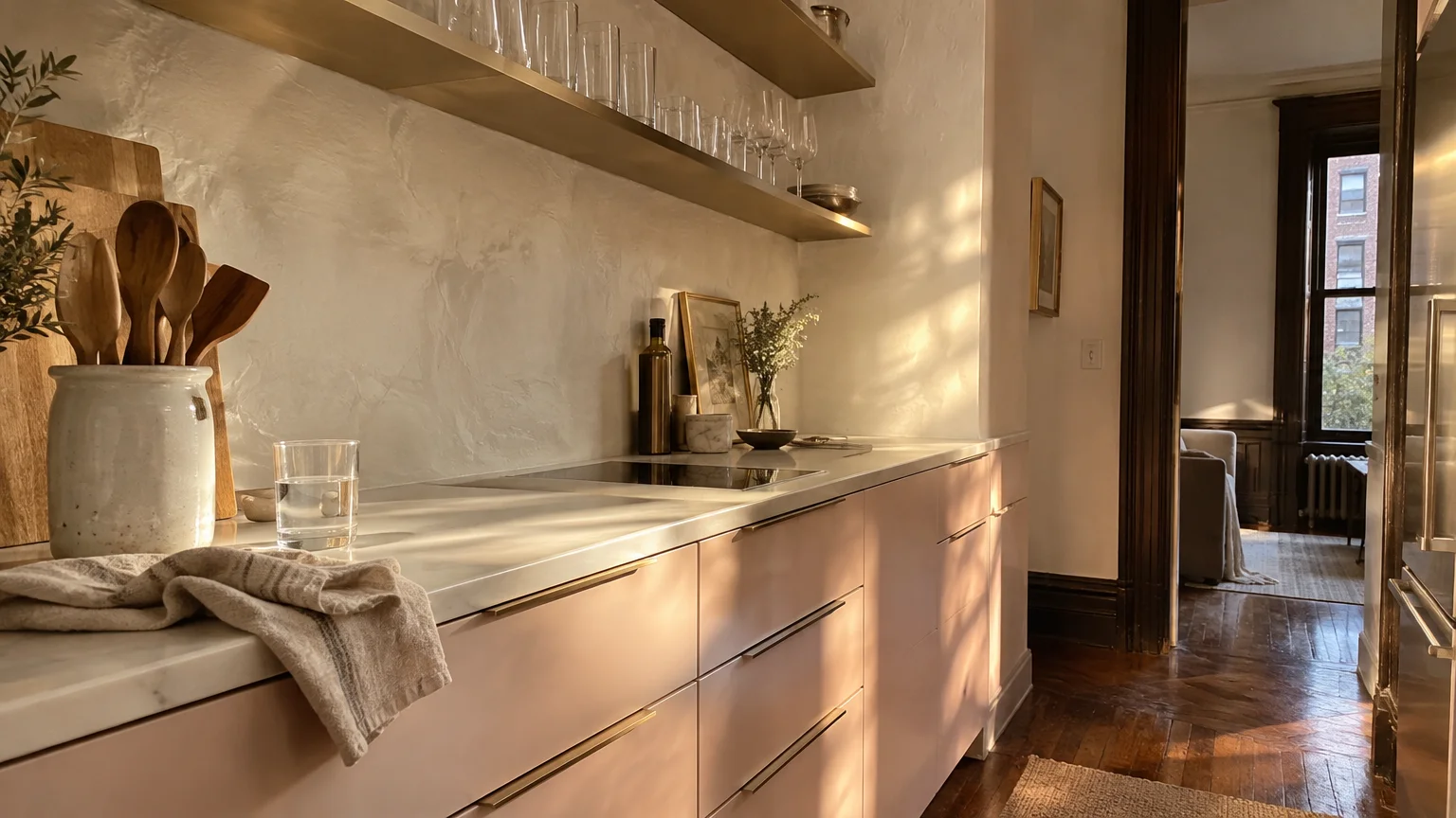
Trend #6: Ethereal Blush and Brushed Champagne
Pale blush has earned its permanent place as a sophisticated modern neutral. Its warm, spectral undertones cast an alluring, flattering glow across compact culinary workspaces.
When you harmonize dusty rose-blush with brushed champagne hardware, your kitchen achieves a luminous, jewelry-box delicacy. The metallic accents capture task lighting and bounce warm glints across the ceiling.
Paint all perimeter walls in an ethereal blush, treating your upper and lower cabinetry in a matching sheen. This monochromatic saturation blurs corner junctions, masking the true boundaries of the room.
Ground the sweetness of blush with pale terrazzo countertops containing flecks of quartz, basalt, and warm sand. This material provenance introduces texture and modern architectural rigor.
Avoid selecting bubblegum or candy pinks that overpower functional architecture. Stick strictly to desaturated, chalky blush tones with muted beige undertones.
Introduce open shelving painted in the exact same wall color to display white ceramic dishware. This seamless background trick allows your curated dinnerware to float weightlessly.
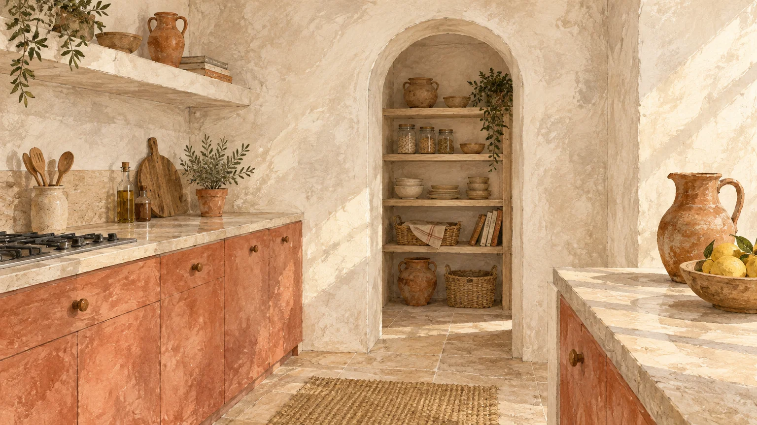
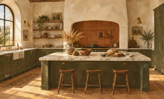
Trend #7: Washed Terracotta and Soft Plaster
Minimalist layouts risk feeling cold when restricted to flat synthetic paints. Washed terracotta and soft plaster bring tactile dimension that enriches compact kitchens without closing them in.
Lime-wash plaster finishes scatter light unevenly across wall surfaces. This gentle diffusion softens harsh corners and visually opens tight architectural niches.
Pair pale terracotta base cabinets with ivory plaster walls to create a warm, artisanal sanctuary. The earthy undertones evoke sun-baked villa kitchens without encroaching on usable floor space.
Accentuate this composition with hand-cast bronze hardware, terracotta pendants, and reclaimed antique limestone flooring. These authentic elements anchor your space with enduring character and heritage.
Keep terracotta accents pale and desaturated rather than deep rust or mud brown. Lighter clay tones elevate the room’s perceived ceiling height and maintain ambient brightness.
Install continuous open floating shelves crafted from pale reclaimed timber along your primary prep wall. The long horizontal lines draw eyes sideways, exaggerating the width of compact cooking quarters.
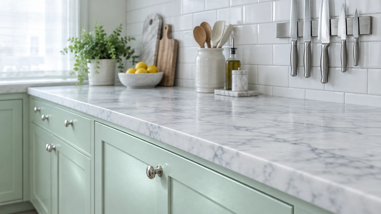
Trend #8: Pearlescent Mint and Honed Carrara
Pearlescent mint delivers an instant splash of crisp freshness to small, stuffy kitchens. Its subtle icy undertone mimics morning frost, lending an open, airy feeling to cramped layouts.
Honed Carrara marble countertops provide the ideal natural counterweight to delicate mint cabinetry. Subtle gray veining in the stone guides the eye outward, creating seamless horizontal movement.
Paint your kitchen walls in an airy off-white to allow the pale mint cabinetry to glow. This strategy prevents the green from competing with valuable natural light sources.
Integrate polished chrome fixtures and clear glass globe pendants overhead. Their transparent silhouettes and mirror-like finishes amplify the crisp luminescence of the mint palette.
Avoid high-gloss finishes on mint surfaces, which can read retro or commercial. A smooth satin or eggshell finish provides a calm, contemporary Scandinavian aesthetic.
Lay white subway tile in a vertical stack pattern up to the ceiling line. The vertical grid works in tandem with the mint cabinetry to visually heighten your room.
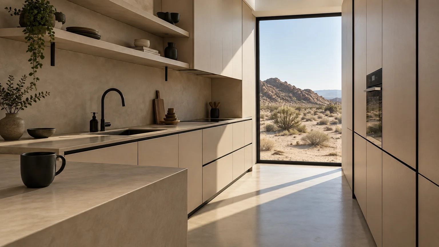
Trend #9: Desert Sand and Crisp Ebony Accents
Desert sand offers a sun-warmed neutral backdrop that instantly banishes claustrophobia. Its subtle yellow and beige undertones bounce sunlight into shadowed work alcoves with ease.
Pairing desert sand walls with crisp ebony hardware creates purposeful graphic contrast. Slender black accents delineate space cleanly without breaking up the luminous continuity of the walls.
This graphic approach frames your kitchen like a curated architectural drawing. The bold hardware anchors the pale surfaces, making the surrounding sand-toned walls feel farther away.
Incorporate light ash open shelving and slatted wood accents to complement the desert aesthetic. These elements add horizontal texture, stretching the perceived width of narrow walls.
Keep your ebony elements thin and architectural, such as linear pulls and slender track heads. Heavy black cabinetry will shrink your kitchen and absorb crucial ambient light.
Choose smooth concrete-look quartz countertops in an ultra-pale greige tone. This durable surface mirrors the desert palette and eliminates jarring focal interruptions between counter and wall.
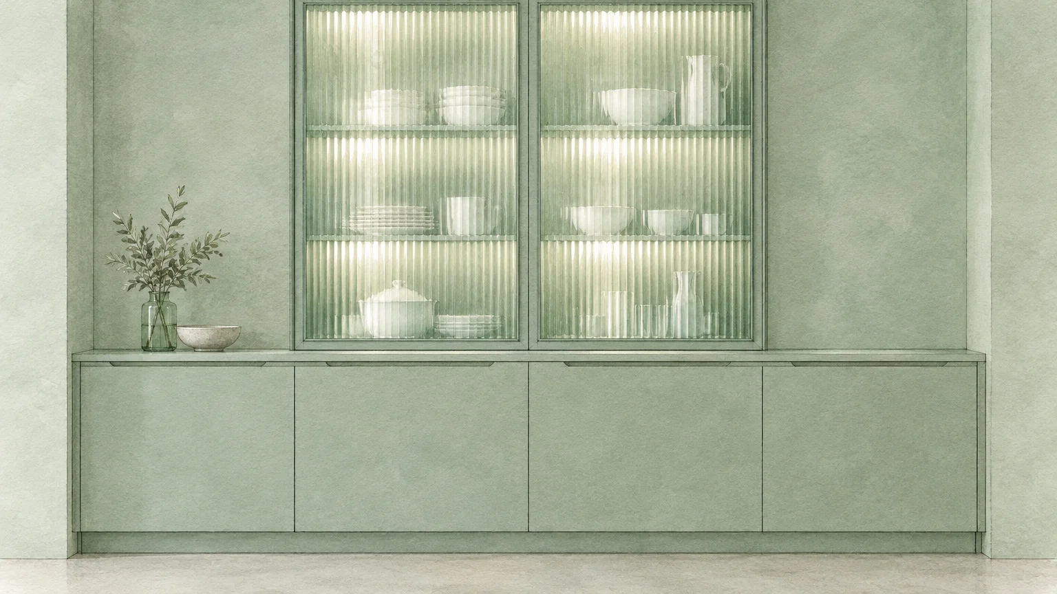
Trend #10: Monochromatic Celadon and Fluted Glass
Celadon represents the pinnacle of refined, pale botanical color design. Applying a single monochromatic celadon hue across walls, trim, and cabinetry eliminates visual fragmentation.
When sightlines encounter uniform color across disparate surfaces, the human eye perceives uninterrupted space. The room feels expansive because no harsh contrast lines define where walls begin or end.
Pair this continuous celadon treatment with fluted glass cabinet doors. The textured glass obscures interior clutter while reflecting light, adding visual depth to upper storage units.
Integrate brushed satin brass handles and white composite countertops to complete this tailored composition. The gleaming metals and pristine surfaces amplify the pale green’s natural brightness.
Ensure your artificial task lighting is rated between 2700K and 3000K. Cool white bulbs can make celadon appear medicinal, whereas warm illumination preserves its tranquil elegance.
Hang a low-profile Roman shade sewn from natural linen over your kitchen window. The organic weave filters daylight softly, bathing your celadon cabinetry in an ethereal glow.
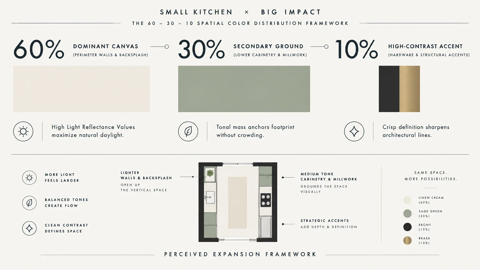
The Big Picture: Weaving These Trends into Your Home
Transforming a compact kitchen demands thoughtful coordination between color, lighting, and materiality. Color alone cannot perform miracles if poor illumination casts shadowy corners across your workspace.
Always test your chosen paint swatches under varying daylight conditions and artificial evening fixtures. Notice how morning rays, direct noon sun, and warm halogen bulbs shift undertones throughout the day.
Select your paint sheen strategically to manipulate interior light bounce. Satin finishes on cabinetry reflect illumination, while matte wall paints conceal plaster imperfections and create soft backdrops.
Maintain visual flow into adjacent living rooms and dining zones. Connecting your kitchen palette to bordering rooms creates an illusion of unified, unbroken square footage.
Invest in concealed storage solutions to preserve your palette’s expansive illusion. Cluttered countertops interrupt sightlines, neutralizing the spatial expansion achieved by your new paint scheme.
Select compact, integrated appliances panel-ready to match your cabinet faces. Concealing bulky stainless steel surfaces keeps your color story uninterrupted from corner to corner.
For the latest color forecasts, consult industry leaders like Pantone and paint companies like Benjamin Moore. For professional design standards, refer to the American Society of Interior Designers (ASID).
Frequently Asked Questions
How do high light reflectance values make a small kitchen appear larger?
Paint colors with a high Light Reflectance Value bounce ambient light across surfaces rather than absorbing it. This optical reflection brightens dark corners, dissolving perimeter boundaries and making the room feel noticeably larger.
Aim for wall colors with an LRV rating of sixty or higher in tight kitchens. This benchmark guarantees effective daylight dispersion across all corners of your room.
Should upper and lower kitchen cabinets always share the same paint color?
Using a single color across all cabinetry creates seamless continuity that simplifies narrow visual planes. This monochromatic strategy minimizes visual breaks, making compact walls feel broader and taller.
However, two-tone schemes work well if you place the darker shade on lower cabinets. Grounding the lower half while painting uppers in wall-matching pale tones draws the eye upward.
Which finish should you choose for small kitchen cabinetry?
Satin and semi-gloss sheens offer the ideal balance of light reflection and practical durability. Their subtle luster bounces illumination through compact spaces while resisting kitchen grease, fingerprints, and frequent wiping.
Avoid high-gloss lacquers across all surfaces unless you possess impeccably smooth custom millwork. High-gloss finishes highlight surface imperfections and can produce distracting glare in confined spaces.
Can you incorporate dark colors into a small kitchen without shrinking it?
You can successfully integrate deep colors by applying them as grounded accents rather than wall-to-wall coatings. Use saturated jewel tones on a kitchen island base, lower cabinets, or architectural window frames.
Pair those dark features with pale walls and reflective backsplash tiles. This intentional contrast establishes dramatic depth without compromising the overall feeling of spaciousness.
How does flooring color influence the perception of kitchen size?
Light-toned flooring reflects overhead illumination and visually expands floor square footage. Running wide wood planks or large-format tiles parallel to your longest wall stretches the room lengthwise.
Dark floors absorb valuable light and sharply define room perimeter edges. Choosing pale wood or light neutral stone creates a fluid transition between walls and floor planes.
Disclaimer: This article reflects design trend analysis and predictions. Personal taste and timeless design principles should always guide your decorating choices.