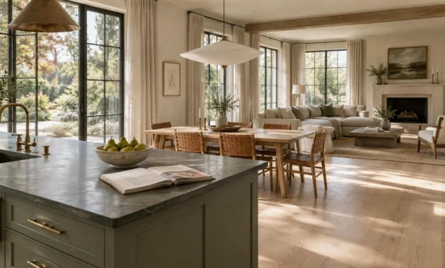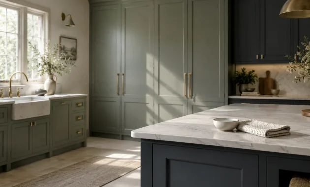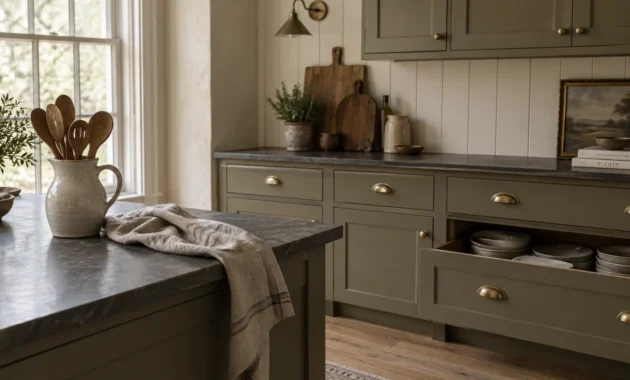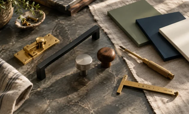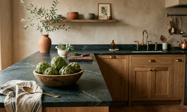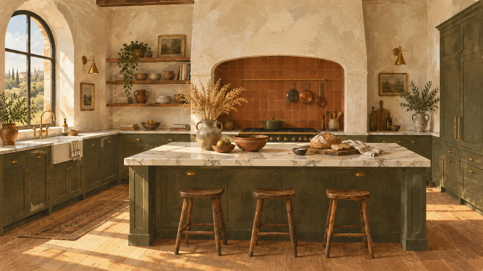
A well-chosen palette instantly transforms your culinary space from a clinical food-prep zone into the welcoming heart of your home. Selecting the right warm kitchen paint colors creates an inviting ambiance that beckons family and guests to linger.
Recent design shifts prove that homeowners are abandoning sterile, icy greys in favor of comforting, deeply pigmented hues. These restorative shades deliver genuine architectural presence while layering quiet luxury across your cabinetry and walls.
Whether you crave sun-drenched terracottas or restorative taupes, warmth remains the defining element of forward-thinking kitchen aesthetics. Here are twelve standout shades redefining modern culinary spaces.
Trend #1: Whipped Alabaster and Cream
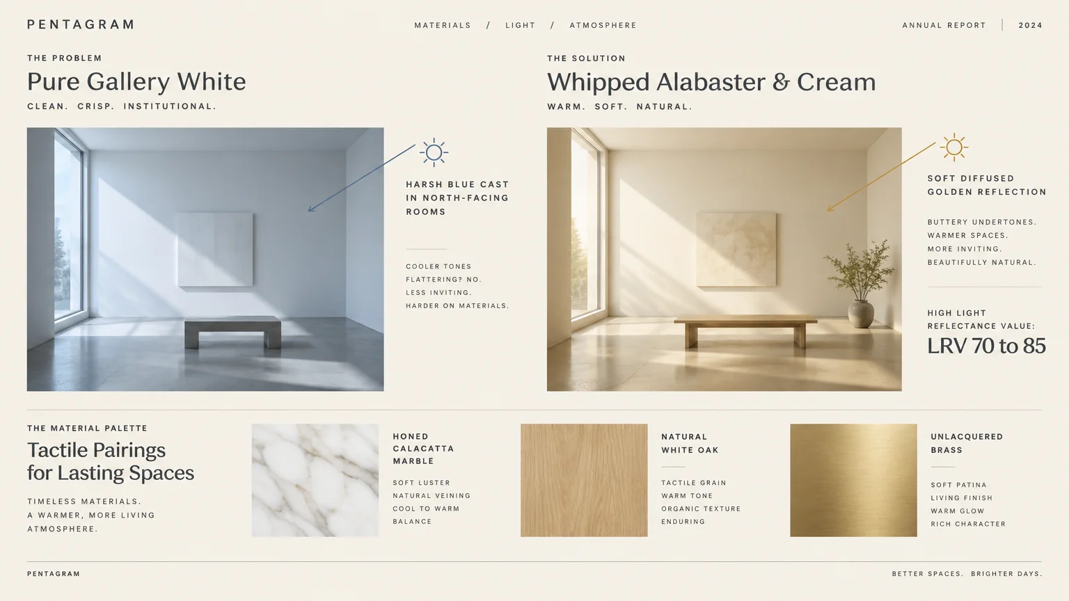
Stark, blue-tinted whites are officially giving way to whipped alabaster and warm creams. This evolution delivers effortless light reflection without casting the cold, institutional shadows typical of pure gallery whites.
These comforting tones register with a high Light Reflectance Value (LRV) between 70 and 85. They maximize incoming daylight while softening sharp room perimeters through gentle, buttery undertones.
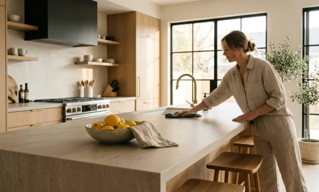
Pair creamy alabaster walls with honed Calacatta marble and natural white oak cabinetry for textural balance. The organic wood grain grounds the light walls; unlacquered brass hardware introduces a subtle, reflective glow.
For north-facing kitchens starved for direct sun, warm neutral paint colors like creamy linen act as optical warmth. They capture dim rays and neutralize the dreary, blue cast common to northern exposures.
Apply this palette across your perimeter cabinetry or vertical shiplap to cultivate timeless architectural charm. It serves as an adaptable, understated canvas that never feels dated or visually fatiguing.
Trend #2: Sun-Drenched Terracotta and Moroccan Clay
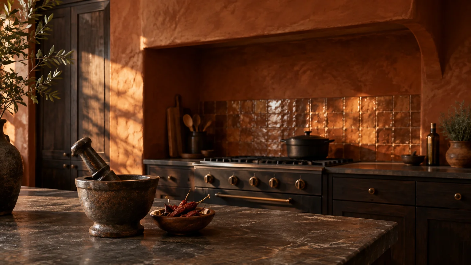
Clay hues and baked terracotta introduce an authentic, artisanal provenance straight from Mediterranean architecture into modern interiors. These grounding tones provide an immediate sensory antidote to sleek, synthetic modern surfaces.
Terracotta thrives on richness, marrying burnt orange, red clay, and soft brown earth pigments. Its dynamic undertones shift subtly throughout the day, looking vibrant in morning light and sultry after dusk.
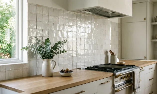
Incorporate zellige tiles alongside terracotta walls to emphasize organic variations in texture and finish. Hand-crafted ceramic surfaces bounce warm highlights, amplifying the tactile depth of the surrounding paint.
Contrast these baked earth walls against soapstone countertops or dark espresso millwork. The juxtaposition between rustic clay and dense, dark stone evokes a sophisticated, European farmhouse sensibility.
You can also limit this shade to a focal kitchen island or a walk-in pantry. A targeted application delivers concentrated warmth without overwhelming compact footprints.
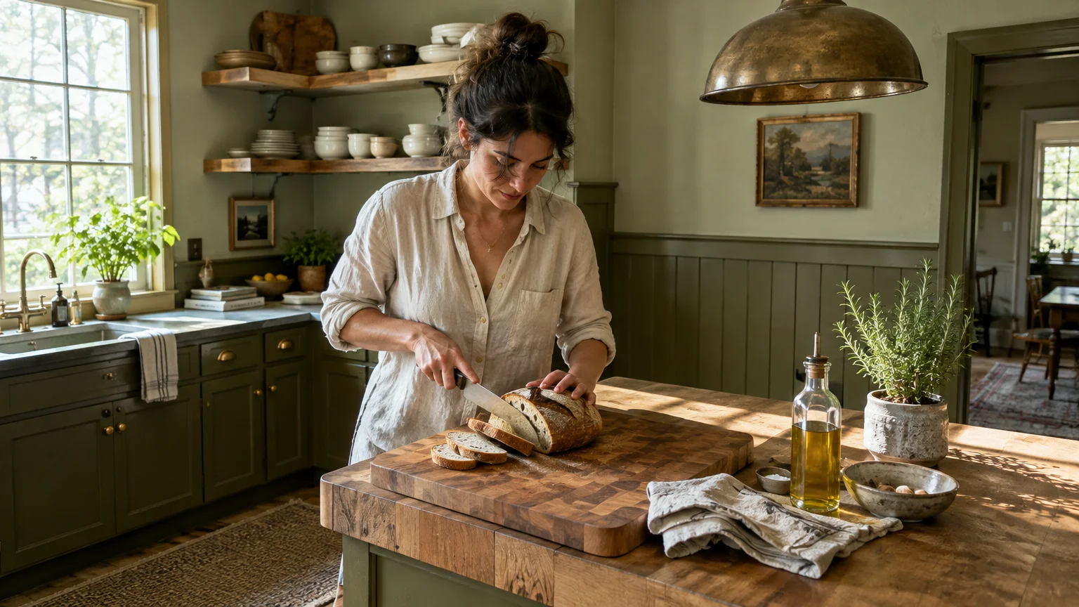
Trend #3: Velvety Olive and Muted Sage
Biophilic design continues to dominate kitchen trends, positioning velvety olive and muted sage as modern essentials. These botanical shades pull the restorative calmness of the outdoors directly into your cooking haven.
Industry sales data confirms that earthy greens carry extraordinary real-world appeal. Zillow research shows that kitchens painted in soft olive and sage hues command sale price premiums of roughly $1,500 to $1,600.
Unlike cooler mint tones, warm sage features golden and yellow undertones that prevent chalkiness. This chromatic complexity ensures the walls feel velvety and cocooning rather than brisk or sterile.
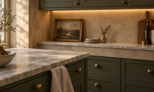
Pair velvety olive walls with butcher block counters and aged bronze light fixtures. The natural timber balances the verdant walls, producing an enduring, grounded atmosphere.
For homeowners seeking cozy kitchen colors, olive provides depth while acting as an honorary neutral. It seamlessly complements both dark walnut cabinets and light travertine floor tiles.
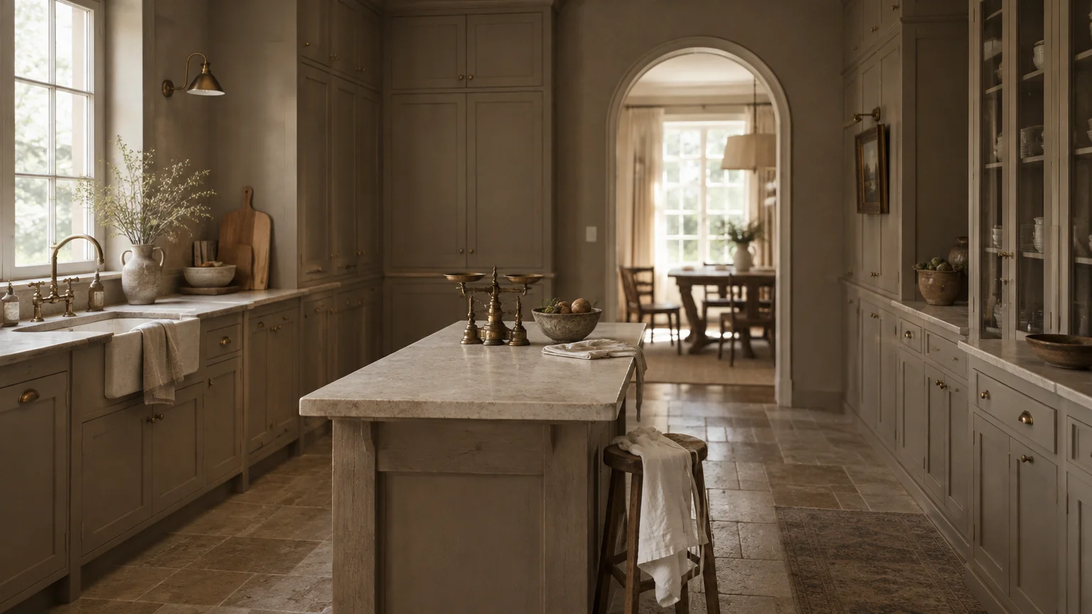
Trend #4: Rich Taupe and Warm Mushroom
Warm taupe and earthy mushroom represent the ultimate expression of quiet luxury in residential design. These nuanced neutrals bridge the gap between grey and brown, providing tailored architectural sophistication.
The National Kitchen & Bath Association reports that up to 96% of design professionals favor warm neutrals over cool greys. Homeowners increasingly desire spaces that feel peaceful, collected, and emotionally grounding.
Taupe paints generally sit within a balanced LRV range of 40 to 60. This sweet spot delivers substantial depth of color while reflecting adequate ambient illumination across your workspaces.
Complement warm mushroom walls with unlacquered brass plumbing fixtures and fluted millwork. As the brass patinas naturally over time, it mirrors the organic warmth embedded within the taupe paint.
This versatile shade creates an effortless aesthetic bridge between open-concept kitchens and adjoining dining rooms. It establishes a fluid, cohesive transition across your entire main living level.
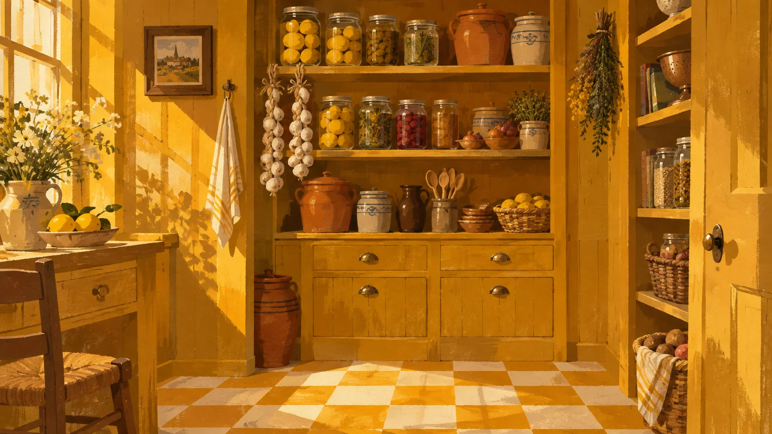
Trend #5: Spiced Mustard and Heritage Ochre
Spiced mustard and heritage ochre evoke European bistro nostalgia with confident, golden character. These enveloping yellows infuse culinary spaces with radiant heat, banishing gloomy shadows and clinical monotony.
Rather than utilizing harsh neon primaries, contemporary ochre leans heavily on earthy umber undertones. This muted composition prevents visual fatigue while retaining a sunlit, joyful disposition.
Contrast mustard walls with matte black wrought iron hardware or charcoal soapstone slabs. The dramatic interplay between dark stone and golden paint creates a striking, gallery-worthy culinary environment.
If full-room coverage feels bold, apply ochre selectively to your window trim, pantry door, or ceiling. Painting the ceiling in warm ochre casts a gentle, flattering golden glow downward across meal preparation areas.
When exploring kitchen paint ideas, ochre delivers personality without sacrificing historic architectural integrity. It harmonizes beautifully with original brickwork and reclaimed hardwood flooring.
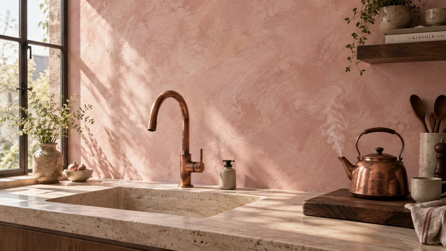
Trend #6: Dusty Plaster Pink and Muted Rose
Muted plaster pink has transcended fleeting novelty to become a timeless, sophisticated design neutral. Far from playful pastel, modern versions capture the raw, mineral elegance of European lime plaster.
These understated roses rely on generous doses of beige and grey pigment to temper the pink chroma. The resulting hue bathes your kitchen in soft, flattering light reminiscent of a late afternoon sunset.
Pair plaster pink with vein-cut travertine countertops and brushed champagne bronze fixtures. The stone surfaces reinforce the chalky, organic nature of the wall finish for a harmonious presentation.
This subtle shade also complements charcoal cabinetry, providing an unexpected, moody counterpoint. The dark millwork anchors the kitchen while the dusty pink keeps the perimeter light and warm.
Designers frequently specify plaster pink in kitchens with tall ceilings to enhance spatial intimacy. The color visually brings overhead planes closer, enveloping the room in warmth.
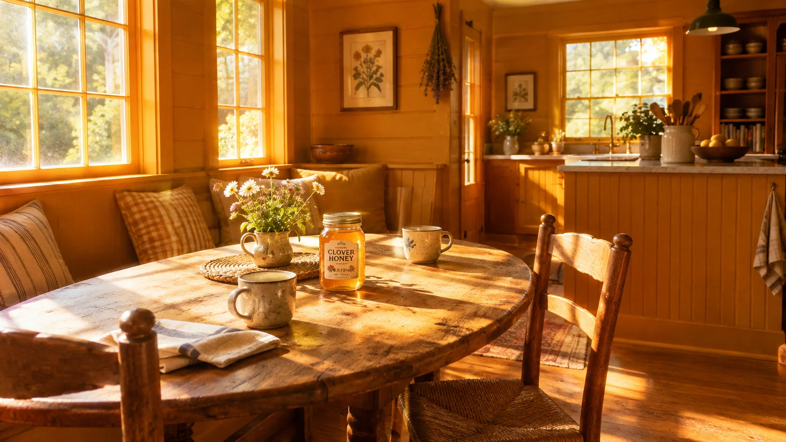
Trend #7: Spiced Honey and Warm Amber
Spiced honey and rich amber offer an intoxicating blend of golden-brown warmth that elevates any kitchen. These radiant hues embody comforting optimism, reflecting ambient light with an alluring, candlelit luminosity.
Falling within an LRV range of 50 to 65, amber shades enrich darker corners without flattening interior architecture. They supply continuous visual energy whether struck by morning daylight or illuminated by task lamps.
Layer amber paint alongside warm wood finishes like quarter-sawn oak, hickory, or cherry. Repeating warm undertones across millwork and walls creates a monolithic, custom-built look that feels undeniably luxurious.
Integrate pendant lighting equipped with warm 2700K LED bulbs to unlock the maximum potential of amber walls. The low-Kelvin spectrum ignites the golden pigments, creating a hypnotic evening dining retreat.
Use spiced honey on built-in breakfast banquettes or open shelving backdrops for charming visual contrast. It turns mundane storage nooks into radiant design focal points.
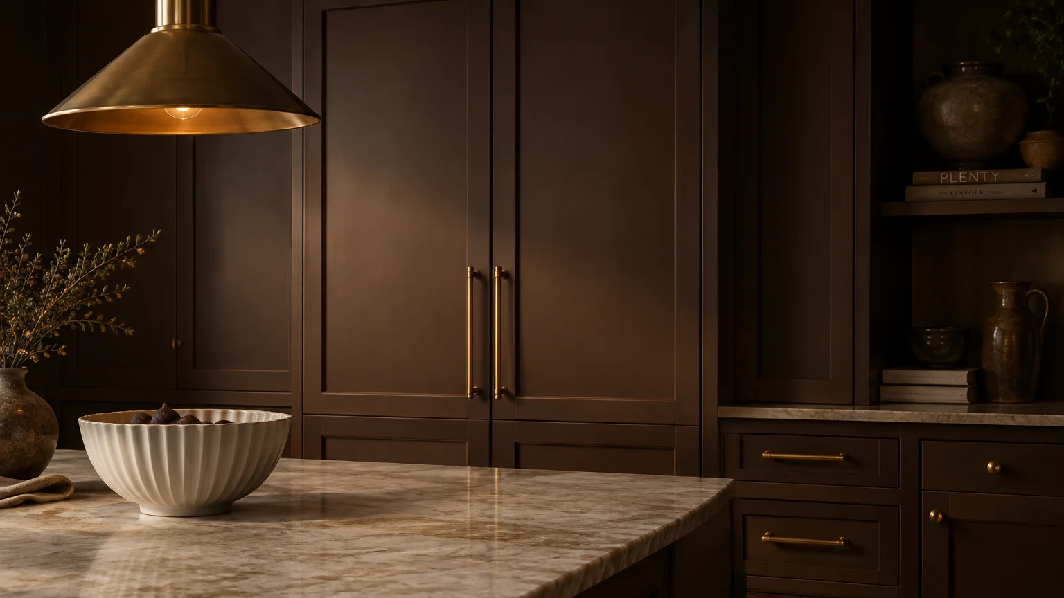
Trend #8: Velvety Cocoa and Espresso Brown
The design world has wholeheartedly embraced rich brown tones, championing dark cocoa as the new luxury anchor. Velvety espresso walls deliver an enveloping sanctuary that makes large kitchens feel intimately proportioned.
Brown draws its warmth from complex blends of red, yellow, and black pigments. This multidimensional base gives cocoa an opulent, grounding quality that standard cool grays could never replicate.
Balance dark chocolate walls with luminous white Danby marble and polished nickel accents. The high-contrast reflective marble prevents the kitchen from feeling enclosed, bouncing daylight across dark expanses.
When painting walls in deep tones, invest in durable, low-sheen finishes like matte or rich eggshell. High-gloss finishes reflect unwanted glare, while matte coats absorb light to emphasize velvety saturation.
For smaller galleys, cocoa establishes a jewel-box aesthetic that conceals awkward boundaries. Embracing darkness can make a modest footprint feel intentionally intimate and strikingly upscale.
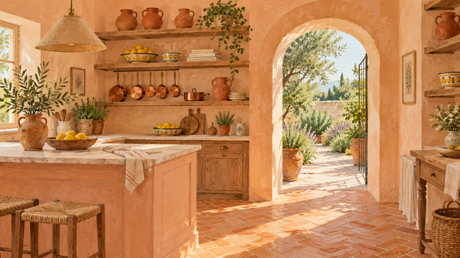
Trend #9: Muted Peach and Apricot Clay
Muted peach and apricot clay bring vibrant, uplifting energy into the heart of your home. These refined shades replace the hyper-saturated tones of past decades with soft, chalky sophistication.
The inherent orange undertones in apricot spark sociability, making your kitchen a magnet for lively dinner parties. Color psychologists consistently note that warm fruit tones encourage conversation and enhance culinary appetites.
Style peach-toned kitchen walls alongside terrazzo surfaces, white quartz, and ribbed glass cabinet doors. The crisp modern materials temper the warmth of the paint, keeping your kitchen refreshingly current.
Apricot clay works particularly well in east-facing kitchens that capture clear morning light. It greets early risers with an invigorating glow that softens as daylight wanes into dusk.
Try coating your kitchen pantry or coffee bar in apricot for a delightful pop of hidden warmth. Opening cabinet doors to reveal an unexpected cheerful shade elevates your daily routine.
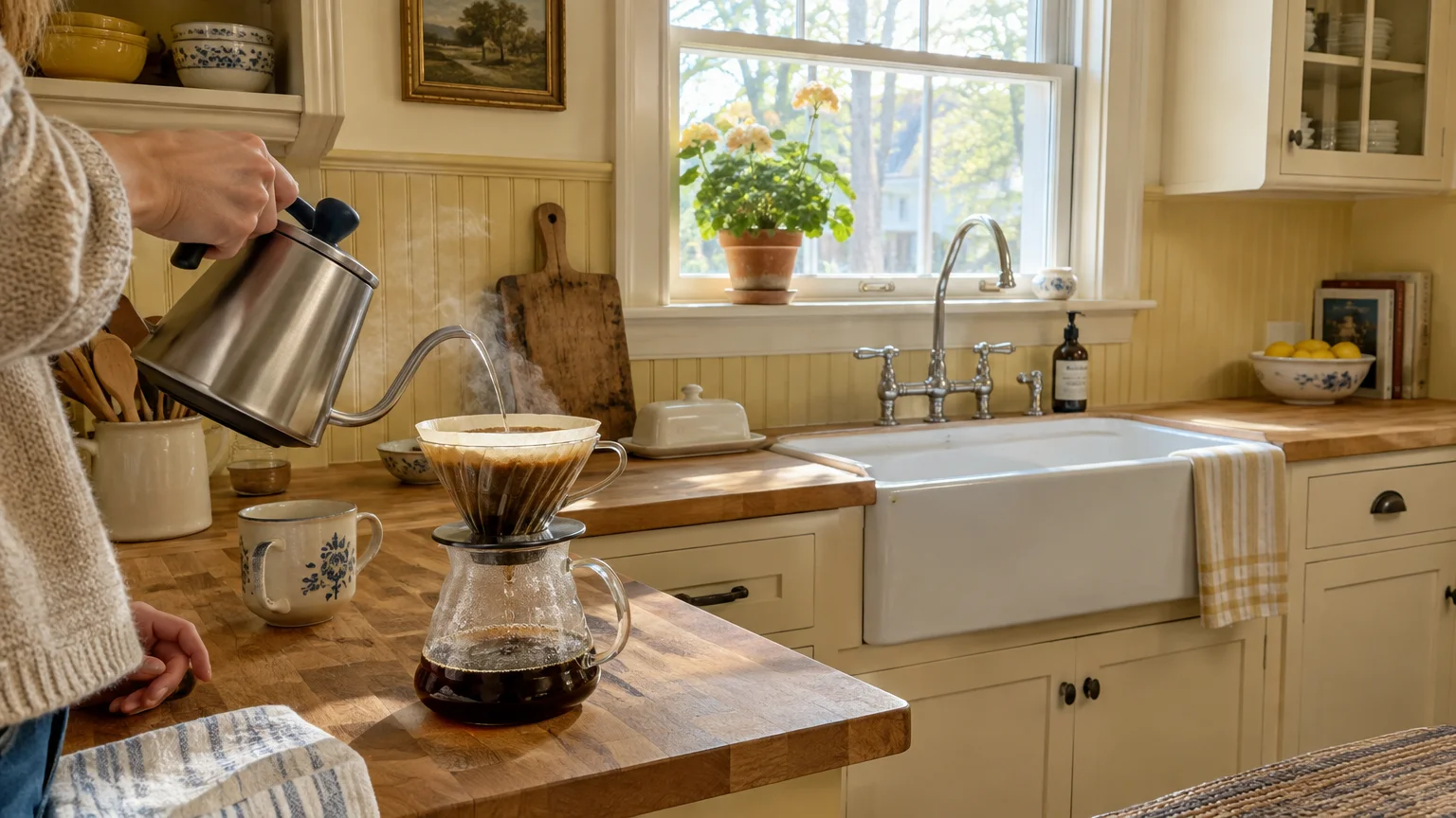
Trend #10: Soft Buttercream and Linen Yellow
Soft buttercream evokes the serene romance of classic English country kitchens while retaining clean, modern lines. Unlike harsh canary shades, linen yellow is mellowed by creamy white and beige undertones.
With a high LRV around 72 to 80, buttercream maximizes daylight across low-ceilinged or narrow floor plans. It infuses shadow-prone kitchens with an effortless, sunny optimism that feels entirely natural.
Pair buttercream walls with sage green cabinetry and honed soapstone or dark granite countertops. This classic color combination establishes a timeless, historic narrative that resists shifting decorative fads.
Incorporate woven rattan barstools, unpainted wood shelving, and linen roman blinds to accentuate natural texture. The tactile elements celebrate the artisanal, hand-crafted spirit that buttery hues naturally evoke.
For kitchen paint ideas that stand the test of time, buttercream offers unmatched versatility. It brightens small spaces without ever slipping into the clinical detachment of plain white.
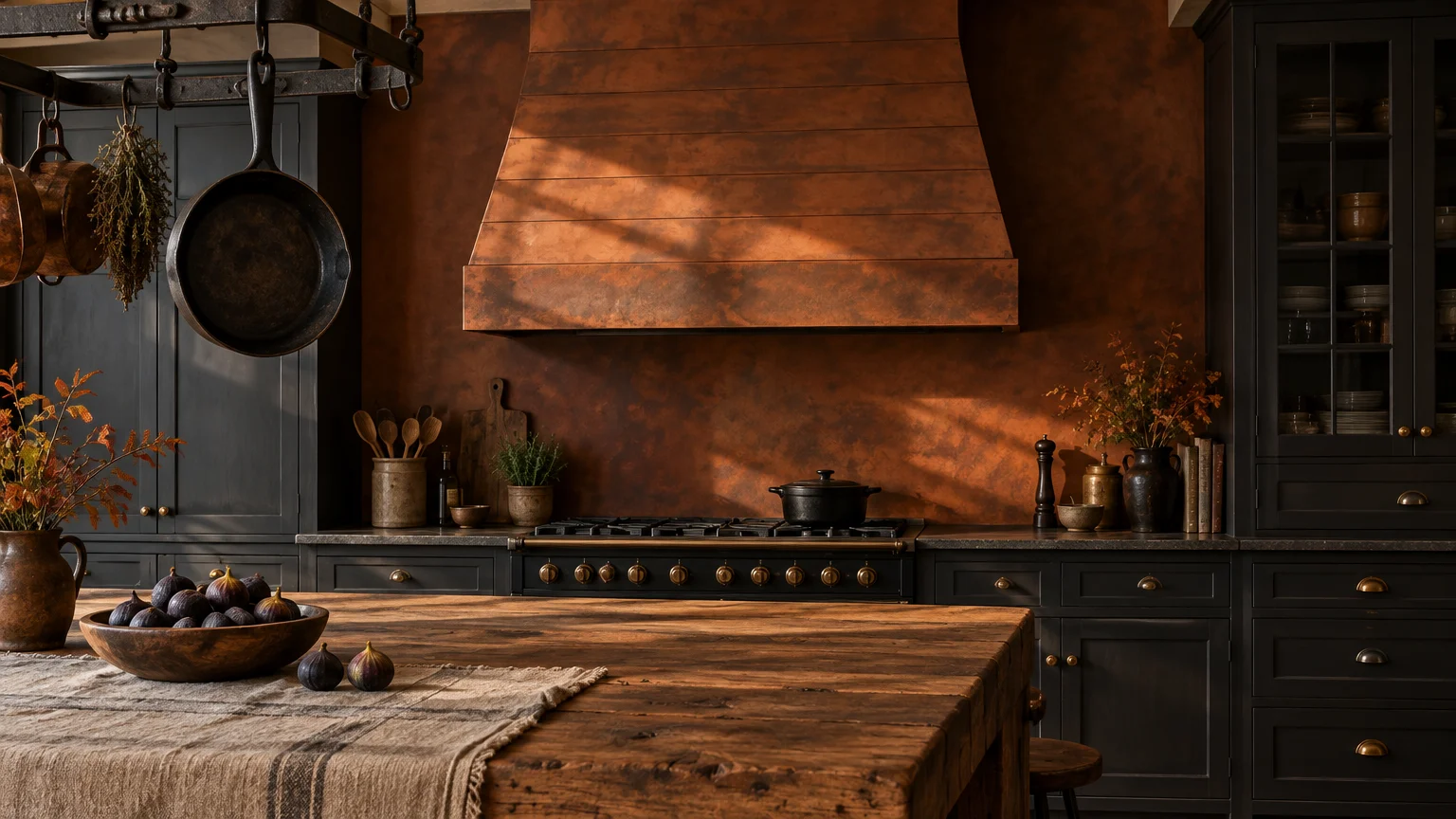
Trend #11: Weathered Rust and Spiced Cinnamon
Weathered rust and cinnamon provide dramatic, earthbound resonance for homeowners who appreciate bold color stories. These smoldering hues draw inspiration from oxidized metals, autumn foliage, and mineral-rich canyon walls.
Cinnamon features a dense concentration of red and brown pigments that evoke warmth and comfort. It creates an intoxicating backdrop that makes brass hardware and polished copper cookware sparkle brightly.
Contrast rust-painted surfaces against industrial elements like poured concrete counters or blackened steel range hoods. The sleek modern architectural features ground the paint color, preventing it from feeling overly historic.
Apply this deep spice hue to a single feature wall or across your kitchen island base. A concentrated dose establishes an anchor point that ties together neutral perimeter walls and cabinetry.
Cinnamon’s low LRV absorbs excess glare in south-facing kitchens flooded with intense, direct afternoon sun. It tempers blinding daylight into a warm, comfortable glow throughout the cooking area.
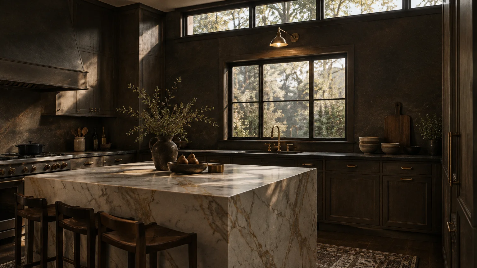
Trend #12: Warm Slate and Smoky Sepia
Dark kitchens do not have to feel cold or unwelcoming. Warm slate and smoky sepia infuse charcoal tones with deep brown and burgundy undertones, crafting a cocooning culinary retreat.
Unlike chilly blue-blacks, smoky sepia absorbs light while exuding subtle, radiant warmth. It produces a moody, dramatic aesthetic that elevates open-concept entertaining spaces into sophisticated evening lounges.
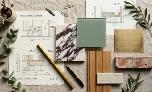
Contrast smoky sepia walls with warm white marble backsplashes and fluted white oak detailing. The light organic elements punctuate the darkness, maintaining essential balance and visual interest.
Integrate warm under-cabinet LED strip lighting to illuminate task areas and showcase the paint’s richness. Targeted illumination prevents shadowy pockets, keeping food preparation safe and effortlessly functional.
Among the best kitchen paint colors for modern drama, warm slate reigns supreme. It proves that dark color stories can deliver immense cozy comfort when paired with the right undertones.
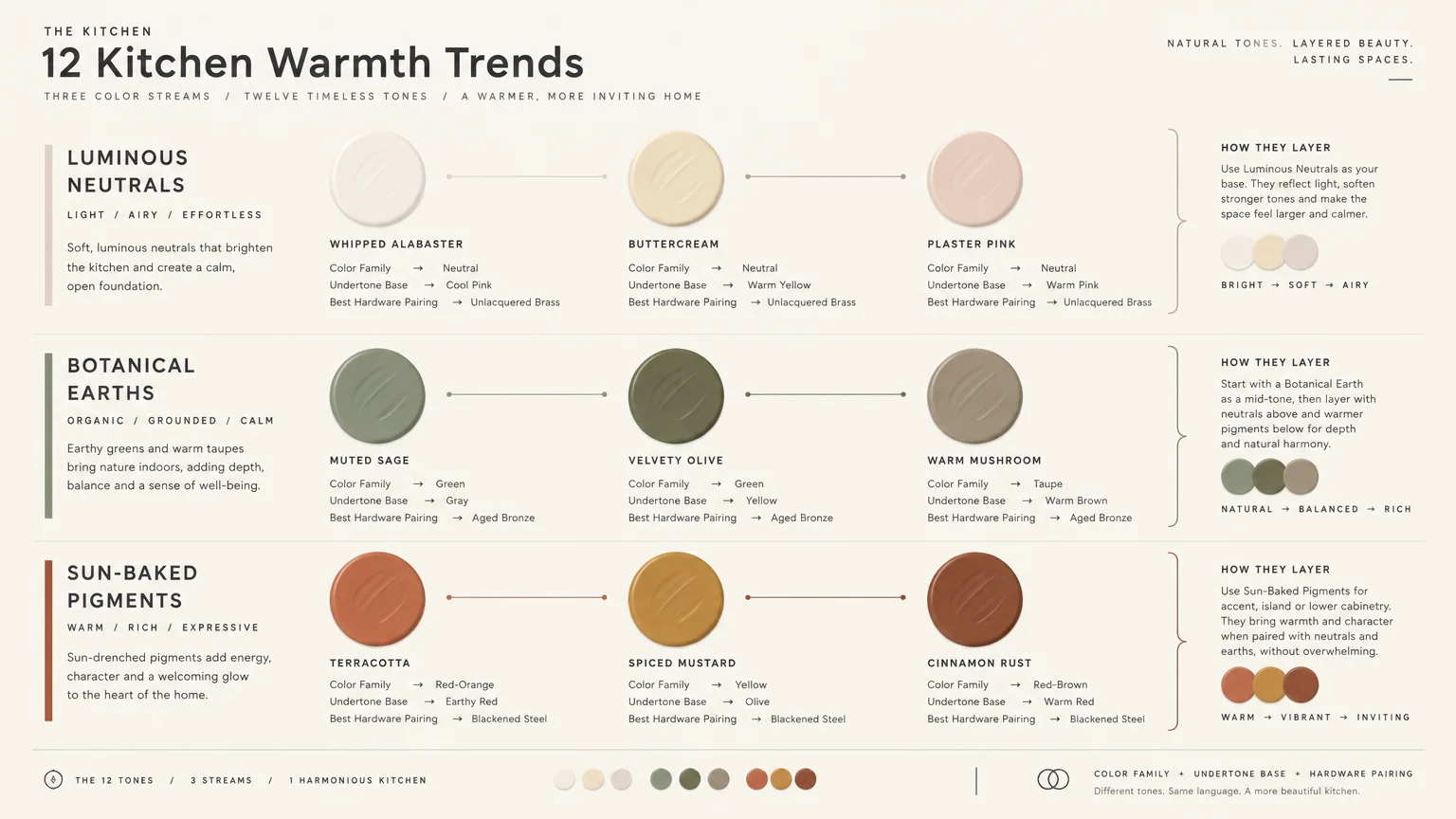
The Big Picture: Weaving These Trends into Your Home
Selecting the perfect warm hue requires balancing lighting conditions, existing materials, and room scale. You must sample colors directly on your walls across morning, afternoon, and evening light before committing.
Consider the Light Reflectance Value of your choices carefully. Designers recommend paint with an LRV between 40 and 65 for cozy walls, and 70 to 85 for luminous creams.
Professional kitchen wall painting typically costs between $570 and $1,210, averaging around $800 or $2 to $6 per square foot. Cabinet painting averages $425 to $1,466 for professional execution.
If you tackle painting as a DIY project, high-grade interior paints run $50 to $100 per gallon. One gallon covers 350 to 400 square feet, meaning an average kitchen requires two gallons.
Anchor your chosen wall paint with complementary flooring, natural stone, and unlacquered hardware. A curated blend of warm undertones ensures your culinary space feels organic, intentional, and deeply inviting.
Frequently Asked Questions
How do I test paint undertones against my kitchen lighting?
Paint large sample boards using two coats and place them against your cabinetry and countertops. Move the boards around your kitchen to evaluate how artificial 2700K bulbs and changing daylight affect undertones.
Never evaluate paint colors under cold 5000K fluorescent lighting. High-Kelvin bulbs drain warmth from earthy hues and distort your perception of complex undertones.
What Light Reflectance Value works best for kitchen walls?
Interior designers recommend paint with an LRV between 40 and 65 for kitchen walls that feel intimate yet airy. This range holds rich pigment without swallowing available ambient light.
If your kitchen lacks ample windows, choose warm whites and creams with an LRV between 70 and 85. These reflective shades bounce light effectively while preserving cozy undertones.
What paint VOC standards should I look for in cooking spaces?
Federal standards permit interior coatings up to 250 grams of VOCs per liter for flat finishes. However, environmental certifications like Green Seal GS-11 define zero-VOC paints as containing under 5 grams per liter.
Select satin or eggshell finishes formulated with zero-VOC levels to protect kitchen indoor air quality. These formulations deliver scrubbable durability against cooking moisture while ensuring minimal chemical odor.
Do warm paint colors improve home resale value?
Real estate analyses indicate that warm, nature-inspired paint choices resonate strongly with prospective buyers. Zillow research shows that kitchens painted in earthy olive or sage greens achieve offer premiums of roughly $1,500 to $1,600.
In contrast, stark hospital whites or jarring, high-saturation colors often cause buyers to lower their bids. Grounded warm neutrals signal thoughtful care and effortless move-in readiness.
For the latest color forecasts, consult industry leaders like Pantone and paint companies like Benjamin Moore. For professional design standards, refer to the American Society of Interior Designers (ASID).
Disclaimer: This article reflects design trend analysis and predictions. Personal taste and timeless design principles should always guide your decorating choices.