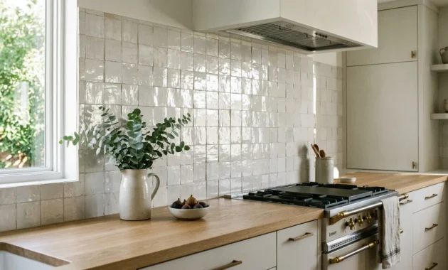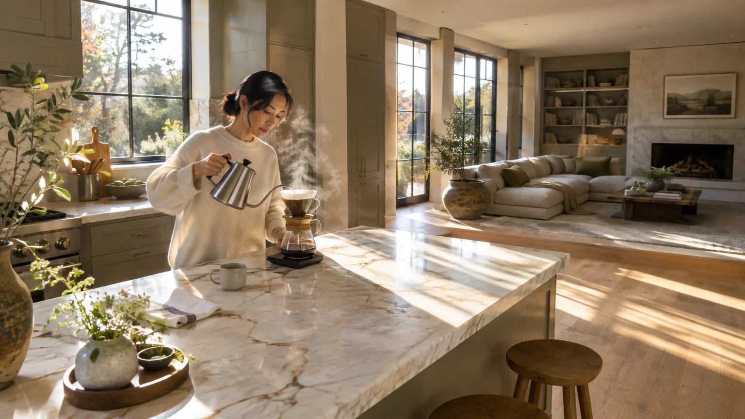
Selecting the best kitchen paint colors for an open layout requires balancing culinary utility with relaxed living room aesthetics. The right shade unifies sightlines, anchors cabinetry, and establishes architectural flow across your entire floor plan.
Leading interior designers rely on multidimensional undertones to prevent open concept kitchen paint from clashing with adjoining living zones. These curated designer kitchen colors bring cohesion, warmth, and quiet luxury to your shared communal spaces.
Whether you favor luminous mineral neutrals or dramatic grounding hues, thoughtful pigment placement completely transforms open-plan living. Explore the eleven strategic paint colors top designers consistently specify to elevate open kitchen environments.
Trend #1: Creamy Alabaster
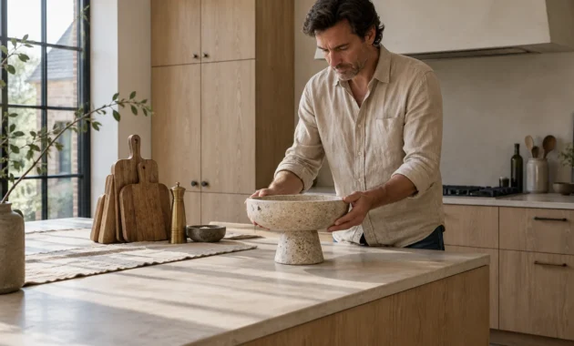
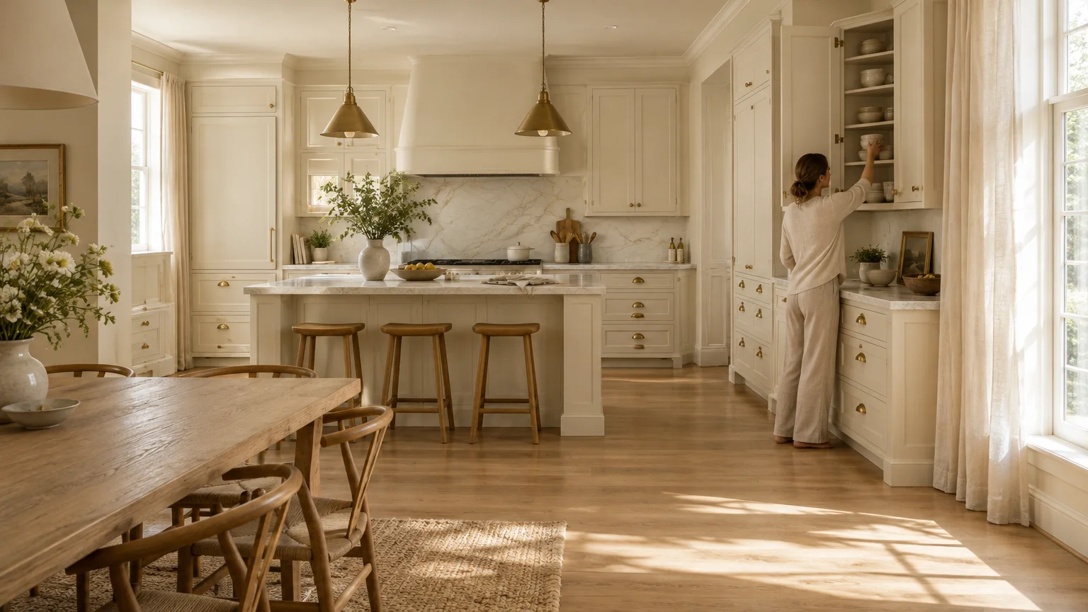
Pristine stark whites often feel clinical when viewed from a plush living room sofa. Creamy alabaster infuses open kitchens with gentle warmth while maintaining an airy, light-reflective atmosphere.
This shade features subtle yellow and beige undertones that soften harsh daylight. Designers frequently utilize it to establish seamless transitions between perimeter cabinetry and adjacent dining walls.
In open concept architecture, this hue elevates wall expanses without creating stark visual boundaries. It reflects natural daylight deep into central living zones, enhancing the perceived volume of your home.
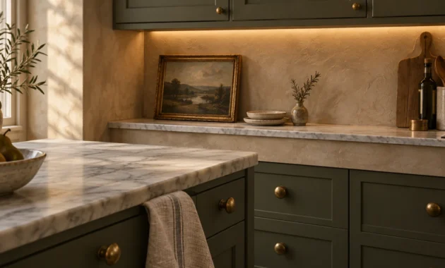
Pair creamy alabaster with warm white oak flooring and honed Calacatta marble countertops. The organic veining in natural stone effortlessly echoes the complex undertones of this versatile neutral.
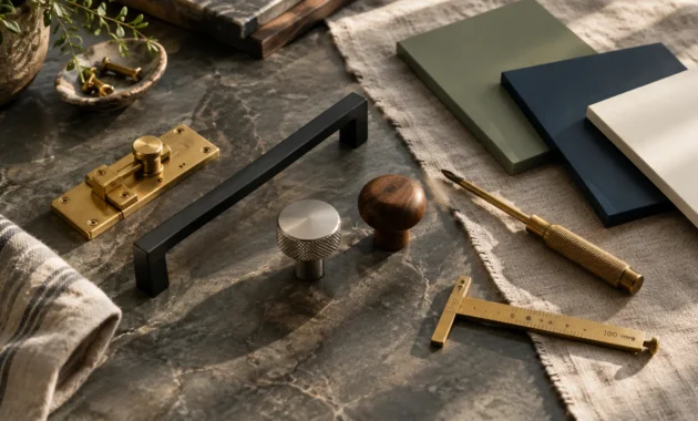
To complete the palette, specify unlacquered brass hardware and natural linen window treatments. These tactile materials ensure your kitchen reads as a sophisticated extension of your primary living area.
Trend #2: Biophilic Sage and Muted Olive
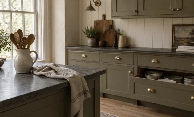
Biophilic design continues to dominate modern residential architecture, and muted greens lead this organic movement. Soft sage introduces an invigorating, restorative quality without overwhelming adjoining living spaces.
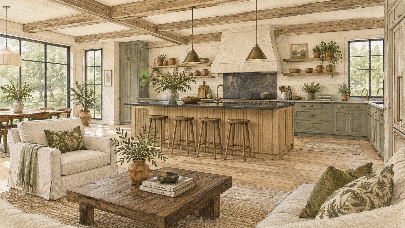
These earthy hues draw the natural landscape indoors, creating an idyllic backdrop for open culinary zones. Olive undertones provide enough depth to anchor floating kitchen islands against light-filled living room windows.
The color reads as a grounded neutral rather than an aggressive accent color. It creates a tranquil visual resting point when viewed across a busy open-concept family room.
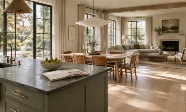
Specify muted sage on lower perimeter cabinets to ground the workspace effectively. Complement this foliage-inspired tone with soapstone countertops and fluted white oak detailing on your kitchen island.
For adjoining seating areas, incorporate olive-toned throw pillows or botanical artwork to create aesthetic harmony. This deliberate color repetition visually integrates cooking and entertaining environments.
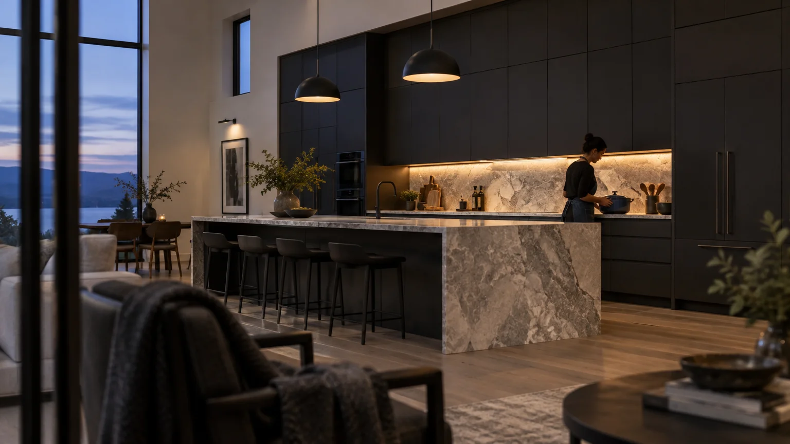
Trend #3: Moody Charcoal and Soft Black
Expansive open concept floor plans often risk feeling cavernous and undefined without strong architectural focal points. Moody charcoal provides the gravitas needed to visually anchor a kitchen within a vast Great Room.
Rather than feeling oppressive, soft black recedes into the background, creating an illusion of infinite depth. It transforms functional cabinetry into elegant furniture that looks intentional from any vantage point.
High ceilings and generous window banks keep deep charcoal from overpowering open floor plans. The shade absorbs glare, bringing visual intimacy to soaring contemporary architectural envelopes.
Balance dark charcoal cabinetry with expansive slabs of dramatic, light-colored quartzite. Integrated under-cabinet lighting prevents shadows and keeps your food preparation areas bright and functional.
Carry this dramatic hue across the threshold by choosing matte black curtain rods or light fixtures in the lounge. This shared metalwork establishes cohesive visual rhythm throughout the entire open footprint.
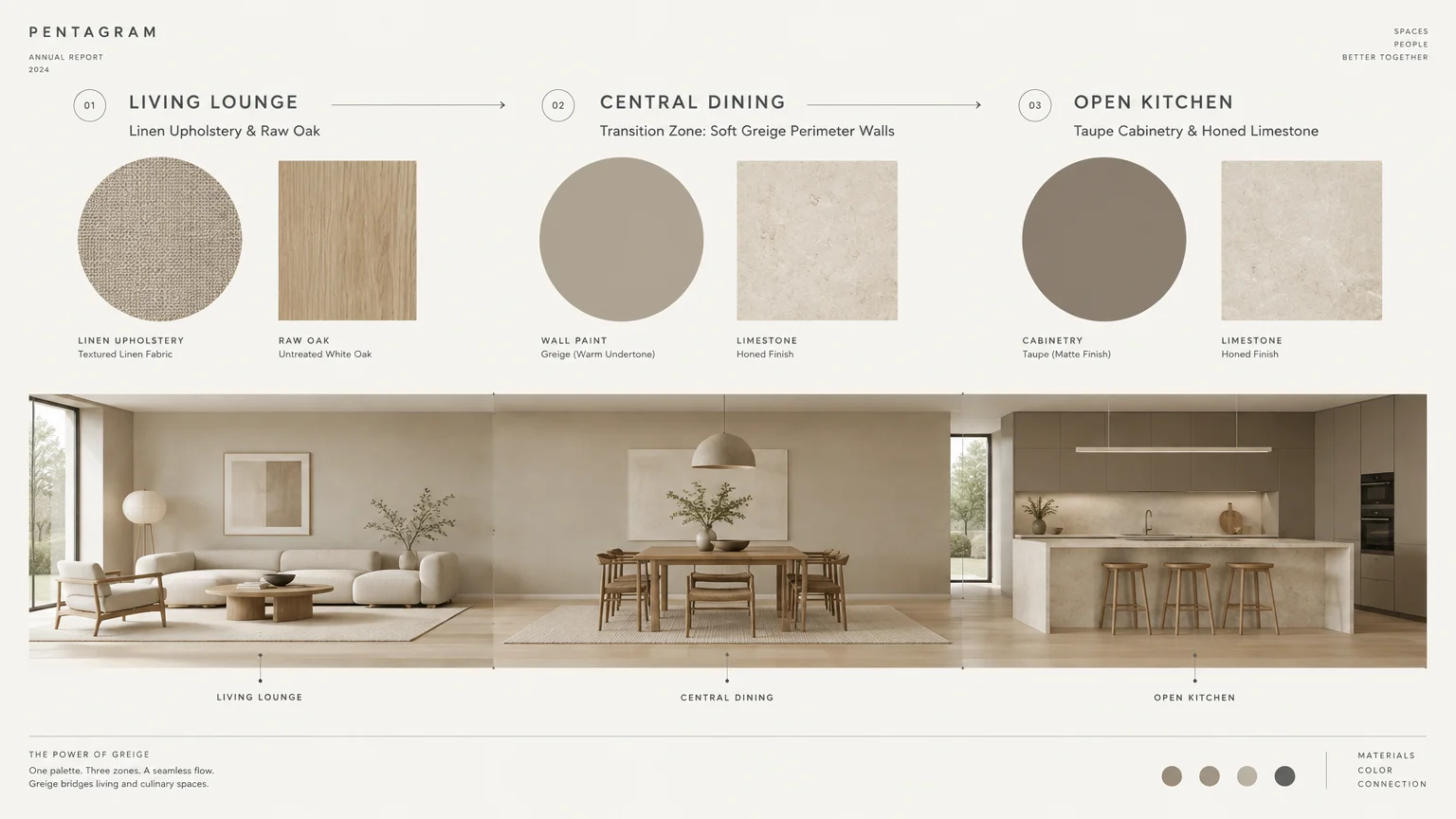
Trend #4: Taupe-Grounded Greige
Cold gray interiors have yielded to warmer, more sophisticated hybrid neutrals in modern luxury residences. Taupe-grounded greige represents the pinnacle of quiet luxury, balancing stone gray with gentle beige undertones.
This chameleon hue shifts gracefully as daylight evolves, appearing cozy at dusk and crisp at dawn. It serves as an ideal bridge color between disparate wood finishes and upholstery fabrics.
Greige resolves the common dilemma of matching kitchen millwork to living room baseboards. It unifies trim work across wide openings, eliminating visual disruption between distinct lifestyle zones.
Apply greige across both kitchen perimeter walls and continuous open hallways for uninterrupted spatial flow. It eliminates jarring visual breaks between distinct functional zones without requiring separate accent walls.
Layer the space with warm travertine decor, bouclé barstools, and bronze plumbing fixtures. These understated textures amplify the tranquil, cohesive ambiance of your open living concept.
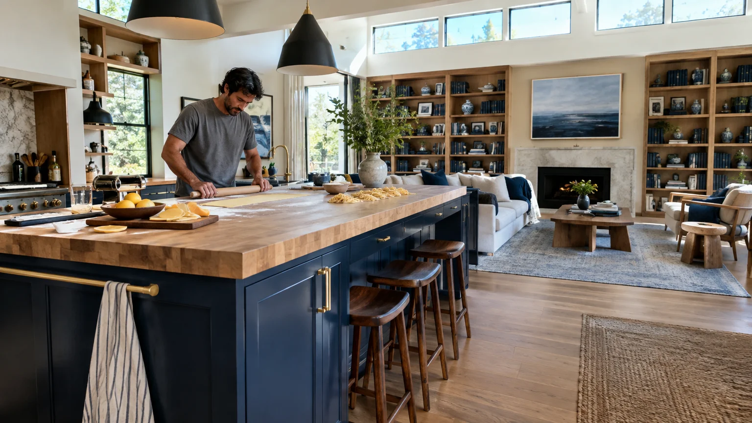
Trend #5: Tailored Navy and Midnight Indigo
Tailored navy remains an enduring favorite among interior designers seeking classic architectural provenance. Midnight indigo brings stately dignity to open kitchen cabinetry, standing out crisply against pale surrounding walls.
This timeless color choice reads as a sophisticated neutral when paired with natural materials. Its blue undertones inject personality without competing with living room rug patterns or accent chairs.
Dark navy creates an unmistakable zone boundary in open spaces where physical walls are absent. It defines the culinary theater without closing off interaction with seated dinner guests.
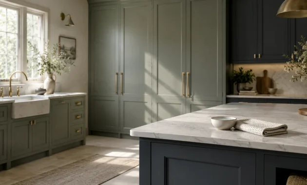
Utilize navy exclusively on the central island to create an eye-catching culinary centerpiece. Retain lighter warm whites on perimeter upper cabinetry to preserve bright sightlines across the room.
Pair deep indigo with warm cognac leather stools and woven rush pendant shades. This dynamic juxtaposition between deep blue and rich caramel balances masculine tailoring with relaxed comfort.
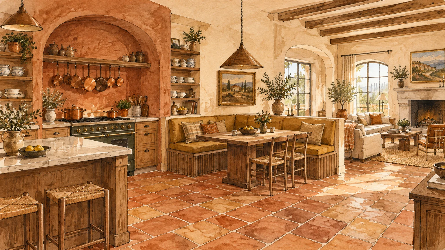
Trend #6: Earthy Terracotta and Warm Ochre
Homeowners increasingly seek comforting, enveloping color palettes that foster intimate conversation during dinner parties. Earthy terracotta and warm ochre deliver baked-clay warmth that enlivens open concept kitchen paint schemes.
These Mediterranean-inspired pigments evoke artisan provenance, grounding sleek stainless steel appliances with tactile nostalgia. They infuse large, open spaces with an undeniable sense of welcoming energy.
Clay tones excel in spaces with northern or eastern exposures by compensating for cool, blue natural light. They create an inviting, sun-warmed environment throughout the entire open floor plan.
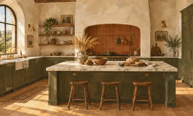
Apply terracotta to a kitchen accent wall or a custom plaster range hood. The resulting textural focal point will captivate guests seated in the adjoining dining or lounge area.
Harmonize this sun-drenched hue with handcrafted zellige backsplashes, walnut floating shelves, and unlacquered copper cookware. These artisanal accents enrich the lived-in character of contemporary homes.
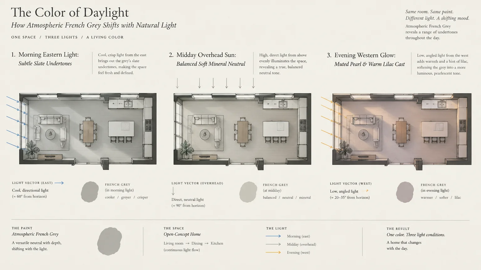
Trend #7: Atmospheric French Grey
Atmospheric French grey avoids the flat sterility of basic gray by weaving delicate green and blue pigments into its base. This historical hue brings understated European elegance to open plan layouts.
In north-facing open kitchens where natural light skews cool, French grey provides remarkable depth without looking dingy. It subtly reflects shifting sky tones throughout the changing seasons.
This complex gray harmonizes stainless steel chef equipment with soft furnishings in adjoining dining rooms. It bridges modern culinary machinery with traditional domestic comfort effortlessly.
Coat traditional shaker cabinets in satin French grey to highlight intricate millwork profiles. Combine this finish with polished nickel hardware to bounce ambient living room lighting effortlessly.
Complement the cabinetry with soft Belgian linen drapery and pale European oak floors in the adjacent seating area. The resulting palette feels effortlessly curated and tranquil.
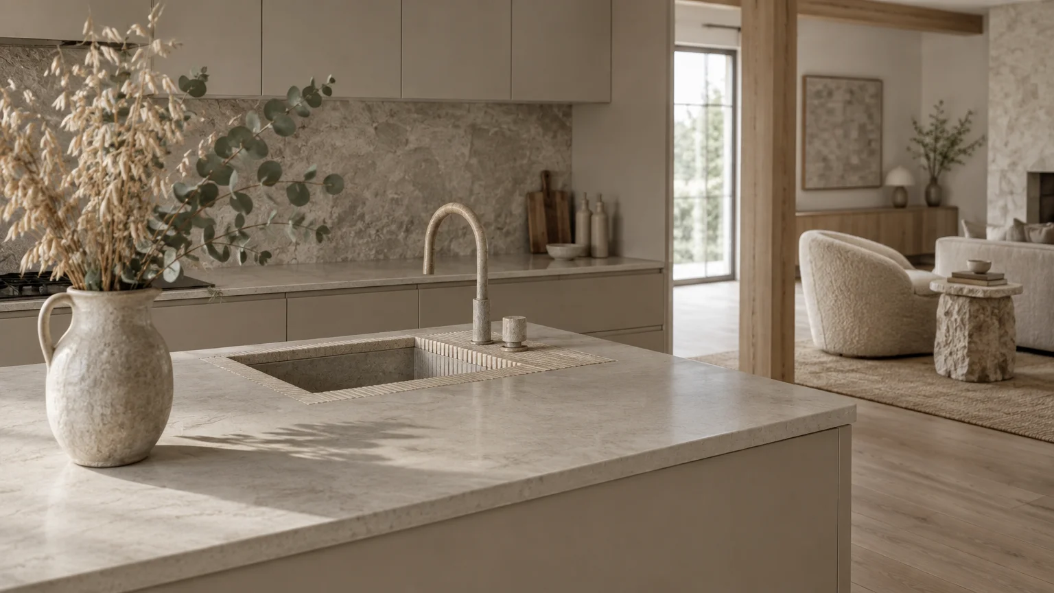
Trend #8: Pale Mushroom and Mineral Stone
Pale mushroom channels the raw beauty of natural river stone, offering a nuanced alternative to conventional off-whites. It contains subtle earthy undertones that bring organic refinement to open kitchen paint concepts and versatile kitchen color ideas.
This low-contrast shade creates visual softness, blurring boundaries between functional kitchen workspaces and comfortable living zones. It promotes a continuous, harmonious horizon across your entire main level.
Designers embrace mineral mushroom because it complements both cool marble slabs and warm white oak flooring. It acts as an adaptable mediator across mixed material palettes.
Paint full-height pantry walls in pale mushroom to integrate massive storage volumes seamlessly into your living space. The cabinetry will read as elegant architectural paneling rather than utilitarian utility storage.
Pair this mineral shade with fluted limestone backsplashes, microcement details, and matte black plumbing accents. The textural contrasts create subtle drama without relying on loud, distracting colors.
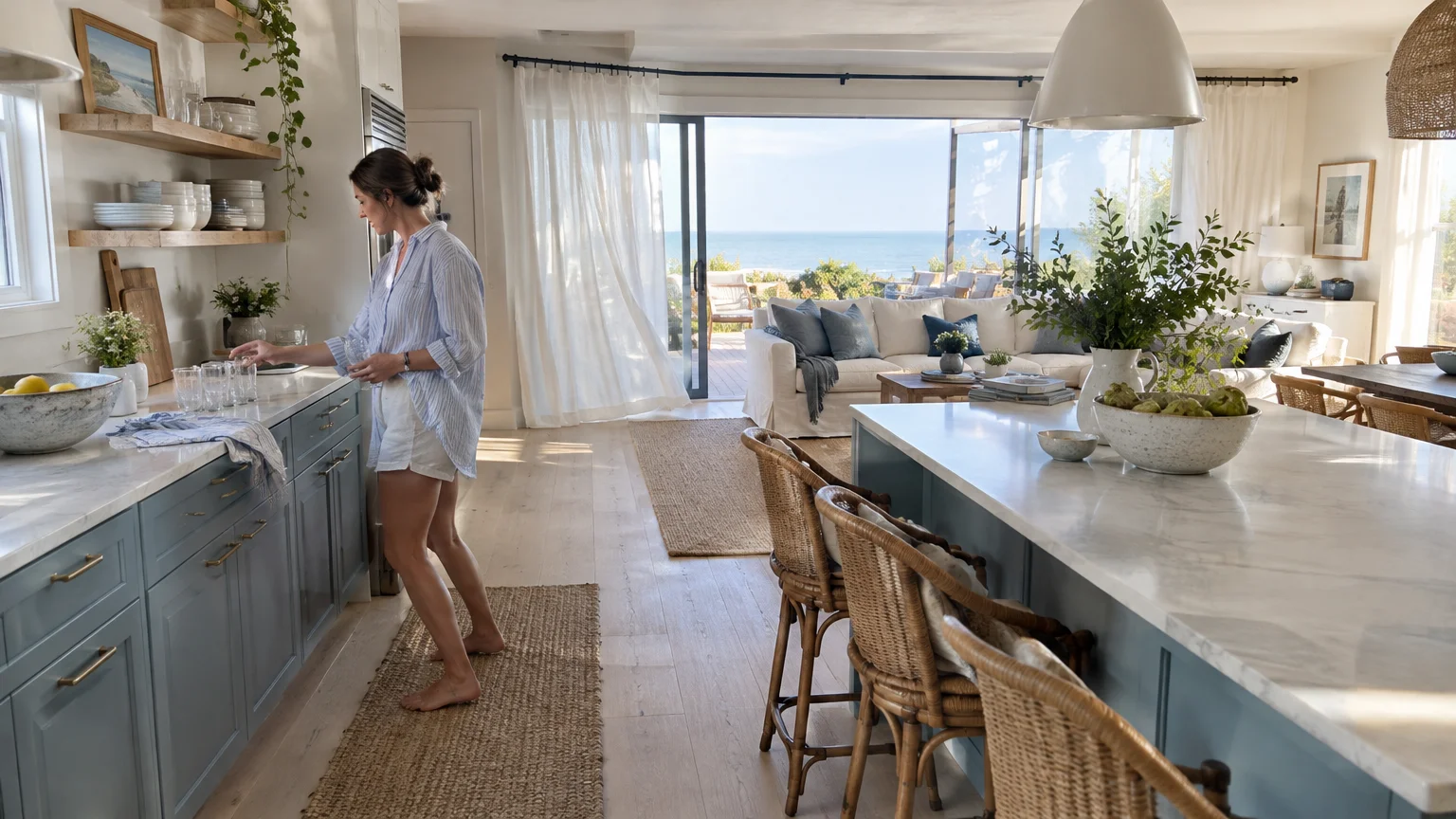
Trend #9: Dusty Coastal Blue
Unlike vibrant tropical blues, dusty coastal blue features muted slate undertones that maintain composure in shared open rooms. It introduces a serene, contemplative aura that counterbalances the frantic energy of culinary prep.
This color functions exceptionally well in open concept homes with expansive glass doors and garden sightlines. It connects your indoor culinary space with distant outdoor horizons and open skies.
The muted undertone prevents the kitchen from clashing with diverse upholstery in the living room. It acts almost like denim, pairing naturally with diverse colors, patterns, and textiles.
Apply dusty blue to your base cabinetry while maintaining warm white perimeter walls. This technique keeps your upper sightlines expansive and open while grounding the lower cabinetry perimeter.
Incorporate natural jute floor runners, white ceramic vases, and bleached ash counter stools. These organic, sun-bleached elements reinforce the breezy, relaxed sophistication of the coastal palette.
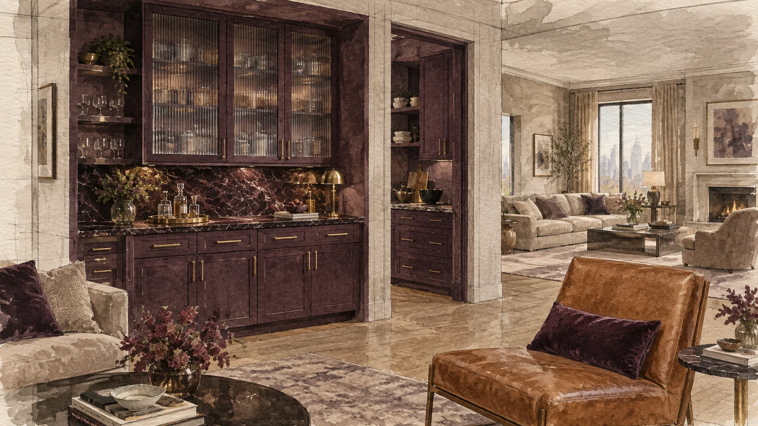
Trend #10: Washed Aubergine and Deep Plum
For homeowners desiring daring individuality, washed aubergine offers an unexpected, high-fashion color statement. This decadent color merges wine undertones with smoky charcoal, creating an alluring cocooning effect.
In open plan layouts, deep plum creates a moody, jewel-box kitchen moment that contrasts beautifully with lighter living spaces. It elevates culinary entertaining into an immersive, restaurant-grade aesthetic experience.
When applied thoughtfully, dark fruit tones evoke historical library paneling and vintage Parisian apartments. They bring refined romance to contemporary homes that often lack architectural detailing.
Use washed aubergine on custom millwork surrounding an integrated bar or wine display area. This placement turns your hospitality zone into an enticing destination visible from the main living area.
Pair plum cabinetry with antiqued brass mesh grille doors, brushed bronze faucets, and dark Emperador marble. In adjoining rooms, mirror this rich hue using sumptuous velvet accent pillows.
Trend #11: Soft Cashmere and Luminous Parchment
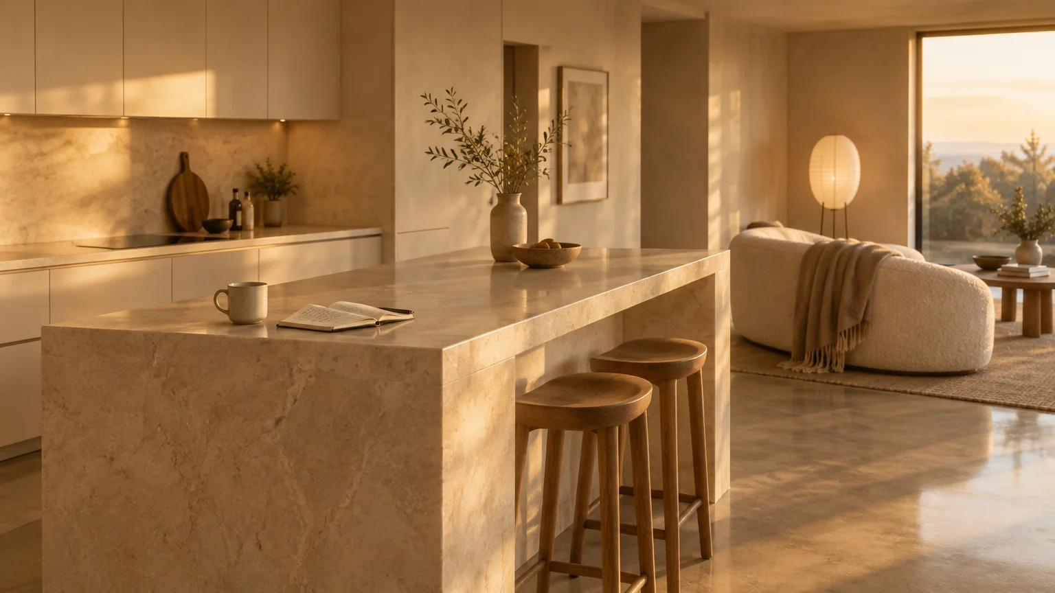
Soft cashmere captures the luminous essence of candlelight, wrapping open concept kitchens in perpetual golden-hour glow. This warm, creamy neutral avoids the yellow cast of butter tones while delivering incomparable radiance.
Its balanced formulation reflects artificial and natural light evenly, preventing harsh shadows in deep corners. It fosters a welcoming, cohesive environment that unites cooking, dining, and relaxation zones.
Cashmere pigments react gently to dimmable evening lighting, creating an intimate dinner party atmosphere. It eliminates the sterile glare common in open kitchens fitted with modern recessed LEDs.
Coat walls, ceilings, and base trim in soft cashmere using varied sheens to achieve seamless architectural envelopment. Use flat finish for ceilings, eggshell for open walls, and satin for trim.
Accent the luminous backdrop with reeded glass pendant lighting, pale travertine surfaces, and sculptural ceramic vessels. The result is a clean, timeless aesthetic that transcends fleeting decorating fads.
The Big Picture: Weaving These Trends into Your Home
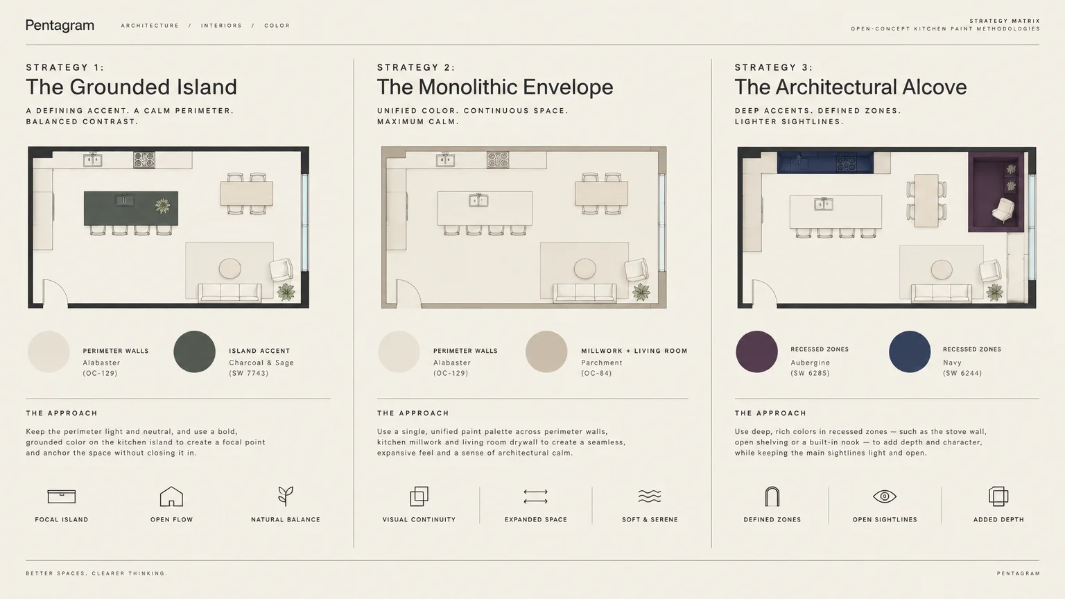
Designing an open concept floor plan requires thinking beyond isolated color swatches. You must treat your kitchen, dining room, and living lounge as a unified visual composition rather than separate compartments.
Begin by selecting a dominant anchor color that covers sixty percent of your contiguous wall surfaces. This foundational shade establishes a peaceful visual baseline across open hallways, kitchen perimeters, and seating areas.
Allocate thirty percent of your palette to secondary millwork colors, such as contrasting island cabinetry or built-in media shelving. This secondary tone adds necessary visual weight and defines distinct functional zones.
Reserve the final ten percent for high-impact accent tones found in artwork, barstool textiles, and decorative ceramics. Distribute these accent colors evenly between the kitchen and living zones to maintain dynamic harmony.
Create smooth transitions by carrying flooring materials continuously across the entire open area. Wood or stone floors establish a singular foundational plane that allows your chosen paint colors to breathe.
Always test large paint samples across multiple walls to evaluate how Light Reflectance Value behaves under varying lighting conditions. Morning sunlight, afternoon glare, and evening task lights dramatically alter pigment perception.
Frequently Asked Questions
How do you choose open concept kitchen paint that coordinates with an existing living room?
Analyze the undertones of your primary living room furnishings, such as sofas, rugs, and hardwood flooring. Select open kitchen paint colors that share the same warm, cool, or neutral undertones to guarantee harmony.
Avoid abrupt color transitions where walls share continuous sightlines. Instead, use natural architectural transitions like corner beads, casing breaks, or cabinet terminations as your stopping points.
If your living room features bold accent walls, keep your open kitchen palette quiet and understated. This visual hierarchy prevents adjoining living zones from competing for attention.
Should kitchen cabinets match the open concept wall paint or contrast with it?
Both approaches yield designer-grade results depending on your spatial goals. Matching cabinetry to wall paint creates a sleek, monochromatic envelope that makes compact open floor plans appear significantly larger.
Conversely, choosing contrasting cabinets establishes the kitchen as an intentional architectural feature within an expansive Great Room. Ensure your contrast color appears in smaller living room accents to maintain balance.
What paint finish works best across open kitchen and dining spaces?
Eggshell or satin finishes are the gold standard for open kitchen walls because they balance scrubbability with low glare. High-gloss finishes reflect too much light and highlight drywall imperfections across large open expanses.
For cabinetry, specify a professional-grade satin or semi-gloss enamel paint. These specialized coatings resist grease, moisture, and frequent wiping while delivering a smooth, furniture-like appearance.
Keep ceiling paint entirely flat throughout the entire open footprint. Flat ceiling finishes minimize glare from recessed cans and conceal tape seams across vast drywall spans.
Will dark paint colors make an open concept kitchen feel smaller?
Dark colors do not inherently shrink a room; instead, they blur edges and create depth by visually receding. In an open concept floor plan, deep hues provide grounding contrast against expansive light-filled spaces.
To keep the space feeling open, ensure adequate multi-layered lighting and balance dark surfaces with pale countertops or reflective backsplashes. This contrast creates a sophisticated, dimensional aesthetic.
For the latest color forecasts, consult industry leaders like Pantone and paint companies like Benjamin Moore. For professional design standards, refer to the American Society of Interior Designers (ASID).
Disclaimer: This article reflects design trend analysis and predictions. Personal taste and timeless design principles should always guide your decorating choices.