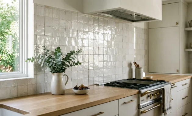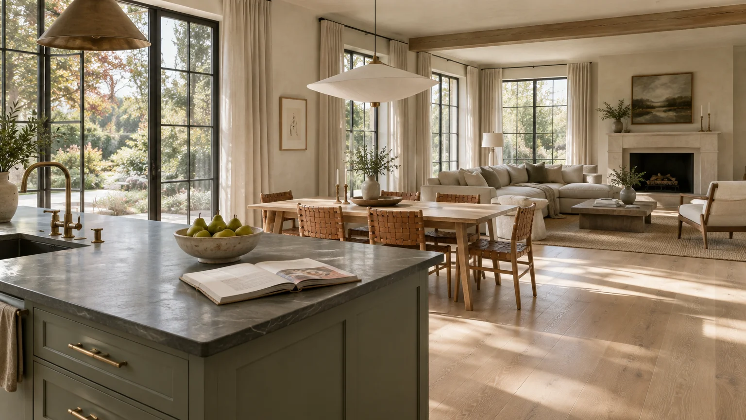
Designing an open kitchen requires a thoughtful palette that effortlessly bridges culinary spaces with adjacent dining and living zones. The right paint shade eliminates visual clutter while establishing an intentional, harmonious rhythm throughout your shared floor plan.
Selecting the perfect whole house color palette allows you to define distinct functional zones without erecting rigid physical barriers. You transform disparate design elements—such as cabinetry, upholstery, and millwork—into one unified, elegant continuum.
These curated open kitchen paint colors deliver architectural balance, elevate natural light, and anchor your interior aesthetic with timeless sophistication. Explore these twelve directional shades to craft a seamless, cohesive color scheme for modern living.
Trend #1: Warm Alabaster
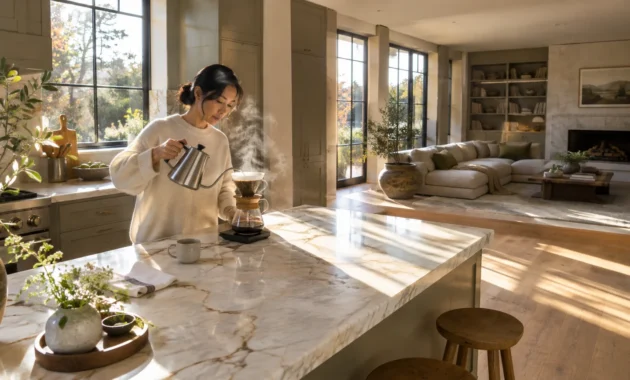
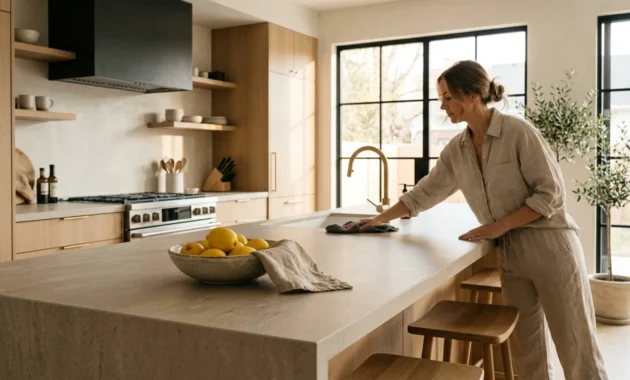
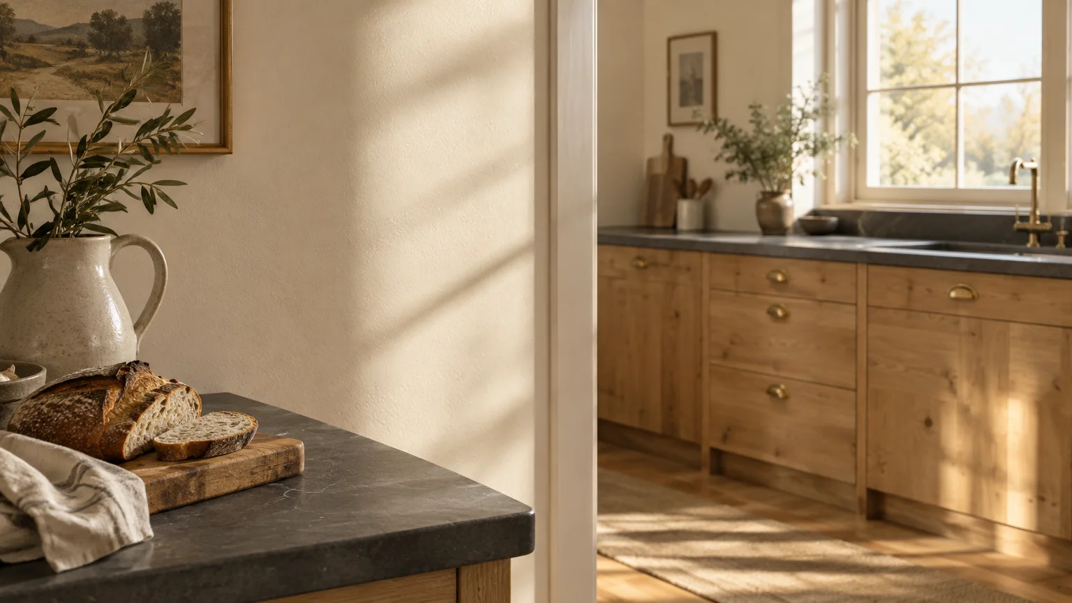
Warm alabaster serves as the quintessential baseline for expansive open concept paint ideas. Its subtle yellow-red undertones soften harsh glare while reflecting abundant natural light across open floor plans.
Unlike stark clinical whites, this nuanced shade harmonizes diverse material transitions effortlessly. It establishes an understated backdrop that flatters both white oak cabinetry and honed soapstone surfaces.
This color succeeds because it provides pure luminosity without feeling detached or sterile. It bridges the gap between utilitarian prep spaces and inviting lounge seating.
Pair this hue with matte black fixtures and unlacquered brass hardware to create tactile contrast. The resulting envelope feels tailored, serene, and remarkably expansive.
Specify an eggshell finish on perimeter walls and a washable satin across trim. This subtle sheen variance adds quiet depth without interrupting spatial flow.
Trend #2: Biophilic Sage
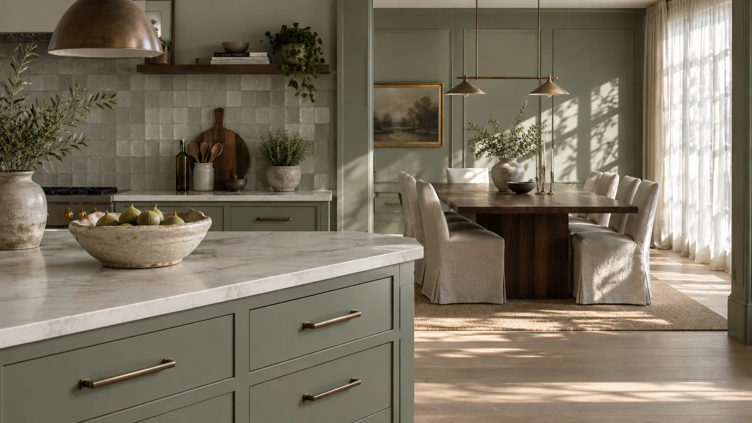
Biophilic sage captures the soothing essence of nature, bridging your kitchen prep areas with informal dining spaces. This muted green carries enough grey to function as a versatile, grounding neutral.
Modern homeowners gravitate toward organic modernism to counteract digital fatigue and urban stress. Applying sage across an open kitchen links your interior envelope directly to outdoor vistas.
The color flatters rich walnut dining tables and natural linen drapery in the adjacent living room. It acts as an organic thread tying varied millwork styles together into a cohesive color scheme.
Designers frequently use this shade on kitchen islands to anchor the central gathering hub. When echoed on nearby accent walls, it draws the eye across the entire living footprint.
For optimal depth, combine sage walls with brushed bronze cabinet pulls and textured zellige tile. The subtle green undertones shift gracefully under changing daylight conditions.
Trend #3: Architectural Greige
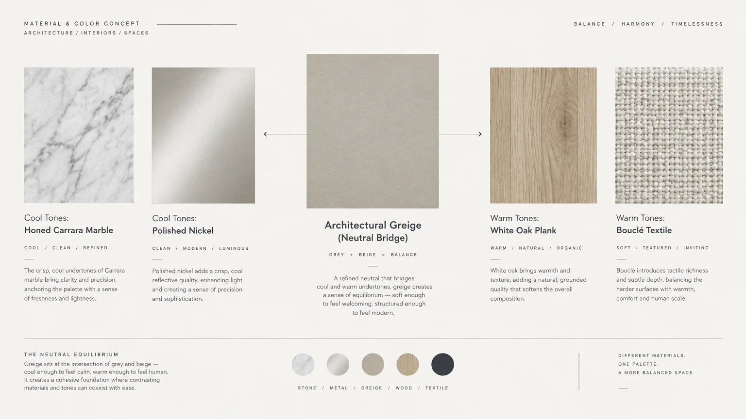
Architectural greige is the definitive transitional hue for bridging warm wood floors and cool marble countertops. It strikes an exact equilibrium between crisp grey and welcoming beige.
High-end residences celebrate this shade for its innate versatility and quiet luxury. It provides a consistent visual anchor that prevents large, cavernous open spaces from feeling fragmented.
This neutral adapts seamlessly as daylight gives way to warm interior evening lighting. The kitchen perimeter feels integrated with the living room sofa and dining credenza.
Use this color to establish a disciplined whole house color palette that never appears dated. It lets curated art and bespoke furniture take center stage without spatial competition.
Pair architectural greige with matte lime wash finishes or micro-cement accents. This layered approach introduces subtle movement and artisanal provenance across adjoining living areas.
Trend #4: Earthen Terracotta
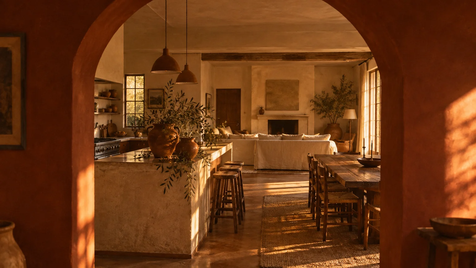
Earthen terracotta injects tactile warmth and Mediterranean soul into vast, open-plan architectural spaces. Its rich clay pigment softens expansive drywall while introducing an inviting, grounded ambiance.
This color answers the rising cultural desire for artisanal authenticity and nostalgic warmth. It moves open kitchen paint colors away from cool minimalism toward comforting hospitality.
In open layouts, terracotta visually anchors dining zones positioned between functional kitchen islands and comfortable seating. It delineates specific entertaining zones without requiring physical partition walls.
Complement this rich shade with creamy travertine surfaces, reeded timber accents, and woven pendant lights. The earthy tone highlights natural wood grains and handmade ceramic accessories.
Apply this pigment in a dead-flat or chalky mineral finish for maximum light absorption. The matte surface creates a velvety, cocooning backdrop that invites relaxed social gatherings.
Trend #5: Tailored Charcoal
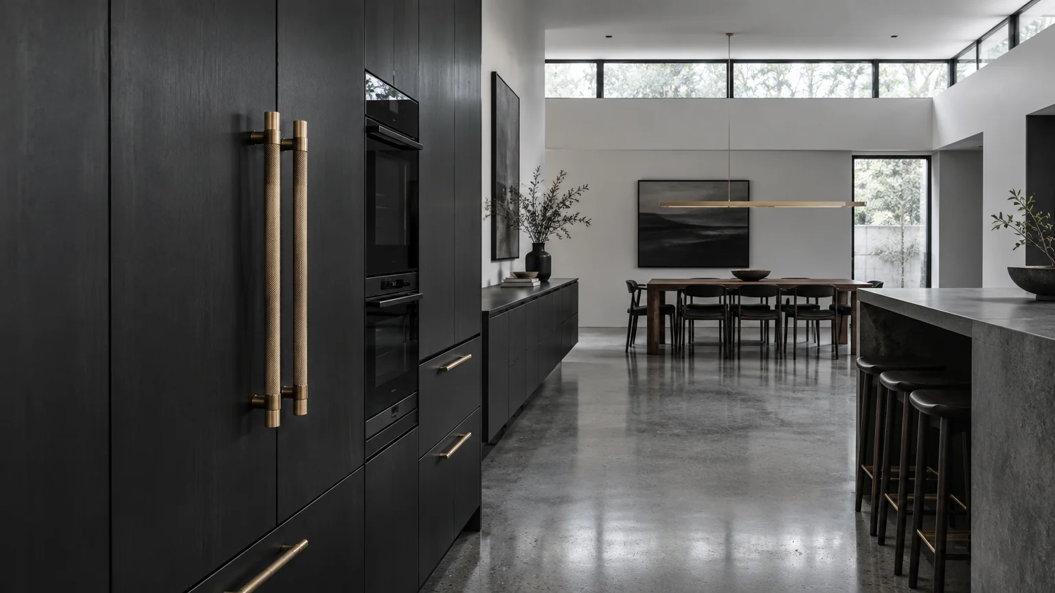
Tailored charcoal introduces dramatic definition and tailored elegance to wide open floor plans. When deployed strategically, it provides visual gravity that keeps airy kitchens from floating aimlessly.
Many open concept homes suffer from an overabundance of pale, washed-out drywall surfaces. A rich charcoal perimeter wall or dark island base provides essential contrast and structural depth.
This shade pairs exceptionally well with stainless steel chef ranges, polished nickel, and dramatic veined marble. It frames your kitchen workspace as an artistic focal installation.
Carry charcoal accents through into the living zone using metal-framed accent chairs or dark fireplace surrounds. This deliberate repetition fosters an intentional, high-contrast whole house color palette.
Balance this deep tone with warm task lighting to maintain an inviting and functional atmosphere. Sconces emitting 2700 Kelvin illuminate the rich undertones without introducing harsh glare.
Trend #6: French Linen Neutral
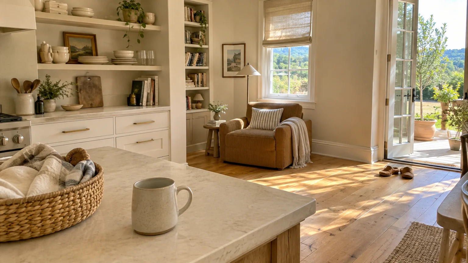
French linen neutral delivers quiet refinement, drawing inspiration from raw flax and sun-bleached European stone. It infuses open spaces with an effortless, collected elegance that transcends seasonal fads.
This shade responds to the enduring popularity of Belgian minimalism and quiet luxury. It offers a softer, more layered alternative to standard builder-grade off-whites.
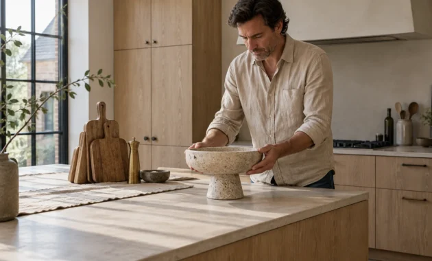
In open kitchens, linen tones connect butcher-block islands with slipcovered living room sectionals. The seamless transition makes connected rooms feel larger, brighter, and perfectly balanced.
Mix this wall color with raw timber beams, antiqued iron chandeliers, and woven jute floor coverings. These tactile pairings create an organic, lived-in aesthetic across the entire shared layout.
Use a washable matte formulation on high-traffic walls between the kitchen pantry and dining area. You preserve pristine aesthetic value without sacrificing essential daily durability.
Trend #7: Atmospheric Slate Blue
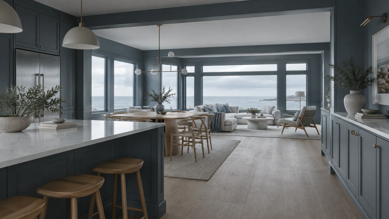
Atmospheric slate blue combines crisp coastal coolness with the dignified presence of heritage grey. It injects personality into modern culinary zones while preserving serene visual continuity.
Blue has long reigned as a beloved accent hue, but slate tones bring a sophisticated maturity. The added grey eliminates child-like brightness, producing a moody, contemplative ambiance.
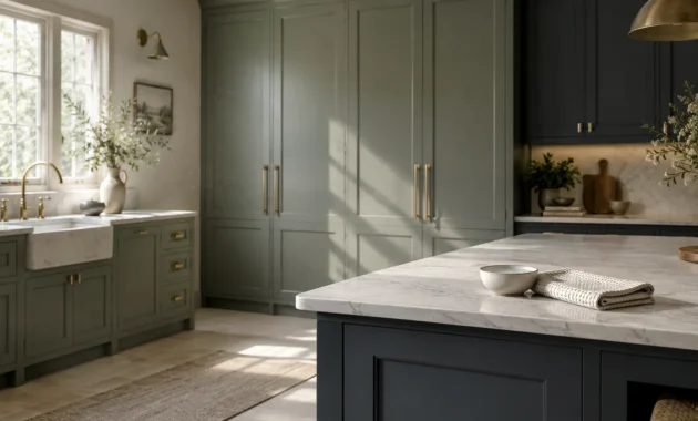
Coat lower kitchen cabinetry in slate blue while carrying the same hue to an adjacent dining banquette. This subtle thread unites distinct furniture pieces under one harmonious narrative.
This hue balances exceptionally well against warm honey oak flooring and brushed brass cabinet hardware. The complementary contrast enlivens the space without overwhelming neighboring living spaces.
Consider using this shade in spaces with ample southern or western natural daylight exposure. The cooler slate undertones temper intense midday sun, keeping your interior tranquil.
Trend #8: Heritage Olive
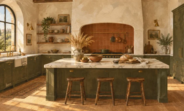
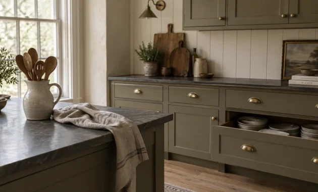
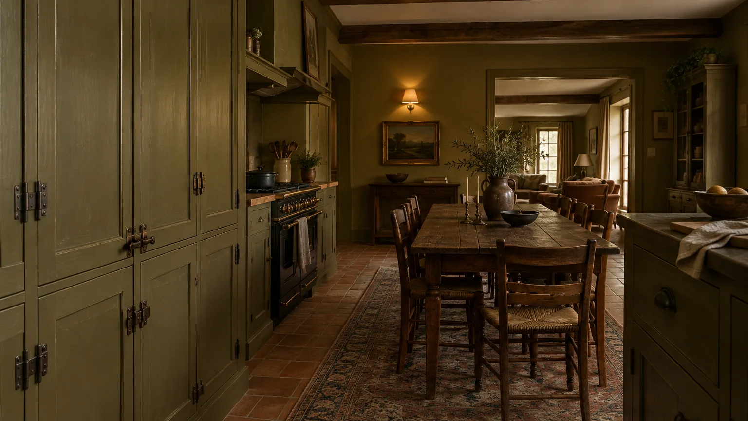
Heritage olive brings historic depth and refined earthiness to contemporary open-concept architecture. Its rich yellow-green composition evokes old-world estates while complementing modern culinary hardware.
Design lovers favor heritage olive for its distinctive ability to feel both daring and timeless. It delivers statement color without disrupting the relaxed rhythm of adjacent lounge areas.
Use olive on kitchen perimeter cabinetry, then repeat the shade in dining chair upholstery or throw pillows. This visual echo prevents your kitchen paint colors from feeling isolated from the rest of the home.
Pair this verdant hue with rich Calacatta gold marble, warm walnut casework, and aged copper cookware. The complex undertones elevate mundane kitchen tools into curated artistic elements.
In open spaces with tall ceilings, paint olive up to picture rail height to ground the proportions. This technique creates intimate human scale within cavernous modern architecture.
Trend #9: Quiet Luxury Mushroom
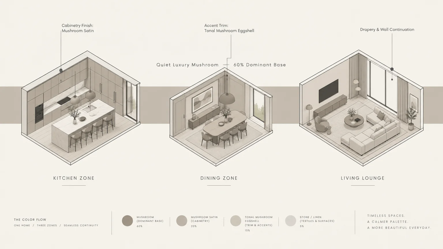
Quiet luxury mushroom represents an evocative blend of taupe, pale stone, and soft grey-brown. It creates an enveloping backdrop that feels inherently tailored, tranquil, and architecturally deliberate.
The design world has embraced mushroom as an elevated upgrade to standard neutral palettes. Its complex pigments absorb and refract light, shifting subtly between morning brightness and evening intimacy.
This color works brilliantly across open-concept layouts by softening transitions between stone counters and lounge fabrics. It fosters a relaxed, cohesive color scheme that feels curated rather than staged.
Layer mushroom walls with boucle armchairs, fluted wood paneling, and aged brass picture lights. These contrasting textures bring out the subtle warmth of the wall paint across shared living areas.
Select a velvety low-sheen finish to accentuate its rich, powdery texture. The subtle surface sheen adds tactile warmth without creating distracting reflections on long shared walls.
Trend #10: Sun-Drenched Ochre
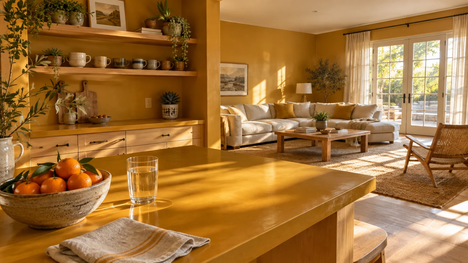
Sun-drenched ochre infuses open living and dining spaces with golden, radiant energy and optimism. This historic mineral pigment feels grounded and sophisticated, completely unlike synthetic lemon yellows.
As homeowners move away from sterile grey schemes, joyful earth tones are experiencing a dynamic resurgence. Ochre wraps large open-concept spaces in warmth, making cavernous floor plans feel genuinely inviting.
Apply ochre to a dining accent wall or the inner casework of an open kitchen pantry. The golden tone draws eyes inward, highlighting custom craftsmanship and curated tableware collections.
It contrasts beautifully against matte black metal frames, dark walnut floors, and soapstone countertops. This rich dynamic tension balances rustic warmth with contemporary urban edge.
Accent the shade with linen light pendants and dried botanical arrangements. These natural accessories extend the organic narrative from the cooking space into the living perimeter.
Trend #11: Mineral Celadon
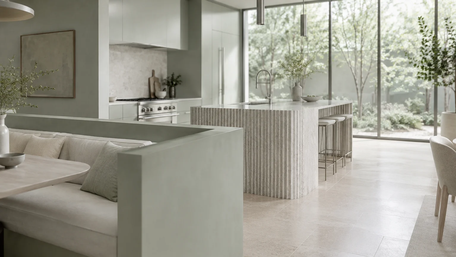
Mineral celadon offers a whisper-soft wash of pale green with soothing aquatic grey undertones. It creates an airy, restorative atmosphere that expands perceived space across connected communal zones.
This color reflects the enduring appeal of wellness-centered design and biophilic interior architecture. It delivers subtle botanical freshness without overstimulating the senses during daily routines.
In open-concept kitchens, celadon acts as a gentle visual palate cleanser between functional prep counters and plush sectionals. It reflects natural daylight deep into darker interior corridors.
Combine celadon with pale ash woodwork, white quartz countertops, and brushed chrome plumbing trim. This restrained palette produces an ethereal Scandinavian aesthetic that feels modern and serene.
Carry celadon across ceiling surfaces in the dining area to define an intimate overhead canopy. This subtle design intervention zones the space without interrupting sightlines.
Trend #12: Dramatic Espresso Navy
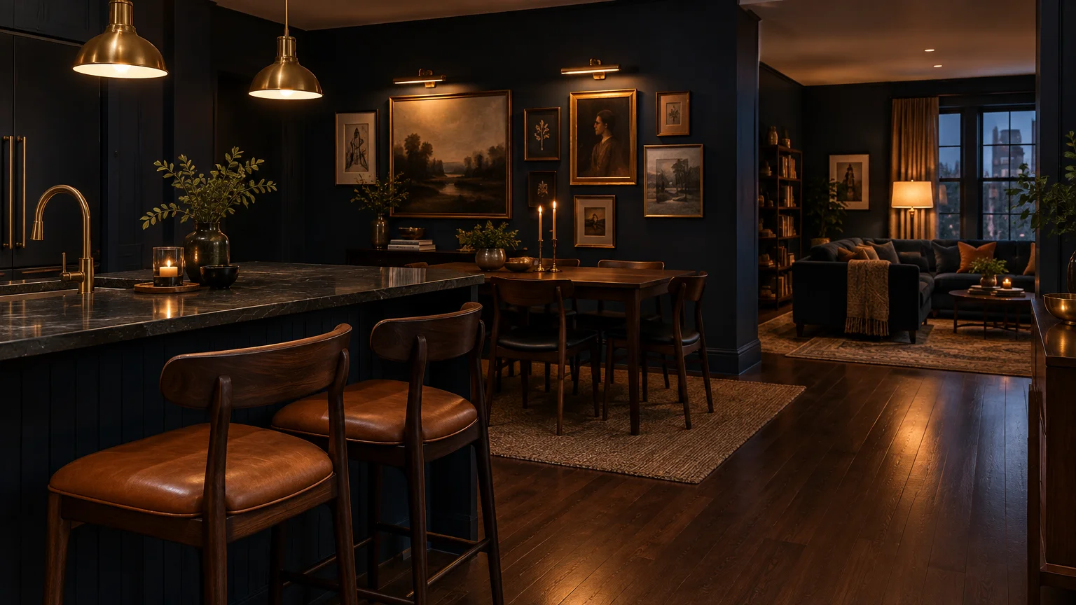
Dramatic espresso navy merges midnight blue with rich black-brown undertones for supreme architectural depth. It establishes an authoritative focal point within otherwise light-filled, expansive open floor plans.
Open layouts often lack visual boundaries, leaving large spaces feeling undefined and adrift. Applying a deep, anchoring navy to the kitchen island or range wall establishes essential visual order.
Continue this commanding shade into the living room on built-in media shelving or dining room credenzas. This recurring anchor color unifies disparate functional areas into a cohesive whole house color palette.
Accentuate espresso navy with polished brass hardware, rich cognac leather seating, and thick Carrara marble. The dark background makes luxury metals and stones gleam with dramatic intensity.
Choose high-performance scuff-resistant paint formulations for islands and perimeter baseboards. Premium durability ensures these deep, saturated colors withstand everyday culinary wear with ease.
The Big Picture: Weaving These Trends into Your Home
Harmonizing an open kitchen with adjoining living spaces requires viewing your ground floor as one holistic canvas. Rather than painting rooms in isolation, curate a unified three-to-five-color palette.
Establish one dominant foundational neutral for roughly sixty percent of your walls and ceilings. This foundational hue carries the visual thread through hallways, living zones, and dining nooks.
Allocate thirty percent of your palette to a secondary color, such as sage or mushroom, on cabinetry and millwork. This secondary tone provides soft structural definition across open vistas.
Reserve your final ten percent for high-impact accents, such as deep charcoal bar stools or terracotta pottery. These targeted visual splashes create dynamic rhythm without overwhelming the senses.
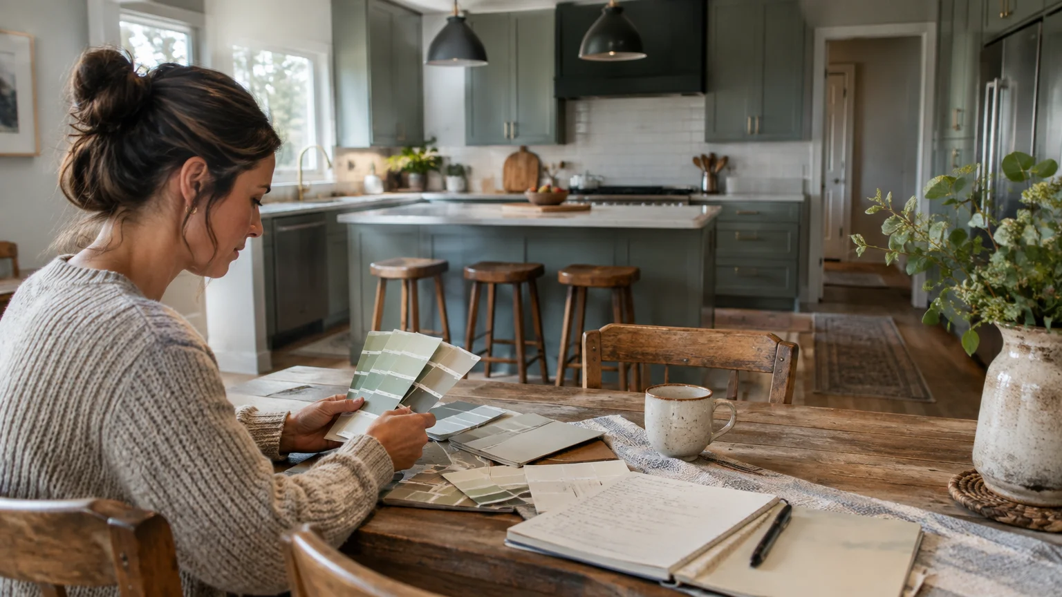
Always evaluate your chosen open kitchen paint colors under different lighting conditions throughout the day. North-facing natural light cools colors down, whereas warm artificial lighting can draw out strong yellow undertones.
Paint large sample swatches on poster boards and move them across your shared space over several days. Observe how the pigments interact with your countertop stone, flooring timber, and upholstery textiles.
Maintain consistent trim and ceiling paint colors throughout the open floor plan to reinforce architectural unity. When overhead planes remain cohesive, the entire open floor plan breathes effortlessly.
For the latest color forecasts, consult industry leaders like Pantone and paint companies like Benjamin Moore. For professional design standards, refer to the American Society of Interior Designers (ASID).
Disclaimer: This article reflects design trend analysis and predictions. Personal taste and timeless design principles should always guide your decorating choices.
Frequently Asked Questions
How do you select paint finishes for an open-concept kitchen and living area?
Specify washable satin or semi-gloss finishes for kitchen cabinets and backsplashes to ensure easy moisture cleanup. These sheens resist grease and frequent scrubbing while highlighting fine millwork detailing.
Use matte or eggshell sheens across continuous living room and dining walls. This low-luster texture conceals drywall imperfections and prevents harsh reflections across shared, open sightlines.
Should your kitchen cabinets match your open living room wall color?
Your cabinetry does not need to match your living room walls identically. In fact, selecting a complementary shade two tones lighter or darker creates sophisticated architectural depth.
Ensure the underlying undertones—whether warm, cool, or neutral—remain aligned across both zones. Consistent undertones prevent visual discord while adding subtle visual variation to the open layout.
How can you make a small open kitchen feel larger using paint?
Paint perimeter kitchen walls and adjacent living spaces the exact same light, reflective neutral shade. Removing high-contrast color boundaries tricks the human eye into perceiving one continuous, expansive room.
Complement this continuous wall color by painting baseboards and moldings in an identical hue. This monochromatic approach eliminates visual breaks and visually elevates low ceilings.
Can you use bold accent walls in an open-concept floor plan?
You can certainly incorporate bold accent walls if you anchor them to intentional architectural boundaries. Choose a dedicated fireplace breast, dining niche, or kitchen bar rather than an arbitrary stretch of drywall.
Echo that statement color in small decorative touches across adjacent rooms. This strategic repetition integrates the accent wall directly into your broader cohesive color scheme.