Selecting the perfect kitchen cabinet color can transform your culinary space from a fleeting trend into an enduring sanctuary. By choosing pigments with depth and warm undertones, you protect your home investment against cyclical design fatigue.
While kitchen aesthetics constantly evolve, certain nuanced shades retain their quiet luxury across decades of daily living. These versatile tones harmonize effortlessly with shifting daylight, organic textures, and varied architectural styles.
Whether you plan a custom renovation or a budget-friendly weekend refresh, the right color establishes lasting character. Discover twelve timeless cabinet colors that age with grace, sophistication, and enduring visual appeal.
Trend #1: Warm Cream and Soft Alabaster
Pure, sterile whites are yielding ground to warmer cream tones that radiate hospitality and refined comfort. These gentle whites create a luminous atmosphere without the clinical glare often produced by stark hospital pigments.
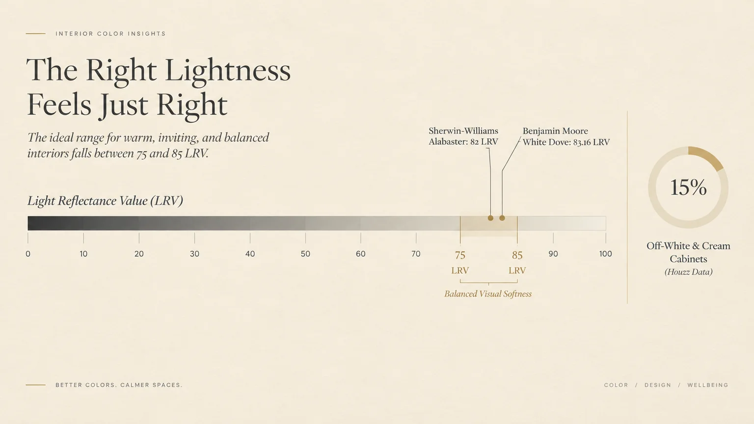
Recent Houzz kitchen trends show off-white and cream accounting for 15% of cabinet renovations. Designers favor these gentle neutrals because they bridge the gap between historic charm and contemporary minimalism.
When evaluating white paint, check the Light Reflectance Value, which measures luminosity on a scale of 0 to 100. Timeless whites universally sit between 75 and 85 LRV to ensure balanced visual softness.
For instance, Sherwin-Williams Alabaster registers an 82 LRV, while Benjamin Moore White Dove measures 83.16 LRV. These precise calibrations prevent your millwork from looking washed out under 3000K to 4000K LED lighting.
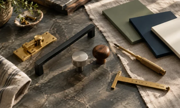
Pair these creamy shades with unlacquered brass hardware and honed marble countertops. The combination yields an inviting aesthetic that patinas gracefully alongside your daily kitchen rituals.
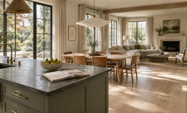
Trend #2: Muted Sage and Botanical Green
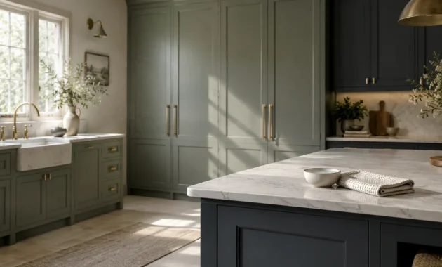
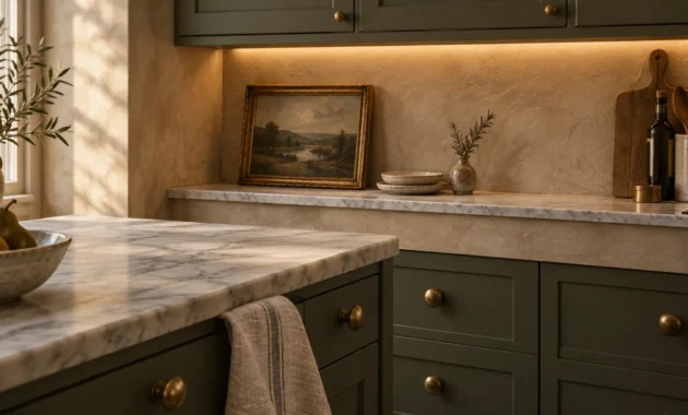
Muted sage brings the serene balance of nature directly into the heart of your home. This earthy green operates as an organic neutral, introducing subtle color without overwhelming surrounding finishes.
Industry data from Houzz highlights green as the second most popular accent color for lower cabinets at 14%. Homeowners gravitate toward botanical tones to cultivate an innate sense of biophilic well-being.
Sage features gray and silver undertones that temper its vibrancy over years of visual exposure. Because the green pigment is softened by earth tones, it never feels dated or overly theatrical.
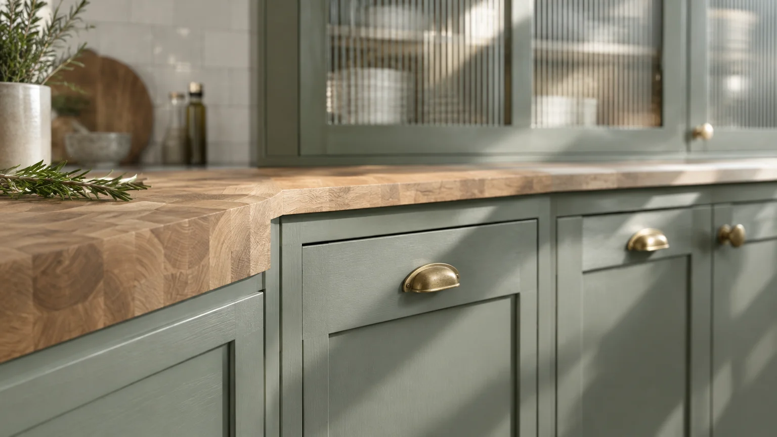
You can effortlessly coordinate sage millwork with butcher block islands, light white oak flooring, or fluted glass displays. The hue harmonizes equally well with brushed brass and matte black fixtures.
To achieve maximum longevity, specify waterborne alkyd formulations that level cleanly across cabinet doors. The subtle herbal undertone stays remarkably consistent whether exposed to morning eastern light or moody evening shadows.
Trend #3: Deep French Navy and Maritime Blue
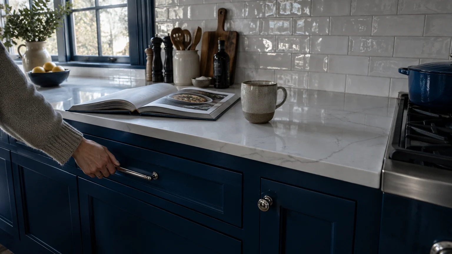
Deep French navy delivers regal dignity and structural grounding to busy culinary environments. Unlike fleeting primary blues, maritime shades possess heavy black and slate undertones that create mature architectural depth.
In two-tone kitchens, blue commands 19% of colored accent base cabinets, leading the market according to Houzz surveys. It anchors lower cabinetry while allowing lighter perimeter walls and countertops to soar.
This shade excels in spaces with abundant natural daylight, where its multi-dimensional pigment can reveal subtle sapphire nuance. In dim lighting, it reads as a warm, welcoming near-black that wraps the room in tailored comfort.
Pair maritime cabinetry with crisp quartz counters, polished nickel pulls, or handcrafted white subway tile. This timeless balance evokes traditional European pantries and high-end coastal estates alike.
Furthermore, dark blue provides an exceptional canvas for displaying warm metallic accents like aged bronze and polished brass. These reflective accents break up the dark expanses, ensuring the kitchen feels energetic and sophisticated.

Trend #4: Earthy Mushroom and Warm Taupe
Mushroom has emerged as a premier neutral among sophisticated kitchen cabinet color trends. Sitting comfortably between stone gray and rich brown, taupe imparts an understated elegance that defies generational obsolescence.
The National Kitchen and Bath Association reports that white cabinetry specifications dropped to 47%, down from historical 70% highs. Designers now embrace earthy taupes to inject tactile warmth into modern kitchens.
Taupe millwork disguises everyday kitchen wear, grease splatters, and scuffs far better than pale white surfaces. This practical resilience makes it an exceptional choice for active family households with heavy foot traffic.
Complement mushroom cabinetry with limestone floors, woven rattan barstools, and patinated bronze latches. Its chameleon-like quality allows you to swap wall art and soft furnishings over time without repainting millwork.
In north-facing rooms with cool cast light, mushroom pigments neutralize cold shadows with their gentle red and umber base. Your cooking space remains welcoming and cocooning throughout overcast winter months.
Trend #5: Balanced Greige and Pale Stone
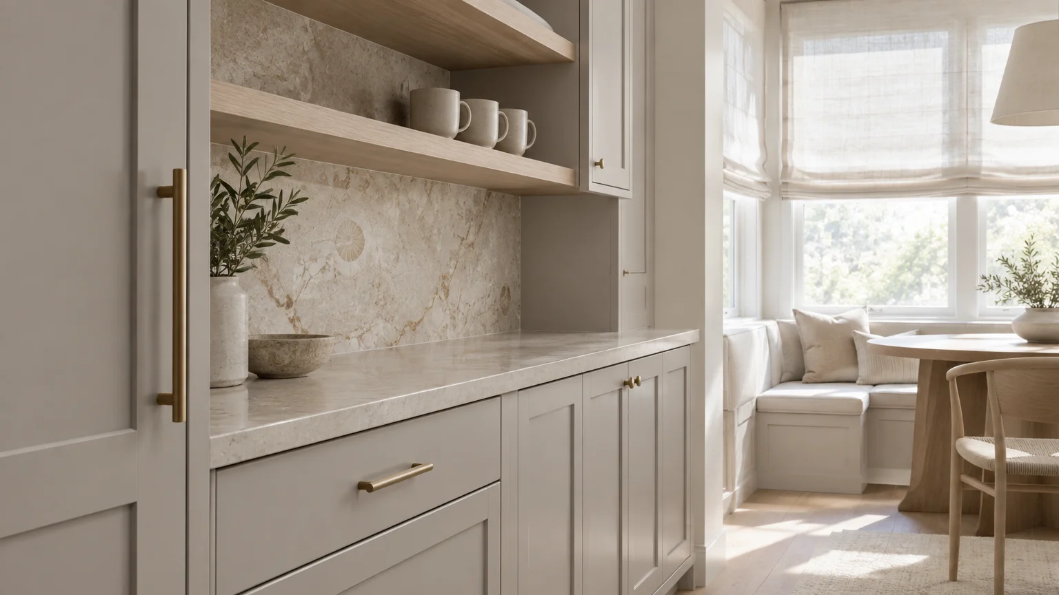
Greige combines the crisp clarity of light gray with the approachable warmth of traditional beige. It provides a peaceful, low-contrast backdrop that showcases high-end cookware and artisanal kitchenware.
Unlike cool grays from the early 2010s, modern greige contains yellow and red micro-pigments that prevent a sterile feel. It creates visual harmony across both north-facing cool light and warm southern exposures.
This adaptable shade stands out as one of the best paint colors for kitchen cabinets in open-concept layouts. It transitions seamlessly into adjoining dining zones and living spaces without visual friction.
Style greige cabinetry with soapstone perimeter counters and a natural walnut prep island. The contrast between warm painted surfaces and organic wood grain exemplifies the popular quiet luxury aesthetic.
Greige also partners seamlessly with warm architectural elements like exposed brick walls and ceiling beams. It bridges modern appliances with historic textures, ensuring long-term aesthetic coherence.
Trend #6: Dramatic Charcoal and Cast Iron Slate
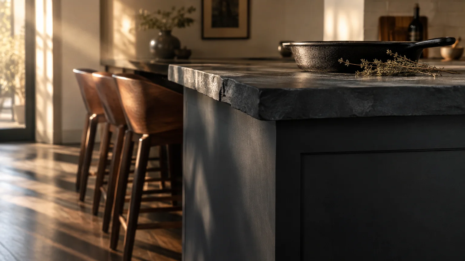
Cast iron slate and deep charcoal provide an alluring sense of permanence and architectural definition. This saturated color creates an immediate focal point while remaining significantly softer than stark jet black.
Houzz research reveals that black and dark charcoal account for 7% of accent island installations. Design enthusiasts appreciate how charcoal sharpens millwork contours and brings modern sophistication to Shaker doors.
Dark charcoal absorbs ambient light, providing an ideal anchor beneath tall ceilings and broad expanses of light-colored tile. It sets off dramatic veining in Calacatta marble and quartzite surfaces with striking precision.
Pair charcoal cabinetry with warm burnished copper hardware or aged brass plumbing trim. This metallic warmth prevents dark cabinets from feeling foreboding, delivering an intimate culinary atmosphere.
To soften charcoal’s moody presence, incorporate light reeded glass upper cabinets or open white oak plate racks. These visual breathers inject brightness into the composition while retaining a luxurious, bespoke sensibility.
Trend #7: Muted Powder Blue and Chambray
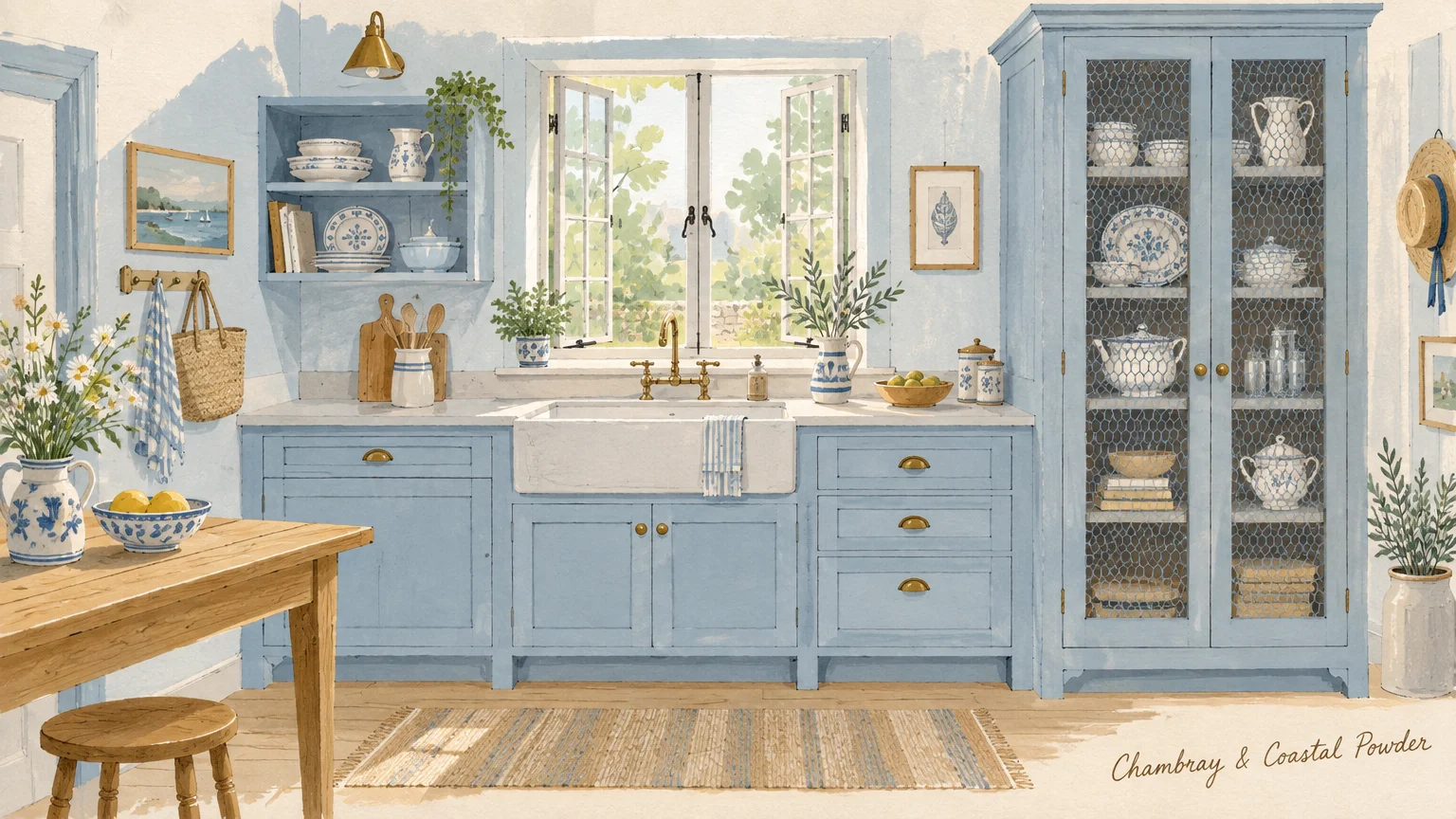
Chambray and dusty powder blue bring historical poetry and gentle light into compact kitchen footprints. When subdued with ample gray undertones, pale blue functions as a versatile neutral rather than a novelty color.
This tone draws direct inspiration from historic Swedish estates and classic English sculleries. It introduces an airy, refreshing mood that visibly expands smaller kitchen floor plans.
Combine chambray cabinets with warm oak countertops, handmade ceramic tiles, and open shelving. The interplay of cool pale blue and honey-toned wood produces an enduring, effortless charm.
To ensure this delicate color resists chips and kitchen abrasion, invest in urethane acrylic enamels. These advanced resins cure to exceptional Shore D hardness while preserving subtle color luminosity.
Powder blue pairs exquisitely with polished chrome or unlacquered silver hardware. The reflective cool metals complement the paint’s airy essence, creating a clean, Scandinavian-inspired culinary retreat.
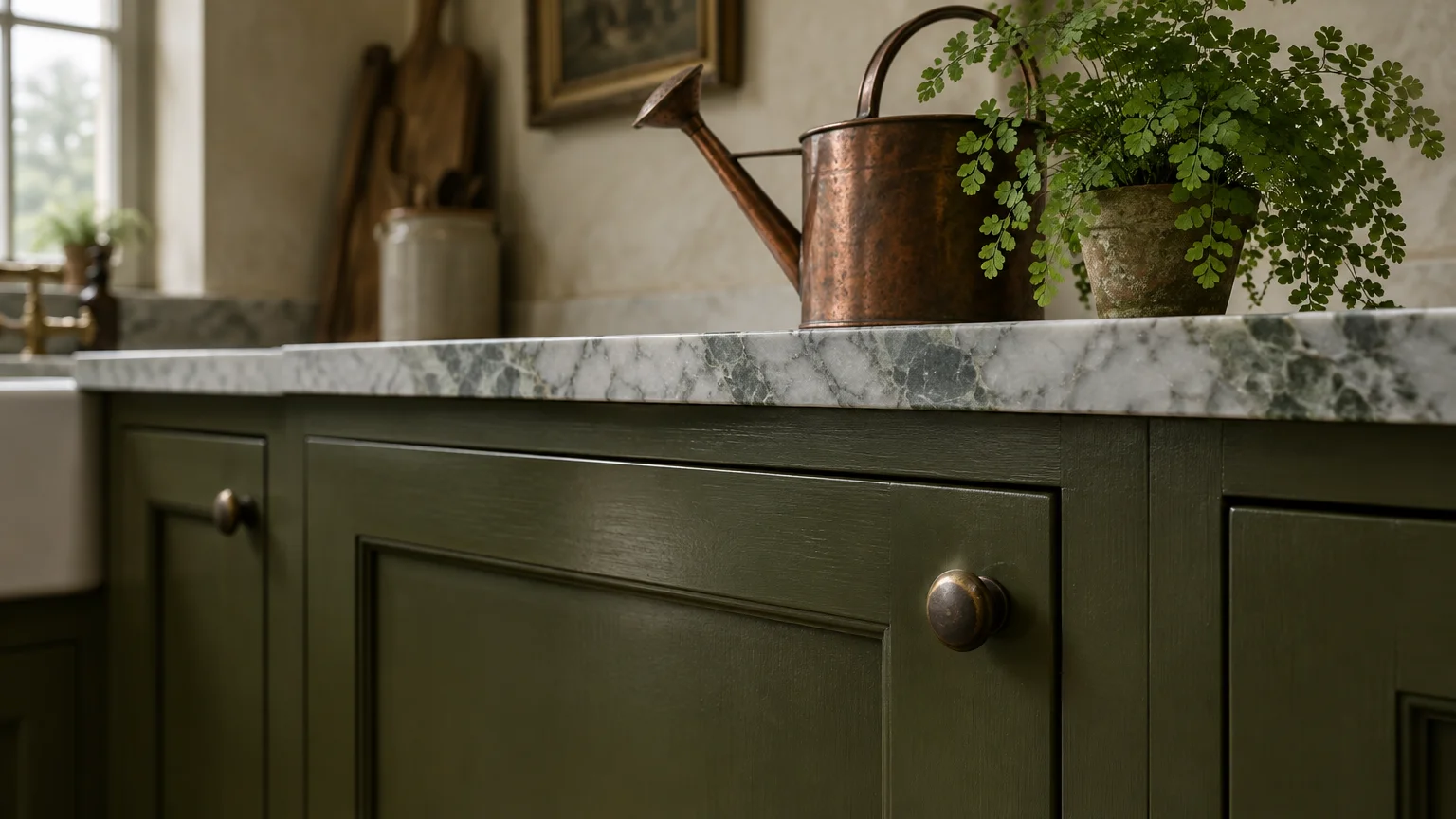
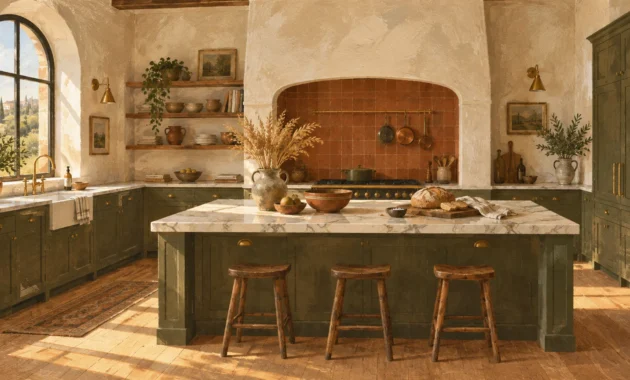
Trend #8: Forest Moss and Deep Olive
Forest moss and olive green offer an earthy, grounded presence steeped in historic British design traditions. These saturated greens communicate permanence, artisanal craftsmanship, and a deep appreciation for the landscape.
Designers frequently pair deep olive cabinetry with natural wood accents to create a grounded sanctuary. In fact, 59% of NKBA design pros note an increase in pairing wood grains alongside painted cabinets.
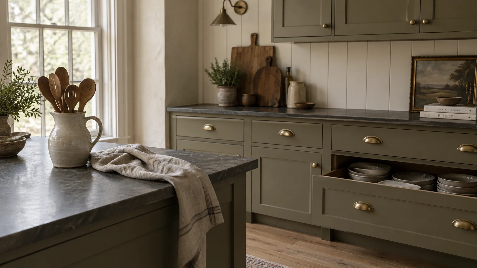
Olive green features golden undertones that capture the glow of late afternoon sun beautifully. It creates an enveloping, cozy ambiance that transforms utilitarian kitchens into favorite gathering rooms.
Accent your olive cabinetry with raw iron hardware, copper cooking pots, and rustic slate flagstone flooring. This earthy palette ages gracefully, gaining character as family life leaves its mark.
When applied to tall floor-to-ceiling larder cabinets, deep olive creates the feeling of fine built-in furniture. It anchors the perimeter while blending effortlessly into garden views beyond kitchen windows.
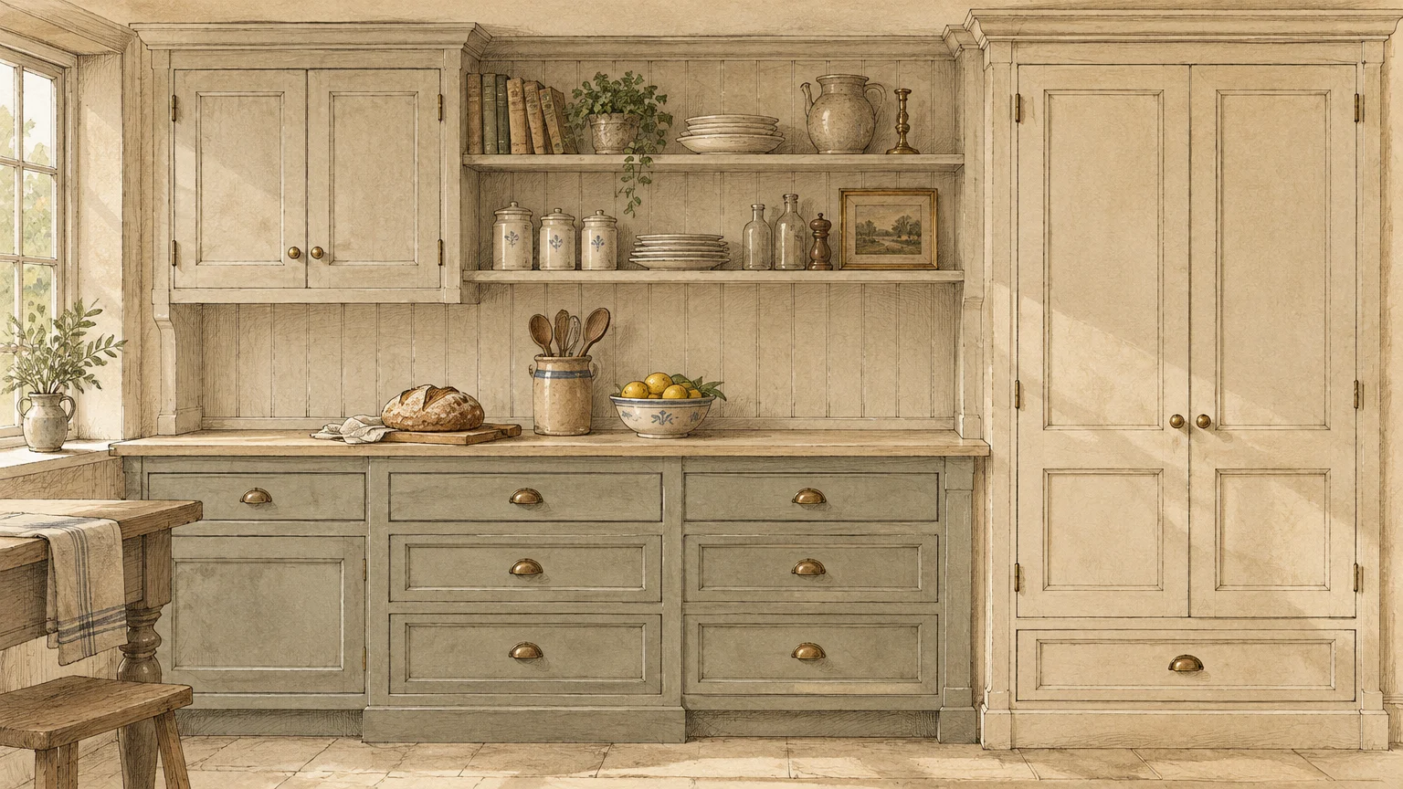
Trend #9: Antique Putty and Parchment
Antique putty channels the historic beauty of eighteenth-century millwork with soft, plaster-like sophistication. This hue blends white, yellow ochre, and raw umber into a rich neutral that flatters any kitchen envelope.
Unlike cool minimalist tones, parchment creates an atmosphere of gentle age and layered domestic history. It serves as one of the most reliable classic cabinet paint colors for restoration projects.
Putty cabinetry provides an ideal foundation for displaying heirloom ironstone pottery, copper kettles, and antique wooden boards. It elevates simple Shaker cabinetry by imparting artisanal richness and visual weight.
Pair parchment tones with dark soapstone surfaces and unlacquered hardware that will tarnish naturally over time. The result is a kitchen that feels collected across generations rather than assembled from a catalog.
In sunny south-facing kitchens, antique putty absorbs harsh midday glare, creating a gentle visual respite. It maintains its mellow dignity whether under blazing summer sun or overcast morning drizzle.
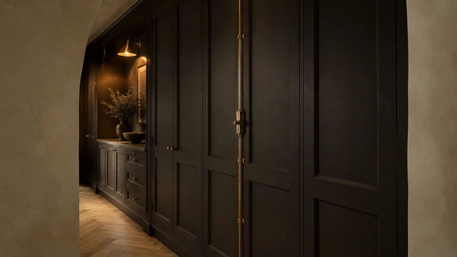
Trend #10: Soft Black and Velvety Espresso
Soft black infused with brown undertones delivers drama without the cold intensity of pure pitch black. This velvety espresso finish reflects refined confidence, lending a bespoke furniture feel to your cabinetry.
Cabinet painting projects typically cost between $425 and $1,466 professionally, with basic jobs averaging $942 according to Angi data. Selecting a deep, dramatic espresso color delivers a multi-thousand-dollar custom look at modest expense.
This dark tone emphasizes fine cabinetry details, from subtle rail bevels to inset cabinet face frames. It frames stainless steel ranges and brass fixtures like pieces of fine jewelry.
To keep dark cabinets pristine, select satin or semi-gloss finishes that repel fingerprints and grease. A low-sheen satin finish creates a luxurious velvet texture that remains tactile and inviting.
Soft black creates striking visual balance when paired with thick marble countertops displaying bold, expressive veining. The moody joinery lets the natural stone movement take center stage.
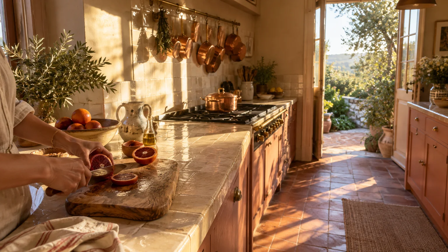
Trend #11: Baked Terracotta and Clay Blush
Earthy terracotta and warm clay blush introduce grounded warmth inspired by Mediterranean ceramics and sun-baked soils. These hues add cheerful character without feeling saccharine or overly juvenile.
Clay tones stimulate appetite and foster intimate conversation, making them brilliant selections for eat-in family kitchens. Their natural provenance ensures they harmonize beautifully with organic textures and raw finishes.
Combine baked clay millwork with travertine countertops, limewash walls, and light ash wood accents. The dusty undertones absorb bright natural light, diffusing a flattering, sun-kissed glow across the workspace.
Terracotta pairs exceptionally well with aged brass pulls and hand-thrown ceramic pendant lights. It creates a soulful, well-traveled atmosphere that maintains its charm through changing decor cycles.
If you hesitate to commit your entire kitchen to clay, test painted kitchen cabinet ideas on an island. A terracotta accent island introduces spirited personality while maintaining serene neutral perimeter millwork.
Trend #12: Soft Linen and Heritage White
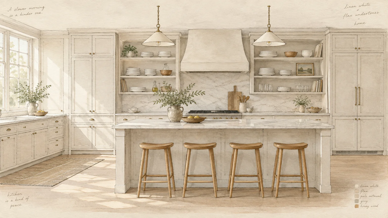
Heritage white and soft linen remain the benchmark for timeless kitchen cabinet colors across architectural eras. White cabinets still hold the leading market share, representing 28% of all kitchen cabinet choices in Houzz studies.
Unlike clinical whites, heritage linen possesses muted beige and cream undertones that suggest spun flax. This delicate balance reflects natural light effortlessly while maintaining an inviting residential character.
In two-tone layouts, white finishes dominate 40% of upper cabinet installations, keeping ceiling heights visually lifted. Pair linen uppers with deeper wood or colored bases to create balanced vertical contrast.
Style soft linen cabinetry with white marble, polished nickel faucets, and warm white oak floorboards. This combination creates an enduring design language that will never feel dated to future buyers.
Soft linen also provides unbeatable flexibility if you decide to update your wall color or backsplashes later. It embraces warm earth tones, cool blues, and dark accents with equal grace.
The Big Picture: Weaving These Trends into Your Home
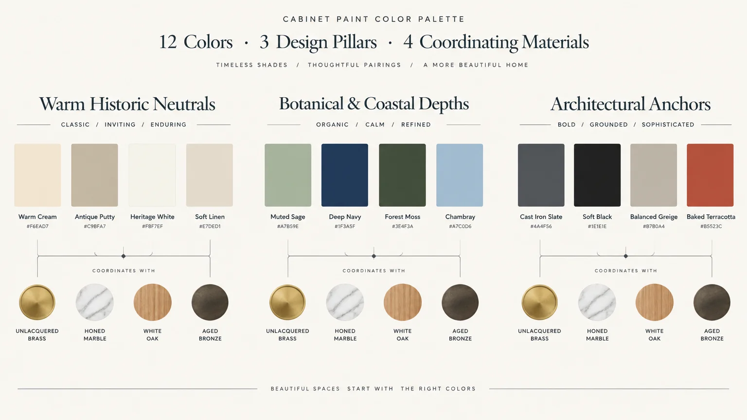
Transforming your kitchen cabinetry requires more than choosing an attractive swatch from a design showroom. You must evaluate how natural light transitions across your room from dawn until dusk.
Always paint large sample boards and prop them against your millwork for several days before committing. Observe how warm 3000K evening task lighting and bright morning rays alter the paint undertones.
If you undertake a DIY cabinet repainting project, expect to spend $200 to $600 on premium materials and bonding primers. This approach saves 85% to 90% compared to cabinet refacing costs ranging from $4,495 to $10,558.
Patience during the paint curing window remains vital to ensuring your new cabinet finish lasts for decades. Premium waterborne alkyds and urethane acrylics require 21 to 30 days to achieve full Shore D hardness.
While your cabinet doors will feel dry within 2 to 4 hours, wait 48 to 72 hours before rehanging them. This cautious approach prevents premature denting, hardware impressions, and edge chipping.
Furthermore, ensure your chosen coatings comply with low-VOC environmental standards under 50 grams per liter. Modern low-VOC formulas deliver superior leveling and durability without releasing noxious fumes into your living areas.
For the latest color forecasts, consult industry leaders like Pantone and paint companies like Benjamin Moore. For professional design standards, refer to the American Society of Interior Designers (ASID).
Disclaimer: This article reflects design trend analysis and predictions. Personal taste and timeless design principles should always guide your decorating choices.
Frequently Asked Questions
How do I select the best paint finish for high-traffic kitchen cabinets?
Satin and semi-gloss enamels offer the optimal balance of durability, cleanability, and sophisticated visual appeal. Satin provides a velvety, low-glare texture that hides minor door imperfections while withstanding routine scrubbings.
High-gloss finishes can appear overly commercial and spotlight surface flaws, whereas flat wall paints absorb grease and scrub away quickly. Waterborne alkyd satin paints deliver the smooth self-leveling benefits of traditional oils with simple soap-and-water cleanup.
Will two-tone painted cabinetry date my kitchen faster than a single color?
Two-tone cabinetry remains a classic technique when you anchor darker hues on island bases and keep perimeter millwork neutral. Houzz data confirms that 40% of renovated kitchens incorporate contrasting upper and lower cabinet palettes.
To ensure longevity, ground lower bases with earthy navy, moss, or natural wood, while finishing uppers in soft off-white. This balanced visual weight lifts the ceiling and prevents high-contrast color fatigue over time.
What paint formulation should I choose for long-lasting cabinet durability?
Waterborne alkyd resins and urethane-modified acrylic enamels provide professional-grade scratch resistance and block protection. Brands like Benjamin Moore Advance and Sherwin-Williams Emerald Urethane excel because they cure into an exceptionally hard enamel shell.
Always prep surfaces thoroughly by cleaning with a degreaser, scuff-sanding, and applying an interior bonding primer before topcoating. Skipping these foundational steps will cause even the most expensive cabinet enamel to peel prematurely.
How does lighting temperature influence cabinet paint undertones?
Bulbs rated at 2700K emit warm amber rays that can make cool grays look muddy and cream cabinets appear overly yellow. Conversely, 4000K to 5000K cool bulbs can strip warmth away, leaving soft neutrals feeling sterile and clinical.
Most interior designers recommend balanced 3000K LED illumination for residential kitchens. This neutral spectrum renders painted kitchen cabinet ideas accurately, highlighting subtle undertones without distorting the intended pigment.