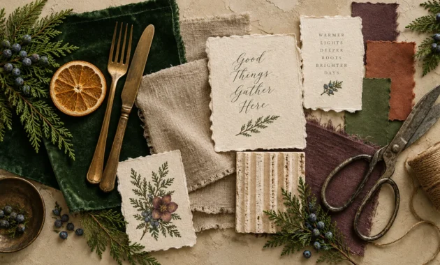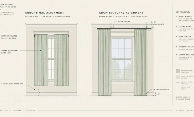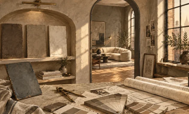
Modern holiday styling no longer depends on standard crimson and pine green to evoke seasonal warmth. You can elevate your living spaces by embracing curated hues that reflect architectural sophistication and individual expression.
Discerning homeowners are trading predictable primary shades for multidimensional tones that harmonize effortlessly with their year-round interior design. These non-traditional Christmas colors introduce bespoke ambiance while honoring the timeless spirit of winter celebrations.
Explore these twelve inventive Christmas color palettes to transform your festive decor into a high-design showcase. Each concept reimagines holiday color schemes through evocative textures, unexpected pairings, and refined finishes.
Trend #1: Ochre, Charcoal, and Raw Linen
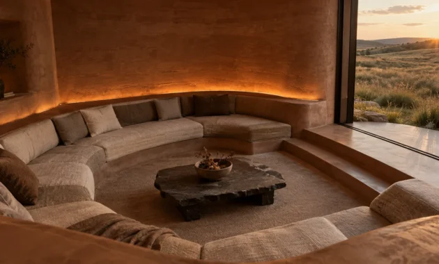
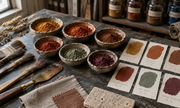
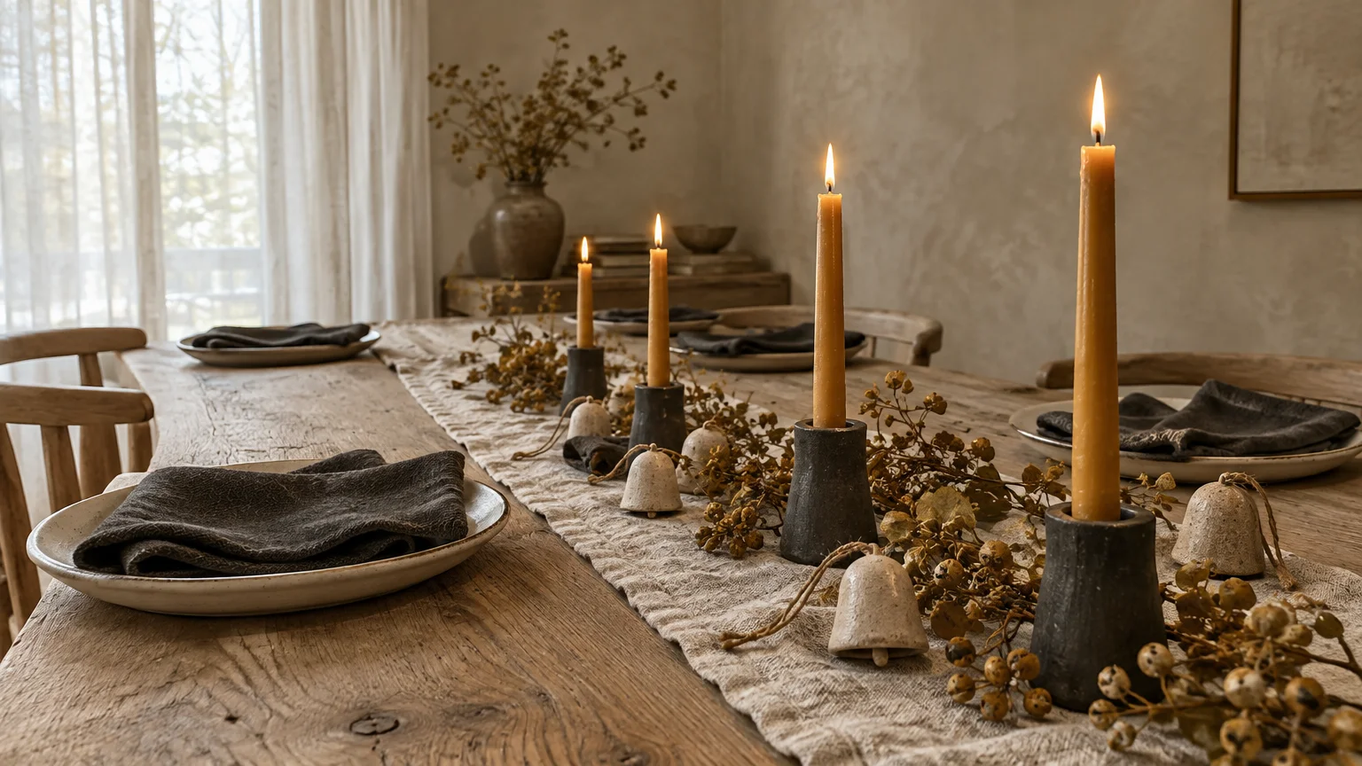
Ochre infuses your seasonal interior with an organic, sun-baked warmth; charcoal anchors the space with deliberate architectural weight, while raw linen softens every surface. This pairing feels simultaneously ancestral and crisply modern.
This palette rejects synthetic shimmer in favor of tactile honesty—a core tenet of modern biophilic design. You celebrate artisanal craftsmanship through unglazed stoneware ornaments and hand-loomed flax ribbon.
Wrap charcoal wool throws across your sofa and set your dining table with golden ochre beeswax tapers. The resulting aesthetic feels curated, grounded, and unmistakably tailored.
This scheme appeals to enthusiasts of organic modernism who want holiday decor to complement natural stone and white oak flooring. It delivers festive depth without visual clutter.
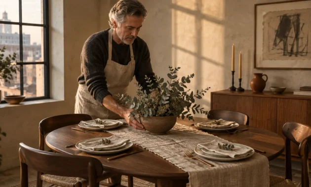
You can introduce dried grasses and seeded eucalyptus to echo the golden ochre notes throughout your entryway. The subdued earthiness establishes an understated, welcoming arrival for holiday guests.
Trend #2: Deep Plum, Burnished Brass, and Fig
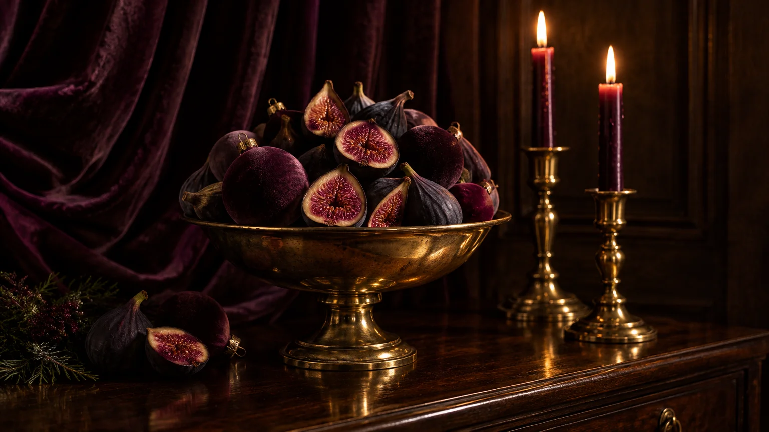
Saturated jewel tones establish an atmosphere of moody indulgence that commands attention. Deep plum and dusky fig provide an opulent foundation, while burnished brass injects luminous warmth.
This direction reflects the growing desire for quiet luxury and evocative sanctuary spaces during darker winter months. The tonal complexity feels regal yet remarkably intimate.
Hang matte velvet baubles in dark fig alongside brushed metallic hardware on your evergreen boughs. Drape heavyweight plum textiles over dining banquettes to evoke European salon elegance.
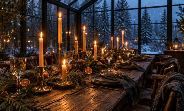
Pair these deep tones with unlacquered brass candlesticks that develop an authentic patina over time. The flickering flame light reflects off dark surfaces with spellbinding warmth.
Use this palette if your home features rich walnut cabinetry, dark millwork, or velvet upholstery. It amplifies existing architectural depth effortlessly.
For an unexpected focal point, fill an antique brass compote bowl with fresh black mission figs and dark purple glass spheres. It instantly creates a painterly Dutch master still-life on your sideboard.
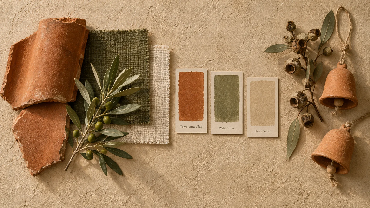
Trend #3: Terracotta, Olive, and Warm Sand
Warm earth tones evoke Mediterranean landscapes and bring a grounded serenity to your winter gathering spaces. Terracotta supplies clay-fired richness, while muted olive and sand create quiet balance.
Consumers increasingly crave holiday color schemes that blend seamlessly with year-round biophilic design elements. This pairing feels collected rather than temporary.
Dress your mantle with dried eucalyptus, olive branches, and unglazed terracotta bells tied with hemp twine. Layer sandy linen table runners beneath olive taper candles for a relaxed holiday feast.
This aesthetic softens stark spaces and pairs exceptionally well with lime-washed walls or warm hardwood flooring. It celebrates seasonal joy through natural materials and sun-baked color.
Add woven rush baskets to store firewood beside the hearth to reinforce tactile rustic elegance. The combination feels timeless, inviting, and unpretentious.
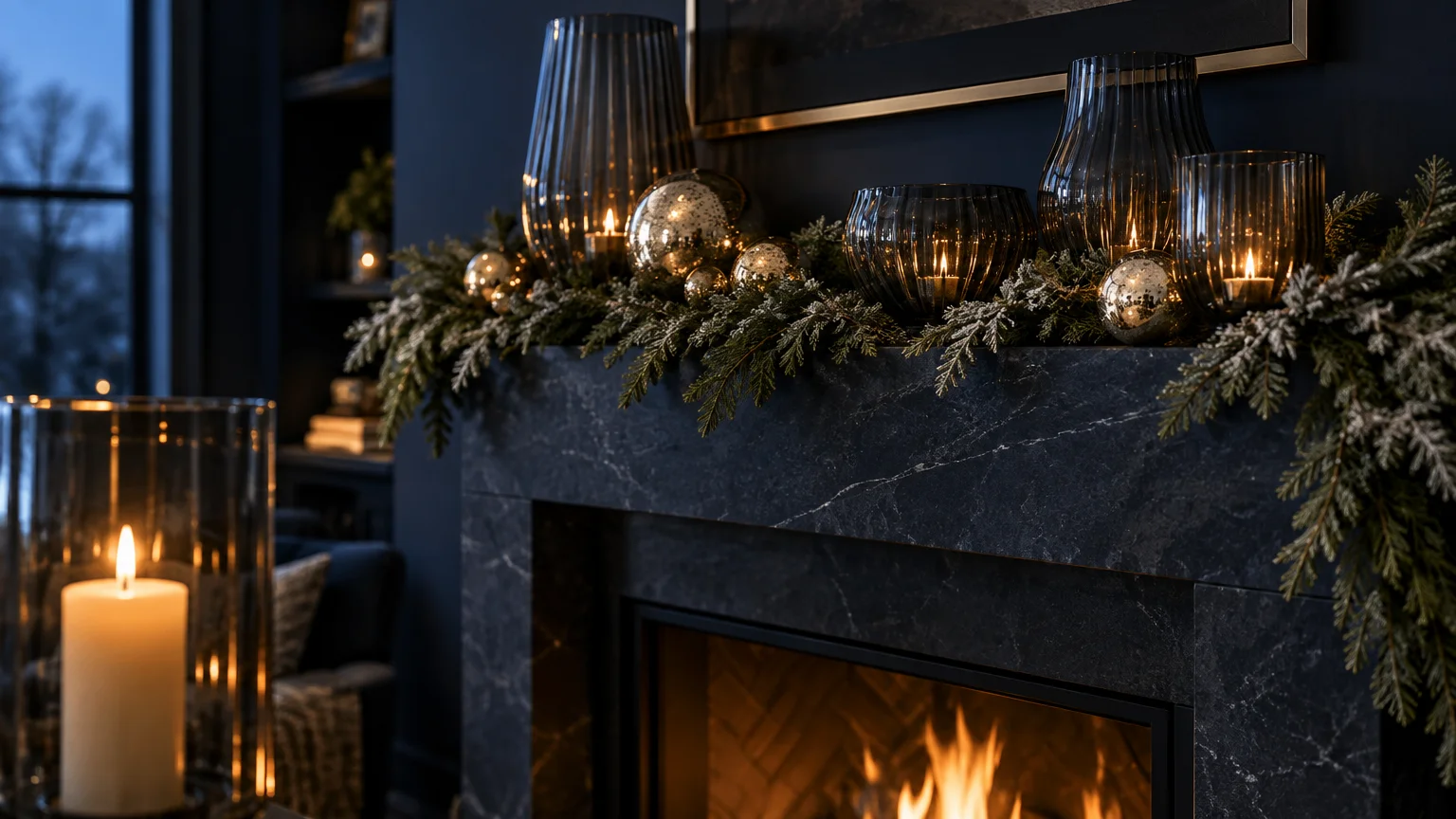
Trend #4: Midnight Blue, Champagne, and Smoked Glass
Midnight blue captures the stillness of winter skies, offering a dramatic alternative to predictable holiday color schemes. Paired with soft champagne and smoked glass, it creates an ethereal, starlit setting.
This palette gains momentum as homeowners look toward celestial motifs and understated evening glamor. It replaces flashy silver with warmer, more nuanced metallics.
Introduce smoked glass globes and pale champagne ribbons to your Christmas tree branches. A navy cashmere throw on a boucle chair immediately brings nocturnal serenity to your living room.
Set your dining table with midnight blue stoneware and champagne gold flatware. The high-contrast harmony feels exceptionally elevated for holiday cocktail parties.
Flank your fireplace with oversized smoked glass hurricane lanterns housing ivory pillar candles. Their moody reflections amplify twilight ambiance throughout late December evenings.
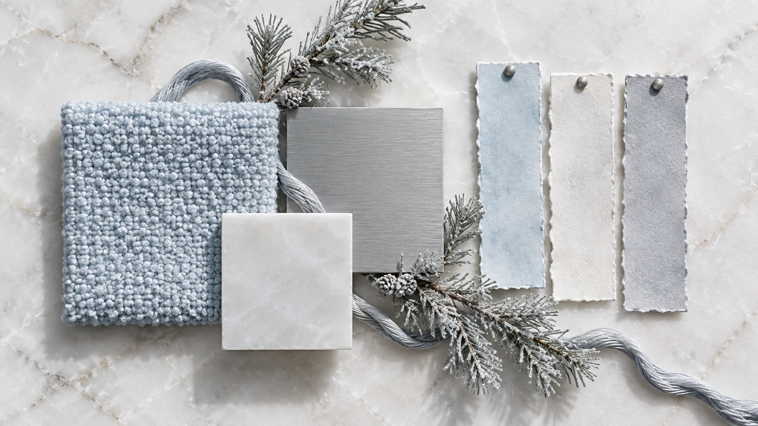
Trend #5: Ice Blue, Alabaster, and Brushed Silver
Draw inspiration from Nordic glacial landscapes with a clean, light-reflective palette of ice blue, alabaster, and brushed silver. This combination maximizes natural illumination during shorter daylight hours.
The design concept relies on subtle color gradations and crisp tonal purity rather than heavy ornamentation. It establishes a serene, restorative sanctuary within your home.
Layer matte alabaster ceramics with pale blue blown glass baubles across the tree. Frosted silver wire lights and sheepskin accents add tactile coziness without disrupting the pale palette.
This scheme complements Scandinavian and minimalist interiors that feature light ash wood, pale limestone, and clean architectural lines. It feels crisp, peaceful, and visually expansive.
Embellish your windowsills with paper-white amaryllis in fluted silver planters alongside pale blue pillar candles. The crisp botanical display captures the quiet poetry of winter frost.
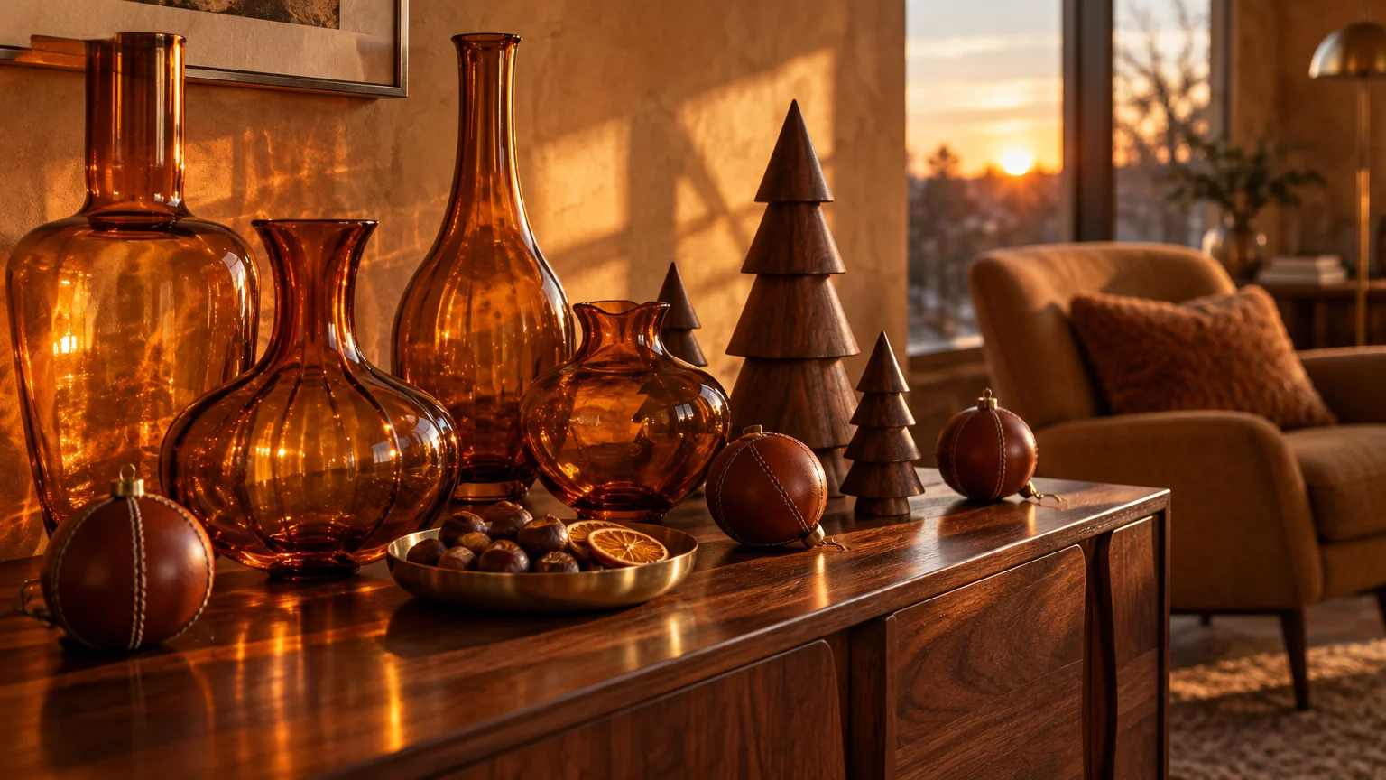
Trend #6: Amber, Cognac, and Walnut
Rich tones of liquid amber, aged cognac, and dark walnut generate immediate warmth without relying on a single drop of red. This palette wraps your interior in mid-century sophistication.
Its appeal lies in its vintage provenance and comforting, fireside ambiance. The colors echo aged leather, bourbon, and polished timber.
Decorate your tree with translucent amber glass ornaments that catch the glow of warm filament bulbs. Incorporate rich cognac velvet ribbons and sculpted walnut wood accents across your display tables.
Style your hearth with stacked cedar logs, brass lanterns, and amber glass vessels filled with winter foliage. The layered warmth creates an inviting, club-like festive retreat.
Place an amber glass decanter alongside lowball tumblers on a dark wood bar cart. This styling detail integrates entertaining rituals directly into your festive decor.
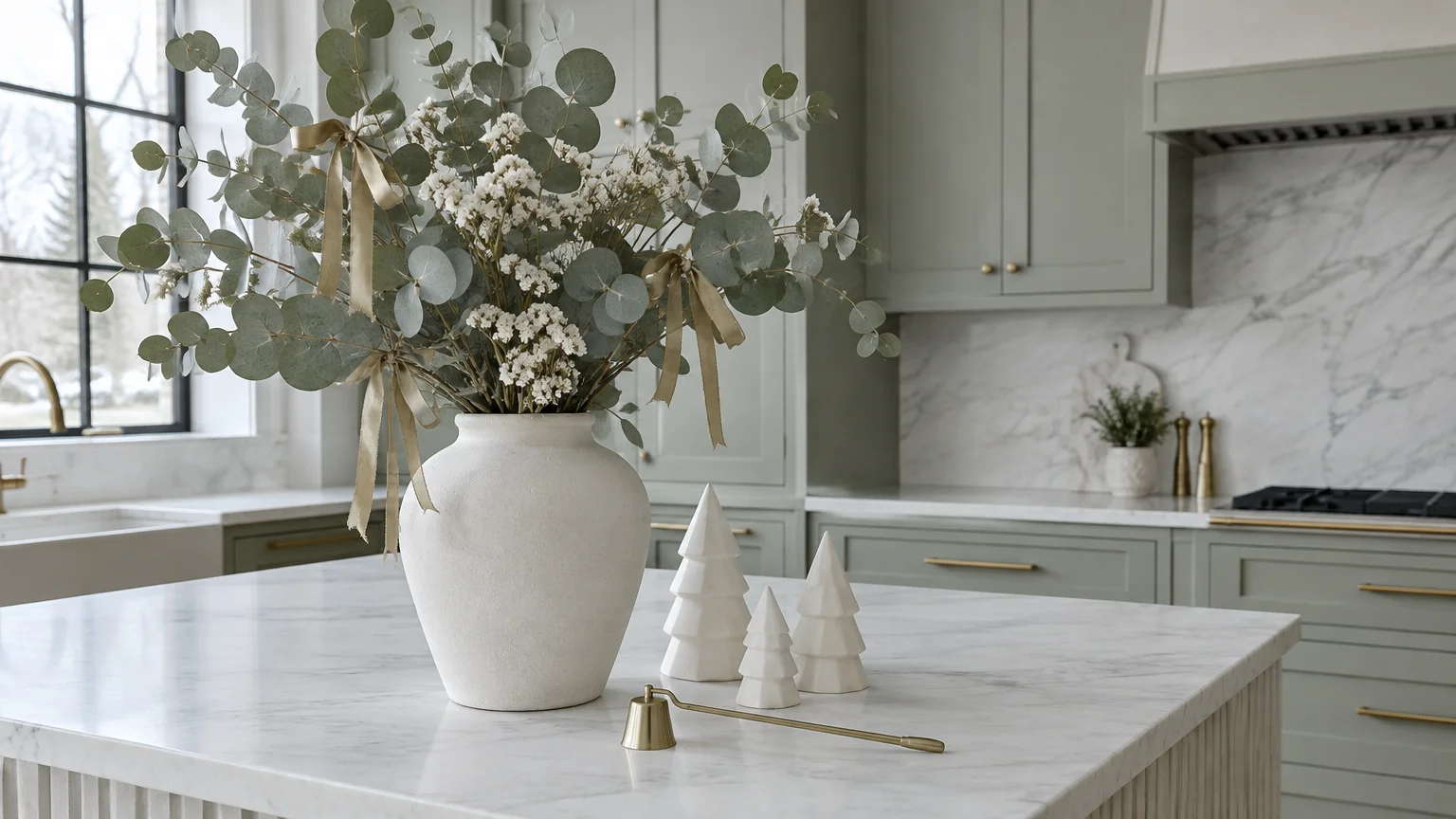
Trend #7: Soft Sage, Chalk White, and Matte Gold
Soft sage offers an understated botanical whisper that feels calmer than traditional emerald or forest greens. Chalk white and matte gold supply luminous counterpoints that keep the scheme refined.
This palette flourishes because it bridges pastoral charm and modern restraint. It captures an English country house sensibility that never feels ostentatious.
Drape fresh eucalyptus and preserved sage leaves across your staircase banister. Intertwine delicate matte gold geometric ornaments and milk-white ceramic stars for a sculptural finish.
On the dining table, combine chalky matte plates with pale sage hemstitch napkins and unlacquered brass flatware. The look remains timeless, gentle, and utterly gracious.
Hang a minimalist wreath of dried silver dollar eucalyptus tied with a matte gold ribbon on your front door. It extends a delicate botanical greeting to your visitors before they step inside.
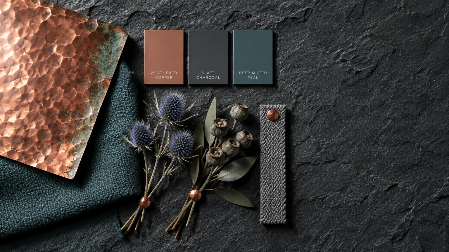
Trend #8: Copper, Slate Gray, and Muted Teal
Deep slate gray provides an unexpectedly chic backdrop for the dynamic pairing of muted teal and polished copper. This palette brings an industrial yet polished edge to festive decor.
The unexpected juxtaposition of cool slate and warm, radiant copper feels fresh and directional. Teal introduces a sophisticated maritime richness that bridges the temperature contrast.
Integrate spun-copper ornaments, dark slate trivets, and teal silk ribbons throughout your living room. A low-profile slate bowl filled with metallic baubles makes an effortless coffee table centerpiece.
This palette thrives in loft-style spaces or rooms with exposed concrete, steel windows, and tailored dark furnishings. It proves that contemporary edge can coexist with holiday wonder.
Contrast hand-poured teal taper candles against raw slate tile bases along your dining sideboard. The metallic copper accents catch the flame light, warming the cool structural gray tones.
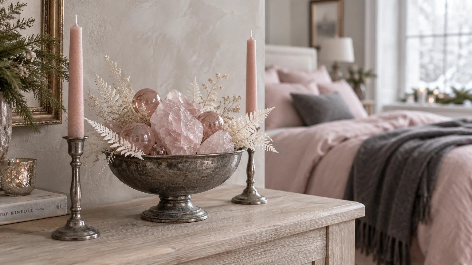
Trend #9: Blush, Rose Quartz, and Antique Pewter
Dusty blush and soft rose quartz offer an enchanting, romantic departure from conventional holiday color schemes. Antique pewter grounds the soft pinks, preventing the scheme from appearing overly sweet.
The rise of neo-romanticism in interior design fuels the popularity of this gentle aesthetic. It replaces harsh contrast with poetic tenderness and vintage grace.
Hang hand-blown rose quartz ornaments alongside weathered pewter pendants on your tree. Drape textured blush mohair throws across your seating areas to reinforce tactile softness.
Pair this palette with mercury glass candleholders and dried pink botanicals like protea or astilbe. The scheme creates an inviting, candlelit haven for quiet winter evenings.
Incorporate vintage pewter trays on your living room ottoman to hold pale pink glass votives. The burnished, moody metal prevents the soft rose hues from skewing juvenile.
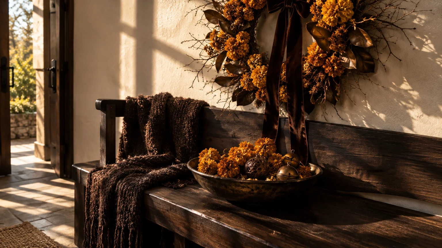
Trend #10: Marigold, Espresso, and Bronze
Radiant marigold brings vibrant sunshine to the winter solstice, creating a joyful dialogue with dark espresso and oiled bronze. This bold composition feels sunny, worldly, and exquisitely grounded.
Homeowners gravitate toward this palette for its exuberant, unconventional energy that challenges dark winter chill. It channels artisanal textiles and Mediterranean warmth.
Style your tree with marigold paper maché ornaments, bronze foliage sprays, and chocolate-hued velvet ribbons. The rich brown elements frame the luminous marigold, making the color sing without overwhelming.
On your mantle, display bronze candelabras alongside espresso-stained timber pedestals holding dried saffron-hued botanicals. The dynamic contrast feels celebratory and undeniably creative.
Layer an espresso-toned wool rug under your holiday tree to ground the vibrant marigold accents. This deliberate foundation enhances the rich golden hues gleaming from the branches.
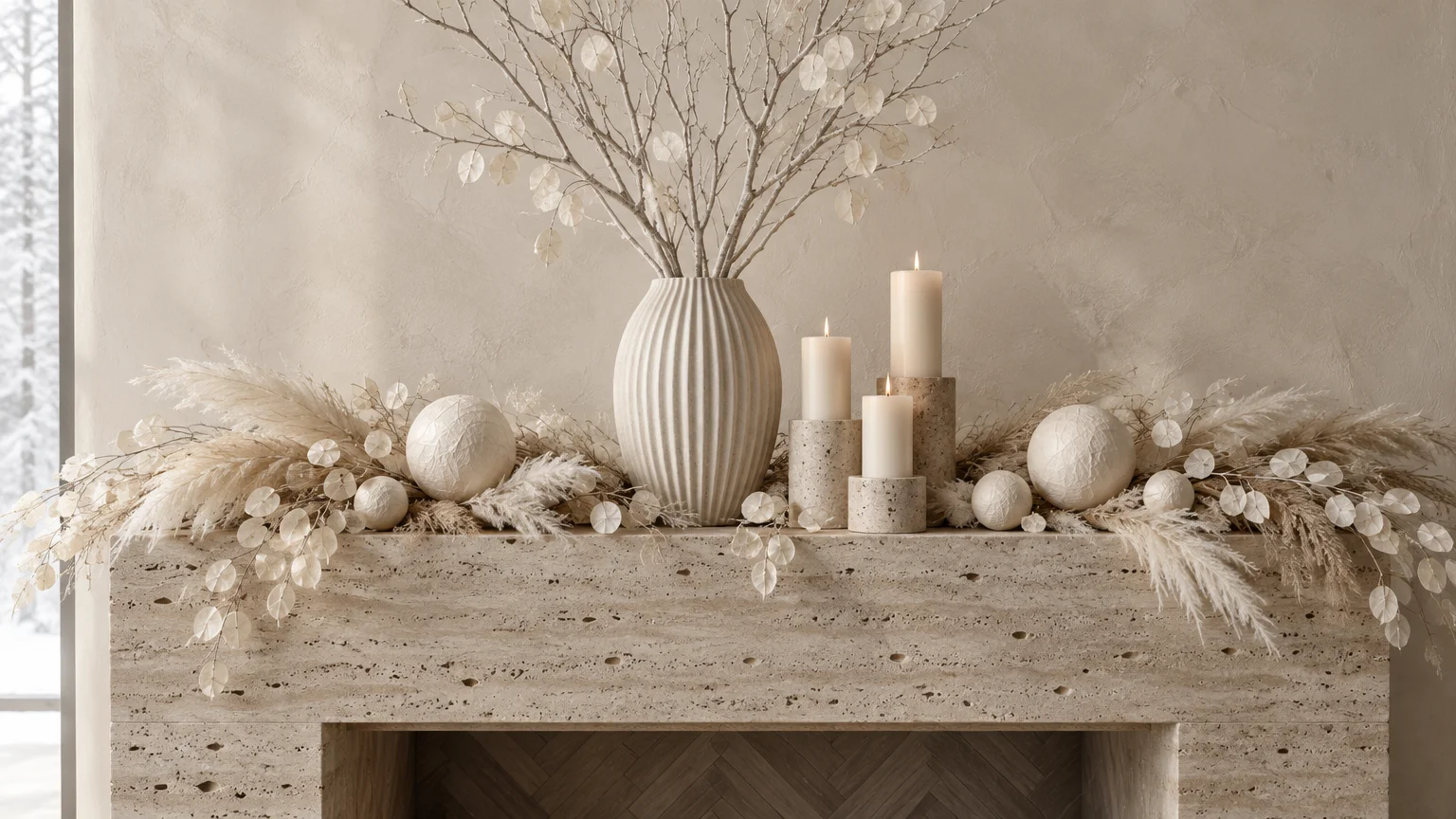
Trend #11: Monochromatic Creams, Ivory, and Travertine
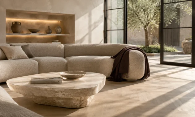
Monochromatic layering delivers the ultimate expression of quiet luxury. By combining chalk white, ivory, rich cream, and travertine hues, you cultivate a tactile winter sanctuary.
This minimalist approach prioritizes texture over saturated color, aligning with contemporary architectural sensibilities. It transforms your home into a calm, snow-dusted escape.
Mix ivory bouclé ribbons, hand-felted wool balls, and matte porcelain ornaments on your holiday tree. Keep the boughs unadorned by bright lights, opting instead for warm, amber micro-fairy wires.
Decorate stone mantles with bleached pinecones, raw travertine candle blocks, and ribbed cream tapers. The resulting aesthetic feels curated, peaceful, and impeccably high-end.
Drape heavy cream cable-knit throws across your linen armchairs to emphasize tactile indulgence. When color stays silent, texture speaks with profound elegance and comfort.
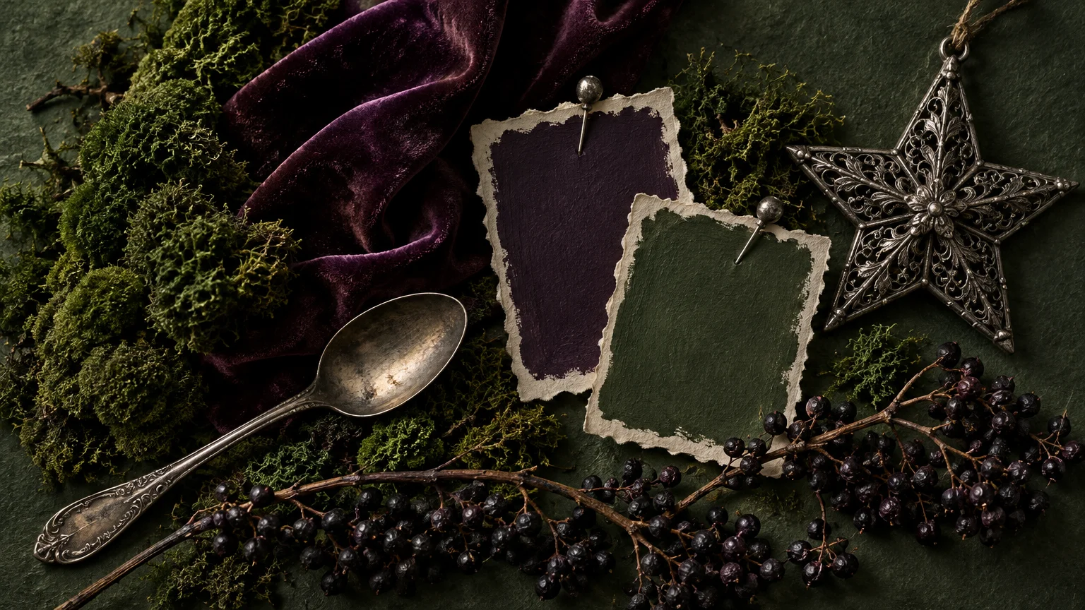
Trend #12: Forest Moss, Aubergine, and Tarnished Silver
If you love traditional botanical themes but demand elevated nuance, pair forest moss with deep aubergine and tarnished silver. This moody woodland palette evokes enchanted winter forests.
The pairing draws inspiration from gothic romanticism and rich vintage textiles. It offers an earthy alternative to bright holiday greenery by utilizing shadowed, mysterious undertones.
Weave preserved moss, dried dark plum foliage, and deep purple glass ornaments throughout your boughs. Tarnished silver accents catch the candlelight, creating antique luminescence.
Set your holiday table with aubergine linen runners, mossy tabletop topiaries, and vintage silver cutlery. The moody atmosphere fosters intimate, lingering conversations long into the evening.
Tuck fresh velvet ribbon in dusky aubergine around silver-gilded taper holders along your mantle. The dark fruit and moss tones evoke the untamed splendor of deep winter woods.
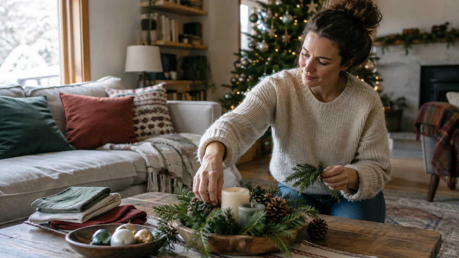
The Big Picture: Weaving These Trends into Your Home
Selecting a non-traditional holiday palette begins with an honest evaluation of your home’s existing architecture and color story. Your festive decor should harmonize with your permanent finishes rather than compete against them.
Look closely at your flooring, wall paint, and prominent upholstery fabrics. A living room with warm white oak and cognac leather naturally welcomes ochre, amber, or terracotta accents.
Conversely, spaces defined by cool marble, gray tones, or crisp white millwork shine brightest with midnight blue, smoked glass, or ice blue. Context always dictates success.
Adopt the classic design rule of proportion when introducing non-traditional Christmas colors. Allocate sixty percent of your visual weight to a dominant neutral, thirty percent to your secondary shade, and ten percent to metallic or high-contrast accents.
Texture plays an essential role in preventing non-traditional palettes from feeling cold or commercial. Mix matte ceramics, tactile velvets, frayed linen, and brushed metals to create irresistible depth.
Invest in foundational ornaments that transcend shifting seasonal trends. High-quality glass baubles, sculpted wooden stars, and solid brass candlesticks provide a versatile canvas you can refresh annually with inexpensive silk or velvet ribbons.
Maintain color cohesion across adjoining rooms by repeating your accent hue in varying scales. A ribbon color used on the living room tree can reappear as taper candles on the dining table.
Illuminate your chosen palette with warm lighting between 2200K and 2700K. Warm light softens bold hues and prevents cool palettes from feeling stark or uninviting during winter nights.
For the latest color forecasts, consult industry leaders like Pantone and paint companies like Benjamin Moore. For professional design standards, refer to the American Society of Interior Designers (ASID).
Disclaimer: This article reflects design trend analysis and predictions. Personal taste and timeless design principles should always guide your decorating choices.
Frequently Asked Questions
How do I transition to non-traditional Christmas colors without replacing all my decor?
Start by keeping your neutral baseline pieces, such as metallic ornaments, warm white lights, and natural greenery. Introduce your new palette gradually through velvet ribbons, colored taper candles, and seasonal textiles.
Swapping out tree ribbons and mantle textiles delivers dramatic visual transformation without requiring an entirely new ornament collection.
Will non-traditional holiday color schemes still feel festive to guests?
Yes, festive atmosphere stems from lighting, sensory textures, and deliberate ritual rather than strict adherence to red and green. Layered candle glow, aromatic evergreen branches, and sparkling glassware instantly signal celebration.
Guests often appreciate the sophisticated departure from commercialized holiday palettes, finding curated environments more restful and memorable.
Can I mix two different holiday color palettes in an open-concept floor plan?
You can mix palettes successfully by choosing a shared unifying neutral, such as alabaster, linen, or warm charcoal, across both spaces. Keep the architectural background constant while varying accent tones subtly between functional zones.
For instance, pair soft sage and matte gold in the dining room with forest moss and tarnished silver in the living area. The shared botanical root ensures effortless flow.
Which non-traditional Christmas palette has the greatest design longevity?
Monochromatic creams and earth-toned palettes like ochre with charcoal offer the greatest longevity because they align seamlessly with modern interior design aesthetics.
Because these shades echo high-end residential interiors, they never look dated or out of place as seasonal trends evolve.