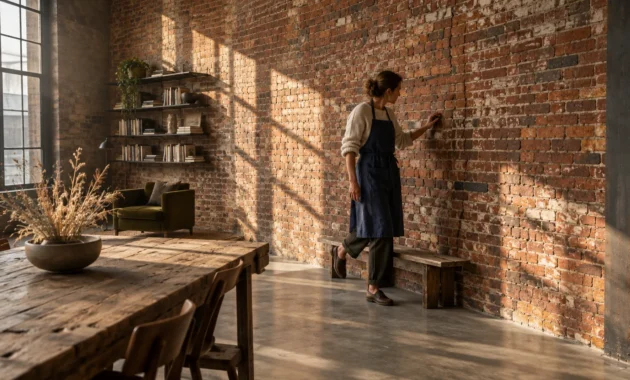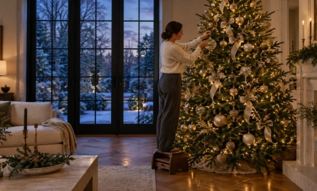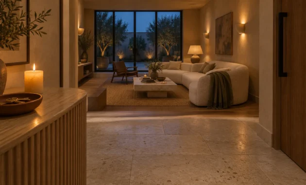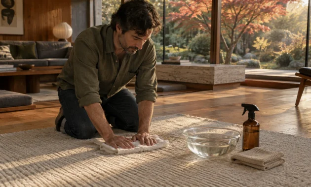
Your wall color establishes the emotional foundation of your home. Refreshing your space with forward-looking palettes immediately elevates your environment while protecting your home’s aesthetic value.
Leading interior designers are actively retiring the flat, sterile neutrals that once crowded social feeds. As paint trends 2027 arrive, biophilic undertones, mineral pigments, and rich heritage shades are displacing predictable formulas.
Staying ahead of designer color trends requires knowing which outdated paint colors to avoid. Explore the nine fading shades industry leaders recommend replacing right now to keep your home timelessly sophisticated.
Trend #1: Cool Gray and Clinical Neutrals
For over a decade, cool gray reigned supreme across modern suburban interiors and urban lofts alike.
Today, designers widely agree that chilly, slate-tinged grays make living spaces feel uninspired and unwelcoming.
Cool gray is officially one of the primary paint colors going out of style across international design hubs.
Paint forecasters note that conventional gray is completely absent from major 2027 color forecasts.
Under northern light exposures, cool gray drains natural warmth from architectural woodwork and creates shadowy, drab corners.
This emotional chill is driving homeowners to seek comforting environments that celebrate visual warmth and texture.
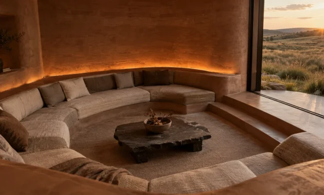
Current interior paint trends are pivoting decisively toward earthy warmth, tactile depth, and historical provenance.
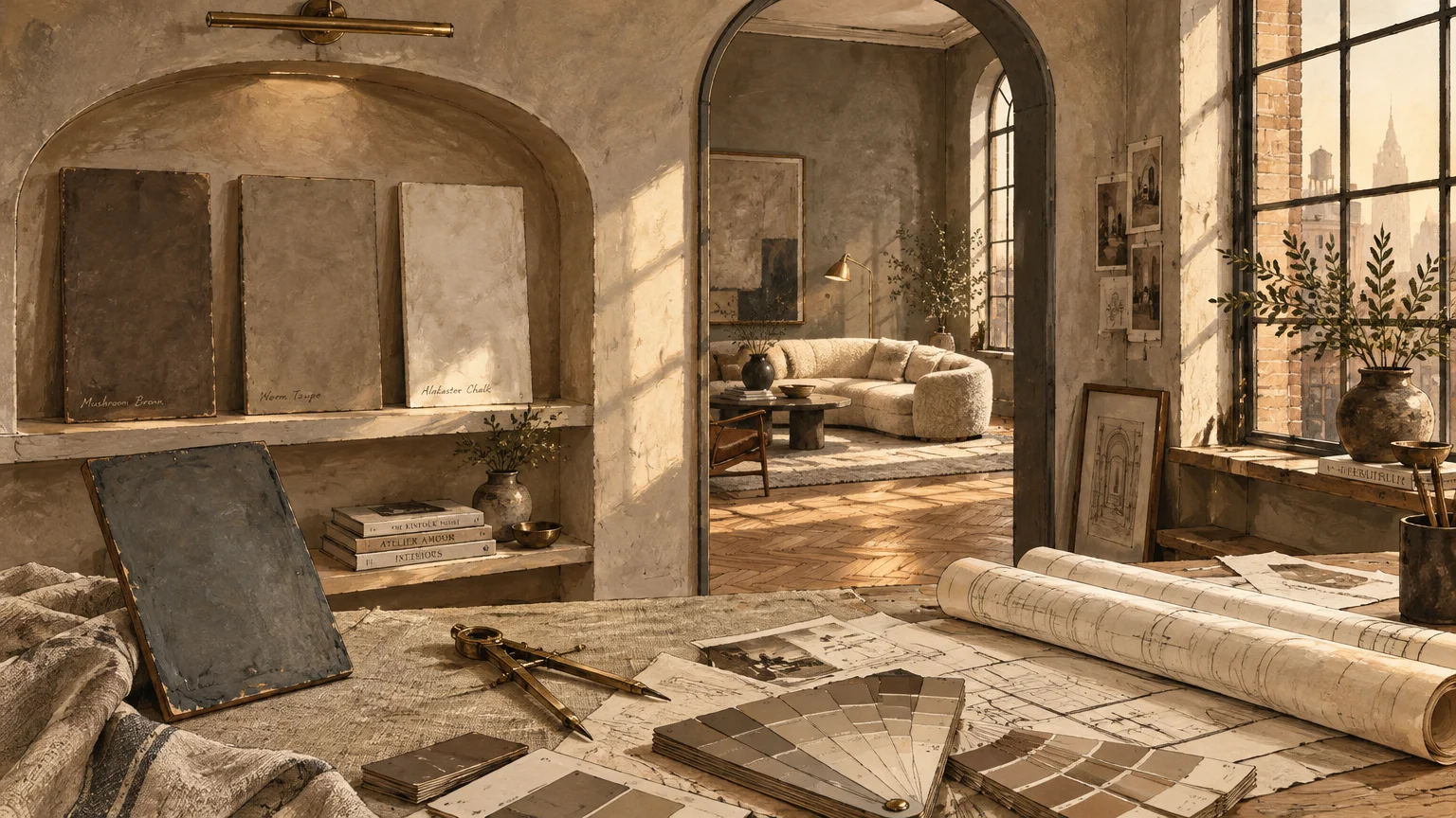
Decorators are replacing icy pebble tones with comforting mushroom browns, warm taupes, and architectural putties.
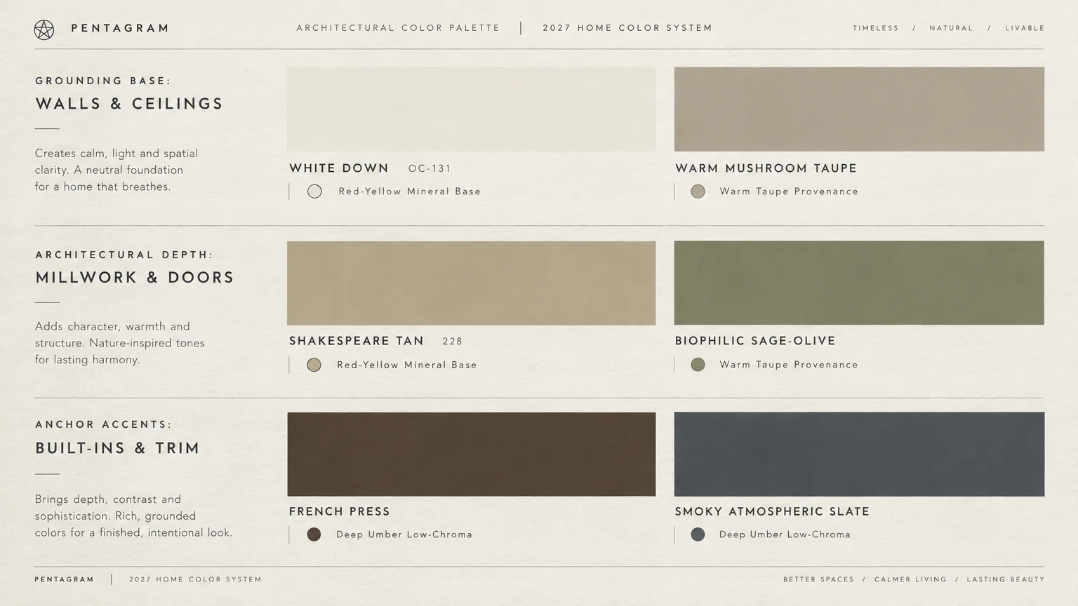
Dunn-Edwards exemplifies this shift by selecting French Press Coffee, a deep brown with purple undertones, as a key anchor.
Similarly, Benjamin Moore celebrates grounding earthiness by highlighting Shakespeare Tan (228) in its curated palette.
These richer neutrals cultivate quiet luxury by bouncing warm light and highlighting organic room textures.
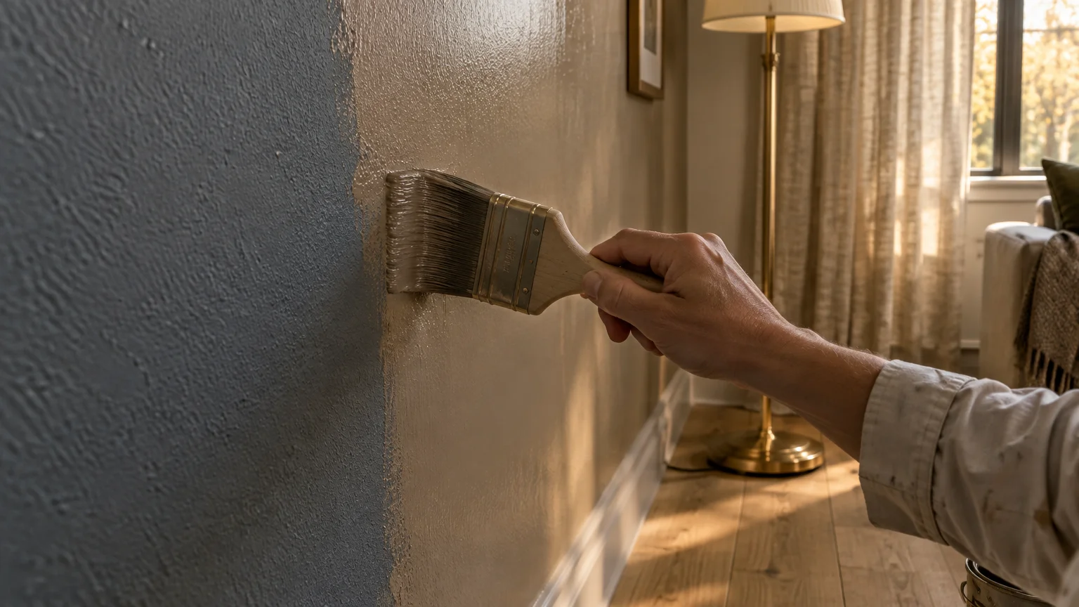
To modernize your living room, paint over cool gray with warm taupe that adapts to shifting daylight.
Pair these grounded wall surfaces with natural white oak flooring, textured linen drapery, and patinated brass fixtures.
Your living space will instantly feel more welcoming, layered, and architecturally permanent.
Trend #2: Stark Hospital-Grade Whites
Blinding, unpigmented white walls once served as the universal default for contemporary minimalism.
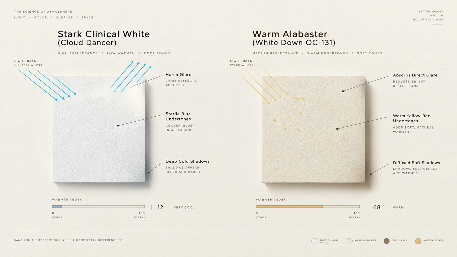
In real homes, stark white produces aggressive visual glare and leaves living rooms feeling drafty and clinical.
While Pantone selected Cloud Dancer white for 2026, designers now view pure white as cold and uninspired.
Today’s design enthusiasts are deliberately abandoning stark white boxes in favor of multidimensional architectural neutrals.
The latest designer color trends emphasize creamy off-whites, warm alabasters, and mineral-infused chalk tones.
Benjamin Moore embraced this aesthetic evolution with White Down (OC-131), a celebrated warm neutral that radiates comfort.
Unlike clinical white, creamy pigments possess subtle yellow and red undertones that absorb harsh direct sunlight.
These nuanced whites envelop open-concept living rooms without casting sterile shadows across drywall transitions.
When refreshing your home, paint your baseboards, walls, and ceiling in unified creamy tones for seamless elegance.
This monochromatic approach softens shadow lines and creates an enveloping, quiet visual envelope.
Pair these gentle neutrals with aged brass hardware, honed travertine accents, and warm European oak floors.
Incorporating layered bouclé and wool upholstery reinforces the soothing, tactile nature of the space.
The resulting interior feels curated and deeply organic rather than sterile or unfinished.
Trend #3: High-Contrast Modern Farmhouse Black
Pitch-black accent walls and stark charcoal window frames saturated home design television throughout the late 2010s.
That severe contrast feels increasingly dated, visually aggressive, and disconnected from natural home environments.
Sharp black-and-white palettes produce eye fatigue because your eyes must constantly adjust between extreme light values.
Furthermore, flat black paint tends to show dust, fingerprints, and wall scuffs remarkably fast.
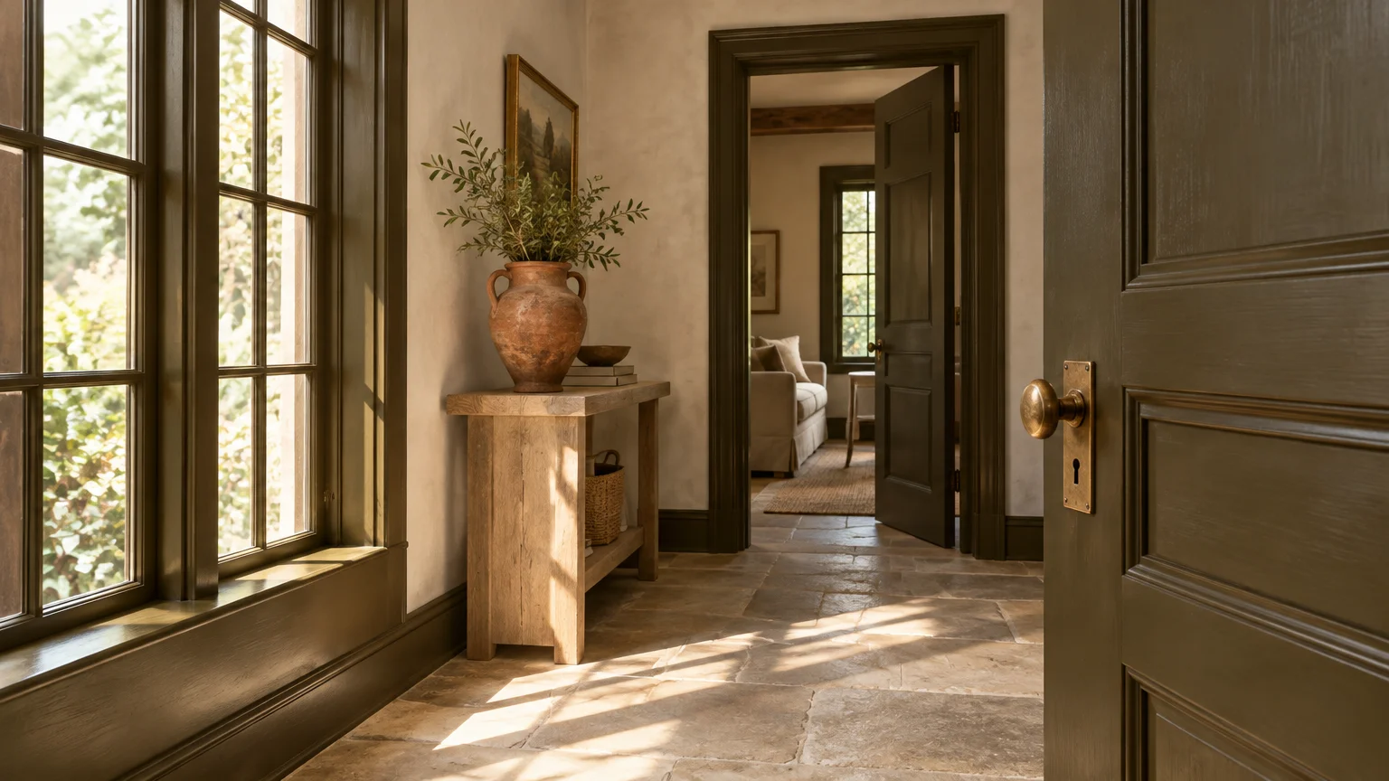
Current interior paint trends favor deeply saturated, atmospheric darks rather than harsh, synthetic pitch blacks.
Designers are embracing rich espresso, bitter chocolate, and warm blackened bronze to deliver dramatic focal points.
Benjamin Moore underscores this transition by championing Townsend Harbor Brown (HC-64) and Durango (2137-30).
These oxidized brown pigments introduce moody sophistication without the industrial sterility of standard flat black.
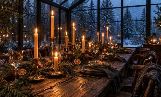
When used in dining rooms, deep browns generate an intimate, candlelit ambiance that invites long evening conversations.
Update your accent walls by swapping cold charcoal for velvet-matte espresso or deep umber paint.
Complement these rich tones with warm wood stains like Minwax Pickled Oak to preserve balanced visual warmth.
Layer in unlacquered iron, nubby wool rugs, and amber glass lighting to enhance the room’s tactile appeal.
This textural balance transforms high-contrast rooms into warm, enduring retreats that stand the test of time.
Trend #4: Millennial Bubblegum Pink
Cheerful pastel pink once dominated boutique storefronts, vanity rooms, and trendy hospitality venues worldwide.
In residential spaces, sugary bubblegum shades quickly wear out their welcome, feeling juvenile and overly sweet.
Designers now categorize synthetic confectionary pinks among the most obvious outdated paint colors.
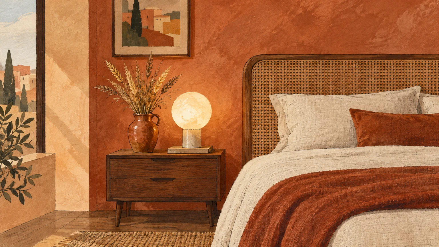
The design conversation has pivoted toward sun-baked clays, dusty terracottas, and weathered plaster rose tones.
Dutch Boy selected Deep Rooted (311-7DB), a saturated terracotta orange with an earthy Light Reflectance Value of 17.
Graham & Brown similarly embraces this organic evolution with Rose Earth, a grounding shade tied directly to nature.
These mineral-rich tones lend warmth and historic provenance to living spaces without reading as saccharine or trendy.
Unlike candy pink, terracotta contains red and brown soil pigments that ground a room visually and emotionally.
Use baked terracotta across your powder room or guest bedroom to envelop guests in comforting, glowing color.
These shades respond magnificently to evening light, casting a flattering, amber glow across the space.
Finish the room with unlacquered brass faucets, handmade ceramic vases, and textured wool rugs for refined character.
Natural wood finishes balance the warmth of clay, creating a space rich in artisan texture.
Your updated room will feel sophisticated and grounded rather than like a passing novelty.
Trend #5: Electric Emerald and Synthetic Forest Greens
Saturated jewel-toned emerald walls flooded social channels as the quintessential statement color for several seasons.
Today, designers view intense synthetic emeralds as loud distractions that overpower ambient architectural details.
The new luxury landscape demands restful, biophilic hues that invite the natural landscape indoors.
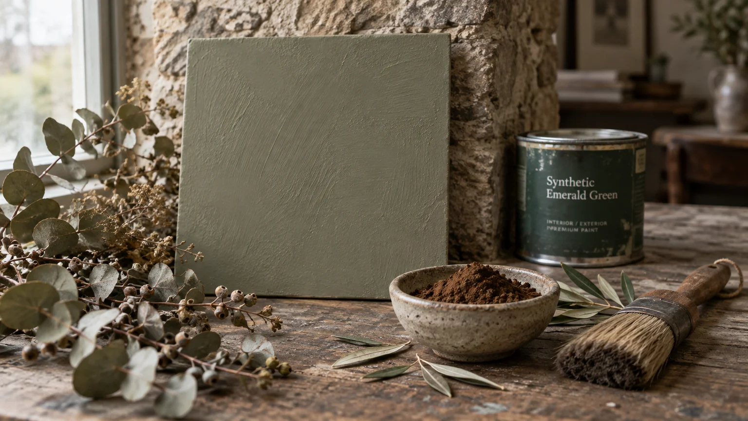
High-saturation greens are giving way to smoky moss, muted olive, and heritage forest pigments with earthy brown undertones.
Demonstrating this movement, Benjamin Moore unveiled Webster Green (HC-130), a classic mid-tone green with an LRV of 20.
Webster Green balances yellow and blue undertones, allowing it to adapt effortlessly to changing daily light.
Behr also made headlines by announcing Grounded (T27-01), an earthy, dark mossy olive with a low LRV of approximately 11.
Behr explicitly positions Grounded as a “living neutral” designed to soothe rather than overwhelm your senses.
Coat your study or library walls in mossy botanical tones that recede gently into shadow.
Paint both the trim and the crown molding to create an immersive, cocooning atmosphere.
Pair these organic pigments with walnut millwork, supple leather seating, and warm lamplight to achieve a timeless study.
The subdued green provides a calming sanctuary that fosters focused reflection and relaxation.
This organic palette connects your interior directly with nature, ensuring enduring beauty for decades.
Trend #6: Saturated Nautical Navy
Standard navy blue served for years as the default choice for kitchen islands, accent walls, and front doors.
However, decorators report that uniform nautical navy has become repetitive and noticeably formulaic in modern homes.
Crisp, high-contrast navy often reads as cold and disjointed against today’s warmer wood tones and earthy furnishings.
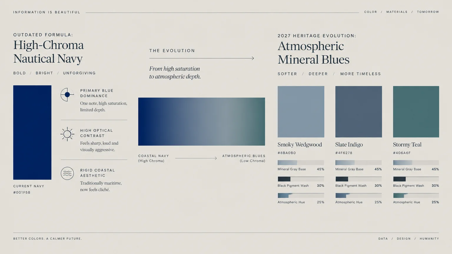
Current paint trends 2027 replace stark navy with complex, mineral-tinged blues that incorporate generous gray undertones.
Leading manufacturers are introducing moody, atmospheric shades that blur the boundary between blue and stone.
Valspar selected Cottage Door (8004-38E), a muted, steely blue-gray featuring warm undertones and an LRV of 26.
Simultaneously, Glidden and PPG introduced Artifact (PPG10-16), a deep, smoky grayed-blue carrying an LRV of 20.
These mineral blues capture the atmospheric depth of coastal mist without the rigid formality of nautical uniforms.
Bring your cabinetry up to date by choosing nuanced slate or river-rock blue rather than flat navy.
These grayed hues integrate seamlessly with open living areas, preventing awkward visual breaks between functional zones.
Complement these atmospheric hues with soapstone countertops, patinated bronze hardware, and wide-plank oak flooring.
Add natural unbleached linen roman shades to soften window frames and balance the blue’s mineral depth.
This balanced pairing ensures your kitchen remains visually rooted, sophisticated, and serene.
Trend #7: Canary Yellow and Primary Brights
Bright, high-stimulus canary yellow often enters home designs with the promise of eternal sunshine and joy.
In reality, saturated primary yellow causes visual agitation and can make a room feel chaotic and glaring.
Designers are actively retiring loud primary colors in favor of subtle, nature-derived herbal tints and citrus neutrals.
Modern palettes prioritize serene sophistication, replacing neon vibrancy with restorative, biophilic washes of color.
Highlighting this transition, Sherwin-Williams announced Celery (SW 6421) as their defining 2027 Color of the Year.
Celery offers an airy, light herbal green with delicate yellow undertones and a bright Light Reflectance Value of 71.
As the anchor for the Sherwin-Williams “Rewild” Colormix forecast, it shapes their Revive, Reignite, and Reconnect design narratives.
Celery demonstrates how yellow undertones can uplift a space when grounded by organic herbal complexity.
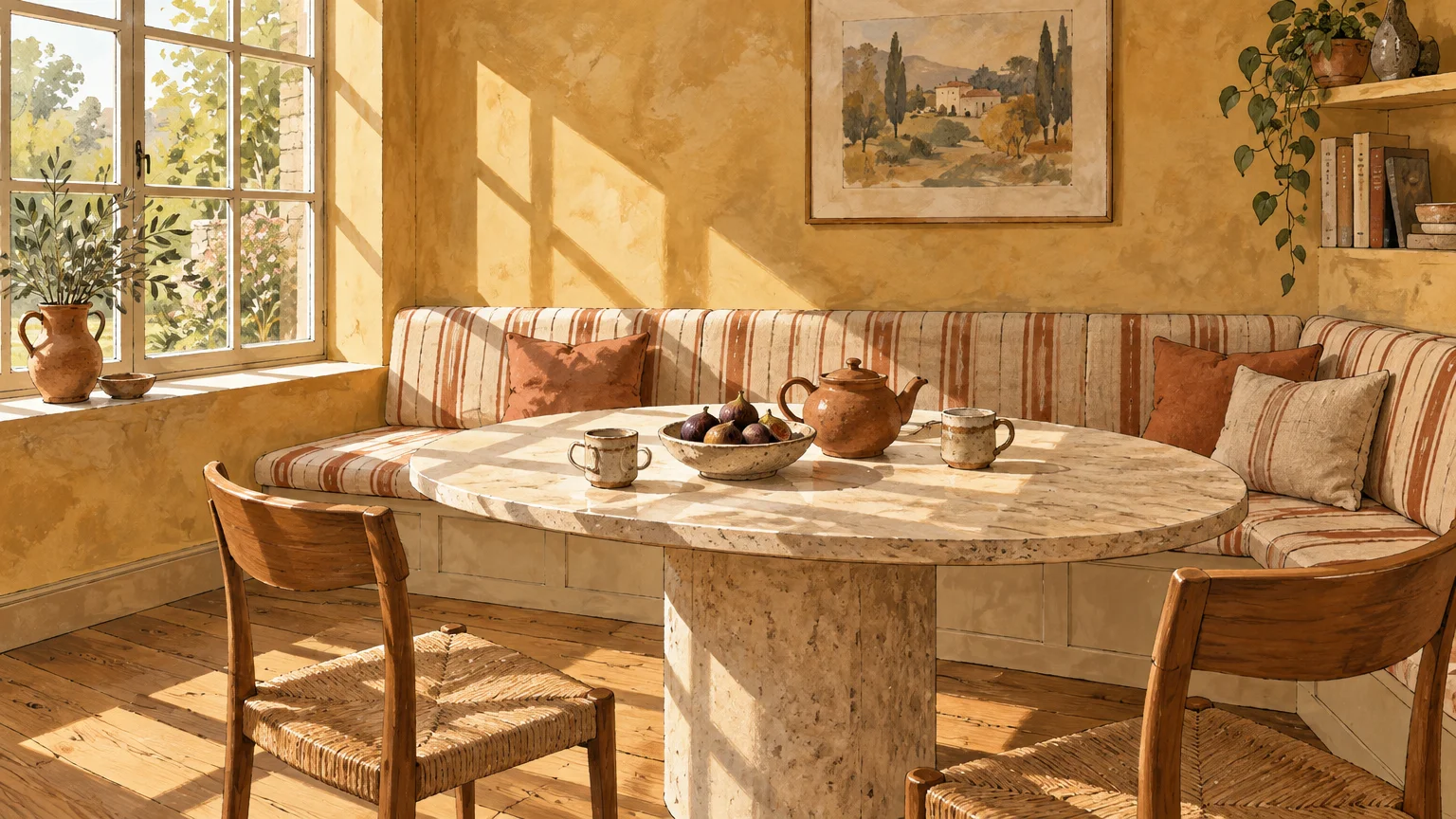
Replace harsh yellow in your breakfast nook with soft herbal celery to capture natural morning sunlight gracefully.
The high LRV bounces abundant daylight into adjoining rooms, creating a breezy, expansive sensation.
Accentuate the fresh hue with botanical prints, bleached timber furnishings, and sheer linen window treatments.
Incorporate woven rush chair seats and matte ceramic dinnerware to keep the aesthetic artisanal and grounded.
Your morning space will feel revitalized, luminous, and harmoniously connected to the outdoors.
Trend #8: Frigid Baby Blue and Icy Slate
Pale baby blue and chilly pastel slate were once popular solutions for creating calm, coastal-inspired bedrooms.
Unfortunately, cool light blues often reflect gray winter daylight poorly, leaving your spaces feeling cold and cast in shadow.
These chilly pastels are quickly becoming outdated paint colors as homeowners seek enveloping, warm comfort.
Designers are steering clients toward silvery gray-greens and historic mineral tones that adapt gracefully to shifting daylight.
Dulux captures this subtle elegance with Soulful Sage, a soft, silvery gray-green that fosters deep visual rest.
Similarly, Benjamin Moore’s Nelson Blue (CW-635) demonstrates how historic undertones add timeless gravitas to soft blue walls.
These muted botanical shades evoke organic tranquility without the frosty, clinical chill of earlier pastel blues.
They carry sufficient earthy gray to prevent the color from feeling juvenile or washed out under bright direct light.
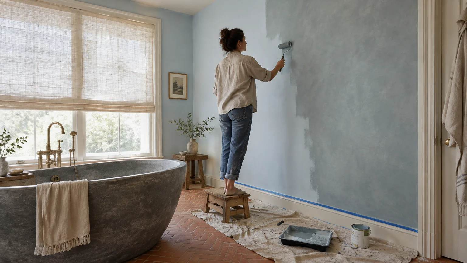
Use silvery sage in primary bedrooms to encourage relaxation and support natural circadian rhythms throughout the evening.
Carry the color onto your ceiling in a flat finish to create a peaceful, continuous canopy of color.
Complement this soothing tone with bouclé upholstery, woven jute rugs, and warm alabaster lighting fixtures.
Layer textured waffle-weave blankets and washed flax bedding to reinforce the room’s tactile sanctuary feel.
The space immediately transforms into an elegant sanctuary tailored for restorative rest.
Trend #9: Hyper-Vibrant Neon and High-Chroma Accents
Fluorescent accents, sharp magenta trims, and electric orange walls had a brief moment of viral notoriety.
Today, high-chroma synthetic colors clash aggressively with the prevailing desire for peaceful, grounded residential interiors.
These loud pigments create visual chaos and fight for attention against natural architectural materials and curated art.
Major paint manufacturers confirm that clear, bright primary colors are vanishing from contemporary design forecasts.
Brand selections for 2027 overwhelmingly feature muted, “muddy,” and low-LRV pigments that absorb light beautifully.
Most prominent picks boast low Light Reflectance Values between 11 and 26, creating moody, enveloping spaces.
Notable examples include C2 Paint’s earthy Pueblo and Benjamin Moore’s rich Antique Copper (1169) and Wild Aster (1240).
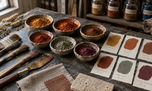
These desaturated shades draw their character from crushed minerals, clay deposits, and oxidized metals.
Replace synthetic neons with baked desert ochres, burnished coppers, and smoky mineral pigments that age gracefully.
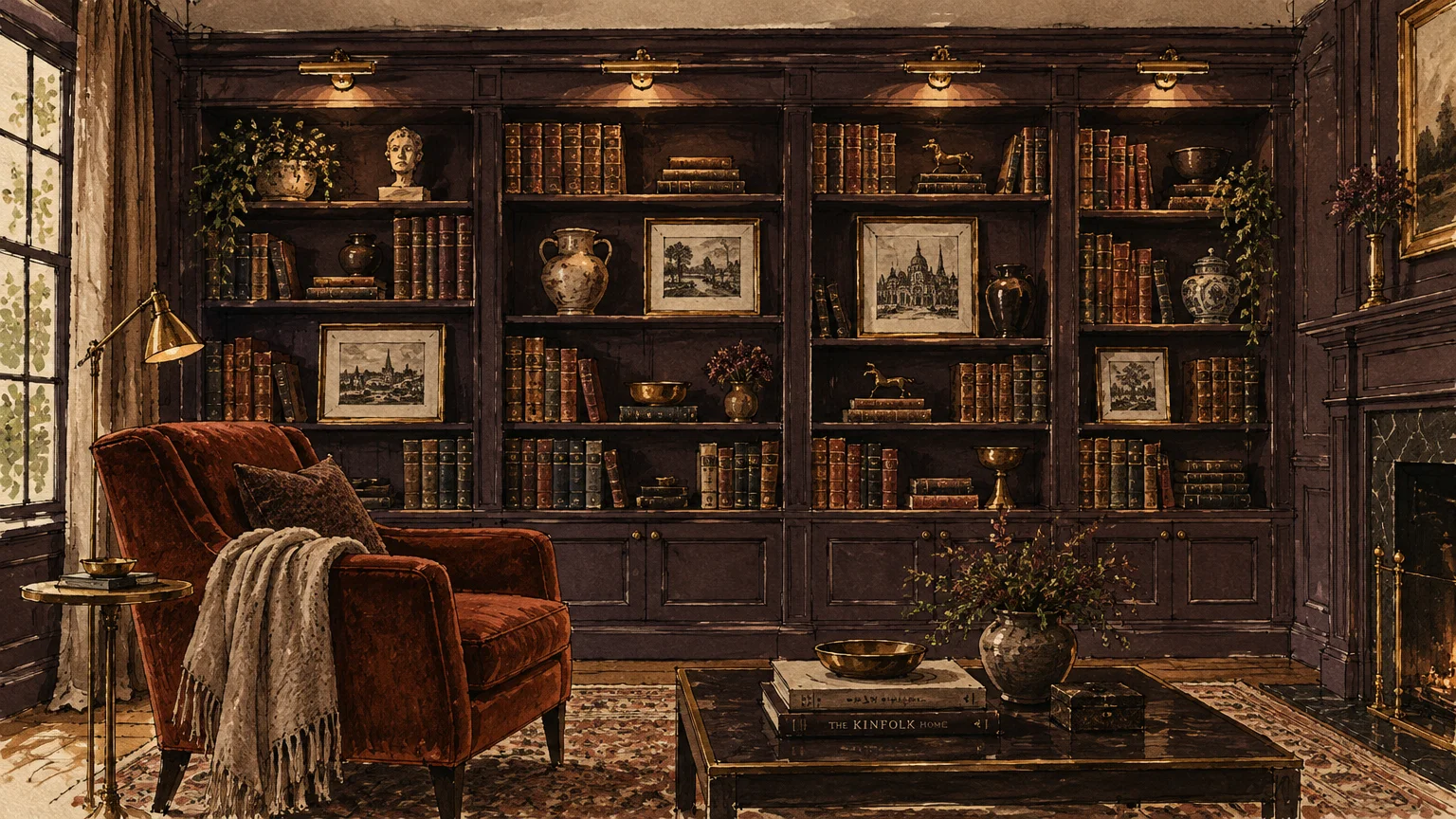
Use them on architectural focal points, such as fireplace mantels, built-in bookcases, or dining room wainscoting.
These organic hues harmonize effortlessly with raw stone hearths, zellige tile, and hand-forged iron elements.
Install warm, dimmable ambient sconces to highlight the subtle pigment shifts within these complex paint formulations.
Your home gains timeless character that feels rooted in craftsmanship rather than passing social media novelties.
The Big Picture: Weaving These Trends into Your Home
Updating your walls does not require gutting your entire home or chasing fleeting micro-trends impulsively.
Successful design begins with understanding your home’s unique architectural provenance and existing natural light exposures.
Before committing to a color, test large swatches across multiple walls to observe undertone shifts from dawn to dusk.
Examine how morning sunlight brings out cool undertones while warm afternoon rays emphasize golden, earthy pigments.
Pay special attention to your room’s Light Reflectance Value, balancing low-LRV moody tones with ample ambient illumination.
Modern design favors color drenching, where you paint walls, baseboards, and crown molding in the same rich hue.
This monochromatic technique eliminates jarring contrasts and makes smaller dining rooms or dens feel expansive and cohesive.
Layer matte finishes on your walls with eggshell or satin on trim to introduce tactile depth without shifting colors.
Ground your refreshed paint choices with natural materials like unlacquered brass, honest timber, and tactile Belgian linens.
When designing adjoining spaces, create a cohesive color thread by selecting shades from a single harmonious palette family.
Incorporating organic pigments creates a continuous visual rhythm that feels effortless as you move from room to room.
You will create a home that feels intentionally curated, deeply comfortable, and distinctly personal.
By focusing on organic earthiness rather than synthetic saturation, you will craft an interior that endures for years.
Frequently Asked Questions
How do I transition away from cool gray walls without repainting my entire home at once?
Begin by repainting enclosed, high-impact spaces such as powder rooms, dining rooms, or home offices first.
Choose transitional warm taupes or soft mushroom tones that share subtle undertones with your adjoining gray hallways.
Introduce warm wood furnishings, creamy textiles, and warm 2700K lighting to soften existing gray walls gradually.
This staged approach allows you to modernize your aesthetic room by room while maintaining overall visual coherence.
What Light Reflectance Value should I look for in modern living rooms?
Most trending 2027 colors feature lower Light Reflectance Values ranging between 11 and 26 for cozy depth.
If your room lacks ample natural daylight, opt for a luminous herbal neutral like Sherwin-Williams Celery with an LRV of 71.
Test samples under both artificial and natural lighting to ensure the shade maintains depth without feeling gloomy.
Layering ambient wall sconces and table lamps ensures low-LRV rooms feel intimate rather than cavernous after sunset.
Will earthy greens and warm taupes date as quickly as cool grays did?
Earthy greens and warm taupes draw from classical architectural history rather than fleeting technology-driven fads.
Because these organic pigments mirror colors found naturally in stones, moss, and timber, they offer superior aesthetic longevity.
To keep them timeless, choose muted formulations with gray or brown undertones rather than hyper-saturated synthetic blends.
Grounding your walls in timeless earth tones protects your home from looking dated as trends inevitably evolve.
Can I still use white paint without making my home look outdated?
Absolutely, but you should avoid chalky, stark hospital whites in favor of warm architectural creams.
Look for nuanced whites like Benjamin Moore’s White Down (OC-131) that contain subtle yellow, red, or gray undertones.
These gentle formulations bounce light softly across living rooms while providing a flattering, sophisticated neutral envelope.
Pair creamy whites with rich wood millwork and organic stone to add visual weight and refined texture.
For the latest color forecasts, consult industry leaders like Pantone and paint companies like Benjamin Moore. For professional design standards, refer to the American Society of Interior Designers (ASID).
Disclaimer: This article reflects design trend analysis and predictions. Personal taste and timeless design principles should always guide your decorating choices.