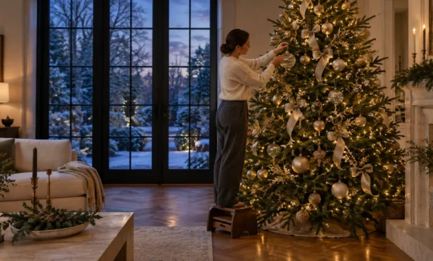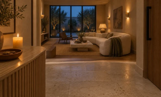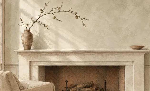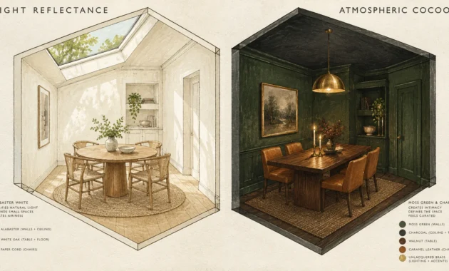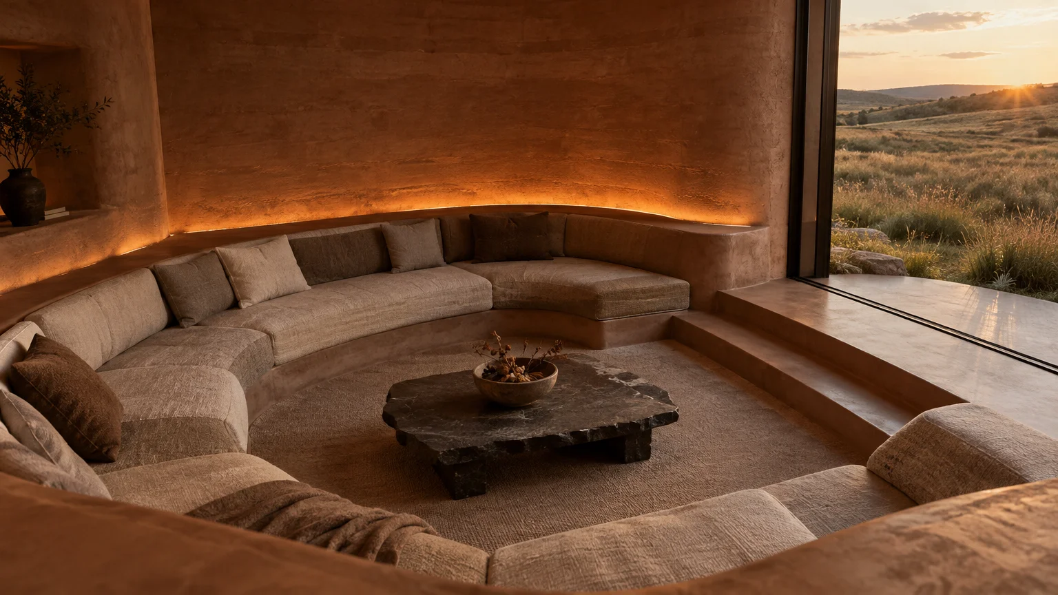
Earthy color palettes are transforming residential interiors heading into 2027, replacing stark minimalism with organic warmth and ecological depth. You can build an enduring sanctuary by surrounding yourself with natural mineral pigments, botanical undertones, and clay-rich soil hues.
Global forecasting indicates a major cultural shift toward grounding, sensory-rich environments. Discerning homeowners and interior designers now prioritize colors that connect indoor spaces directly to natural landscapes.
This predictive report reveals the nine essential color trends defining interiors through 2027. You will discover practical strategies to harmonize heritage paints, raw natural woodwork, and architectural lighting in every room.
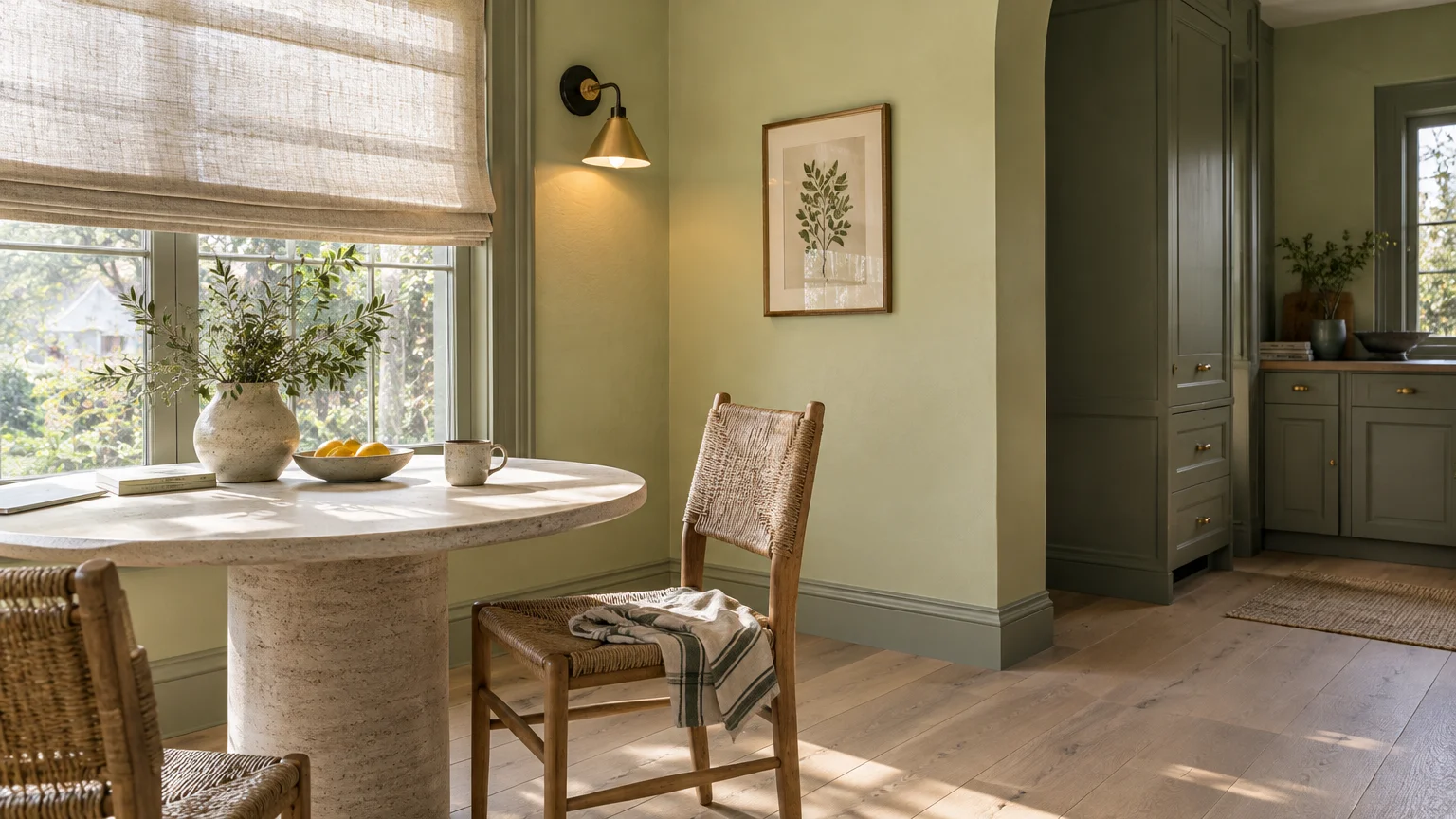
Trend #1: Biophilic Canopy: Celery, Soulful Sage, and Pickled Oak
Sherwin-Williams selected Celery (SW 6421), a soft botanical yellow-green, as its 2027 Color of the Year. The airy shade captures the quiet vitality of early spring foliage.
Celery anchors the brand’s expansive 2027 Colormix Forecast, titled Rewild, which features 48 nature-inspired shades. This forecast encourages homeowners to reconnect their domestic environments with living ecosystems.
Dulux embraces a parallel botanical aesthetic with its 2027 Colour of the Year, Soulful Sage. This silvery sage delivers calming botanical serenity while eliminating harsh glare from contemporary interiors.
Light-Filled Living Spaces
You can introduce Celery across open-concept living rooms to amplify natural daylight. The subtle yellow undertone adds gentle warmth to rooms that receive changing daily light.
Pair these delicate greens with light, natural wood finishes that display authentic grain patterns. Avoid heavy amber varnishes that clash with soft botanical hues.
Minwax named Pickled Oak (MW260) as its 2027 Stain Color of the Year. This neutral wood stain preserves authentic grain while providing a fresh, sun-bleached foundation for botanical walls.
Layered Textures and Lighting
Incorporate unbleached linen drapery, woven rush seating, and matte travertine coffee tables. These tactile organic textures prevent soft green spaces from feeling clinical or cold.
Install 2700K warm LED light fixtures throughout botanical rooms. Warm ambient illumination prevents sage and celery tones from shifting into flat hospital greens after sunset.
Introduce unlacquered brass hardware and blackened bronze light fixtures for structural contrast. The warm metals highlight the yellow warmth concealed within botanical paint pigments.
This restorative palette works exceptionally well in transitional breakfast rooms and reading nooks. It fosters mental restoration by surrounding your morning rituals with living garden hues.
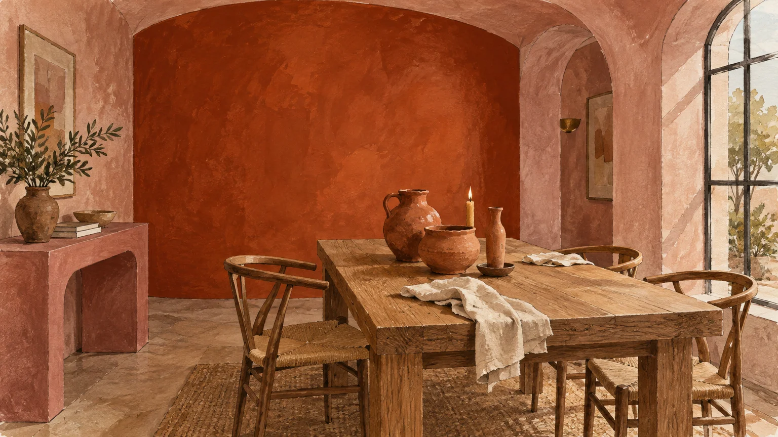
Trend #2: Sun-Baked Mineral Terracotta: Pueblo, Deep Rooted, and Rose Plaster
Dutch Boy Paints unveiled Deep Rooted (311-7DB) as its 2027 Color of the Year. This rich, earthy terracotta-orange brings authentic warmth and comforting earthiness into residential interiors.
Dutch Boy organizes this hue within three curated 2027 palettes: Essence, Bliss, and Clarity. Each collection explores how baked clay balances modern architectural lines.
Graham & Brown similarly embraced the earth with Rose Earth, its 2027 Color of the Year. This plaster-like dusty pink draws inspiration from natural Italian mineral pigments.
C2 Paint selected Pueblo (C2-510), an earthy hue bridging dusty desert pink and sun-baked terracotta. These pigments replace previous pastel pinks with deep geological authenticity.
Creating Intimate Gathering Rooms
Apply Deep Rooted in dining rooms and formal entryways to produce an immediate enveloping embrace. The baked reddish-orange undertones flatter warm skin tones during evening gatherings.
Pair Rose Earth with hand-troweled lime wash finishes on fireplace surrounds or bedroom walls. The uneven mineral texture adds artisanal craftsmanship and European country charm to modern rooms.
Natural Material Pairings
Contrast terracotta surfaces with oxidized brass lighting and caramelized walnut joinery. The rich timber stains and metallic sheens balance the dry, chalky quality of mineral paints.
Incorporate hand-thrown earthenware vessels, unglazed saltillo tile floors, and textured bouclé upholstery. These organic elements anchor the palette firmly in tactile, grounded simplicity.
Terracotta palettes thrive in north-facing living areas that struggle with cool, gray daylight. The concentrated orange and clay undertones actively counteract cold shadows throughout winter.
Use creamy chalk whites on ceiling planes rather than bright synthetic whites. Soft off-whites ensure a seamless, warm transition between walls and architectural trim.
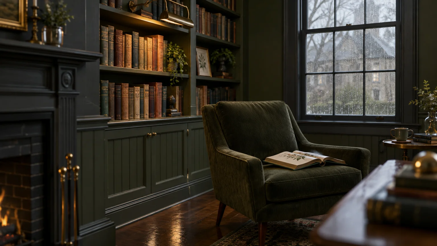
Trend #3: Heritage Forest: Webster Green, Grounded Olive, and Smoked Charcoal
Benjamin Moore selected Webster Green (HC-130), a distinguished heritage green, as its 2027 Color of the Year. This rich hue honors timeless architectural traditions while projecting modern confidence.
Webster Green follows Benjamin Moore’s 2026 Color of the Year, Silhouette (AF-655), an espresso-charcoal blend. Together, these shades demonstrate how deep forest colors can ground luxury interiors.
Behr also embraced deep foliage with Grounded (T27-01), its 2027 Color of the Year. This mossy olive green features heavy brown undertones that evoke dense woodland canopies.
Color Drenching for Introspective Spaces
Use full color drenching to turn home offices and media libraries into restorative retreats. Paint walls, trim, doors, and ceilings in Webster Green to blur architectural boundaries.
Layer your forest walls with antiqued cognac leather seating and quartersawn white oak millwork. The warm honey and caramel tones in the wood highlight olive undertones in the paint.
Tactile Stone and Textile Pairings
Incorporate deep green Verde Alpi marble or honed soapstone countertops on credenzas and vanities. The dark natural stone surfaces echo forest pigments while introducing cool mineral luxury.
Introduce heavy moss-toned mohair velvet, ribbed wool rugs, and washed Belgian linen curtains. Dense, sound-absorbing fabrics enhance the cocooning quality of dark forest interiors.
Incorporate cast bronze hardware and aged brass picture lights across dark millwork. The warm metallic reflections slice through the shadows, creating moody, high-end visual interest.
This deep woodland palette provides a welcome escape from digital overstimulation. It surrounds your private spaces with the timeless stillness of ancient, untouched forests.
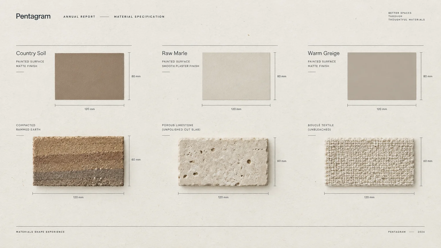
Trend #4: Sedimentary Foundations: Country Soil, Raw Marle, and Warm Greige
PPG named Country Soil (PPG15-30) as its 2027 Color of the Year. This warm, saturated neutral blends beige, taupe, and gray, drawing direct inspiration from clay and stone.
Country Soil anchors PPG’s global theme, Foundations, which includes the Solid Ground, Quiet Zone, and Life Shared palettes. These collections celebrate authentic, unadorned materials.
British heritage paint company Little Greene launched Marle as its 2027 Colour of the Year. Marle is a comforting mid-tone clay brown enriched with golden yellow and red undertones.
The Evolution of Warm Neutrals
Sedimentary neutrals permanently replace sterile grays and flat builder beiges. They reflect the visual complexity of limestone cliffs, dry riverbed silt, and raw European plaster.
You can coat whole open-concept floor plans in Country Soil without visual fatigue. The subtle taupe and clay pigments shift gracefully as natural sunlight changes throughout the day.
Masonry and Millwork Integration
Pair Marle with fluted limestone fireplace surrounds, microcement flooring, and travertine coffee tables. The shared mineral lineage unites architectural surfaces into a cohesive, quiet whole.
Add blackened iron lighting and raw umber oak furniture to prevent monochromatic rooms from feeling flat. Strong dark silhouettes ground the soft beige-gray walls.
Layer your sedimentary palette with coarse bouclé upholstery, thick jute carpets, and unrefined linen. Tactile fabrics provide depth and shadows that highlight the paint’s earthy undertones.
Use this versatile neutral in great rooms and primary suites. It establishes a calming architectural foundation that lets your art and furnishings take center stage.
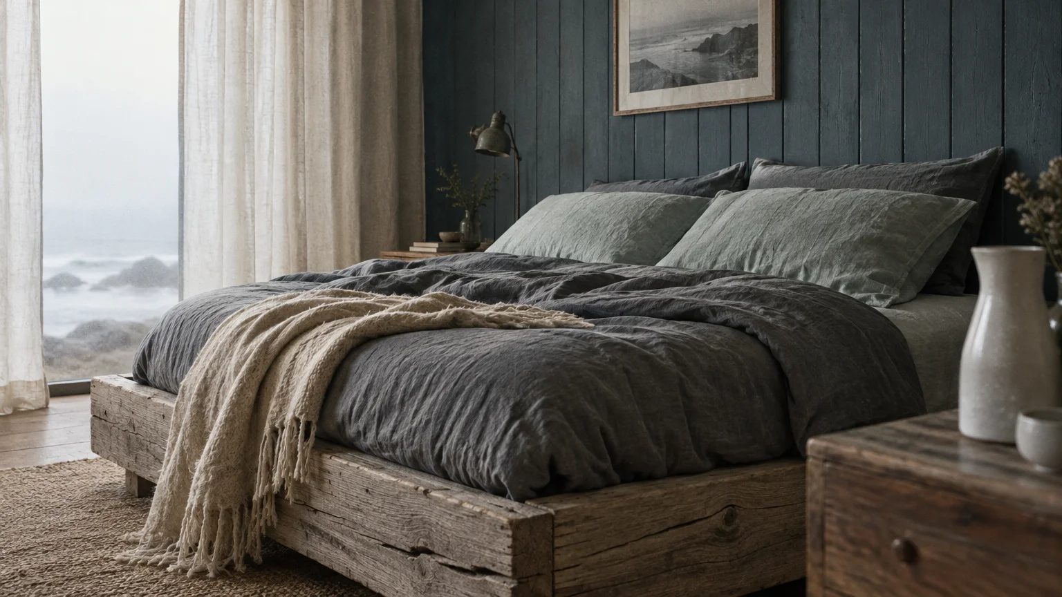
Trend #5: Weathered Shoreline: Smoky Slate, Artifact Blue, and Driftwood
Coastal design is shedding artificial nautical clichés in favor of weathered shoreline minerals. Glidden announced Artifact (PPG10-16), a warm and weathered smoky blue, as its 2027 Color of the Year.
Valspar selected Cottage Door (8004-38E), an earthy blue-gray with calm saline depth. Clark+Kensington introduced Vantage Point (38B-4), pairing this smoky blue with its warm neutral Drift and Mellow collections.
Smoky Coastal Atmospheres
WGSN and Coloro named Luminous Blue as their global 2027 Colour of the Year. Yet within residential interiors, designers favor muted, mineral-dense blues that echo river stones and coastal fog.
Artifact functions as a complex neutral rather than a loud accent color. You can apply it across kitchen cabinets, bathroom vanities, or mudroom cabinetry with lasting elegance.
Pairing Blues with Raw Driftwood
Combine weathered slate blues with bleached white oak flooring and wire-brushed driftwood furniture. The organic wood tones counteract cool blue pigments, keeping spaces warm and inviting.
Add honed Carrara marble countertops, soft gray zellige tiles, and brushed pewter hardware. These mineral finishes enhance the weathered seaside aesthetic without feeling themed.
Incorporate coarse linen drapes, chunky waffle-weave cotton blankets, and sea-salt ceramics. The soft textures bring tactile comfort into mineral-washed living rooms.
Morning sunlight emphasizes the slate-gray clarity within Artifact. During evening hours under warm lamp light, the paint shifts toward a tranquil, contemplative blue-charcoal tone.
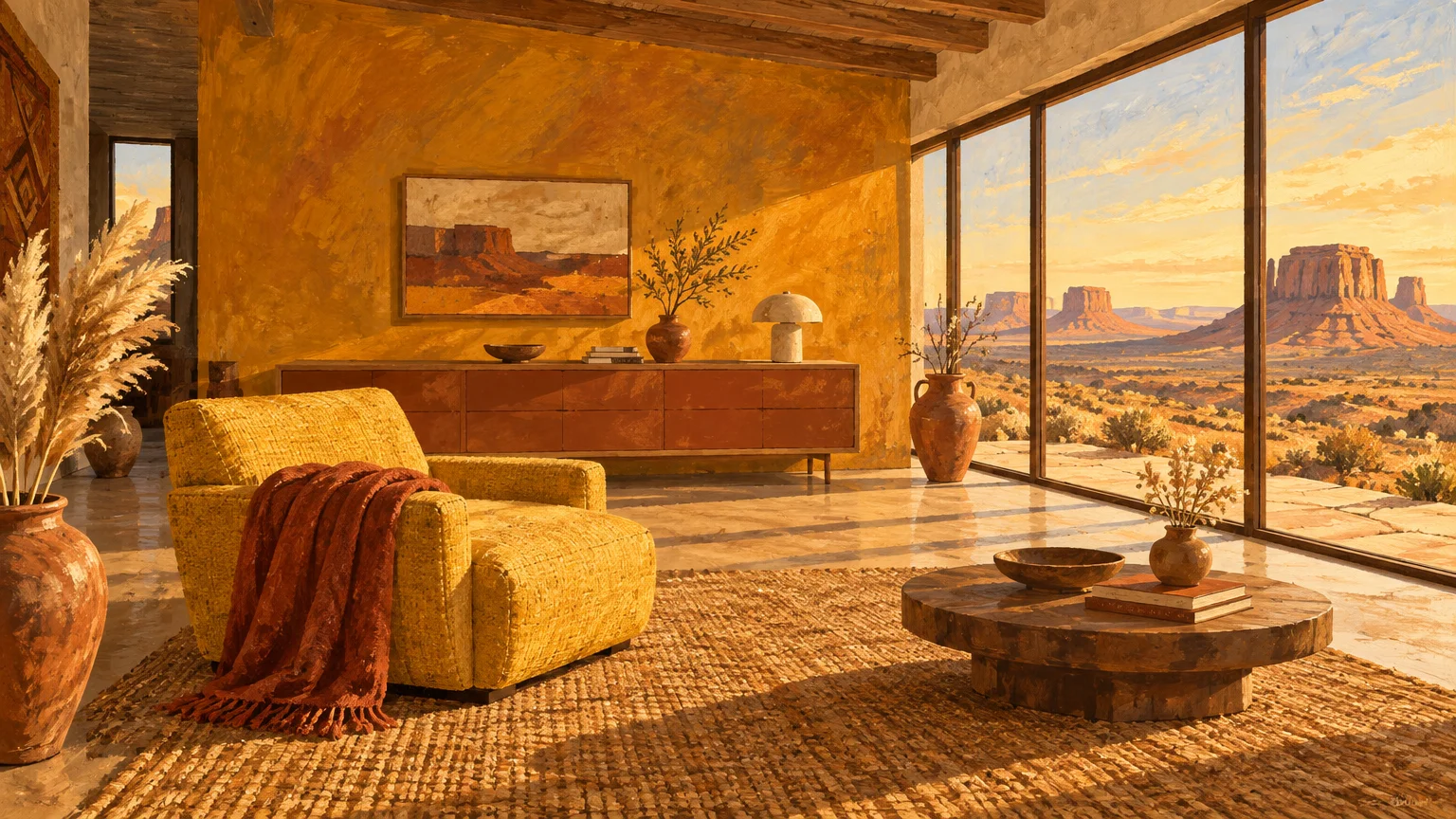
Trend #6: High-Desert Harvest: Russet, Maize, and Golden Ochre
WGSN and Coloro selected Russet (013-30-24) and Maize (036-65-23) for their Autumn/Winter 2027/28 forecast. These agrarian tones capture the spirit of sun-ripened crops and rich red-brown loam.
High-desert palettes celebrate the raw warmth of golden grain fields, toasted wheat, and sun-baked canyon cliffs. They deliver uplifting visual warmth without relying on aggressive, synthetic primaries.
Illuminating Social Spaces
Paint dining room walls or breakfast nooks in Maize to evoke permanent late-afternoon golden hour light. The warm ochre pigment stimulates appetite and encourages relaxed conversation.
Ground golden ochre walls with rich Russet leather armchairs or heavy twill draperies. The deep red-brown earth tone keeps the bright harvest yellow from feeling overly rustic.
Agrarian Textures and Materials
Incorporate handmade terracotta floor tiles, unpolished sandstone surfaces, and rough-sawn ceiling beams. These raw building materials reinforce the palette’s agrarian provenance.
Select patinated copper light fixtures and hammered brass cabinet hardware. The warm, living metals catch ambient room light and reflect the golden pigments across the room.
Layer your harvest interior with handwoven kilim rugs, natural wool cushions, and coarse linen slipcovers. These authentic textiles provide physical warmth that complements the visual heat of ochre.
This palette performs beautifully in west-facing living spaces. As the sun sets, the low-angled natural light turns harvest-toned rooms into glowing, radiant sanctuaries.
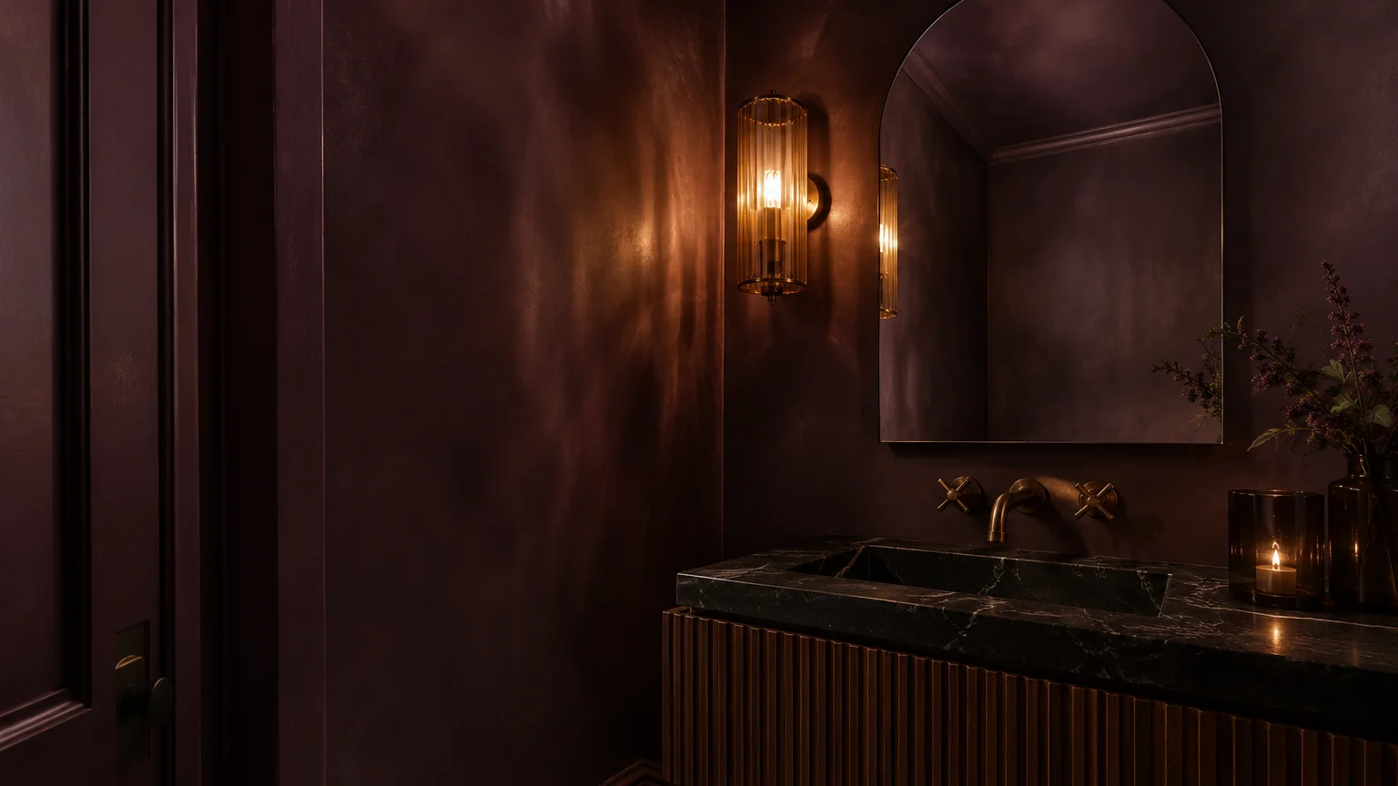
Trend #7: Moody Understory: Earthy Aubergine, Pelt Plum, and Dark Timber
Deep, soil-infused purples and plums are emerging as surprising, sophisticated neutral foundations for 2027. British paint maker Farrow & Ball reported a remarkable 63.5% jump in U.S. purple paint sales.
This surge between 2025 and 2026 was propelled by moody, complex shades like Pelt, a rich aubergine, and Brassica, a dusty mineral lavender. Homeowners are embracing these vegetable-dyed pigments.
Coloro reinforced this trend by spotlighting Peaceful Lilac (135-78-11) in its 2027/28 forecast. These purple pigments function like umber and dark walnut rather than bright confectionery tones.
Intimate Bedroom and Lounge Design
Drench a primary bedroom or cocktail lounge in deep Pelt to create an intoxicating, cocoon-like atmosphere. The deep aubergine absorbs excess daylight, fostering restful relaxation and deep evening calm.
Combine dark plum walls with deep espresso wood furniture and smoked bronze sconces. The dark wood grain anchors the purple pigment, making it feel organic and architectural.
Velveteen Textures and Metallic Contrast
Layer dusty lavender mohair pillows against dark brown leather sofas. The delicate color contrast softens heavy timber pieces, introducing quiet luxury into your living room.
Install unlacquered antique brass hardware across doors and cabinets. The gleaming gold reflections slice through moody plum shadows, creating a high-contrast European salon aesthetic.
Select ultra-flat matte or eggshell paint sheens for dark plum walls. Low-sheen finishes prevent distracting light glare and preserve the velvety, earth-bound quality of the pigment.
This brooding palette offers a compelling departure from standard charcoal and navy. It injects poetic individuality and historic sophistication into private domestic sanctuaries.
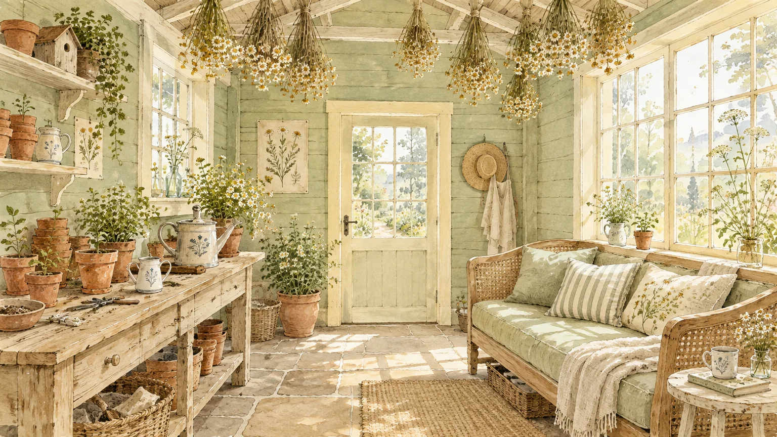
Trend #8: Rewilded Meadow: Soft Celery, Wild Chamomile, and River Sand
Sherwin-Williams structured its 2027 Colormix Forecast around Rewild, showcasing 48 nature-inspired shades and 10 Continuity Colors. This trend reflects a cultural longing for untamed meadows and biodiverse landscapes.
WGSN and Coloro echo this ecological direction with Deep Green (082-30-14). The forecast captures the contrast between delicate field flowers and dense, shaded grass roots.
Constructing a Meadow Palette
Establish your foundation with warm chamomile white and river sand tones on main walls. Then, layer accents of soft Celery green and deep moss across built-in joinery.
Incorporate woven botanical wall coverings or subtly patterned linen window treatments. Choose delicate organic abstractions that evoke prairie grasses rather than heavy, traditional floral motifs.
Pale Wood and Tactile Accessories
Finish oak flooring and bespoke cabinetry with Minwax Pickled Oak (MW260). The pale stain lets natural wood grains shine through while maintaining a light, meadow-inspired aesthetic.
Add hand-pinched ceramic vases, coarse wool throws, and unbleached cotton cushions. These artisanal accessories bring tactile warmth and celebrate the quiet beauty of natural imperfection.
Introduce aged iron or blackened bronze accents to anchor the pale meadow tones. Thin metal table legs and picture frames provide modern structure without disrupting the peaceful organic mood.
This botanical scheme excels in master suites and spa-inspired bathrooms. It turns personal spaces into peaceful retreats that honor the regenerative rhythms of the natural world.
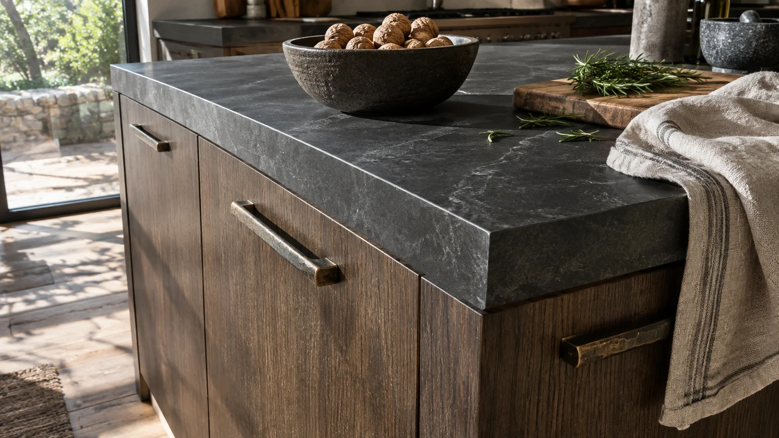
Trend #9: Volcanic Earth: Smoked Umber, Cast Bronze, and Basalt Slate
Earthy interior design is discovering new depth through charred timber and volcanic minerals. Benjamin Moore signaled this direction with Silhouette (AF-655), an earthy blend of espresso and charcoal.
Volcanic earth tones replace synthetic, clinical blacks with rich, tactile umbers and dark slate. They establish strong architectural boundaries within open-plan modern homes.
Monolithic Focal Points
Anchor large living rooms with a smoked umber accent wall or a dark basalt stone fireplace. The brooding mineral surface commands visual attention and provides enduring structural permanence.
Pair deep charcoal-brown walls with honed travertine slabs, caramel leather lounge chairs, and brushed brass lighting. The dramatic contrast between pale stone and dark pigment embodies quiet luxury.
Charred Wood and Forged Hardware
Incorporate shou sugi ban charred timber paneling and forged cast iron cabinet handles. These volcanic materials celebrate ancient elemental craftsmanship and textural resilience.
Soften dark volcanic architecture by adding plush taupe cashmere throws, shearling cushions, and hand-knotted wool rugs. Rich tactile textiles ensure the space feels inviting rather than stark.
Use focused accent spotlights rather than bright overhead ceiling fixtures. Directional lighting grazes textured volcanic stone, revealing subtle chocolate and mineral-red undertones within dark surfaces.
This grounded palette provides protective weight and timeless elegance in contemporary homes. It surrounds you with the enduring strength and geological beauty of deep volcanic soil.
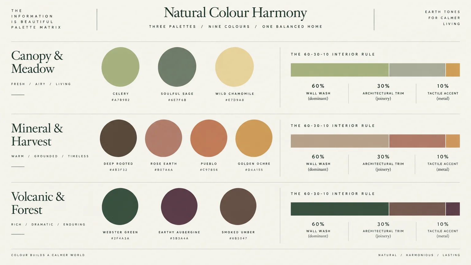
The Big Picture: Weaving These Trends into Your Home
Embracing 2027 earthy color palettes does not require a disruptive, whole-home renovation. You achieve the most enduring results by introducing colors that honor your home’s existing architecture and lighting.
Always test large paint swatches on multiple walls before committing to a full room makeover. Observe how pigments change across morning, afternoon, and artificial evening lighting.
Build your color story around your home’s fixed architectural finishes. Match wall paints to existing hardwood stains, stone fireplaces, and floor tiles before selecting accent colors.
If you hesitate to paint full walls in saturated shades, start with smaller accents. Try painting an interior door in Webster Green or adding velvet cushions in Pelt plum.
Maintain cohesive flow between adjoining spaces by selecting an anchoring neutral. Use versatile sedimentary tones like Country Soil or Marle in connecting corridors and entry halls.
Invest in authentic, natural materials like pickled oak, honed travertine, and raw linen. Quality organic materials outlast fleeting micro-trends and look better with age.
Balance your color choices with your home’s natural light orientation. Cool north-facing rooms require warm terracotta and maize, while sunny south-facing spaces flourish with botanical celery and sage.
For the latest color forecasts, consult industry leaders like Pantone and paint companies like Benjamin Moore. For professional design standards, refer to the American Society of Interior Designers (ASID).
Disclaimer: This article reflects design trend analysis and predictions. Personal taste and timeless design principles should always guide your decorating choices.
Frequently Asked Questions
How do I combine cool earthy greens with warm terracotta tones without clashing?
You can harmonize cool botanical greens with warm terracottas by anchoring them with a stone-inspired neutral. Use taupe or greige like Country Soil on trim or millwork between them.
Ensure that both your green and terracotta paints feature matte or chalky finishes. Shared mineral sheens help contrasting warm and cool tones blend organically, just like in nature.
Why are dark, moody purples and plums considered earthy neutrals for 2027?
Modern plums like Farrow & Ball’s Pelt are derived from deep soil tones and botanical dyes. Their heavy brown undertones allow them to ground spaces like charcoal or dark walnut.
Farrow & Ball recorded a 63.5% surge in purple paint sales precisely because these shades add dramatic warmth. They provide an atmospheric, earthy alternative to sterile grays and dark navies.
Which earthy color palette works best for small rooms with limited natural light?
Small spaces with limited natural light benefit from warm mineral tones like Graham & Brown’s Rose Earth. The clay-pink pigments reflect warm ambient light, preventing corners from feeling shadowy or cold.
Alternatively, embrace the lack of light by color drenching in Webster Green or Grounded olive. Enveloping dark colors blur room edges, creating an intimate, jewel-box sanctuary.
How can I make sure these 2027 color trends will not look dated in five years?
Focus on authentic mineral pigments, chalky matte sheens, and natural building materials. Earth tones drawn from stone, clay, and foliage have remained timeless interior foundations across centuries of design.
Avoid pairing earthy colors with trendy synthetic materials or overly thematic decor. Grounding your palette with classic wood millwork and vintage furnishings guarantees lasting sophistication.