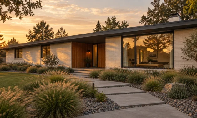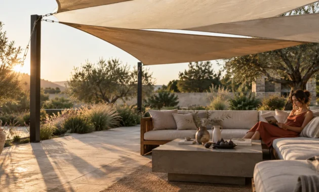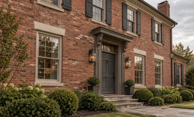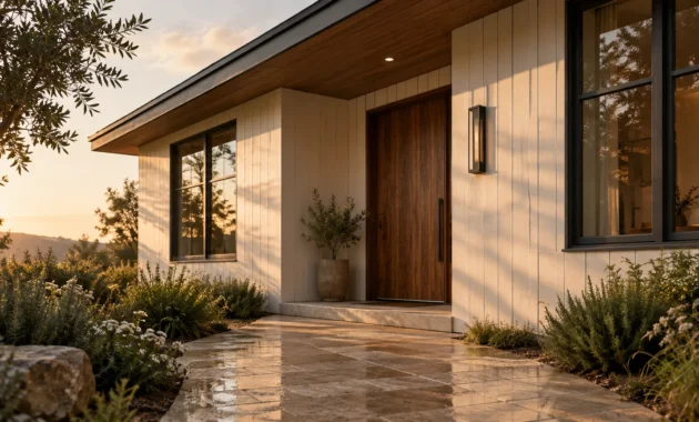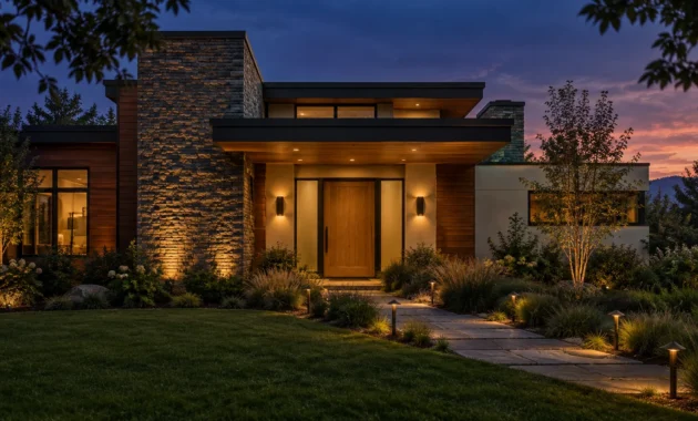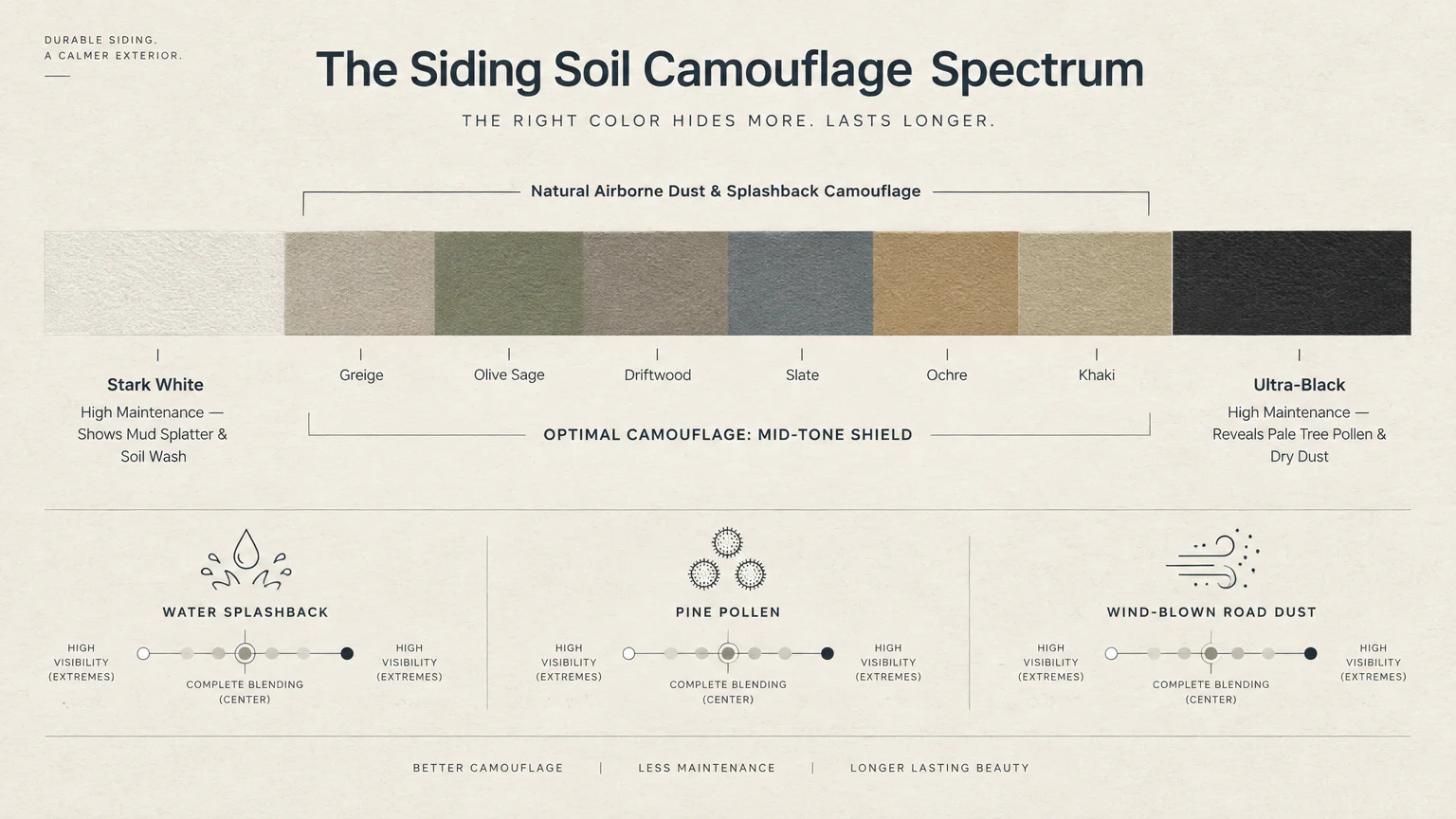
Selecting low maintenance siding colors preserves your home’s architectural beauty and saves you countless hours of power washing. The best siding colors disguise airborne dust, pollen, and splashback by mirroring the natural hues of your surrounding landscape.
While stark whites reveal every splash of mud and ultra-dark blacks expose pale pollen, mid-tone shades offer the ideal aesthetic camouflage. These nuanced tones bridge exterior durability with sophisticated curb appeal.
Today’s exterior palettes seamlessly echo the quiet luxury and grounded elegance found inside modern living spaces. Exploring these low maintenance siding colors will help you curate a cohesive, resilient home envelope.
Trend #1: Earthy Greige and Warm Mineral Taupe
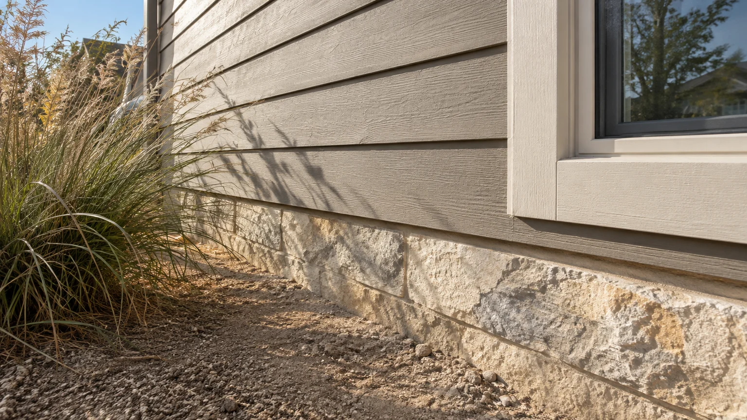
Earthy greige merges stone gray with warm beige, creating an adaptable neutral that naturally conceals environmental grime. This balanced undertone ensures that dry soil particles and road dust simply blend into the facade.
Because exterior siding colors endure windblown grit daily, greige functions as an intuitive shield against routine weathering. It effortlessly balances light reflection with dust concealment.
In luxury architecture, greige establishes an organic transition between your facade and interior living spaces. It pairs effortlessly with natural limestone pathways and wide-plank European oak flooring indoors.
You can pair mineral taupe siding with creamy linen window trims to create soft, dimensional contrast. This combination mirrors the serene minimalism celebrated in contemporary open-plan dining rooms.
Designers favor this versatile hue because it conceals water spots after heavy storms without dulling your home’s exterior presence. It maintains a clean, intentional silhouette throughout every season.
When selecting house siding ideas, choosing a warm greige guarantees both timeless curb appeal and significantly reduced wash cycles. It remains a foundational shade for enduring design.
Mineral pigments ground the structure, making your residence appear deeply settled into its native terrain. You gain effortless exterior beauty that resists the unruliness of everyday weather.
Trend #2: Deep Forest Olive and Biophilic Sage
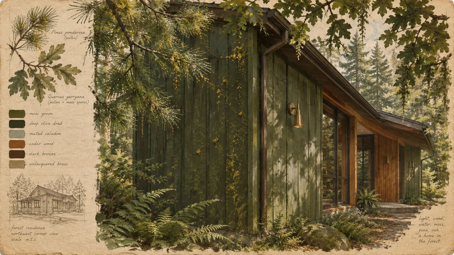
Biophilic design continues to dominate high-end residences, making forest olive one of the best siding colors for nature-immersed properties. Its organic pigmentation disguises tree pollen, moss residue, and garden debris.
Standard siding often highlights green algae buildup, especially on north-facing elevations sheltered from direct sunlight. Olive and sage tones absorb these organic blemishes effortlessly.
This earthy palette creates visual harmony by anchoring your home firmly within surrounding trees and plantings. It softens rigid architectural angles into lush, restorative sanctuaries.
By extending this palette inward, you establish immediate indoor-outdoor continuity with your interior living spaces. Forest olive exteriors transition beautifully into potted botanical displays and moss-toned velvet dining room seating.
Complement sage siding with unlacquered brass hardware, dark bronze gutters, and warm cedar accents. These textural pairings evoke an artisanal, quiet luxury that ages with grace.
For homeowners nestled near woods or open fields, muted olive siding offers unrivaled resilience against environmental staining. You spend less time scrubbing and more time enjoying your landscape.
The natural depth of olive reflects light softly, diffusing dust layers during dry summer stretches. It imbues your exterior architecture with enduring botanical character.
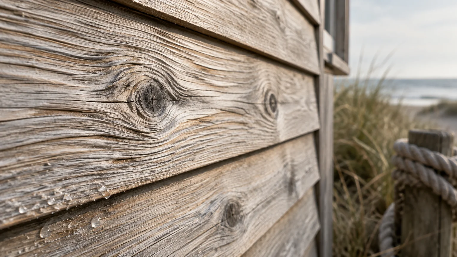
Trend #3: Weathered Driftwood and Muted Cedar
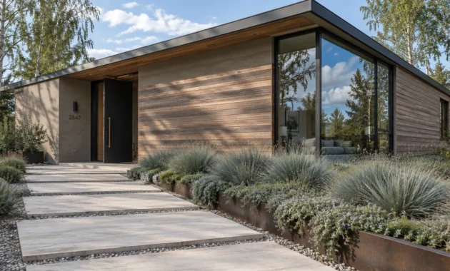
Weathered driftwood captures the quiet elegance of sun-bleached timber while disguising lawn dust and mud splatters. Its multi-tonal grain effect provides built-in visual camouflage.
Pure flat pigments often spotlight surface imperfections, but driftwood tones celebrate natural organic variation. Splashes from heavy rainstorms dry inconspicuously across its textured surface.
This finish reflects the wabi-sabi design philosophy, which embraces natural patinas and enduring materials. It brings a grounded, coastal sophistication to modern exterior siding colors.
Inside your residence, this aesthetic pairs naturally with reclaimed timber consoles, neutral boucle sofas, and organic jute area rugs. The resulting dialogue between exterior and interior feels curated and tranquil.
Pair driftwood composite siding with matte black window frames to add modern architectural discipline. This crisp boundary keeps the weathered wood aesthetic looking intentional and polished.
If you seek low maintenance siding colors that evoke effortless relaxation, muted cedar tones deliver unrivaled durability. They mask airborne debris while exuding timeless architectural pedigree.
The layered undertones in driftwood mimic shifting shadows, making ambient soot virtually invisible. Your exterior stays fresh despite heavy winds and seasonal storms.
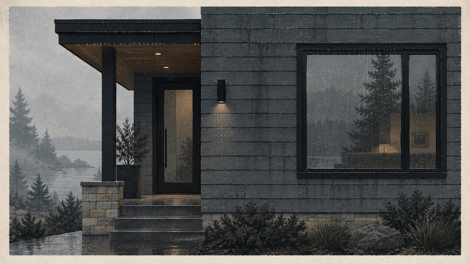
Trend #4: Charcoal Slate and Foggy Graphite
Charcoal slate provides deep, dramatic moodiness without the unforgiving maintenance demands of pitch black. Its misty graphite undertones mask soot, urban exhaust, and ambient air pollution.
Jet black exterior finishes often showcase chalking, hard water streaks, and light dust within days. In contrast, slate gray diffuses sunlight to hide those common surface deposits.
This sophisticated color trend anchors modern farmhouse and Scandinavian-inspired architecture with equal poise. It delivers an imposing yet understated curb appeal that commands respect.
The brooding elegance of charcoal siding sets the stage for moody, atmospheric interior foyers and dining rooms. It naturally connects with smoked oak finishes, fluted millwork, and polished concrete flooring.
Balance foggy graphite siding with white plaster porticos and honey-toned timber soffits. This thoughtful interplay prevents dark siding from appearing excessively monolithic or heavy.
Slate siding remains a premier option for urban and suburban residences exposed to roadway dust. It conceals daily grime while maintaining a sharp, high-contrast exterior profile.
The stony coolness of graphite grounds large vertical walls, masking imperfections in older cladding materials. You attain dramatic contrast without resigning yourself to regular washing.
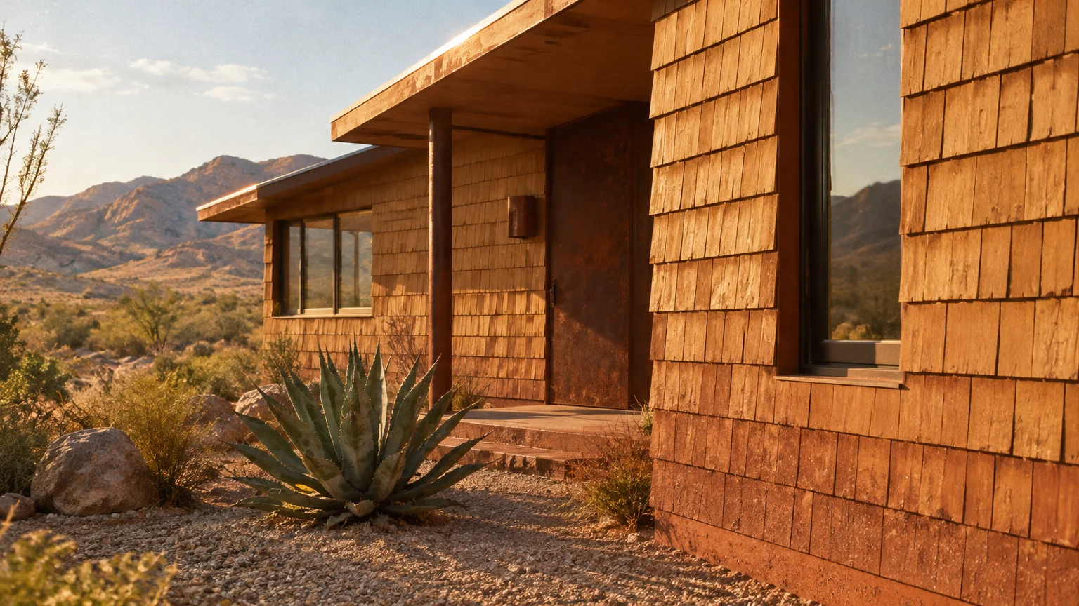
Trend #5: Desert Ochre and Sun-Baked Clay
Inspired by arid landscapes, desert ochre and terracotta bring comforting warmth to residential exteriors. Their mineral-rich pigmentation camouflages reddish soil splatters, clay dust, and dry summer grime.
Homes situated in dry or windy climates frequently suffer from clinging topsoil and fine dust clouds. Sun-baked clay tones absorb these particles naturally without appearing discolored.
This trend aligns with the global resurgence of warm Mediterranean and Southwestern residential architecture. It replaces cold, industrial grays with comforting, sun-kissed tranquility.
Inside the home, desert clay exteriors harmonize with terracotta floor tiles, lime-washed plaster walls, and linen drapery. This tactile continuity generates an inviting, grounded ambiance from room to room.
Contrast ochre siding with copper downspouts and olive-toned entry doors for a curated, historic appearance. The warm metal and foliage tones enrich the siding’s baked-earth undertones.
Choosing sun-baked hues ensures your property retains its chromatic richness despite dusty weather patterns. It is an exceptional solution among siding colors that hide dirt.
The natural warmth of clay softens direct midday sunlight, preventing glaring reflections on broad facade expanses. It wraps your residence in welcoming, resilient earth tones.
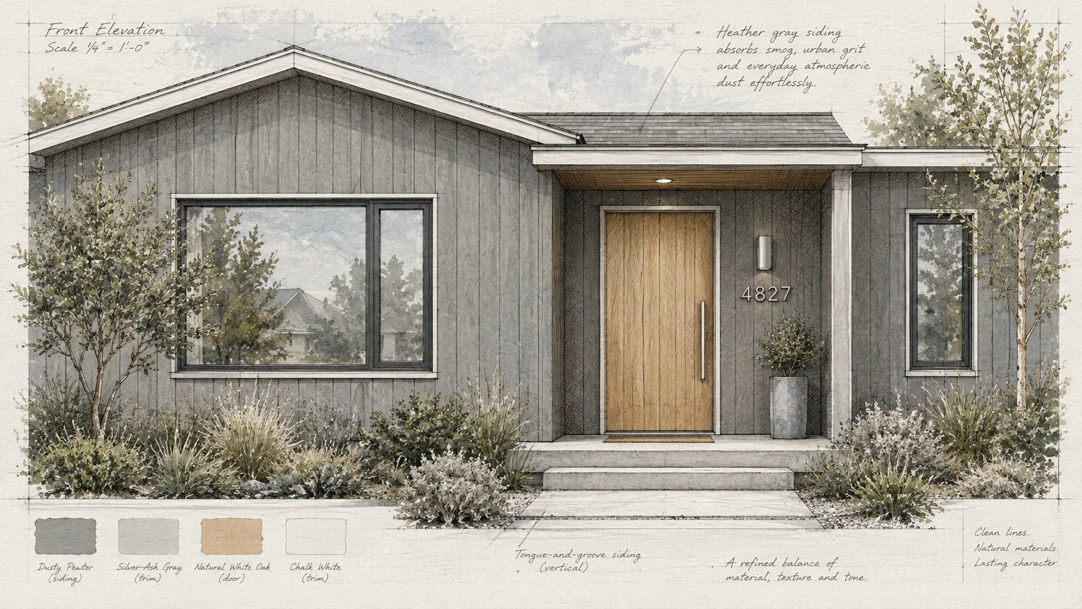
Trend #6: Dusty Pewter and Heather Gray
Dusty pewter offers a sophisticated medium-gray finish that neutralizes the visibility of neighborhood pollution and airborne pollen. Its balanced chromatic depth prevents it from looking dingy over time.
Light grays often reveal rain streaks, while dark charcoals magnify powdery deposits. Heather gray occupies the sweet spot between these two extremes.
This versatile mid-tone fits seamlessly into both historic Victorian facades and transitional suburban builds. It carries an understated authority that feels consistently fresh and pristine.
When transitioning indoors, dusty pewter echoes the soft architectural palettes seen in contemporary living rooms. It complements brushed nickel hardware, marble mantels, and cool wool carpets.
Pair pewter siding with crisp off-white fascia and flagstone entryways to craft an elegant facade. This balanced contrast defines your home’s roofline without demanding frequent exterior detailing.
For homeowners wanting a timeless neutral with minimal upkeep, heather gray remains a premier exterior choice. It disguises ambient grime while delivering enduring dignity.
This shade adapts effortlessly to shifting daylight, appearing soft and silver in mornings and warmer at dusk. It hides roadway film without losing its refined luster.
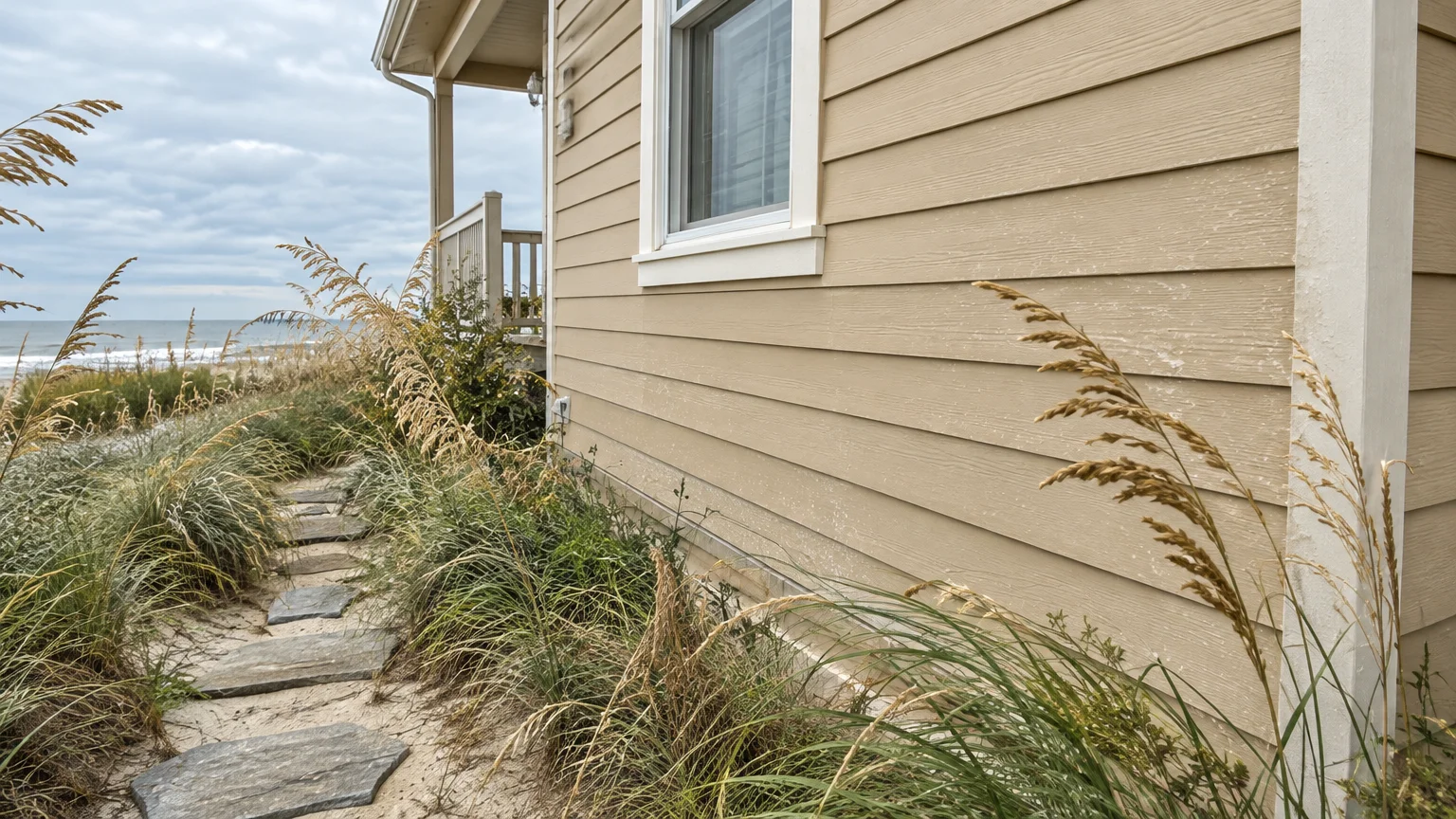
Trend #7: Coastal Wheat and Spun Straw
Coastal wheat mimics the golden undertones of dried grasses, offering radiant warmth that conceals yellow pollen blooms. It is particularly effective for homes surrounded by flowering trees and open meadows.
Springtime pollen blankets dark siding in a persistent chartreuse film that requires continuous rinsing. Spun straw tones blend seamlessly with this seasonal dusting, masking it completely.
This sunny neutral also obscures dried mud splatters from lawn mowers and perimeter garden beds. It delivers the cheerful luminosity of pale yellow without showing wear.
You can mirror this warm exterior radiance inside your kitchen and dining areas using cane cabinetry and blonde maple furnishings. The cohesive light flow creates a bright, restorative atmosphere.
Frame wheat-colored siding with bright ivory trim and sandstone garden edging for crisp architectural definition. This layering lends your exterior an upscale, sun-drenched resort aesthetic.
Coastal wheat stands out as one of the best siding colors for high-pollen regions. It maintains a welcoming, spotless appearance throughout peak spring and summer conditions.
Warm straw undertones provide a sunny glow even under gray, overcast skies. Your home looks vibrant and clean without weekly pressure washing sessions.
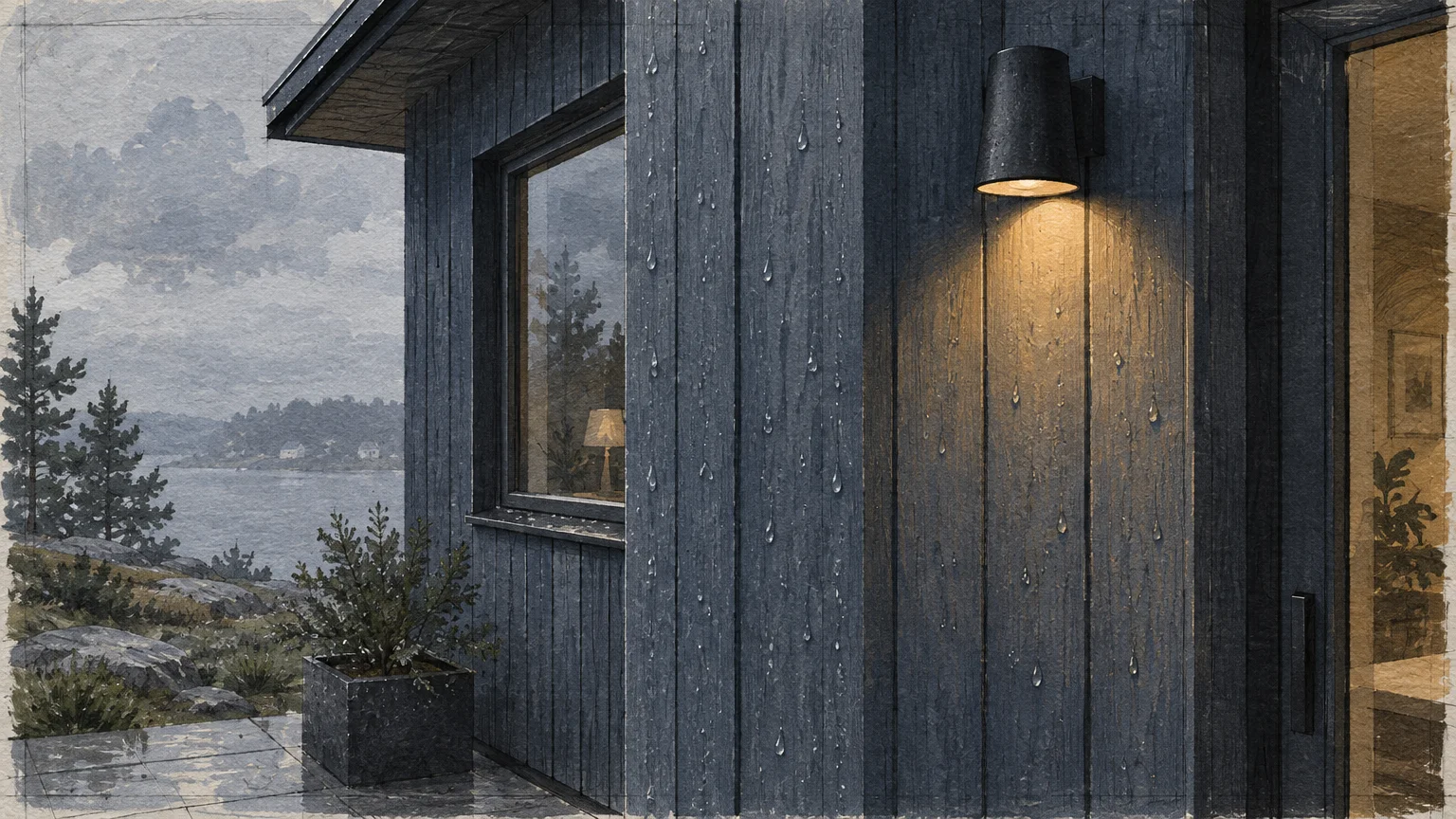
Trend #8: Stormy Blue-Gray and Muted Indigo
Stormy blue-gray infuses exterior architecture with refined maritime drama while providing stellar soil concealment. Its complex charcoal undertones mask splashback and road grime effortlessly.
Standard royal blues show chalking and salt deposits quickly, but desaturated indigo weathers exposure gracefully. It provides deep color saturation without emphasizing exterior imperfections.
This moody blue hue captures the quiet strength of overcast coastal skies. It lends historic estates and modern cottages a tailored, distinctly designer-grade presence.
Connecting this exterior shade to interior palettes creates an immersive design journey. It flows effortlessly into navy-accented libraries, velvet-appointed living rooms, and slate-tiled entryways.
Elevate muted indigo siding with crisp white window mullions and unpainted cedar shingles on accent gables. The vibrant contrast highlights architectural peaks while the siding hides base-level splashback.
For homeowners craving distinct character alongside practical resilience, stormy blue-gray delivers unmatched longevity. It conceals daily weathering while offering bold, sophisticated charm.
The smoky indigo base reflects minimal glare, preventing dust accumulation from standing out in high sun. It offers a stately alternative to conventional exterior neutrals.
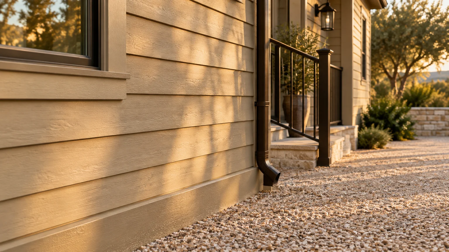
Trend #9: Toasted Almond and Creamy Khaki
Toasted almond captures the airy elegance of off-white while incorporating sufficient pigment to disguise foundation splashes. It provides a luminous facade without the demanding upkeep of stark white.
Pure white siding showcases water runoff lines, dead insects, and lawn debris within days of cleaning. Creamy khaki integrates gentle stone pigments that diffuse these everyday blemishes.
This shade reflects the quiet luxury ethos, which favors understated, layered neutrals over harsh contrasts. It imparts your exterior with a stately, sunlit gentility.
In your interior spaces, toasted almond pairs seamlessly with warm travertine fireplaces, cashmere throws, and oatmeal linen upholstery. The home feels unified, welcoming, and thoughtfully designed from every angle.
Accentuate creamy khaki siding with deep espresso front doors and dark bronze exterior lighting. This visual weight anchors the soft siding, establishing a balanced, high-end exterior envelope.
If you adore light exterior siding colors but dread frequent washing, toasted almond is your perfect compromise. It delivers bright sophistication with remarkably low maintenance requirements.
By selecting this warm stone tone, you protect your facade from harsh visual degradation after stormy weather. Your house siding ideas remain timeless and wonderfully practical.
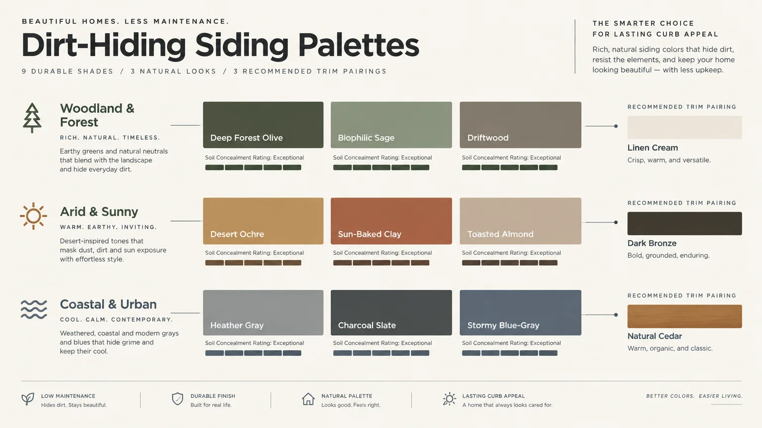
The Big Picture: Weaving These Trends into Your Home
Designing an enduring home requires harmonizing low maintenance siding colors with your interior design philosophy. A thoughtful exterior finish should never exist in isolation from your living spaces.
Look at your home as a continuous sensory experience from the curb to the dining table. Matching exterior undertones with interior wood species, textiles, and wall finishes creates effortless aesthetic continuity.
Evaluate your local environment carefully before committing to specific house siding ideas. Take note of native soil color, surrounding foliage, and seasonal pollen density to pick the most concealing shade.
Sample your top paint and siding contenders on different sides of your home across various times of day. Morning sunlight reveals yellow undertones, while late afternoon shadows emphasize cooler gray pigments.
Invest in premium siding materials with factory-baked finishes to enhance dirt resistance even further. Advanced coatings resist dirt adhesion and UV fading, keeping your chosen palette pristine for decades.
A well-chosen siding color elevates your home’s architectural integrity while granting you peace of mind. By balancing color science with refined aesthetics, you achieve timeless, effortless luxury.
Consider how exterior light filters into your interior living rooms through large picture windows. Siding undertones subtly tint natural daylight, reinforcing the emotional warmth and mood of your indoor spaces.
Frequently Asked Questions
Why does pure white siding show dirt so quickly?
Pure white creates maximum chromatic contrast against dark soil, tree pollen, and rain splatter. Even microscopic dust particles disrupt its reflective surface, making grime immediately noticeable to the human eye.
Choosing warm alternatives like greige or toasted almond softens that stark contrast. These nuanced tones disguise ambient debris while preserving a bright, welcoming exterior aesthetic.
Can dark siding colors hide dirt as effectively as mid-tones?
Very dark siding, especially matte black, frequently shows pale dust, dried hard water spots, and pollen. It functions much like a black car, requiring frequent washing to appear clean.
Mid-tone shades like charcoal slate or muted olive perform far better over time. They offer dramatic visual depth while camouflaging both light airborne dust and darker garden splashes.
How do siding color choices influence interior color palettes?
An exterior color sets expectations for your entire living environment before guests step inside. Selecting complementary undertones creates a cohesive narrative between the facade, entryway, and central living rooms.
For instance, exterior sage siding creates a soothing transition into biophilic indoor plants and natural stone flooring. This deliberate flow elevates your home’s holistic architectural character.
Which siding finishes are easiest to maintain long term?
Low-luster satin and matte finishes generally hide surface imperfections and water spots better than high-gloss coatings. High-gloss sheens accentuate exterior surface flaws and dirt accumulation under direct sunlight.
Furthermore, textured or embossed composite materials provide micro-shadows that diffuse dust. When paired with mid-tone earth shades, these finishes deliver superior low-maintenance longevity.
For the latest color forecasts, consult industry leaders like Pantone and paint companies like Benjamin Moore. For professional design standards, refer to the American Society of Interior Designers (ASID).
Disclaimer: This article reflects design trend analysis and predictions. Personal taste and timeless design principles should always guide your decorating choices.