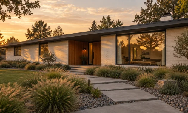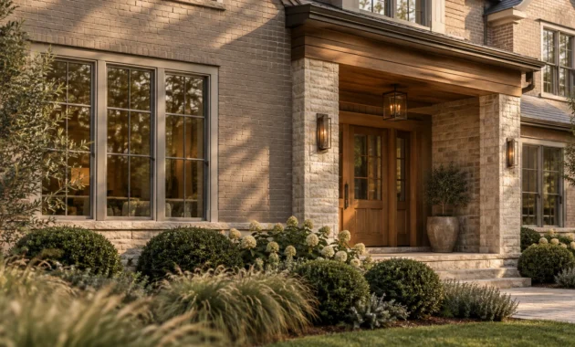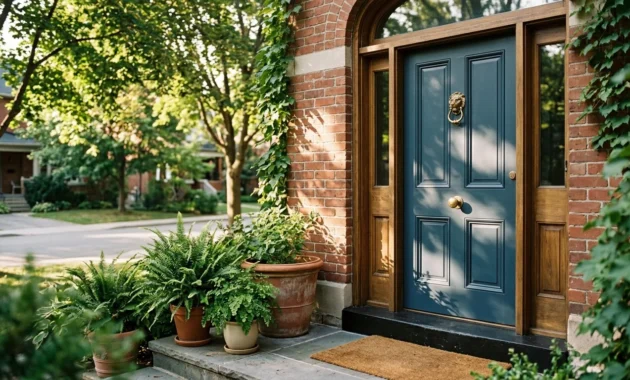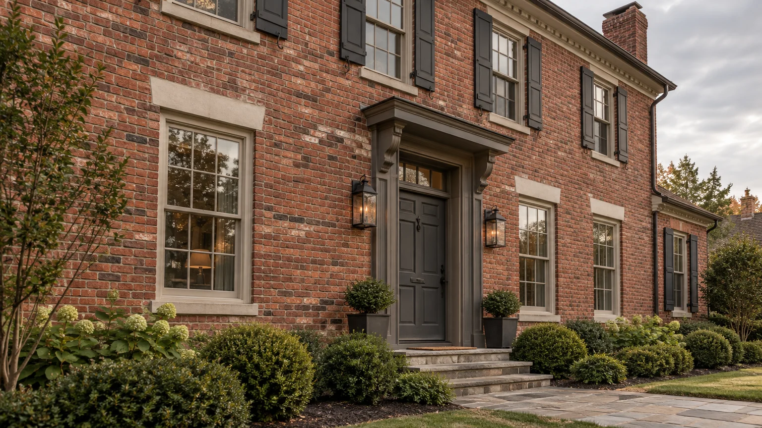
Choosing the right exterior paint colors for brick homes transforms your facade from dated to commanding. Selecting colors that pair with brick unlocks immediate curb appeal and elevates your property’s architectural provenance.
Natural masonry carries permanent undertones—ranging from iron red to weathered ochre—that dictate your exterior palette. The right trim and siding hues will harmonize these natural textures effortlessly.
From moody charcoals to organic sage, sophisticated palettes modernize traditional masonry while honoring historic craftsmanship. Explore nine vetted brick house exterior color ideas designed to maximize aesthetic cohesion and market value.
Trend #1: Deep Charcoal and Architectural Graphite
Saturated charcoals and deep graphites introduce an alluring sense of quiet luxury to classic brick facades. This high-contrast pairing grounds traditional red brickwork, delivering a crisp, tailored aesthetic.
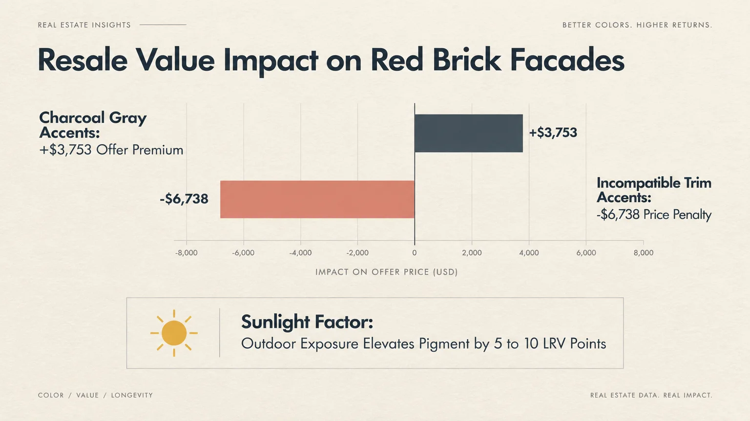
Real estate metrics highlight the tangible value of this deliberate aesthetic contrast. Zillow’s June 2026 Exterior Paint Color Study revealed that charcoal gray accents paired with red brick homes commanded a $3,753 offer premium.
Conversely, incompatible accent selections degraded prospective buyer offers by as much as $6,738. Buyers respond enthusiastically when dark trim frames masonry, perceiving the home as thoroughly modern yet structurally substantial.
Deep shades like iron ore and soft obsidian sharpen exterior millwork, gables, and window sashes. They transform rustic red brick from dated to intentional and sophisticated.
Outdoor lighting naturally softens dark pigments across your exterior elevation. Direct sunlight elevates exterior paint by 5 to 10 Light Reflectance Value (LRV) points, preventing charcoal trim from appearing overly severe outdoors.
Use architectural graphite on front entry doors, garage framing, and gutters to create crisp visual borders. These bold lines celebrate the tactile masonry beneath while giving your home modern definition.
Trend #2: Tailored Warm Greige
Warm greige establishes an effortlessly refined bridge between contemporary minimalism and traditional clay masonry. It merges cool gray stability with warm beige comfort, providing an elegant alternative to stark white.
Industry valuation data reinforces this enduring color preference. Zillow’s 2025–2026 Paint Color Analysis found that homes featuring greige exterior accents and siding sold for $3,496 more than comparable houses with medium brown or tan siding.
In contrast, yellow exterior pairings penalized sale prices by approximately $3,400. Yellow clashes with red brick undertones, creating visual friction that repels discerning homebuyers.
As one of the best siding colors for brick, warm greige harmonizes directly with natural mortar joints. This tonal alignment diminishes the visual heaviness of red brick while highlighting intricate masonry patterns.
Greige also provides an organic, grounding presence on transitional and modern farmhouse elevations. It allows natural daylight to warm the facade without introducing chalky yellow or cold blue casts.
Apply warm greige across horizontal lap siding, porch columns, and garage doors. It functions as a luxurious, neutral canvas that allows the authentic provenance of your brick to shine.
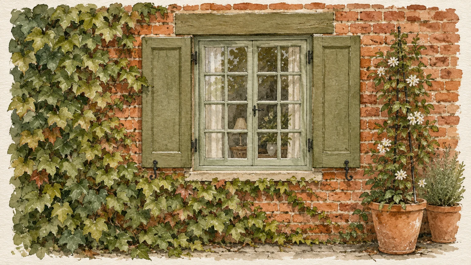
Trend #3: Biophilic Sage and Muted Olive
Green and red sit directly opposite one another on the color wheel, establishing innate chromatic harmony. Muted sage and earthy olive celebrate this biophilic relationship without feeling festive or overwhelming.
Modern exterior design embraces biophilic palettes that connect residential structures with surrounding botanical landscapes. Soft, gray-infused greens blur the visual perimeter between lush foundation plantings and structural brickwork.
When curating complementary colors for brick exteriors, choose desaturated greens containing complex gray undertones. Pure emerald tones clash aggressively, whereas weathered eucalyptus and mossy olive accentuate natural clay hues.
These botanical shades excel on board-and-batten siding additions and exterior window shutters. They soften the hard, rigid edges of masonry, creating an inviting, organic street presence.
Natural sunlight shifts sage tones fluidly throughout the day, revealing silvery undertones at noon and warm olive hues at twilight. This dynamic character gives your facade an enduring, living warmth.
Pair muted sage with bronze light fixtures and oiled wood doors for a cohesive, nature-inspired palette. The combination honors your home’s structural heritage while projecting understated modern luxury.
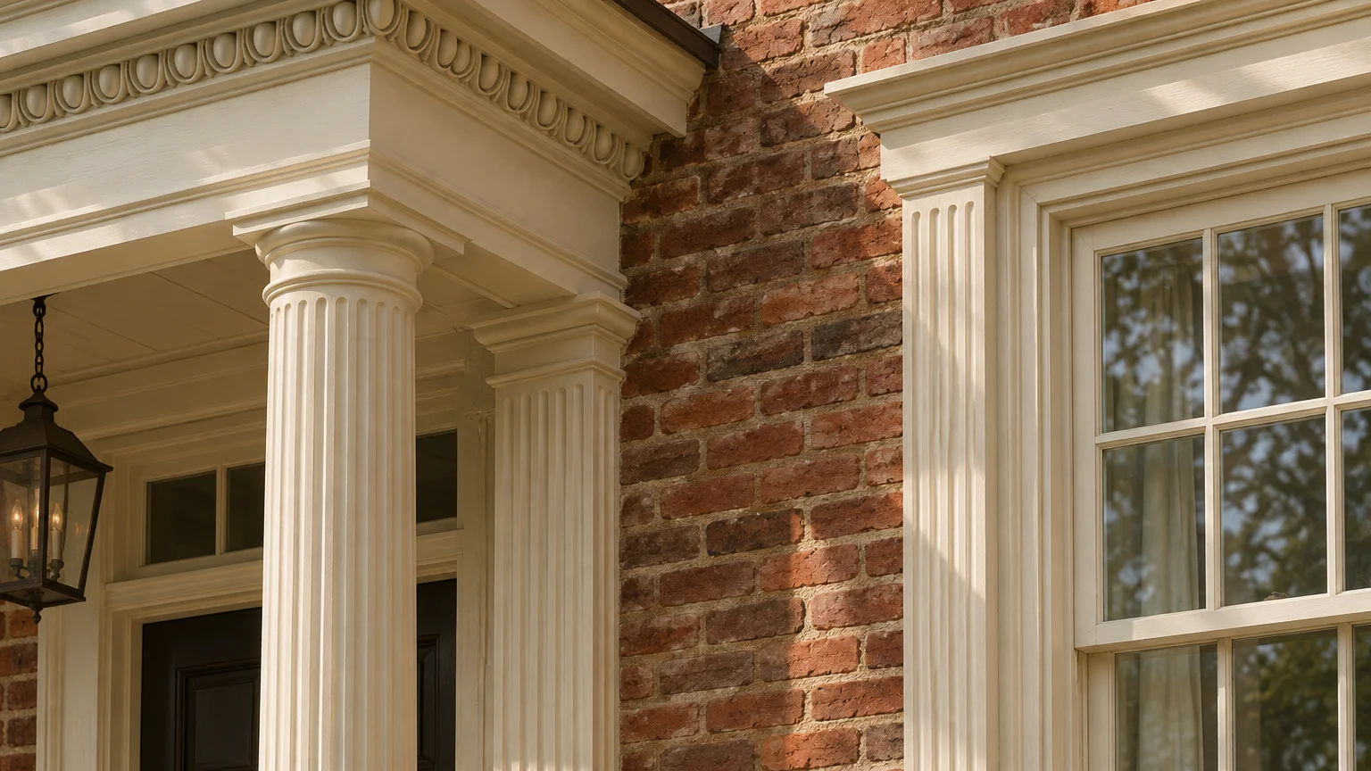
Trend #4: Creamy Alabaster and Warm Roman Off-White
Pure, stark whites often create harsh visual glare and feel clinical against rich, historic brickwork. Soft alabaster, creamy linen, and warm Roman off-whites provide a timeless alternative that exudes refined gentility.
Direct natural light washes exterior pigments out by one to two full shades. A warm, creamy off-white swatched indoors reads as a crisp, classic white once exposed to bright outdoor sun.
Selecting an exterior paint with an LRV around 70 to 75 maintains clarity without blinding the viewer. It reflects ample light while preserving warm undertones that flatter natural clay and sand.
This classic pairing recalls Georgian and colonial manor architecture while remaining thoroughly modern. Creamy siding contrasts cleanly against red, brown, or weathered antique brick facades.
When developing brick house exterior color ideas, consider painting porticos, dentil moldings, and window trim in soft alabaster. The deliberate contrast draws the eye upward, celebrating your home’s architectural silhouette.
Maintain warmth by pairing alabaster trim with natural copper downspouts and bluestone walkways. The resulting composition balances classic historical charm with crisp, contemporary curb appeal.
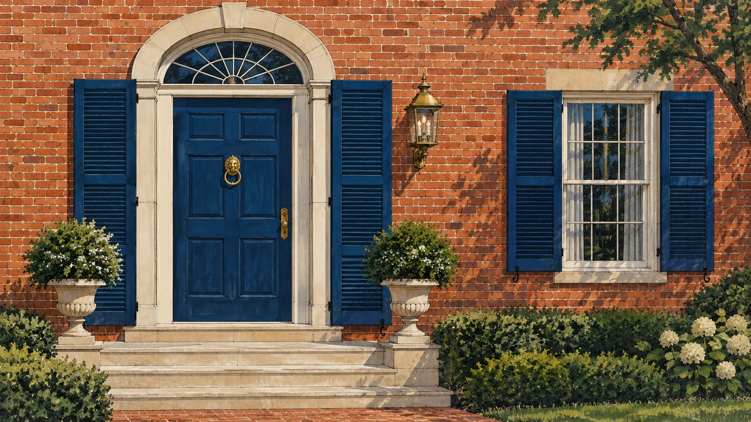
Trend #5: Historic Navy and Prussian Blue
Deep navy and evocative Prussian blue introduce an aristocratic presence to exterior brick palettes. These classic hues counter orange and terracotta brick with cool, authoritative sophistication.
The intense chromatic contrast between blue and orange delivers an invigorating yet balanced dynamic. Navy anchors the facade, imparting the tailored permanence found in historic coastal estates and distinguished brownstones.
To keep the palette grounded, select rich navies infused with subtle charcoal or black undertones. Overly bright blues risk appearing juvenile, whereas blackened navy reads as deeply bespoke and enduring.
Painting an upper-story siding elevation in midnight navy grounds the exterior without overpowering the lower masonry. It balances heavy brick basework with crisp architectural poise and visual intrigue.
When seeking colors that pair with brick, Prussian blue serves as a dramatic accent on front doors and shutters. It frames your entrance with dignity, inviting guests inside with distinguished charm.
Accent this naval palette with unlacquered brass or matte black hardware on entry doors. The metal hardware glints against the dark background, finishing the entry with undeniable polish.
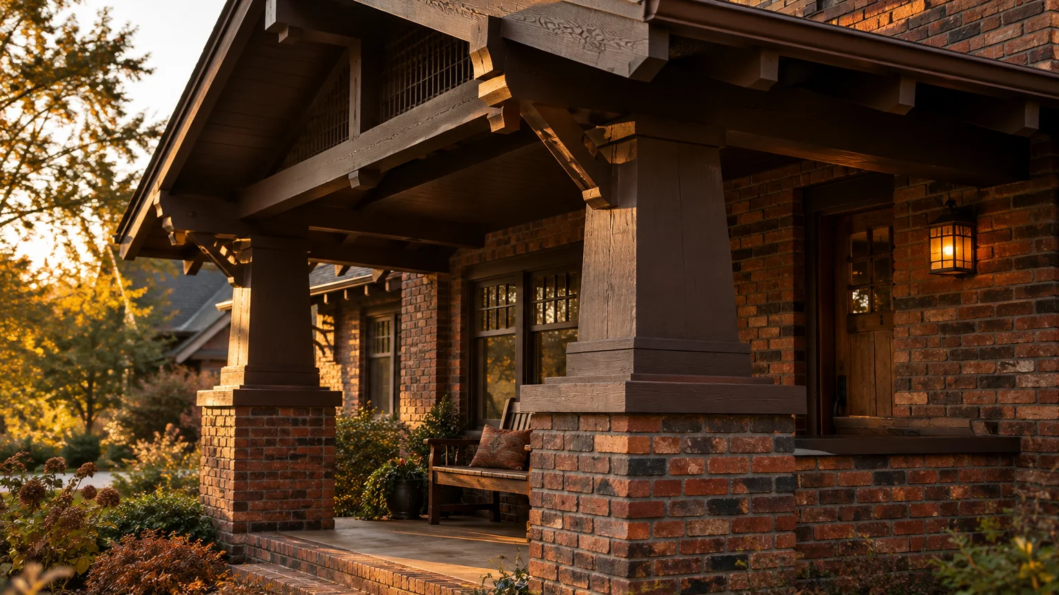
Trend #6: Rich Espresso and Bitter Chocolate
Deep espresso and bitter chocolate represent an adventurous evolution in monochromatic exterior palettes. Moving beyond cool grays, this warm, earthen aesthetic embraces rich soil and roasted cocoa notes.
Deep brown pairs naturally with variegated brick containing dark umber or blackened clinker elements. Rather than fighting masonry variations, espresso unites the home’s tonal composition into a harmonious whole.
This low-contrast approach creates an enveloping, quiet luxury aesthetic that feels grounded and serene. It eliminates jarring visual breaks between upper siding, roof soffits, and textured brick masonry walls.
Bitter chocolate siding accents look stunning alongside bronze-finished exterior light fixtures and textured timber accents. Natural cedar or white oak details soften the dark trim beautifully.
Utilizing espresso as one of your exterior paint colors for brick homes brings an organic modernism aesthetic to life. It imparts an understated, woodland retreat ambiance that feels intimately connected to surrounding greenery.
Use rich espresso across fascia, siding dormers, and architectural pergolas. It lends an intimate, architectural elegance that feels deeply intentional, grounding your home with dramatic warmth.
Trend #7: Weathered Slate Blue-Gray
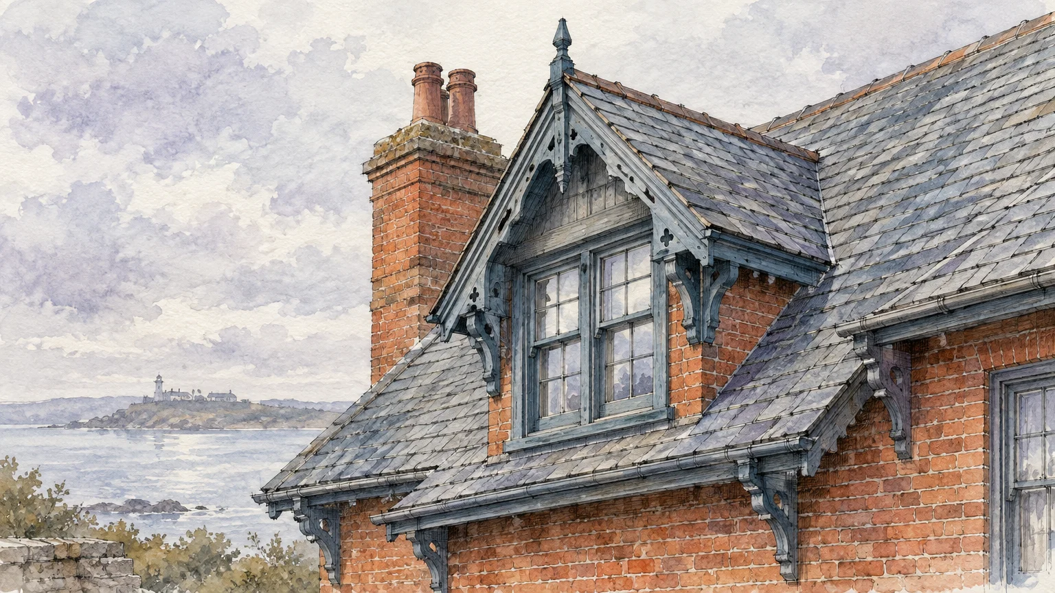
Weathered slate blue-gray introduces a misty, atmospheric calm to traditional brick homes. Blending cool slate, maritime gray, and a drop of indigo, this shade flatters pink and orange brick undertones effortlessly.
Salmon and washed pink brick facades often pose the steepest color-matching challenges for homeowners. Slate blue-gray effortlessly neutralizes pink tones by offering a muted, cool counterpart on the color spectrum.
The dusty undertones evoke European country estates and historic coastal cottages. It introduces refined color without demanding aggressive attention, preserving a gentle, restorative ambiance across your property.
On modern farmhouse or transitional brick homes, slate siding offers an upscale alternative to conventional gray. It catches varying light throughout the day, shifting subtly from dusk blue to stony gray.
Slate blue-gray stands out as one of the best siding colors for brick additions and second-story extensions. It softens the visual transition between historic lower brickwork and newer framed construction.
Pair weathered slate siding with warm stone pathways and crisp off-white window framing. The cohesive dialogue between masonry and cool accents establishes timeless curb appeal that withstands shifting trends.
Trend #8: Industrial Pewter and Architectural Bronze-Gray
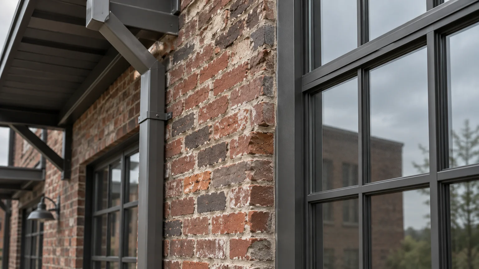
Industrial pewter and bronze-gray provide a tailored, urban sensibility that flatters mid-century and modern brick structures. These medium-to-deep metallic neutrals highlight the raw craftsmanship and texture of masonry.
Pewter avoids the warmth of taupe and the starkness of pure charcoal, settling into an understated, steel-inspired middle ground. It enhances both clean red running-bond brick and rough, textured clinker brick.
This palette connects naturally with modern black steel casement windows and standing-seam metal roofs. It bridges historic brick texture with contemporary industrial finishes seamlessly.
Painting your siding or soffits in architectural pewter anchors multi-level additions to an original brick foundation. The neutral tone prevents new building wings from visually overpowering historic masonry.
Incorporate pewter on garage doors, trim transitions, and modern architectural louvers. The color imparts an engineered precision that sharpens the overall facade with quiet confidence.
When selecting complementary colors for brick exteriors, pewter offers an executive finish that endures. It retains its crispness across diverse weather conditions, resisting fading while providing enduring sophistication.
Trend #9: Desert Sand and Pale Ochre
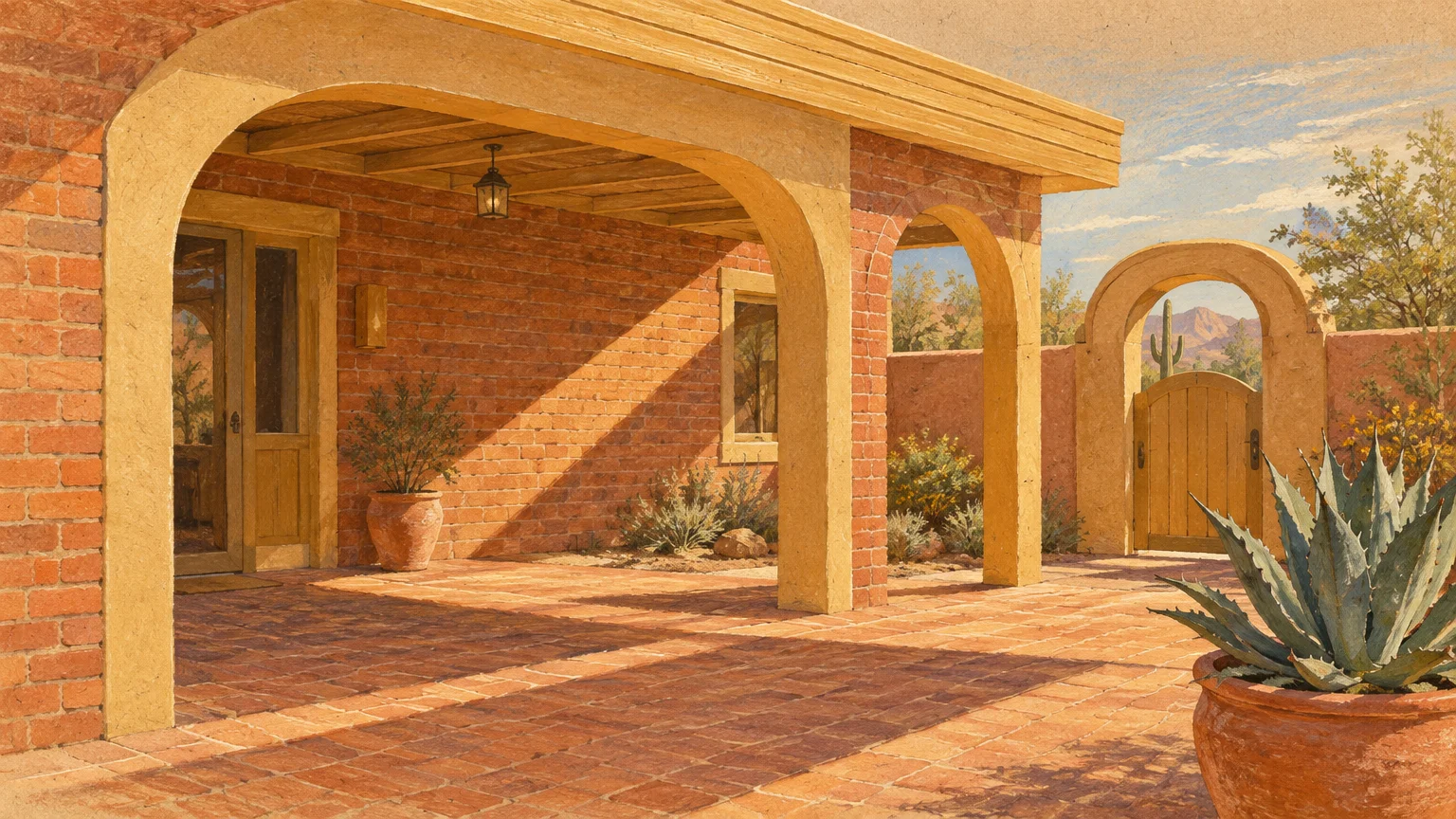
A tonal, desert-inspired palette creates a unified, sculptural presence across your exterior. Pairing warm sand, soft wheat, and pale ochre with brick yields a seamless, sun-drenched facade that feels warm and inviting.
Monochromatic palettes are surging across luxury residential architecture, trading high contrast for tactile, tonal serenity. By pairing siding closely with the primary brick hue, the entire residence reads as an organic whole.
Soft sandy tones flatter yellow, tan, and light buff brick varieties with effortless warmth. They reflect ambient sunlight, making compact homes appear expansive, airy, and cohesive.
Avoid overly saturated yellows or vivid golds that disrupt architectural harmony. Instead, select chalky, earth-pigmented ochres and warm clays that echo natural mineral formations and dry riverbeds.
Use desert sand across large siding expanses, reserving deeper terracotta for the front door and window sashes. This subtle tonal layering produces an inviting, bespoke exterior with rich tactile depth.
This palette thrives in sunny climates where harsh sunlight washes out cool grays. Sand and ochre embrace strong daylight, maintaining rich warmth from sunrise through dusk.
The Big Picture: Weaving These Trends into Your Home
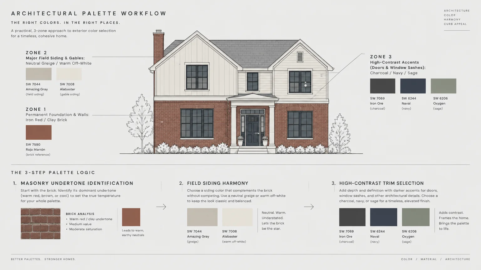
Elevating your brick exterior requires balancing high-design trends with structural preservation. Refreshing adjacent siding and trim allows you to modernize your home without compromising the integrity of original masonry.
Painting siding and exterior trim accents costs an average of $3,178 nationwide, according to 2026 contractor benchmarks. Typical projects range between $1,819 and $4,551, translating to $1.50 to $4.00 per square foot.
By comparison, painting the brick masonry directly averages $7,000, frequently climbing to $10,500. Brick requires intensive power washing, specialized masonry primer, and significantly higher paint volume due to surface porosity.
Preserving your brick’s natural breathability is critical for long-term structural durability. Standard 100% acrylic exterior latex can trap internal moisture within the wall cavity, causing freeze-thaw spalling and permanent masonry deterioration.
If you choose to coat masonry directly, select potassium silicate or mineral masonry paints. Preservation standards mandate a vapor permeance rating of 10 perms or higher under ASTM E96 standards to guarantee vapor breathability.
Before ordering paint, review neighborhood guidelines and historic district covenants. Historic preservation commissions frequently prohibit painting previously unpainted historic masonry, and standard HOAs require formal Architectural Review Committee (ARC) submission.
Account for natural lighting shifts when testing paint swatches outdoors. Exterior paint appears 5 to 10 LRV points lighter in direct sunlight than on indoor paint chips, so choose slightly deeper values.
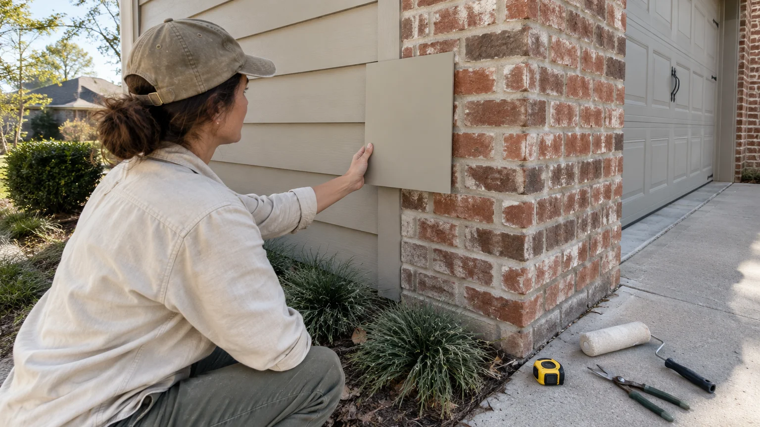
Test large paint swatches on movable foam boards placed directly against your brick facade. Evaluate these swatches at dawn, midday, and twilight to ensure your chosen palette maintains its harmony across every lighting condition.
For the latest color forecasts, consult industry leaders like Pantone and paint companies like Benjamin Moore. For professional design standards, refer to the American Society of Interior Designers (ASID).
Disclaimer: This article reflects design trend analysis and predictions. Personal taste and timeless design principles should always guide your decorating choices.
Frequently Asked Questions
How do you identify undertones in exterior brick before selecting paint?
Hold a large, pure white poster board against your brick facade in natural daylight. The neutral white surface eliminates optical illusions, instantly revealing secondary undertones like salmon, violet, yellow, or charcoal within the clay.
Identifying these undertones prevents costly color clashes across your siding and trim. Matching cool accents to cool undertones, or warm tones to terracotta, guarantees chromatic cohesion.
Should exterior trim match the mortar color or the brick color?
Matching your trim to the mortar creates a cohesive, harmonious appearance that softens heavy masonry patterns. This strategy expands the visual plane, making windows and gables feel integrated into the structure.
Conversely, selecting a contrasting hue—such as charcoal or dark navy—produces sharp architectural definition. High contrast frames windows dynamically, lending your exterior a modern, tailored feel.
Why should homeowners avoid painting natural exterior brick?
Natural brick is a porous, breathing material that naturally absorbs and expels atmospheric moisture. Coating brick with conventional latex paint seals pores, trapping water that causes surface spalling during winter freeze-thaw cycles.
Painting brick also converts a maintenance-free surface into an ongoing maintenance obligation requiring repainting every seven to ten years. Refreshing trim and siding colors delivers modern curb appeal without jeopardizing your masonry’s structural longevity.
How does exterior sunlight affect paint color perception?
Direct sunlight washes out exterior paint colors dramatically, making shades appear 5 to 10 LRV points lighter than indoors. A neutral shade that appears medium-depth inside will read significantly brighter outdoors.
Always sample colors outdoors and choose paints one to two shades deeper than your initial indoor swatch. This calibration prevents your exterior trim from appearing washed out or stark under midday sun.