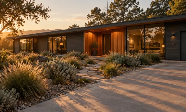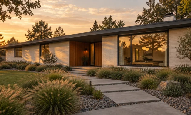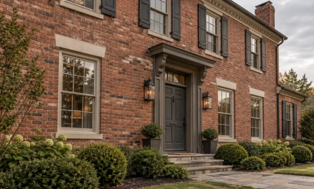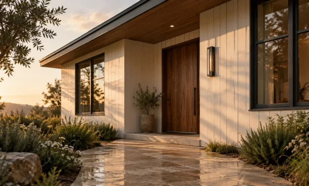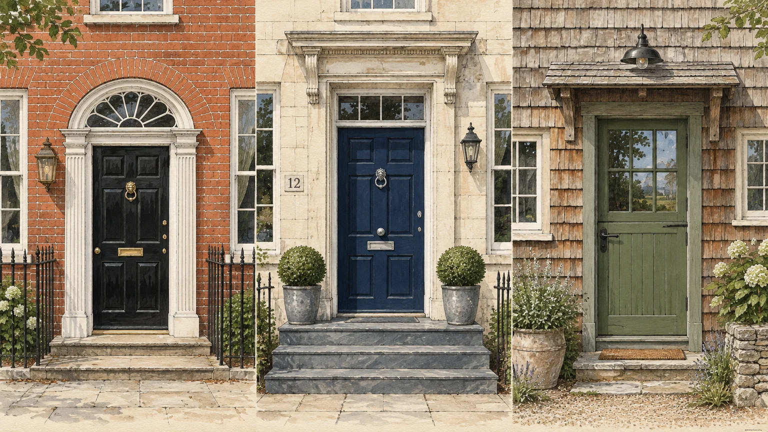
Your front door serves as the architectural anchor of your home’s exterior, setting aesthetic expectations before anyone steps inside. Selecting the right palette instantly transforms basic curb appeal into an enduring statement of style.
While seasonal color fads quickly fade, classic door colors maintain their cultural provenance and visual power across decades. These shades honor architectural history while welcoming guests with understated poise.
Investing in timeless front door colors ensures your facade retains sophisticated charm regardless of passing exterior design micro-trends. Discover nine enduring exterior door colors that never lose their distinct appeal.
Trend #1: Architectural Black
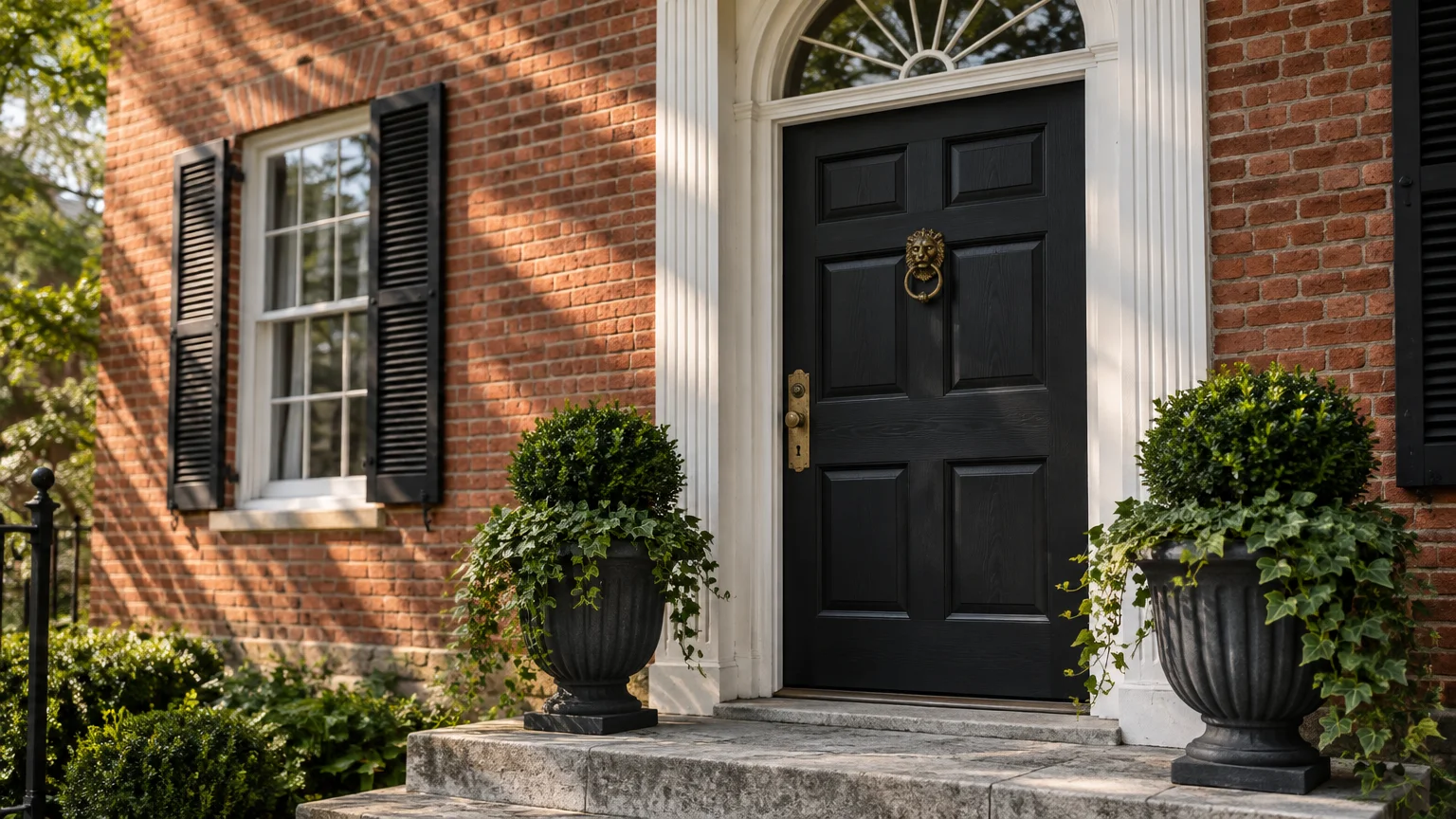
A deep, true black creates an unmistakable focal point that anchors your facade. It signals quiet luxury—an understated design ethos that prioritizes refined restraint over ostentation.
This shade flatters virtually every architectural vernacular, from historic Federal brick homes to crisp modern farmhouses. It delivers sharp contrast against pale limestone, brickwork, or whitewashed siding.
To execute this look effectively, select a satin or semi-gloss finish. High-gloss creates a dramatic lacquered mirror effect, while satin delivers subtle, velvet richness under bright sunlight.
Pair black exterior door colors with unlacquered brass hardware for traditional warmth. Alternatively, choose matte black or brushed stainless steel fixtures to achieve a sleek, monolithic appearance.
Black doors also conceal everyday scuffs and environmental dust far better than paler alternatives. They ground flanking planters, iron lanterns, and stone entry steps into a unified composition.
Ensure your interior foyer coordinates smoothly by repeating black accents along your entry console, stair runner hardware, or lighting. This visual repetition connects exterior curb appeal directly to your interior palette.
Trend #2: Heritage Navy
Heritage navy captures centuries of maritime and architectural provenance. This hue offers rich chromatic character without the aggressive intensity of brighter primary blues.
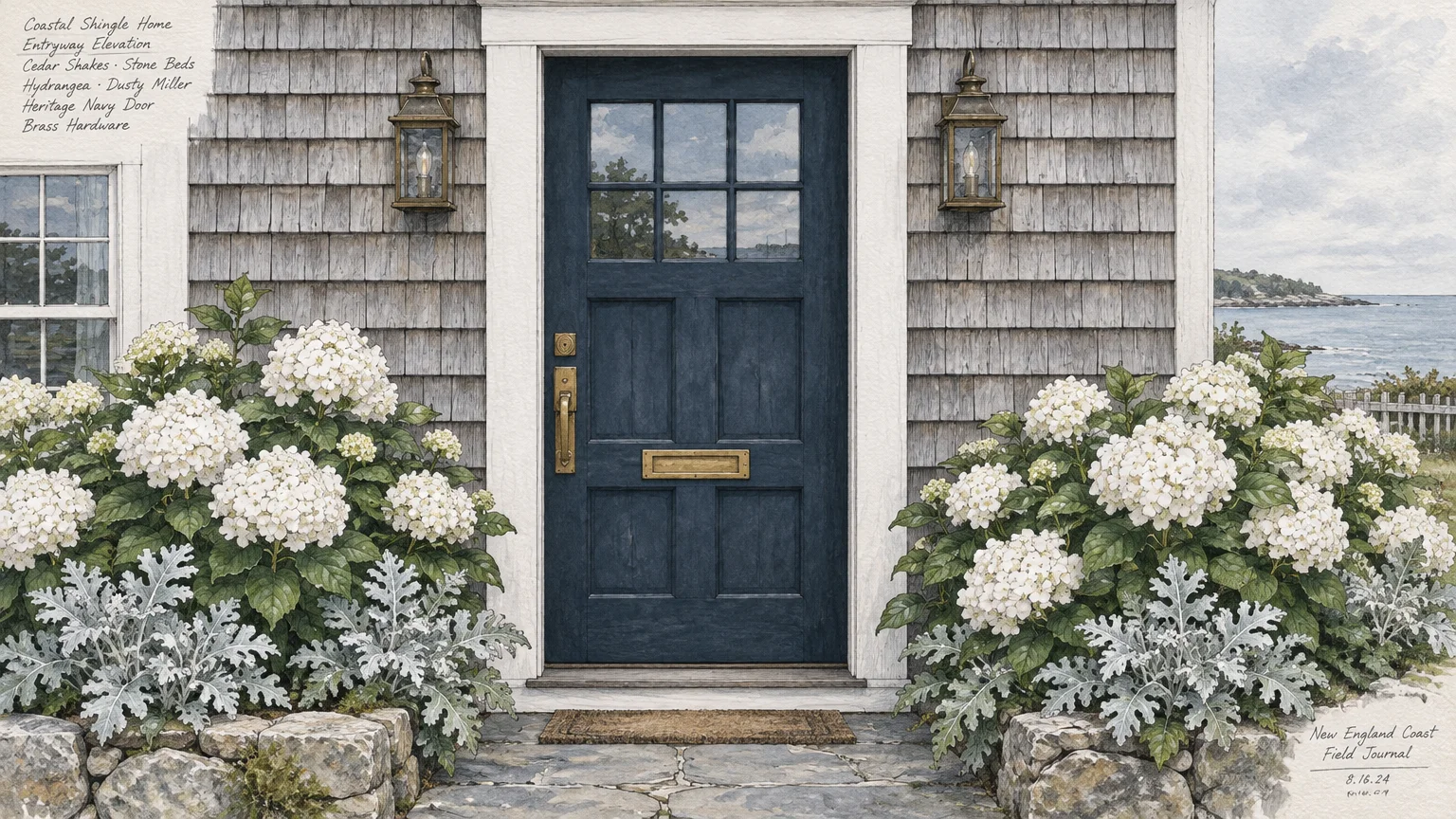
Because navy operates almost as an architectural neutral, it flatters cedar shingles, stacked stone, and warm red brickwork. It provides stately contrast while softening the severe edge of monochrome palettes.
Look for navy front door paint colors featuring subtle slate or charcoal undertones. These muted undertones keep the shade looking grounded rather than overly electric under midday sunlight.
Polished chrome and brushed nickel hardware create a crisp, nautical contrast against rich navy. For an antique, estate-like atmosphere, install heavy unlacquered brass or aged bronze hardware instead.
Coordinate this color with perimeter landscaping by planting white hydrangeas, boxwood hedges, and silver foliage nearby. The surrounding greenery allows the blue depth to stand out clearly from the street.
Extend this palette indoors by echoing navy in living room textiles, patterned foyer runners, or custom entry millwork. Such deliberate repetition creates a harmonious sequence as you step across the threshold.
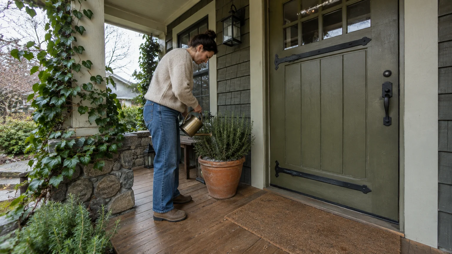
Trend #3: Biophilic Sage and Olive
Earthy green shades draw directly from biophilic design, which emphasizes an innate human connection to the natural environment. Muted olive and sage establish immediate organic serenity on your porch.
These nature-derived timeless front door colors soften hard masonry, concrete steps, and timber decking. They bridge your exterior gardens with the built envelope of your home effortlessly.
Sage provides an airy, luminous quality ideal for shaded entryways beneath deep porticos. Darker olive brings rich, mossy depth that grounds light stucco and natural wood siding.
Enhance these organic greens using oil-rubbed bronze or blackened iron hardware. These earthy metal finishes complement the natural undertones without distracting from the painted surface.
When testing swatches, evaluate the paint during morning light and late afternoon shade. Earthy greens shift dramatically depending on tree canopy shadows and fluctuating solar angles.
Continue the biophilic motif into your dining room or living area with potted olive trees, linen drapery, and warm white walls. This seamless transition brings the calming exterior tone into daily living spaces.
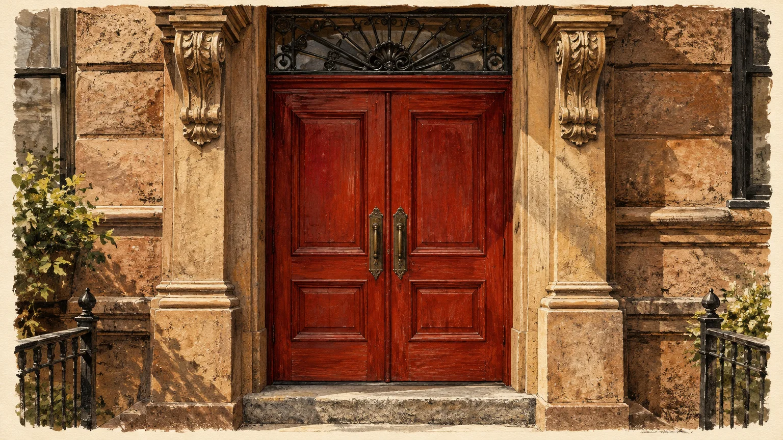
Trend #4: Stately Vermilion and Heritage Red
Deep, storied reds carry centuries of domestic heritage, historically symbolizing sanctuary, hospitality, and welcoming warmth. A rich crimson or vermilion door provides immediate, charismatic presence.
Unlike hyper-bright candy reds, heritage shades contain brown, black, or blue undertones that impart refined sophistication. They establish curb appeal door colors with undeniable architectural gravitas.
This classic hue pairs brilliantly with traditional brick facades, weathered stone, and warm white clapboard siding. It draws the human eye directly to the entrance, creating a clear focal beacon.
Solid brass hardware—whether polished or antiqued—serves as the quintessential companion for deep red doors. The golden metal reflections amplify the radiant warmth embedded in the red pigments.
Keep the surrounding door trim crisp and restrained to let the red command attention. A soft off-white or creamy stone casing frames the door without jarring, high-contrast discord.
Inside, mirror this vibrant confidence using Persian runners, rust velvet throw pillows, or warm mahogany furniture. These interior accents validate your exterior statement and tie the architectural narrative together.
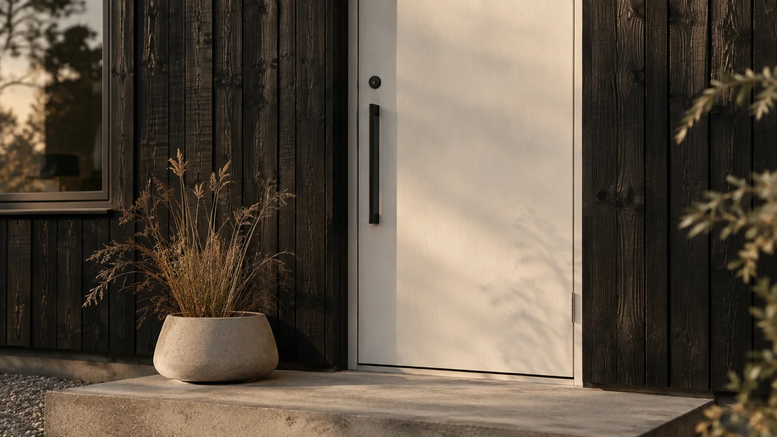
Trend #5: Architectural Chalk White
Architectural white offers pristine clarity, celebrating proportion, symmetry, and classical restraint. It reflects maximum sunlight, making recessed or shadowed porches feel expansive and cheerful.
Avoid sterile, blue-tinged commercial whites in favor of soft chalk, alabaster, or warm parchment tones. These nuanced whites maintain character without appearing institutional or harsh in direct outdoor glare.
Chalk white excels on monochromatic residences, modern farmhouses, and coastal cottages alike. It frames surrounding dark finishes, from dark window sashes to slate roof tiles, with tailored elegance.
Matte black or oil-rubbed bronze hardware provides striking visual contrast against a pure white background. If you prefer subtle quiet luxury, select polished nickel for an understated, luminous gleam.
Because white shows environmental dust quickly, apply a durable semi-gloss exterior enamel. High-grade formulas allow for easy wipe-downs while resisting moisture, mildew, and ultraviolet degradation.
Inside, your entrance can transition into light oak flooring, plaster wall finishes, and airy linen lighting. This strategy establishes a luminous, Scandinavian-inspired sanctuary that feels cohesive and calm.
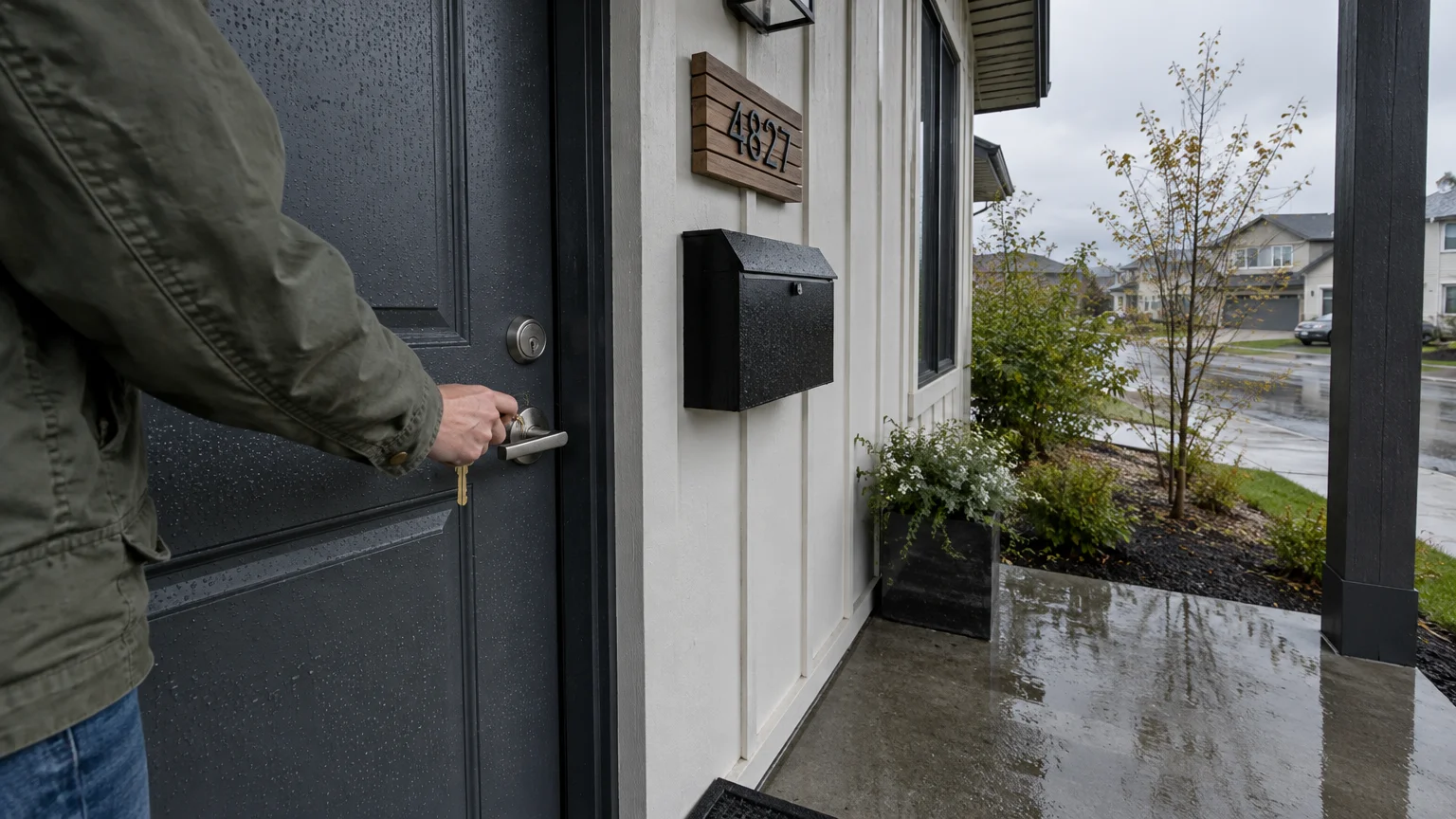
Trend #6: Saturated Charcoal and Slate Gray
Slate gray and charcoal represent contemporary neutrality at its most commanding. These complex grays bridge the gap between stark black and passive light neutrals with moody sophistication.
Saturated charcoal provides strong architectural definition while preserving a velvety softness. It complements limestone pavers, bluestone porches, and cool cedar shingles with remarkable ease.
Look for charcoal front door paint colors containing mineral undertones of violet, green, or deep blue. These subtle complexities keep the gray vibrant across fluctuating weather conditions and seasons.
Brushed stainless steel and satin chrome fixtures yield an uncompromising, modern aesthetic against dark gray. Alternatively, warm brass hardware provides an alluring, jewel-like counterpoint to the cool charcoal substrate.
Position slate gray doors alongside charcoal exterior sconces and graphite house numbers. This cohesive curation gives your entryway an intentional, architect-designed aura that elevates entire street facades.
Echo this moody neutral indoors across living room accent walls, stone fireplace surrounds, or charcoal velvet armchairs. Connecting interior textures to exterior surfaces creates a seamless aesthetic progression.
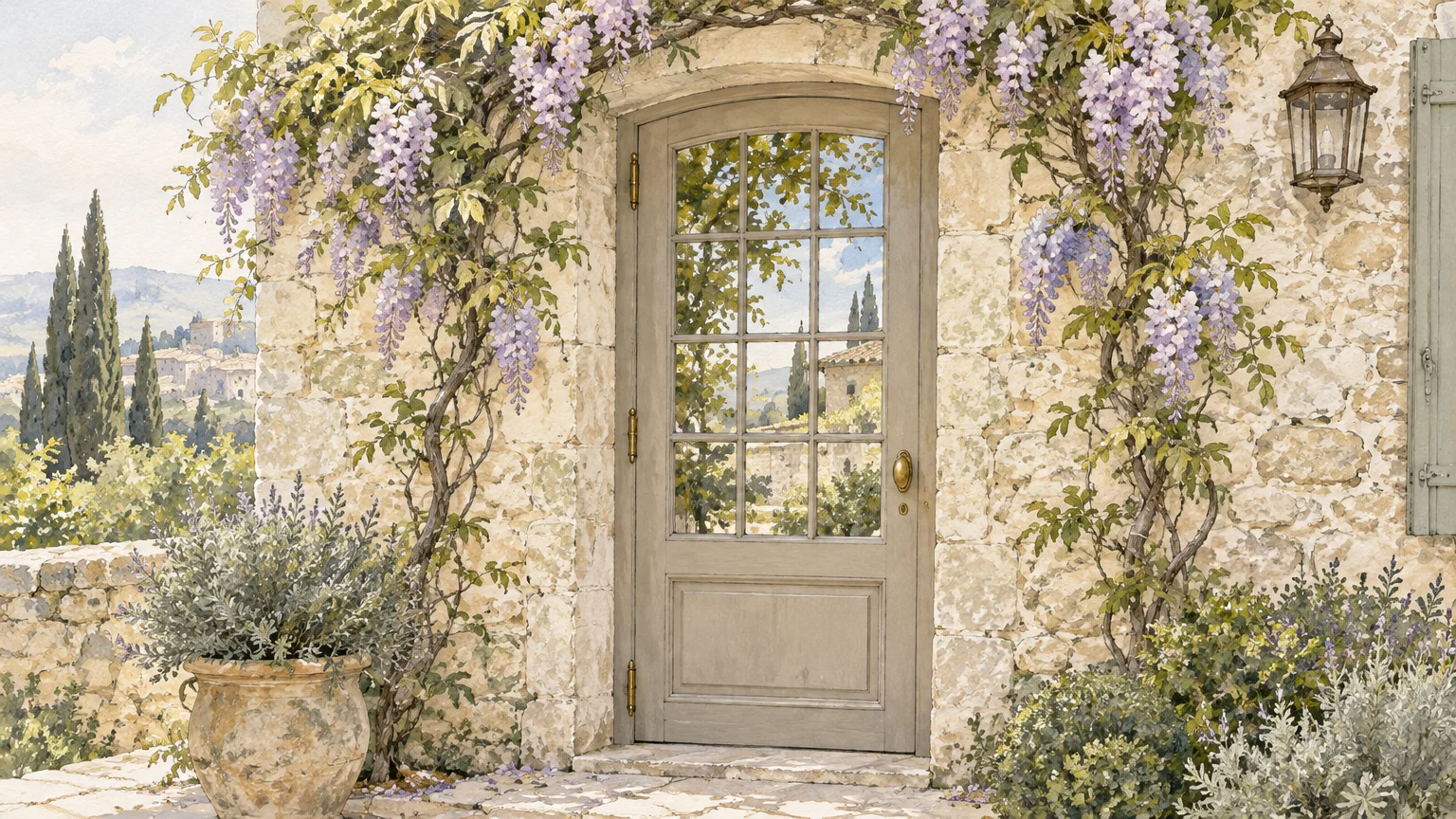
Trend #7: Warm Greige and Soft Taupe
Warm greige balances the crisp modernity of gray with the tactile comfort of beige. This understated neutral delivers quiet luxury, projecting poise without shouting for attention.
Greige adapts effortlessly to masonry materials, from warm river rock and travertine to pale limewashed brick. It absorbs shifting natural light smoothly, avoiding harsh glare on south-facing entrances.
Select a medium-depth taupe to ensure adequate contrast against surrounding light-colored trim and siding. Insufficient contrast can cause the entryway to look washed out from street level.
Pair warm greige with burnished brass, aged bronze, or champagne gold hardware. These luminous metallic finishes bring out the underlying warmth of the taupe formulation.
Complement the door with textured ceramic planters, woven outdoor seating, and warm cedar porch ceilings. These natural accents accentuate the organic, tactile quality inherent in greige palettes.
In your foyer, continue the tonal palette with travertine flooring, bouclé benches, and warm plaster accents. This effortless flow creates an inviting, serene retreat the moment you enter.
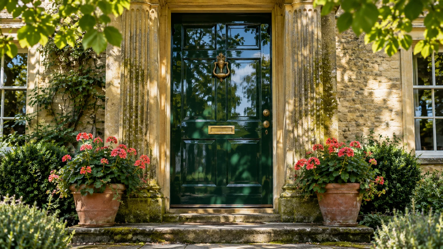
Trend #8: English Forest Green
English forest green channels the timeless grandeur of heritage manor estates and private garden retreats. Its deep, saturated emerald undertones convey permanence, stability, and enduring prestige.
This verdant classic door colors choice integrates seamlessly with climbing ivy, manicured boxwoods, and mature perimeter trees. It makes your entry feel naturally rooted in its surrounding site.
Forest green pairs exceptionally well with weathered red brick, river stone, and creamy stucco exteriors. Its dark chroma adds visual weight, making smaller entrances appear grounded and substantial.
Heavy forged iron or polished unlacquered brass hardware completes this historic look. Solid brass letterboxes, knocker rings, and kickplates gleam brilliantly against the dark botanical background.
Opt for a high-gloss enamel finish if you want to evoke traditional British townhouses. The reflective surface captures street lamps and garden foliage, creating an exquisite, mirror-like depth.
Carry this rich hue into your interior library or dining room millwork. By mirroring exterior green tones on interior cabinetry or wainscoting, you establish a stately, unified design narrative.
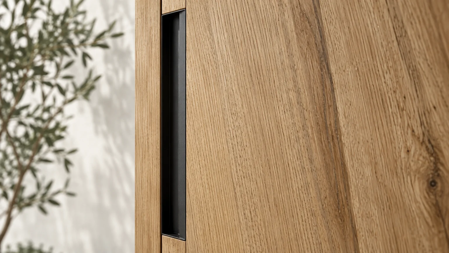
Trend #9: Natural Stained Walnut and White Oak
Natural timber finishes celebrate the tactile provenance of organic materials rather than concealing them beneath opaque paint. Rich walnut and white oak finishes offer authentic grain and bespoke character.
Wood tones introduce organic modernism to clean contemporary architecture, while honoring historic craftsmanship in traditional homes. A stained wood door exudes artisanal warmth that paint cannot replicate.
Choose deep walnut, chestnut, or warm honey stains that accentuate natural wood figure without turning orange. Ensure your finish includes high-grade ultraviolet inhibitors to protect against solar bleaching.
Architectural black hardware or patinated bronze fixtures provide strong industrial contrast against raw wood grain. Clean, elongated pull bars look striking on contemporary pivot doors.
Maintain your wood door with seasonal conditioning or fresh clear coats to prevent weather checks and moisture penetration. Proper timber maintenance preserves the richness and depth for generations.
Harmonize your interior entry by matching the door stain to your interior hardwood floors, stair handrails, or ceiling beams. This material continuity provides an instant sense of structural integrity.
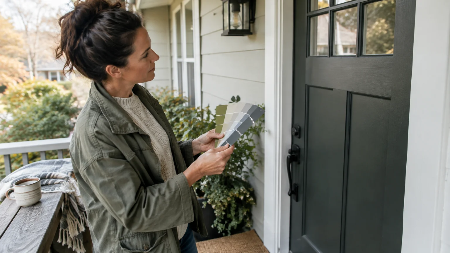
The Big Picture: Weaving These Trends into Your Home
Selecting between timeless front door colors requires evaluating your home’s fixed materials, including brick, stone masonry, and roofing shingles. Your front door should balance these permanent elements rather than clash with them.
Sheen selection plays an equally critical role in your door’s final appearance and longevity. High-gloss finishes accentuate architectural details and imperfections, while satin hides surface flaws and weathers gracefully.
Always test physical paint swatches directly on your exterior door rather than relying on digital representations. Natural sunlight, outdoor shadows, and porch overhangs alter color temperature dramatically throughout the day.
Hardware selection acts as jewelry for your entryway, elevating classic door colors into cohesive compositions. Coordinate your handleset finish with exterior sconces, house numbers, and mailbox accessories for consistent polish.
Furthermore, design your entryway as an intentional threshold connecting the exterior landscape to your interior living areas. Repeating your door’s accent color in nearby foyer rugs or foyer lighting establishes sophisticated continuity.
By honoring timeless color principles instead of fleeting fads, you safeguard your property’s enduring curb appeal. A well-chosen palette welcomes family and guests with unmistakable elegance year after year.
Frequently Asked Questions
Which paint finish works best for exterior front doors?
Satin and semi-gloss enamels provide the optimal balance of durability, cleanability, and visual sophistication for exterior doors. They resist fingerprints and harsh weather while imparting an elegant, soft luster.
Reserve high-gloss paint for perfectly smooth, blemish-free doors where a dramatic, formal lacquered look is desired. Matte finishes should generally be avoided because they collect grime and scuff easily outdoors.
How do I select the right door color to complement red brick?
Heritage navy, deep onyx, sage green, and charcoal offer the most flattering contrast against red brick. These tones cool down the fiery orange and red undertones present in traditional masonry.
If you prefer warmth, select a deep crimson or vermilion that matches the brick’s darkest undertones. Avoid bright orange or yellow hues, which clash aggressively with natural clay bricks.
Should the inside of the front door match the exterior color?
Not necessarily; painting the interior side to match your foyer trim or wall color often creates a smoother indoor transition. Alternatively, carrying a dramatic exterior hue inside turns the door into an interior accent.
Paint the door’s edges thoughtfully: paint the latch side the interior color, and the hinge side the exterior color. This ensures only matching colors show when the door swings open.
How often should you repaint an exterior door to preserve curb appeal?
Most exterior doors require repainting every five to seven years, depending on direct sun exposure and regional climate. South- and west-facing doors exposed to intense ultraviolet rays may need refinishing sooner.
Regularly inspecting for chalking, fading, or peeling ensures you maintain protective weather seals before timber or metal suffers damage. Timely maintenance keeps your entryway looking pristine and stately.
For the latest color forecasts, consult industry leaders like Pantone and paint companies like Benjamin Moore. For professional design standards, refer to the American Society of Interior Designers (ASID).
Disclaimer: This article reflects design trend analysis and predictions. Personal taste and timeless design principles should always guide your decorating choices.