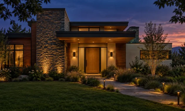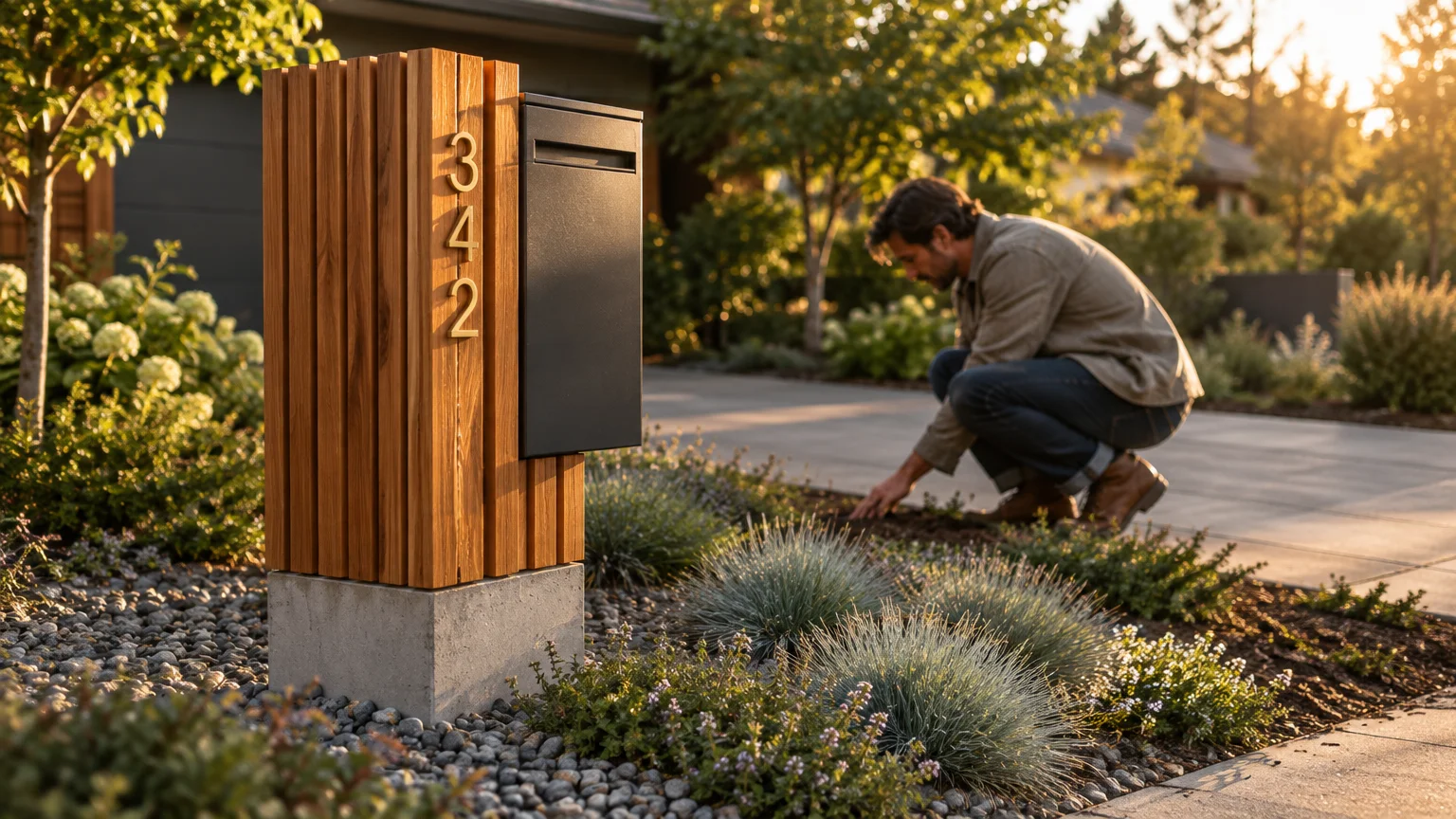
Your home’s architectural narrative begins at the curb; exceptional details set the tone before guests cross your threshold. Thoughtful mailbox and house number choices establish immediate visual character and sophisticated design intent.
According to the National Association of Realtors, 97% of real estate professionals confirm that curb appeal directly attracts buyers. Upgrading these utilitarian fixtures turns overlooked front yard decor into refined design statements.
By harmonizing exterior hardware with your interior aesthetic, you establish seamless cohesion from the driveway into the foyer. Here are nine elevated ideas reshaping residential exteriors.
Trend #1: Warm Patina and Unlacquered Brass
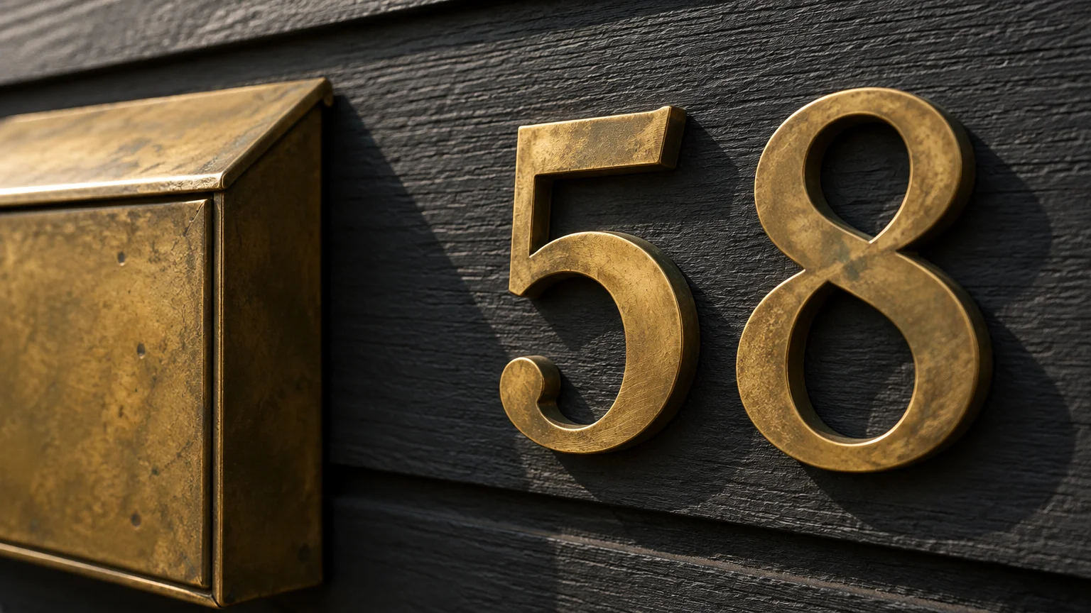
Quiet luxury has transitioned from refined living rooms to exterior entryways through the resurgence of unlacquered brass. This living metal develops an organic patina over time, echoing the timeless allure of historic European estates.
Instead of high-gloss polished brass, designers favor brushed and hand-relieved finishes that celebrate organic aging. The evolving luster reflects ambient sunlight, adding warmth to brick, stone, or painted timber facades.
Pair oversized brass numerals with a matching burnished brass wall-mounted mailbox. The warm undertones create an inviting focal point that immediately signals thoughtful craftsmanship.
To balance this classic metal, anchor it against moody paint tones like charcoal, forest green, or deep navy. These saturated backdrops allow the metallic golden highlights to command visual attention.
Ensure your address numbers satisfy safety codes while maintaining high design standards. The International Fire Code requires numerals to stand at least 4 inches high with a 0.5-inch stroke width.
This dimensional scale guarantees emergency responders can read your address effortlessly from the roadway. Elegance never requires compromising fundamental legibility.
Selecting solid brass hardware also provides superior resistance against coastal humidity and relentless temperature fluctuations. Investing in authentic materials guarantees your exterior accents age with distinction rather than deterioration.
Trend #2: Integrated Biophilic Planters and Architectural Fluting
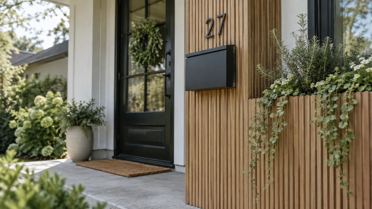
Biophilic architecture continues to shape interior design, and it now defines sophisticated curb appeal ideas. Designers are pairing geometric mailboxes with integrated planter boxes filled with lush, drought-tolerant greenery.
Architectural fluting adds tactile dimension to wooden and powder-coated metal mailbox posts. These vertical grooves echo the reeded millwork currently dominating high-end cabinetry and fireplace surrounds.
Selecting cascading flora—such as creeping thyme, silver falls dichondra, or trailing rosemary—softens rigid post structures. Living foliage turns a standalone utility post into an artistic garden installation.
When constructing custom posts with planting troughs, verify local utility easements before excavating. Calling 811 two to three business days before digging ensures underground utility lines remain untouched and secure.
In addition, adhere to standard installation metrics established by the United States Postal Service. The bottom of your roadside mailbox must sit precisely 41 to 45 inches above the road surface.
This regulated mounting height accommodates postal carrier vehicle access while integrating effortlessly into your landscape architecture. Practical function and natural beauty coalesce seamlessly at your property border.
Incorporate native perennial plantings at the post base to anchor the entire vignette within your regional ecosystem. Thoughtful botanical accents turn an ordinary driveway entrance into an inviting sanctuary.
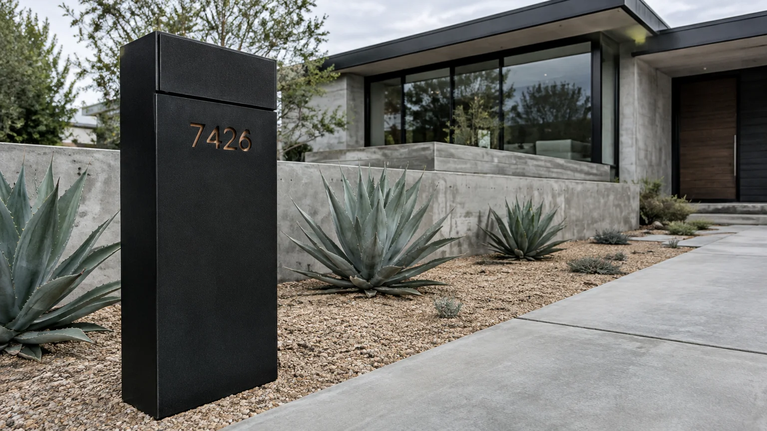
Trend #3: Modern Monolithic Minimalism with Powder-Coated Steel
Monolithic design replaces delicate ornamental ironwork with bold, sculptural planar geometry. Fabricators craft these striking structures from heavy-gauge marine aluminum or powder-coated steel with seamless laser welds.
A matte black or deep graphite finish provides an authoritative, grounding presence against minimalist landscaping. These monochromatic monoliths align seamlessly with modern transitional and brutalist architectural styles.
Integrate negative-space laser-cut numbers directly into the steel faceplate. Backing the cutout with a contrasting metal plate creates striking, shadowswept address indicators.
Roadside installations must adhere to Federal Highway Administration crash-safety regulations. Posts must yield or break away cleanly upon vehicle impact rather than presenting an unyielding roadside hazard.
Heavy masonry pillars or concrete-filled metal posts are hazardous and strictly prohibited along many municipal rights-of-way. Instead, secure a standard 2-inch diameter steel pipe buried no deeper than 24 inches.
This engineering standard ensures optimal vehicular safety without detracting from your home’s tailored, architectural presence. Sleek industrial lines can protect drivers while redefining modern curbside luxury.
Complement the steel structure with minimalist gravel beds and architectural ornamental grasses. This curated pairing establishes crisp textural contrast between rigid metals and organic textures.
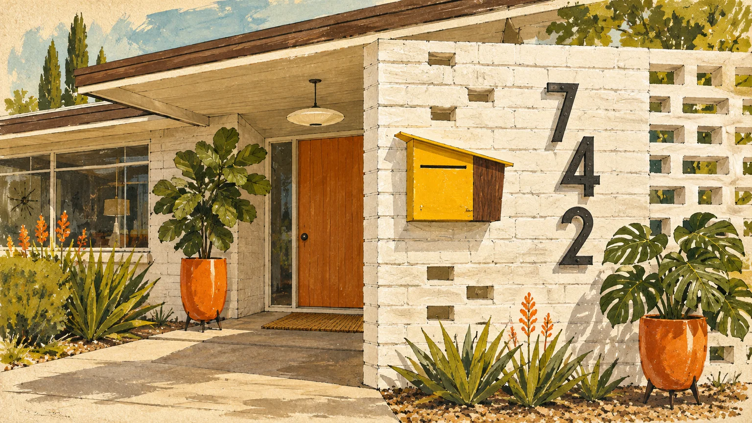
Trend #4: Mid-Century Modern Asymmetry and Retro Typefaces
Mid-century modern aesthetics maintain enduring appeal because of their structural optimism and graphic clarity. Modern interpretations focus on asymmetrical post layouts paired with iconic architectural typography.
House number ideas inspired by architect Richard Neutra use sleek, geometric sans-serif numerals. These crisp figures communicate clarity and effortless mid-century elegance from the street.
Give your existing roadside setup an authentic mailbox makeover by introducing horizontal cedar slats. Staining the wood in rich teak or warm walnut evokes authentic mid-century warmth.
Offset the receptacle to one side of the horizontal backing panel, balancing it with oversized numbers on the other. This asymmetrical visual tension feels dynamic, sophisticated, and intentional.
If you build a custom mid-century box, consult postal guidelines before completing the installation. Custom designs require inspection and approval by your local postmaster prior to regular mail delivery.
Alternatively, select a manufactured mailbox stamped with the official Postmaster General seal of approval. This ensures regulatory compliance while honoring your mid-century exterior palette.
Pair the horizontal wooden screen with vibrant atomic accent colors like ochre, chartreuse, or burnt orange. Subtle retro hues infuse joyful character into everyday utilitarian elements.
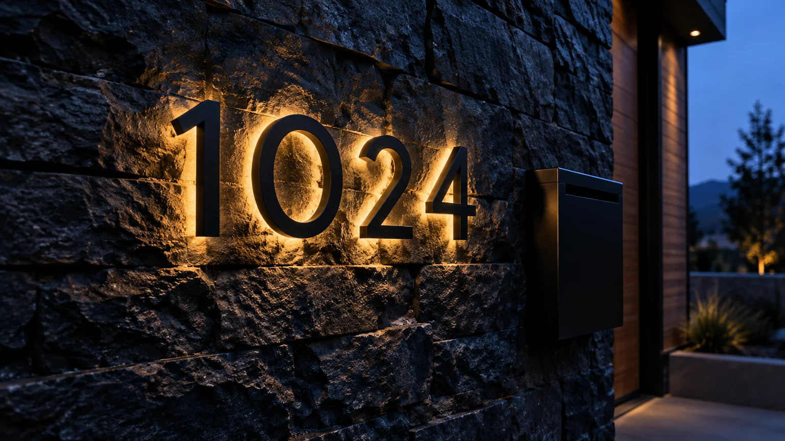
Trend #5: Backlit Floating Numerals for Dramatic Luminance
Lighting design has evolved far beyond basic porch sconces into nuanced architectural layering. Backlit floating numerals introduce a dramatic halo effect that elevates your home’s nocturnal curb appeal.
Concealed low-voltage warm LED strips cast indirect illumination against the exterior cladding. This ambient glow makes the numbers pop in sharp relief against limestone, stucco, or dark cedar.
Designers recommend using warm color temperatures between 2700K and 3000K for exterior accent lighting. Cool blue lighting feels institutional, whereas warm luminance imparts hospitality and sophisticated calm.
Floating numerals mounted with half-inch spacers create natural daytime drop shadows. As sunlight shifts throughout the day, the shifting shadows provide organic visual depth.
Legibility remains critical for midnight deliveries and emergency response teams navigating your street. International Fire Code standards dictate that address numbers must sharply contrast with their background surface.
Halo lighting meets this safety threshold effortlessly, combining functional security with an arresting architectural statement. Guests will appreciate the effortless nighttime visibility as they arrive.
Connect your low-voltage illuminated address system to a smart astronomical timer or photocell sensor. Automated dimming ensures energy efficiency while delivering dependable evening illumination.
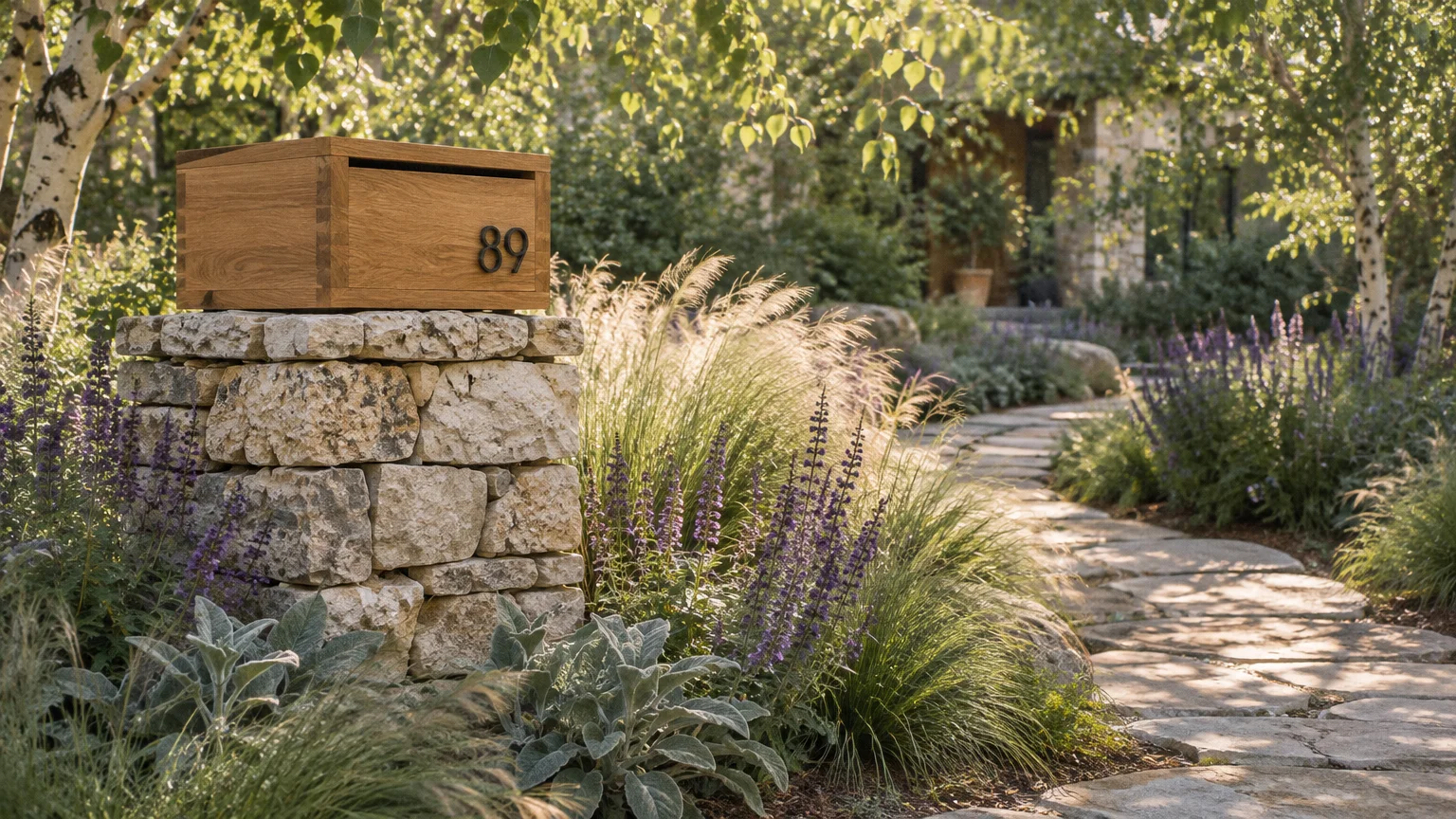
Trend #6: Organic Modernism with Mixed Timber and Stone Finishes
Organic modernism bridges contemporary minimalism with tactile, earthy materials inspired by the landscape. Blending weather-treated white oak, thermally modified ash, and natural limestone creates grounding front yard decor.
Instead of uniform composite materials, designers celebrate the tactile provenance of quarried stone and figured timber. The juxtaposition of cool natural stone and warm wood grain feels grounded and luxurious.
Position your curbside mailbox 6 to 8 inches back from the road curb. This USPS setback prevents passing municipal street sweepers and snowplow blades from striking the assembly.
Mount carved slate or travertine house number plaques on an adjacent natural stone retaining wall. Honed stone surfaces resist weathering while developing a dignified, natural exterior patina.
Repeat these organic finishes throughout your landscape pathways, stone steps, and front porch planters. Material continuity unites your property’s perimeter with your interior entry hall design.
Seal exposed exterior hardwoods annually with a penetrating UV-inhibiting matte oil finish. Proper maintenance protects rich grain patterns against moisture while preventing uneven silver weathering.
By framing raw stone with rich timber, you infuse serene organic warmth into your home’s curbside boundaries. The resulting aesthetic looks timelessly anchored in its geographic environment.
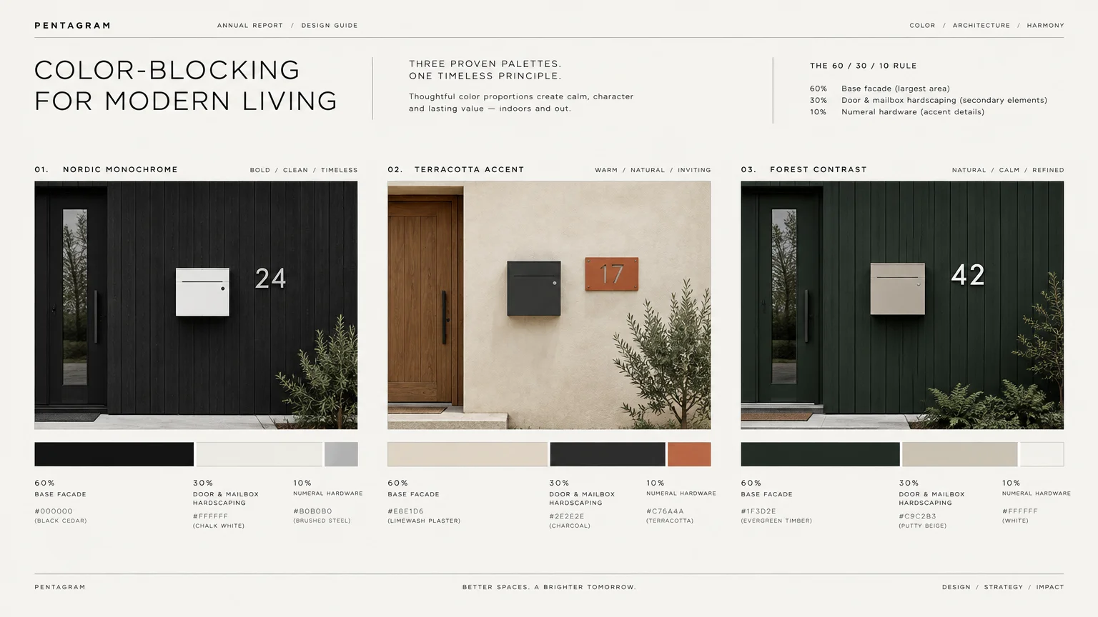
Trend #7: High-Contrast Scandinavian Color Blocking
Scandinavian design champions intentional simplicity, clean geometry, and high visual contrast. This trend embraces monochromatic color blocking to transform modest hardware into memorable curbside design features.
Picture a chalk-white stucco pillar anchoring a saturated matte black mailbox and obsidian numerals. This dramatic tonal polarity creates immediate graphic impact that catches the eye from down the street.
Alternatively, introduce refined accent shades drawn from heritage Nordic exterior paint swatches. Muted ochre, deep terracotta, and stormy fjord blue offer character without disrupting architectural restraint.
Keep the mounting hardware completely concealed to preserve pure, uninterrupted geometric profiles. Hidden blind mounts and magnetic closures deliver the clean lines synonymous with modern Scandinavian craft.
When refreshing existing posts, a swift mailbox makeover using exterior-grade enamel paint works wonders. High-durability coatings shield metal from rust while delivering a flawless satin finish.
Install crisp white dimensional numerals against a charcoal composite backdrop for maximum visual legibility. High-contrast typography satisfies safety requirements while elevating your front yard decor.
Minimalist Nordic styling demonstrates that deliberate restraint often makes the loudest design statement. Pure forms and confident contrast command attention without visual noise.
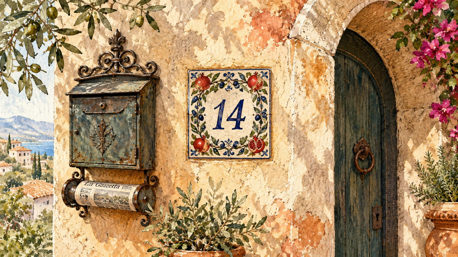
Trend #8: Artisanal Ceramic Plaques and Handcrafted Provenance
Mass-produced hardware is giving way to bespoke objects infused with authentic maker provenance. Artisanal ceramic address plaques bring textural nuance, subtle glaze pooling, and tactile warmth to your entryway.
Studio ceramists craft custom stoneware tiles featuring hand-stamped numerals and custom mineral glazes. Earthy terracotta, celadon green, and speckled oatmeal tones complement both Mediterranean and craftsman architecture.
Mount handmade ceramic address plaques alongside a copper mailbox that ages alongside the earthenware. The dialogue between reactive metal and fired clay tells an evolving artistic story.
Ensure the ceramic numbers are rendered in legible Arabic numerals rather than spelled-out words. Emergency response guidelines require Arabic digits to facilitate rapid visual recognition during critical situations.
Grouping handcrafted elements near your entryway cultivates an approachable, collected aesthetic. These distinctive maker details reassure guests that your home is thoughtfully curated at every scale.
Select stoneware fired to high vitrification temperatures to avoid frost wedging during severe winter freezes. Durable ceramic glazes resist moisture absorption, preventing micro-fractures in sub-zero climates.
Bespoke pottery accents establish emotional warmth before visitors ever cross your interior threshold. Each artisanal piece connects exterior functionality to fine studio craft.
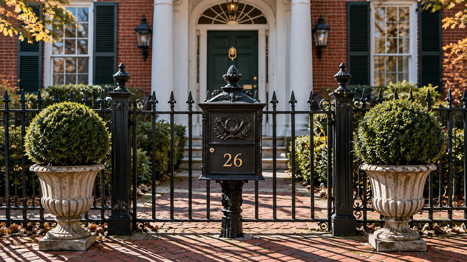
Trend #9: Symmetrical Classical Revival with Cast Iron Flourishes
Classical revival architecture celebrates timeless symmetry, proportion, and enduring materiality. Traditional homes benefit immensely from substantial cast iron mailboxes mounted on formal fluted posts.
Pair a heavy cast aluminum or iron receptacle with polished nickel or antique bronze numerals. Placing identical topiaries or boxwoods on either side of the post reinforces formal architectural equilibrium.
If you reside in a historic conservation district, consult preservation covenants before altering curb fixtures. Matching period-correct fonts and metal finishes preserves the neighborhood’s unique architectural heritage.
For curbside posts, install an approved 4×4-inch wooden post wrapped in historical millwork casings. The wood core satisfies federal breakaway safety mandates while maintaining regal architectural substance.
A well-appointed entry composition sets an aristocratic tone that endures through changing design cycles. Investing in classic detailing delivers lasting satisfaction and timeless curb appeal.
Coat historical metalwork with rust-inhibiting primer and semi-gloss exterior black paint every few seasons. Routine maintenance preserves crisp ornamental crests, fluting, and embossed address details.
Traditional symmetry establishes immediate dignity and composure along your front boundary. It proves that historic proportion remains utterly captivating in modern exterior design.
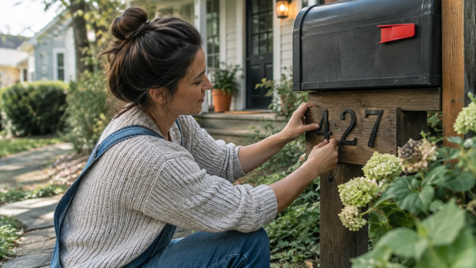
The Big Picture: Weaving These Trends into Your Home
Transforming your mailbox and house numbers should never happen in isolation from your home’s broader design narrative. Exterior elements serve as the visual prelude to your interior living spaces.
Consider the metals, woods, and architectural finishes inside your foyer and living room. Mirroring these materials at your curb establishes an unbroken thread of intentional design continuity.
If your home showcases warm bronze lighting fixtures and wide-plank white oak flooring, replicate those textures outside. A matching white oak post and patinated bronze address plaque create harmonious visual symmetry.
Furthermore, investing in high-quality exterior details delivers measurable financial dividends. The National Association of Realtors reports that 92% of realtors recommend enhancing curb appeal before selling.
Avoid chasing transient micro-trends that clash with your primary architectural facade. A Victorian home demands historical gravitas, whereas a mid-century ranch calls for graphic typography and asymmetrical balance.
Scale remains equally vital when selecting new numbers or commissioning custom mailbox cabinetry. Hardware that appears generous on a workbench often diminishes rapidly when viewed from thirty feet away.
Audit your curb view by standing across the street during midday light and twilight. Evaluating visibility ensures your address remains functional, safe, and visually commanding in all conditions.
By prioritizing authentic materials, proper scale, and regulatory codes, you craft a sophisticated arrival experience. Your home’s charm begins precisely where your property meets the world.
Frequently Asked Questions
What are the strict USPS regulations for curbside mailbox placement?
Curbside mailboxes must be installed with the bottom of the box 41 to 45 inches above the road surface. This specific elevation allows postal carriers to deposit deliveries efficiently without leaving their vehicles.
Additionally, position the mailbox door 6 to 8 inches back from the curb face or road edge. This setback protects your receptacle from passing street sweepers, traffic, and municipal snowplows.
How do I choose house numbers that balance aesthetic charm with emergency visibility?
According to International Fire Code section 505.1, numerals must be Arabic numbers measuring at least 4 inches tall. They require a minimum stroke width of 0.5 inches to ensure quick recognition.
Always select finishes that contrast sharply with your background cladding or mounting panel. Scripted words or low-contrast tones look creative but can critically impede emergency first responders.
Can I build my own custom mailbox post without violating municipal safety codes?
Federal highway safety standards require roadside posts to yield or break away cleanly on vehicular impact. Approved supports include a 4×4-inch wooden post or a 2-inch diameter standard steel pipe.
Supports must never be buried deeper than 24 inches into the ground. Heavy concrete-filled pillars or massive stone columns are hazardous and frequently banned along roadway easements.
Always contact 811 two to three business days before excavating to mark underground public utility lines. Furthermore, remember that DIY mailbox boxes require approval from your local postmaster before installation.
How do I coordinate exterior mailbox finishes with my interior design hardware?
Select one or two key metal finishes from your entry foyer and repeat them at the curb. For instance, patinated unlacquered brass or matte black finishes transition beautifully between indoor and outdoor spaces.
Echoing these tactile materials creates an immediate sense of cohesion throughout your entire property. Consistent details signal refined curation before guests even step inside your home.
For the latest color forecasts, consult industry leaders like Pantone and paint companies like Benjamin Moore. For professional design standards, refer to the American Society of Interior Designers (ASID).
Disclaimer: This article reflects design trend analysis and predictions. Personal taste and timeless design principles should always guide your decorating choices.