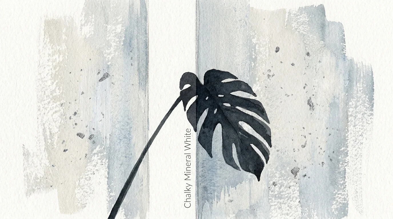
Trend #8: Chalky Mineral White
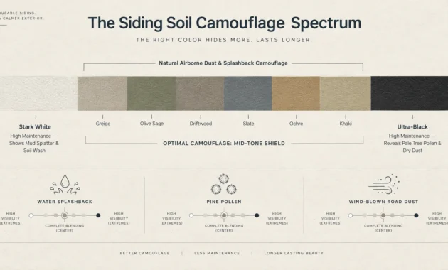
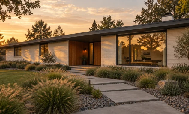
Step away from stark, optic whites and embrace the tactile simplicity of a chalky mineral white. True, brilliant whites often bounce light aggressively, creating a clinical glare that strains the eyes and heightens anxiety. Conversely, mineral whites feature subtle infusions of limestone, alabaster, and raw cotton, giving the paint a soft, almost porous visual texture.
Unlike standard builder-grade white, which relies on synthetic blue brighteners, chalky mineral whites derive their luminosity from natural earth pigments. You can use this highly nuanced shade to unify disparate architectural elements in older homes or to soften the severe angles of contemporary new builds.
Designers consider this the foundational color for quiet luxury interiors, where the focus remains strictly on high-quality materials rather than loud visual statements. Pair mineral white walls with dramatically veined Calacatta marble, brushed oak cabinetry, and raw, unsealed brass hardware that will develop a living patina over time.
To fully capture the calming magic of this shade, specify a low-sheen or matte finish; the lack of reflection emphasizes the color’s inherent softness and mimics raw architectural materials.