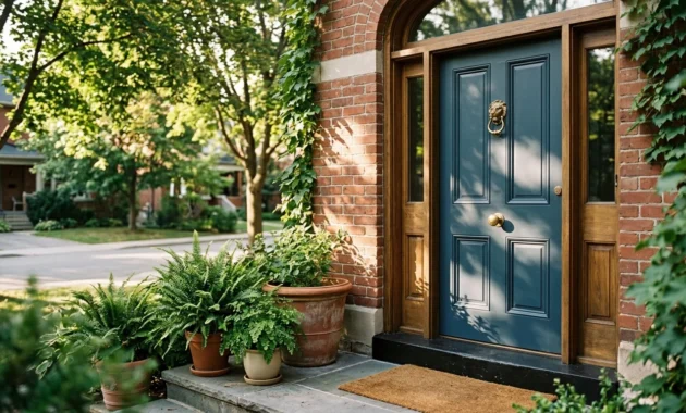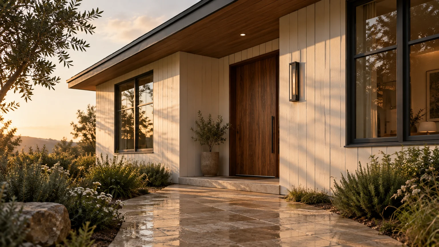
Transforming your facade with intentional color unlocks immediate architectural pedigree and tangible value. High-impact curb appeal exterior colors bridge the gap between interior sanctuaries and street-level presence.
Choosing the best exterior paint colors fundamentally reshapes how natural light highlights your home’s structural silhouette. Modern design movements reject flat, sterile tones in favor of nuanced, multidimensional undertones.
Industry research confirms that curb-appeal upgrades represent eight of the top ten highest-ROI home improvement projects. Selecting sophisticated, standout home exterior colors commands attention while celebrating neighborhood context.
Trend #1: Warm Alabaster and Mineral White
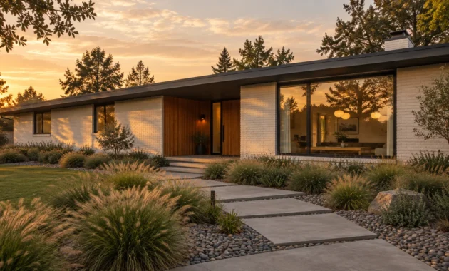
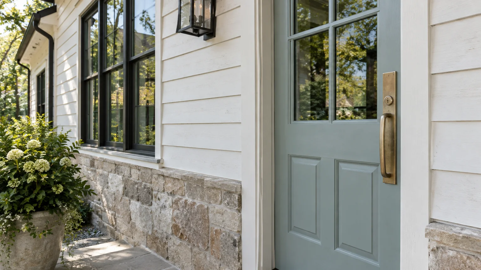
Pure titanium white is relinquishing its crown to warm, grounded mineral shades. Alabaster evokes a sense of quiet luxury, imparting timeless historical weight to both modern farmhouses and classical estates.
These luminous mineral shades reflect shifting daylight without producing blinding midday glare. Their subtle ivory undertones soften sharp architectural perimeters, creating an inviting, residential embrace.
When selecting exterior colors that boost curb appeal, pair mineral white siding with contrasting accents. Charcoal window trim or warm walnut timber doors bring dimensional tension to clean pale surfaces.
Recent real estate research from Zillow reveals that high-contrast pairings yield measurable financial dividends. A light blue-green front door against crisp, pale siding generated an average offer premium of $5,023.
Integrate rough-hewn limestone cladding or blonde travertine pathways to reinforce tactile materiality. This approach anchors the home organically to its surrounding hardscaping.
For coastal or historic properties, mineral white maintains impeccable provenance while projecting modern restraint. It delivers fresh brilliance without the cold, clinical starkness of yesteryear’s ultra-white paints.
Treat your exterior palette as a seamless canvas that previews warm interior living spaces. This continuity produces an uninterrupted visual narrative from street to foyer.
Trend #2: Biophilic Sage and Forest Moss
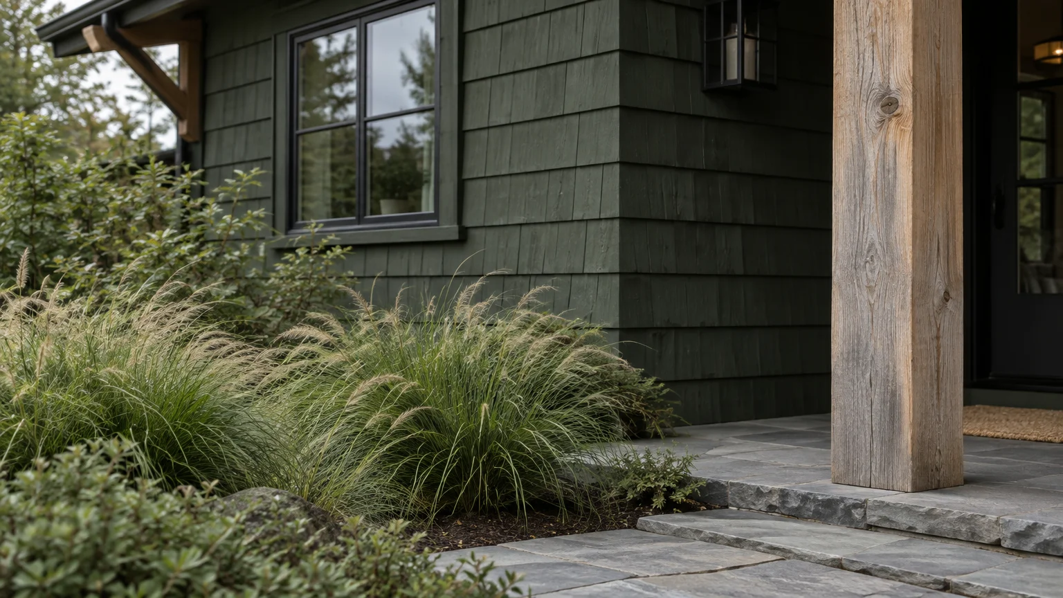
Biophilic design has officially stepped through the front door and established its dominance on residential exteriors. Deep forest greens and velvety moss tones effortlessly dissolve the barrier between domestic structures and landscape design.
These botanical shades adapt intuitively across varying elevations, siding styles, and seasonal light levels. They reflect current home exterior color trends prioritizing organic connection, mental well-being, and ecological harmony.
Muted sage softens rigid architectural lines on contemporary, boxy silhouettes. On craftsman bungalows or rustic cottages, deep evergreen highlights authentic woodwork and historic trim profiles.
Complement rich moss siding with unlacquered brass hardware and natural cedar porticos. The natural oils in raw cedar will weather into a silvery patina that mirrors the undertones of olive paint.
Pair these woodland shades with native ornamental grasses, fieldstone masonry, and bluestone pavers. This landscape synergy ensures your home appears rooted within its site rather than artificially placed upon it.
Matte and low-sheen eggshell finishes maximize the organic richness of these botanical shades. Avoid high-gloss sheens across large expanses, which can read as synthetic and distract from the earthy aesthetic.
A verdant exterior communicates architectural intentionality, making your residence a restful focal point on a block dominated by standard gray siding.
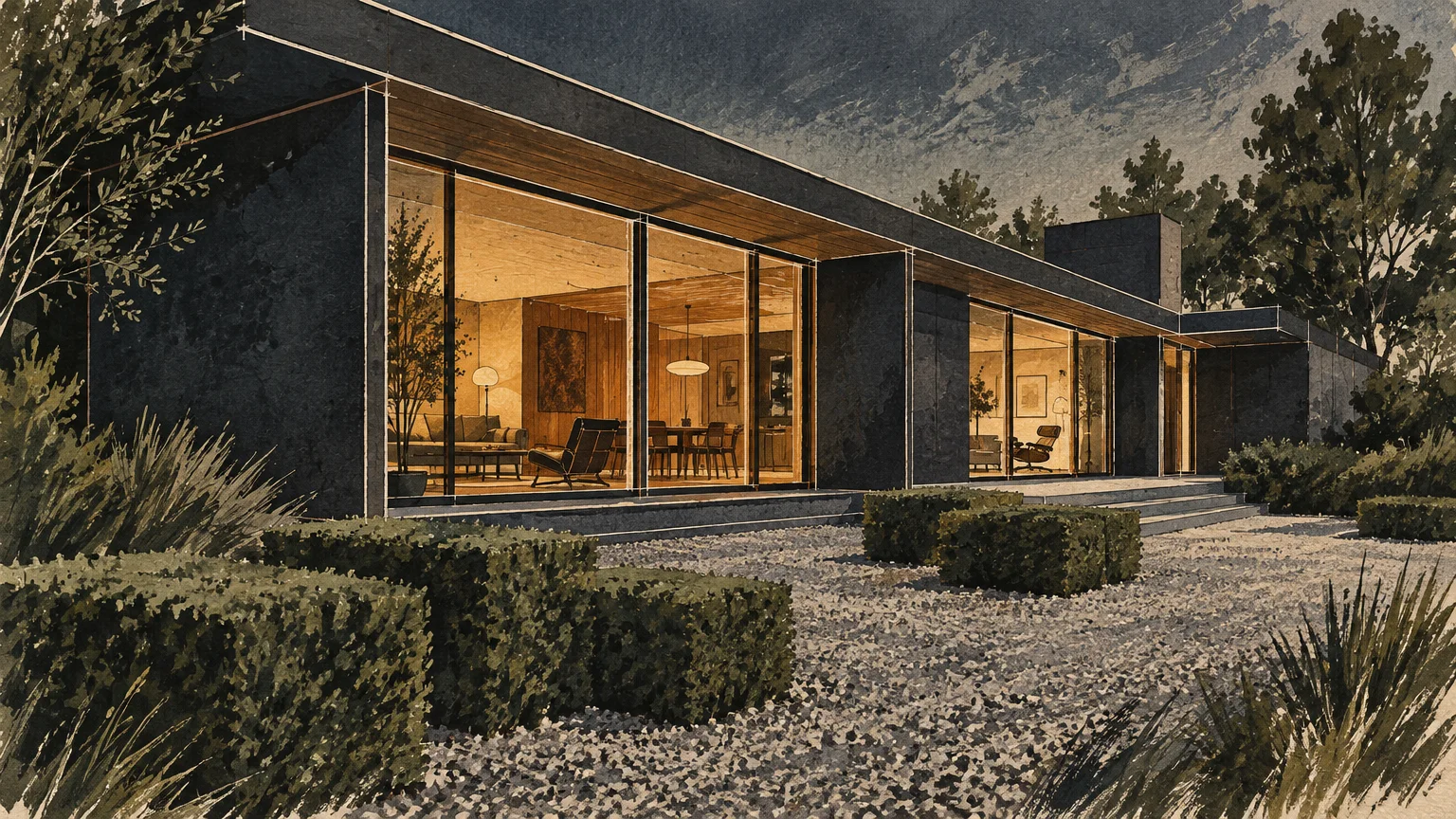
Trend #3: Cast Iron Charcoal and Midnight Slate
Saturated, moody tones have ascended to the forefront of architectural luxury. Cast iron charcoal and velvety slate establish unmistakable gravitas, lending crisp articulation to both modern and traditional framing.
Dark exteriors absorb ambient light, accentuating complex geometry, roof pitches, and cantilevered volumes. They provide an unapologetic counterpoint to neighborhood monotony while retaining an air of understated elegance.
When curating best exterior paint colors, deep charcoals demand thoughtful balance to avoid feeling overly stern. Incorporate warm architectural lighting, rich cedar soffits, and lush perimeter greenery to soften the aesthetic.
High-contrast accents generate remarkable market interest when executed properly. Industry studies show that high-contrast black front doors can increase sale values by roughly $6,200 to $6,450 over standard white doors.
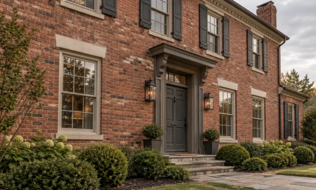
Balance is equally critical when dealing with exterior masonry surfaces. Pairing a charcoal door with dark red brick adds an average of $3,753 in value, yet slashes offers when paired inappropriately with pale brick.
Select high-performance acrylic latex formulations containing heat-reflective pigments for dark siding. These specialized formulas prevent thermal absorption from warping underlying substrate boards over long summer exposures.
Embracing midnight slate creates an unforgettable architectural silhouette that distinguishes your property as a masterpiece of contemporary sophistication.
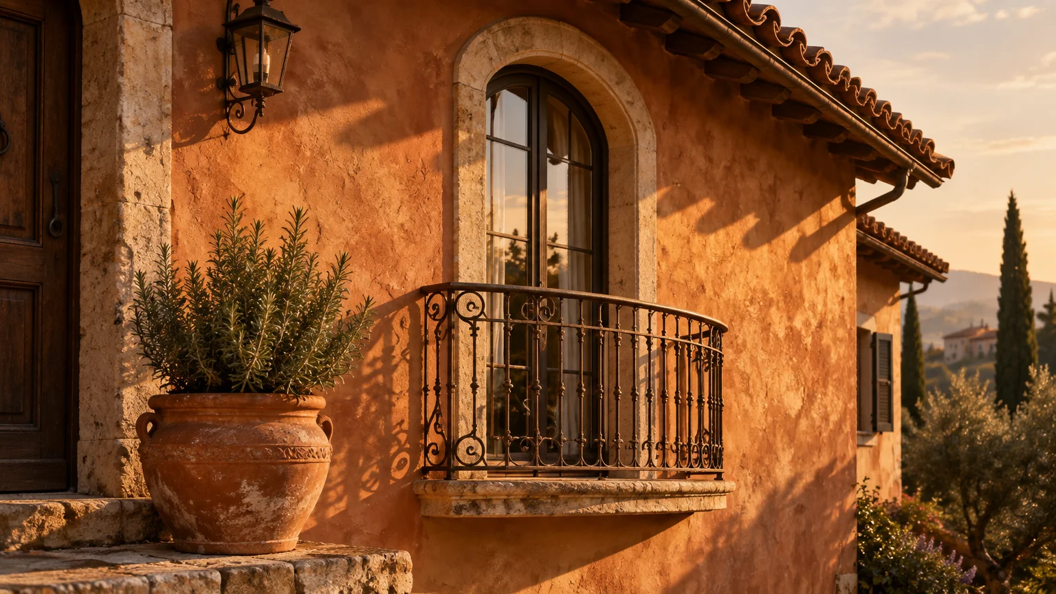
Trend #4: Earthen Terracotta and Warm Ochre
Modern homeowners are increasingly gravitating toward pigments with historical provenance and artisanal warmth. Sun-baked terracotta, warm adobe, and muted ochre introduce radiant, grounding vitality into residential neighborhoods.
These pigments reflect centuries of Mediterranean, Spanish colonial, and desert modern building traditions. They resonate deeply in sun-drenched regions, where bright daylight illuminates the subtle red and amber undertones.
As standout home exterior colors, warm earthen tones deliver personality without resorting to neon garishness. They evoke hand-troweled clay plasters, sun-dried ceramics, and weathered canyon landscapes.
Complement warm terracotta siding with wrought iron railings, raw stone retaining walls, and dark bronze light fixtures. This rustic curation introduces tactile, old-world romance to contemporary architectural footprints.
Avoid oversaturated primary reds, which buyers consistently penalize during market evaluations. Real estate data reveals that mismatched red front doors on light brick structures slash offer values by as much as $6,738.
Instead, select muted clay tones infused with dusty brown or gray undertones. These gentle formulas ensure your facade feels sophisticated, grounded, and harmoniously integrated into its natural surroundings.
Terracotta evokes the warmth of artisanal craftsmanship, transforming your property into a welcoming haven of cultural resonance.
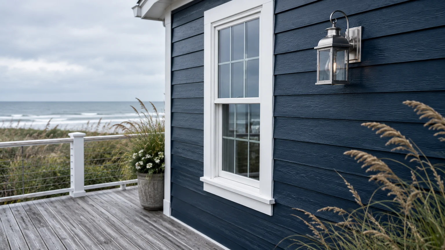
Trend #5: Prussian Ink and Maritime Navy
Deep maritime blues offer an authoritative alternative to conventional neutrals. Prussian ink, midnight indigo, and ocean navy provide timeless elegance that feels crisp, distinguished, and deeply commanding.
These saturated nautical shades possess immense versatility, flourishing on coastal shingle cottages, stately Colonials, and minimalist contemporary villas alike. They anchor the structure firmly against both bright skies and green lawns.
Navy serves as one of the best exterior colors that boost curb appeal without polarizing prospective buyers. Its universal familiarity conveys stability, reliability, and refined taste.
Pair maritime siding with crisp alabaster trim to generate iconic, nautical contrast. Alternatively, pair indigo siding with charcoal fascias and black window casings for a more contemporary, monochromatic silhouette.
Integrate warm brass sconces, teak entry doors, and bluestone walkways to complete the nautical composition. The warm golden metallic sheen provides a stunning visual bridge against deep blue surfaces.
Ensure your blue contains a substantial dose of black or slate gray undertone. Pure, highly saturated blues can look childlike on broad siding expanses under direct southern sunlight.
When rendered in moody, ink-infused formulations, navy elevates your facade into an enduring statement of classic elegance.
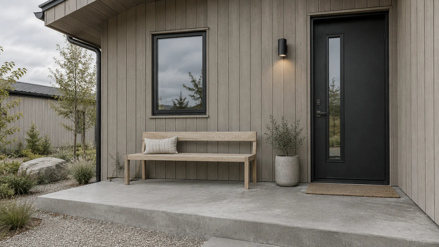
Trend #6: Nordic Taupe and Weathered Greige
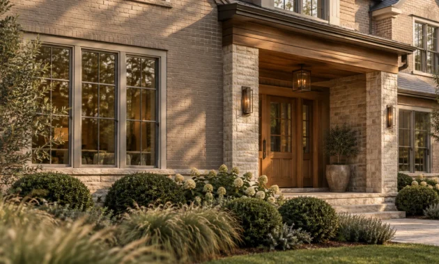
Bridging the gap between sterile cool gray and yellow-based beige, Nordic taupe defines current quiet luxury exterior palettes. It represents an understated, architectural neutrality that celebrates natural light and structural simplicity.
This low-chroma shade acts as a chameleon under shifting atmospheric conditions. In bright sunshine, it reads as an inviting stone; on overcast days, it reveals calming, smoky depth.
As subtle curb appeal exterior colors, complex greiges unify mixed-material facades effortlessly. They seamlessly blend cedar shakes, poured concrete foundations, limestone columns, and composite cladding into a cohesive composition.
Taupe functions as a peaceful backdrop for intentional accents like white oak doors or matte black metalwork. It allows landscaping, sculpture, and architectural fenestration to take center stage.
Applying high-quality acrylic latex taupe finishes delivers incredible exterior durability over time. Professional coatings routinely endure 7 to 10 years on siding before requiring maintenance, shielding against sun bleaching.
Wood siding coated in taupe tones generally requires fresh paint every 5 to 7 years to prevent moisture intrusion. Masonry and fiber cement surfaces will hold the pigment significantly longer.
Nordic taupe demonstrates that you do not need bright saturation to turn heads on your block. Restraint, nuance, and impeccable tonal balance speak volumes.
Trend #7: Celadon Mist and Pale Muted Blue-Green
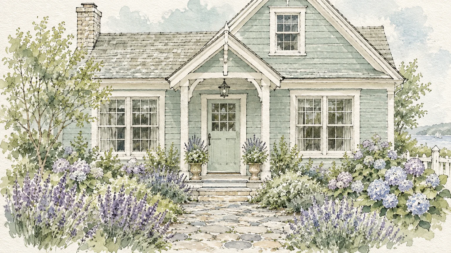
Ethereal and serene, celadon mist offers a refreshing alternative to traditional off-whites and pale creams. This whisper-soft blue-green hue introduces delicate color while remaining remarkably neutral and unobtrusive.
The color evokes morning mist rolling across botanical gardens and tranquil coastal estuaries. It harmonizes exceptionally well with historical Victorian ornamentation, craftsman cottages, and low-slung mid-century ranch homes.
This color family actively drives measurable buyer enthusiasm in competitive housing markets. Market studies confirm that light blue-green accents deliver the single highest price premiums across residential exterior evaluations.
While frequently deployed on front doors, painting entire siding envelopes in muted celadon creates a striking, storybook presence. It captures the imagination without overwhelming neighboring properties.
Pair pale blue-green facades with crisp chalk-white trim and warm terracotta potted planters. The complementary warmth of red clay accentuates the cool, tranquil undertones of the painted siding.
Use dark bronze or blackened iron hardware to prevent the soft palette from appearing overly delicate. The deep metallic hardware provides the visual ballast needed to ground the home.
Celadon mist transforms your home into a calm, welcoming oasis that leaves an indelible impression on everyone who passes by.
Trend #8: Monumental Bronze and Smoked Sepia
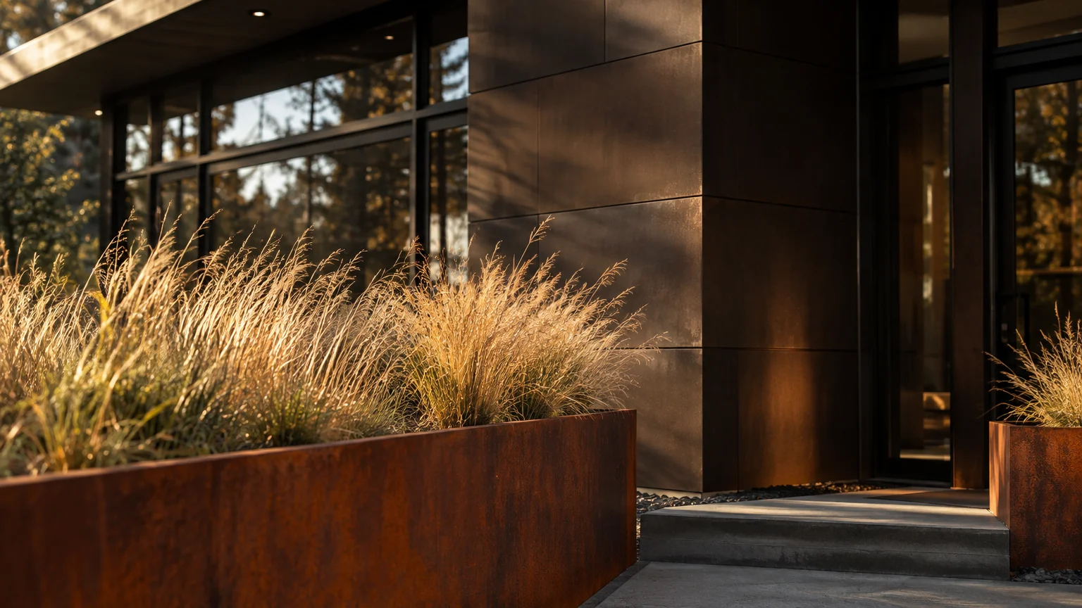
Drawing inspiration from mid-century modernist icons and industrial architecture, monumental bronze represents the pinnacle of contemporary exterior refinement. This deep, brown-black hybrid features warm metallic and sepia undertones.
Unlike harsh jet black, bronze exudes organic warmth that coordinates brilliantly with surrounding natural landscaping. It mirrors the tones of tree bark, river stone, and rich potting soil.
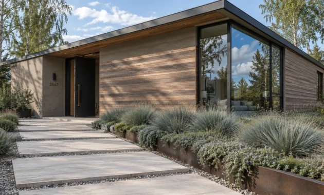
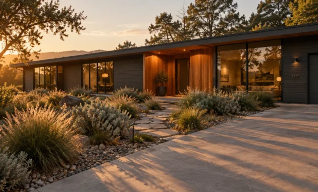
Bronze siding pairs exquisitely with floor-to-ceiling glass fenestration and warm white oak siding accents. It provides an opulent, gallery-like envelope that makes interior living rooms look inviting from the street.
When choosing standout home exterior colors, dark sepia tones offer dramatic curb presence without feeling jarring or abrasive. They establish a commanding, architect-designed identity for custom builds and full-scale renovations.
Balance dark bronze exteriors with light-colored paving materials like limestone, pale granite, or bleached concrete walkways. This radiant ground plane bounces soft daylight upward onto the moody facade.
Smoked sepia finishes conceal exterior environmental dust and highway soot far better than stark white or glossy black paints. This practical advantage maintains your property’s immaculate curb appearance between seasonal cleanings.
Choosing monumental bronze signals an eye for vanguard design, making your residence a striking masterclass in contemporary architectural luxury.
The Big Picture: Weaving These Trends into Your Home
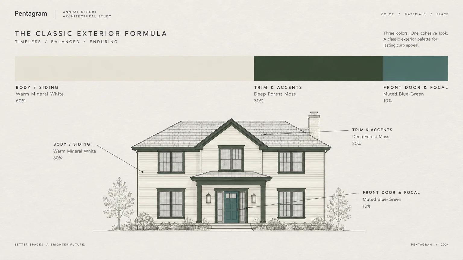
Choosing the best exterior paint colors requires evaluating your home’s fixed architectural context before opening a paint deck. Stone foundations, roof shingle hues, and prevailing daylight determine how any shade reads on your facade.
A full exterior paint renovation represents a meaningful financial investment in your property’s longevity. The national average cost to paint a home exterior stands at $3,178, according to Angi and HomeAdvisor.
Most residential projects range from $1,819 to $4,551, translating roughly to $1.50 to $4.00 per square foot. Multi-story layouts, elaborate millwork, and stucco repairs can increase these investment figures.
Fortunately, exterior painting delivers an impressive direct return on investment, regularly yielding 55% to 80% at resale. Remodeling magazine confirms that curb-appeal enhancements dominate the highest-ROI remodeling projects nationwide.
Before finalizing your color selection, review your neighborhood covenants and municipal zoning restrictions carefully. Over 35% of all U.S. housing and 65% of newly built single-family homes belong to homeowners associations.
Submitting your color selections to an Architectural Review Committee (ARC) prevents costly delays, fines, or mandatory repainting orders. Present complete palettes alongside physical material samples to streamline committee approvals.
Test large, two-foot-square swatches on multiple sides of your home before committing to thousands of dollars in paint. Observe these samples across dawn, midday, and twilight to evaluate shifting chromatic undertones.
Connect your exterior hue intentionally with your interior foyer and dining room palettes. This seamless color conversation ensures an elegant transition whenever you welcome guests across your threshold.
Frequently Asked Questions
How do exterior paint choices impact long-term home resale value?
Exterior color directly shapes a prospective buyer’s initial psychological impression of a property. Neutral tones, soft mineral whites, and sophisticated charcoals consistently yield high offer premiums and shorten days on market.
Conversely, jarring or poorly coordinated combinations can dramatically depress market value. Data shows mismatched doors on light brick structures slash buyer offers by over $6,700.
How should I navigate HOA guidelines when choosing standout exterior paint?
Begin by requesting the specific design guidelines published by your community’s Architectural Review Committee. More than 78 million Americans reside in HOA-governed communities that require formal pre-approval for exterior modifications.
Choose colors that fall within allowable LRV (Light Reflectance Value) bands while asserting subtle sophistication through nuanced undertones. Presenting high-quality paint swatches and professional renderings significantly accelerates committee approvals.
What is the typical lifespan of high-performance exterior paint before repainting?
Premium acrylic latex paint jobs typically endure for 7 to 10 years when applied to sound surfaces. Superior paint formulations resist ultraviolet fading, surface cracking, and moisture damage under harsh weather.
Natural wood siding requires repainting every 5 to 7 years due to natural expansion and contraction. Fiber cement, stucco, and brick retain exterior coatings substantially longer before displaying signs of wear.
How do I choose between warm and cool undertones for exterior siding?
Inspect the permanent, unpainted materials surrounding your home, including your roof shingles, stonework, and paving. Warm brick and brown shingles demand warm paint undertones like alabaster, olive, or ochre.
Cool slate roofing and gray flagstone walkways harmonize best with cool undertones like midnight slate, charcoal, or maritime navy. Matching these fundamental undertones prevents visual dissonance across your entire property.
For the latest color forecasts, consult industry leaders like Pantone and paint companies like Benjamin Moore. For professional design standards, refer to the American Society of Interior Designers (ASID).
Disclaimer: This article reflects design trend analysis and predictions. Personal taste and timeless design principles should always guide your decorating choices.