Experts Say These 7 Paint Colors Will Dominate in 2027

The era of sterile white boxes is officially behind us; interior design is now embracing an emotion-driven approach to color. You are seeking spaces that reflect deep personal narratives, and industry forecasters recognize that your wall colors serve as the ultimate canvas for this expression. The upcoming year champions a dramatic shift toward rich, grounding hues and atmospheric tones that establish an immediate sense of sanctuary. By examining interior design trends, biophilic design principles, and a renewed desire for quiet luxury, experts have identified a definitive palette. These seven paint colors will dominate the market in 2027, offering you actionable ways to elevate your home aesthetics with intentional, designer paint colors.
A close-up of a marble dining table with brass candlesticks against a rich matte midnight aubergine wall.
Rich midnight aubergine walls create a dramatic, intimate backdrop for this candlelit marble dining table.

Trend #1: Midnight Aubergine

Deep, nuanced darks are replacing standard blacks and charcoals. Midnight Aubergine emerges as the quintessential color for homeowners who crave drama without sacrificing elegance. This rich, blackened purple carries subtle brown undertones, creating a velvety depth that shifts dramatically depending on your lighting. In natural daylight, the plum notes add warmth and vitality to your living spaces; under ambient evening lighting, the color recedes into a moody, sophisticated shadow. Design experts champion this hue because it perfectly encapsulates the quiet luxury movement—a shift toward spaces that feel collected, expensive, and deeply considered.

You can apply Midnight Aubergine in dining rooms to foster an intimate, enveloping atmosphere for dinner parties, or use it to anchor a primary bedroom suite. To maximize the impact of this color, pair it with heavily veined marble countertops, unlacquered brass fixtures, and tactile fabrics like mohair or bouclé. The contrast between the dark, matte walls and reflective, high-end materials delivers an immediate sense of provenance and timelessness. Recent sales data from boutique paint brands indicates a massive increase in specifications for plum and aubergine tones over the past year. When applying this robust shade, you must evaluate your artificial lighting scheme. Swap out cool LED bulbs for warm white options—ideally around 2700K—to enhance the red and brown undertones of the aubergine. This precise lighting adjustment prevents the room from feeling cave-like, ensuring the walls radiate a sophisticated, ambient glow.

A textured earthen terracotta plaster fireplace in a sunlit living room with natural oak floors and a green plant.
A textured terracotta fireplace creates a warm, earthy focal point in this cozy, modern living room.

Trend #2: Earthen Terracotta

Homeowners increasingly desire spaces that feel connected to the natural world. Earthen Terracotta directly answers this craving, bridging the gap between indoor comfort and outdoor vitality. Unlike the bright, saturated oranges of the early 2000s, the 2027 iteration of terracotta is heavily muted with brown and dusty pink undertones. This specific balance creates a baked-earth aesthetic that feels incredibly grounding. Industry analysts note a massive surge in Mediterranean-inspired design elements, and this paint color anchors that look flawlessly.

When you apply Earthen Terracotta to a sun-drenched living room, the walls emanate a cozy warmth that instantly relaxes the nervous system. The color also serves as a brilliant backdrop for lush indoor greenery, emphasizing biophilic design principles by mimicking the visual harmony found in natural landscapes. To execute this trend properly, you should opt for a lime wash or Roman clay finish rather than standard flat paint. These specialized finishes introduce a mottled, plaster-like texture that gives your walls historical depth and tactile interest.

You can complement this hue with natural oak flooring, woven rattan furniture, and organic linen upholstery. If your architecture leans more contemporary, you can still embrace this trend by applying it to unexpected spaces. Painting a modern geometric fireplace surround or a streamlined kitchen island in Earthen Terracotta immediately warms up rigid lines and austere materials. Recent market data shows that contemporary homes incorporating warm, earthy accents sell significantly faster than those relying strictly on grayscale palettes. By integrating Earthen Terracotta into your home, you construct a timeless environment that prioritizes emotional well-being and organic beauty.

A gouache and ink flat-lay illustration of a Quiet Sage paint can, linen fabric swatch, and fresh sage leaves.
A dripping can of sage green paint sits beside a wooden stir stick and fresh botanical leaves.

Trend #3: Quiet Sage

Cool, clinical grays have dominated the interior design landscape for over a decade, but 2027 marks their definitive end. Quiet Sage steps in as the new foundational neutral for your home. This highly adaptable, desaturated green carries heavy silver and gray undertones, allowing it to function as a neutral canvas while still injecting life into your rooms. The psychological benefits of green are well-documented; the color lowers heart rates and reduces stress, making it an essential tool for residential design.

You will see Quiet Sage dominating kitchen cabinetry and spa-inspired bathrooms, where its restorative qualities shine brightest. Homeowners are increasingly treating their bathrooms as personal wellness retreats, and painting the walls a soft, silvered green instantly replicates the atmosphere of a high-end spa. Furthermore, this shade provides a seamless transition between the interior of your home and your exterior landscaping when used in rooms with expansive windows. For a truly contemporary aesthetic, pair Quiet Sage with honed quartzite countertops, polished nickel plumbing fixtures, and pale ash wood tones.

Furthermore, the versatility of Quiet Sage extends well beyond the kitchen and bath. You can apply this color to millwork in a mudroom or laundry area to bring an element of elegance to otherwise utilitarian zones. When paired with vintage brass hardware and classic checkerboard flooring, the green acts as an anchor that feels both historically informed and refreshingly modern. Designers report that homes featuring green-toned spaces often sell faster and at higher valuations because the color feels both fresh and universally appealing. Rather than defaulting to a stark white for your next renovation, you should utilize Quiet Sage to achieve a sophisticated, tranquil environment.

A gouache painting of an elegant arched doorway painted in deep, glowing golden ochre, catching warm sunlight.
A painted arched doorway in rich, saturated ochre brings warmth and rustic charm to a sunlit interior.

Trend #4: Saturated Ochre

As the global mood shifts toward optimism and creative expression, interior palettes are reflecting a renewed sense of joy. Saturated Ochre represents this energetic shift, offering a rich, mustard-toned yellow that feels historical rather than harsh. Standard yellows often skew too acidic or overly sweet, but the 2027 Ochre relies on deep, earthy umber undertones to maintain its sophistication. This color commands attention, making it the perfect choice for transition spaces where you want to make a strong first impression.

Applying Saturated Ochre in your entryway or a powder room creates an immediate sense of warmth and hospitality. You can also utilize this shade in a formal dining room to stimulate conversation and appetite—a trick interior designers have leveraged for centuries. Market forecasting reports indicate that consumers are actively moving away from safe, monochromatic homes in favor of spaces infused with personality and bold, saturated color.

To ground the vibrancy of Saturated Ochre, you must pair it with heavily contrasting elements. Think rich walnut furniture, deep charcoal accents, and heavy textiles like velvet or wool. The juxtaposition of the sunny wall color with dark, structured furniture creates a dynamic visual tension that feels incredibly chic. For those hesitant to commit to fully saturated walls, Saturated Ochre serves as a phenomenal accent color. You can introduce it through painted wainscoting or a beautifully lacquered interior front door. Psychologists specializing in environmental design note that exposure to grounded yellow tones actively stimulates positive energy, proving that your paint choices directly influence your daily emotional health.

An abstract gouache study showing thick, textured layers of plaster white, warm cream, and soft gray paint.
Thick, textured swatches of plaster white and neutral paint on paper showcase a serene, tactile aesthetic.

Trend #5: Atmospheric Plaster White

While bold colors are making a massive resurgence, the demand for light, airy spaces remains strong. However, the stark, blue-toned whites of the minimalist era are giving way to Atmospheric Plaster White. This shade is not simply a color; it is an experience of texture and subtle warmth. True to the principles of wabi-sabi—the Japanese philosophy that embraces imperfection and organic beauty—this off-white carries complex undertones of cream, mushroom, and subtle peach. When applied to your walls, it creates a luminous, soft-focus effect that blurs hard architectural lines and makes your space feel expansive yet intimate.

High-end designers are exclusively specifying these warmer whites because they respond beautifully to changing light throughout the day, glowing with an amber hue at sunset. To fully realize this trend, you should move beyond standard drywall finishes. The 2027 approach involves applying this color via genuine plaster, micro-cement, or heavily textured paint treatments. This tactile approach transforms a flat wall into a bespoke architectural feature. Atmospheric Plaster White serves as the ultimate backdrop for displaying curated art collections, sculptural furniture, and vintage rugs.

The push toward Atmospheric Plaster White also aligns with sustainable design practices. Many homeowners now seek out mineral-based and eco-friendly paint formulations that naturally dry to this chalky, imperfect finish. These non-toxic options improve indoor air quality while delivering the exact artisanal aesthetic that upcoming design trends demand. Real estate staging experts consistently utilize these warm, textural whites to make properties feel both luxurious and inviting. You invest not just in a color, but in the overarching health and integrity of your home environment.

A cozy reading nook with deep marine blue built-in bookshelves, a leather armchair, and a glowing brass floor lamp at twilight.
Deep marine blue bookshelves frame a cozy leather armchair, creating a warm and sophisticated reading nook.

Trend #6: Deep Marine Blue

Navy blue is a perennial favorite, but the 2027 iteration—Deep Marine Blue—pushes the boundary with strong teal and green influences. This color mimics the profound depths of the ocean, offering a level of saturation and vibrancy that standard navy lacks. The design industry is experiencing a massive revival of New Traditionalism, an aesthetic that honors classic silhouettes and historical colors while updating them for modern lifestyles. Deep Marine Blue fits perfectly into this movement, establishing spaces that feel both scholarly and effortlessly chic.

You will find this color extensively utilized in home offices, libraries, and custom built-in cabinetry. The deep, immersive quality of the blue fosters focus and contemplation, making it highly practical for spaces dedicated to work or study. To modernize the application, you should employ the color-drenching technique: painting your walls, baseboards, crown molding, and interior doors all in the exact same shade. This monochromatic approach eliminates visual clutter, making small rooms feel larger and significantly more architectural.

To truly maximize the impact of Deep Marine Blue, consider the finish carefully. While matte finishes offer a velvety, modern appearance, applying this deep hue in a high-gloss or lacquer finish creates an extraordinary, mirror-like effect. A high-gloss marine blue ceiling reflects the room below, pulling the eye upward and adding an astonishing layer of glamour to formal dining spaces or luxurious primary suites. You can offset the coolness of the blue by incorporating warm metallic accents, such as antiqued brass sconces, which pop brilliantly against this marine backdrop.

A delicate gouache illustration of a dusty rose wall behind a simple oak chair with a vase of dried grasses.
A warm, muted dusty rose wall creates a serene backdrop for a wooden chair with dried grass.

Trend #7: Muted Dusty Rose

The final color poised to dominate the market is a highly sophisticated evolution of pink. Muted Dusty Rose completely sheds any juvenile associations, emerging as a mature, nuanced alternative to standard beige and taupe. This color features a heavy dose of brown and gray, rendering it a complex, muddy neutral that flatters every skin tone and casts a beautiful, romantic glow across your rooms. Lighting designers frequently praise this specific hue because it acts like a photographic filter for your home, softening harsh shadows and enhancing natural sunlight.

You can confidently use Muted Dusty Rose in living rooms, bedrooms, and even open-concept kitchens to establish an atmosphere of gentle refinement. The trend data reveals a growing consumer fatigue with hyper-masculine, starkly contrasting interiors; people want their homes to feel soft, forgiving, and nurturing. Muted Dusty Rose delivers this emotional resonance effortlessly. For a truly elevated look, pair this color with deep burgundy accents, natural stone featuring pink veining like Calacatta Viola marble, and dark, smoky woods.

Muted Dusty Rose also performs exceptionally well in textural applications. Imagine this color utilized on heavily ribbed wood paneling or a custom limewash accent wall. The interplay of shadow and light across the texture deepens the gray undertones, making the pink feel even more grounded. Interior styling experts predict this specific shade will completely replace traditional builder-beige, offering you a neutral base that actively contributes to the room’s overarching design narrative. Transitioning from safe neutrals to a muddy rose demonstrates a sophisticated understanding of subtle color theory.

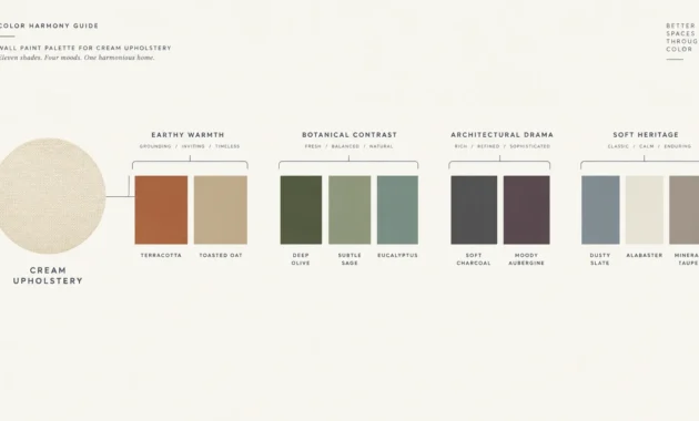
A clean, minimalist infographic showing the seven paint color swatches with connecting lines indicating harmonious combinations.
Seven circular color swatches are connected by elegant lines to show a beautifully woven home palette.

The Big Picture: Weaving These Trends into Your Home

Understanding the paint color trends 2027 will unveil is only the first step; the true mastery lies in how you weave these hues into your existing architecture and personal style. You do not need to repaint your entire house to stay relevant. Instead, you should approach these color forecasts as a menu of emotional atmospheres, selecting the shades that resonate most deeply with how you want to feel in a given space. If you are hesitant to commit to a bold hue like Midnight Aubergine or Saturated Ochre on all four walls, you can introduce these colors strategically. Paint a singular focal wall, update your interior doors, or transform a neglected powder room into a jewel-box moment.

Furthermore, you must consider the visual flow of your home. A cohesive interior design relies on a well-planned color story that carries the eye naturally from one room to the next. You can achieve this by establishing a foundational neutral—such as Atmospheric Plaster White or Quiet Sage—in your main living areas and hallways, and then injecting the deeper, more saturated trends into enclosed spaces like dining rooms and bedrooms.

Always test your paint samples properly. Professional decorators emphasize the importance of viewing these swatches on both sunny and overcast days. The way Earthen Terracotta looks in the bright morning sun will differ drastically from how it reads under artificial evening lighting or during a heavy rainstorm. By taking the time to layer these trending colors with your cherished furnishings, heirloom pieces, and natural materials, you create a home that feels both fashion-forward and timelessly yours.

Frequently Asked Questions

How do I mix warm and cool paint trends in the same house?

Mixing warm and cool tones requires an understanding of visual balance. You can successfully pair a warm color like Saturated Ochre with a cool Deep Marine Blue by utilizing transitional spaces. Ensure that there is a visual bridge between the rooms, such as a hallway painted in a unifying neutral like Atmospheric Plaster White. Additionally, you should weave accent colors from one room into the home decor of the adjoining room—for instance, placing ochre throw pillows on a blue sofa—to create a cohesive narrative.

Is color drenching still relevant for 2027?

Absolutely. Color drenching—painting the walls, trim, ceiling, and doors the exact same color—remains a highly recommended technique for the upcoming year. This method is particularly effective with deep shades like Midnight Aubergine, as it eliminates contrasting trim lines that visually chop up a room. The result is a seamless, enveloping space that feels highly architectural and custom-designed.

Will these bold colors negatively impact my home’s resale value?

While real estate flips historically relied on stark whites and cool grays, the market is shifting. Buyers are increasingly drawn to homes with distinct personalities and high-end design elements. Trending but sophisticated colors like Quiet Sage or Earthen Terracotta often increase a home’s perceived value because they make the property feel like a bespoke, professionally curated space rather than a generic build. If you plan to sell within a few months, sticking to nuanced neutrals is always a safe, lucrative strategy, but do not fear color if you plan to stay.

Can I use saturated colors in small, windowless rooms?

Yes; in fact, interior designers heavily encourage it. Small, windowless rooms—such as powder rooms or interior hallways—rarely look good painted stark white because there is no natural light to reflect. Instead, leaning into the darkness by applying a rich hue like Deep Marine Blue or Saturated Ochre creates a beautiful visual experience. You transform an architectural shortcoming into an intentional, dramatic design moment.

For the latest color forecasts, consult industry leaders like Pantone and paint companies like Benjamin Moore. For professional design standards, refer to the American Society of Interior Designers (ASID).

Disclaimer: This article reflects design trend analysis and predictions. Personal taste and timeless design principles should always guide your decorating choices.

zeidqi
Author and editor. I write about Interior designs, Beauty tips, IT services for business, Real estate and architectures. Strongly passionate about games, comics, art, design, fashion and decoration, I will tell you in detail the best stories in the world of beauty and will guide you through the most popular trends of the moment.

Recent Articles

Related Stories

Stay on op - Ge the daily news in your inbox