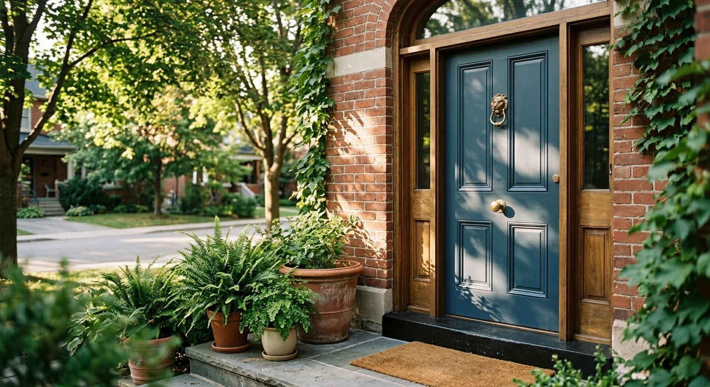
Your front entrance creates the ultimate first impression, setting the aesthetic narrative for your entire home before guests even cross the threshold. Selecting the right exterior shade does far more than elevate curb appeal; strategic color choices establish architectural character and substantially boost property valuation. As homeowners pivot away from sterile palettes toward expressive, tactile design, the latest front door color trends reflect a deliberate blend of heritage warmth and quiet luxury. Whether you want to refresh a historic facade or energize a modern build, upgrading your entryway offers one of the most accessible, high-impact design investments you can make this season.
Trend #1: Earthy Greens and Biophilic Olive
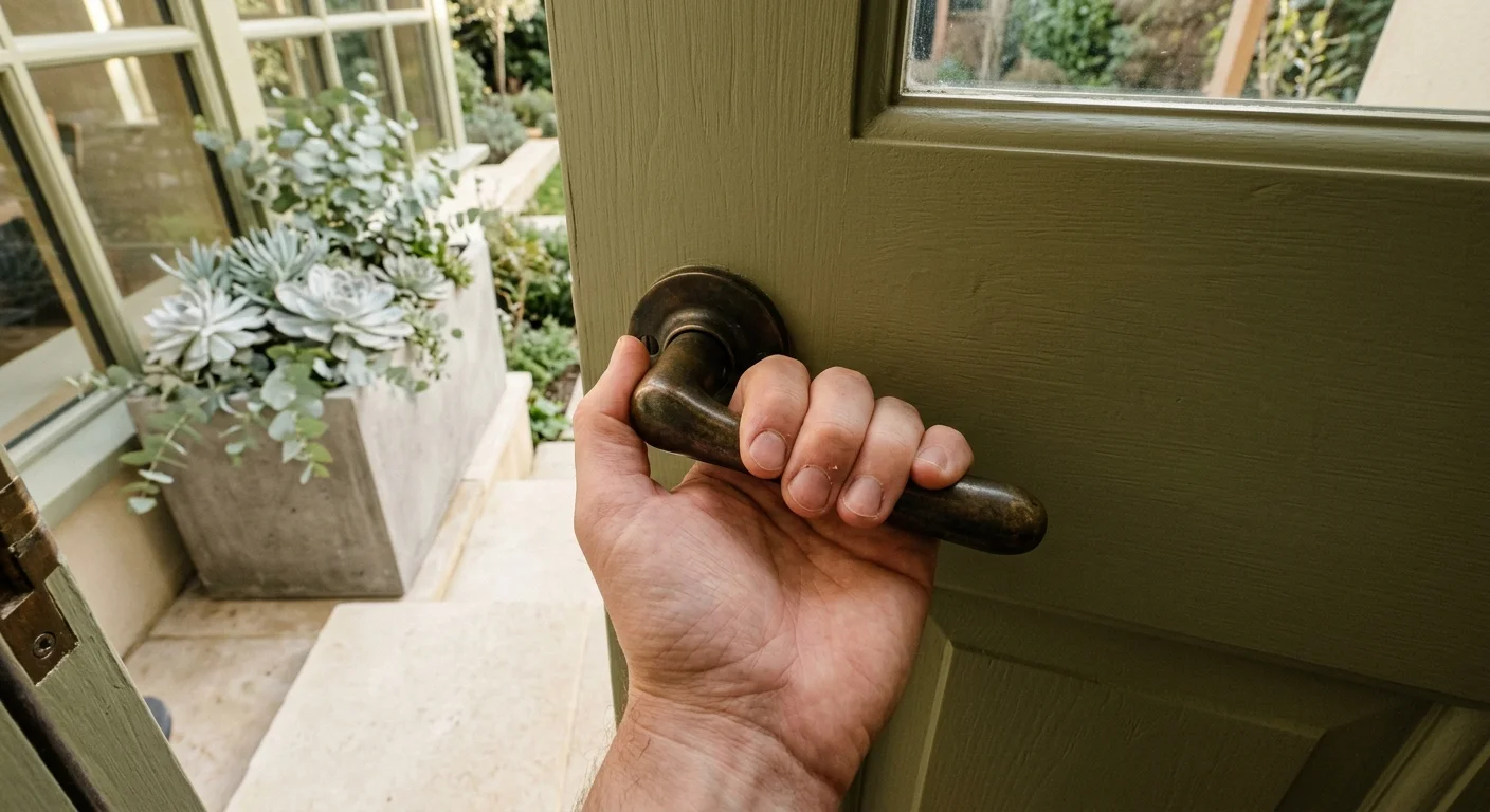
Biophilic design has migrated from sunrooms and botanical interior wallpapers straight to exterior entryways. Grounded greens—ranging from muted sage and eucalyptus to deep, resinous forest olive—represent the leading “new neutral” in modern exterior styling. These shades create an organic visual bridge between your front porch landscaping and your interior foyer, establishing an immediate sense of sanctuary and calm.
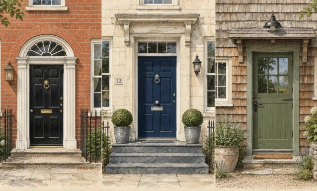
Unlike transient novelty shades, botanical greens possess remarkable versatility across architectural genres. A muted sage door softens the stark geometry of contemporary charcoal siding; conversely, a deep, saturated olive adds historical gravitas to red brick colonials or white cedar shingle homes. Designers frequently pair these organic hues with unlacquered brass or patinated bronze hardware, which develops a living patina over time that mirrors the natural aging of the outdoors.
To execute this look effectively, examine the surrounding foliage and hardscaping before committing to a specific swatch. If your home features limestone steps and silver-toned succulents, cooler eucalyptus tones harmonize effortlessly. If your entryway features warm bluestone, red clay pavers, or extensive cedar woodwork, opt for olive hues infused with golden undertones. This color family delivers an understated yet deeply intentional design presence that feels simultaneously rooted in landscape history and fresh for contemporary living.
Trend #2: Dramatic Dark Neutrals and Soft Black
High-contrast framing remains an undisputed favorite among luxury architects and visionary remodelers. Deep charcoal, iron ore, and velvet soft black dominate contemporary entries by creating a crisp, assertive focal point that anchors an exterior elevation. Rather than absorbing light into an impenetrable void, these nuanced dark neutrals feature subtle brown, blue, or slate undertones that interact dynamically with changing outdoor sunlight throughout the day.
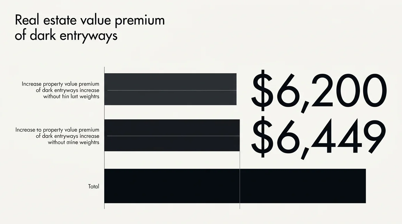
This design direction delivers substantial financial dividends alongside aesthetic prestige. Industry valuations and real estate studies from Zillow reveal that homes featuring front doors painted in black or deep charcoal can command an offer premium between $6,200 and $6,449 over comparable properties. The visual weight of a dark entryway conveys structural substance, premium craftsmanship, and pristine maintenance, instantly elevating buyer perception and setting an upscale tone before anyone steps indoors.
When selecting best front door paint colors in this category, avoid flat matte formulations that tend to appear chalky under direct exterior glare. Instead, specify an exterior acrylic latex or urethane enamel in a refined semi-gloss or high-gloss finish. The subtle sheen reflects ambient daylight, highlights architectural panel detailing, and withstands seasonal weather variations. Pair soft black doors with minimalist matte black hardware for a monochromatic architectural statement, or contrast them with polished brass fixtures to channel timeless Parisian elegance.
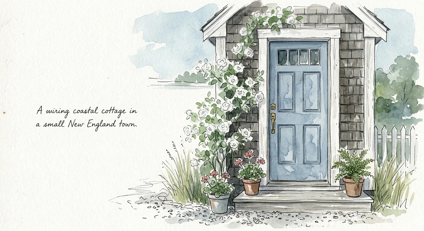
Trend #3: Deep Slate and Coastal Powder Blue
Blue has permanently evolved beyond traditional coastal nautical tropes into a complex, atmospheric statement for entry doors. Two dominant blue families are capturing designer attention this season: chalky, mineral-washed powder blue and moody, oceanic slate. These shades infuse an entryway with crisp visual interest while preserving a serene, welcoming ambiance.
Market data strongly reinforces the enduring popularity of blue exterior entries. Zillow curb appeal research indicates that light blue front doors on solid white homes are linked to an average purchase offer premium of $5,023, while slate blue consistently ranks near the very top of buyer purchase intent metrics. In sharp contrast, monochromatic white doors on white homes perform poorly in buyer engagement, underscoring the absolute necessity of intentional color contrast at the threshold.
Slate blue operates as a sophisticated bridge color that complements both cool masonry and warm natural timber. If your home features river rock stone veneers, gray slate walkways, or weathered shake siding, a chalky slate door provides rich depth without overwhelming the facade. For coastal or cottage-inspired properties, pair a soft powder blue door with oil-rubbed bronze lanterns and woven rattan porch planters to create an inviting, breezy entrance that feels thoughtfully composed.
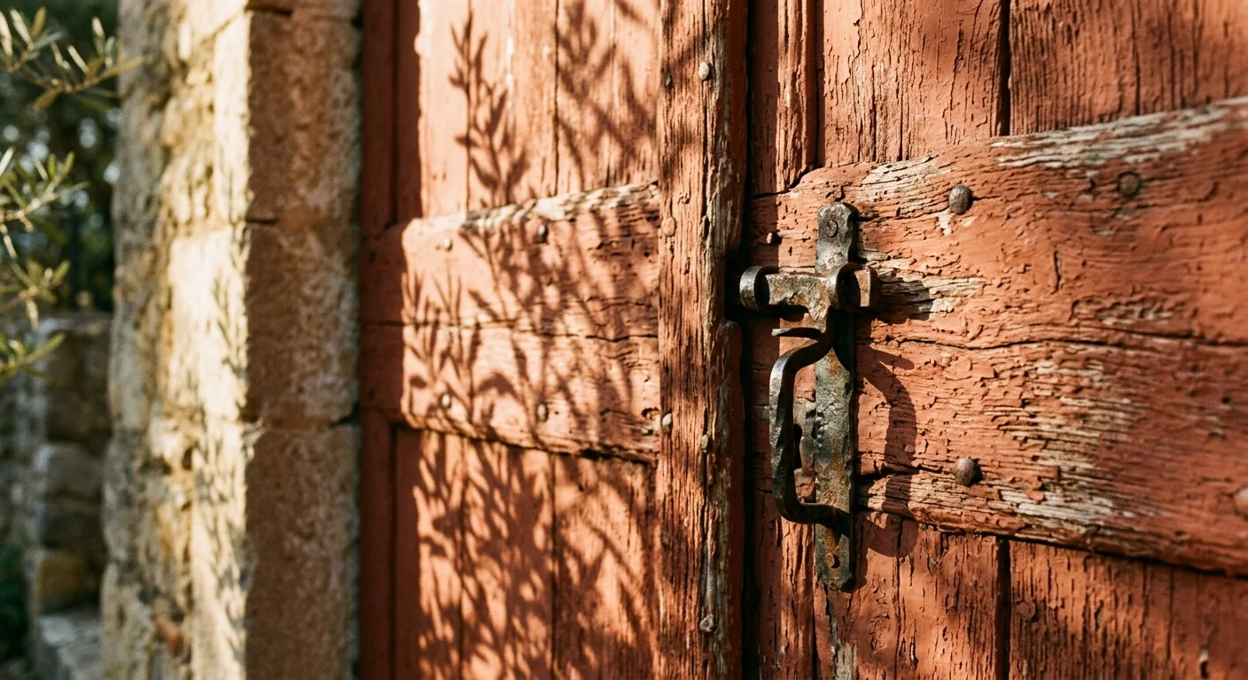
Trend #4: Warm Terracotta and Heritage Clay
Earthy reds and sunbaked clay tones are staging a major revival, completely replacing the bright, high-gloss fire-engine reds of previous decades. Modern homeowners are embracing terracotta, burnt rust, and brick red to inject authentic artisanal warmth into their exterior facades. These colors channel historic Mediterranean, Spanish Colonial, and mid-century aesthetics while providing an earthy, grounded welcome.
The cultural shift toward heritage clay stems from an appetite for provenance and tactile materials. As homeowners gravitate toward limewash finishes, raw brick, and natural plaster, terracotta serves as the ideal complementary accent. It creates a striking counterpoint against creamy off-white stucco, dark charcoal siding, or lush green garden borders. The color carries intrinsic warmth that makes an entrance feel genuinely hospitable and radiant, even on overcast winter afternoons.
Styling a clay or terracotta door requires thoughtful material coordination. These warm hues pair exceptionally well with wrought iron handlesets, hand-thrown ceramic planters, and antiqued bronze light fixtures. If your home features natural brick, select a terracotta shade that sits two shades deeper or more saturated than the brick mortar to prevent the door from blending visually into the surrounding masonry wall.
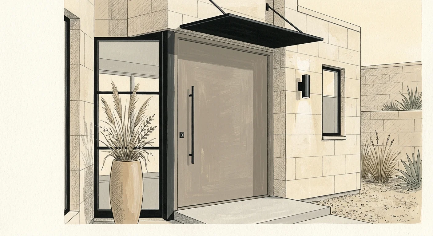
Trend #5: Warm Stone Neutrals and Earthy Greige
The era of sterile, cool industrial gray has officially ended. Recent real estate market analyses demonstrate that stark cement gray doors actually reduced buyer offer values by an average of $3,365, as buyers perceived the color as cold and dated. In its place, designers are celebrating warm stone neutrals, agate grey, pebble, and rich greige tones that exude quiet luxury.
Warm stone neutrals draw inspiration from natural architectural limestone, French travertine, and aged parchment. These subtle hues reflect high design restraint, allowing the architectural profile of the door—such as intricate millwork, crossheads, and sidelights—to take center stage. They create a seamless, cohesive aesthetic for tone-on-tone exterior palettes, delivering an effortless, layered look that feels polished and upscale.
To maximize the impact of a stone neutral door, focus on textural contrast rather than color clash. Combine an agate grey door with textured limewash masonry, bluestone flagstone steps, and brushed nickel or blackened brass hardware. The result is a calm, sophisticated entryway that radiates quiet confidence and adapts effortlessly to seasonal floral arrangements and holiday decor.
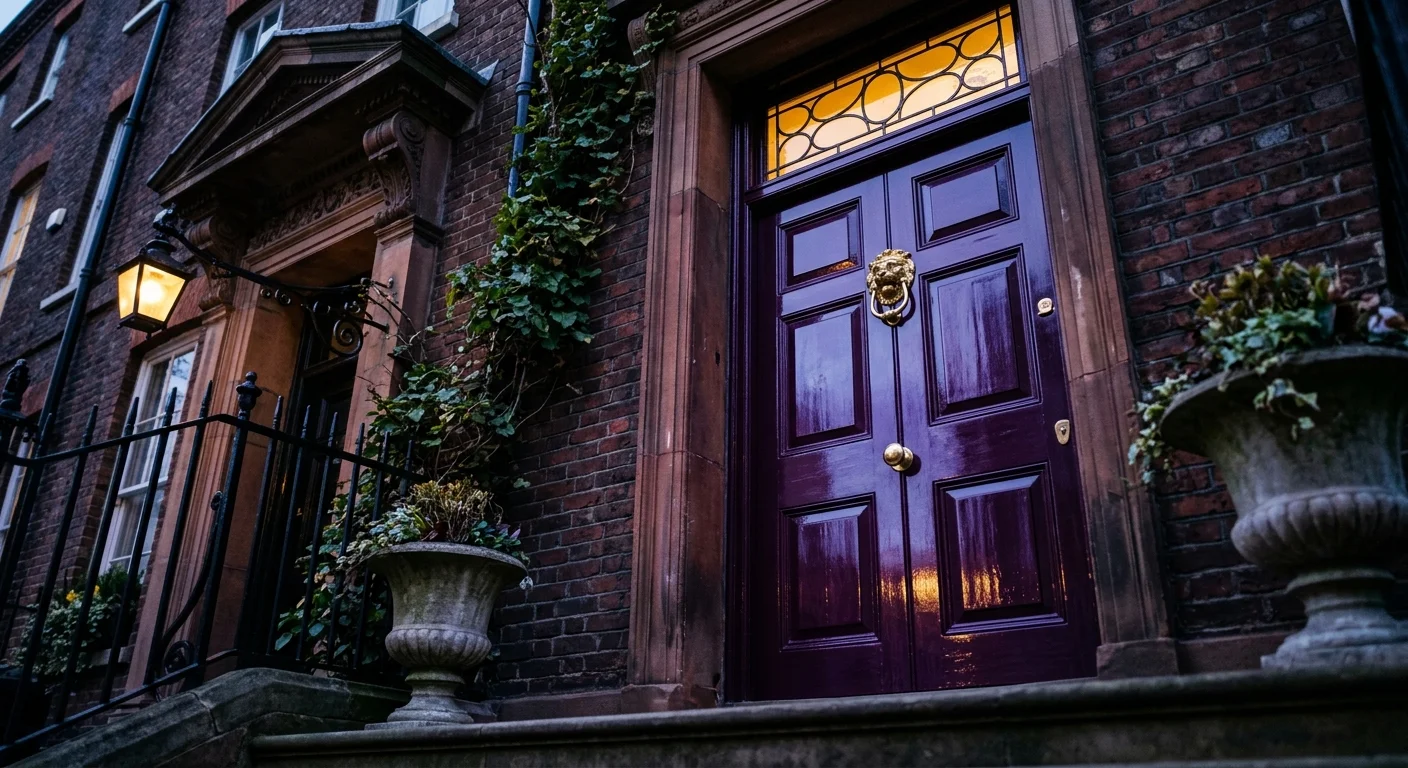
Trend #6: Saturated Plum and Moody Aubergine
For homeowners looking to make an unapologetic, sophisticated style statement, rich jewel tones have emerged as the definitive luxury frontier. Saturated plum, blackened fig, and deep aubergine bring the theatrical elegance of interior “moody dopamine” decor right out to the front porch. These shades offer an enticing blend of historical opulence and modern eccentricity.
Plum and aubergine are chameleons under natural light. In morning sunlight, these hues reveal warm violet and crimson undertones; as dusk approaches, they deepen into an enigmatic, velvety near-black. This dynamic shift provides continuous visual intrigue, ensuring your home exterior never appears flat or monotonous. It provides a welcome departure from predictable palettes while maintaining an unmistakably upscale aura.
This dramatic color family excels on historic Victorian facades, urban brownstones, and transitional shingle homes. To let an aubergine door truly shine, frame it with crisp off-white or warm greige exterior trim. Pair the rich purple undertones with high-polish unlacquered brass hardware, historic gas lanterns, and architectural boxwood topiaries set in black fluted urns for an unforgettable, bespoke entryway.
Trend #7: Muted Ochre and Sunlit Honey
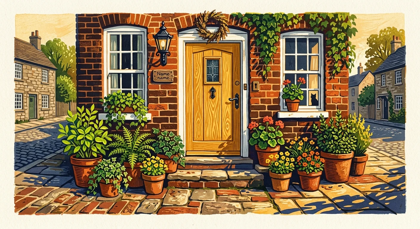
Injecting warmth and optimism into curb appeal front door ideas, muted ochre and honey yellow have captured the imaginations of progressive colorists. Moving away from aggressive neon yellow, this trend focuses on toasted wheat, golden mustard, and amber honey tones that feel organic, historic, and uplifting.
A sunlit honey front door creates an instant focal point that naturally draws the eye toward your home’s entrance. Color psychology associates warm ochre with hospitality, abundance, and joy—qualities that create an undeniably inviting entryway. It functions exceptionally well on Craftsman bungalows, mid-century ranches, and traditional brick homes where a burst of warm color breaks up heavy structural materials.
When executing a yellow door, precision in undertone selection is paramount. Avoid shades with cold, greenish undertones, which can appear sickly in natural daylight. Instead, prioritize warm, amber-infused formulations that carry earthy brown or orange bases. Complement the honey tones with dark bronze hardware, copper rain chains, and cedar porch pillars to construct an entrance bursting with welcoming warmth.
The Big Picture: Weaving These Trends into Your Home
Selecting from the best front door paint colors requires a holistic understanding of your home’s existing architectural canvas. Your front door should never exist in a stylistic vacuum; it must establish a coherent dialogue with your roof shingles, window framing, stone foundations, and surrounding natural greenery. Before applying a single brushstroke, analyze the fixed, unchangeable elements of your exterior to ensure your chosen color complements the underlying warm or cool undertones of your masonry and siding.
Executing an entryway transformation is one of the most cost-effective home improvements available. If you choose to tackle the project yourself, a DIY front door repaint typically costs between $30 and $100 total. One quart of premium exterior door and trim paint—such as exterior acrylic latex or urethane enamel—costs between $20 and $50 and provides ample coverage for two generous coats. If you prefer professional execution, hiring a licensed painting contractor averages $150 to $400 for standard doors; costs can range from $500 to $700 or more if your entryway requires extensive wood stripping, intricate dental molding work, or includes matching sidelights and transom trim.
Regardless of whether you hire a professional or paint the door yourself, never compromise on paint quality and sheen. Paint specialists strongly recommend a semi-gloss or high-gloss finish for exterior front doors. These higher-luster finishes resist moisture intrusion, prevent hand-oil scuffing around door handles, and bounce natural sunlight across your porch, giving your entryway an inviting luminescence.
For the latest color forecasts, consult industry leaders like Pantone and paint companies like Benjamin Moore. For professional design standards, refer to the American Society of Interior Designers (ASID).
Disclaimer: This article reflects design trend analysis and predictions. Personal taste and timeless design principles should always guide your decorating choices.
Frequently Asked Questions
Which front door sheen provides the best balance of aesthetics and durability?
Design professionals almost universally recommend semi-gloss or high-gloss sheens for exterior front doors. A semi-gloss sheen offers an optimal balance by highlighting the door’s architectural paneling and resisting everyday wear, fingerprints, and rain exposure without highlighting surface imperfections. A full high-gloss finish delivers maximum drama, reflecting light like polished lacquer, but it requires a perfectly smooth, professionally sanded substrate prior to application.
How do I choose a front door color that works with red or brown exterior brick?
When selecting trending exterior door colors for brick homes, examine the mortar color and the darkest secondary specks within the brick itself. Earthy greens such as olive and sage act as natural color complements to red clay brick on the color wheel. Alternatively, deep neutrals like charcoal or soft iron ore anchor the facade by echoing the darker iron spots in the brickwork. Avoid bright primary reds that clash against natural brick tones.
Should I paint the interior side of my front door the same color as the exterior?
You are under no obligation to match the interior face of your front door to the exterior. While painting both sides the same color can create continuity when the door swings open, interior designers often treat the interior side as an extension of the foyer’s color palette. You can paint the exterior a bold, trending hue like plum or ochre while keeping the interior side a soft white, subtle greige, or coordinating trim color that complements your interior living room decor.
How does exterior lighting orientation impact door color selection?
Natural light dramatically shifts how paint colors read on exterior surfaces. North-facing entryways receive cool, indirect, bluish daylight, which can make pale grays look cold; these doors benefit from warmer colors like terracotta, ochre, or rich olive. South-facing doors receive intense, warm sunlight throughout the day, which washes out pale colors but makes deep slates, charcoals, and saturated jewel tones appear vibrant and true to swatch.