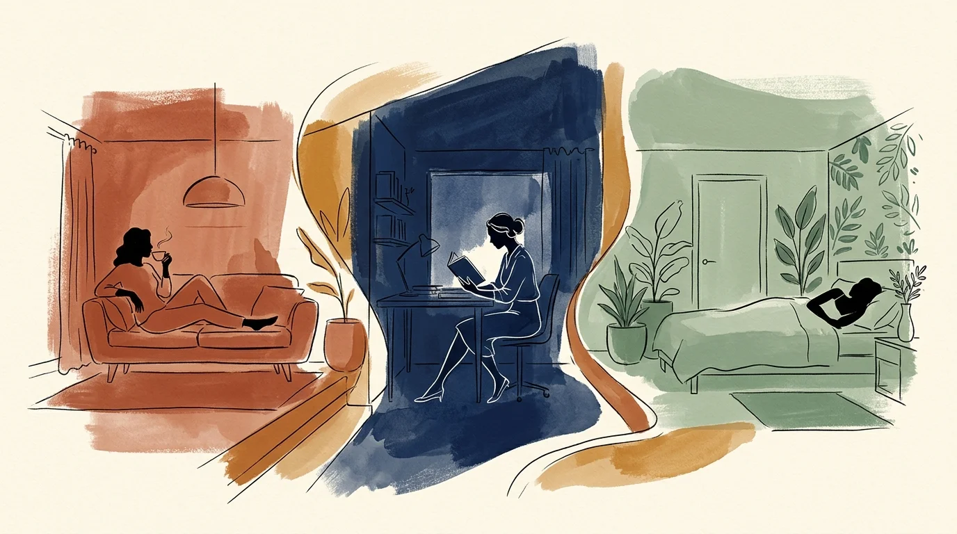
Color choices dictate emotional well-being, spatial perception, and physiological comfort far beyond simple aesthetics. By mastering color psychology in home design, you transform static rooms into dynamic, mood-regulating environments tailored to your daily routines. Research in neuro-architecture demonstrates that specific light wavelengths stimulate brain chemistry, influencing everything from cortisol production to cognitive endurance. Choosing paint colors psychology allows you to curate tranquility in sanctuaries, spark conversation in entertaining zones, and amplify focus in modern home offices. Incorporating interior design color psychology elevates decorative choices into a sophisticated, science-backed framework for intentional living across every square foot.
For the latest color forecasts, consult industry leaders like Pantone and paint companies like Benjamin Moore. For professional design standards, refer to the American Society of Interior Designers (ASID).
Trend #1: Earthy Terracotta for Grounding Social Spaces
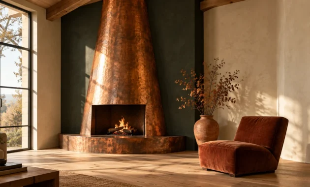
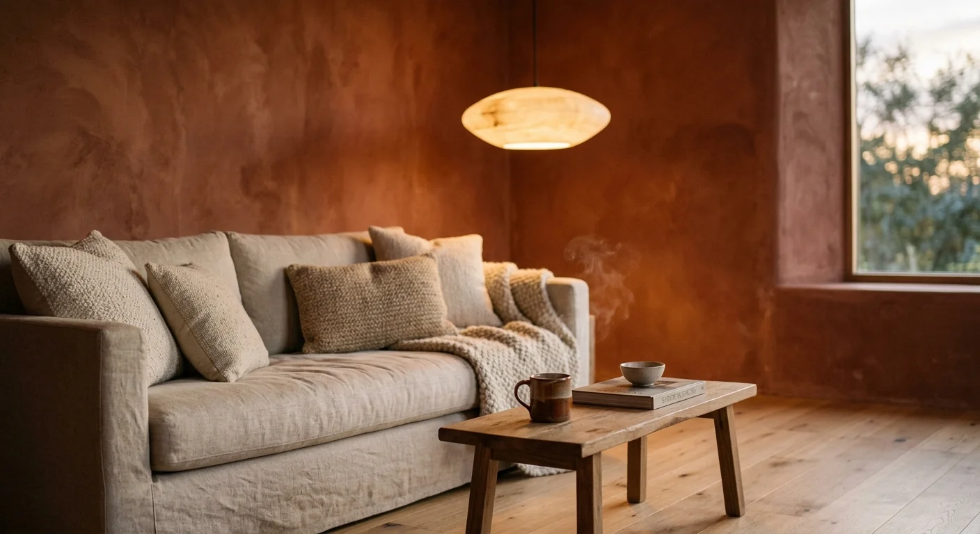
Terracotta and clay tones anchor living rooms and formal dining spaces by tapping into primal human associations with earth, fire, and raw shelter. When using color psychology at home, interior architects rely on rich reddish-brown hues to lower social reservations and stimulate organic conversation. Unlike intense primary reds, which trigger fight-or-flight nervous responses, muted terracotta delivers subtle ambient warmth that encourages guests to settle in and linger long after dinner ends.
To execute this trend, apply matte terracotta lime-wash paint to living room walls while pairing the surface with light European white oak flooring and unbleached linen upholstery. The visual contrast between warm clay walls and raw tactile fibers reinforces a grounded sense of place and provenance. Complement this palette with low-slung alabaster pendant lights emitting a warm 2700K illumination; this specific color temperature accentuates the red spectrum in the paint, enhancing facial skin tones and creating an inviting social atmosphere during evening entertaining.
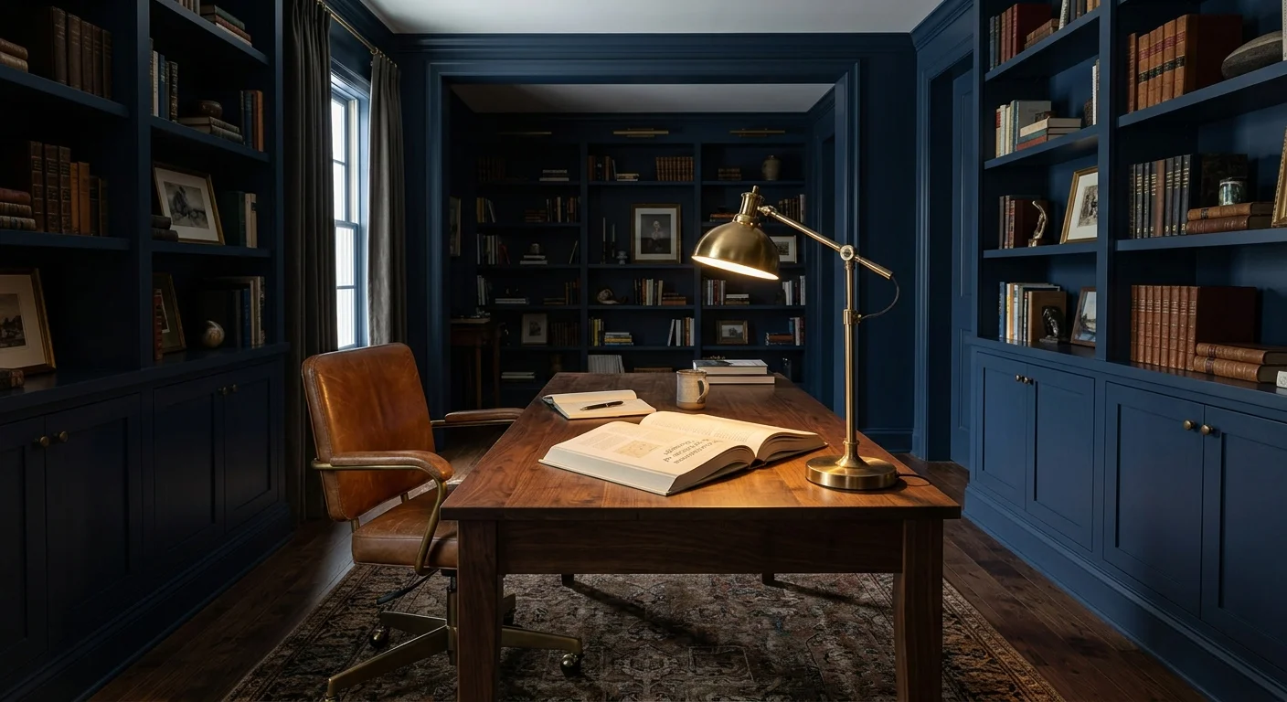
Trend #2: Deep Indigo and Navy for Cognitive Focus
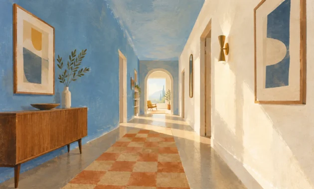
Deep indigo and rich navy blue remain the gold standard for dedicated home offices, executive studies, and reading libraries. Within the framework of interior design color psychology, short-wavelength colors like deep blue reduce your heart rate and quiet background mental chatter. Dark navy creates spatial depth by blurring wall boundaries, effectively pushing room perimeters outward while shielding you from visual distractions during intense deep-work sessions.
For optimal cognitive performance, adopt the technique of color drenching—coating the walls, baseboards, window casings, and ceiling in an identical matte navy finish. Complement these saturated surfaces with warm walnut millwork, cognac leather desk chairs, and brushed brass task lighting. The warm wood and metallic accents prevent the space from feeling cold or heavy, infusing quiet luxury into your daily workflow. Position your task lamps to cast direct light onto physical documents while keeping peripheral walls softly shrouded in calm shadow.
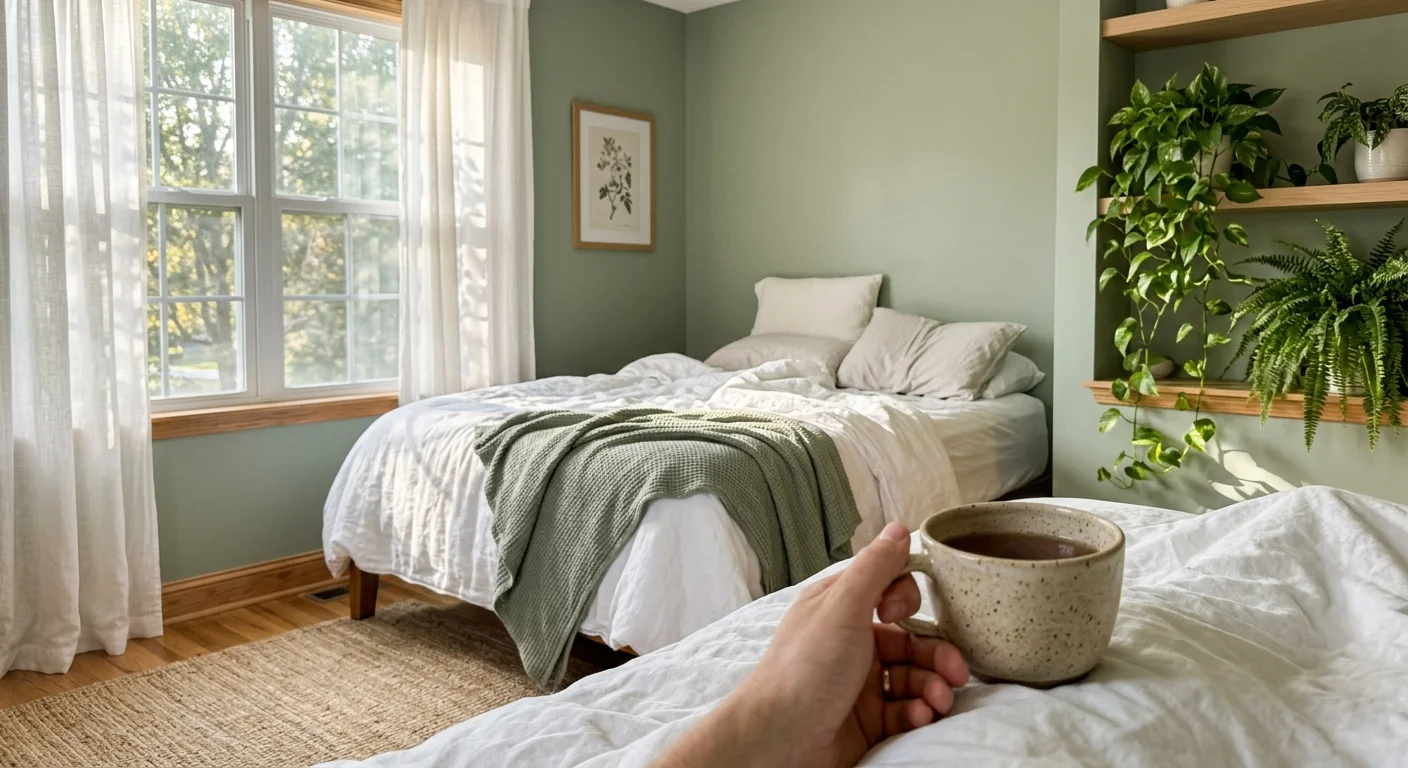
Trend #3: Soft Sage Green for Biophilic Stress Reduction
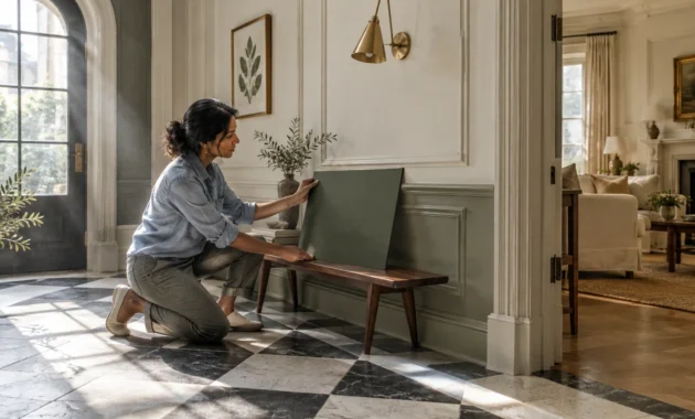
Sage green acts as a visual bridge between interior living areas and the natural landscape, tapping into your innate biophilic drive. Environmental psychology shows that human eyes process green wavelengths with minimal muscular strain, making sage an exceptional choice for primary bedrooms and open-plan family rooms where stress recovery is paramount. Soft sage green actively lowers salivary cortisol levels, offering a soothing remedy for daily screen fatigue and urban overstimulation.
Apply soft sage green paint with an eggshell or velvet finish to your bedroom walls, pairing it with natural ash wood furniture and layered neutral textiles. Introduce woven bouclé throw blankets, matte ceramic vases, and live botanical accents like olive branches or fiddle-leaf figs. When evaluating the best colors for mood home environments, sage green consistently delivers universal appeal because it balances warm yellow and cool blue undertones effortlessly, adjusting smoothly as natural sunlight shifts throughout the day.
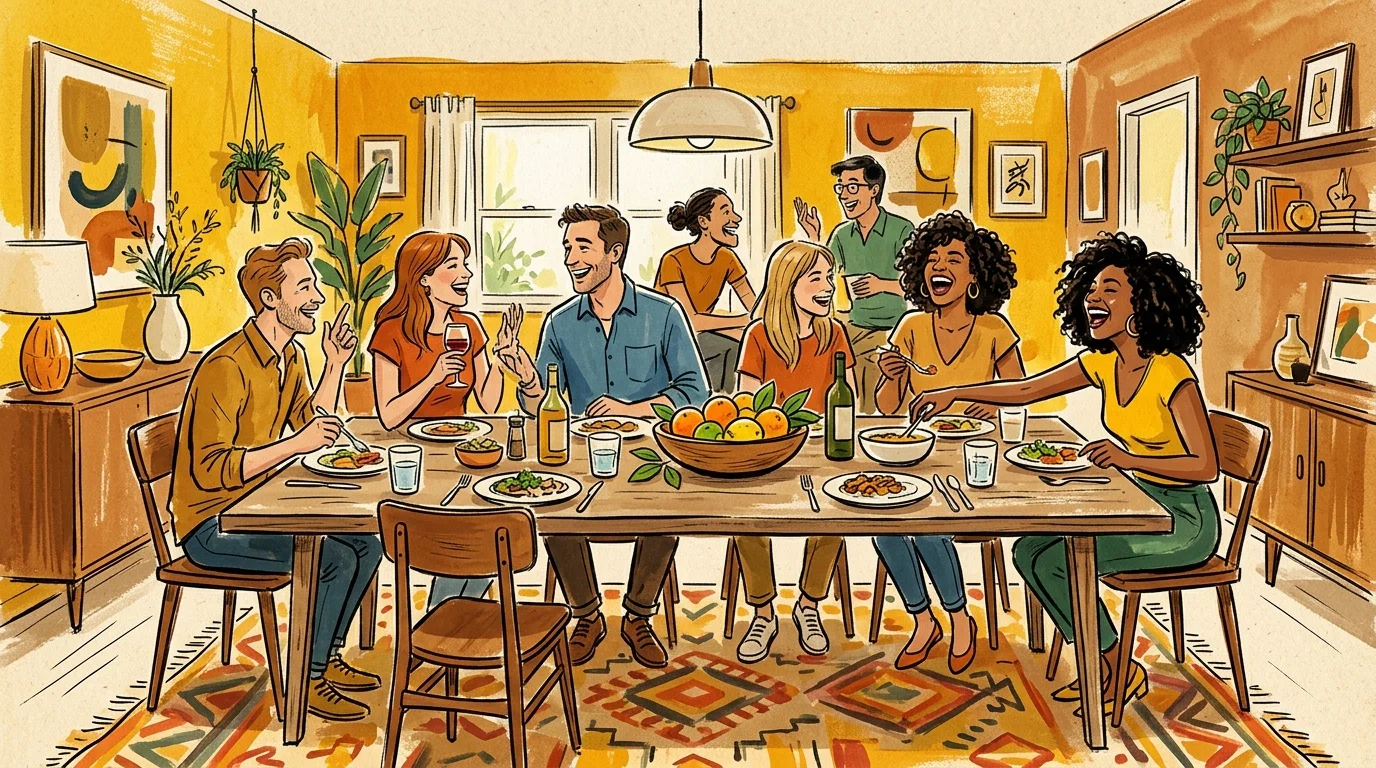
Trend #4: Warm Ochre and Honey Yellow for Gastronomic Energy
Warm ochre, golden amber, and honeyed yellow inject energetic optimism into kitchens, breakfast nooks, and informal dining areas. Photobiology confirms that golden light wavelengths stimulate serotonin production, cultivating an invigorating morning ambiance as you start your day. In culinary spaces, muted yellow shades stimulate appetite and social warmth, turning routine meal preparation into a joyful communal ritual.
Avoid highly saturated, neon yellows, which trigger optic fatigue and subtle anxiety over time. Instead, choose earthy ochre hues paired with honed limestone countertops, cream zellige backsplashes, and natural oak cabinetry. Contrast these sunny tones with burnished bronze hardware and dark soapstone accents to anchor the visual weight. The resulting aesthetic feels bathed in late-afternoon Mediterranean sunlight, maintaining an inviting atmosphere even on overcast winter mornings.
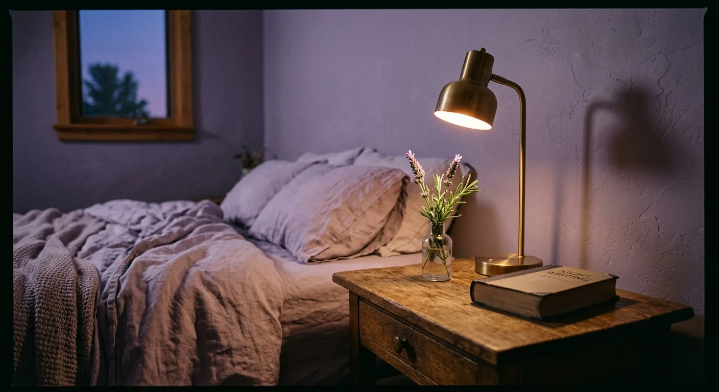
Trend #5: Restorative Lavender and Dusky Violet for Sleep Sanctuaries
Muted lavender and dusky violet are fast replacing standard cool grays in high-end bedroom design. Far from sweet pastel purples, these desaturated, gray-infused violets trigger parasympathetic nervous system activity, slowing your breathing rate and signaling to your brain that it is time for rest. Violet sits at the precise balance point between calming blue and warming red, rendering it an ideal chromatic envelope for personal retreats.
Apply dusky violet paint to your bedroom walls or custom upholstered headboard panels, layering washed percale bedding in complementary slate and warm ivory tones. Hang heavy velvet drapery in deep plum along exterior windows to absorb ambient street noise and restrict light leaks. Install indirect LED cove lighting behind picture rails or underneath floating bed frames, using dimmable controls to maintain a soft, cocooning atmosphere as evening approaches.
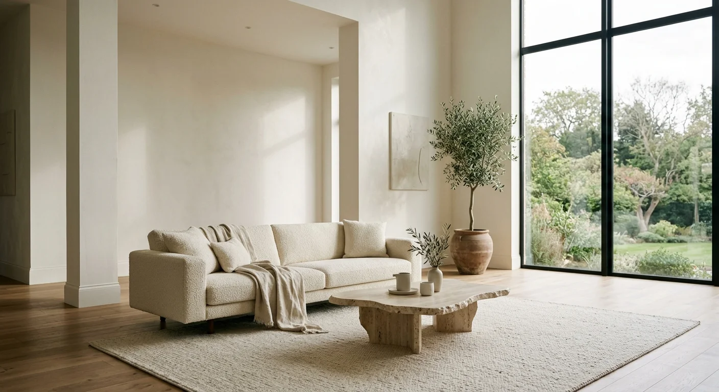
Trend #6: Crisp Warm Whites for Spatial Perception and Clarity
Warm whites containing subtle yellow or red undertones maximize natural light reflection without creating the clinical, sterile ambiance associated with cool blue-whites. In compact city apartments, narrow corridors, or galley kitchens, high Light Reflectance Value (LRV) paint finishes bounce daylight into shadowed corners, expanding tight floor plans and clearing visual clutter. Warm white gives your eyes a clean, uncluttered plane, drastically reducing cognitive overload.
When choosing paint colors psychology dictates balancing crisp, light-reflecting walls with rich tactile textures underfoot. Combine warm alabaster walls with wide-plank natural oak flooring, woven jute area rugs, and off-white linen sofas. Introduce matte black metal frames or dark bronze picture rails to establish structural boundaries within the space. This subtle monochromatic layering prevents high-LRV rooms from feeling washed out, yielding an airy atmosphere grounded by clear architectural lines.
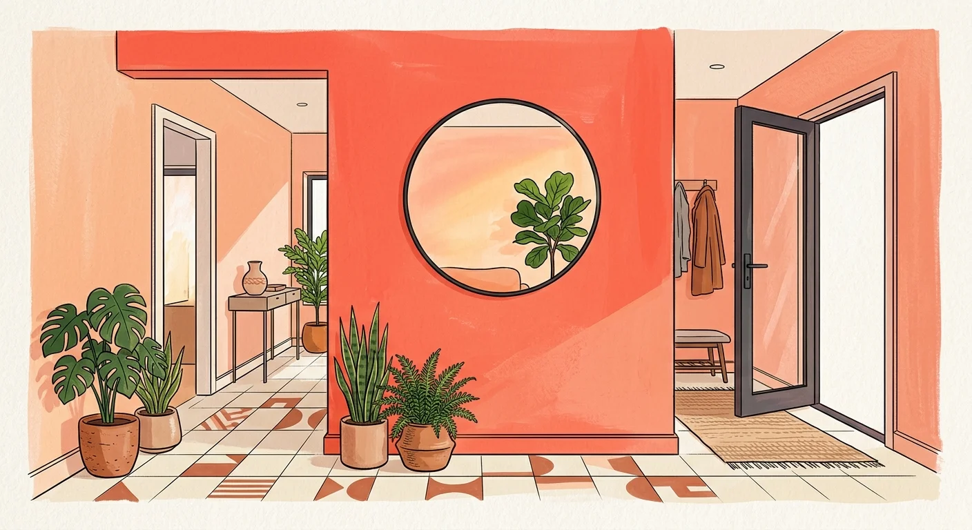
Trend #7: Energetic Coral and Peach for Transitional Spaces
Transitional spaces such as entryways, powder rooms, and stairwells serve as perfect testing grounds for adventurous, mood-elevating colors. Warm coral and soft peach infuse these brief pause points with warmth, establishing positive emotional tone as you cross the threshold of your home. Peach undertones reflect remarkably flattering light onto human skin tones, making guest powder rooms feel welcoming, intimate, and sophisticated.
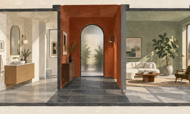
Treat a small entryway or powder room to high-gloss peach or coral lacquer paint paired with classic marble checkerboard flooring and vintage brass mirrors. The glossy surface multiplies artificial light sources, converting a small windowless room into an memorable interior highlight. By using color psychology at home in transitional corridors, you turn routine movement between functional rooms into a refreshing sensory experience.
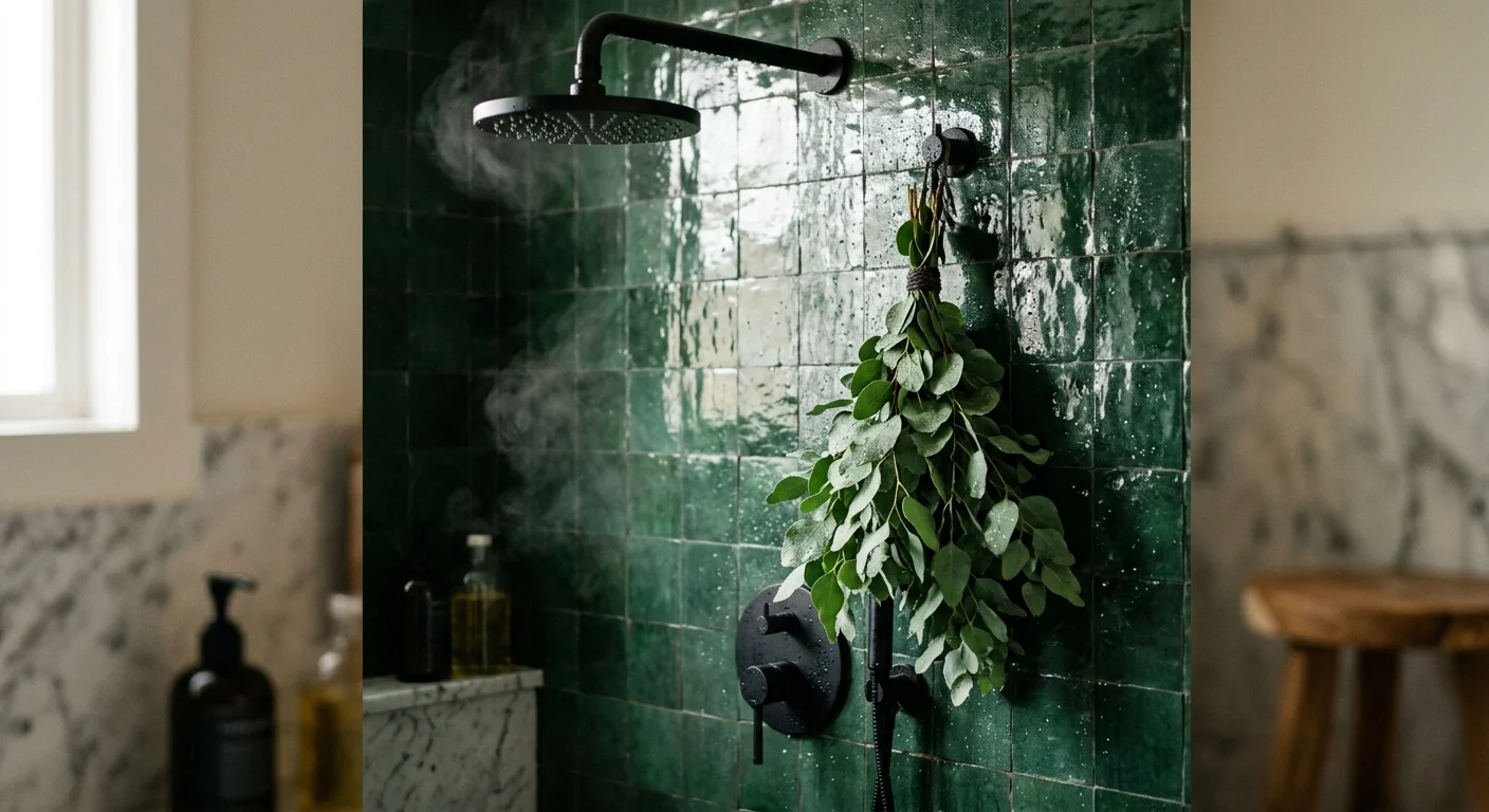
Trend #8: Deep Forest Green for Spa-Inspired Bathrooms
Deep forest green and rich mossy olive transform ordinary bathrooms into restorative, spa-inspired sanctuaries. Saturated greens evoke dense woodland canopies, channeling the proven health benefits of forest bathing (shinrin-yoku). Deep green pigments absorb excessive light glare from mirrors and vanity fixtures, creating a quiet, moody setting for evening soaking routines and mindful morning prep.
Combine forest green wall tile or moisture-resistant dark green lime wash with brushed nickel or oil-rubbed bronze plumbing fixtures. Incorporate natural travertine stone vanity tops and humidity-loving flora like maidenhair ferns or pothos to emphasize organic connection. Underfoot, dark slate or matte basalt tile grounds the room, completing a luxurious retreat that insulates you against external daily stresses.
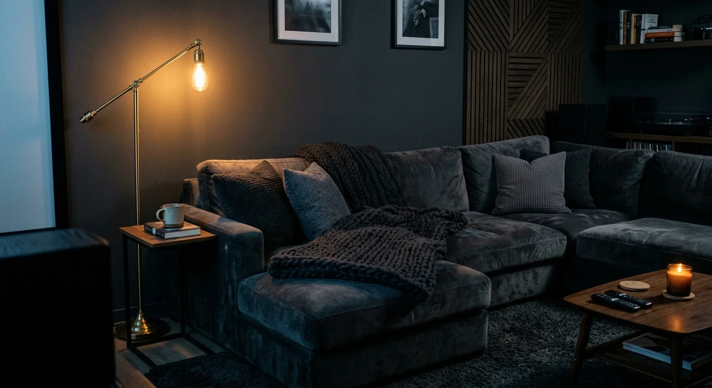
Trend #9: Enveloping Charcoal and Graphite for Media Lounges
Enveloping charcoal, dark graphite, and soft slate black establish deeply cozy, protective environments in media rooms, evening parlors, and formal sitting rooms. Dark hues minimize visual boundaries and ceiling height edges, producing an enveloping effect that releases emotional tension. Rather than feeling restrictive, properly lit dark rooms deliver emotional security, encouraging intimate conversations and total immersion in music or cinema.
Apply dark charcoal paint with a matte or mineral finish across all four walls, doors, and architectural moldings. Pair dark walls with plush velvet seating in deep jewel tones, dark-stained oak flooring, and rich walnut cabinetry. Accentuate the room with targeted, warm ambient lighting—such as low-level LED step lights and floor lamps equipped with 2200K filament bulbs—to create inviting glowing pools of light against the moody backdrop.
Trend #10: High-Contrast Monochromes for Architectural Discipline
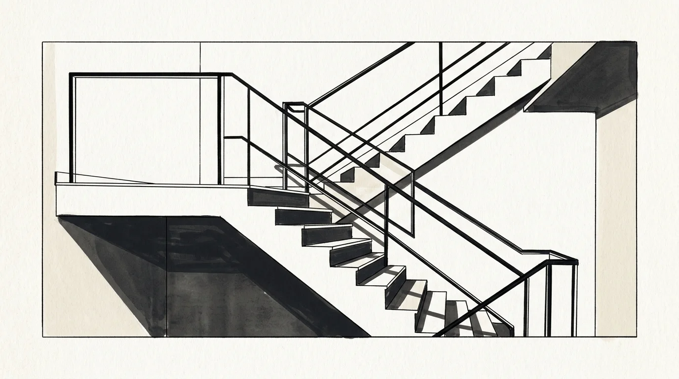
High-contrast monochrome palettes—combining stark black accents, chalky whites, and warm greiges—instill visual discipline and structural clarity in modern open-plan homes. Visual contrast sharpens focus, establishes spatial rhythm, and guides movement across sprawling living zones. By pairing dark architectural elements against light-reflecting wall planes, you draw eye attention to key structural details like steel doors, exposed beams, and panoramic windows.
Implement this aesthetic in an open-concept living area by framing soft greige plaster walls with matte black steel-framed glass partition doors and dark-stained timber floors. Keep large upholstered furniture pieces within neutral oatmeal and taupe tones to maintain a calm baseline. Allow black iron lighting pendants, metal door hardware, and dark picture frames to act as sharp graphic punctuation marks, delivering architectural sophistication without feeling clinical.
The Big Picture: Weaving These Trends into Your Home
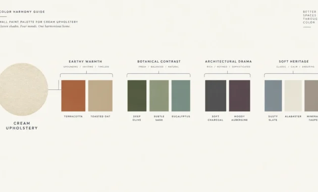
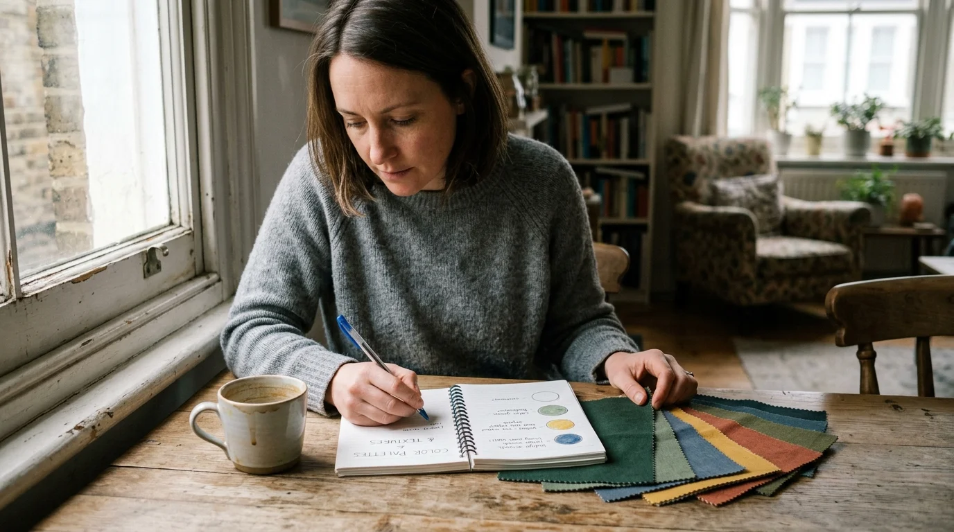
Harmonizing interior design color psychology across an entire residence requires strategic planning rather than isolated decorating decisions. To construct a cohesive narrative throughout your floor plan, establish a continuous neutral anchor shade across shared corridors and open-plan sightlines. Apply the classic 60-30-10 design formula to manage visual weight: allocate 60 percent of a room to your primary foundational shade (such as warm white or sage), 30 percent to a secondary structural color (like walnut wood tones or terracotta), and 10 percent to energetic accent hues.
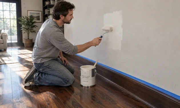
Always evaluate paint swatches under varying light conditions before committing to full application. A paint color that feels soothing under North-facing daylight can feel stark or cold under harsh fluorescent bulbs. Test physical paint boards on multiple walls, observing how undertones shift between morning light, late afternoon sun, and artificial evening lighting. By aligning color saturation, light reflectivity, and room function, you craft a balanced home environment that nourishes your well-being, supports your daily habits, and reflects elevated personal style.
Frequently Asked Questions
How do I determine the best colors for mood home environments when family members prefer different styles?
Focus on functional neutrality for shared zones while personalizing private quarters. Apply universally comforting, low-saturation shades like soft sage green or warm alabaster white in main living rooms and kitchens where everyone gathers. Reserve saturated, highly specific shades—such as deep indigo or energetic coral—for private bedrooms, personal home offices, or compact powder rooms where individual tastes can flourish without overwhelming communal spaces.
Can I mix warm and cool undertones when using color psychology at home?
Yes, mixing warm and cool undertones creates visual balance and prevents rooms from feeling flat or visual simple. Select one temperature family as your dominant foundation (around 70 percent of the space) and use the contrasting temperature for the remaining 30 percent. For instance, balance cool sage green walls with warm terracotta clay ceramics and natural oak floors, or temper warm golden ochre walls with cool slate gray stone hearths.
How does light bulb color temperature affect color psychology in home design?
Lighting color temperature directly alters how your eyes perceive wall pigments and triggers distinct circadian responses. Cool lighting (3500K-5000K) promotes daytime alertness but can make warm paint colors look washed out or sterile. Warm lighting (2700K-3000K) enhances red, orange, and yellow undertones, encouraging relaxation and comfortable social interaction. Use 2700K bulbs in living rooms and bedrooms, while selecting 3000K-3500K for task-focused zones like kitchens and home offices.
Does color psychology work effectively in small apartments with limited natural light?
Color psychology is extraordinarily effective in small or dim spaces because it dictates whether you should maximize available light or embrace dark ambiance. High Light Reflectance Value (LRV) whites bounce limited daylight to make compact rooms feel expansive. Alternatively, color drenching a windowless room in deep navy or graphite blurs physical corners, transforming a restricted footprint into a cozy, luxurious sanctuary.
Disclaimer: This article reflects design trend analysis and predictions. Personal taste and timeless design principles should always guide your decorating choices.