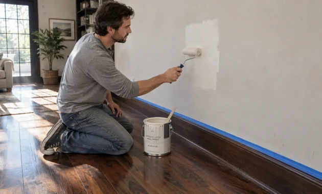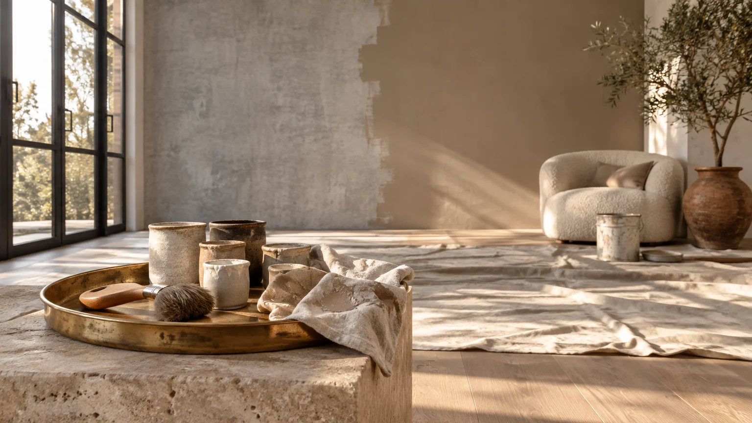
Repainting your home interior delivers an impressive 107% return on investment, but applying the wrong shade can devalue your entire property. Selecting outdated tones alienates prospective buyers and drains the architectural vitality from your living spaces.
Today’s design landscape embraces rich earth tones, tactile neutrals, and nuanced warmth over sterile, clinical pigments. Recognizing paint colors that look dated will save you thousands of dollars and countless hours of design regret.
Before you pick up a roller, discover the outdated paint colors to avoid to protect your home’s enduring aesthetic appeal.
Trend #1: Stark Cool Gray
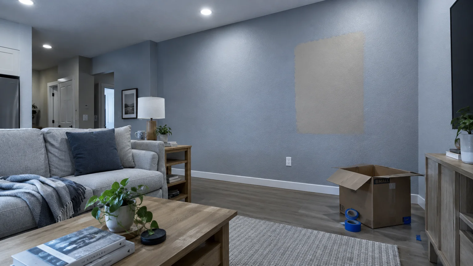
The ubiquitous cool gray that dominated the previous decade has reached its aesthetic expiration date. Homeowners once favored this chromatic tone for its perceived minimalism, but it now feels sterile and emotionally detached.
Designers categorize this flat concrete tone among the foremost outdated paint colors to avoid in modern renovations. Cool gray drains natural sunlight and creates an institutional atmosphere under energy-efficient LED lighting.
This cool hue struggles to complement contemporary materials like warm white oak, travertine, and unlacquered brass. Instead of feeling intentional, it leaves living rooms looking like chilly office corridors.
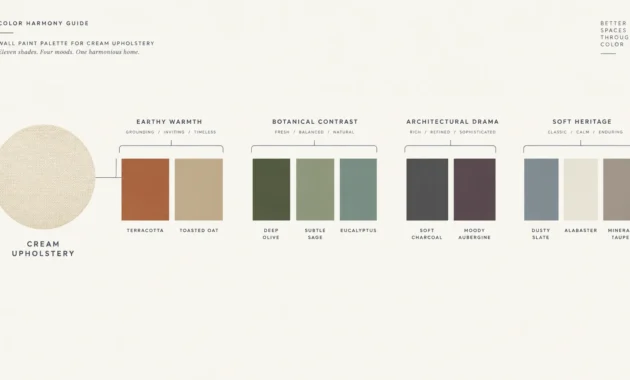
Replace this icy wash with warm greige or nuanced taupe. These complex neutrals reflect the rise of quiet luxury, grounding your home with architectural depth and tactile comfort.
Pair warm neutrals with woven textiles and rich timber finishes. This biophilic pairing injects visual vitality while honoring balanced, timeless spatial proportions.
Trend #2: Tuscan Ochre Yellow
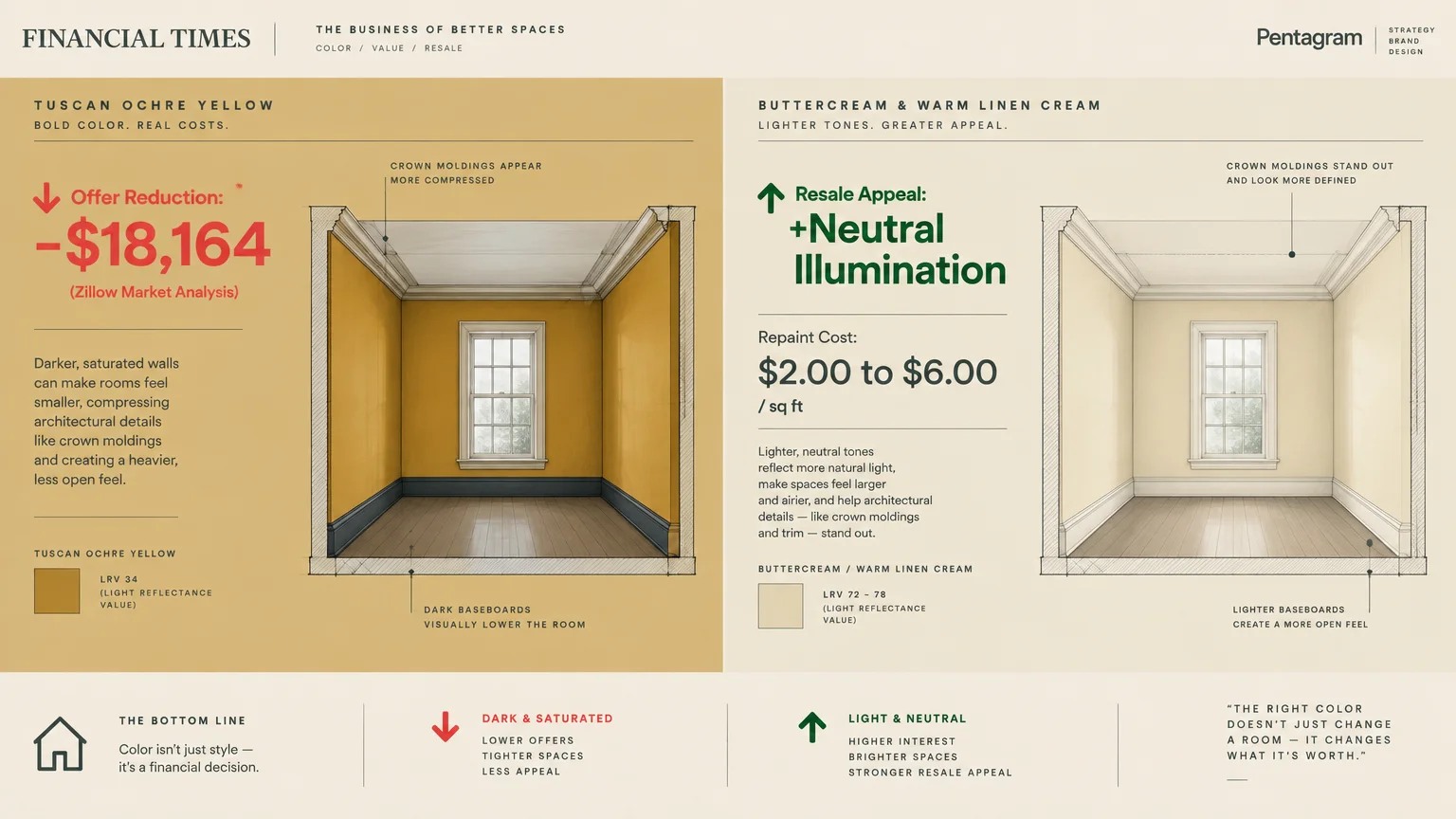
Heavily saturated ochre yellow once defined Mediterranean-inspired luxury, yet today it reads as an aggressive relic of early-2000s design. This heavy pigment overwhelms subtle architectural trim and visually shrinks room volumes.
The financial consequences in the real estate market are substantial. According to Zillow’s Paint Color Analysis, an ochre yellow interior scheme can reduce a home’s offer value by up to $18,164.
Prospective buyers perceive heavy golden hues as immediate renovation liabilities that require costly remediation. In today’s competitive market, yellow walls instantly trigger buyer fatigue during walkthroughs.
Repainting costs between $2.00 and $6.00 per square foot, making professional repainting a high-value cosmetic upgrade. Spending your budget on trending vs outdated home colors protects your equity.
Pivot instead toward delicate buttercream or aged linen parchment. These nuanced pigments introduce cheerful illumination without suffocating your crown molding or natural hardwood flooring.
Trend #3: Aggressive Primary Red
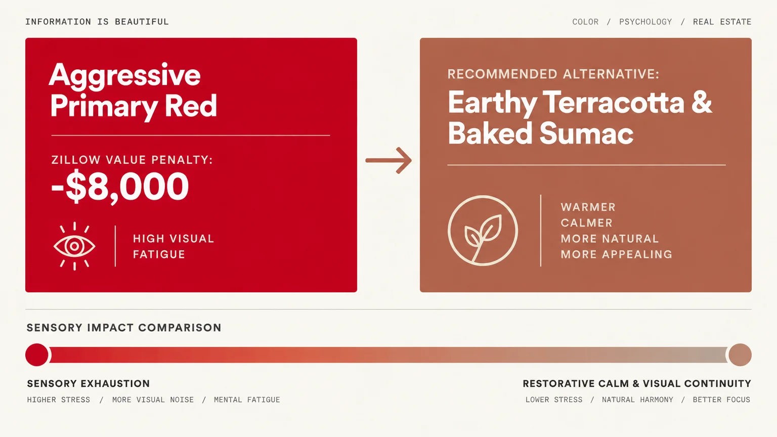
High-saturation primary red was once championed for stimulating appetite and lively energy in dining rooms. Today, color psychologists and designers agree that hyper-saturated crimson triggers sensory exhaustion rather than welcoming hospitality.
Zillow’s market research reveals that a bright red kitchen can reduce prospective buyer offers by roughly $8,000. It remains one of the costliest home repaint color mistakes in residential real estate.
Modern interior architecture prioritizes restorative calm and visual continuity. Saturated red creates visual friction against neighboring spaces, jarring your senses as you move through the floor plan.
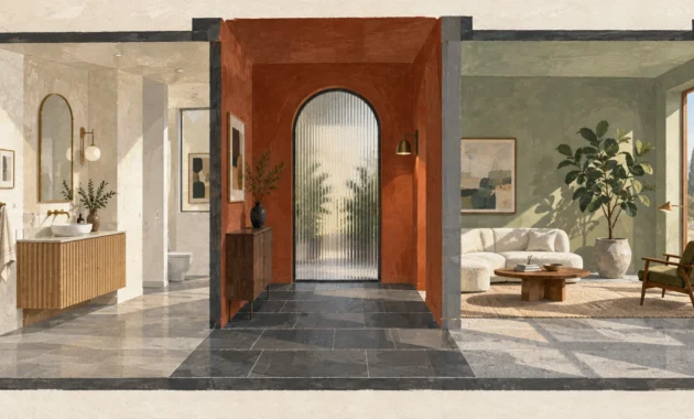
If you crave warmth and chromatic drama, embrace grounded terracotta or baked Venetian sumac. These organic, mineral-based tones evoke ancient plasterwork while maintaining contemporary sophistication.
Complement these baked earth shades with matte black accents and honed limestone surfaces. The resulting aesthetic feels grounded, historic, and effortlessly elevated.
Trend #4: Powdery Millennial Pink
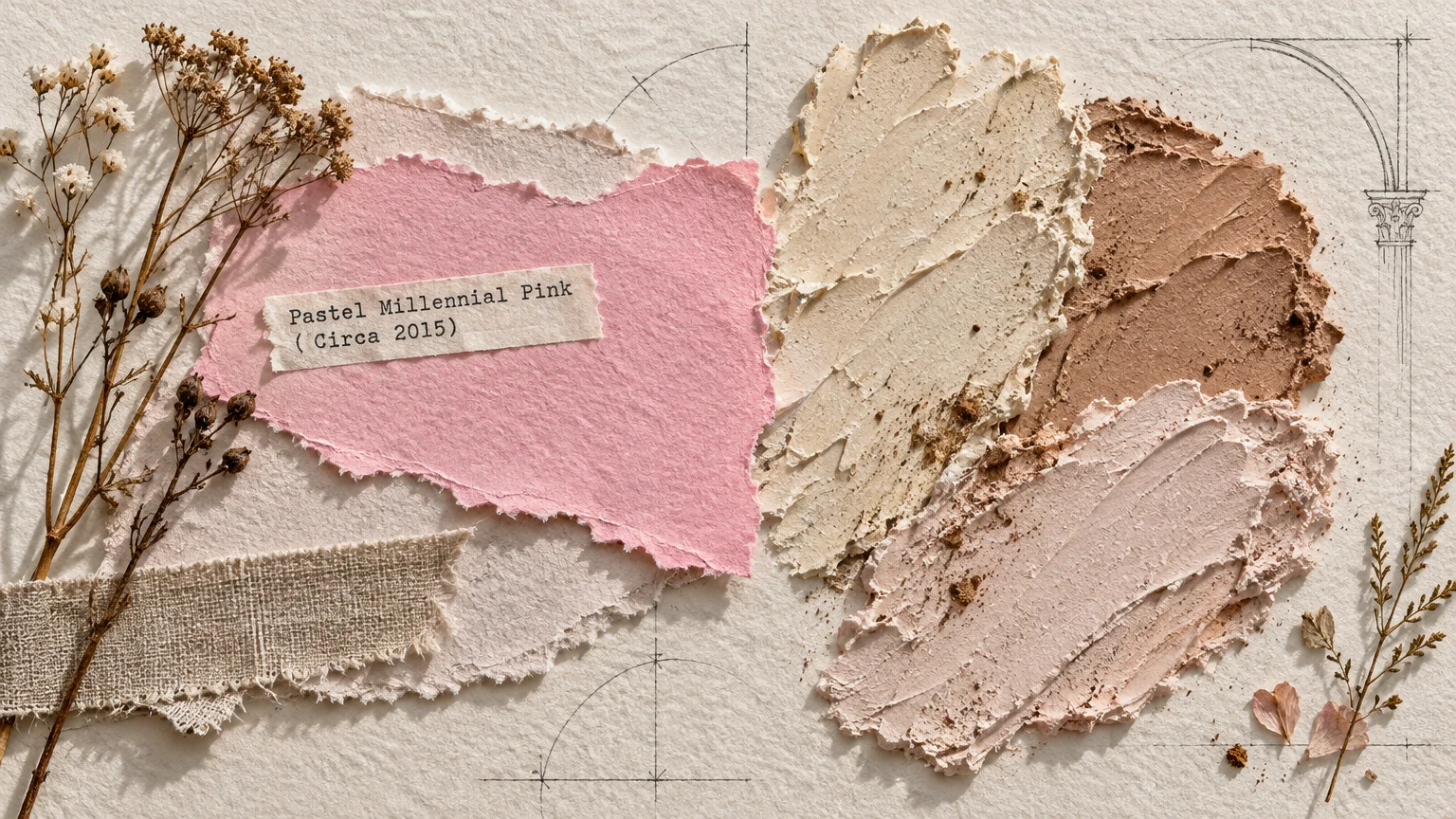
The pastel bubblegum cast of Millennial pink dominated social media, hospitality, and residential accents for years. Today, this sugary pastel feels tired, juvenile, and distinctly dated.
Zillow’s behavioral research confirms that defaulting to outdated pastels like Millennial pink causes homes to receive thousands less in buyer offers compared to warm, earthy alternatives.
This flat pastel struggles to integrate with organic materials like reclaimed wood or patinated leather. Its artificial sweetness clashes with the collected, curated interiors currently shaping interior trends.
Instead, select sophisticated plaster tones, muted clay, or warm desert peach. These pigments deliver romantic softness while maintaining an elevated, adult presence within your architecture.
Incorporate limewash techniques or micro-cement finishes when applying these earthy pinks. The subtle tonal variations add historic texture that prevents the color from feeling flat or synthetic.
Trend #5: Hospital-Grade Cool White
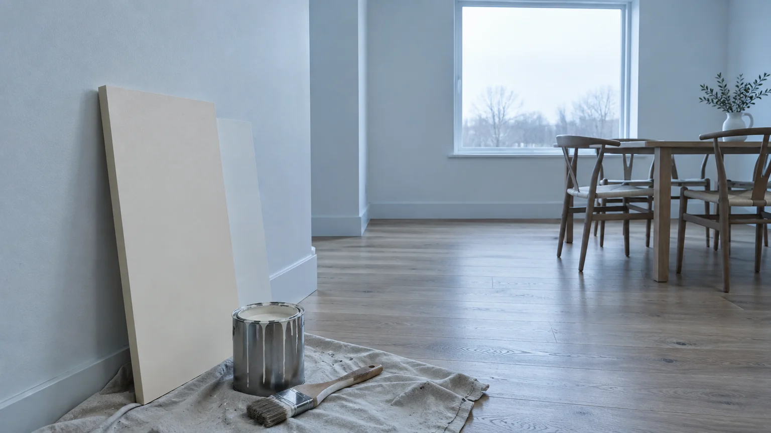
Many homeowners assume that pure, untinted white guarantees a clean, Scandinavian gallery look. In practice, clinical cool white casts harsh blue shadows and leaves rooms feeling unfinished and hollow.
Clinical whites are among the most prevalent paint colors that look dated because they lack organic undertones. They create glare under bright sun and look dead under evening lamps.
A professional room refresh averages between $400 and $1,600 per room; using sterile white squanders that investment. You forfeit the chance to wrap your living spaces in tailored, quiet luxury.
Opt instead for alabaster, chalk, or soft linen white formulated with delicate umber pigments. These warm whites harness changing daylight to establish an inviting, radiant atmosphere.
Pair these nuanced whites with textured bouclé drapery, woven sisal rugs, and warm walnut millwork. This tonal layering transforms basic white into a multidimensional, tactile experience.
Trend #6: Muddy Builder’s Beige
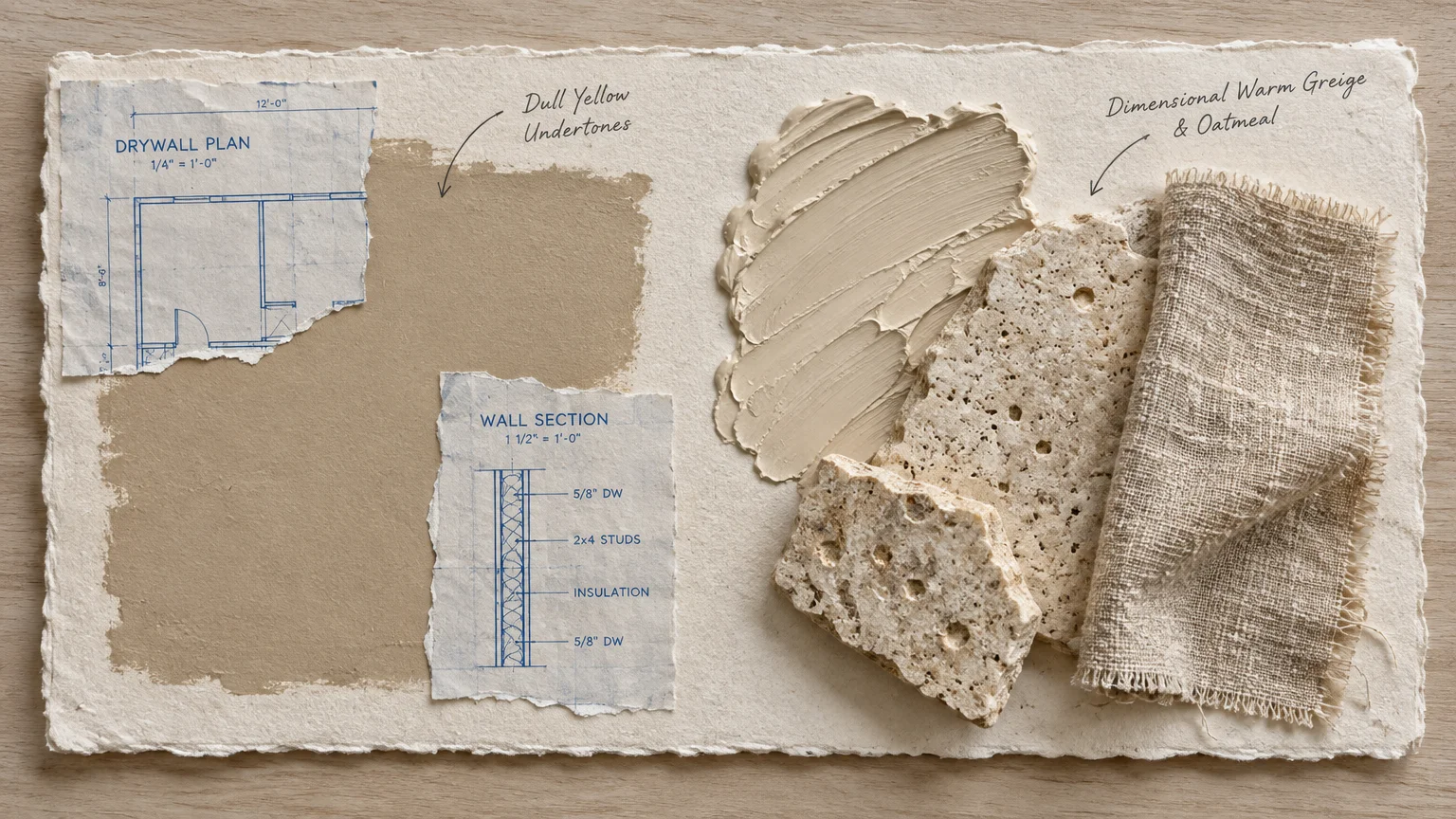
Standard developer beige lacks depth, nuance, and architectural character. Formulated with flat green-yellow undertones, it turns dingy in shadow and robs interior woodwork of its crisp definition.
This generic hue remains high on the list of paint colors to skip when planning a modern renovation. It flattens spaces visually and deadens the vibrancy of your upholstery.
Repainting an entire modest home interior costs between $1,000 and $3,100, while larger homes reach $5,800. Allocating your budget to muddy neutrals misses the mark entirely.
Modernize your envelope with textured oatmeals, travertine hues, or layered canvas pigments. These dimensional neutrals showcase artisanal cabinetry and provide rich contrast against dark structural accents.
Layer these new neutrals with mixed metal hardware and organic stoneware vessels. The resulting composition looks intentional, layered, and unmistakably bespoke.
Trend #7: High-Gloss Nautical Navy
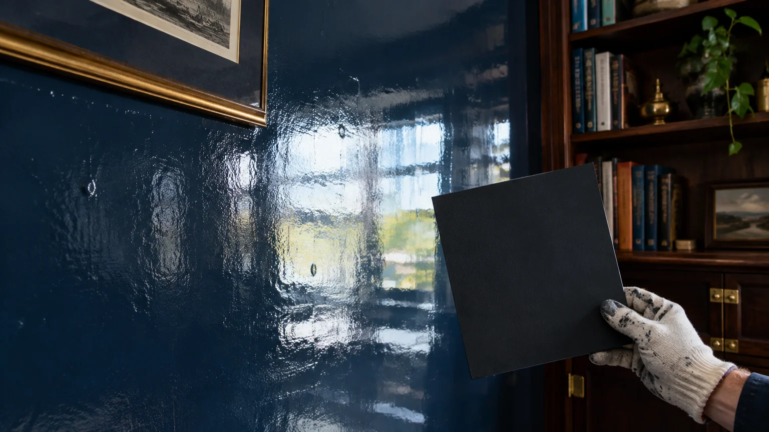
During the mid-2010s, high-gloss navy dominated dining room accents, powder rooms, and kitchen cabinetry. When applied across entire walls, its high-contrast nautical character now feels commercial and overplayed.
Overly vibrant navy disrupts visual continuity between adjoining open-concept living spaces. Contemporary interior architecture emphasizes seamless flow, where colors glide harmoniously across thresholds rather than abruptly clashing.
To replace this look, explore smoked indigo, blackened slate, or deep marine charcoal. These soot-infused blue-blacks ground the space with quiet authority without evoking coastal clichés.
Combine these moodier shades with unlacquered brass hardware, fluted marble, and raw linen drapery. This tactile contrast delivers a rich, bespoke finish that transcends fleeting micro-trends.
Ensure your selected formula contains low VOC levels below 50 grams per liter. This ensures your dark, dramatic library or study remains healthy and free of hazardous emissions.
Trend #8: Flat 1990s Hunter Green
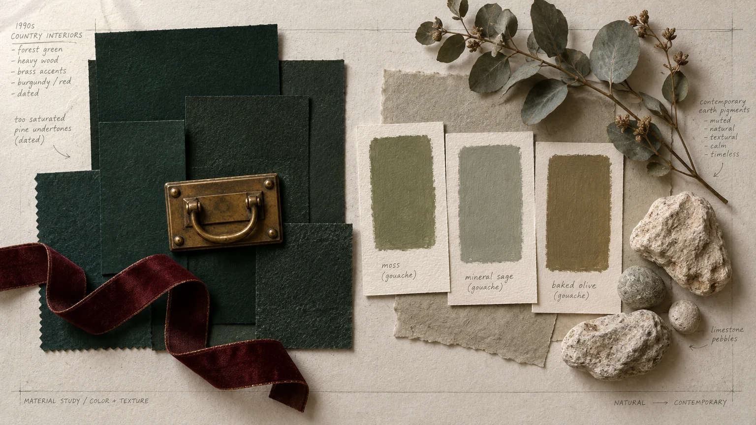
The saturated hunter green of the 1990s has resurfaced in poorly planned makeovers, but its heavy, synthetic look quickly ages an interior. It absorbs excessive ambient light, leaving rooms gloomy and closed-in.
Modern biophilic design celebrates the nuanced natural world rather than rigid jewel tones. Today’s sophisticated environments demand botanical colors enriched with soft mineral complexity.
According to nationwide real estate data, sage green was the only tone to rank in the top tier across all living spaces. Buyers reward soft, organic greens that promote psychological wellbeing.
Select muted sage, wild thyme, or silvery eucalyptus for your living and dining areas. These botanical hues establish an effortless bridge between your interior spaces and the outdoor garden landscape.
Accompany these mineral greens with unsealed white oak, honed soapstone, and aged brass fixtures. This harmonious palette honors organic materials while elevating everyday residential living.
Trend #9: Saturated Electric Teal
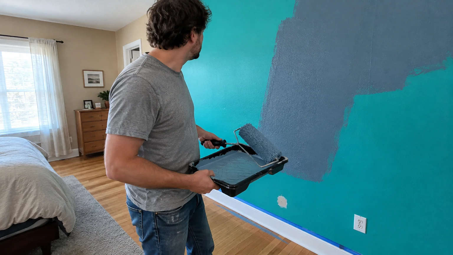
Electric teal and vibrant turquoise once defined mid-century accent walls, but they now appear jarring and outdated. Their artificial intensity fights against wall art and disrupts peaceful sightlines.
Evaluating trending vs outdated home colors reveals a decisive shift toward restorative, earth-bound pigments. Hyper-pigmented tropical brights instantly cheapen high-end finishes and fine architectural details.
When choosing replacement coatings, opt for modern zero-VOC formulations that emit under 5 grams per liter. Updating your palette should improve both aesthetic sophistication and indoor air quality.
Transition away from electric teal by selecting aged sea glass, celadon, or mineral slate. These muted blue-greens whisper calm sophistication while allowing your furnishings to take center stage.
Incorporate these subtle tones into guest bedrooms or sunlit reading nooks. They capture changing morning daylight beautifully, providing a tranquil backdrop for contemplation and rest.
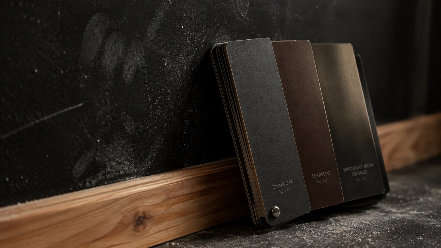
Trend #10: Chalky Matte Jet Black
The chalky matte black accent wall trend has definitively run its course. Matte jet black absorbs all surrounding light, creating an oppressive void that flattens spatial perception.
Rooms painted in harsh flat black often feel claustrophobic rather than dramatic. Dust, oils, and scuffs show instantly on ultra-matte dark surfaces, demanding relentless maintenance and spot repairs.
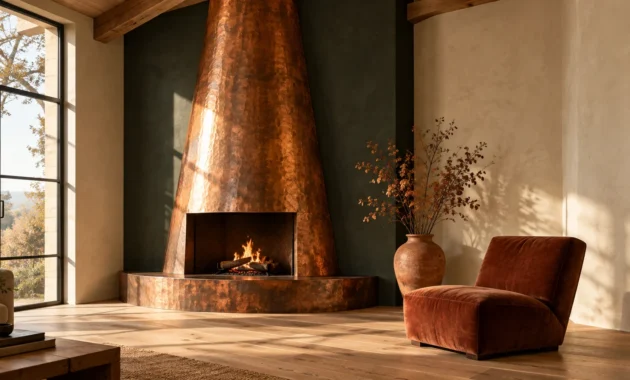
Achieve seductive drama instead through nuanced off-blacks infused with espresso or bronze undertones. These pigments catch shifting highlights, celebrating architectural molding rather than obliterating it.
Pair deep bronze-blacks with warm lime-wash finishes, aged leather, and fluted light oak panelling. This strategic balance prevents visual heaviness from dragging down your room’s vertical volume.
Use satin or eggshell sheens rather than dead-flat matte on deep colors. A gentle sheen reflects ambient light across the wall, highlighting the subtle pigment undertones.
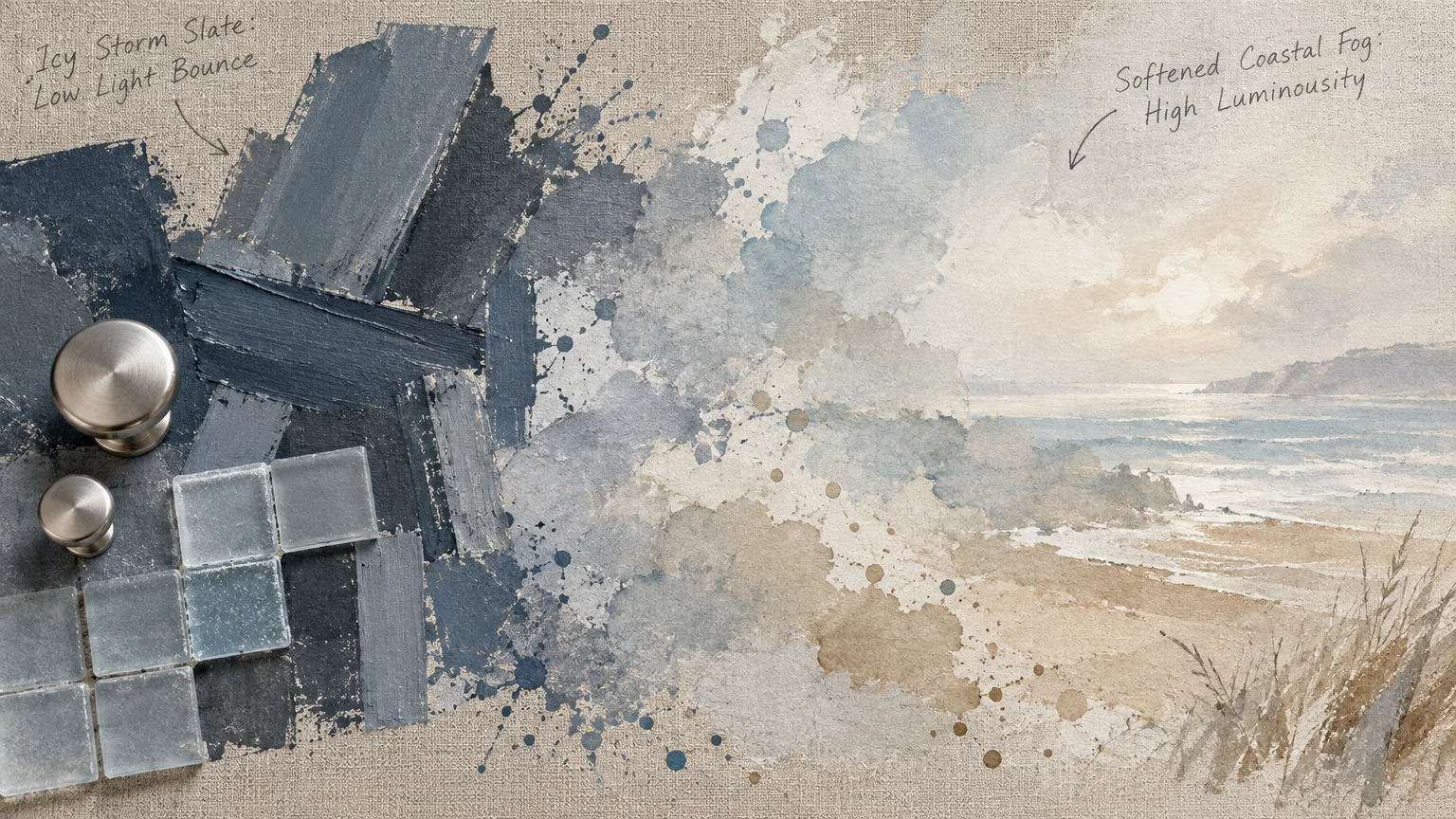
Trend #11: Cold Slate Blue-Gray
Cold blue-gray was a staple of the modern farmhouse craze, painted liberally across cabinets, living spaces, and primary bedrooms. However, its chilly undertone creates an uninviting, overcast gloom inside residential rooms.
Cool blue-gray is an outdated paint color to avoid if your space faces north or receives limited natural sunlight. In diffuse lighting, it quickly reads as depressing, institutional battleship gray.
Interior paint refreshes yield an impressive 107% return on investment when executed thoughtfully. Squandering that potential on depressing, frigid hues compromises your home’s emotional warmth and market value.
Embrace atmospheric mist, warm pigeon blue, or French gray with violet-tinted warmth. These pigments reflect ambient daylight gracefully, yielding an inviting and serene spatial sanctuary.
Anchor these soft tones with dark walnut floors, brushed nickel hardware, and creamy wool throws. The interplay between warmth and cool undertones creates a layered, sophisticated environment.
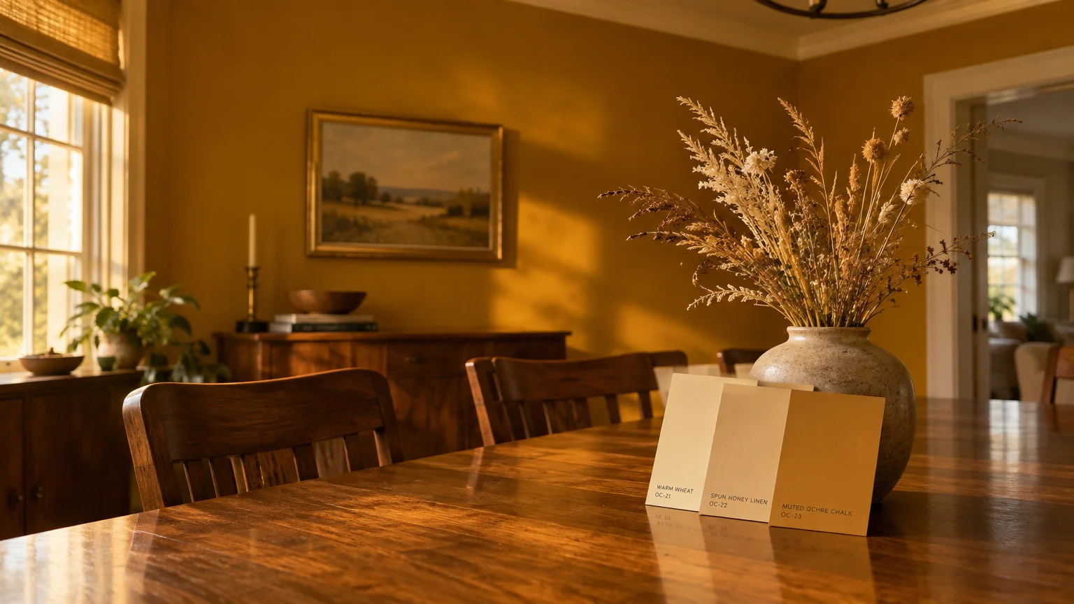
Trend #12: Harsh Mustard Gold
Mustard gold surged during the retro mid-century revival, but this piquant shade dates an interior faster than almost any other pigment. It casts unflattering reflections on skin tones and clashes with natural wood species.
Instead of mustard, sophisticated homeowners are embracing grounding earth tones. In fact, Zillow research demonstrates that warm chocolate brown in bedrooms added an average of $2,277 to home offer prices.
Rich, velvety brown conveys quiet luxury, permanence, and reassuring safety. It honors architectural provenance without imposing the loud, disruptive presence of mustard gold.
If you prefer golden warmth, choose toasted wheat, spun honey, or raw umber. These tonal alternatives radiate subtle, sun-drenched elegance while preserving chromatic balance throughout the home.
Pair these rich golden hues with cream bouclé upholstery, travertine cocktail tables, and matte brass lighting. The overall composition evokes understated luxury and effortless warmth.
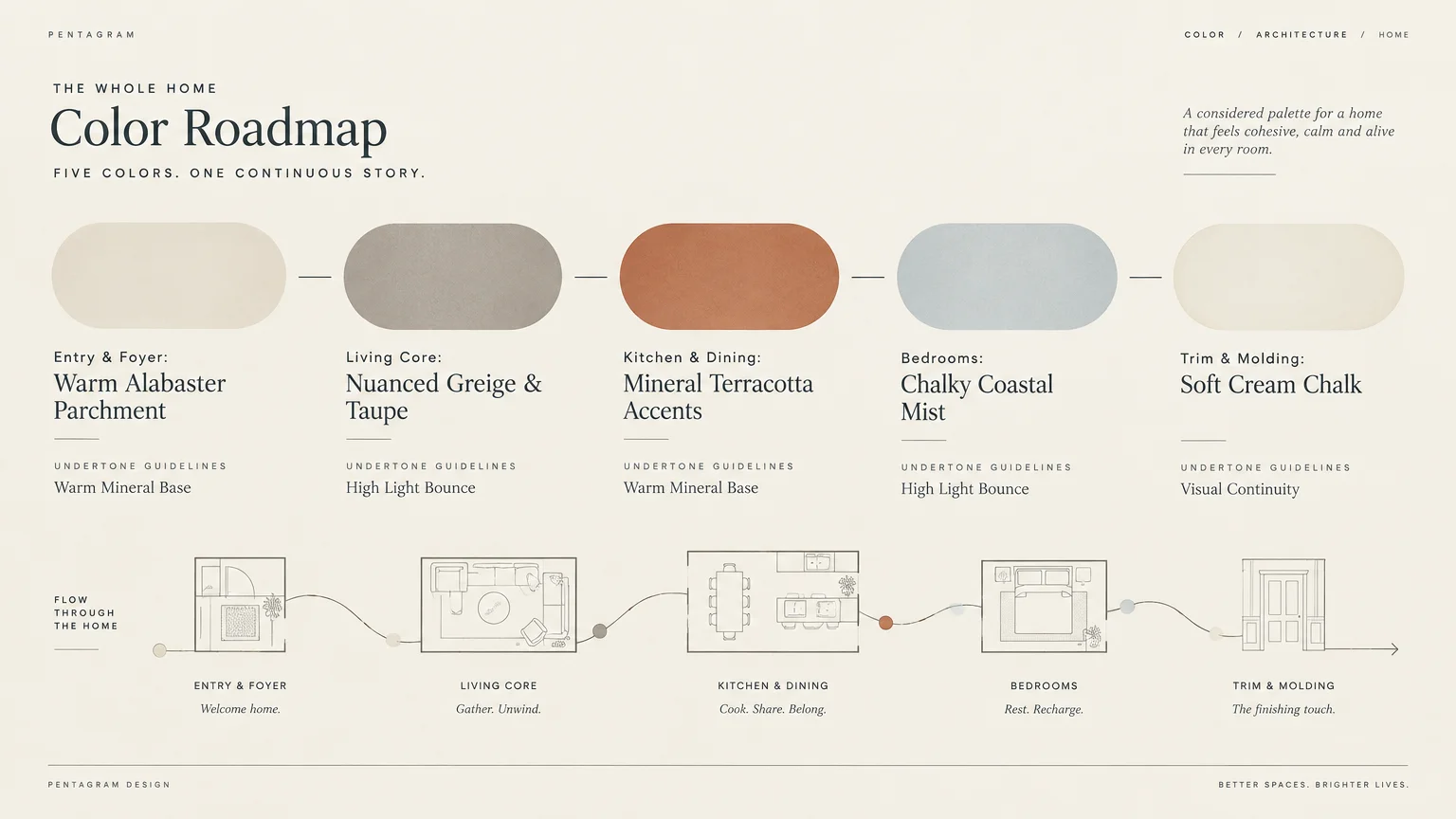
The Big Picture: Weaving These Trends into Your Home
Successfully modernizing your home requires a holistic understanding of flow, lighting, and material longevity. Color should never exist in isolation; it must engage in a dialogue with your flooring, millwork, and architecture.
Begin every repaint project by assessing your home’s natural light orientation. North-facing rooms require warm, luminous undertones to counteract cool ambient rays, while southern exposures comfortably balance deeper, cooler shades.
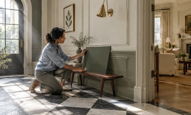
Sample your paints on large poster boards rather than painting directly onto existing walls. Move these swatches across different rooms at morning, noon, and night to observe how artificial and natural light interact with the pigments.
Prioritize low-VOC paints tested under 50 grams per liter to safeguard your family’s health. Modern acrylic latex coatings offer exceptional washability and color retention without releasing toxic off-gassing solvents into your living spaces.
With typical professional repaint costs ranging from $400 to $1,600 per room, disciplined color planning delivers immense dividends. Thoughtful chromatic curation elevates your daily living experience while preserving long-term property equity.
Remember that color trends are cyclical, but genuine quality and organic balance remain eternal. Invest in hues that evoke emotional peace, celebrate natural provenance, and honor the architectural rhythm of your home.
Frequently Asked Questions
How do I know if a paint color has long-term staying power?
Look for pigments inspired by natural geological formations, raw clays, and botanical life. Earth-derived hues maintain relevance across decades because they harmonize effortlessly with human circadian rhythms and organic building materials.
Avoid hyper-saturated primaries and novelty synthetic pastels that mirror short-lived fashion cycles. A truly timeless paint shade adapts gracefully as you update rugs, art, and furniture over the years.
What is the most cost-effective way to correct outdated wall colors?
Repainting individual rooms costs between $400 and $1,600, delivering a commanding 107% return on investment. Focus your budget first on high-impact social zones like the entryway, kitchen, and primary living room.
Applying two coats of a high-hiding primer prevents dated dark or saturated pigments from bleeding through. This critical prep work ensures your modern neutral achieves its true, luminous depth of color without requiring extra topcoats.
Can I combine warm neutrals with existing cool-toned flooring?
Yes, bridge the chromatic gap by selecting transitional greiges and taupes that contain dual undertones. These versatile pigments contain microscopic flecks of both umber and slate, uniting disparate architectural elements seamlessly.
Introduce natural fiber area rugs like jute or wool to soften the visual transition between your floors and walls. Layered textiles disguise stark contrasts while infusing your living areas with inviting textural depth.
How do zero-VOC and low-VOC paints compare in durability?
Modern acrylic resin formulations allow zero-VOC paints to match or exceed the durability of traditional solvent-heavy coatings. Formulations meeting SCAQMD standards under 5 grams per liter clean easily and resist scuffs effectively.
Choosing advanced low-VOC paints ensures superior indoor air quality without sacrificing scrubbability or pigment richness. You gain long-lasting beauty while protecting your family from harmful chemical emissions.
For the latest color forecasts, consult industry leaders like Pantone and paint companies like Benjamin Moore. For professional design standards, refer to the American Society of Interior Designers (ASID).
Disclaimer: This article reflects design trend analysis and predictions. Personal taste and timeless design principles should always guide your decorating choices.