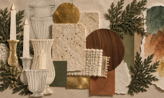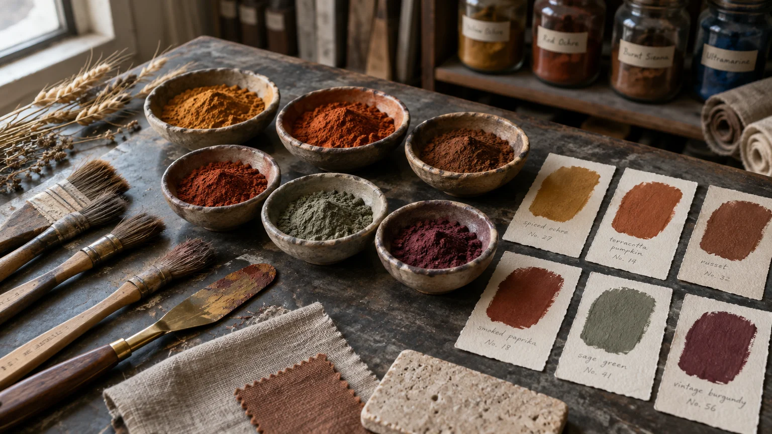
Rich autumn paint colors ground your living spaces with an undeniable sense of warmth and understated luxury. By drawing directly from the harvest landscape, you can craft layered interiors that feel both timely and timeless.
Today’s sophisticated earthy paint colors trade fleeting seasonal novelty for enduring tactile comfort. These twelve refined harvest tones provide the architectural depth and organic provenance needed to elevate your entire home.
Whether you refresh a formal dining room or wrap a sunlit study, these curated pigments offer versatile design solutions. Let us explore the twelve harvest shades redefining elevated interior palettes this season.
Trend #1: Spiced Ochre
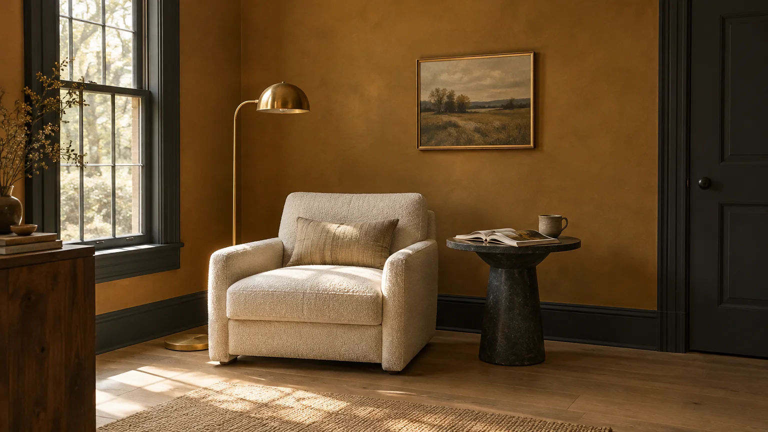
Spiced ochre introduces radiant warmth by mimicking sun-drenched grain fields in late October. This golden, earth-tinged yellow balances luminous cheer with the grounded weight of organic clay.
Pair spiced ochre with natural white oak flooring, unlacquered brass hardware, and nubby bouclé textiles. These materials complement its amber undertones without overwhelming smaller sitting rooms or breakfast nooks.
Homeowners gravitate toward this shade because it infuses dim, northern exposures with simulated natural daylight. It turns sterile open-plan layouts into inviting, enveloping sanctuaries with minimal architectural modification.
Apply an eggshell finish on living room walls to softly bounce ambient light throughout the day. For dramatic contrast, balance the golden hue against matte charcoal trim or dark soapstone surfaces.
Use this shade when you want the optimism of yellow without the synthetic brightness of citrus tones. It serves as an inviting canvas for contemporary gallery walls and curated vintage oil paintings.
Trend #2: Heirloom Pumpkin
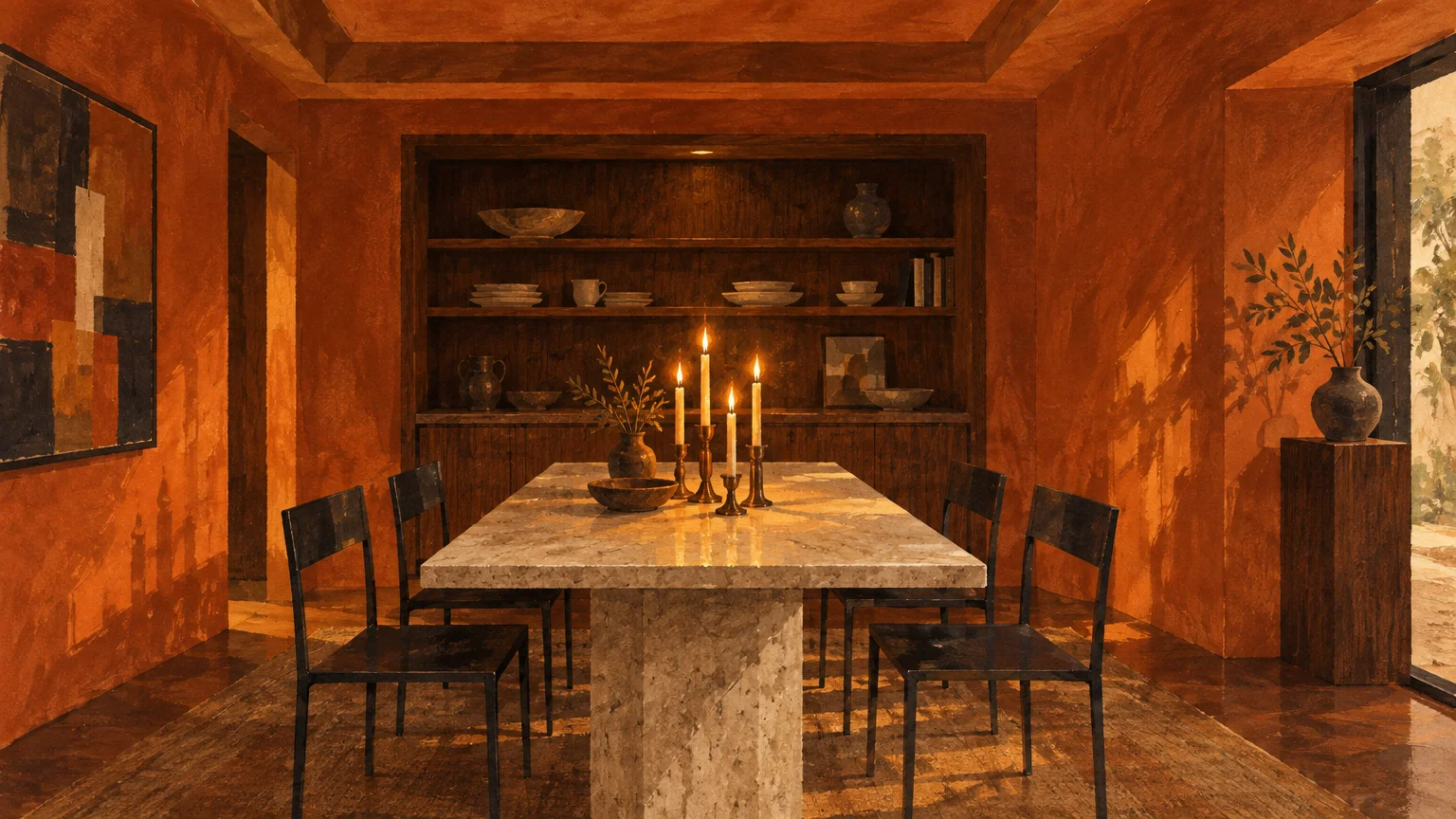
Heirloom pumpkin elevates traditional orange into a complex, mud-softened terracotta shade. Unlike bright holiday accents, this nuanced pigment carries subtle brown undertones that evoke sun-baked harvest fields.
Anchor this color with blackened steel fixtures, raw travertine, and open-grain walnut millwork. The cool, chiseled stone curbs the warmth of the paint, creating architectural equilibrium in modern dining rooms.
This earthy paint color satisfies our collective desire for tactile comfort and nostalgic security. It provides an immediate sense of quiet luxury, especially when wrapped around intimate powder rooms or dining spaces.
Paint your dining room ceiling in this hue to lower visual height and foster intimate dinner conversations. Pair it with beeswax taper candles to watch the walls glow with luminous, multidimensional depth.
If full wall coverage feels excessive, deploy heirloom pumpkin across architectural millwork or an entryway door. This focused application delivers an intentional burst of warmth that welcomes guests into your home.
Trend #3: Deep Burlap
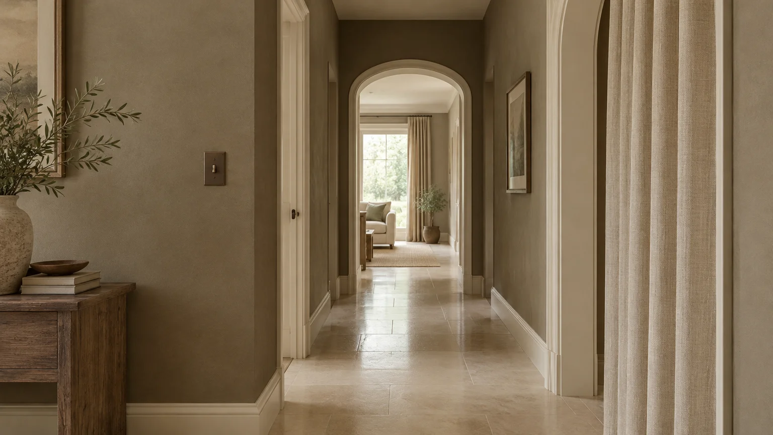
Deep burlap functions as the ultimate architectural neutral, replacing cold, sterile grays with woven straw warmth. Its subtle green-gray base gives your walls organic resonance and historical permanence.
Combine deep burlap with honed limestone tiles, linen drapery, and matte bronze switch plates. The tactile harmony between woven fabrics and this muted taupe builds an effortless biophilic atmosphere.
Interior designers rely on this shade because it bridges disparate timber tones across open-concept floor plans. It creates a cohesive backdrop that allows statement furniture and varied wood species to coexist gracefully.
Paint entire hallways and transition corridors in deep burlap using a washable matte finish. This treatment establishes visual continuity between rooms while disguising the everyday scuffs of busy household corridors.
Avoid matching deep burlap with glossy cool whites, which can make the undertones appear muddy. Instead, choose soft parchment or creamy ivory trim to maintain an uninterrupted, tailored flow.
Trend #4: Wild Blackberry
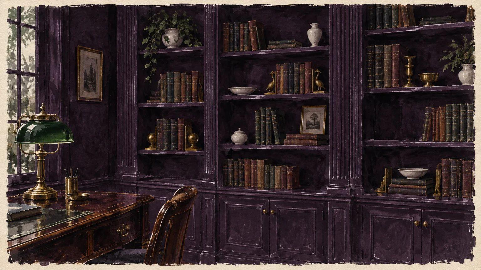
Wild blackberry brings moody decadence to your interior palette through its saturated blend of violet and soot. Inspired by late-season brambles, this rich shade injects instant drama into formal living spaces.
Balance this nocturnal hue with aged brass light sconces, fluted glass, and light-toned velvet upholstery. The interplay between reflective metal and absorbent dark paint produces an enchanting, jewelry-box effect.
Design enthusiasts embrace this color as a daring departure from predictable neutral living rooms. It offers an immersive sensory retreat that feels protective, secluded, and undeniably sophisticated at night.
Apply wild blackberry in a satin finish across home offices, media dens, or primary suites. Coat both walls and baseboards in this shade to eliminate visual breaks and visually expand the room.
Ensure you install layered dimmable lighting to prevent the space from reading as visually flat. Wall-grazing sconces and picture lights reveal the complex plum undertones lurking beneath the surface.
Trend #5: Roasted Chestnut
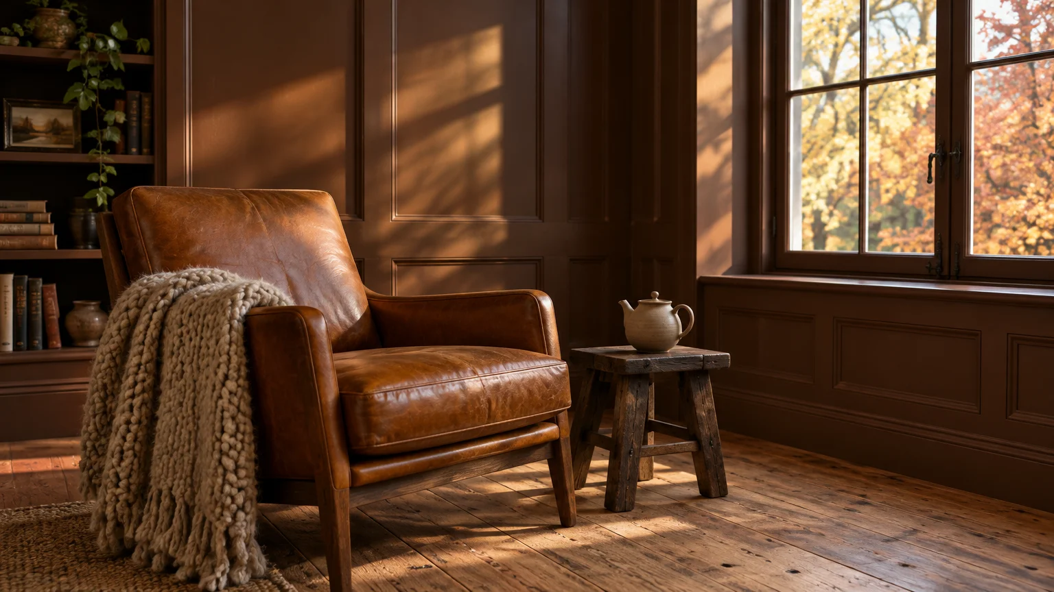
Roasted chestnut reinterprets classic chocolate brown with warm red and amber undertones. This indulgent color replaces flat mid-century walnut stains with enveloping architectural pigment that radiates quiet luxury.
Layer roasted chestnut alongside creamy boucle, polished marble, and reclaimed oak flooring. These contrasting textures elevate the brown from rustic simplicity to high-end cosmopolitan refinement.
The surge in warm paint colors stems from a widespread craving for grounding, earth-bound stability. Roasted chestnut envelops your senses, creating living rooms that invite quiet contemplation and unhurried rest.
Saturate your living room walls with this hue, using a dead-flat finish to absorb harsh shadows. Complement the palette with low-profile caramel leather seating and sculptural plaster lighting fixtures.
Test this color under both natural morning sun and evening incandescent bulbs before final application. Its red undertones reveal themselves dramatically under warm interior lamps, enriching the evening ambiance.
Trend #6: Pressed Cider
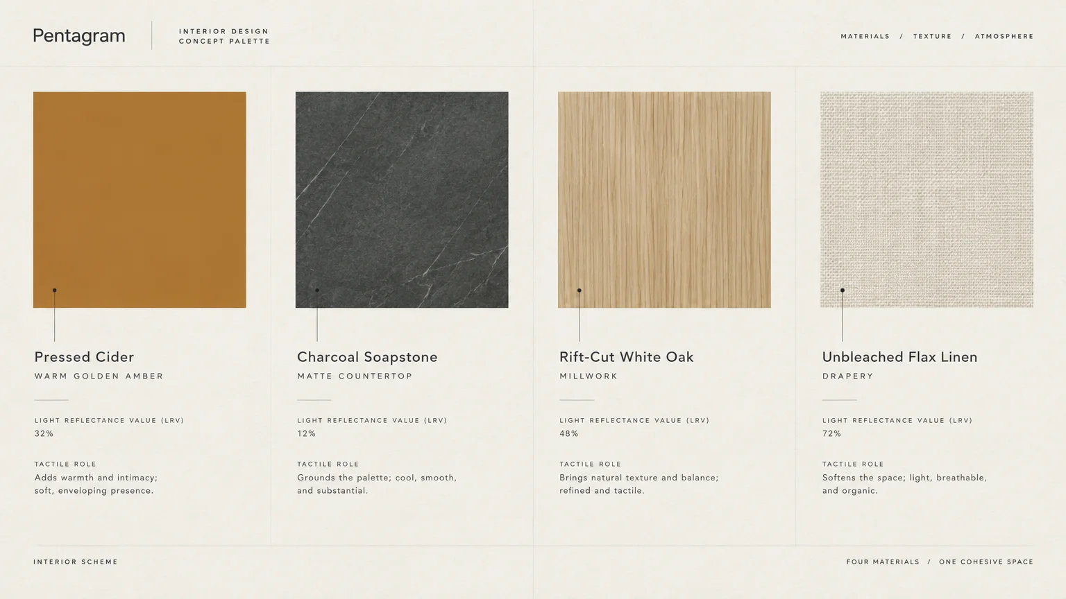
Pressed cider captures the crisp, refreshing acidity of an orchard harvest in a radiant golden-brown tone. It merges the vitality of yellow with the reassuring weight of weathered amber resin.
Pair pressed cider with terracotta floor pavers, bleached pine cabinetry, and blackened iron hardware. This combination anchors modern farmhouse kitchens with an artisanal, lived-in aesthetic.
This hue is rising rapidly because it provides warmth without feeling oppressive or dark. It bathes north-facing kitchen corners in an enduring golden hour glow that persists throughout bleak winter afternoons.
Use this color on kitchen islands, built-in pantries, or dining room wainscoting. Its balanced chromatic intensity energizes food preparation areas while encouraging lively culinary conversations among guests.
Pair pressed cider with warm neutral wall paints like cream or warm alabaster. This contrast lets the cider tone function as a focal point without overwhelming open-concept kitchen sightlines.
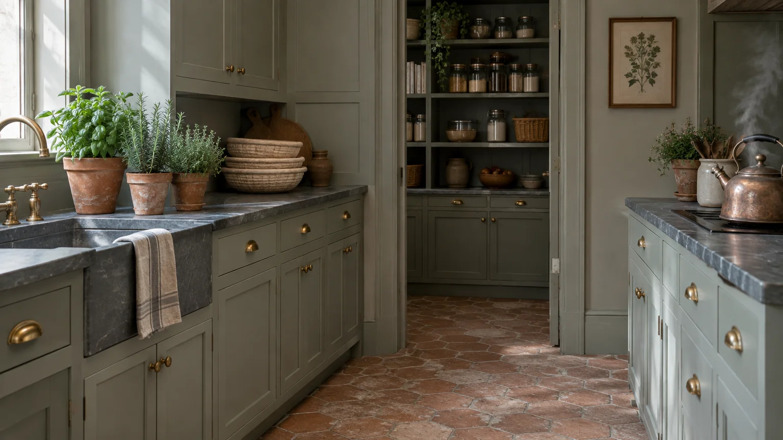
Trend #7: Dried Sage
Dried sage introduces a gentle vegetal balance to your fall paint colors. This silver-cast green draws direct inspiration from herb bundles hanging to dry in rustic autumn pantries.
Style dried sage alongside soapstone countertops, white marble, and wire-brushed white oak accents. The cool botanical undertones cool down heavy harvest reds while maintaining an organic, restorative ambiance.
Biophilic design continues to dominate modern interiors as homeowners seek deeper connections to nature. Dried sage acts as a peaceful visual balm, reducing cognitive fatigue in busy home environments.
Coat your primary bathroom or wellness corner in this restorative hue with an eggshell sheen. The moisture-resistant finish repels water while the soothing hue creates an immediate spa-like sanctuary.
Combine dried sage with aged bronze plumbing hardware to reinforce its heritage pedigree. The soft green illuminates beautifully under both natural skylights and warm vanity lighting.
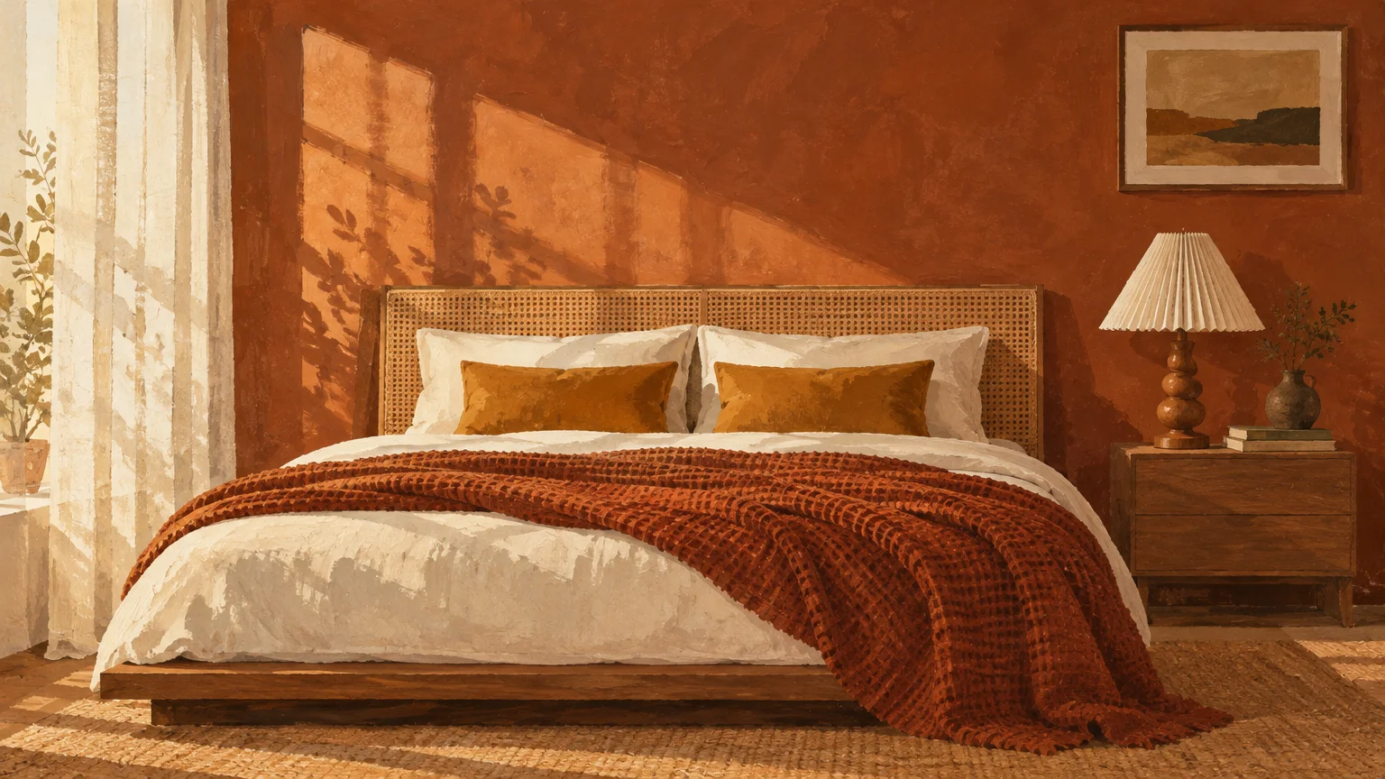
Trend #8: Tawny Russet
Tawny russet merges iron oxide red with weathered oak bark to produce a compelling, historic shade. It evokes late-harvest woodland trails and provides a refined alternative to conventional terracotta or red brick.
Complement this shade with burnished copper, raw wool rugs, and dark espresso wood finishes. These textural pairings bring out the earthy complexity of russet without feeling rustic or unrefined.
Discerning homeowners select tawny russet because it commands attention without shouting. Its subdued saturation feels cultivated and mature, avoiding the aggressive energy often associated with standard crimson paint.
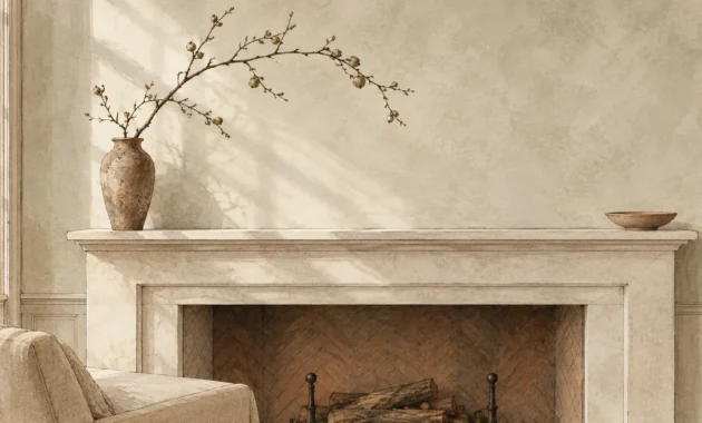
Utilize tawny russet in library nooks or around fireplace mantels to emphasize architectural focal points. The color absorbs fireplace flickers, generating an irresistibly cozy and cinematic hearthside environment.
When painting an entire room in russet, keep window treatments minimal and made of natural linen. Sheer panels let soft daylight wash over the walls, preventing deep tones from feeling claustrophobic.
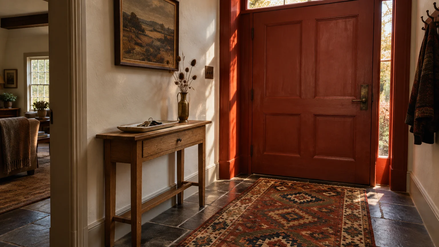
Trend #9: Smoked Paprika
Smoked paprika brings worldly energy into your home through its dusty, spice-laden red profile. It carries subtle brown and orange nuances that evoke open-air markets and artisanal spice bins.
Pair smoked paprika with hand-painted zellige tiles, woven rattan, and patinated brass plumbing fixtures. The artisanal tiles reflect light against the matte spice paint, generating dramatic surface contrast.
This color answers the growing demand for interiors with unmistakable personality and cultural provenance. It repudiates sterile, all-white rooms in favor of sensory richness, heat, and adventurous storytelling.
Paint an open entryway in smoked paprika to greet visitors with confidence and warmth. The shade establishes an engaging transitional threshold before transitioning into calmer adjoining living spaces.
Select a durable matte finish to highlight the velvety texture of this rich terracotta-red hybrid. Avoid high gloss finishes, which can create distracting glare on heavily pigmented spice tones.
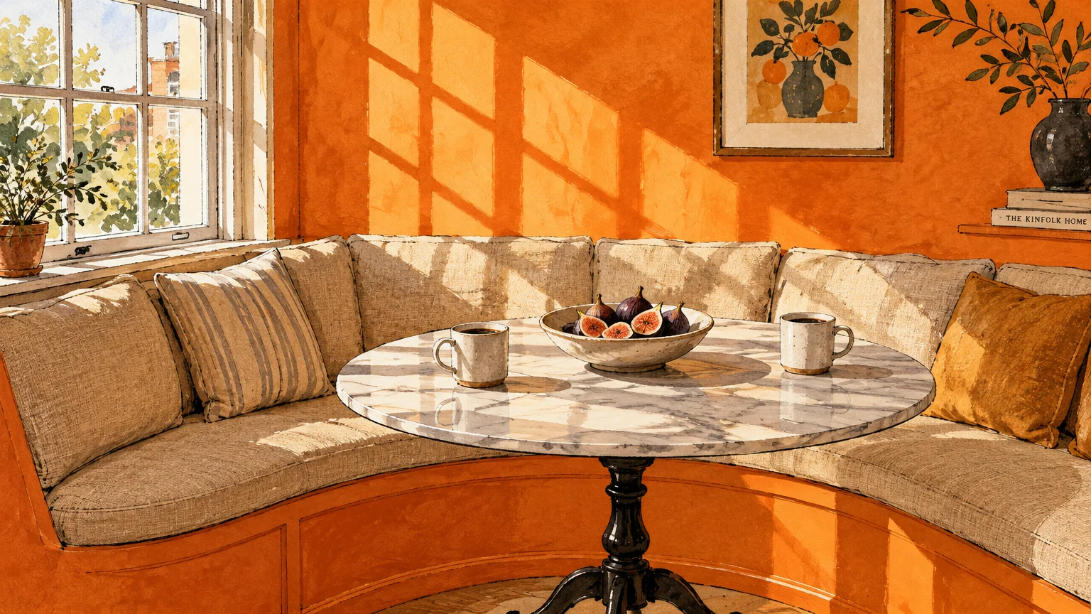
Trend #10: Ripe Persimmon
Ripe persimmon delivers an inviting burst of coral-infused orange that captures late-autumn orchards. It is cheerful yet muted enough to feel tailored, mature, and remarkably versatile across modern residences.
Combine ripe persimmon with pale ash millwork, natural jute floor coverings, and glazed cream ceramics. The neutral accessories temper the color’s vibrancy, sustaining a chic and composed aesthetic.
Design enthusiasts favor persimmon because it introduces energetic optimism into modern interior palettes. It delivers a welcome antidote to overcast autumn and winter days without appearing juvenile.
Consider coating custom kitchen cabinetry or built-in bookshelves in this spirited harvest hue. When set against crisp linen-white backdrops, the persimmon paint transforms functional casework into bespoke art.
For bedrooms, limit this color to an accent alcove or an upholstered headboard niche. This provides an energizing focal point in the morning while maintaining a restful atmosphere for sleep.
Trend #11: Golden Barley
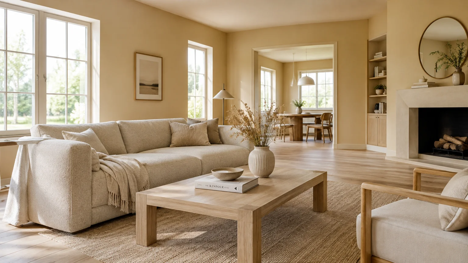
Golden barley brings the warmth of late-afternoon grain prairies directly into your primary living zones. Softer than yellow yet richer than beige, this shade functions as a luminous modern neutral.
Coordinate golden barley with boucle armchairs, light travertine tables, and bleached oak floorboards. These creamy, tactile surfaces amplify the paint’s natural warmth, crafting an effortless quiet luxury atmosphere.
Modern homeowners are moving past sterile cool grays in search of nurturing, sunlight-infused foundational colors. Golden barley provides an approachable middle ground that flatters contemporary artwork and vintage furnishings alike.
Paint open-concept great rooms with golden barley using an ultra-flat or chalky matte finish. The uniform low-sheen surface masks minor drywall imperfections while reflecting a soft, flattering ambient glow.
Pair this tone with dark bronze window frames to establish crisp, architectural framing around outdoor views. The dark perimeter accentuates the golden undertones and creates pleasing spatial depth.
Trend #12: Vintage Burgundy
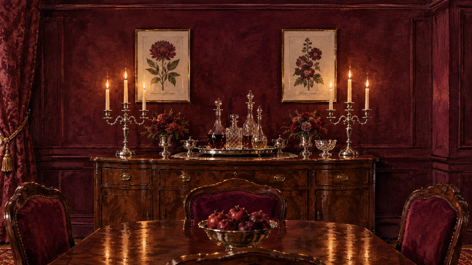
Vintage burgundy represents the culmination of autumn richness, drawing inspiration from harvested wine grapes and aged casks. It weaves deep red, purple, and brown into a singular, intoxicating tone.
Pair vintage burgundy with honed black granite, velvet drapery, and unlacquered antiqued brass details. The reflective metallics catch ambient light, cutting through the moody visual weight of the walls.
This color gains popularity as homeowners prioritize dramatic, cocoon-like spaces over cavernous open rooms. It imparts an unmistakable sense of heritage, intimate seclusion, and aristocratic elegance to entertaining zones.
Apply vintage burgundy to formal dining rooms, wine cellars, or music parlors with a rich eggshell sheen. The subtle sheen reflects candlelight beautifully, creating an unforgettable backdrop for sophisticated dinner parties.
Pair this saturated wine hue with high-contrast, creamy baseboards to articulate classic crown moldings. This structured separation keeps the dark color crisp, intentional, and architecturally defined.
The Big Picture: Weaving These Trends into Your Home
Integrating a harvest color palette into your home requires an intentional balance of saturation and texture. Rather than adopting every trend simultaneously, select one dominant hue and support it with grounding neutrals.
Consider the architectural envelope and existing flooring before dipping your paintbrush into deep autumn pigments. Warm terracotta tiles and honeyed oak flooring harmonize effortlessly with spiced ochre, russet, and warm barley.
For modern homes with polished concrete or cool stone surfaces, utilize dried sage or vintage burgundy. These tones introduce necessary visual warmth without conflicting with the sleek, industrial materials underneath your feet.
Lighting dictates how these earthy paint colors behave across the changing hours of the day. Warm 2700K LED illumination enhances red and golden undertones, ensuring your harvest walls never appear muddy after dusk.
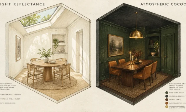
Embrace the color-drenching technique by coating baseboards, doors, and trim in the same shade as your walls. This unified application creates an immersive architectural envelope that makes small spaces feel expansive and intimate.
For the latest color forecasts, consult industry leaders like Pantone and paint companies like Benjamin Moore. For professional design standards, refer to the American Society of Interior Designers (ASID).
Always sample large swatches on multiple walls before committing your entire room to a saturated harvest shade. Observe how natural morning light and artificial evening illumination shift the pigment throughout the week.
Frequently Asked Questions
How can you introduce deep autumn paint colors without making a small room feel dark?
Pair rich harvest pigments with a unified trim color and open window treatments that maximize incoming natural daylight. Painting the ceiling a warm ivory lifts the eye upward and preserves an airy spatial feel.
Strategically place large wall mirrors opposite windows to bounce ambient light across saturated surfaces. Mirrors multiply natural light, preventing moody colors like wild blackberry or roasted chestnut from feeling oppressive.
Will warm paint colors clash with cool gray flooring or marble countertops?
You can bridge the temperature divide by choosing transitional harvest shades with subtle gray or green undertones. Dried sage and deep burlap possess enough cool pigmentation to integrate seamlessly alongside gray tiles.
Introduce intermediate accent materials like unlacquered brass, natural linen, and warm wood cutting boards to create visual bridges. These textural layers soften sharp contrasts between cool stone surfaces and warm walls.
Which paint finish works best for earthy, saturated harvest tones?
Matte and eggshell sheens provide the best visual results for deeply saturated, earthy paint colors. These low-sheen finishes absorb harsh light glare, allowing the true chromatic nuance of the pigment to shine.
Reserve satin or semi-gloss finishes exclusively for architectural moldings, doors, and custom cabinetry. The slight contrast in sheen highlights craftsmanship without causing distracting reflections across expansive wall spans.
Do autumn paint colors remain stylish through spring and summer?
Yes, these shades possess timeless organic provenance that transcends fleeting seasonal holiday themes. Because they derive from nature, harvest pigments feel as grounded in mid-July as they do in late October.
Transition your styling between seasons by swapping heavy wool textiles for lightweight organic cotton and breathable linen. This simple textile adjustment keeps your harvest-painted rooms feeling breezy and fresh year-round.
Disclaimer: This article reflects design trend analysis and predictions. Personal taste and timeless design principles should always guide your decorating choices.