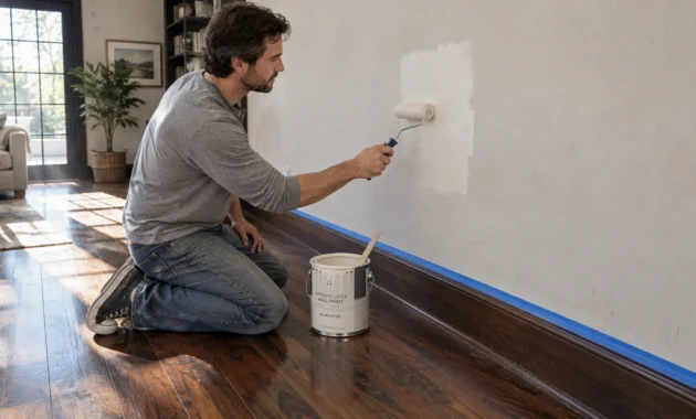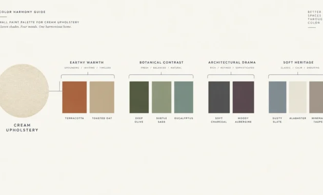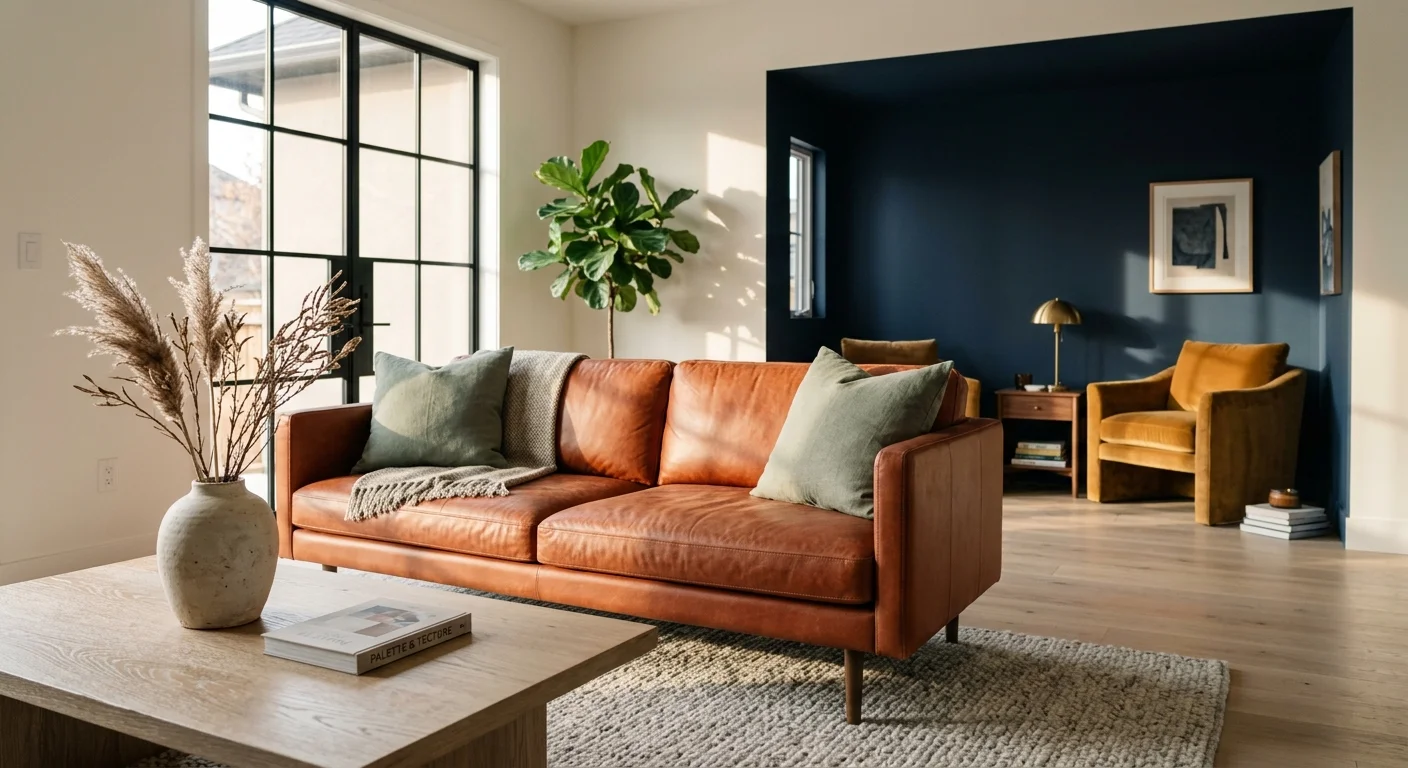
Mastering the interior design color schemes that elevate a room from ordinary to extraordinary requires an understanding of contrast, light, and emotional resonance. Top interior designers repeatedly turn to a core set of timeless color palettes because these combinations consistently deliver balance, quiet luxury, and artistic longevity across diverse architectural styles. By pairing grounded neutrals with sophisticated chromatic accents—such as warm terracotta alongside muted sage, or deep navy offset by warm ocher—you create spaces that feel both refined and deeply welcoming. Discover the best color pairings interior design professionals rely on to craft harmonious, enduring spaces, complete with actionable advice on applying them within your own home.
Trend #1: Terracotta and Muted Sage
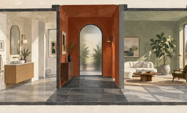
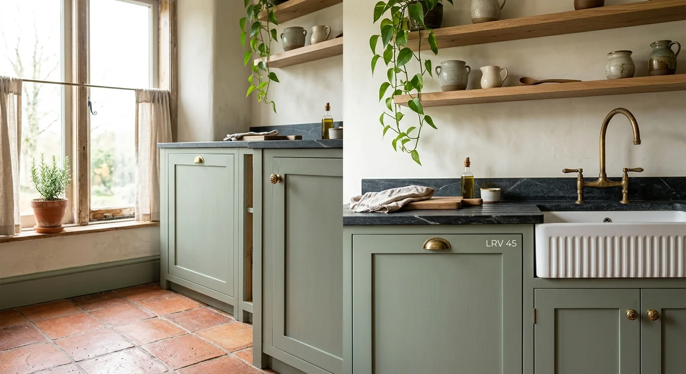
The combination of terracotta and muted sage remains one of the most reliable designer favorite color combos due to its deep roots in biophilic design. Biophilic principles emphasize our innate human connection to the natural world, and this pairing draws directly from natural clay and dried foliage. Terracotta provides an enveloping, tactile warmth with its rich red-orange undertones, while muted sage introduces a cooling, restorative counterweight. When you place these two hues in proximity, they form a harmonious dialogue between fire and earth, warmth and serenity.
To apply this pairing effectively in your living room or kitchen, establish a clear focal hierarchy. Consider painting kitchen perimeter cabinetry in a muted sage green with a Light Reflectance Value (LRV) around 45, which reflects light gently without feeling clinical. Complement this cabinetry with hand-pressed terracotta floor tiles or a textured terracotta plaster accent wall behind floating oak shelves. The organic variation in the tile adds visual texture that plain paint cannot match. Complete the look with unlacquered brass hardware, which develops a rich patina over time and enhances the warm undertones of the terracotta.
In living areas, execute this scheme through layered textiles. A low-profile camel or terracotta leather sofa against walls painted in soft sage creates an inviting atmosphere that feels both grounded and modern. To prevent the space from feeling overly dark, integrate light wood tones such as white oak or bleached ash in your flooring and tables. Industry data indicates that organic, warm-neutral pairings like this increase spatial comfort while maintaining high aesthetic longevity, ensuring your home feels relevant for years to come.
Trend #2: Deep Navy and Warm Ocher
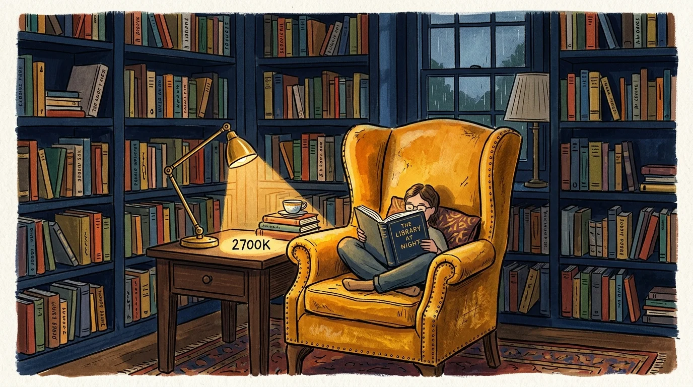
Deep navy and warm ocher represent a historic color combination that designers continually reinterpret for modern interiors. Navy functions as an anchor hue—a chromatic alternative to black that adds immense depth without absorbing every photon of light in the room. Warm ocher, with its golden-yellow and earthy undertones, provides a striking contrast that instantly enlivens navy’s quiet weight. This dynamic interplay between cool depth and glowing warmth creates a room that feels both tailored and intellectually stimulating.
When integrating this scheme into formal dining rooms or moody home offices, leverage the psychological impact of rich paint finishes. Paint the walls, trim, and baseboards in a dark matte navy to create an immersive, cocooning effect. Contrast this moody envelope with seating upholstered in golden ocher velvet or rich cognac leather. The luster of velvet captures natural light, transforming the ocher from a flat yellow into a gleaming focal point that draws the eye across the room.
Lighting choices play a pivotal role in optimizing this palette. Install warm-toned LED light sources (around 2700 Kelvin) to enhance the radiant glow of the ocher elements without stripping the richness from the navy walls. Architectural accents—such as dark walnut millwork, brushed bronze light fixtures, and woven natural-fiber rugs—bridge the gap between these two bold shades, ensuring your interior design color schemes achieve seamless sophistication.
Trend #3: Charcoal Black and Creamy Alabaster
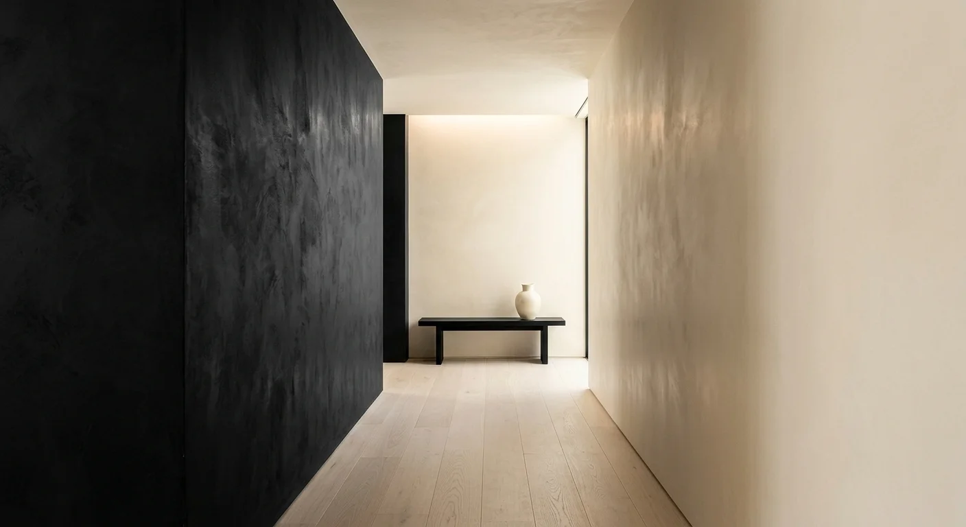
While high-contrast black and white can sometimes feel harsh or sterile, replacing stark hues with charcoal black and creamy alabaster achieves quiet luxury. Designers turn to this pair when they want to establish strong architectural geometry while maintaining a soft, welcoming atmosphere. Charcoal black carries a natural smokiness and subtle warm undertones, while creamy alabaster offers a rich, off-white base with gentle yellow and beige undertones that prevent the space from feeling clinical.
To execute this look, use alabaster as your primary backdrop across walls and ceilings, utilizing a matte or eggshell finish to diffuse incoming sunlight. Introduce charcoal black strategically to frame views and highlight architectural features. Matte black metal window casings, ebonized oak dining chairs, or a wrought-iron staircase railing act as bold graphic lines against the luminous alabaster surface. This technique creates visual structure, guiding the eye through the space with deliberate intent.
Texture is essential when working with popular paint color combinations that lean monochrome. Incorporate rich, tactile materials like bouclé fabrics, slubbed linen drapery, honed Nero Marquina marble, and hand-plastered fireplace surrounds. By prioritizing varied surface textures over bright colors, you create a deeply relaxing environment that exudes subtle elegance and contemporary refinement.
Trend #4: Rich Emerald Green and Dusty Rose
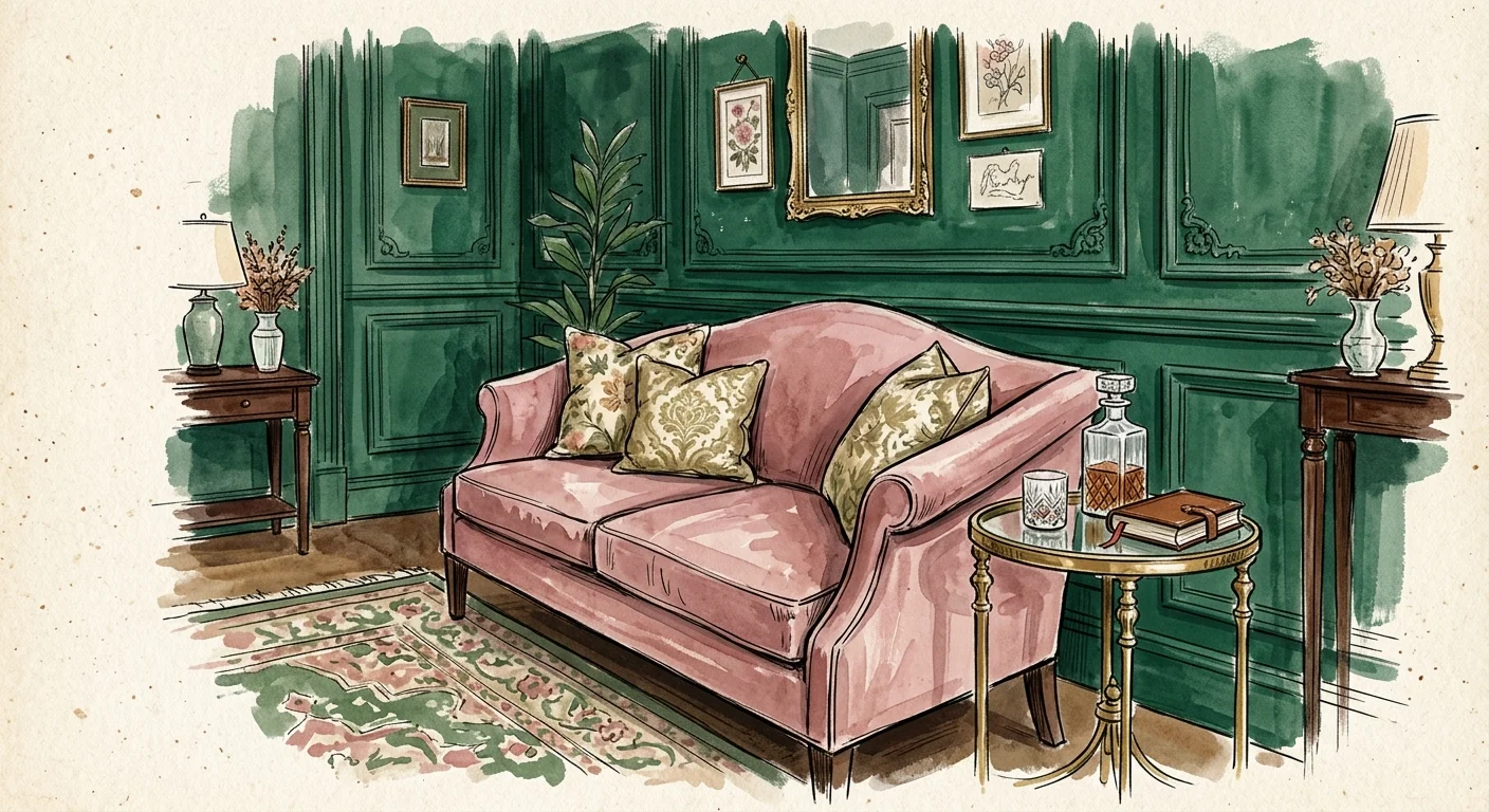
Red and green sit directly opposite each other on the traditional color wheel, making them natural complementary colors. However, using saturated primary shades can easily look garish. High-end designers elevate this classic pairing by shifting the saturation and undertones, combining rich emerald green with muted dusty rose. Emerald green provides a dense, jewel-toned sophistication, while dusty rose supplies a soft, romantic warmth that tempers the green’s intensity.
This combination excels in primary bedrooms, formal sitting rooms, and boutique-inspired powder rooms. In a bedroom setting, paint walls in a rich, low-sheen emerald green to wrap the space in a tranquil, forest-like atmosphere. Introduce dusty rose through washed linen bedding, velvet accent cushions, or an upholstered headboard. The delicate pink tones soften the dark walls, creating an inviting, multi-layered sanctuary designed for rest.
To ground this sophisticated palette, incorporate warm wood finishes like dark American walnut or antique mahogany. Metallic accents should lean toward brushed brass, warm gold, or patinated bronze rather than polished chrome, as warm metals reinforce the rich depth of both emerald and rose. This curated balance prevents the space from feeling overly feminine or excessively dark, offering a polished result that stands the test of time.
Trend #5: Warm Chocolate Brown and Creamy Linen
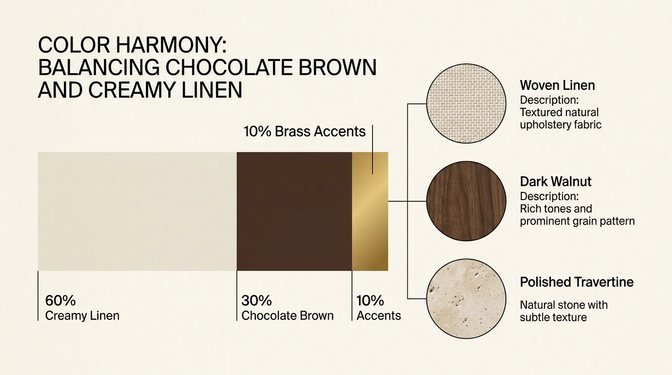
The design world has embraced the warm brown renaissance, moving decisively away from the cool, flat grays that dominated the previous decade. Warm chocolate brown paired with creamy linen represents the epitome of modern comfort and understated elegance. Chocolate brown offers a feeling of security and earth-bound luxury, while creamy linen provides a luminous, breathable background that prevents dark brown furniture or trim from overwhelming the spatial balance.
When introducing this palette into living rooms and dens, focus on material honesty and warm layering. Choose rich espresso or chocolate brown for major timber elements, such as architectural wall paneling, ceiling beams, or custom bookcases. Balance these deep elements with tailored sofas upholstered in textured ivory linen, shearling accent chairs, and hand-knotted wool rugs in light oatmeal hues. The contrast between deep wood tones and soft, light textiles yields an inviting ambiance.
Pay close attention to paint undertones when specifying your neutral walls. Select off-white paint shades with subtle umber or yellow undertones to complement the chocolate brown. Avoid cool blue-based whites, which cause unpleasant color clashes against warm browns. Incorporating natural leather, tumbled travertine surfaces, and warm amber glassware will further enrich this sophisticated palette.
Trend #6: Slate Blue and Mustard Ochre
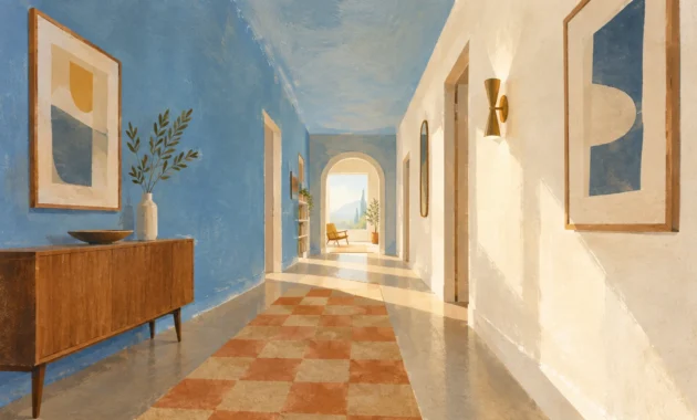
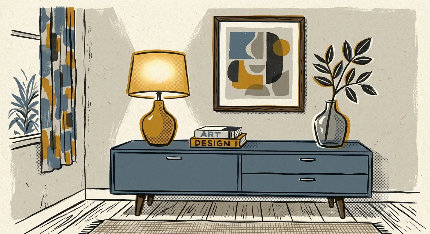
For homeowners seeking an artistic and intellectually stimulating home aesthetic, slate blue and mustard ochre deliver an unbeatable combination. Slate blue contains strong gray undertones, making it a calm, muted base that feels tranquil and spacious. Mustard ochre brings a spicy, vintage-inspired warmth that injects immediate personality into cool blue surroundings. This pairing balances the serene calm of coastal design with the vibrant character of mid-century aesthetics.
In home offices, libraries, or open-plan living areas, use slate blue as your dominant wall color to foster focus and relaxation. A matte finish in slate blue creates a peaceful atmosphere that recedes visually, making small rooms appear larger. Layer in mustard ochre through statement furniture pieces—such as a tailored velvet armchair, graphic throw pillows, or abstract artwork. The golden ochre pops against the blue wall without feeling overly aggressive.
Pair this color palette with medium-toned woods like teak, mid-century walnut, or honey oak. For hardware and light fixtures, select gunmetal, antique brass, or matte black steel. This rich combination of materials creates a layered, curated look that feels collected over time rather than purchased all at once from a single showroom.
Trend #7: Olive Green and Soft Warm Sand
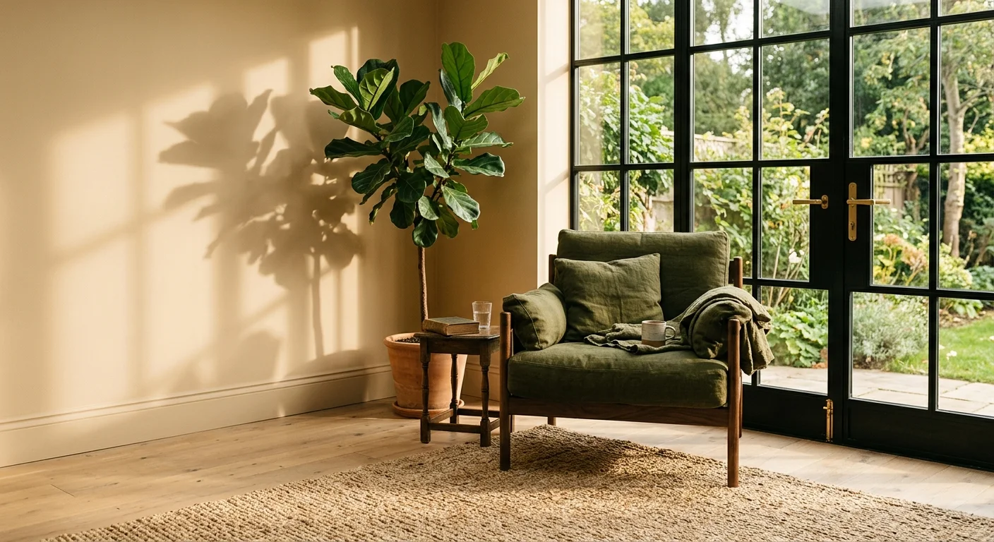
Olive green and soft warm sand form a refined palette inspired by Mediterranean landscapes and desert modern architecture. Olive green carries subtle yellow and brown undertones, making it far warmer and more versatile than traditional forest or mint greens. When paired with soft warm sand, it creates a serene, organic environment that feels grounded, sunny, and connected to nature.
This pairing works exceptionally well in open-concept kitchens, bathrooms, and sunrooms. Consider using sand-toned lime-wash or micro-cement plaster on walls to establish a textured, artisanal backdrop. Install olive green cabinetry paired with honed limestone or Calacatta gold marble countertops. The muted green cabinetry grounds the room, while the sandy plaster walls reflect natural light, casting a gentle warmth across the space.
Enhance this earthy dynamic with natural materials like rattan, zellige tiles, woven linen drapery, and unvarnished timber accents. Research in spatial wellness demonstrates that warm earth tones significantly reduce stress levels and foster domestic tranquility, making olive green and sand an ideal choice for modern living spaces focused on well-being.
The Big Picture: Weaving These Trends into Your Home
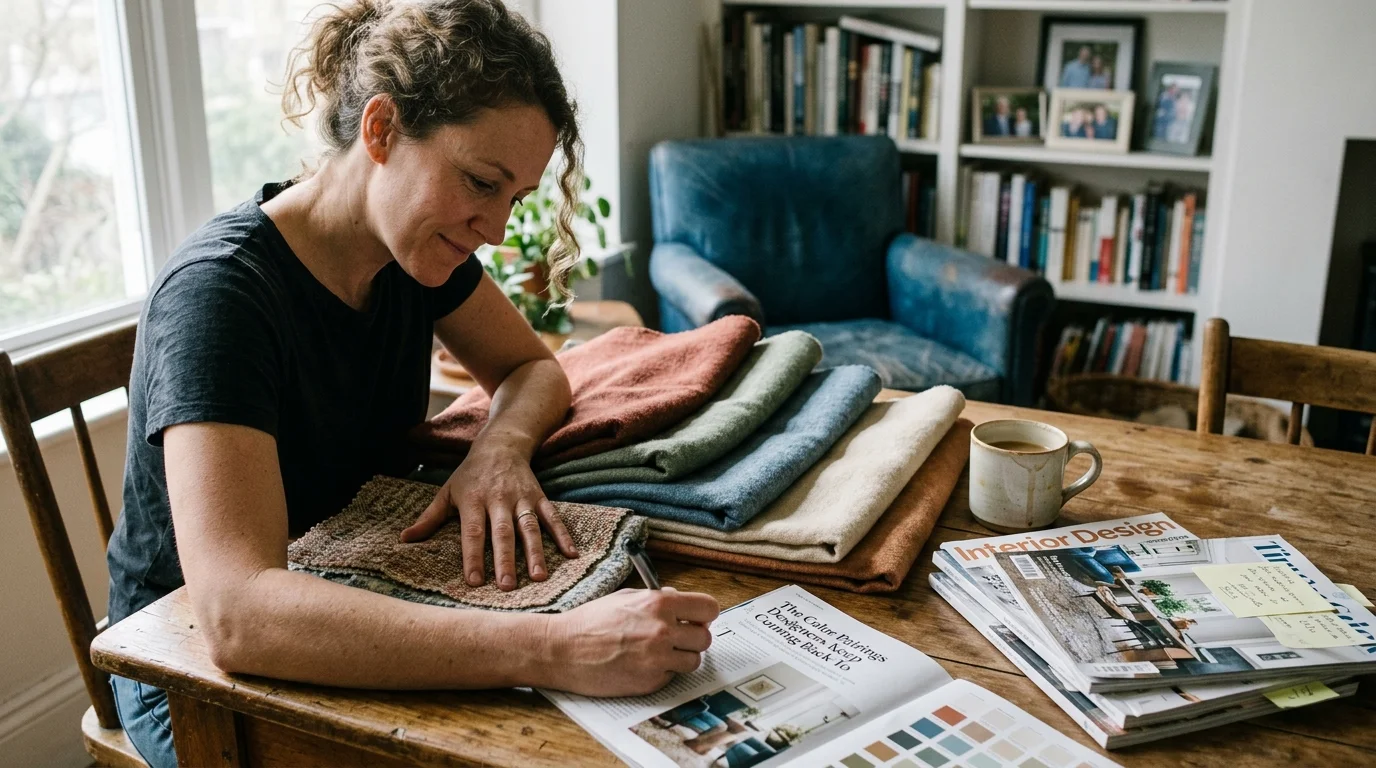
Successfully incorporating timeless color palettes into your home requires more than simply choosing two paint colors from a swatch deck. To achieve a cohesive and sophisticated result, you must consider light, proportion, texture, and flow across your entire floor plan. By following a structured approach to color application, you can seamlessly adapt these designer favorite color combos to fit your personal taste and architectural setting.
Start by evaluating the orientation of natural light in each room. North-facing rooms receive cool, diffused light that can make paint shades look flatter and blue-tinted. To counter this, lean into warmer pairings like chocolate brown and creamy linen, or terracotta and muted sage. South-facing rooms enjoy bright, warm sunlight throughout the day, allowing you to experiment with deeper, cooler shades like slate blue, deep navy, or charcoal black without risking a dismal atmosphere.
Apply the classic 60-30-10 rule to maintain visual harmony. Allocate 60 percent of your room’s color surface to your dominant neutral backdrop (such as walls, large rugs, or drapery), 30 percent to your secondary structural color (such as cabinetry, upholstery, or large millwork), and 10 percent to your accent hue (found in art, pillows, ceramics, and small furniture pieces). This simple balance ensures that high-contrast pairings like emerald and dusty rose enrich the room without overwhelming it.
Finally, maintain continuous color flow between adjoining spaces. You do not need to paint every room the same shade, but carrying key undertones—such as warm sand, brass accents, or natural oak flooring—from one room to the next creates a unified spatial narrative. This intentional layering ensures your home feels thoughtfully curated, harmonious, and timelessly stylish.
For the latest color forecasts, consult industry leaders like Pantone and paint companies like Benjamin Moore. For professional design standards, refer to the American Society of Interior Designers (ASID).
Disclaimer: This article reflects design trend analysis and predictions. Personal taste and timeless design principles should always guide your decorating choices.
Frequently Asked Questions
How do I test popular paint color combinations before committing to an entire room?
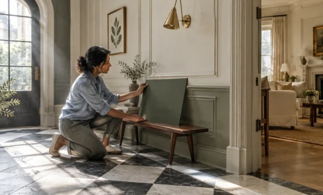
Always test paint samples on large boards (at least two feet by two feet) rather than painting directly onto primed walls. Move the sample boards around the room throughout the day to observe how changing natural light and artificial evening lighting affect the undertones. Observe the paint next to your flooring, cabinetry, and upholstery fabrics to ensure all elements harmonize under both 2700K warm artificial light and natural daylight.
Can I combine cool and warm tones in interior design color schemes without visual clash?
Yes, combining warm and cool tones is the secret behind many of the best color pairings interior design professionals create. The key is ensuring that both colors share a similar saturation level or undertone mutedness. For example, pairing a cool slate blue with a warm mustard ochre works because both shades contain grounded, dusky undertones that prevent them from competing aggressively for attention.
What is the easiest way to update my home’s palette without repainting every wall?
If repainting entire rooms feels overwhelming, introduce new color palettes through moveable decor elements and architectural accents. You can paint trim, interior doors, or built-in bookshelves in a contrasting secondary color while keeping your walls neutral. Layering in accent rugs, window treatments, throw cushions, and artwork featuring your chosen color pairing allows you to refresh your home’s aesthetic with minimal effort.
How do I know if a color pairing will remain timeless or quickly go out of style?
Timeless palettes rely on natural materials, complex undertones, and historical precedent rather than bright, oversaturated neon trends. Color schemes rooted in nature—such as earth-derived terracotta and sage, or oceanic navy and warm sand—have maintained design popularity for centuries. Choosing paints with muted or dusky undertones ensures your space feels elegant and enduring rather than transient or overly trendy.