Autumn interior palettes are leaving sterile minimalism behind in favor of soulful, nostalgic warmth. You can instantly elevate your living space this season by embracing saturated hues rooted in mid-century and 1970s heritage.
Leading paint manufacturers have confirmed this shift, unveiling collections rich in earthy depth, creamy warmth, and expressive color. These tones provide effortless comfort while delivering a sophisticated architectural statement throughout your home.
From velvet upholstery to drenched accent walls, retro shades offer unmatched intimacy for cooler months. Here are the six defining retro colors dominating fall design and how to style them seamlessly.
Trend #1: Rich Chocolate and Caramel Brown
Deep, luxurious brown has officially reclaimed its throne as the premier foundational shade of autumn. Designers are abandoning stark blacks in favor of deep cocoa and decadent caramel tones.
Benjamin Moore anchored this movement by designating Silhouette (AF-655) as its 2026 Color of the Year. This nuanced espresso hue blends deep brown with subtle charcoal undertones to deliver immediate drama.
The resurgence stems from a collective yearning for sanctuary, warmth, and architectural grounding. Chocolate tones cultivate a cocooning atmosphere that makes cavernous living spaces feel intimate and anchored.
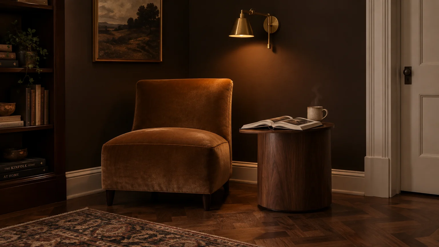
You can incorporate this shade effortlessly through tailored upholstery or full-room color drenching. Matte espresso walls create a breathtaking contrast against warm alabaster trim and honed limestone mantels.
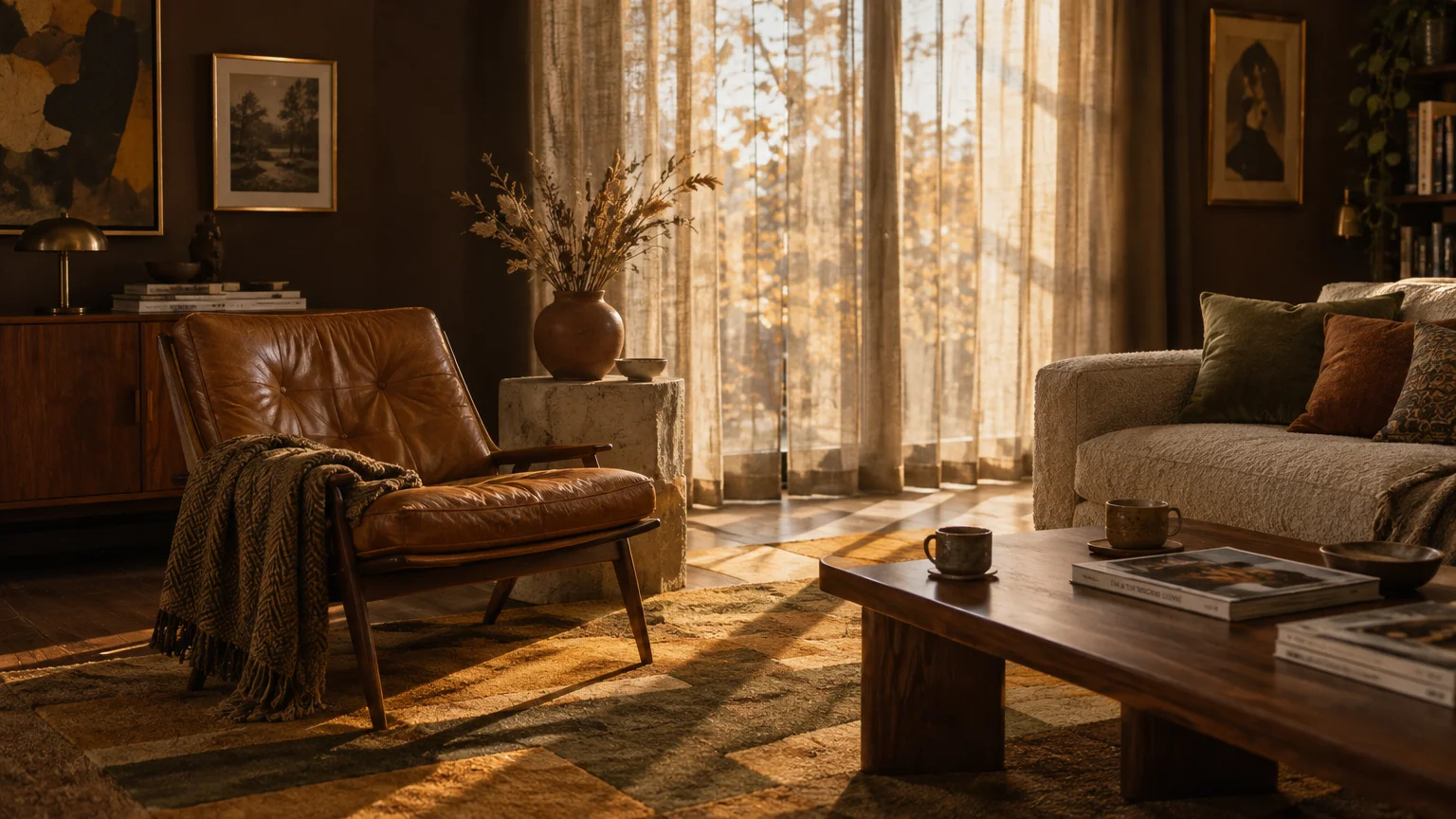
If you prefer subtle accents, introduce caramel through full-grain leather armchairs or rich velvet pillows. These supple textures catch natural fall light, creating soft highlights that enhance your living room.
Pair chocolate hues with mid-century walnut furniture to honor the authentic provenance of the palette. The shared undertones establish a seamless visual continuum that feels deliberate rather than haphazard.
Balance the visual density of dark brown by layering in warm metallic hardware. Unlacquered brass and polished bronze fixtures reflect ambient lamplight, preventing dark corners from feeling heavy.
For flooring, dark chocolate stains and walnut parquetry ground the entire composition. A vintage wool runner over dark hardwood softens footfall while anchoring your retro autumn aesthetic.
Designers also praise Sherwin-Williams Rojo Marrón for bringing deep reddish-brown sophistication to dining spaces. Under candlelight, this vintage color palette 2026 favorite creates an unforgettable backdrop for entertaining.
Rich brown functions as a timeless anchor that supports evolving decor styles without demanding annual updates. Its enduring versatility cements chocolate as an essential centerpiece for cozy autumnal redesigns.
Trend #2: Vintage Butter Yellow and Ochre
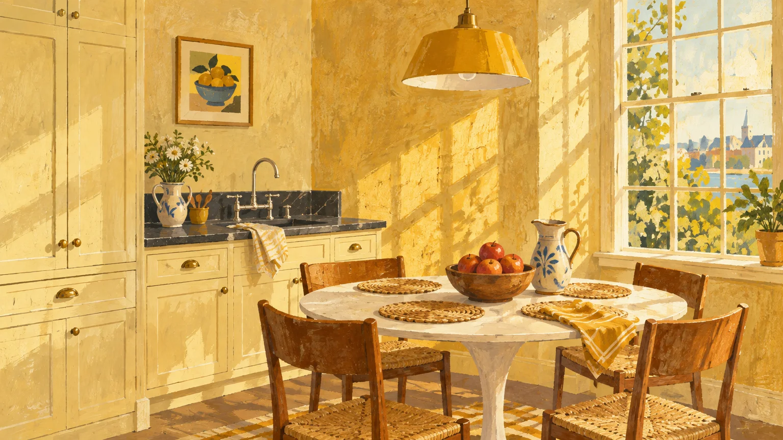
Cheerful, nostalgic yellows are illuminating autumn interiors with radiant warmth and gentle optimism. This trend reinterprets 1970s harvest gold into a softer, sophisticated butter and ochre palette.
Dutch Boy spotlighted this evolution by selecting Melodious Ivory as its 2026 Color of the Year. This shade acts as a luminous vintage cream that injects daylight into shadowed spaces.
Similarly, Krylon highlighted Meringue within its Fall 2026 collection, showcasing the appeal of buttery tones. These pigments counteract dreary autumn grayness without overwhelming your eyes with neon brightness.
In your kitchen, consider painting perimeter cabinetry or a freestanding pantry in rich butter yellow. The color pairs beautifully with soapstone countertops and polished nickel plumbing fixtures.
If you want a softer touch, apply a delicate ochre limewash across your dining room walls. The subtle tonal movement mimics aged European plaster, capturing afternoon light with bespoke elegance.
You can also integrate vintage butter yellow through heavy linen drapery and patterned textiles. As sunlight filters through the fabric, your entire living space fills with a golden, comforting glow.
Ground bright yellow accents by layering them alongside deep timber finishes and woven rattan. The organic textures temper the warmth, preventing the space from reading overly sweet or juvenile.
For a bold retro contrast, place ochre accessories against dark espresso or deep jade backdrops. This deliberate tension produces a high-design aesthetic straight from an archival design editorial.
Vintage butter tones also enhance small breakfast nooks when combined with checkered tablecloths and ceramic pendant lights. The resulting morning ambiance feels both delightfully nostalgic and thoroughly modern.
This golden spectrum revitalizes tired spaces without requiring complete structural overhauls. A single accent wall in warm ochre enlivens quiet corners with captivating historic vitality.
Trend #3: Earthy Terracotta and Burnt Rust
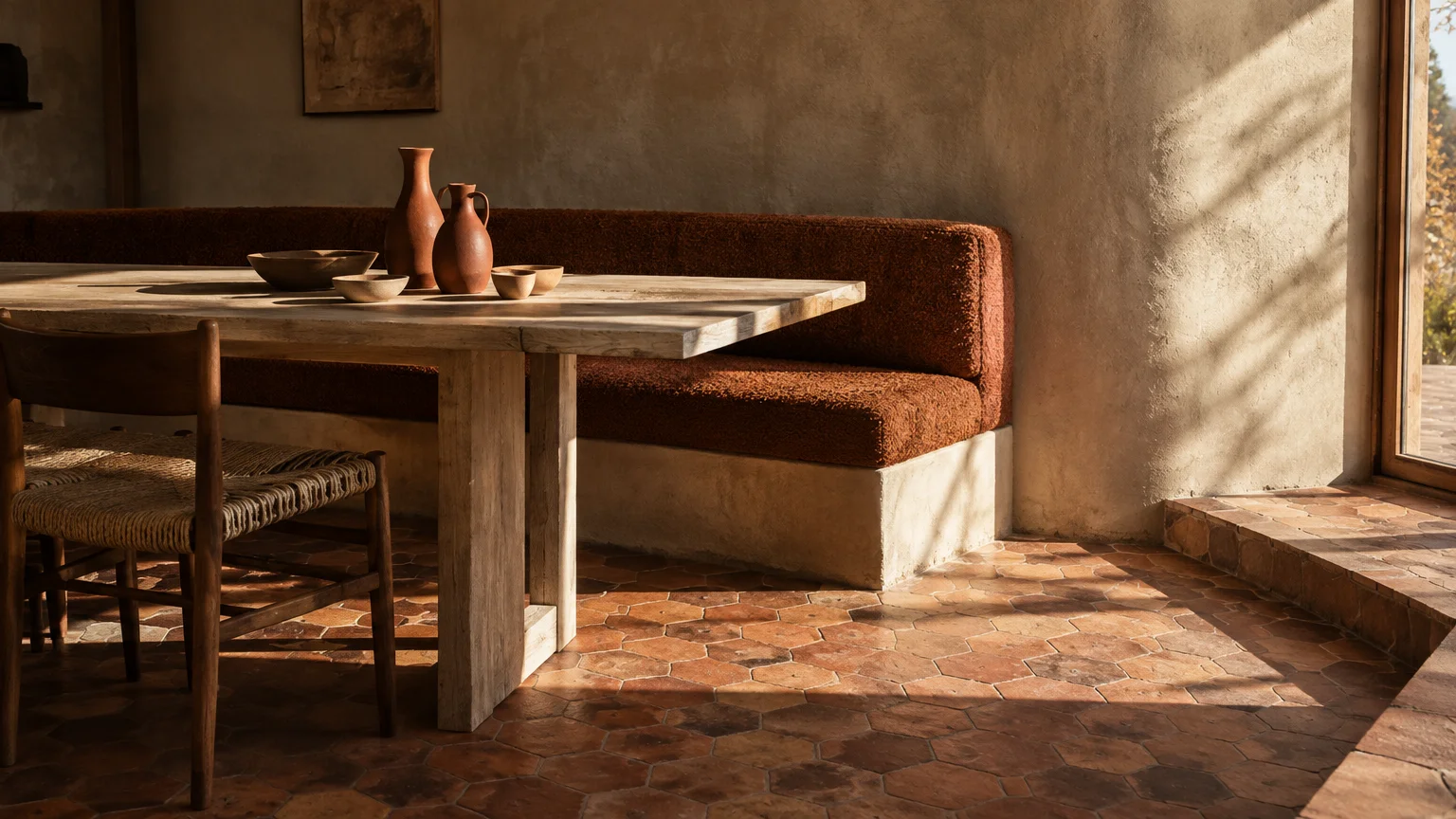
Terracotta and burnt rust continue to dominate fall color forecasts with their raw, sun-baked elegance. These rich clay shades evoke artisan ceramics and Mediterranean villas from the late 1960s.
Paint specialists point to hues like Sherwin-Williams Pennywise as definitive anchors for autumn interiors. Simultaneously, Krylon embraced this nostalgic wave with its mid-century Pumpkin Orange accent shade.
The aesthetic power of burnt rust lies in its innate connection to raw geological elements. Humans gravitate toward fired clay and iron oxide because they radiate natural authenticity and tactile security.
Incorporate burnt rust into your primary living room through a sculptural, curved velvet sofa. The low-profile silhouette honors mid-century forms while the saturated fabric commands immediate visual attention.
For permanent architectural updates, install reclaimed terracotta tiles across entryway or sunroom floors. Their weathered patina and varied red-orange tones instantly supply historic character to new construction.
Kitchens benefit immensely from glazed rust zellige tile applied to backsplashes or island surrounds. Each handmade tile reflects light differently, generating a shimmering, artisanal focal point behind your range.
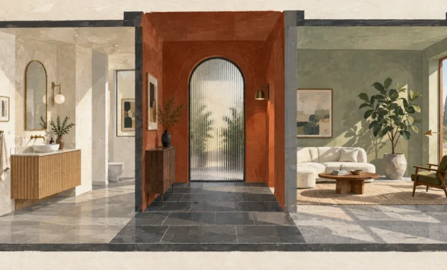
Complement rust tones with cool sage or smoky jade accents to create balanced dynamic tension. The natural complementary relationship between red-orange and green produces an effortlessly organic environment.
Finish the scene with unglazed ceramic vessels, dried branches, and blackened steel hardware. These raw, earthy materials accentuate the rustic sophistication intrinsic to terracotta.
When used as trending fall paint colors, burnt rust shades create an enveloping cocoon in powder rooms. Guests will appreciate the moody, flattering ambiance cast by warm clay surfaces under sconce lighting.
Terracotta also pairs beautifully with natural cane furniture and exposed brick architectural features. The textural synergy reinforces a grounded, handcrafted sanctuary perfect for crisp autumn days.
Trend #4: Avocado and Olive Greens
The polarizing avocado greens of the 1970s have undergone a sophisticated, nature-inspired renaissance. Today’s interpretations skew toward muted olive, moss, and leafy herbal tones that honor the natural landscape.
Krylon championed this naturalistic return by introducing Spring Grass in its Fall 2026 palette. Meanwhile, selections like Valspar Sprig of Sage showcase how softer botanical greens stabilize interior schemes.
Biophilic design principles explain why olive green feels endlessly restful within modern residential spaces. Surrounding yourself with plant-based undertones reduces physiological stress and establishes an organic baseline indoors.
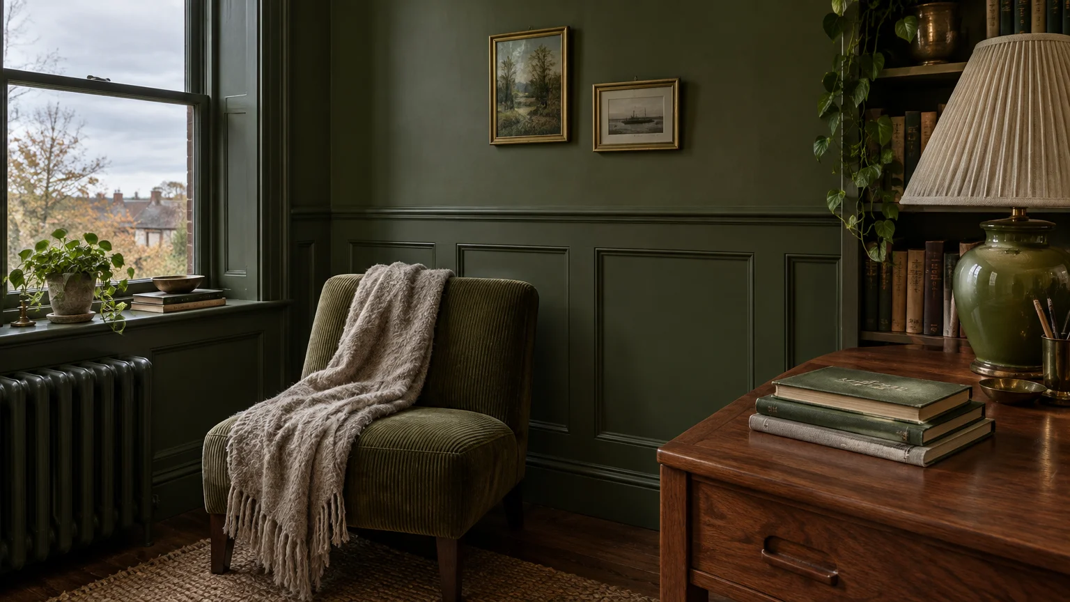
Try enveloping a formal study or powder bath in a deep, satin olive green. Drenching walls, baseboards, and window trim creates a moody, jewel-box sanctuary for autumn evenings.
In open-concept spaces, weave olive through upholstered dining chairs or plush mohair throw blankets. The earthy tone complements natural white oak flooring while providing subtle retro contrast.
Pair olive greens with rich chocolate browns and warm brass accents for timeless harmony. This classic combination evokes mid-century modern estates nestled within lush, wooded hillside environments.
You can also incorporate olive through statement stone surfaces like Verde Alpi or forest-toned marble. An olive-veined marble coffee table serves as both functional furniture and enduring natural sculpture.
Layering preserved moss, indoor ficus trees, and aged botanical prints will further reinforce the palette. These botanical touches bridge the gap between exterior autumn foliage and your interior design.
With retro colors making a comeback, olive acts as a versatile bridge between warm and cool tones. It effortlessly balances burnt oranges, sunny butter yellows, and deep wood stains across any room.
Olive millwork also lends tailored dignity to mudrooms and home libraries. Its calming presence ensures that busy transition zones feel ordered, intentional, and intimately connected to nature.
Trend #5: Smoky Jade and Retro Aqua
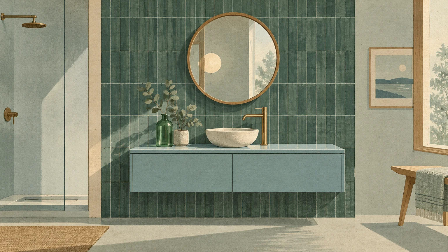
Retro aqua and jade tones provide a refreshing, cool-toned antidote to typical autumn warmth. This sophisticated color family draws direct inspiration from mid-century poolside glamor and mid-century art glass.
Behr solidified this movement by naming Hidden Gem, a smoky jade blue-green, its 2026 Color of the Year. Its nuanced blue undertone adds remarkable depth to living areas, bedrooms, and millwork.
Additionally, Krylon included Beach Glass in its 2026 collection to celebrate muted, vintage aquatic pastels. These retro blues and greens prevent autumn interiors from feeling monochromatic or excessively heavy.
Introduce smoky jade to your home through high-gloss lacquered cabinetry in an office or butler’s pantry. The reflective surface bounces light beautifully, creating a dramatic, jewel-like focal point.
In your bedroom, a smoky aqua upholstered headboard introduces soothing energy conducive to restful sleep. Combine it with crisp ivory percale bedding and rust-colored linen bolsters for balance.
Smoky jade also acts as the ultimate backdrop for warm caramel leather and cognac woods. The temperature contrast between warm leather and cool jade yields an expertly curated interior vignette.
For smaller upgrades, display fluted glass vases, ceramic lamp bases, or abstract art in jade tones. These colorful accents infuse vintage personality into your rooms without demanding extensive remodeling.
Anchor retro aqua accents with blackened iron lighting or dark bronze switch plates. The dark metallic details lend industrial weight, ensuring your pastels feel grounded and mature.
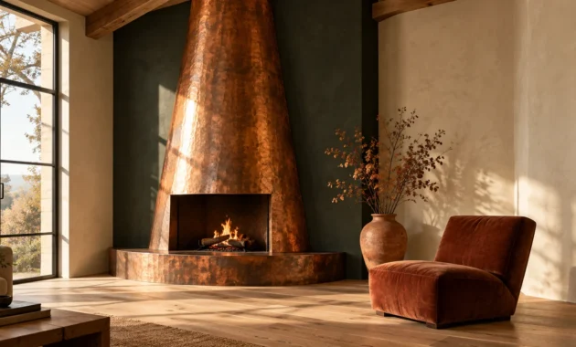
As one of the most popular fall decor colors, smoky jade delivers unexpected coolness alongside crackling fireplaces. The crisp visual balance elevates standard autumnal styling into modern editorial artistry.
Pairing jade walls with geometric mid-century wallpaper borders offers a playful nod to retro design heritage. This curated vintage touch delights visitors while preserving refined architectural balance.
Trend #6: Warm Vintage Cream and Grounding Khaki
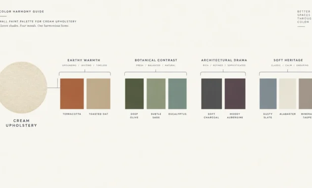
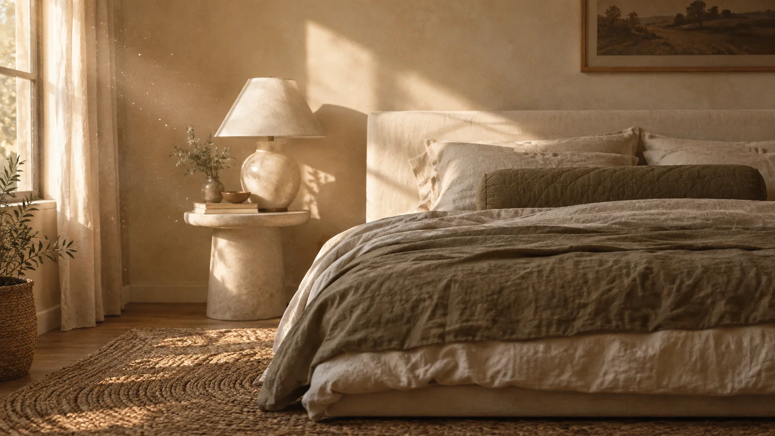
Cool gray neutrals have officially retired in favor of comforting, vintage-inspired khakis and creams. These heritage neutrals provide the warm architectural foundation that makes all other retro colors sing.
Sherwin-Williams highlighted this foundational pivot by crowning Universal Khaki (SW 6150) as its 2026 Color of the Year. Pulled from its Anthology Volume Two forecast, this shade revives 1970s understated elegance.
Unlike stark whites that feel clinical, vintage cream possesses subtle golden and taupe undertones. It bathes your walls in soft, forgiving light that flatters both artwork and occupants.
Many homeowners also embrace Benjamin Moore Swiss Coffee (OC-45) for its welcoming, time-tested radiance. It acts as an adaptable neutral canvas that accommodates changing seasonal accents effortlessly.
Apply warm khaki across your main hallways and open living spaces for enduring cohesion. It establishes a fluid background that lets bolder autumn shades step forward without clashing.
Enhance cream-painted walls by layering tactile textiles like heavy wool, bouclé, and nubby Belgian linen. Tone-on-tone textures create rich visual interest without introducing chaotic color clashes.
Combine vintage khaki with dark walnut baseboards or stained timber ceiling beams for architectural contrast. The deep wood tones accentuate the richness of the wall color, evoking craftsman pedigree.
In dining areas, pair cream limewash walls with a travertine dining table and vintage cane chairs. The monochromatic palette honors quiet luxury while preserving a distinct mid-century design lineage.
Finish the space with soft white lampshades that diffuse incandescent light evenly across the room. The resulting glow accentuates the gentle golden warmth baked into your khaki walls.
Universal Khaki also transforms exterior entryways and interior trim into seamless, inviting transitions. It functions as the ultimate architectural bridge for modern homeowners seeking warmth.
The Big Picture: Weaving These Trends into Your Home
Integrating retro hues requires a delicate balance between nostalgic charm and contemporary refinement. You want your interior to evoke timeless sophistication rather than resembling a vintage set piece.
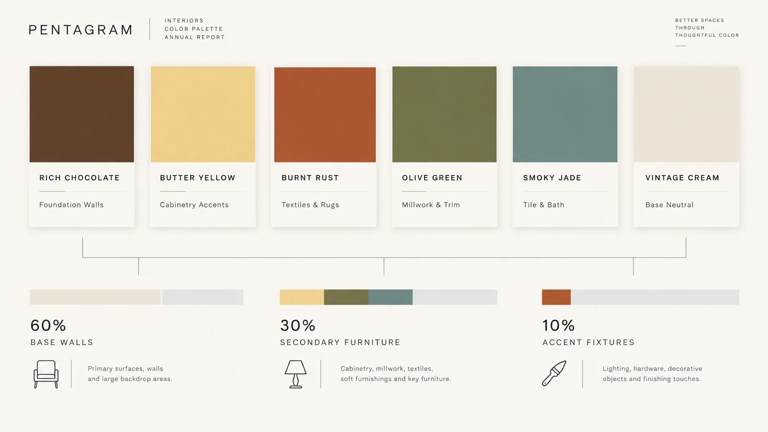
Start by anchoring your largest surfaces in versatile neutrals like vintage cream or Universal Khaki. Establishing this grounded envelope gives you freedom to introduce saturated retro accents without visual chaos.
Follow the classic 60-30-10 design ratio to maintain harmonious color distribution across each room. Devote sixty percent to your foundation neutral, thirty percent to secondary tones, and ten percent to accents.
For instance, pair cream walls with a caramel velvet sofa and burnt rust accent pillows. This structured hierarchy ensures every hue contributes to a unified, deliberate design story.
Fall color trends 2026 celebrate individuality, so embrace colors that resonate with your personal taste. Mixing two or three retro tones across adjoining spaces builds seamless visual continuity throughout your home.
Material texture plays an equally vital role in modernizing retro color palettes. Balance smooth, saturated surfaces with tactile materials like honed marble, boucle, and wire-brushed white oak.
Vary your paint sheens across millwork, walls, and ceilings to add architectural depth. A flat matte wall paired with high-gloss trim transforms standard paint into an intentional luxury feature.
Incorporate modern lighting silhouettes to keep vintage color palettes firmly rooted in the present day. Sleek brass sconces or minimalist plaster pendants prevent your rooms from feeling dated.
Above all, select colors that flatter the specific orientation and quality of natural light in your home. Northern exposures benefit from warm terracotta, while south-facing rooms can carry deeper espresso and jade hues.
Mindful curation ensures your home captures vintage nostalgia while remaining thoroughly functional and undeniably chic. Your personalized palette will feel authentic, elegant, and deeply welcoming throughout the cooler months.
Frequently Asked Questions
How do you prevent retro colors from making a room look dated?
The secret lies in pairing retro shades with contemporary silhouettes and streamlined architectural details. Avoid replicating an entire period room with matching vintage furniture, shag carpeting, and antique drapery.
Instead, place a vintage ochre armchair beside a minimalist marble side table and modern architectural lighting. This thoughtful juxtaposition creates intentional tension between eras, signaling sophisticated design rather than old-fashioned decor.
Can you mix warm retro tones like terracotta with cool jade?
Warm clay and cool jade are natural complements that bring dynamic visual balance to interiors. Combining warm and cool undertones prevents a space from feeling uncomfortably heavy or visually monotonous.
Anchor the combination with a neutral foundation, such as vintage cream or natural white oak flooring. This neutral buffer allows the complementary tones to converse gracefully without competing for visual dominance.
Do these retro fall colors have longevity beyond the autumn season?
Yes, these hues derive from timeless earth pigments that transcend seasonal decorating cycles. Shades like deep chocolate, olive, and warm khaki serve as enduring neutrals throughout spring and summer.
When warm weather returns, simply swap heavy velvet throws and wool rugs for breathable linens and woven jutes. The underlying retro paint colors will seamlessly adapt to lighter, sunnier styling.
What is the most effective way to test these paint colors in your home?
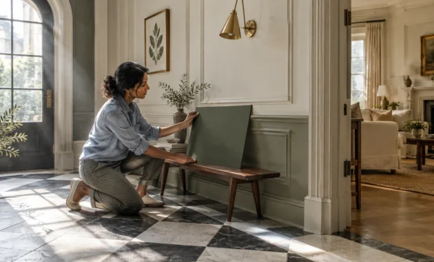
Always test paint swatches on large poster boards rather than painting directly onto existing colored walls. Move the sample boards around your room throughout the day to observe shifting morning and evening light.
Pay close attention to artificial lighting at night, as warm bulbs can intensify yellow and rust undertones. Evaluating colors under both conditions ensures complete confidence before you commit to painting an entire room.
For the latest color forecasts, consult industry leaders like Pantone and paint companies like Benjamin Moore. For professional design standards, refer to the American Society of Interior Designers (ASID).
Disclaimer: This article reflects design trend analysis and predictions. Personal taste and timeless design principles should always guide your decorating choices.