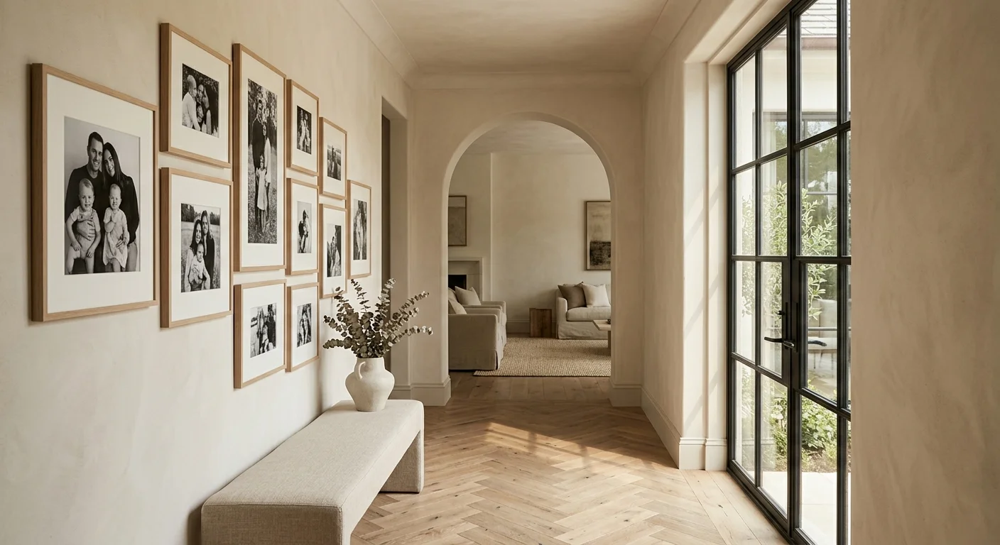
Transforming personal memories into elevated interior statements requires moving beyond cluttered tabletop frames and chaotic photo collages. Today’s leading interior designers treat family portraiture as genuine fine art, merging intimate narrative provenance with deliberate architectural form and spatial harmony.
By mastering deliberate scale, bespoke archival framing, and balanced negative space, you can honor cherished family milestones while actively enhancing your home’s sophisticated design language.
Discover the refined, designer-approved strategies that industry professionals use to curate meaningful, gallery-worthy visual stories that seamlessly integrate with modern, high-end living spaces.
Trend #1: The Symmetrical Archival Grid with Exaggerated Mats
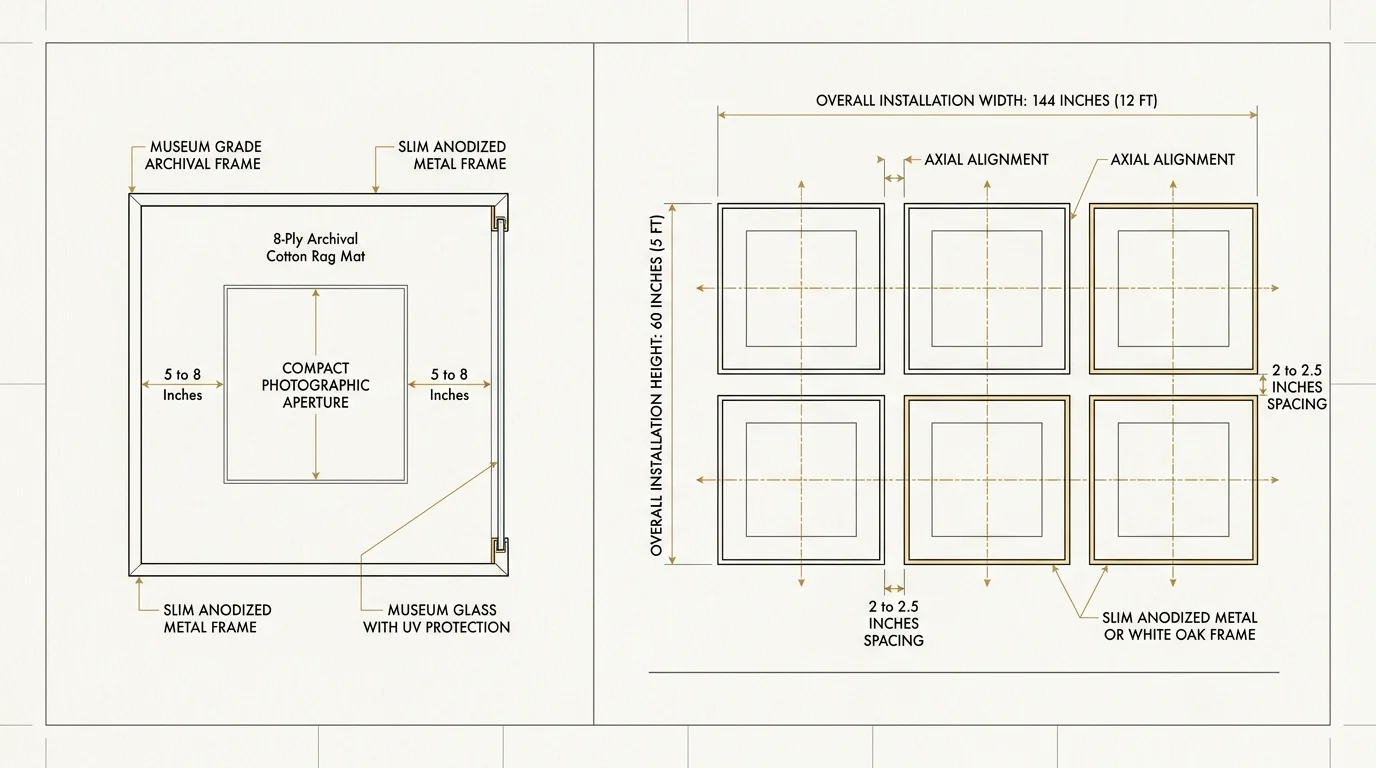
Nothing conveys curated refinement quite like an architecturally disciplined grid. Top interior designers regularly turn to symmetrical configurations to establish structural rhythm in transitional spaces such as expansive hallways, grand stairwells, and formal dining rooms. The secret to transforming standard candid snapshots into museum-caliber installations lies within the matting. Rather than settling for standard two-inch borders, designers specify exaggerated, eight-ply archival cotton rag mats measuring five to eight inches wide, paired with relatively compact photographic prints.
This dramatic proportion creates generous negative space around each portrait, drawing your eye inward and lending quiet gravitas to everyday moments. Opt for matching frames crafted from slim anodized black metal, natural white oak, or polished burl wood to maintain cohesive unity across the entire composition. High-contrast black-and-white prints work exceptionally well in this format because they eliminate clashing color palettes across pictures taken during different seasons or decades.
When executing this layout, maintain strict, uniform spacing between every frame—typically two to two-and-a-half inches apart. This structural discipline introduces axial alignment that grounds tall ceilings and brings tailored elegance to vast expanses of drywall. For homeowners seeking stylish ways to display family photos, the archival grid remains the gold standard for enduring sophistication and quiet luxury.
Trend #2: The Integrated Architectural Picture Ledge
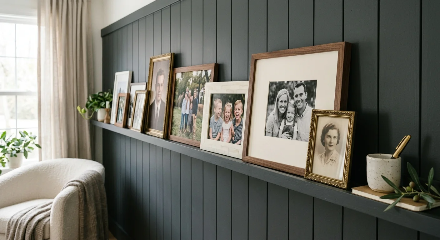
For dynamic, evolving interiors, built-in picture ledges offer unmatched versatility without sacrificing aesthetic rigor. Rather than mounting individual frames directly to the wall, top decorators integrate continuous custom joinery running along an entire architectural perimeter or across a designated accent niche. By painting or staining the ledge in the exact shade of your wall panelling or wainscoting, you create a seamless architectural element that anchors the entire room.
This approach allows you to explore creative photo display ideas through calculated layering. Position larger, taller frames at the back to anchor the composition; then, overlap smaller, wider frames slightly in front to establish genuine visual depth. The resulting arrangement breaks away from rigid formality, offering a casual elegance reminiscent of a Parisian artist’s atelier.
To achieve a cohesive aesthetic, vary your frame profiles while keeping your material palette disciplined. Interweave slim walnut frames with warm antique brass and textured bone finishes. Because this setup requires zero additional nails to update, you can effortlessly rotate childhood candids, holiday portraits, and artistic travel scenes as your family story grows, ensuring your home decor for displaying photos remains fresh, tactile, and responsive.
Trend #3: The Curated Salon Wall with Mixed-Era Provenance
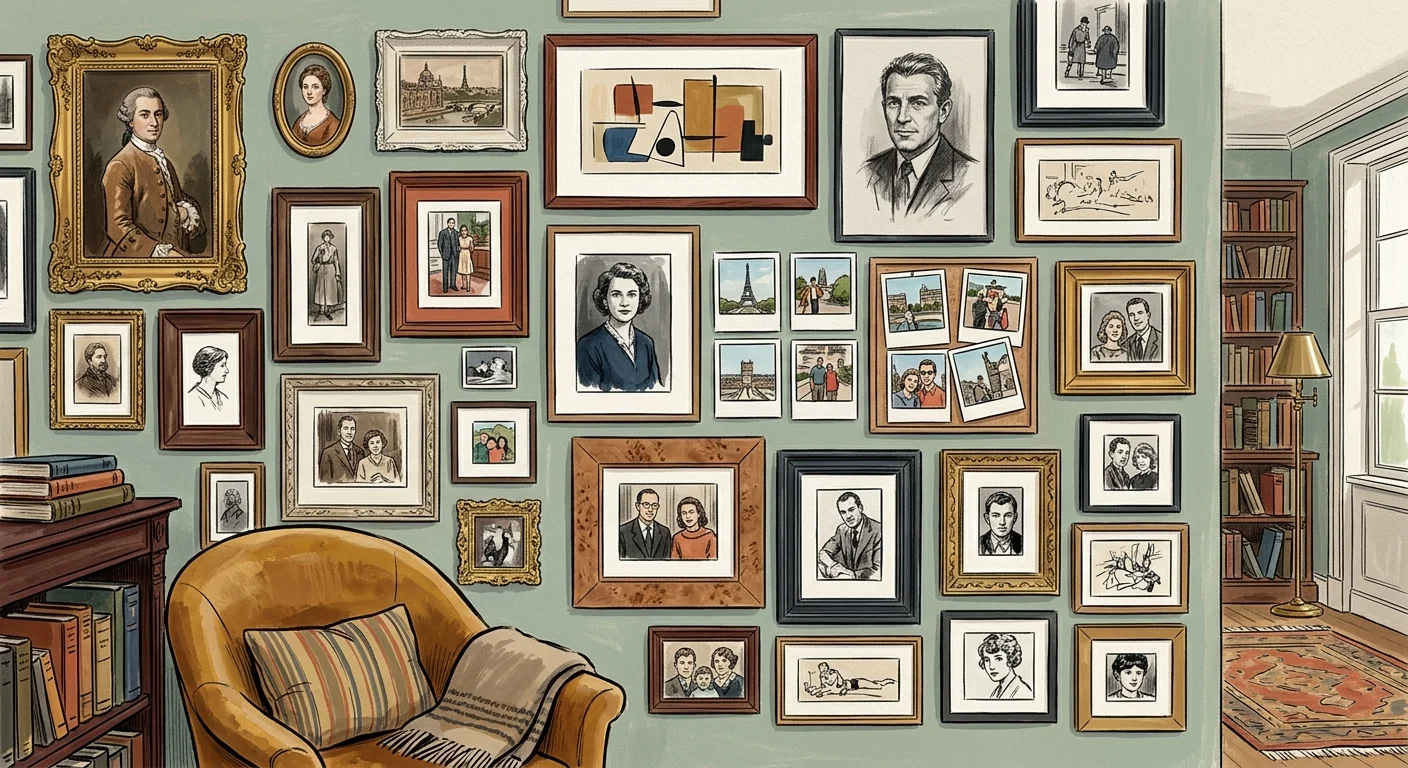
The era of matching, generic frame sets purchased from big-box retailers has passed; discerning decorators now celebrate the layered beauty of eclectic salon walls. Inspired by classic European salons and historic country estates, this method juxtaposes diverse framing styles, textures, and historical periods to curate a captivating visual journey. By treating your family archive as a storied art collection, you infuse your living space with character and authentic provenance.
The magic of this technique hinges on curated tension. Combine heavy, hand-carved antique giltwood frames with sleek mid-century modern profiles, warm burl wood veneers, and unlacquered brass accents. Unify this diverse mix through chromatic discipline across the photographs themselves. Converting disparate color prints to sepia, rich silver-toned monochrome, or desaturated matte finishes creates a cohesive visual bridge across the entire display.
Start by anchoring your arrangement with your largest or most visually weighty frame slightly off-center. From there, radiate outward organically, balancing heavier silhouettes with delicate, thin-profile frames. Maintain an average gap of one-and-a-half to three inches between pieces. This thoughtful asymmetry yields unique family photo decor that feels gathered over a lifetime of intentional living rather than assembled in an afternoon.
Trend #4: The Monolithic Fine-Art Portrait
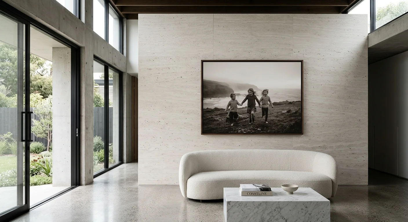
Sometimes the most profound design statement emerges from singular restraint. Instead of scattering dozens of small photographs across a room, forward-thinking designers champion the monolithic portrait—a single, oversized fine-art print that commands an entire wall as a definitive focal point. When executed with high artistic standards, an intimate family moment becomes an arresting work of contemporary art.
The success of this approach relies entirely on compositional artistry. Select a photograph characterized by strong emotional resonance, dramatic natural lighting, or artistic abstraction. Think of a wind-swept silhouette on a coastal bluff, a candid close-up of hands intertwined, or a child captured in contemplative shadow. Enlarge the image to monumental dimensions—such as 36 by 48 inches or larger—and print on heavyweight, museum-grade matte rag paper.
Complete the presentation with bespoke, understated framing. A float frame in blackened steel or an ultra-deep shadowbox with a linen liner isolates the image while enhancing its presence. Position this commanding piece above a low-slung living room sofa, opposite a dining table, or within an expansive entry vestibule. This method eliminates visual clutter while proving that designer approved photo wall ideas can deliver the high-impact punch of fine contemporary art.
Trend #5: Layered Installations on Textured and Wallpapered Walls
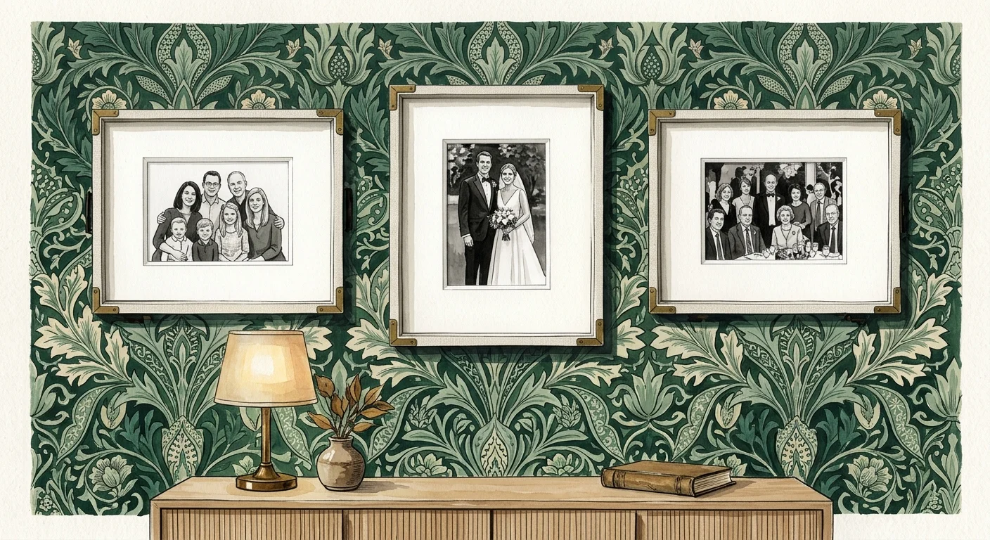
Modern residential design increasingly prioritizes tactile warmth and sensory depth, making textured wallcoverings a dominant trend. Designers are brilliantly capitalizing on this by layering framed family portraiture directly against rich surfaces like natural grasscloth, woven raffia, scenic hand-painted murals, and velvety limewash finishes. This layered juxtaposition transforms a plain photograph into an integrated architectural vignette.
When mounting art against patterned or textured backdrops, intentional contrast is vital. If your walls feature a dark, moody botanical wallpaper, encase your family portraits in wide white or pale linen mats paired with slender light-oak frames to ensure the artwork pops crisply off the surface. Conversely, against pale grasscloth or fluted plaster, deep ebony or dark bronze frames provide essential visual grounding.
For an added touch of classical European grandeur, suspend your frames from traditional picture rails using decorative brass chains or wide grosgrain ribbons. This historical detail celebrates craftsmanship while providing a gorgeous physical separation between the frame and the textured wall behind it. The result is a richly layered, biophilic interior that honors personal memory within an environment of refined luxury.
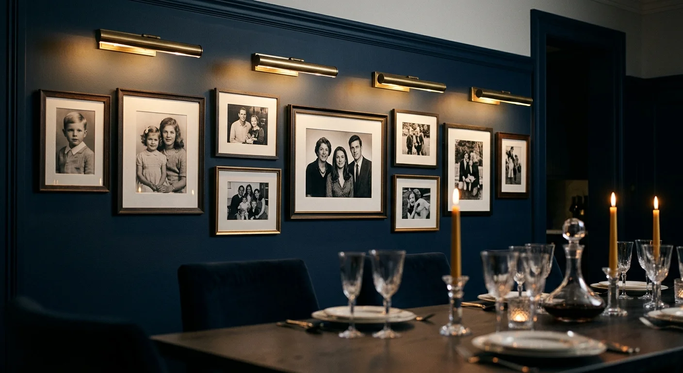
Trend #6: Atmosphere-Driven Illumination and Dedicated Art Lighting
Even the most exquisite framing falls flat without deliberate, atmospheric lighting. Leading lighting designers and decorators treat family photo walls with the same curatorial precision as multimillion-dollar private art collections. By integrating dedicated picture lights and directional spotlights, you immediately establish spatial hierarchy and elevate everyday snapshots into illuminated gallery installations.
Classic hardwired picture lights mounted directly above individual frames or ledges introduce architectural elegance and warm task illumination. Opt for fixtures featuring slim, minimalist silhouettes in hand-rubbed brass, matte black, or burnished nickel. Modern low-voltage LED technology provides warm 2700K illumination with a Color Rendering Index (CRI) of 95 or higher, ensuring the true tonal depth of your photographic prints shines without harmful ultraviolet or infrared heat degradation.
Alternatively, incorporate recessed ceiling gimbal fixtures aimed precisely at your photo grouping at a 30-degree angle. This eliminates harsh glare on the glass while casting dramatic, museum-quality pools of light across the gallery. When dimmed during evening gatherings, dedicated art lighting crafts an intimate, cozy atmosphere, drawing guests naturally toward the personal narratives displayed upon your walls.
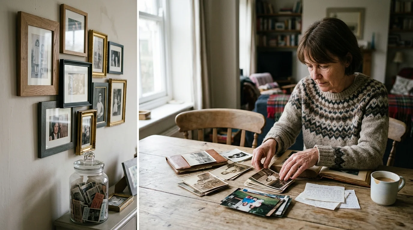
The Big Picture: Weaving These Trends into Your Home
Integrating family photographs into a curated home does not require sacrificing personal warmth for high-end polish, nor does it mean turning your living space into a sterile art showroom. The key to lasting design harmony lies in understanding proportion, honoring your home’s unique architectural language, and approaching personal photography through an editorial lens. When you treat your memories with curatorial care, personal history and high design elevate one another seamlessly.
Begin by evaluating the spatial flow and primary function of each room. High-traffic transitional zones, like wide corridors and stairwells, welcome the structural rhythm of symmetrical archival grids or integrated picture ledges. Meanwhile, formal entertaining spaces like dining rooms and great rooms benefit from the dramatic impact of a single monumental portrait or an illuminated salon grouping. Always consider the surrounding materiality—allow your timber flooring, upholstery fabrics, and stone surfaces to inform your frame finishes and mat textures.
Cultivate an editorial eye by selecting photographs that balance emotional intimacy with strong visual composition. Mix close-up portraits with wide-angle landscape shots from family travels, architectural vignettes, and spontaneous candid laughter. Maintaining a harmonious color palette across your prints prevents visual discord and ensures your installation complements your broader interior design schemes.
For the latest color forecasts, consult industry leaders like Pantone and paint companies like Benjamin Moore. For professional design standards, refer to the American Society of Interior Designers (ASID).
Disclaimer: This article reflects design trend analysis and predictions. Personal taste and timeless design principles should always guide your decorating choices.
Frequently Asked Questions
How do I select the best paper finish and glazing for rooms with bright natural light?
In rooms flooded with natural daylight, reflections on glass surfaces can easily obscure your photographs. Designers strongly recommend specifying anti-reflective, museum-grade glass or UV-filtering acrylic like Tru Vue Museum Optium. For paper selection, choose archival 100% cotton rag with a smooth matte or subtle velvet finish rather than high-gloss photographic paper. Matte paper prevents light bounce, deepens tonal contrast, and gives family portraiture the refined, tactile appearance of fine art prints.
Can I combine color and black-and-white family photos within the same display?
Yes, you can successfully mix color and black-and-white photography, provided you establish clear compositional rules. The most effective designer method is the 80/20 balance: make 80 percent of the collection monochrome and use 20 percent desaturated, warm-toned color prints as intentional focal accents. Alternatively, keep the photographic imagery uniform within individual frame groupings while varying the frame finishes, or unite diverse photos using identical oversized off-white archival mats to create visual cohesion across the entire installation.
What is the designer standard for hanging height when creating photo displays?
The fundamental rule applied by professional decorators and art galleries is positioning the center of your art installation—or the midpoint of a gallery grouping—at eye level, precisely 57 to 60 inches from the finished floor. When hanging photographs above furniture such as a credenza, sofa, or console table, position the bottom edge of the lowest frame roughly six to eight inches above the furniture top. This creates an organic visual connection between the furniture and the artwork rather than leaving an awkward void.
How can I display family photos stylishly in a rental without damaging plaster or drywall?
Renters can achieve sophisticated results using freestanding furniture solutions and non-invasive hardware. Prop a series of large, substantial frames along the top surface of a wide sideboard, mantelpiece, or console table, layering them artfully against the wall. Alternatively, lean an oversized monolithic framed portrait directly against the floor in a quiet corner or bedroom. If hanging is necessary, modern high-capacity adhesive art hooks paired with ultra-lightweight acrylic glazing offer reliable support without leaving nail holes in delicate walls.