Transforming a compact living space into an airy, expansive sanctuary requires an understanding of proportion, light, and visual rhythm. Many homeowners inadvertently fall into subtle layout traps that restrict sightlines and suffocate natural light, turning potentially elegant interiors into claustrophobic quarters. By recognizing the critical design mistakes that shrink a room, you can manipulate spatial perception, refine your floor plan, and establish an effortless sense of quiet luxury. Whether you manage a cozy city apartment or aim to maximize square footage in a sprawling estate, eliminating these small room design errors elevates your home into an open, harmonious environment.

Mistake #1: Pushing All Furniture Flat Against the Walls
One of the most common mistakes that make rooms feel cramped is the tendency to press every piece of furniture firmly against the perimeter walls. Homeowners often assume that pushing a sofa, credenza, or armchair against the drywall maximizes open central floor space. In reality, this layout strategy draws immediate attention to the exact boundary line of the room, exposing its physical limitations and creating a sterile, awkward visual void in the middle.
When you float furniture even a few inches off the wall, you introduce air, movement, and dynamic negative space into the floor plan. Pulling your sofa 6 to 12 inches forward allows light to trickle behind the frame, breaking up rigid wall planes and generating an impression of depth. In larger or open-concept living spaces, group furniture into distinct conversational islands anchored by plush textiles rather than pushing seating outward toward the perimeter.
To master floating arrangements, leave clear traffic paths of at least 30 to 36 inches between furniture pieces. This ensures smooth movement while maintaining an intimate, cozy atmosphere. Combining floating seating with slender back-sofa console tables adds architectural depth and functional surface area without eating into perceived room volume.
Mistake #2: Mounting Window Dressings Directly Above Frame Lines
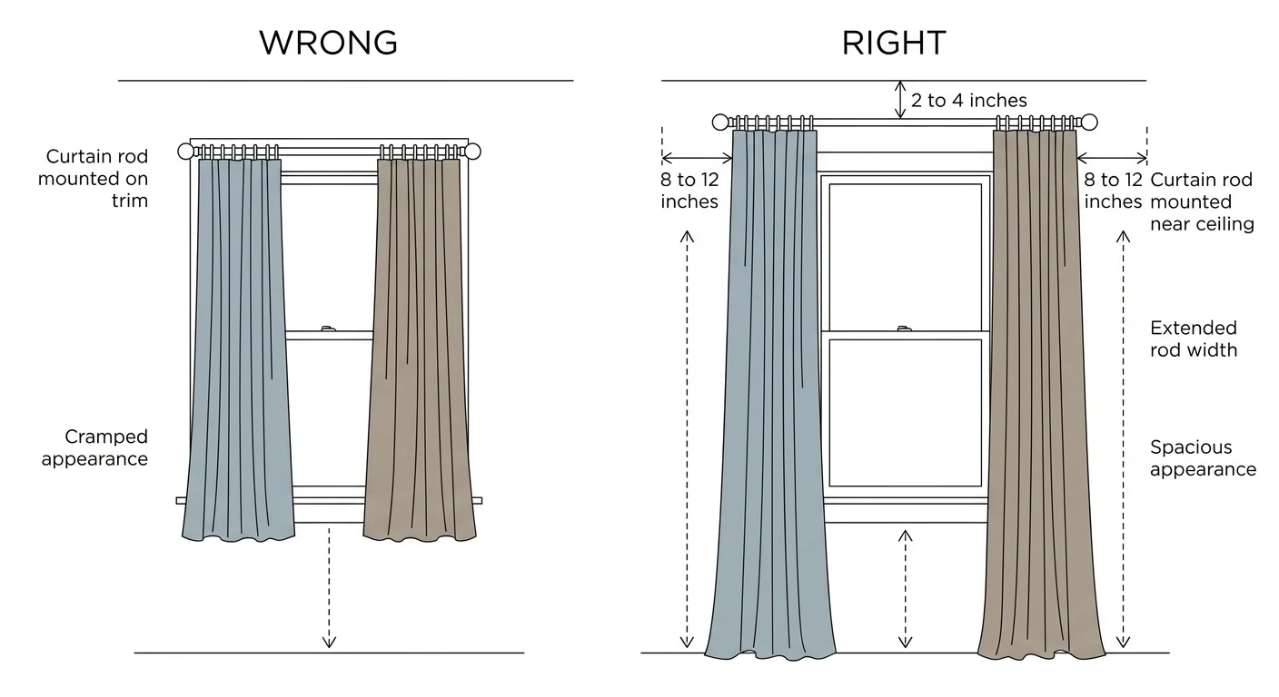
Mounting curtain rods immediately atop window trim is a frequent culprit among room design mistakes to avoid. Hanging drapery low truncates your wall height, visually drawing the ceiling downward and making standard eight-foot ceilings feel oppressive. It also covers natural glass area when drapes are drawn open, robbing the room of essential natural daylight that enhances spatial expanse.
To lengthen your walls dramatically, install curtain rods high and wide. Position your drapery hardware 2 to 4 inches below the ceiling line or crown molding. Extend the rod brackets 8 to 12 inches beyond the outer edge of the window frame on both sides. This technique allows drapery panels to rest against the wall surface when fully open, keeping the window glass fully exposed to flood the room with sunlight.
Opt for floor-length drapery panels that kiss the floor or hover a quarter-inch above it. Choose lightweight, translucent fabrics like tailored linen, airy sheer cotton, or subtle slubbed weaves that softly filter daylight. Tailored pleats create continuous vertical lines that draw the viewer’s eye upward, instantly accentuating vertical dimension.
Mistake #3: Anchor-Sinking Rooms with Under-Sized Area Rugs
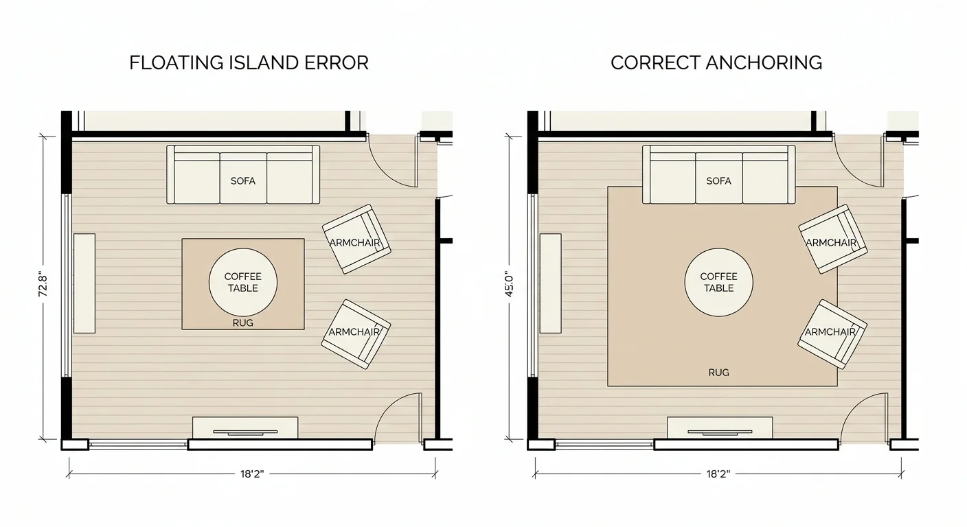
Selecting an area rug that is far too small for your seating area acts as a visual sinkhole, instantly shrinking a room’s footprint. Design enthusiasts often call this the floating island error, where a tiny rug sits isolated beneath a coffee table, touching none of the major seating pieces. This fragmented setup chops up floor space into distinct, uncoordinated patches that confuse the eye.
A properly scaled area rug anchors furniture, defines boundaries, and unifies the aesthetic footprint of a space. In a living room, your rug should be large enough so that at least the front legs of every major seating piece rest securely on top of it. In formal dining rooms, the rug must extend 24 inches beyond all sides of the dining table so chairs remain on the rug even when pulled out.
To calculate the optimal rug size for any room, maintain a consistent floor border of 12 to 18 inches of exposed hardwood, stone, or tile around the room’s perimeter. This margin creates a framed, intentional layout while establishing an expansive visual field across the entire space.
Mistake #4: Relying Exclusively on Single Overhead Lighting
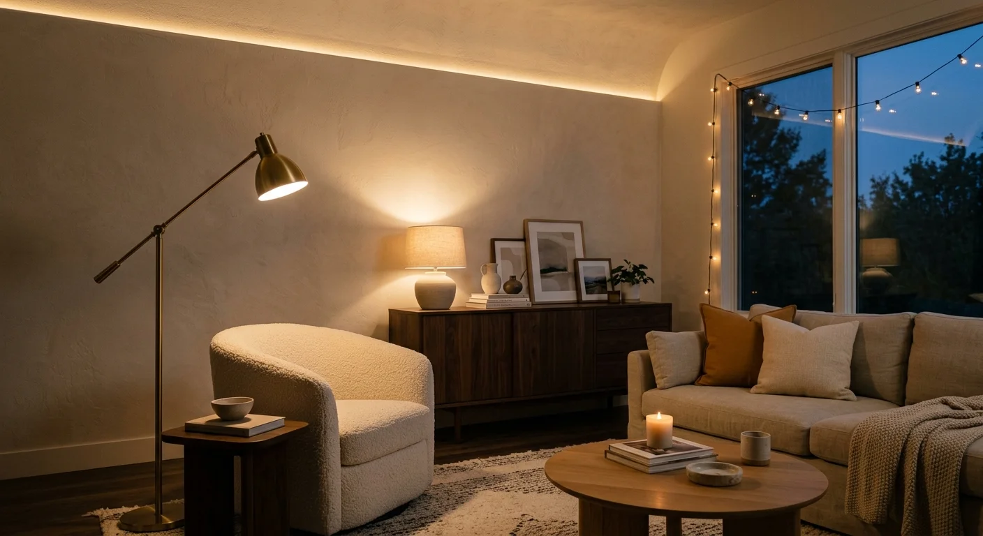
Relying on a single central flush-mount light fixture casts flat, aggressive downlight that accentuates deep shadows in corners, rendering room perimeters visually claustrophobic. When illumination originates from only one source, room corners fade into darkness, effectively pulling the perceived walls inward and flattening architectural details.
Effective illumination relies on a layered lighting system incorporating three distinct tiers: ambient, task, and accent lighting. By scattering illumination across multiple elevations, you cast light across horizontal and vertical surfaces, coaxing dark corners into view and expanding the visual perimeter of your home.
Position slender floor lamps in dark corners to bounce light off the ceiling, and mount warm wall sconces at eye level to illuminate vertical wall planes. Integrate low-profile LED cove lighting under floating shelves or cabinet bases. Using warm-white bulbs rated between 2700K and 3000K creates an inviting, golden glow that mimics natural sunset, adding atmospheric warmth and dimension.
Mistake #5: Ignoring Vertical Wall Space and Ceiling Heights
When decorating compact rooms, many people focus exclusively on low horizontal surfaces—like coffee tables, sideboards, and sofas—while leaving the vertical upper wall space blank. This heavy concentration of low-level decor drags the viewer’s gaze down, making low ceilings feel even lower and reducing the perceived volume of the interior.
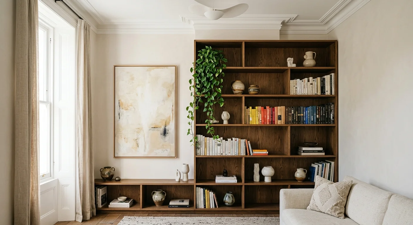
Engaging your vertical architecture draws the eye upward, celebrating total volume rather than just square footage. Install custom floor-to-ceiling shelving units, apply vertical timber fluting, or hang tall, vertically oriented art pieces to encourage upward visual movement. Vertical design elements create clean visual lines that elevate the architectural standard of any small space.
Painting ceiling surfaces in a bright, light-reflective shade—or utilizing a subtle soft paint color with high sheen—bounces light back down into the living area. Incorporating full-height vertical shiplap or narrow picture frame molding adds refined surface detail while stretching ceiling height perception exponentially.
Mistake #6: Overloading Interiors with Too Many Micro-Scale Pieces
A pervasive misconception in interior design tips small spaces is that compact rooms require small-scale, tiny furniture. Filling a small room with multiple petite armchairs, narrow end tables, and dozens of small decorative accents creates intense visual noise. This scattershot approach clutters the floor plan and breaks up visual continuity, making the room feel chaotic and cramped.
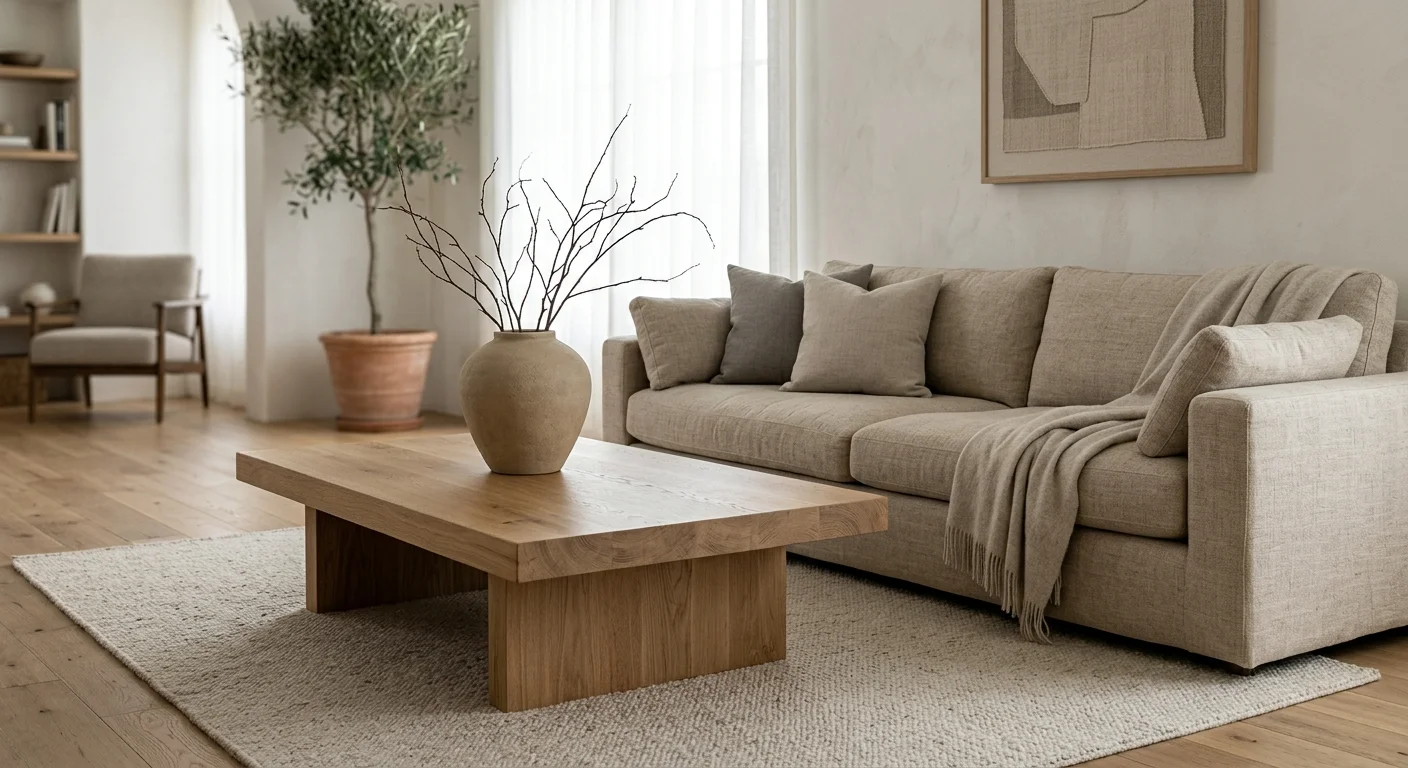
Instead of crowding a space with numerous small items, embrace the principle of statement scale. Selecting one or two large, full-scale furniture pieces—such as a tailored sectional, a generous armoire, or a bold architectural sofa—anchors the room confidently. Surrounding a well-proportioned anchor piece with clean negative space streamlines the aesthetic, establishing calm sophistication.
Consolidate small accent items into a curated collection on a single large surface rather than scattering small tchotchkes across multiple tables. Remember that fewer, higher-impact design elements foster a sense of serene, quiet luxury, whereas visual clutter always shrinks room volume.
Mistake #7: Breaking Floor Plan Continuity with Fragmented Flooring
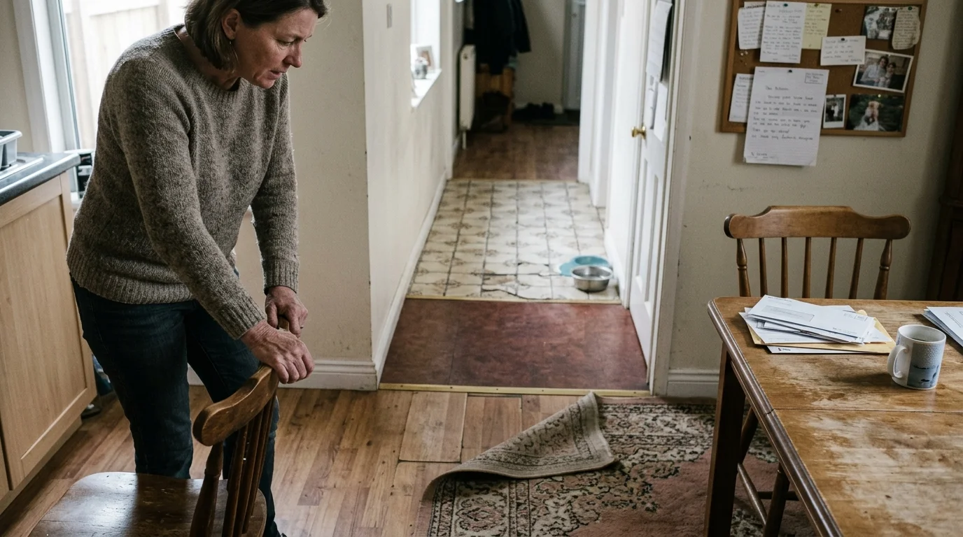
Abruptly changing flooring materials between adjoining rooms creates harsh visual breaks that fragment your floor plan. Transitioning from dark hardwood in the hallway to light tile in the living room and patterned carpet in the dining room chops the home into tiny, isolated zones. These sudden material changes shorten sightlines and make each individual room feel severely constrained.
Unifying flooring materials across connecting rooms provides seamless visual flow that tricks the brain into seeing a single, expansive area. Installing continuous wide-plank oak, polished concrete, or large-format porcelain tiles across living, dining, and hallway zones pulls the eye through rooms without interruption.
If changing flooring materials between wet zones and dry zones is necessary, select subtle, tonal transitions that match in color value. Avoiding contrasting threshold strips or thick transitional saddles maintains smooth horizontal planes across your entire home floor plan.
Mistake #8: Selecting Heavy, Grounded Furniture That Blocks Sightlines
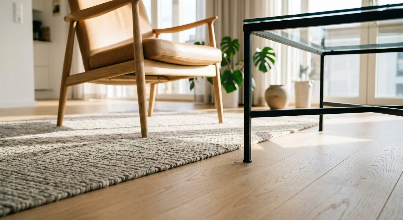
Furniture pieces that sit flat on the floor with solid bases, heavy skirts, or thick boxy silhouettes trap visual energy and block physical sightlines. Heavy, floor-bound sofas and boxy credenzas absorb natural light and prevent eyes from seeing the floor beneath them, making small rooms feel dense and overcrowded.
To restore visual breathability, select furniture with raised legs and airy silhouettes. Tapered mid-century wood legs, slender brushed-brass frames, or elevated metal pedestals raise furniture off the ground, allowing light to flow beneath the frames. Revealing visible floor space under furniture tricks the eye into perceiving a larger, lighter footprint.
Integrate transparent or reflective materials like glass, lucite, polished nickel, and refined marble into your coffee tables and accent furniture. Using open-weave cane chairs or wireframe chairs preserves open sightlines throughout the interior, adding texture without imposing physical mass.
Mistake #9: Misapplying High-Contrast Paint Schemes Without Strategic Lighting
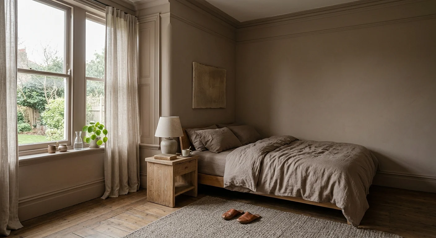
Pairing dark wall colors with stark, bright white trim creates sharp perimeter lines that trace the exact boundaries of a compact room. This high-contrast box effect highlights tight corners and rigid angles, emphasizing cramped room dimensions rather than concealing them.
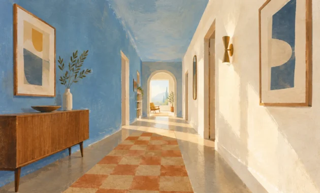
To overcome high-contrast restrictions, embrace monochromatic color drenching or low-contrast paint palettes. Painting walls, baseboards, door casings, and ceilings in the exact same color—or subtle tone-on-tone variations—blurs room edges and softens hard corners. Neutral tones like warm plaster, soft taupe, or creamy off-white melt structural boundaries into the background.
If you prefer dramatic moody hues like deep navy, forest green, or charcoal, apply them across all surfaces, including ceilings and trim. Rich, saturated hues pull walls outward when light softly reflects across uniform surfaces, creating an intimate, jewel-box atmosphere that feels expansive rather than restricted.
The Big Picture: Weaving These Principles into Your Home
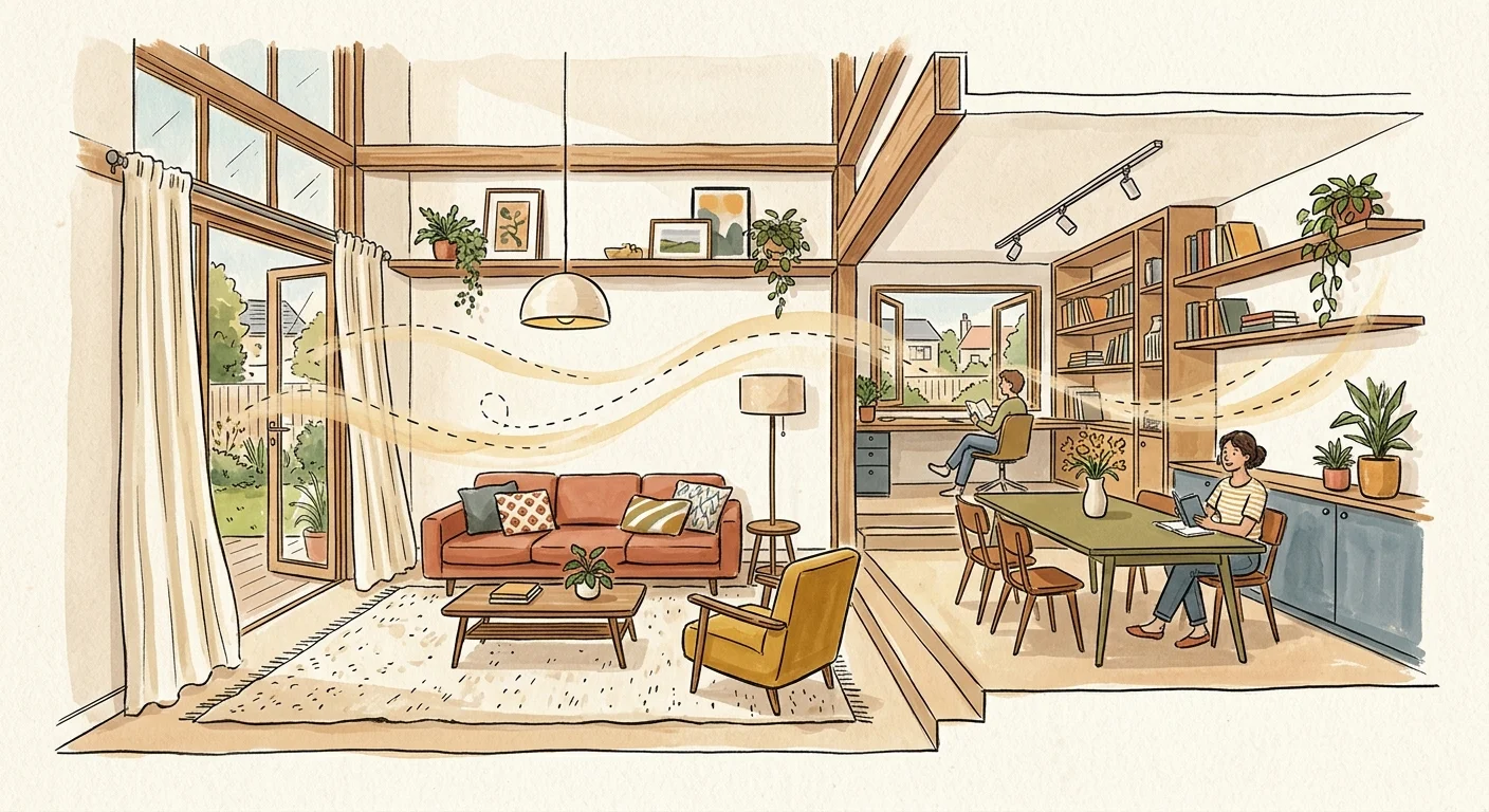
Creating an expansive, serene home environment is not about knocking down structural load-bearing walls or undertaking expensive structural additions. Rather, achieving spatial balance requires a thoughtful approach to visual rhythm, scale, light distribution, and functional zoning. When you systematically correct these classic design mistakes that shrink a room, you unlock the hidden potential of your existing square footage.
Begin your transformation by conducting a thorough audit of your space. Step into the doorway of each room and evaluate the primary sightline. Identify heavy furniture pieces that block views, curtain rods that cut off window height, or undersized rugs that split up the floor plan. Replace heavy, solid-base furniture with elevated leg frames, float your main seating groups away from perimeter walls, and install drapery hardware near the ceiling line.
Remember that cohesive design relies on balance rather than rigid minimalism. Introduce organic textures—such as tactile bouclé, woven rattan, honed travertine, and warm natural timber—to build depth without introducing physical clutter. By prioritizing visual continuity and unobstructed sightlines, you turn small room design errors into opportunities for effortless style and elevated comfort.
For the latest color forecasts, consult industry leaders like Pantone and paint companies like Benjamin Moore. For professional design standards, refer to the American Society of Interior Designers (ASID).
Frequently Asked Questions
How do dark paint colors actually affect the perceived size of a small room?
Dark paint colors do not automatically make a small room feel tiny. When applied uniformly across walls, trim, and ceilings through color drenching, dark saturated hues erase sharp corner lines and create an illusion of depth. The key is providing adequate layered lighting so corners do not sink into heavy shadows.
Can you place large furniture in a small room without making it feel crowded?
Yes, placing a single full-sized hero piece, such as a deep sectional sofa or a grand armoire, anchors a small space without causing clutter. A few large, beautifully scaled items create cleaner visual lines than crowding the room with multiple small-scale tables and chairs.
What is the most effective way to maximize natural light in a dark, narrow space?
To maximize daylight, hang sheer linen drapes on high and wide curtain rods extended beyond window frames. Position oversized decorative mirrors directly opposite or adjacent to natural windows to reflect sunlight into dark corners and double visual depth.
How do mirrors expand visual space without feeling outdated?
Avoid full-wall antiqued glass panels from past decades. Instead, opt for large architectural mirrors featuring minimal brass, iron, or timber frames. Arch-topped floor mirrors or oversized minimalist hanging mirrors create stylish focal points while reflecting light across the floor plan.
Disclaimer: This article reflects design trend analysis and predictions. Personal taste and timeless design principles should always guide your decorating choices.