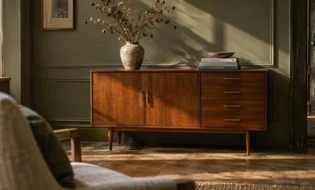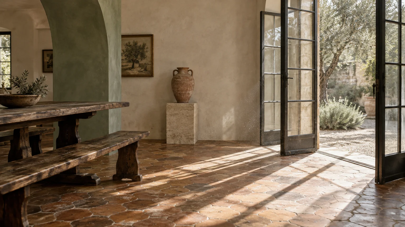
Terracotta infuses interior spaces with grounded warmth, rich history, and tactile provenance. Pairing the right wall shade alongside baked clay elevates your home from rustic simplicity to undeniably sophisticated luxury.
Whether you navigate vintage floor tiles or contemporary terracotta decor, deliberate color pairings establish visual rhythm throughout your rooms. The wrong undertone causes muddy friction; the right hue unlocks seamless architectural depth and light.
Discover eight directional paint colors that pair effortlessly with terracotta surfaces. These designer-approved palettes balance raw, sun-drenched earth tones with timeless modern living to inspire your next renovation.
Trend #1: Sage Green and Biophilic Balance
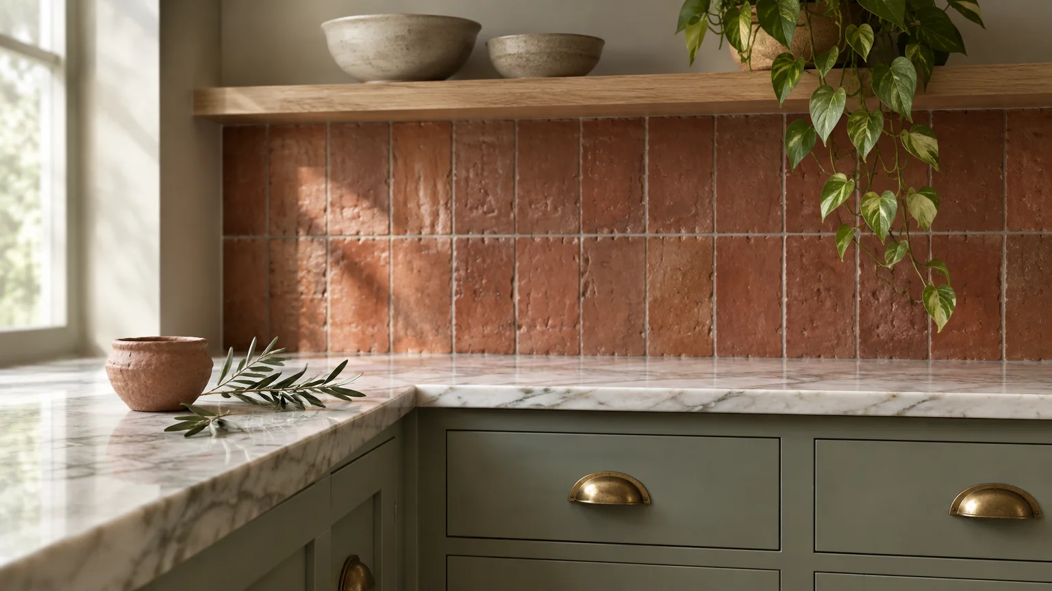
Sage green offers an intuitive, biophilic counterweight to the fiery undertones of baked clay. Because red and green sit directly opposite each other on the color wheel, this pairing delivers effortless chromatic equilibrium.
You will find that muted botanical green softens the dense heat of raw earthen materials. It evokes sunlit Mediterranean courtyards where silvery olive foliage frames handmade clay urns.
Select a sage with deliberate gray undertones rather than bright pastel tints. Muted pigments like Benjamin Moore’s October Mist prevent your room from feeling juvenile or overly sweet.
Apply this soothing hue across your living room walls while showcasing unglazed terracotta floor tiles. The cool botanic wash tempers the floor’s radiant orange cast with understated elegance.
For tactile harmony, incorporate woven jute rugs, white oak shelving, and brushed brass hardware. These natural materials reinforce the organic provenance of both foundational colors.
Introduce large potted plants like trailing pothos or olive trees against your painted surface. Live foliage bridges the transition between your painted walls and terracotta planters seamlessly.
You can also specify this paint color on kitchen cabinetry paired with handmade terracotta backsplash tiles. The combination creates a curated, artisanal atmosphere that feels rooted in enduring design traditions.
Use an eggshell finish on the walls to softly diffuse incoming sunlight. This low-luster sheen prevents harsh glares from detracting from your tiles’ tactile, earthy texture.
Trend #2: Creamy Alabaster White and Quiet Luxury
Pure brilliant whites often look stark and clinical against earthy terracotta elements. Instead, you should embrace creamy alabaster whites infused with subtle yellow and beige undertones.
This sophisticated pairing embodies quiet luxury by allowing your architectural terracotta elements to become the focal point. The soft white envelope reflects natural daylight while preserving the clay’s intrinsic warmth.
Interior designers frequently specify shades like Sherwin-Williams Alabaster or Farrow & Ball’s Wimborne White. These complex emulsions create a velvety backdrop that glows softly in southern and western exposures.
If your home features an exposed brick hearth or terracotta floor tiles, coat adjacent surfaces in this warm neutral. The visual boundary remains crisp without feeling abrasive or disjointed.
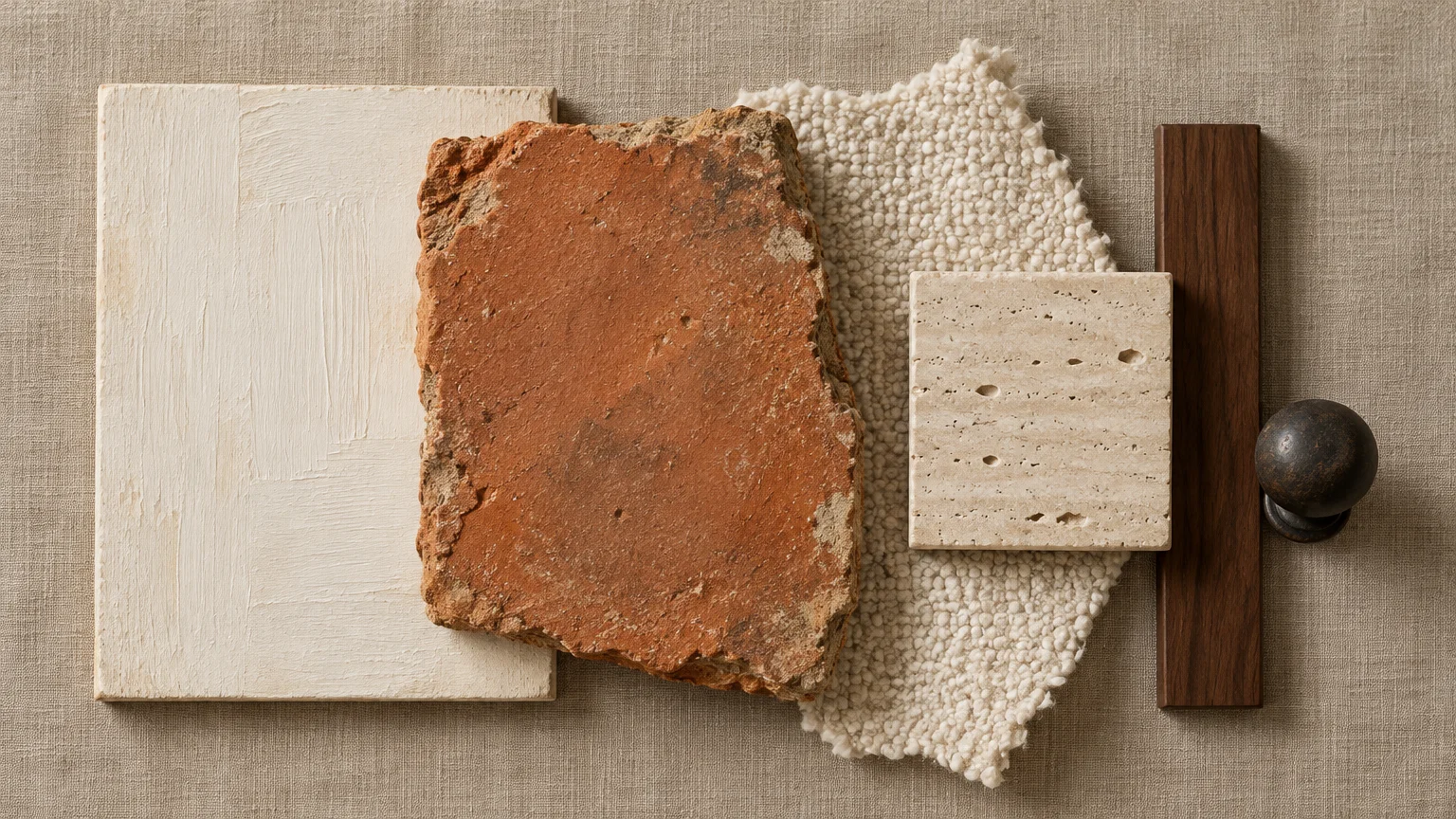
Layer your space with bouclé upholstery, tumbled linen drapery, and honed travertine tables. These diverse textures keep an ivory and terracotta palette rich, multidimensional, and calm.
To maximize depth, introduce dark walnut wood accents or blackened iron lighting fixtures. These grounding elements anchor the airy walls against the substantial weight of clay tiles.
This combination works exceptionally well in expansive open-concept living spaces where natural light shifts throughout the day. Your terracotta decor will ground the room, while the creamy perimeter amplifies ambient brightness.
Choose matte chalk paint for historic plaster walls or lime-washed finishes. The velvety texture enhances the artisanal character shared by both materials.
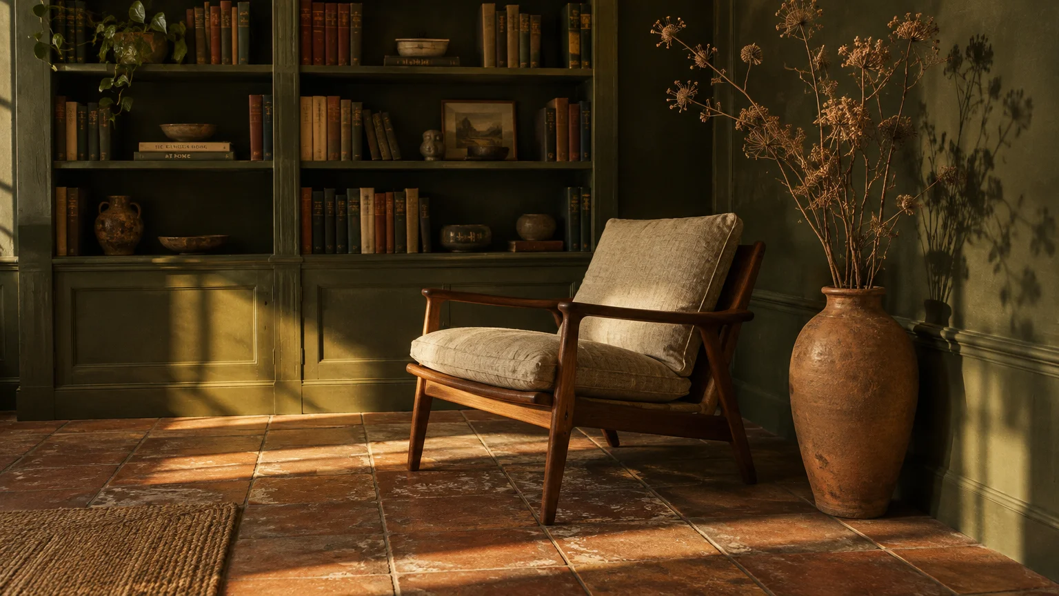
Trend #3: Deep Olive Green and Earthy Chromatic Resonance
If you crave dramatic immersion, deep olive green creates an evocative, enveloping atmosphere alongside terracotta. This pairing moves beyond light contrast to deliver rich, mood-driven chromatic resonance.
Both hues share strong organic origins rooted in the natural landscape. Olive’s yellow-green complexity resonates harmoniously with the iron oxides found in fired earthenware.
Consider coating an intimate dining room or study in a saturated olive like Farrow & Ball’s Bancha. The deep pigment produces a cozy, cocooning environment that honors historic design sensibilities.
Position raw terracotta urns, matte clay vessels, or architectural pedestals against your olive walls. The visual warmth of the pottery pops dynamically against the shaded green perimeter.
Elevate the scheme with unlacquered brass switch plates, antiqued bronze sconces, and dark mahogany furniture. The reflective metal finishes provide deliberate moments of luster within the matte earthiness.
When styling textiles, choose moss velvet drapery or vintage Persian rugs that interweave forest tones and burnt sienna. This layering ties the entire perimeter together with painterly sophistication.
You can also paint millwork or built-in bookshelves olive to frame a terracotta tile fireplace surround. The resulting juxtaposition feels deeply grounded, historic, and enduring.
Install warm 2700K lighting to emphasize the golden undertones present in both colors. Harsh cool bulbs will flatten the deep olive, robbing it of its luxurious warmth.
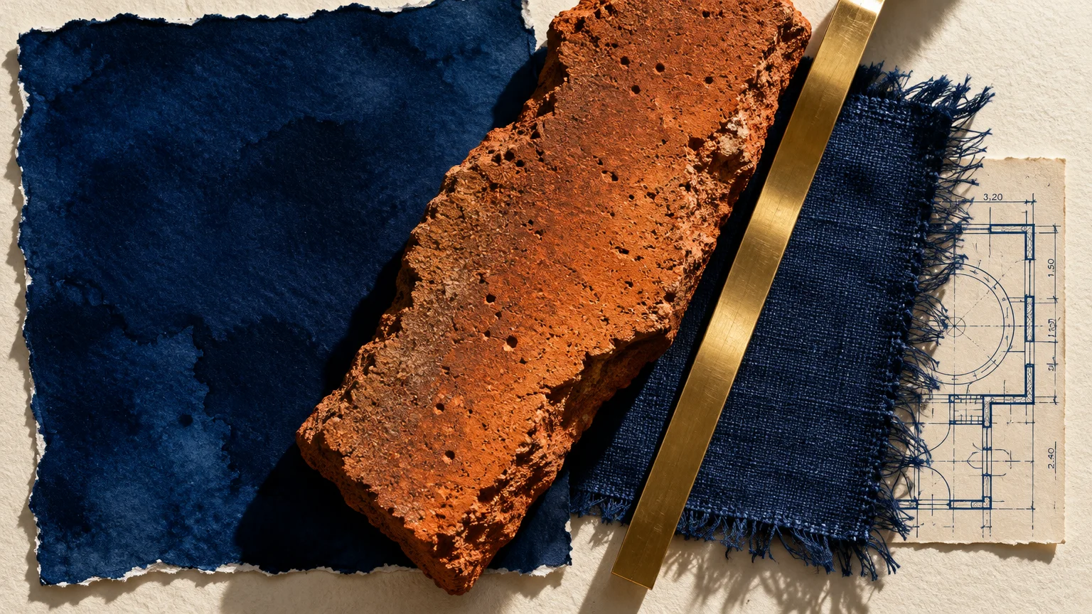
Trend #4: Saturated Navy Blue and Complementary Tension
Saturated navy blue introduces striking dynamic tension when set against a warm terracotta color palette. As classic complementary colors, deep blue and burnt orange generate high-impact visual energy.
This pairing evokes nautical Mediterranean villas and classic Moorish architecture. The cool serenity of ocean-inspired indigo anchors the kinetic warmth radiating from artisanal clay.
Select ink-tinted navies with slate undertones, such as Benjamin Moore’s Hale Navy, to maintain adult sophistication. Avoid primary royal blues, which can read aggressive or dated in residential settings.
Paint your dining room or formal sitting room walls in deep navy to establish moody elegance. Then, feature polished terracotta floor tiles or clay wall sconces to provide a radiant counterbalance.
Complement the bold pairing with brushed gold accents, crisp white picture mats, and cognac leather armchairs. The leather smooths the transition between cool walls and warm clay surfaces.
For modern kitchens, install deep navy lower cabinets beneath walls lined with handcrafted terracotta zellige tiles. The contrast delivers immediate architectural depth that commands attention without overwhelming your senses.
You can also ground the space with geometric patterned rugs containing cream, cobalt, and rust motifs. This repetition ensures your color scheme feels intentional and artfully curated.
Opt for a satin finish on navy millwork to reflect soft ambient light back into the room. This subtle gleam softens the heavy pigment and flatters adjacent terracotta elements.
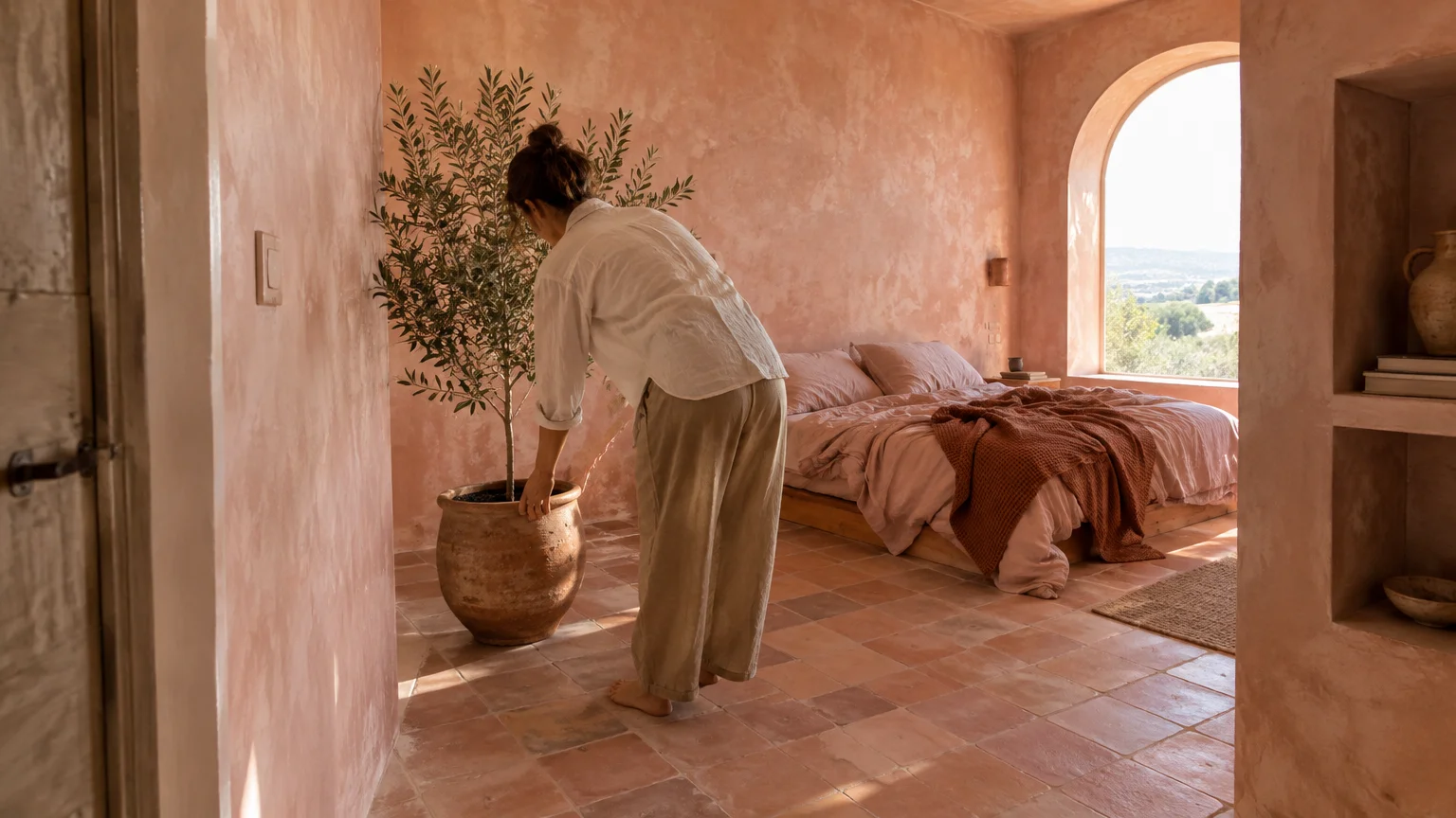
Trend #5: Dusty Plaster Pink and Monochromatic Sunset Tones
For an ultra-contemporary tonal statement, partner your terracotta decor with dusty plaster pink. This tonal approach layers neighboring red-orange pigments to establish an inviting, sun-drenched environment.
Plaster pink shares identical warm DNA with terracotta, functioning as its softer, desaturated sibling. Instead of competing, the two colors blend into a soothing monochromatic gradient.
Look for chalky, mineral-heavy pinks like Farrow & Ball’s Setting Sun or Portola Paints’ Roman Clay finishes. These textured emulsions evoke aged Moroccan riads and Mediterranean stucco facades.
You can paint bedroom walls in dusty blush while styling the space with terracotta bedside lamps and linen bedding. The tonal continuum creates a restful sanctuary infused with gentle, flattering light.
Add tactile interest through woven rattan pendants, light ash wood furniture, and ivory sheepskin throws. Textural variation prevents a monochromatic palette from feeling flat or visually monotonous.
Introduce subtle bronze hardware or smoked glass accents to insert modern architectural punctuation. These deliberate darker notes keep the romantic blush atmosphere grounded in modern restraint.
In powder rooms, this palette performs magic under warm incandescent lighting. Your guests will appreciate how the rosy-clay glow creates an ambient, spa-like reflection.
Use limewash application techniques to give the pink walls visual movement and cloudy texture. The rustic patina mirrors the artisanal irregularities inherent in handmade terracotta surfaces.
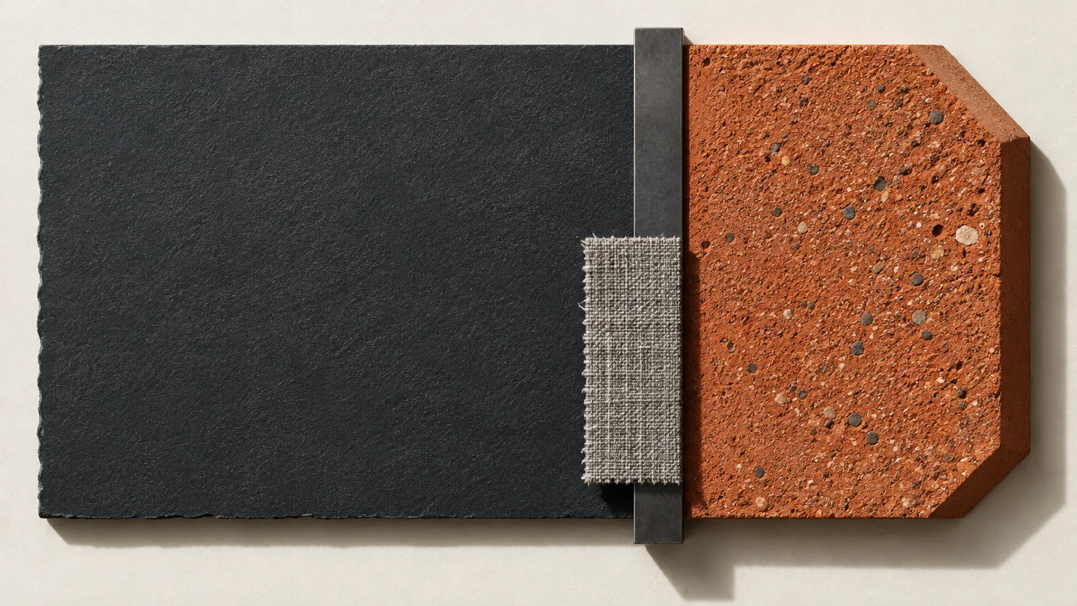
Trend #6: Architectural Charcoal Slate and Modern Edge
Pairing terracotta with dark charcoal slate transforms traditional rustic clay into an edgy, contemporary design statement. The deep mineral gray supplies sharp architectural contrast that modernizes warm paint colors.
High-contrast palettes create visual drama by accentuating the artisanal imperfections of handmade terracotta tiles. Charcoal strips away vintage sentimentality, reframing the clay as a sculptural, raw material.
Choose rich, nuanced dark grays with neutral or slightly blue undertones rather than flat black. Benjamin Moore’s Kendall Charcoal or Sherwin-Williams Peppercorn provides the requisite depth without swallowing natural light.
Paint an accent wall or media console surround charcoal while showcasing sculptural terracotta planters on floating shelves. The warm orange silhouettes stand out sharply against the dark mineral canvas.
Incorporate concrete accents, blackened steel hardware, and ribbed glass fixtures to enhance the industrial aesthetic. These urban materials complement the elemental nature of fired clay seamlessly.
Balance the moody atmosphere with warm white ceiling paint and pale wood flooring. This strategic layout maintains an open feeling while preserving the intimate mood around your charcoal feature.
In outdoor patios or covered sunrooms, charcoal exterior paint frames terracotta paving with extraordinary elegance. The juxtaposition turns your outdoor lounge into a chic, resort-worthy retreat.
Incorporate matte finishes when applying dark paint near raw terracotta. High-gloss sheens create distracting glare that undermines the moody, architectural gravitas of the space.
Trend #7: Muted Ochre and Sun-Drenched Analogous Energy
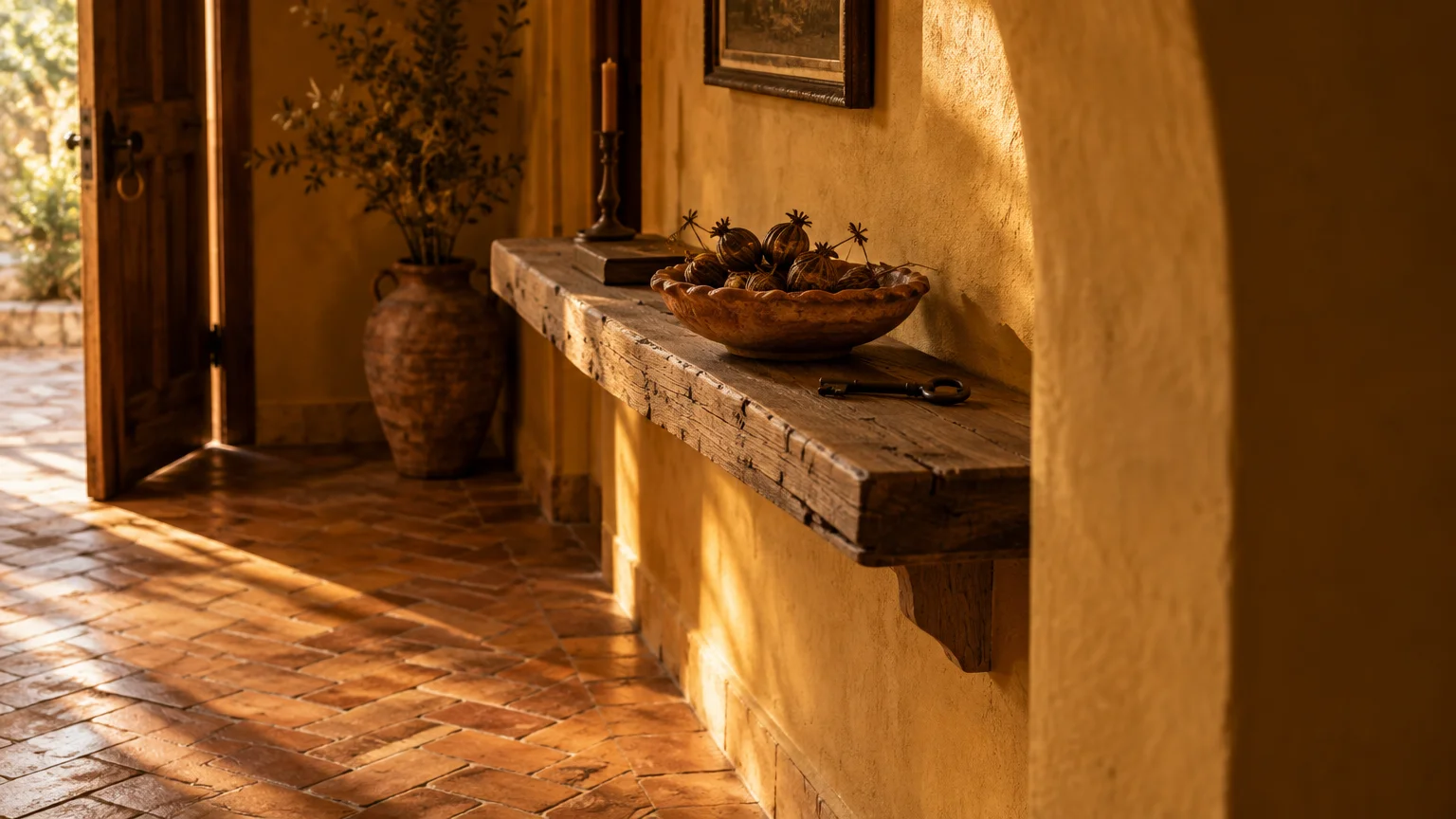
If you love saturated, radiant interiors, muted ochre and mustard yellow generate exhilarating warmth alongside terracotta. These hues reside next to each other on the color wheel, forming a harmonious analogous relationship.
This color story takes direct inspiration from desert landscapes, spice markets, and mid-century modern architecture. It envelops your home in golden optimism while honoring organic pigments.
Select earthy, browned yellows like Sherwin-Williams Roycroft Brass rather than harsh neon varieties. Desaturated ochre feels dignified, historically grounded, and delightfully complex under shifting daylight.
Utilize ochre on kitchen walls or dining nooks where you want to foster energetic conversation. Terracotta floor tiles or pendant lights ground the energetic paint with tactile, earthen gravitas.
Balance the pervasive warmth by integrating walnut furniture, cream bouclé fabrics, and matte black lighting. These contrasting accents prevent the rich yellow-orange scheme from overwhelming your visual field.
Incorporate woven textiles featuring ethnic kilim patterns that bridge mustard, terracotta, and off-white. This cohesive textile styling anchors your upholstery and pulls the entire room together effortlessly.
You can also use ochre as an accent color inside bookshelves or arched architectural niches. The golden backdrop frames terracotta pottery and ceramics with museum-quality presence.
Ensure you test this palette in rooms with abundant southern sunlight. Natural golden hour light makes this warm combination glow with extraordinary, radiant hospitality.
Trend #8: Pale Greige and Textural Neutral Serenity
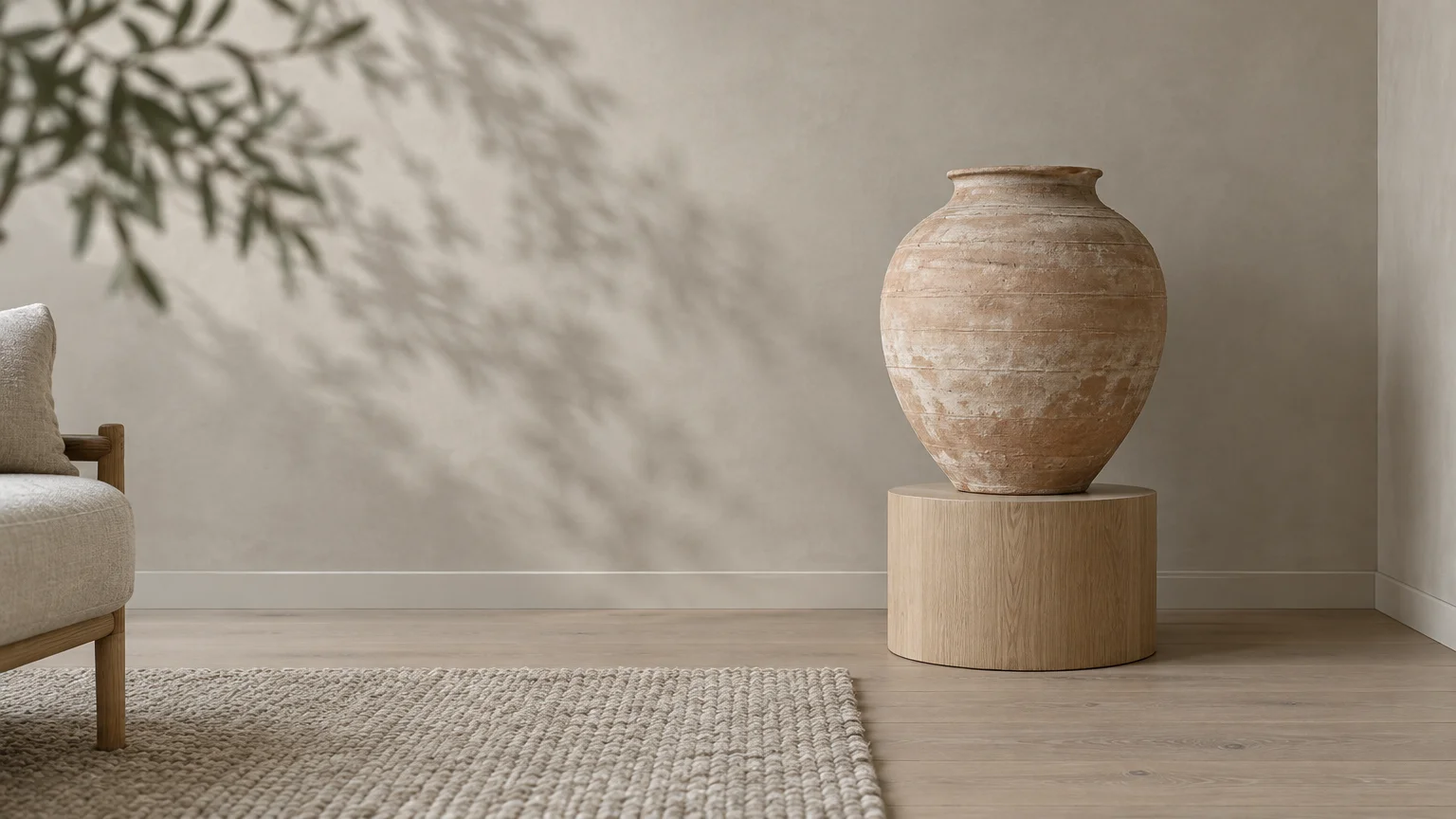
Pale greige represents the quintessential chameleon neutral for homeowners seeking an understated terracotta color palette. By uniting gray and beige, greige offers a calming buffer that bridges cool modernism and earthen heat.
Unlike sterile gray, greige carries enough brown undertone to harmonize organically with clay tiles and pottery. It lets your terracotta decor shine without making your living environment feel cold or detached.
Opt for designer favorites like Sherwin-Williams Agreeable Gray or Benjamin Moore’s Edgecomb Gray. These versatile formulas adjust smoothly to both morning shadows and warm afternoon sunlight.
Apply pale greige across main hallways and living spaces where terracotta flooring flows through multiple rooms. The neutral perimeter maintains visual continuity and softens transitions between living zones.
Pair greige and terracotta with bleached oak flooring, washed linen upholstery, and brushed nickel hardware. This understated combination aligns with Belgian modernism and relaxed coastal sensibilities.
Layer ceramic stoneware, dry floral arrangements, and tactile woven wool throws across seating areas. These layered accents build rich tactile interest across the neutral backdrop without introducing competing colors.
You can also specify matte greige paint on interior doors and architectural moldings. This subtle detail frames terracotta-accented spaces with tailor-made architectural refinement.
Use flat or dead-matte wall finishes when painting large greige expanses. Flat paint absorbs harsh highlights and allows the warm nuances of your clay decor to take center stage.
The Big Picture: Weaving These Trends into Your Home
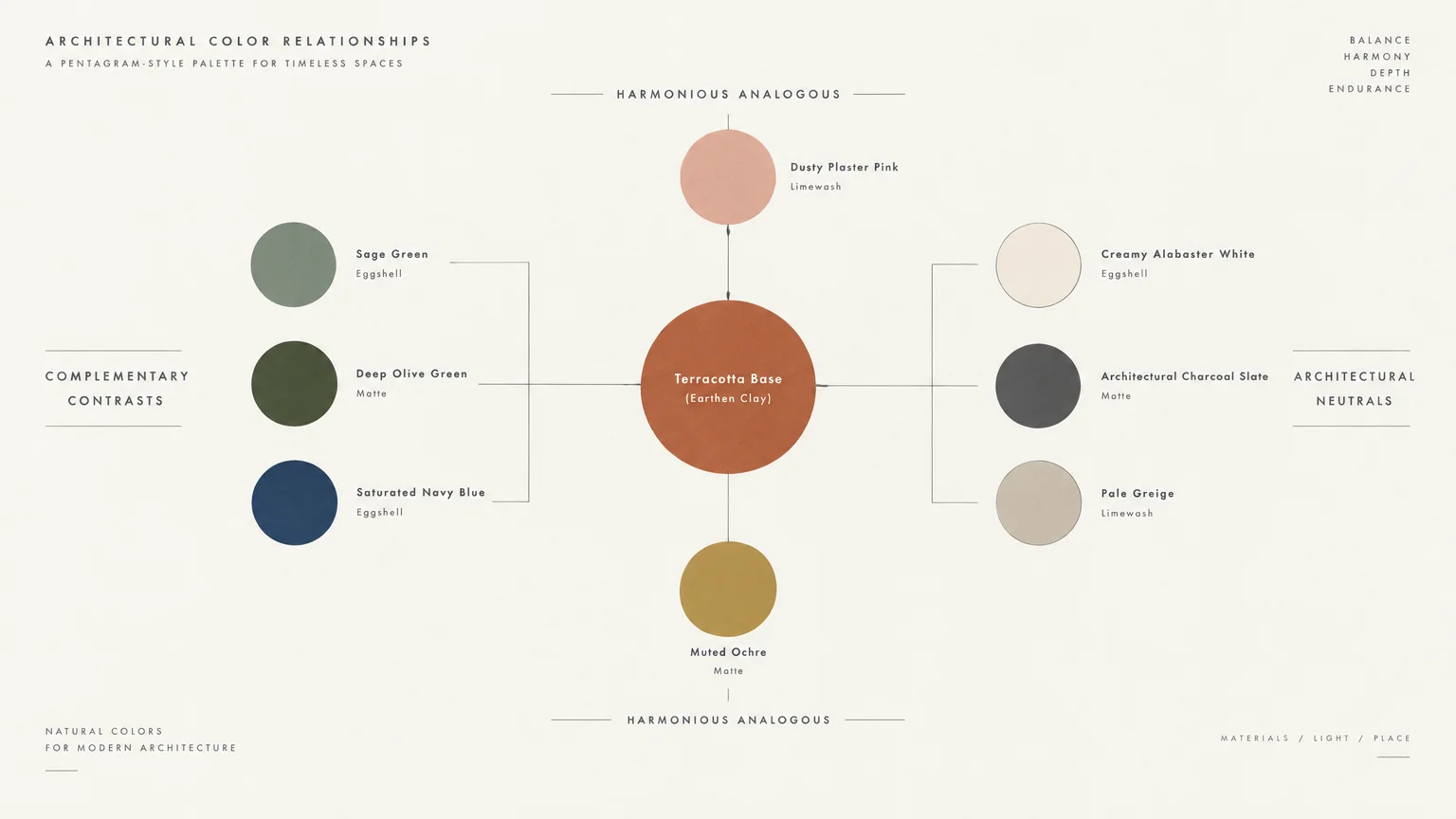
Balancing colors that go with terracotta requires thoughtful attention to your home’s natural light and existing finishes. South-facing light amplifies terracotta’s red undertones, while northern light pulls out cooler gray notes.
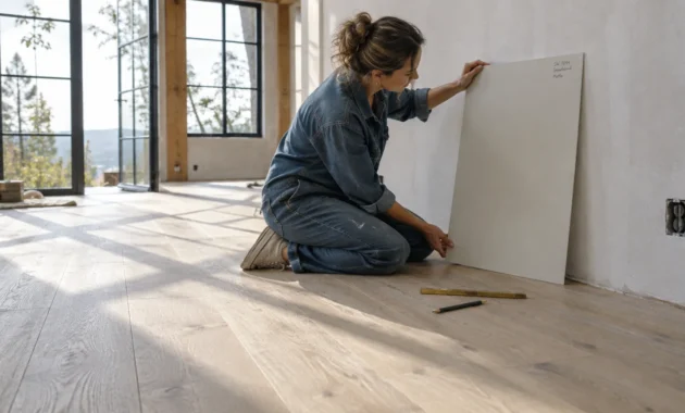
Always sample paint swatches directly against your terracotta surfaces before committing to full wall application. Clay tiles contain organic pigment variations that react uniquely to surrounding wall colors.
Incorporate the 60-30-10 color rule to maintain effortless visual harmony throughout your space. Dedicate sixty percent of the room to your dominant wall paint, thirty percent to terracotta, and ten percent to accent fixtures.
Focus on authentic materiality rather than chasing fleeting design fads. Pair your painted surfaces with genuine raw clay, solid hardwood, and woven plant fibers that age with grace.
Layering diverse sheen levels also enhances your overall color story. Matte or eggshell wall finishes partner best with unglazed terracotta, preventing distracting glare across textured surfaces.
Trust your architectural context when selecting from these eight designer-approved paint colors. By honoring your home’s lighting and materials, you curate an enduring space that feels intentional and distinctly yours.
For the latest color forecasts, consult industry leaders like Pantone and paint companies like Benjamin Moore. For professional design standards, refer to the American Society of Interior Designers (ASID).
Frequently Asked Questions
Does terracotta pair better with warm or cool paint colors?
Terracotta pairs exceptionally well with both color temperatures, depending on your aesthetic goal. Cool tones like sage green and navy create energetic contrast, while warm whites and dusty pinks foster monochromatic serenity.
Examine your room’s natural lighting before deciding between warm and cool tones. Warm paint colors enhance dark northern rooms, whereas cool tones balance radiant southern exposures effortlessly.
What is the best trim color for rooms with terracotta floor tiles?
Creamy warm whites and soft greiges serve as the most flattering trim colors alongside terracotta floors. Avoid stark pure white trim, which creates a jarring visual disconnect against earthy clay tiles.
If you desire modern drama, consider charcoal trim to frame your floors with architectural precision. This daring choice creates an intentional border that highlights the floor’s organic texture.
How do you modernize terracotta decor without remodeling?
You can instantly modernize terracotta decor by painting your walls in contemporary hues like muted olive or charcoal. The fresh paint palette recasts traditional clay items as striking sculptural art.
Swap out dated brass hardware for matte black or brushed nickel finishes throughout the room. Pairing fresh metallic accents with clean paint colors transforms the entire room’s visual temperature.
Will terracotta color palettes remain in style long-term?
Yes, terracotta remains an enduring staple of classic Mediterranean, Southwestern, and Scandinavian design. Its organic provenance and grounding warmth transcend temporary micro-trends.
By pairing terracotta with timeless paint colors like alabaster, sage, or navy, you ensure enduring relevance. Your space will feel grounded and sophisticated for decades to come.
Disclaimer: This article reflects design trend analysis and predictions. Personal taste and timeless design principles should always guide your decorating choices.