Your workspace wall color dictates your cognitive endurance, creative stamina, and mental clarity throughout the day. Selecting the best home office paint colors transforms your environment from a draining chore into an intentional sanctuary of focus.
Modern interior design merges color psychology with elevated architecture, proving that chromatic choices directly influence your daily output. The right shade sharpens your attention while establishing a seamless aesthetic dialogue with the rest of your home.
Whether you manage analytical spreadsheets or spearhead creative campaigns, strategic paint application provides an immediate upgrade. Explore these eight sophisticated hues engineered to cultivate deep work and inspire effortless productivity.
Trend #1: Biophilic Sage Green
The Psychological Architecture
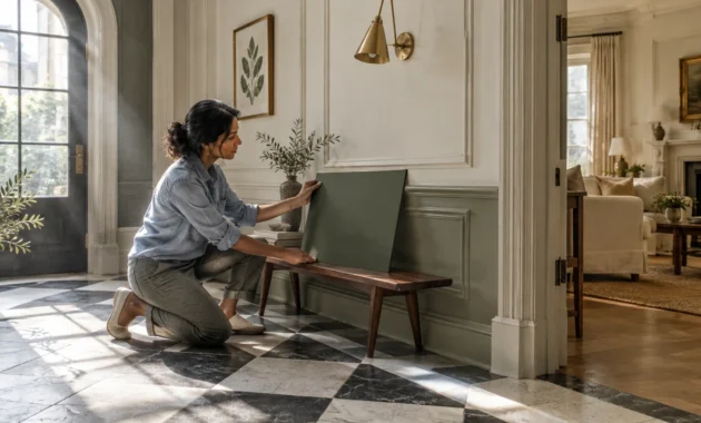
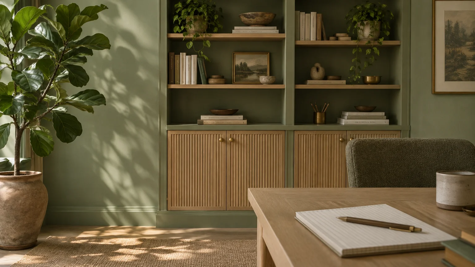
Biophilic sage green anchors the mind by evoking the restorative tranquility of the natural world. Its gentle frequency reduces ocular fatigue, making it one of the most effective paint colors for productivity.
Color researchers consistently note that soft greens encourage balanced thinking and sustained cognitive equilibrium. By mirroring the natural landscape, this hue keeps your nervous system calm during high-pressure deadlines.
Styling and Material Synergy
Pair sage with unlacquered brass hardware, fluted white oak cabinetry, and bouclé upholstery. These organic textures amplify the restorative feeling while preventing the space from appearing sterile.
For northern-facing offices, choose a sage with warm golden undertones to counteract cool exterior daylight. A matte or eggshell finish softens glare from computer monitors and overhead architectural lighting.
Extend the shade across your baseboards and window trim for a tailored, monochromatic envelope. This subtle color drenching expands visual boundaries, allowing you to concentrate without peripheral distractions.
Incorporating living houseplants like fiddle-leaf figs or trailing pothos reinforces this biophilic aesthetic. The layered foliage enriches the tonal depth of the walls while naturally purifying your indoor air.
Trend #2: Deep Inky Navy
The Psychological Architecture
Deep inky navy commands authority while fostering rigorous analytical focus and introspection. This saturated hue minimizes visual noise, creating an executive ambiance that encourages disciplined, deep work.
Psychological studies confirm that darker blues lower resting heart rates and induce deep mental clarity. When applied across an entire study, navy acts as a quiet barrier against domestic interruptions.
Styling and Material Synergy
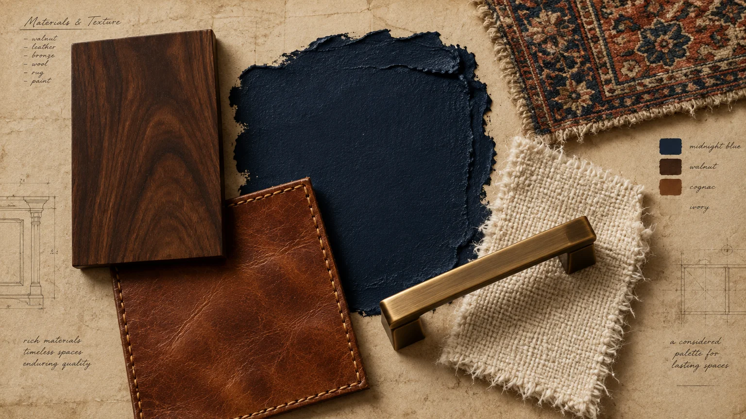
Contrast rich navy walls with warm walnut desks, cognac leather task seating, and brushed bronze accents. These rich, tactile materials bring classic warmth and quiet luxury to the dramatic backdrop.
Pay careful attention to your lighting scheme when committing to dark, moody tones. Layer warm 2700K task lamps alongside directional recessed fixtures to keep your workspace inviting and functional.
Paint your ceiling in the same navy shade to create a sophisticated cocooning effect. This seamless visual wrap eliminates sharp shadow lines, pulling your attention inward toward your desktop tasks.
Complete the scheme with cream-colored wool drapery or an antique Persian runner underfoot. These textiles temper the moodiness and inject timeless provenance into your daily working environment.
Trend #3: Warm Alabaster White
The Psychological Architecture
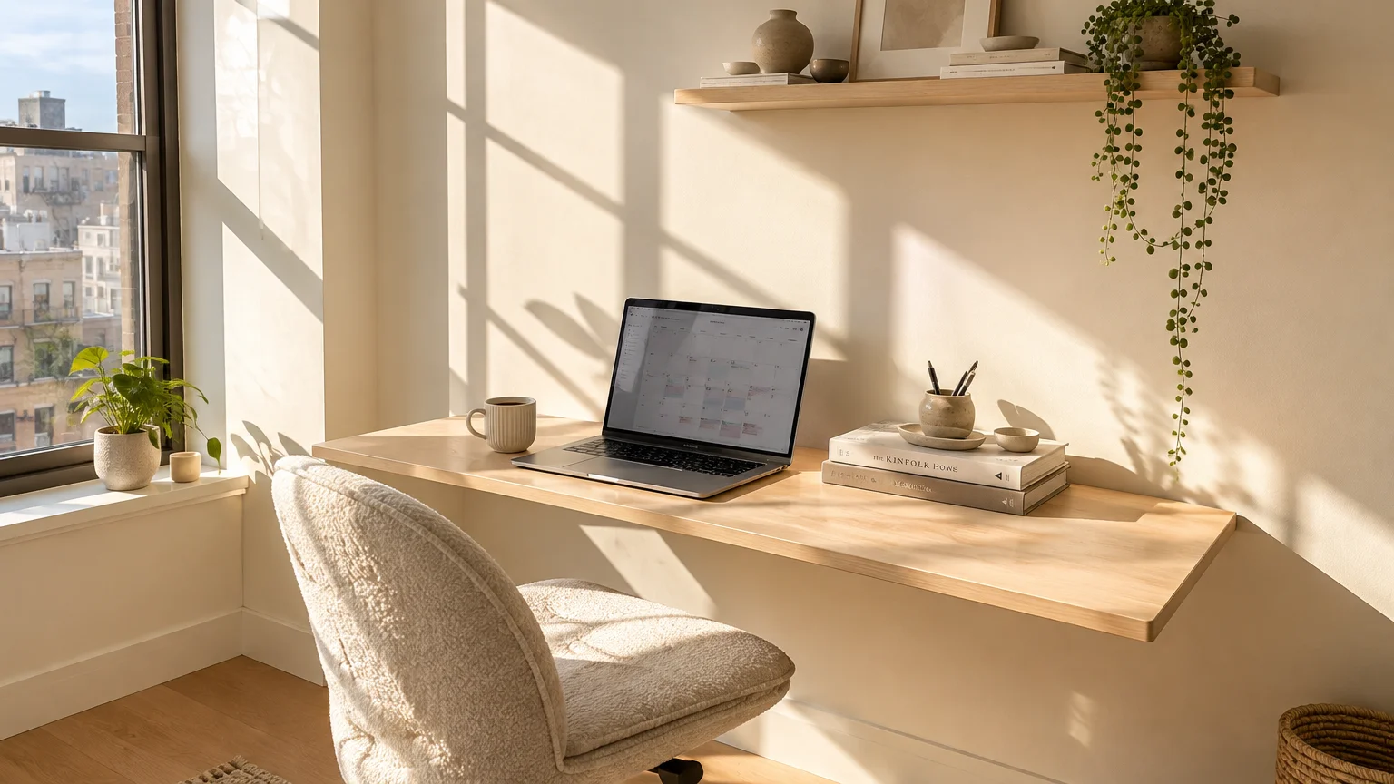
Warm alabaster white provides unmatched spatial clarity without the clinical chill of stark, blue-based whites. As one of the best home office paint colors, it creates an open, versatile canvas that optimizes natural daylight.
The yellow and beige undertones in alabaster soften high-contrast shadows across your workspace. This ambient softness reduces mental strain and establishes an uplifting, orderly environment for daily planning.
Styling and Material Synergy
Elevate an alabaster office with honed Calacatta marble surfaces, matte black light fixtures, and natural cane accents. The juxtaposition of light surfaces and sculptural silhouettes maintains visual intrigue without creating cognitive clutter.
Evaluate the Light Reflectance Value (LRV) before committing; an LRV between 80 and 85 yields radiant bounce without glare. This luminous balance proves especially vital in compact home offices or windowless studio nooks.
Introduce tactile dimension through textured limewash or Roman clay wall treatments in matching alabaster. The subtle plaster movement catches changing daylight, infusing your office with artisan craftsmanship.
Layer neutral elements such as a ribbed travertine side table and ivory linen roman shades. This tonal discipline keeps your visual field serene, promoting continuous hours of creative concentration.
Trend #4: Grounded Terracotta
The Psychological Architecture
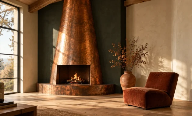
Grounded terracotta infuses your home office with earth-born vitality and creative optimism. Unlike hyper-stimulating reds, this sun-baked clay hue fuels creative momentum while maintaining an emotionally grounding presence.
Terracotta ranks among the top colors that boost focus by stimulating physical endurance and enthusiasm. It provides the invigorating energy you need to tackle complex, boundary-pushing projects without inducing restlessness.
Styling and Material Synergy
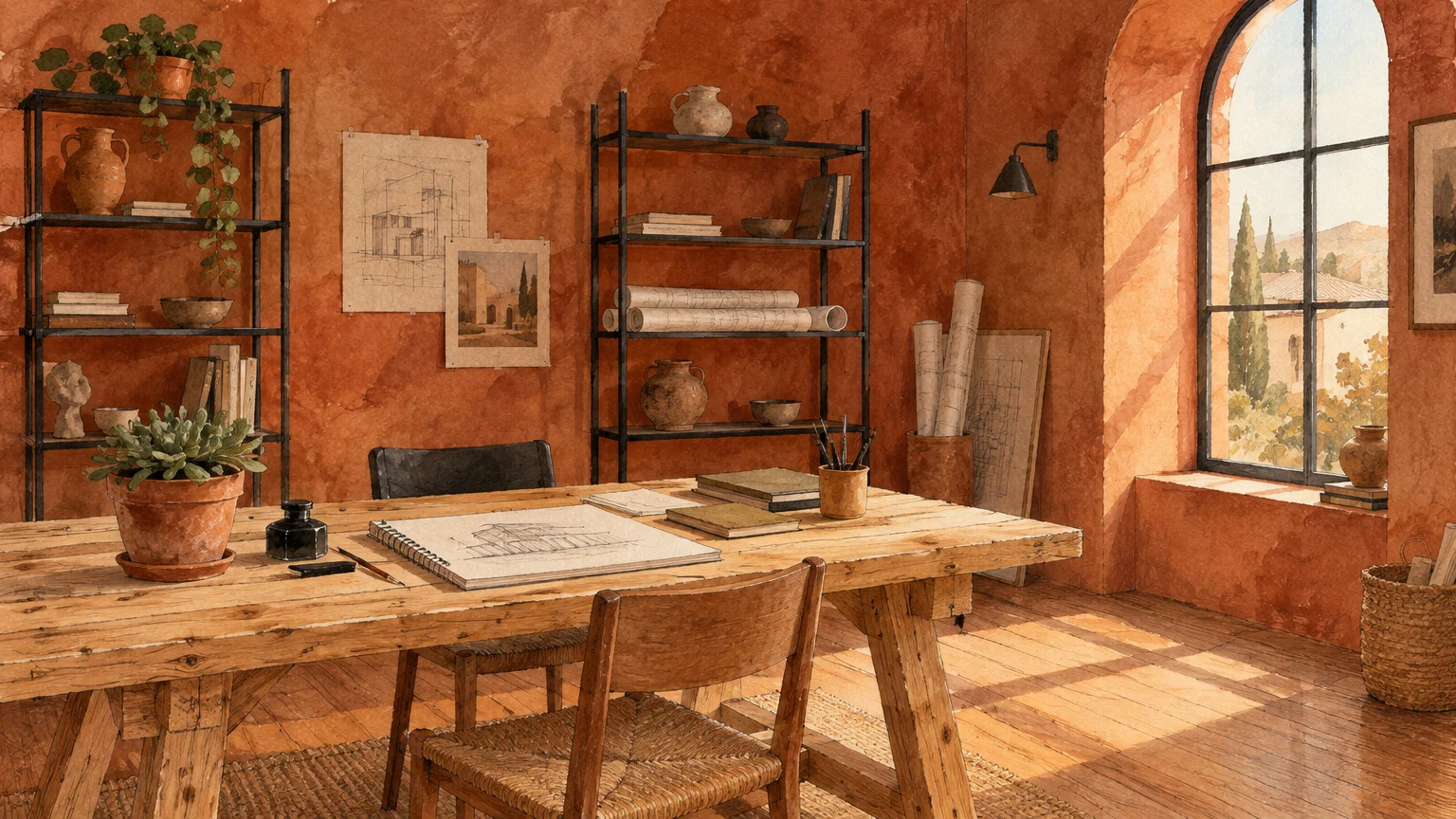
Pair terracotta with charcoal metal accents, ebonized ash furniture, and textured woven jute rugs. The balance of warm clay and dark architectural lines creates a grounded, Mediterranean modern aesthetic.
This shade thrives in spaces with abundant south-facing sunlight, which illuminates the nuanced ochre undertones. During dusk hours, warm perimeter lighting transforms the room into an inviting, amber-glowing sanctuary.
If painting all four walls feels overly bold, use terracotta strategically on an accent library wall. Framing open bookshelves in this rich hue draws the eye and defines your focal work zone.
Complement the palette with raw stoneware planters and handcrafted ceramic desktop accessories. These tactile elements celebrate artisanal craftsmanship, grounding your digital tasks in organic, tangible textures.
Trend #5: Muted Slate Blue
The Psychological Architecture
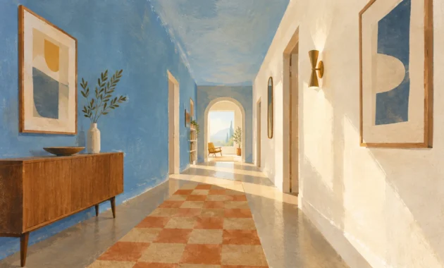
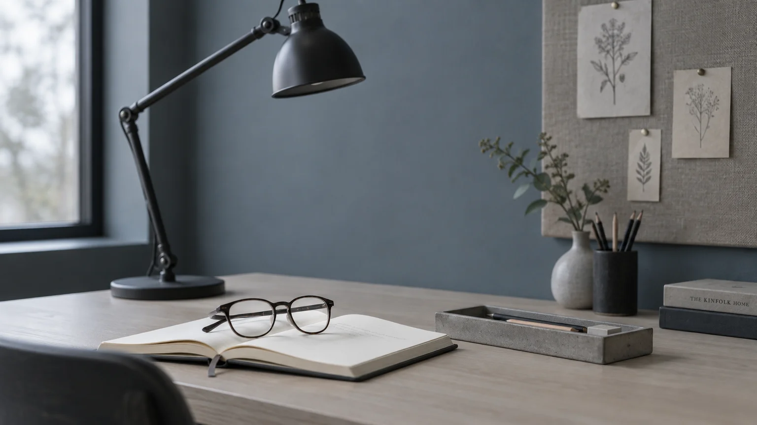
Muted slate blue blends the cognitive composure of traditional blue with the understated discretion of mineral gray. It excels as one of the premier calming productive workspace colors for detail-oriented tasks.
This sophisticated mid-tone helps regulate breathing and pulse rates during demanding professional negotiations. Its cool temperature promotes analytical efficiency, making it the ideal partner for high-stress corporate roles.
Styling and Material Synergy
Style slate blue alongside bleached maple desks, polished chrome fixtures, and rich saddle leather blotters. The crisp metal and warm wood details provide structural contrast against the smoky wall surface.
Test slate swatches across morning and afternoon light, as shifting gray undertones alter its spatial perception. In cooler exposures, incorporate warm ambient lighting to prevent the color from feeling somber.
Consider a satin finish on custom millwork and built-in cabinetry painted in matching slate blue. The lustrous surface reflects low-angle light while establishing an unbroken, tailored aesthetic.
Add an upholstered velvet office chair in a rich forest green or burnt caramel tone. This chromatic dialogue energizes the room, preventing a predominantly cool environment from feeling impersonal.
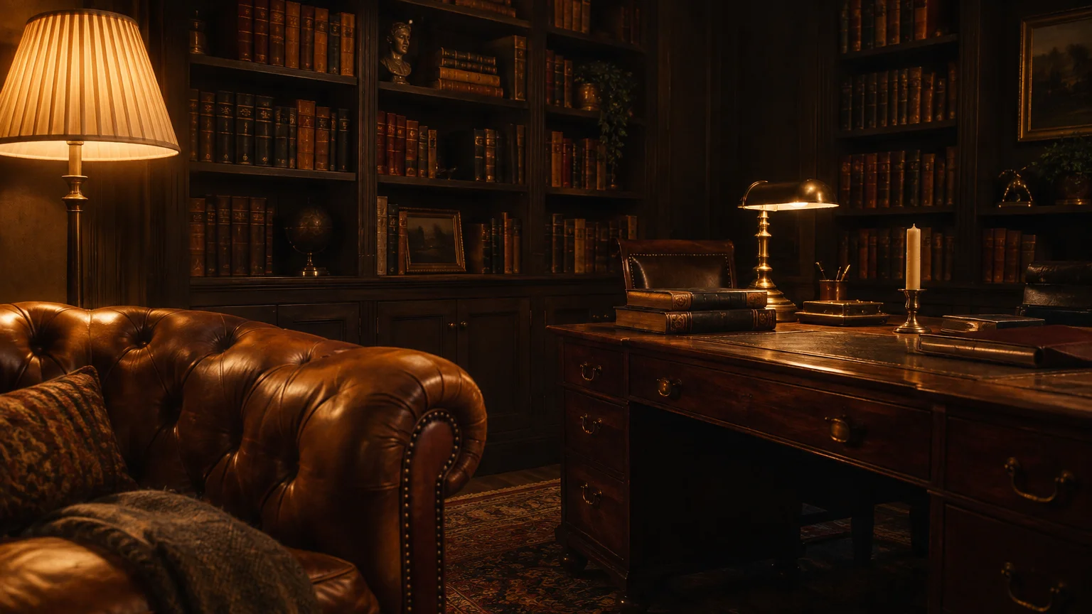
Trend #6: Rich Espresso Brown
The Psychological Architecture
Rich espresso brown exemplifies the quiet luxury movement, offering an enveloping backdrop rooted in permanence and authority. Its comforting warmth shields you from outside chaos, fostering prolonged periods of intense focus.
Deep earthy tones tap into primal instincts of security, eliminating the nervous restlessness caused by bright environments. This steady visual weight proves remarkably effective for authors, strategists, and thoughtful researchers.
Styling and Material Synergy
Balance dark chocolate walls with antiqued brass sconces, cream shearling chairs, and light travertine surfaces. High-contrast pale accents prevent the space from closing in, preserving an airy, modern architectural dynamic.
Apply an ultra-flat matte formulation to absorb excessive glare and accentuate the velvety depth of the pigment. Matte dark paint imparts an Old World, library-like gravitas to contemporary home studies.
Install floor-to-ceiling picture frame molding before painting to give the espresso walls dimensional shadow play. The classic architectural detail elevates the color from simple paint to bespoke interior architecture.
Integrate warm wool textiles and polished caramel marble trays on your desk. These refined accessories echo the rich tonality of your walls, solidifying an inspiring, distraction-free environment.
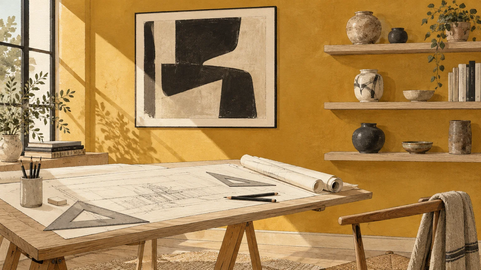
Trend #7: Dusky Mineral Ochre
The Psychological Architecture
Dusky mineral ochre introduces a refined, golden warmth that stimulates mental agility and intellectual curiosity. It avoids the hyperactivity of primary yellow, choosing instead an earthy, contemplative luminescence that uplifts your mood.
Behavioral colorists link golden amber tones with enhanced problem-solving capacity and optimistic ideation. Surrounding yourself with ochre helps counter creative fatigue during long afternoons at your desk.
Styling and Material Synergy
Pair ochre walls with mid-century teak furniture, oxidized bronze accents, and charcoal wool felt accessories. These rich elements anchor the radiant warmth, crafting a balanced, design-forward studio aesthetic.
Mineral ochre thrives in dimly lit rooms that lack natural daylight, mimicking the warm glow of late sunshine. It transforms recessed basement offices or interior alcoves into magnetic hubs of creativity.
Anchor the vibrant walls with off-white architectural trim painted in a satin finish. The subtle break in tone frames the golden hues while emphasizing your room’s structural craftsmanship.
Accent the workspace with sculptural ceramic lighting and archival art prints framed in raw maple. These artistic appointments honor the creative heritage of ochre while keeping your visual space pristine.
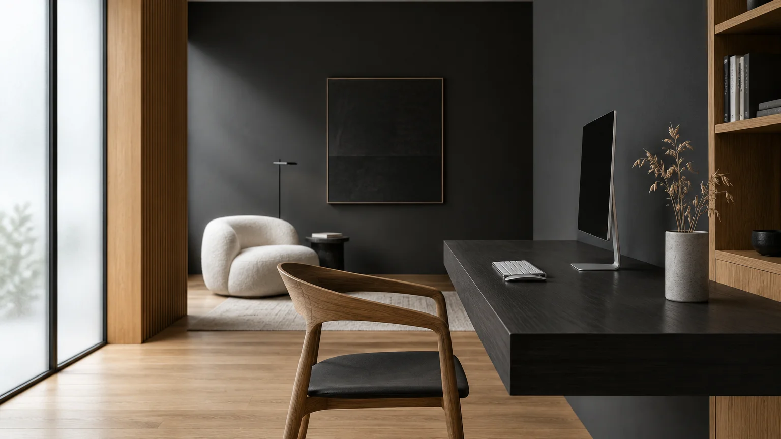
Trend #8: Restful Charcoal Gray
The Psychological Architecture
Restful charcoal gray provides a disciplined, modern backdrop that removes all chromatic distraction from your sightlines. It allows computer displays and design materials to stand out with crisp, absolute clarity.
Far from drab, a balanced charcoal creates a cocoon of visual silence that sharpens executive thinking. Its neutral character frees your mind from ambient clutter, cultivating deliberate and decisive action.
Styling and Material Synergy
Elevate charcoal with brushed nickel accents, reeded glass partitions, and sculptural blonde oak furnishings. These contemporary materials introduce luminosity, keeping the moody atmosphere energetic, fresh, and visually engaging.
Look for charcoal shades infused with subtle slate or violet undertones to prevent an uninspiring cement appearance. These complex undertones shift gracefully throughout the day under variable lighting conditions.
Integrate thoughtful acoustic felt wall panels in a tonal graphite shade behind your workstation. This addition absorbs sound reverberations, enhancing productivity during virtual calls while contributing architectural texture.
Finish the space with crisp white gallery frames showcasing minimalist architectural photography. The sharp monochrome contrast gives your home office a decisive gallery aesthetic tailored for focused innovation.
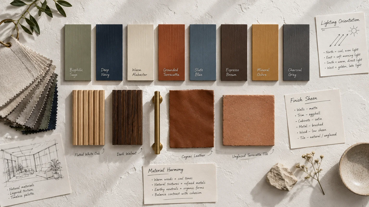
The Big Picture: Weaving These Trends into Your Home
Implementing professional home office design tips requires balancing your personal work style with your home’s broader architecture. A productive workspace should never feel disconnected from the surrounding living areas.
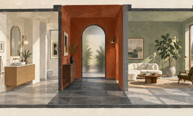
Maintain visual continuity by drawing undertones from adjacent rooms into your office palette. If your living room features warm white oak, select office hues with kindred warm bases.
Test your shortlisted colors using large sample boards rather than painting directly onto existing drywall. Move the boards around your office to monitor how dawn, midday, and twilight light alter their appearance.
Remember to harmonize paint with your existing flooring, whether you walk on wire-brushed hardwood or polished concrete. A warm floor requires balanced wall undertones to create a cohesive, grounding foundation.
Embrace architectural trim and ceiling surfaces as opportunities to deepen your chosen color story. Painting doors and casing in tonal variations adds bespoke sophistication without overwhelming your senses.
Ultimately, your workspace should empower your daily workflow and reflect your personal aesthetic values. Select a color that supports your mental demands while welcoming you each morning with quiet inspiration.
Frequently Asked Questions
Which paint finish is most practical for a home office?
Eggshell and matte finishes are ideal for home office walls because they diffuse artificial glare from screens and task lights. They create a soft, sophisticated surface that conceals minor drywall imperfections effortlessly.
For baseboards, doors, and custom built-in desks, select a durable satin or semi-gloss finish. These higher-sheen coatings resist scuffs from office chairs and allow for straightforward, regular cleaning.
How can I tell if a dark paint color will make my office feel too small?
Dark colors do not inherently shrink rooms; instead, they blur room corners to create an illusion of infinite depth. If your office enjoys sufficient ambient or natural lighting, dark shades feel cozy rather than cramped.
To maintain openness, keep your ceiling pale or introduce high-contrast accents through light drapery, rugs, and artwork. These reflective elements bounce light while preserving the dramatic sophistication of dark walls.
Can I combine two different productivity colors in one office?
Yes, pairing complementary hues can demarcate distinct zones for different types of work. For instance, paint your desk wall in calming sage green and your reading nook in deep navy.
Ensure that both colors share similar undertones or saturation levels to maintain visual harmony. Mismatched tonal weights can create visual dissonance, disrupting the mental tranquility required for sustained focus.
How does artificial lighting affect paint colors during evening work sessions?
Warm artificial bulbs (2700K to 3000K) amplify yellow, red, and brown undertones, making cool paints appear softer and warmer. Conversely, daylight bulbs (4000K+) accentuate blue and green tones while making warm shades look slightly washed out.
Install dimmable, color-tuned LED fixtures so you can adjust Kelvin levels to match your daily tasks. This dynamic flexibility ensures your paint color looks intentional, whether at noon or midnight.
For the latest color forecasts, consult industry leaders like Pantone and paint companies like Benjamin Moore. For professional design standards, refer to the American Society of Interior Designers (ASID).
Disclaimer: This article reflects design trend analysis and predictions. Personal taste and timeless design principles should always guide your decorating choices.