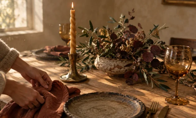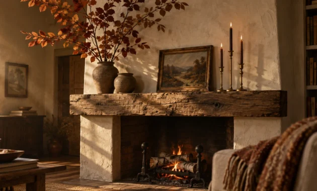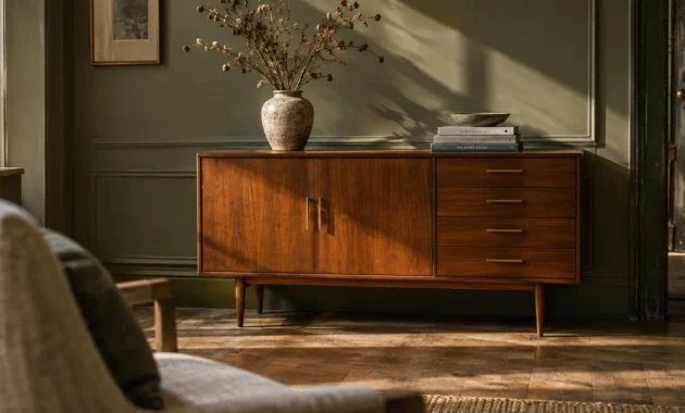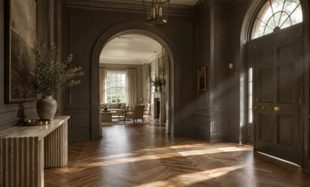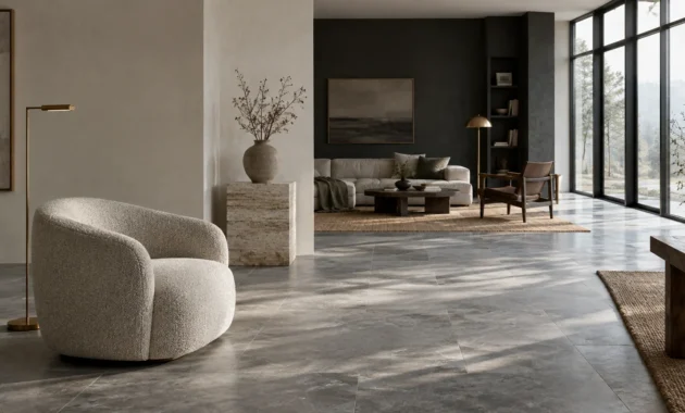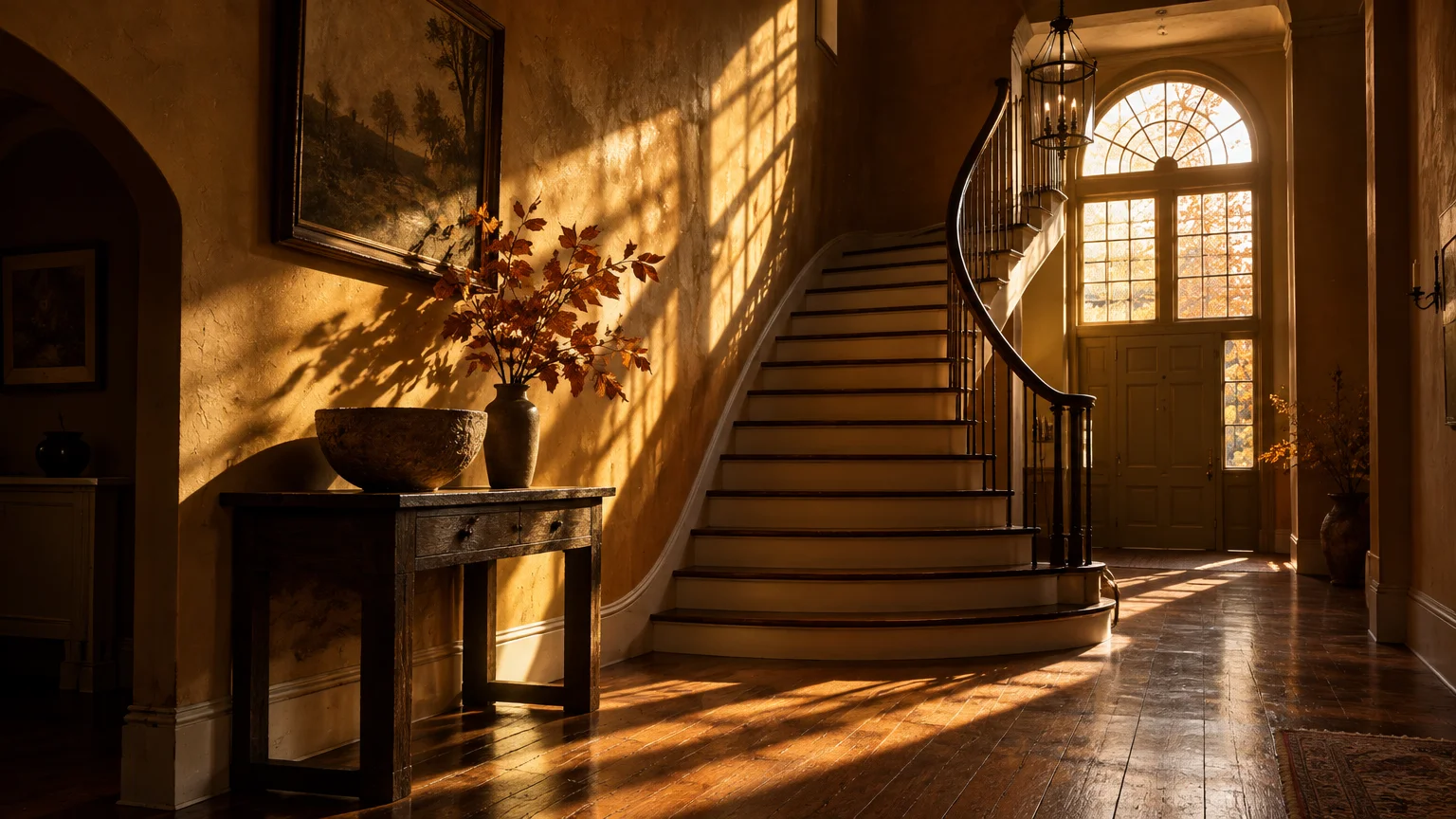
As the autumn sun dips lower on the horizon, natural daylight shifts toward warm 3,000K amber tones. Cool summer neutrals suddenly appear flat and uninviting under this angled illumination.
Selecting the best paint colors for fall transforms this seasonal atmospheric shift into an architectural asset. Richer pigments absorb low-angle rays to envelop your living spaces in comforting, intentional warmth.
From trending warm paint colors for 2026 to enduring heritage pigments, these curated selections celebrate seasonal change while maintaining year-round sophistication. Here are eight designer-approved shades engineered to maximize the beauty of autumn light.
Trend #1: Earthy Universal Khaki
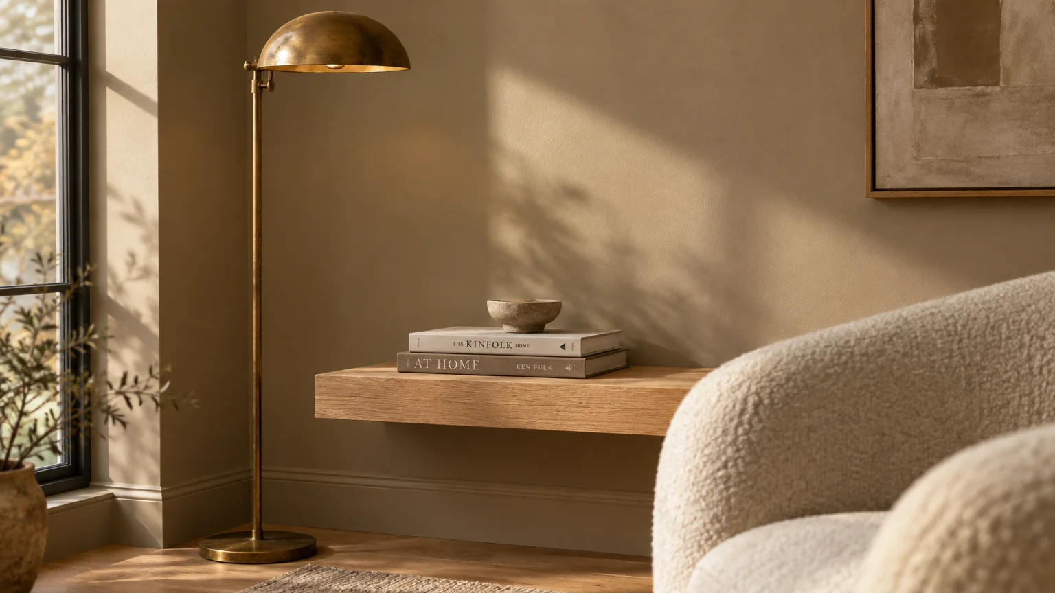
Interior palettes are moving decisively away from sterile, icy grays toward grounding, organic earth tones. Sherwin-Williams highlighted this cultural shift by selecting Universal Khaki (SW 6150) as their 2026 Color of the Year.
This warm mid-tone tan anchors living rooms and hallways with understated confidence. Its golden-brown undertone prevents walls from skewing flat or muddy when natural daylight wanes in late October.
The color features a balanced Light Reflectance Value (LRV) near 40, reflecting adequate ambient light while maintaining cozy enclosure. You can use it across large, open-concept spaces without overwhelming adjacent decorative details.
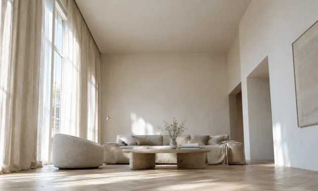
Designers pair this earthy hue with raw white oak flooring, textured boucle upholstery, and unlacquered brass hardware. This palette embodies quiet luxury—a style defined by restraint, natural materials, and authentic craftsmanship.
Standard acrylic latex formulas cost between $30 and $60 per gallon, offering dependable durability for everyday areas. Investing $70 to $95 per gallon for designer lines like Sherwin-Williams Emerald yields superior washability and richer depth.
You can complete a typical DIY living room refresh for roughly $150 to $300 in supplies. Universal Khaki establishes an enduring organic foundation that makes your autumn color palette home feel instantly restorative.
Trend #2: Heathered Cinnamon Slate
Autumn lighting creates high-contrast shadows that reward complex, multi-dimensional wall colors. Benjamin Moore addressed this seasonal need directly with their 2025 Color of the Year, Cinnamon Slate (2113-40).
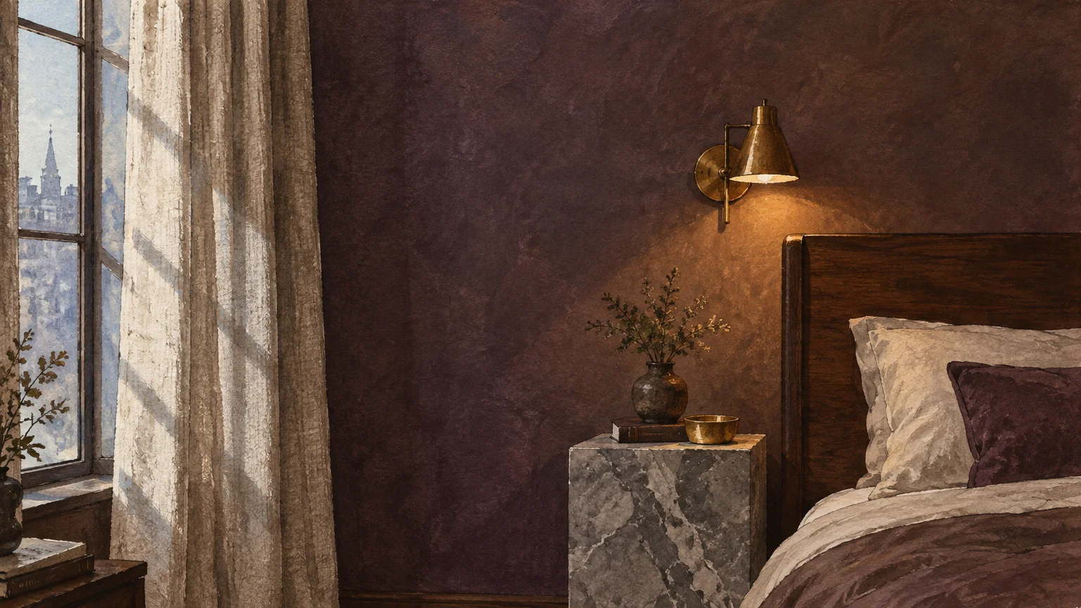
This sophisticated hue merges heathered plum with velvety brown undertones. The nuanced mixture catches afternoon light delicately, revealing smoky purple notes by day and rich cocoa depth after twilight.
Cinnamon Slate reinterprets traditional autumnal palettes through an elegant, modern lens. It avoids the harshness of stark charcoal while delivering far more emotional resonance than standard taupe.
Apply this shade in primary bedrooms or formal dining rooms where you desire an intimate, sheltering atmosphere. Pair it with woven linen drapery, honed marble accents, and dark stained walnut furniture for refined contrast.
One gallon covers approximately 350 to 400 square feet of smooth interior drywall. Applying two coats ensures consistent pigment saturation, allowing the subtle plum undertones to show their full textural character.
By absorbing cooler morning rays and radiating under late-day gold, this shade exemplifies modern cozy interior paint colors. It feels deeply rooted in historic domestic architecture yet undeniably contemporary.
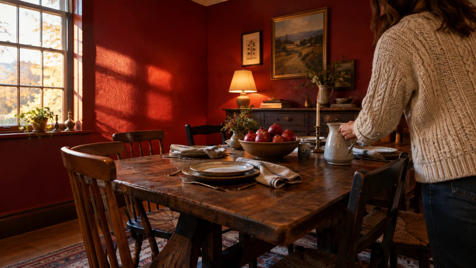
Trend #3: Saturated Ruby Red
Jewel tones are experiencing an energetic revival as homeowners crave warmth, optimism, and unapologetic character. Behr captured this vibrant momentum by declaring Rumors (MQ1-15), a deep ruby red, their 2025 Color of the Year.
This bold crimson shade features warm undertones that thrive under the softer, angled illumination of late autumn. Rather than reading as aggressive, the color radiates comforting hospitality across communal gathering spaces.
Design professionals frequently specify this hue for comprehensive color-drenching treatments. With an LRV well under 20, Rumors allows walls, trim, and ceilings to blur into an enveloping cocoon.
This immersive technique transforms drafty libraries, powder rooms, or intimate parlors into luxurious sanctuaries. Matte or eggshell sheens reduce distracting surface glare while amplifying the velvety richness of the red pigment.
Professional painting contractors charge between $2.00 and $6.00 per square foot for complex dark-tone applications. If you tackle this project yourself, applying a tinted gray primer guarantees seamless coverage across two coats.
Pair this evocative red with antique oil paintings, unlacquered bronze fixtures, and heavy velvet pillows. The resulting aesthetic feels both timeless and perfectly attuned to cozy evenings around the fireplace.
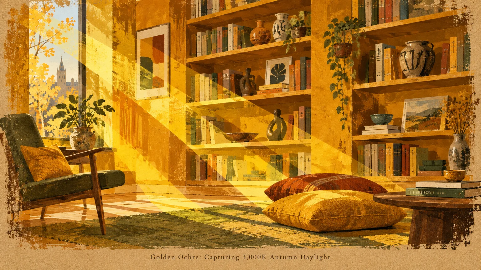
Trend #4: Sunlit Golden Ochre
When natural sunlight drops to 3,000K during autumn afternoons, golden ochre walls mirror the outdoor glow beautifully. This botanical, spice-infused yellow captures fading daylight and multiplies it across interior spaces.
Unlike bright lemon yellows that feel harsh in autumn, golden ochre carries heavy brown and amber undertones. This earthy foundation ensures the color remains calm, mature, and deeply comforting throughout the season.
Ochre functions exceptionally well in north-facing living rooms that suffer from flat, cool natural light. The pigment injects perpetual warmth, making chilly mornings feel cheerful without relying on artificial lighting fixtures.
To ground the radiance of ochre, incorporate dark charcoal architectural accents and blackened iron hardware. Natural stone surfaces, such as soapstone or slate, offer an exquisite tactile counterpoint to the warm plaster finish.
Ochre sits within an optimal LRV range of 45 to 55, ensuring adequate illumination retention during shorter days. You can easily brighten dark corners without sacrificing the snug, nest-like sensation homeowners desire in autumn.
Investing in premium paints like Benjamin Moore Aura guarantees the rich color depth required for nuanced ochres. These high-end formulations preserve delicate amber pigments that cheaper retail formulas often lose over time.
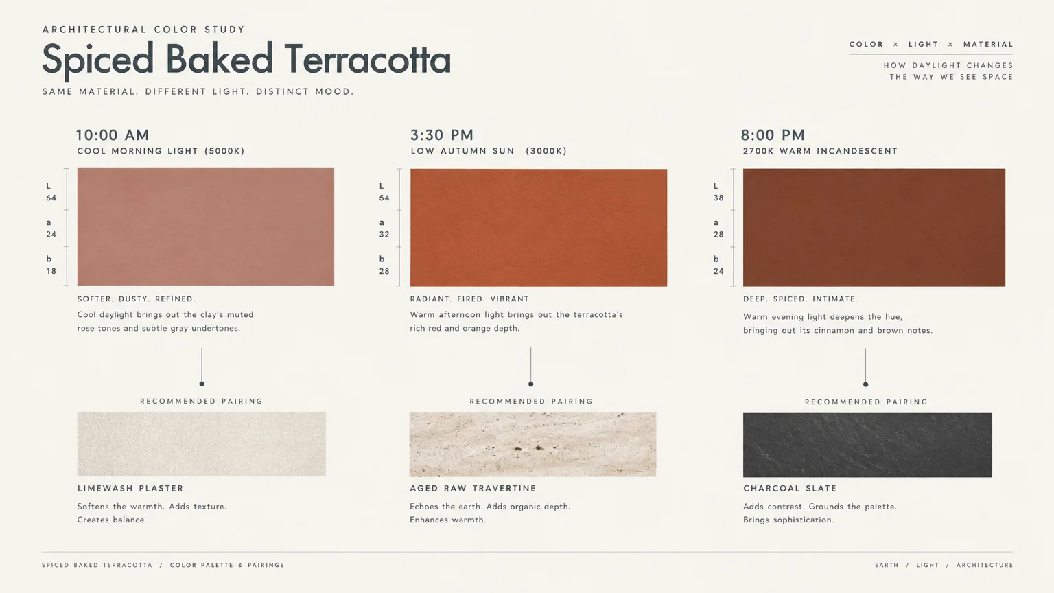
Trend #5: Spiced Baked Terracotta
Terracotta remains a foundational favorite for interior designers who champion biophilic materials and artisanal provenance. This clay-inspired hue introduces tactile, sun-baked warmth that echoes the fading foliage outside your windows.
The color bridges rust, peach, and burnt orange to create a deeply soothing residential backdrop. In autumn light, terracotta softens harsh room perimeters and creates an instantly welcoming atmosphere.
It pairs effortlessly with European oak flooring, zellige tile, and vintage hand-knotted wool rugs. Designers often specify lime-wash or Roman clay finishes in terracotta to heighten its natural, old-world plaster texture.
This shade works wonders in kitchens, dining alcoves, and casual dens that host frequent family gatherings. The warm undertones stimulate appetite and conversation, reinforcing a spirit of authentic connection and comfort.
At an LRV hovering around 35 to 45, baked terracotta balances depth with pleasant ambient reflection. It avoids feeling overly heavy while banishing the sterile coolness common in contemporary white drywall.
Terracotta represents an enduring anchor within any cohesive autumn color palette home. It demonstrates that cozy interior paint colors can provide immense warmth without skewing dark or moody.
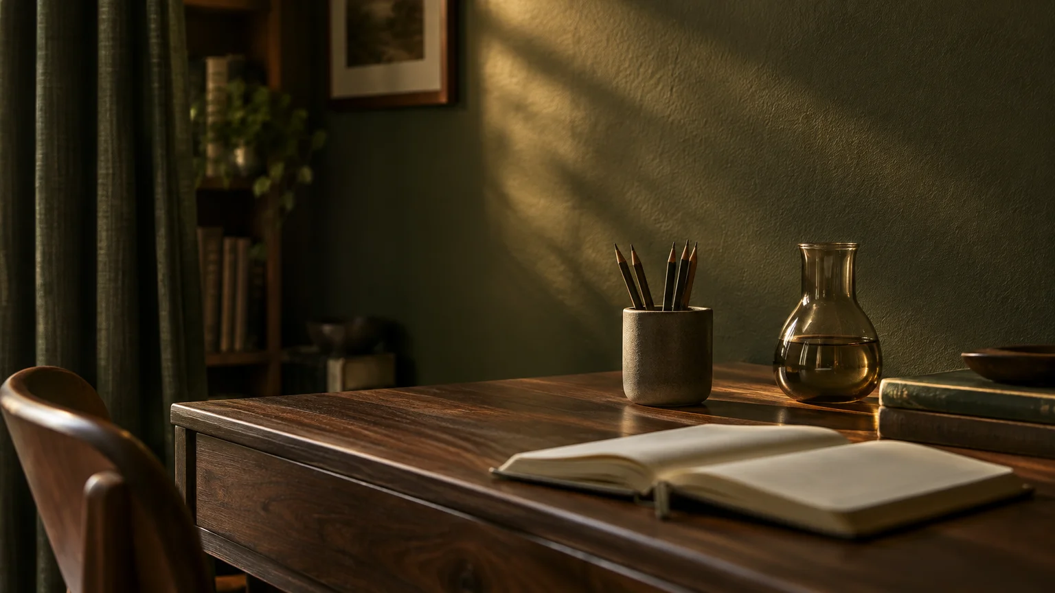
Trend #6: Velvety Forest Olive
Autumn is not solely about reds and oranges; deep vegetative greens provide a breathtaking seasonal counterweight. Forest olive evokes late-harvest landscapes, infusing interiors with biophilic calm, organic luxury, and enduring stability.
When the golden afternoon sun washes over olive walls, the yellow-green undertones reveal surprising radiance. The color feels grounded and serene, bridging your indoor sanctuaries with the natural woodland environment outside.
Olive walls create stunning contrast against warm wood furniture, cognac leather seating, and brass task lamps. This shade complements historic moldings just as naturally as it flatters minimalist, clean-lined modern cabinetry.
In home offices and personal libraries, olive encourages sustained mental focus and emotional grounding. Scientific studies in biophilic design demonstrate that nature-derived greens alleviate mental fatigue and reduce physical stress.
With an LRV between 18 and 25, velvety olive leans toward the moodier side of the spectrum. Consider painting your baseboards and crown molding in the same color to create a unified architectural statement.
A gallon of quality paint covering 400 square feet makes transforming a bedroom into an olive retreat surprisingly affordable. For less than $200 in materials, you can create a quiet, luxurious personal retreat.
Trend #7: Creamy Caramel Greige
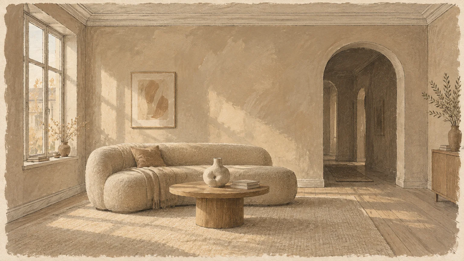
If saturated jewel tones feel too intimidating, creamy caramel greige offers a softer, universally adaptable alternative. This shade blends pale gray and warm beige with a generous drop of golden honey.
Standard cool grays often turn icy and bleak when autumn cuts seasonal daylight hours short. Caramel greige solves this dilemma by infusing walls with buttery warmth that embraces shifting afternoon sunbeams.
With an LRV between 55 and 62, this versatile neutral maximizes ambient bounce in dimly lit spaces. It keeps open-concept living rooms bright and expansive while still projecting a distinctly autumnal sense of comfort.
The color provides an exquisite neutral foundation for seasonal styling updates like wool throws and ceramic vases. You can easily swap decorative pillows from pumpkin rust to winter evergreen without repainting your walls.
Pair caramel greige with travertine stone coffee tables, unbleached linen sofas, and light white oak cabinetry. This combination captures the quiet luxury aesthetic that dominates contemporary architectural publications today.
It stands as one of the most reliable warm paint colors for 2026 renovations. You can paint multiple connecting rooms in this hue to establish continuous harmony throughout your home.
Trend #8: Smoked Bronze and Espresso
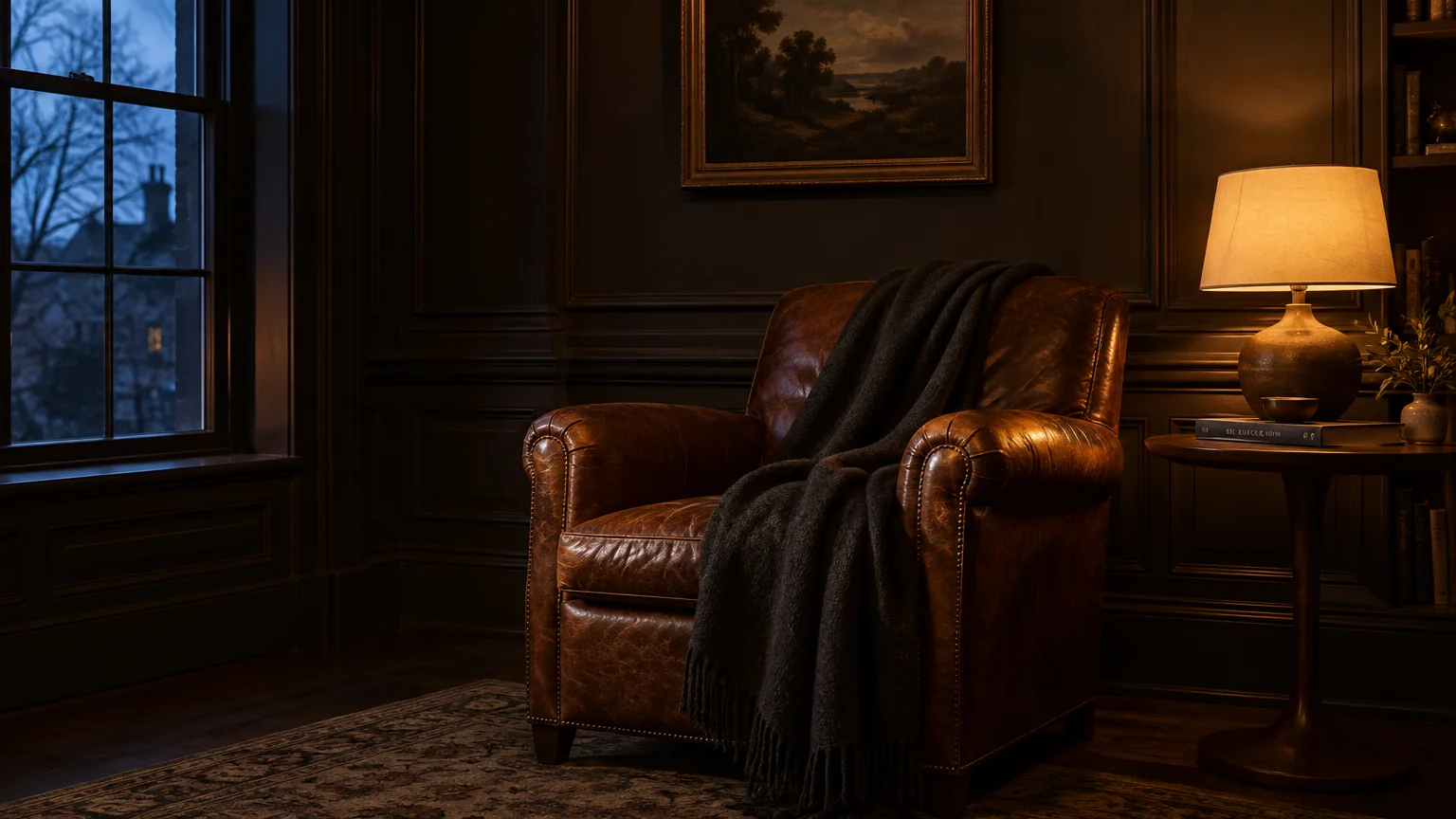
For dramatic architectural impact, deep brown pigments offer a softer, more inviting alternative to pure black. Smoked bronze and dark espresso hues deliver sophisticated gravitas that feels undeniably right for brisk autumn nights.
These deep tones absorb excessive glare during bright midday hours and recede into velvety softness after dusk. Under incandescent lighting, subtle red and gold undertones emerge to produce an extraordinarily rich ambiance.
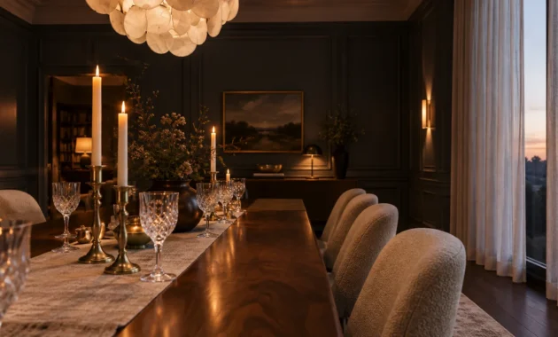
With an LRV below 12, this palette relies on deliberate shadow play and focused accent illumination. It works magnificently in compact powder rooms, formal dining salons, or dedicated media viewing rooms.
Contrast these dark walls against crisp off-white crown molding, polished marble mantels, and gleaming metallic sconces. The stark juxtaposition creates an editorial, high-end look reminiscent of historic boutique hotels.
Professional painters recommend using ultra-matte or chalk finishes when applying deep espresso pigments. Matte surfaces prevent annoying light reflections from distorting the smooth, seamless continuity of the saturated wall surface.
While hiring a painter costs $500 to $1,200 per room, DIYers can achieve immaculate results with patience. Using high-density foam rollers prevents lap marks, yielding a flawless, museum-grade finish across dark feature walls.
The Big Picture: Weaving These Trends into Your Home
Refreshing your home for autumn does not require an exhaustive whole-house renovation. You can introduce these evocative hues selectively to enhance architectural focal points and create harmonious spatial transitions.
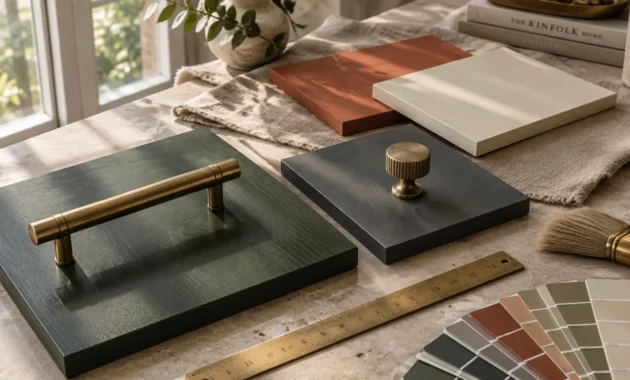
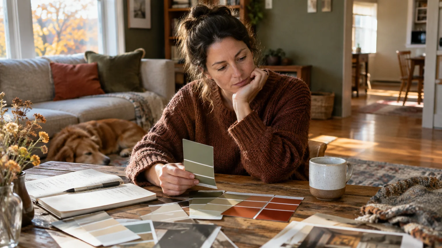
Always test physical paint samples on multiple walls before committing to a full room transformation. Autumn daylight shifts dramatically from crisp 5,000K morning rays to warm 3,000K afternoon beams, fundamentally altering undertones.
Paint large two-foot swatches and observe them at breakfast, midafternoon, and under your nighttime artificial lamps. This testing ritual prevents costly surprises and guarantees your chosen color performs beautifully around the clock.
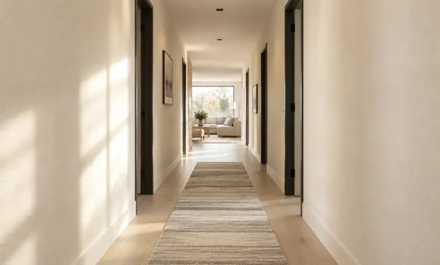
Connect adjacent rooms by using a shared underlying warmth across varied saturation levels. For instance, pairing caramel greige hallways with an espresso dining room establishes cohesive visual flow without repetitive monotony.
Layer tactile materials—such as bouclé, ribbed velvet, and aged brass—to reinforce the emotional warmth of your walls. These rich textures interact dynamically with the paint sheen, completing your seasonal interior transformation.
Paint offers the most cost-effective and emotionally impactful design tool in residential remodeling. By honoring seasonal daylight shifts, you cultivate an environment that feels welcoming, refined, and effortlessly timeless.
Frequently Asked Questions
Why do cool gray paint colors look muddy or cold during autumn?
The sun sits lower in the sky during autumn, filtering light through thicker atmospheric layers. This shift reduces cool blue wavelengths and enhances warm amber light between 3,000K and 4,000K.
Cool grays lack the warm yellow or red undertones needed to harmonize with this seasonal light. As a result, cool pigments absorb the warm illumination awkwardly, making walls appear dingy and uninviting.
What artificial light bulbs best complement warm fall paint colors?
Select warm-white LED bulbs rated between 2,700K and 3,000K to maintain natural warmth after sundown. Cool bulbs above 4,000K will clash with rich autumn pigments, washing out their subtle undertones.
Always look for bulbs with a Color Rendering Index (CRI) of 90 or higher. High-CRI illumination reveals the true depth of saturated paints, keeping your colors vibrant and true at night.
How do I choose between color-drenching and an accent wall?
Color-drenching—painting walls, trim, and ceilings in one hue—creates an immersive, cozy envelope that modernizes compact rooms. It works best with shades carrying an LRV under 25, such as ruby red or espresso.
If you have soaring ceilings or open-concept architecture, an accent wall offers a safer, balanced focal point. Accent walls allow you to introduce deep seasonal drama without overwhelming expansive daytime illumination.
Will these autumn wall colors still feel appropriate during spring and summer?
Grounded autumn hues maintain exceptional longevity when balanced with adaptable, season-neutral furnishings. Pairing warm walls with light linen textiles, fresh botanical arrangements, and woven rattan keeps rooms airy in warmer months.
Shades like Universal Khaki and caramel greige act as perpetual neutrals that transition effortlessly across all seasons. Their timeless organic character ensures your home remains stylish and relevant long after autumn concludes.
For the latest color forecasts, consult industry leaders like Pantone and paint companies like Benjamin Moore. For professional design standards, refer to the American Society of Interior Designers (ASID).
Disclaimer: This article reflects design trend analysis and predictions. Personal taste and timeless design principles should always guide your decorating choices.