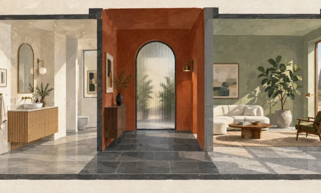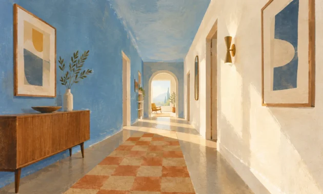
Strategic color combinations alter how your eyes register spatial boundaries and ambient light. You can visually expand compact square footage simply by pairing the right complementary hues across adjacent surfaces.
Harsh visual divides abruptly halt the eye, whereas deliberate chromatic dialogues blur architectural corners and trim. These intentional palettes make even modest rooms feel wonderfully expansive, airy, and full of natural radiance.
Discover how curated paint colors make room bigger and transform tight spaces into open sanctuaries. Leading interior designers rely on these eight color pairing ideas to unlock immediate architectural scale.
Trend #1: Alabaster White and Soft Greige
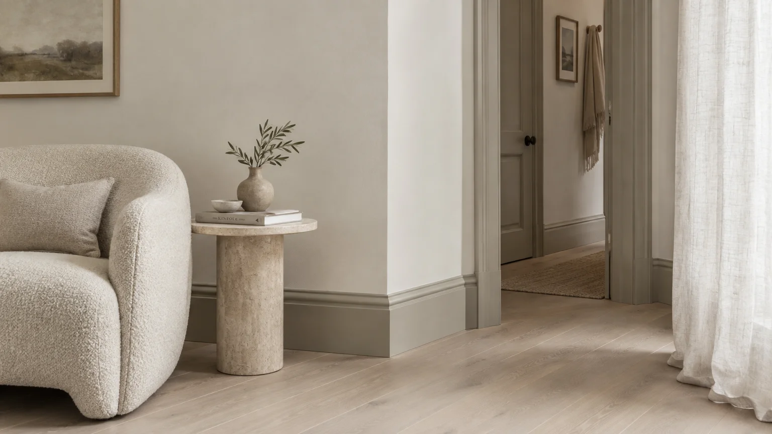
Alabaster white paired with soft greige creates a luminous, low-contrast atmosphere that expands visual volume. This pairing relies on high Light Reflectance Values (LRV) to amplify natural daylight across interior planes.
Greige injects subtle organic warmth, preventing living spaces from adopting the sterile chill of stark white pigments. It gently anchors baseboards and doors without severing the eye’s journey across the room.
Paint broad walls in warm alabaster while applying soft greige to millwork, crown moldings, and window frames. This eliminates jarring perimeter outlines that normally chop small rooms into fragmented visual zones.
The trend is anchored in the quiet luxury movement, celebrating understated provenance and enduring architectural quality. Homeowners love how this tonal fluidity makes compact living rooms and entryways feel grounded yet boundless.
Pair this palette with bleached white oak flooring and raw linen drapes to enrich physical texture. Bouclé accent chairs and honed limestone coffee tables complete the serene, expansive composition.
Use a velvety matte finish on walls and an eggshell sheen on greige woodwork. The subtle variance in light diffusion gently elevates ceiling height without introducing visual clutter.
For north-facing spaces with limited daylight, select an alabaster with delicate yellow undertones. This prevents gray pigments from looking shadowy or dingy during overcast winter afternoons.
This refined pairing proves that neutral palettes need not feel flat or uninspired. Instead, subtle chromatic shifts generate an effortless sense of expansive breathing room.
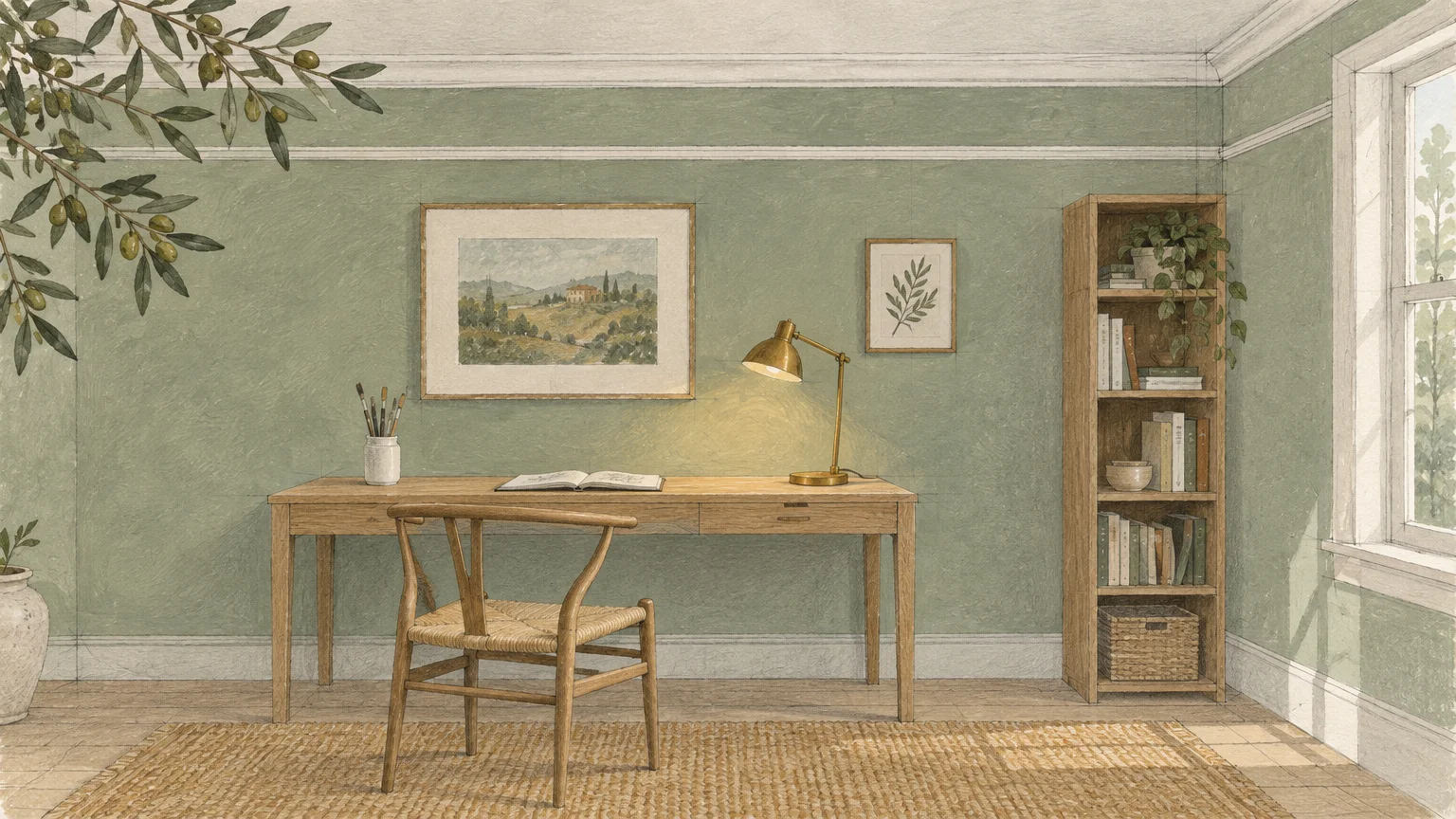
Trend #2: Celadon Sage and Muted Chalk White
Celadon sage and muted chalk white introduce restorative biophilic harmony into compact domestic spaces. Soft green undertones possess shorter visual wavelengths, causing perimeter walls to gently recede from the eye.
Pairing this botanical green with chalk white architectural trim evokes the tranquility of expansive outdoor gardens. Your gaze travels outward toward natural light rather than stopping at physical walls.
These small room paint colors are increasingly favored by homeowners seeking restorative wellness at home. The chromatic softness dissolves tension and breathes life into stuffy, sun-deprived quarters.
Coat primary walls in pale celadon and finish ceilings in airy chalk white. This color combination draws the gaze upward, giving the immediate impression of elevated ceiling heights.
Layer organic materials like woven jute rugs, unlacquered brass hardware, and white ceramic pottery alongside this palette. These earthy textures bridge interior boundaries with the exterior garden landscape.
Select flat or dead-flat paint finishes for sage walls to minimize light bounce and glare. Chalk white trim in a satin sheen reflects ambient window light back into shadowy corners.
This pairing performs exceptionally well in compact home offices, primary bathrooms, and guest suites. The verdant backdrop creates an optical illusion of limitless organic expanse.
By blurring the distinction between indoors and the natural world, celadon sage psychologically expands your living envelope. It transforms small enclosures into peaceful, airy retreats.
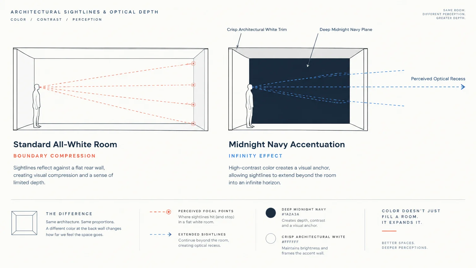
Trend #3: Deep Midnight Navy and Crisp Architectural White
Pairing deep midnight navy with crisp architectural white exploits dramatic contrast to establish perceived depth. Saturated walls create a limitless backdrop that makes architectural boundaries seem to vanish into thin air.
While conventional wisdom suggests dark hues shrink rooms, deep navy actually absorbs shadow lines. Corners disappear into rich saturation, tricking the human brain into perceiving infinite space.
Crisp white woodwork and ceilings frame the moody backdrop with sharp geometric precision. This deliberate architectural contrast pulls your gaze forward, accentuating spatial depth and room length.
Apply midnight navy to a focal wall or library alcove while enveloping surrounding walls in white. This directional shift draws viewers into deep visual corridors that exaggerate square footage.
Integrate rich walnut case goods, polished chrome sconces, and smoked glass elements to balance the dark surfaces. The reflective glass and metal accents scatter light points throughout the moody field.
This high-contrast strategy works brilliantly in powder rooms, compact media lounges, and dining nooks. It turns structural limitations into deliberate, immersive design statements.
Always illuminate navy surfaces with warm 2700K lighting to preserve velvet undertones. Harsh daylight bulbs will flatten the navy pigment and dilute its spatial depth.
The dynamic interplay between darkness and crisp white creates architectural theater. It proves that small rooms can embrace bold intensity while remaining visually expansive.
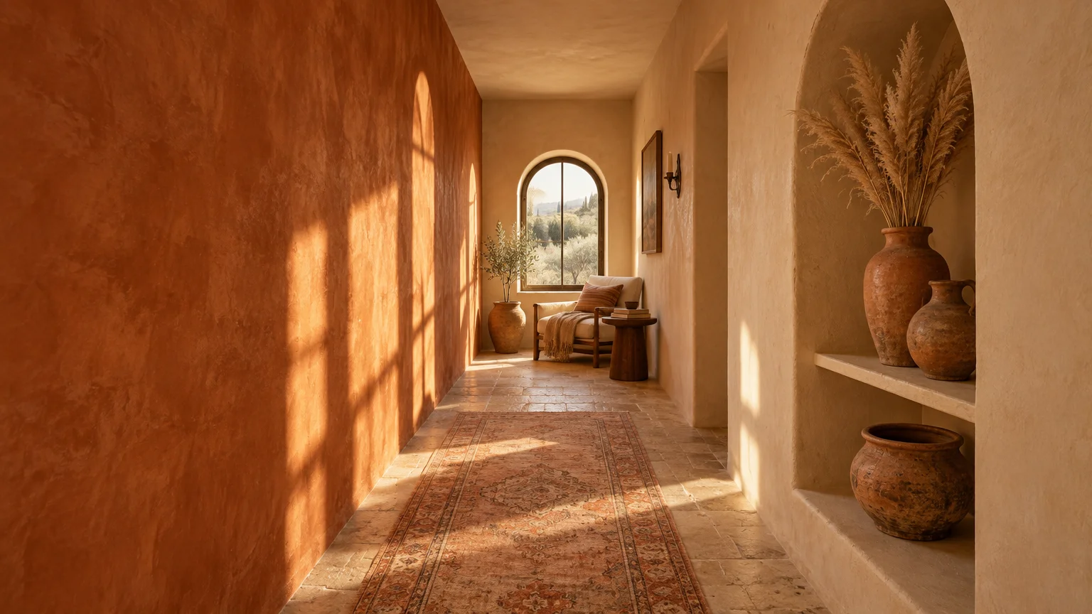
Trend #4: Warm Terracotta and Pale Sand
Warm terracotta and pale sand form an earthy, sun-drenched palette that radiates spatial warmth. This pairing draws inspiration from Mediterranean masonry and desert landscapes, producing inviting visual continuity.
These color combinations for small rooms prevent intimate dimensions from feeling confining or clinical. Instead, rich clay tones impart grounded comfort while luminous sand balances upper sightlines.
Paint the lower two-thirds of your walls or wainscoting in rich terracotta. Coat the upper wall section and ceiling in pale sand to open vertical dimensions upward.
This two-tone horizon line anchors bulky furniture pieces while directing the eye toward open ceiling space. As a result, small dining areas and galley kitchens feel taller and airier.
Complement this palette with travertine side tables, woven cane seating, and matte black iron accents. The contrast between warm earth tones and dark iron outlines clarifies spatial hierarchy.
Modern homeowners gravitate toward this scheme because it balances modern minimalism with artisanal craft. It delivers immediate character to boxy builder-grade rooms devoid of original moldings.
Choose mineral-based limewash paints to apply these hues for subtle textural movement. The varied mineral sheen reflects natural light dynamically across small surface areas.
The warm clay undertones envelop you without encroaching on your physical space. It offers a cozy, grounded sophistication that turns modest square footage into an asset.
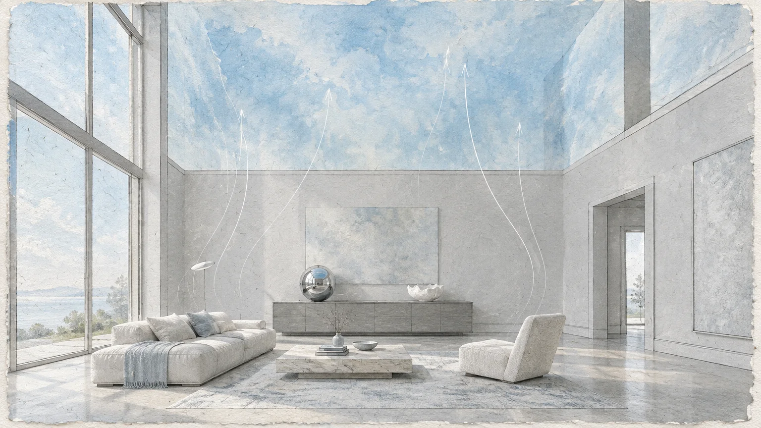
Trend #5: Ethereal Sky Blue and Cool Pearl Gray
Ethereal sky blue paired with cool pearl gray offers a classical optical trick for compact living spaces. Blue pigments naturally recede visually, making vertical planes and ceilings appear significantly further away.
Pearl gray provides a calm, refined foundation that diffuses natural light across wide wall spans. Together, these cool tones establish an open, cloud-like atmosphere that defies cramped floor plans.
Professional interior design color tips often highlight blue ceilings as an architectural game-changer. Painting your ceiling pale sky blue draws attention upward, instantly heightening the room.
Apply soft pearl gray across all four walls to maintain consistent, tranquil perimeter reflections. The cool neutral field softens harsh glare in south-facing rooms while bouncing daylight evenly.
Introduce polished nickel fixtures, white Carrara marble surfaces, and sheer voile curtains into the room. These cool-toned materials amplify the ethereal, airborne ambiance generated by the paint scheme.
Designers utilize this duo in compact condominiums, narrow master bedrooms, and windowless vestibules. The palette simulates exterior horizons, providing psychological relief in dense urban environments.
Keep window treatments tonal with the pearl gray walls to avoid breaking visual sightlines. Continuous wall colors make modest window openings appear wider and more expansive.
This heavenly pairing creates visual buoyancy in spaces burdened by low overhead clearance. It replaces structural enclosure with the peaceful serenity of endless open sky.
Trend #6: Tonal Taupe and Warm Putty
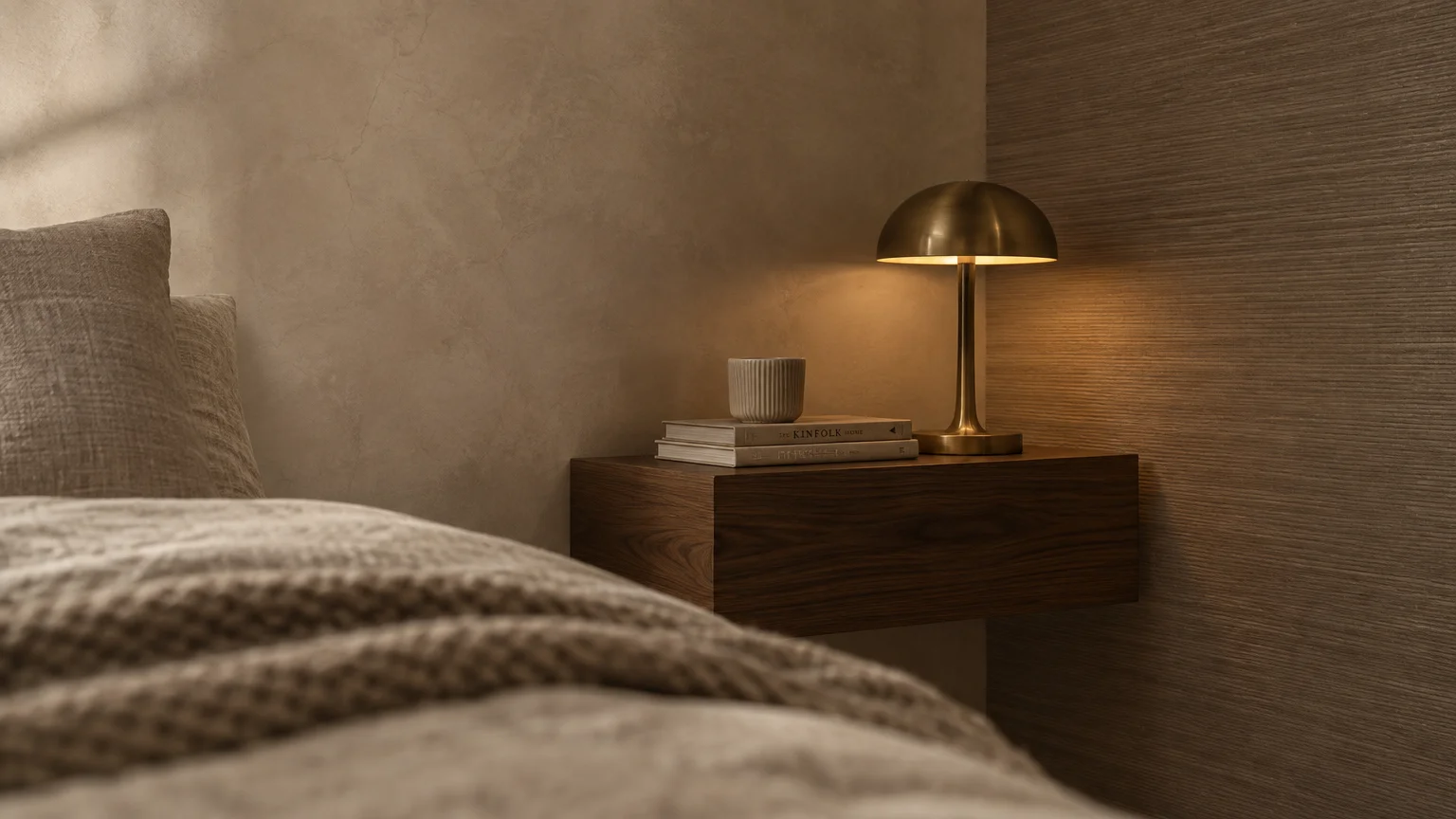
Tonal taupe and warm putty demonstrate the transformative power of monochromatic color drenching. By using closely related earthy neutrals, you eliminate harsh architectural cutoffs between walls, trim, and doors.
When trim and wall colors blend seamlessly, the eye glides across the perimeter without interruption. This visual continuity makes modest footprints feel substantially larger and more cohesive.
Paint baseboards, walls, interior doors, and crown moldings in monochromatic putty variations. This seamless envelope obscures awkward soffits, pipe chases, or irregular architectural corners.
The rising popularity of quiet luxury interior aesthetics fuels widespread interest in tonal taupe palettes. It delivers understated elegance while turning compact rooms into sophisticated sanctuaries.
Layer chunky wool area rugs, fluted oak consoles, and unglazed ceramic table lamps across the room. Tactile variations provide essential visual interest without relying on jarring color breaks.
Use a washable matte finish on broad wall spans and a soft eggshell on architectural millwork. This slight sheen shift provides subtle definition without severing spatial flow.
This palette works wonders in multi-functional studio apartments where visual cohesion is vital. It creates a tranquil backdrop that accommodates living, dining, and sleeping zones seamlessly.
By smoothing out architectural clutter, tonal taupe lets your curated furnishings shine. Your room gains a serene, tailored spaciousness that feels custom-built and expansive.
Trend #7: Dusky Lavender and Warm Cream
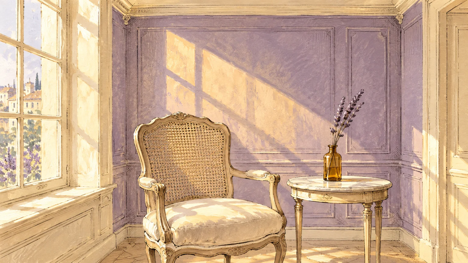
Dusky lavender and warm cream provide an unconventional yet remarkably effective pairing for small rooms. Muted purple undertones reflect light at higher frequencies, lending subtle spectral depth to enclosed spaces.
The dusky, grayed quality of lavender keeps it from reading juvenile or overly vibrant. When anchored by rich cream, it yields an expansive, sophisticated ambiance that feels poetic.
Coat walls in dusty lavender while bathing window trims, ceiling beams, and mantels in warm cream. The cream frames soften shadowy wall junctions, infusing the space with mellow sunlight.
As daylight transitions from morning radiance to dusk, lavender subtly alters its perceived depth. This dynamic color shift prevents compact guest bedrooms and parlors from feeling static or boxed-in.
Pair this gentle color scheme with warm brass lighting, washed silk bedding, and patinated bronze hardware. These reflective metallic elements catch shifting light and echo the warmth of cream accents.
Avoid pairing lavender with cool blue-white paints, which can make the room appear sterile and chilly. Warm cream maintains a welcoming temperature that expands spatial comfort.
This pairing is an ideal solution for north-facing boudoirs craving architectural interest. It injects personality and visual space without overwhelming modest square footage.
The unexpected sophistication of dusky lavender makes corners float outward gently. It balances artistic romance with practical spatial enlargement in the most charming manner.
Trend #8: Olive Drab and Warm Ochre Trim
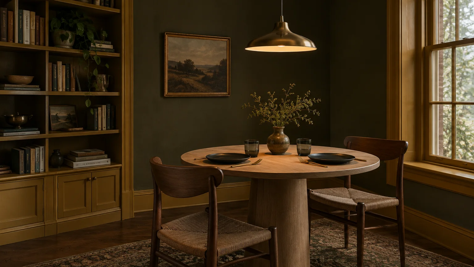
Olive drab paired with warm ochre trim challenges conventional small-space decorating conventions with stunning success. Earthy olive recedes into deep shadow, making exterior walls feel distant and mysterious.
Warm ochre trim outlines doors and windows, creating vibrant architectural frames that catch incoming light. This deliberate contrast tricks human depth perception, lending grand character to cozy footprints.
The resurgence of heritage English interiors and moody historic palettes drives this pairing’s popularity. Homeowners are embracing intimate spaces as jewel-box environments rather than forcing artificial lightness.
Paint walls and shelving in enveloping olive while accenting door casings and baseboards in rich ochre. The bright ochre trim draws the eye around the perimeter, exaggerating vertical height.
Furnish the room with aged cognac leather club chairs, antique brass picture lights, and dark parquetry flooring. These storied materials enhance the sense of permanence and refined luxury.
Small home libraries, walk-in bars, and private dens flourish under this rich chromatic dialogue. The strategic depth makes boundaries dissolve into rich, atmospheric shadow.
Incorporating focused picture lighting and low-level task lamps illuminates ochre details with warmth. Directed illumination produces dramatic shadow play, expanding perceived visual dimensions across the room.
Rather than fighting small square footage, this bold pairing celebrates architectural intimacy. It proves that saturated, thoughtful colors can make modest rooms feel exceptionally expansive and dignified.
The Big Picture: Weaving These Trends into Your Home
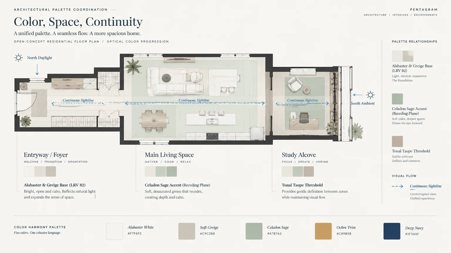
Successfully using paint colors to expand room dimensions requires evaluating your home’s holistic architectural context. Rather than treating each room as an isolated capsule, establish chromatic continuity across adjacent hallways.
Maintaining consistent undertones between rooms prevents jarring visual shocks when moving through your home. A fluid color transition extends lines of sight from one threshold into the next.
Always evaluate how natural daylight moves across your space from sunrise through sunset. Morning eastern light enhances cool hues, while late afternoon western rays flatter warm earthy pigments.
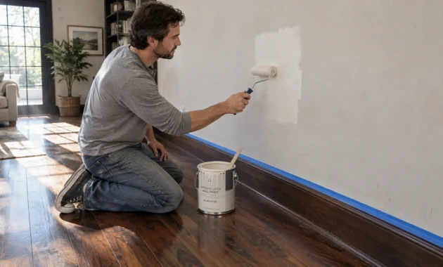
Testing paint swatches directly onto multiple walls is an indispensable phase of spatial planning. Observe how sample patches appear under existing artificial lighting before making a definitive purchase.
For the latest color forecasts, consult industry leaders like Pantone and paint companies like Benjamin Moore. For professional design standards, refer to the American Society of Interior Designers (ASID).
Align wall paint colors with flooring materials, cabinet finishes, and substantial upholstered furniture. Cohesive material selections ensure that your chosen color pairings elevate your home with enduring grace.
Introduce mirrors and strategic sconce lighting opposite painted accent surfaces to amplify reflective depth. Bouncing light across tonal walls visually pushes boundaries further away than they actually stand.
Remember that true spatial luxury stems from intentional harmony rather than strict square footage. Mindful color pairings empower you to unlock every ounce of visual potential within your home.
Disclaimer: This article reflects design trend analysis and predictions. Personal taste and timeless design principles should always guide your decorating choices.
Frequently Asked Questions
Does painting a small room with dark colors always make it feel smaller?
Dark colors do not automatically shrink a room when applied with proper lighting and complementary trim. Saturated tones blur corner shadows, creating an illusion of infinite depth that can actually enlarge perceived space.
Pair dark walls with lighter trim or intentional accent lighting to prevent the room from feeling closed in. The resulting contrast draws the gaze outward, accentuating depth rather than confinement.
What paint sheen works best to make compact rooms look larger?
Matte and eggshell sheens work best on walls because they diffuse ambient light smoothly without harsh glare. Highly glossy walls can reflect clutter, highlighting imperfections and visually constricting the room.
Use satin or semi-gloss finishes exclusively on trim and architectural moldings to reflect light outward. This subtle contrast between wall and woodwork textures introduces depth without visual chaos.
How does color drenching help a small room feel bigger?
Color drenching involves painting walls, trim, doors, and ceilings in identical or closely related tonal shades. This method removes hard contrast lines that visually partition the room into small segments.
By disguising boundaries where walls meet ceilings, your brain perceives continuous vertical and horizontal planes. Consequently, compact rooms feel unified, expansive, and delightfully tranquil.
Can cool paint colors visually expand north-facing rooms?
Cool hues naturally recede from the eye, but north-facing rooms receive cool, grayish natural light. Applying cool pigments without warm undertones can make small north-facing spaces feel dark and chilly.
Balance cool tones by selecting shades infused with subtle warm undertones, such as greige or celadon. Pairing them with creamy trim maintains warmth while preserving spatial expansion benefits.