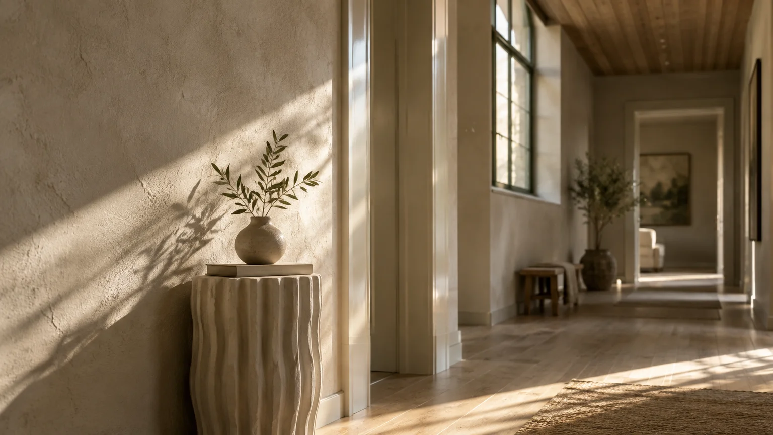
The right paint sheen alters how light dances across your walls, completely transforming a room’s architectural presence. Selecting finishes intentionally turns ordinary wall color into an immersive, bespoke spatial experience.
Master designers do not merely select hues from a swatch deck; they engineer light through calibrated surface textures. Subtle shifts in gloss levels can hide drywall flaws, heighten drama, or protect delicate surfaces against daily life.
This definitive paint sheen guide uncovers the precise formulas top interior architects specify across seven unique living spaces. Discover how to elevate your home through the transformative science of sheen selection.
Trend #1: Chalky Ultramatte for the Living Room Sanctuary
The Philosophy of Velvet Light Diffusion
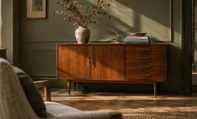
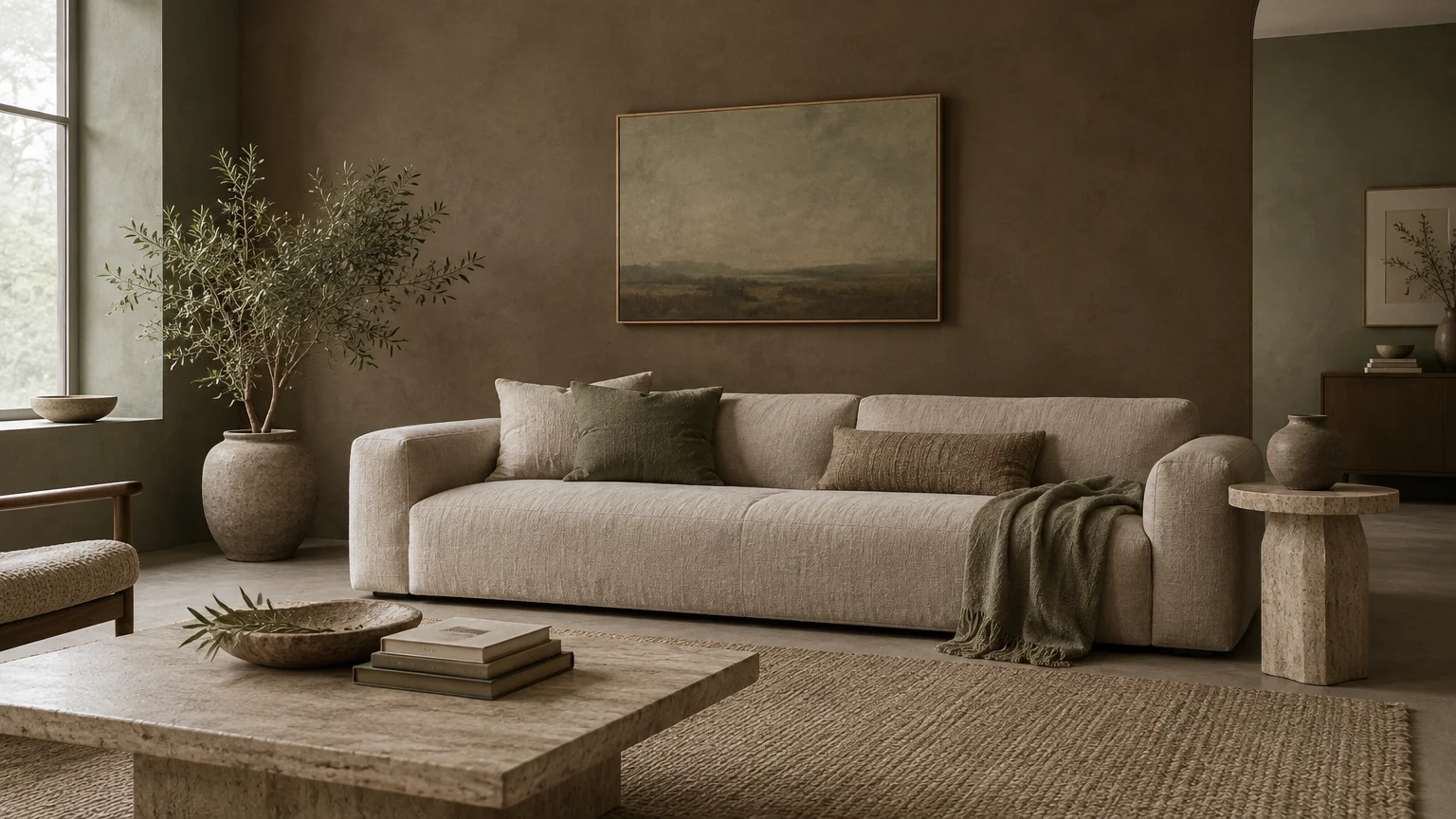
Living rooms serve as grounding gathering spaces where visual calm remains paramount. Modern interior architects now favor ultramatte finishes to cultivate an aura of quiet luxury across expansive living room walls.
Unlike reflective surfaces that bounce harsh light, a flat sheen absorbs glare and conceals substrate imperfections effortlessly. This textural softness creates an enveloping atmosphere that feels grounded, serene, and sophisticated.
Ultramatte walls mimic the understated grandeur of raw stone or aged European mineral plaster. The finish lends timeless provenance to both historic townhomes and contemporary open-concept residences.
Formulation and Pigment Dynamics
Ultramatte formulations feature a high ratio of raw pigment bound by minimal resin. Because incoming light scatters in all directions across micro-textured particles, the paint displays pure color saturation throughout the day.
When choosing paint sheen by room, flat finishes yield an earthy richness reminiscent of lime plaster. They soften bold drywall angles and highlight sculptural furnishings without creating distracting reflections.
Advanced acrylic formulas provide washability without compromising the chalky, zero-gloss aesthetic. You no longer need to sacrifice practical maintenance for artisanal depth.
Curating the Color Palette
Pair flat living room walls with chalky mineral tones, such as raw umber, warm linen, and muted sage. These nuanced shades absorb natural shadows and celebrate an organic modernism aesthetic.
Reserve this finish for lower-contact walls away from heavy foot traffic. While modern formulations resist burnishing, gentle spot cleaning with a damp microfiber cloth preserves the powdery texture best.
Trend #2: Velvety Eggshell for High-Traffic Entryways and Foyers
Balancing Luminance and Functional Durability
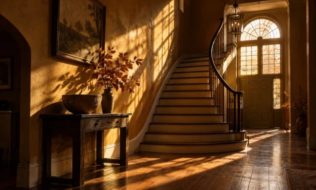
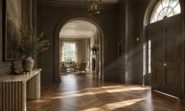
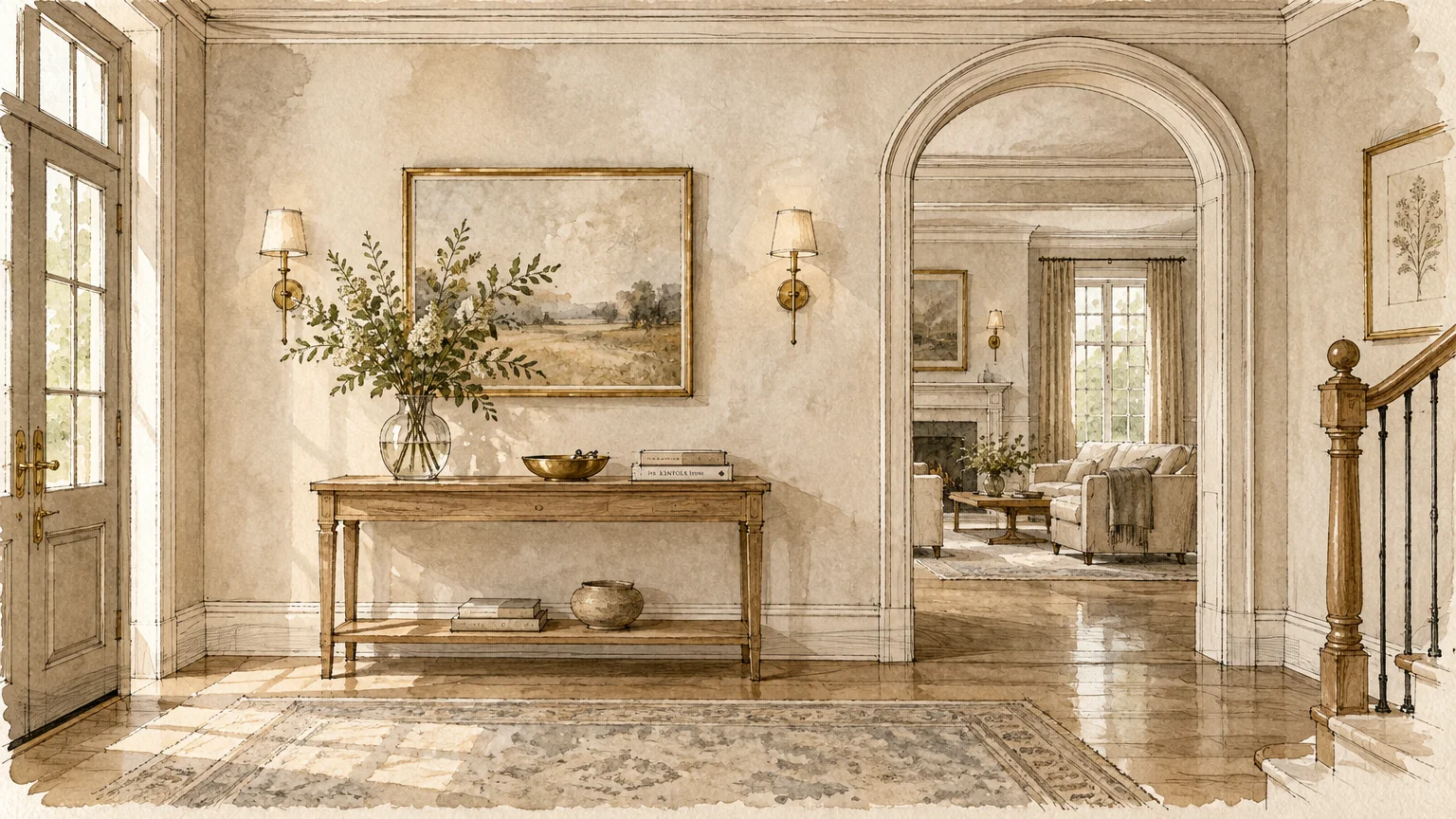
Foyers and hallways demand surfaces that withstand relentless traffic while presenting an inviting first impression. Designers consistently name eggshell as the best paint finish for each room that experiences continuous movement.
Eggshell features a delicate luster that mimics the gentle, organic texture of an egg’s shell. It reflects roughly ten to twenty percent of incident light, lending depth without glaring reflections.
The finish casts a welcoming glow as guests step across your threshold. It sets an elevated, hospitable tone for the entire residence.
The Science of Modern Acrylic Binders
The balanced binder-to-pigment ratio in eggshell paint creates an impervious film over primed drywall. This durable surface repels accidental scuffs from coats, bags, and daily transit with remarkable ease.
You can wipe away surface dirt using mild soap and water without stripping away color saturation. It bridges the divide between delicate visual beauty and daily household resilience.
This molecular density prevents airborne dust and hand oils from penetrating porous drywall. The result is an entryway that retains its newly painted freshness for years.
Architectural Impact in Transitional Spaces
In narrow corridors, eggshell gently distributes ambient light down windowless hallways. This subtle luminescence prevents transitional spaces from feeling dark, narrow, or institutional.
Consider pairing warm alabaster eggshell walls with contrasting satin door frames and baseboards. This measured contrast introduces quiet architectural distinction to your home’s primary corridors.
The soft glow highlights wall sconces and decorative paneling gracefully. It adds dimensional layers to otherwise utilitarian transit zones.
Trend #3: Pearl Satin for the Modern Culinary Kitchen
Engineered Resilience for Culinary Hubs
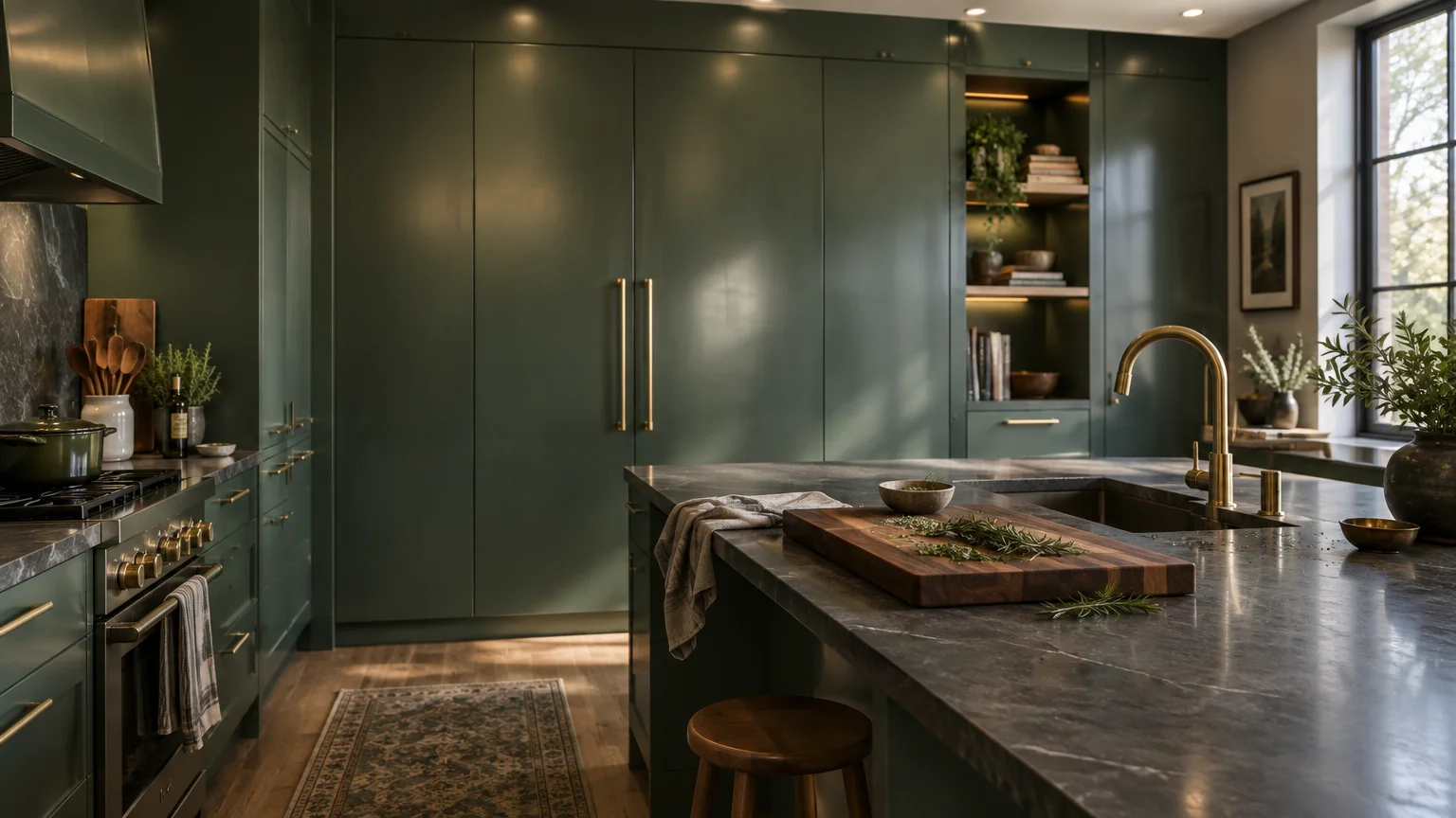
Modern kitchens function as bustling social stages that face intense heat, airborne grease, and elevated humidity. Designers champion pearl satin finishes here to deliver refined sophistication alongside uncompromising physical defense.
When debating matte vs satin vs gloss paint for kitchen walls, satin strikes the ideal aesthetic equilibrium. It avoids clinical glare while providing far superior wipeability compared to flat paints.
Satin reflects twenty-five to thirty-five percent of light, infusing your kitchen with radiant, energetic vitality. It enlivens culinary prep zones during busy morning routines.
Performance Under Heat and Vapor
Satin finishes contain dense cross-linking acrylic resins that prevent cooking steam from infiltrating underlying drywall. The smooth surface resists staining from stubborn food splatters and acidic liquids.
You can scrub satin surfaces repeatedly without polishing the paint film or creating shiny patches. This resilience makes it indispensable behind banquettes, near ranges, and around active prep islands.
The hardened paint surface resists bacterial growth and airborne moisture accumulation. Your kitchen perimeter stays sanitary, fresh, and exceptionally easy to maintain.
Reflecting Natural Stone and Raw Millwork
The pearl-like glow of satin complements tactile kitchen surfaces, such as fluted oak cabinetry and unlacquered brass. It harmonizes effortlessly alongside honed marble and leathered quartzite countertops.
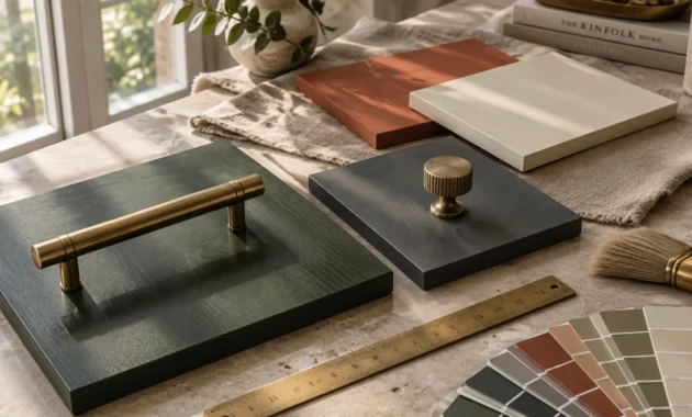
Select organic hues such as rich olive, warm terracotta, or creamy oatmeal for your kitchen perimeter. The delicate sheen highlights the organic provenance of surrounding raw materials.
This balanced sheen unifies varied textures across backsplashes, range hoods, and open shelving. It ensures your culinary space feels curated rather than purely utilitarian.
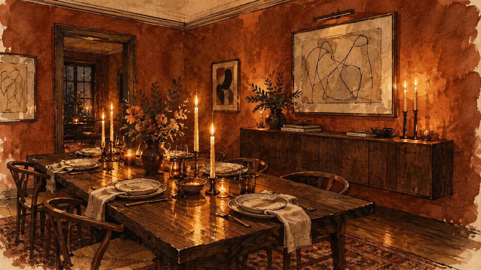
Trend #4: Low-Lustre Enamel for the Curated Dining Room
Intimate Ambiance for Evening Entertaining
Dining rooms come alive under the warm flicker of chandelier light and ambient beeswax tapers. Interior tastemakers specify low-lustre enamels to evoke atmospheric drama and quiet luxury during twilight dinner parties.
Understanding how to pick the right paint finish for formal dining spaces hinges on your evening lighting plan. Low-lustre enamels catch subtle highlights while maintaining velvety visual weight along perimeter walls.
This tailored finish imparts a bespoke, hand-applied aesthetic reminiscent of traditional European oil glazes. It invites lingering conversations long after the meal concludes.
The Modern Art of Color Drenching
Leading designers utilize low-lustre sheens to execute continuous color drenching across walls, wainscoting, and crown molding. Unifying surfaces with identical finishes creates a seamless, cocooning envelope.
The minimal gloss difference between flat ceilings and low-lustre walls produces cohesive spatial harmony. This technique visually expands modest footprints while infusing historical character into contemporary dining spaces.
Enveloping trim, doors, and walls in identical low-lustre paint erases awkward breaks in visual sightlines. The entire dining envelope reads as one sculptural, unified installation.
Curating Moody Pigment Densities
Deep jewel tones like midnight navy, smoked aubergine, and forest spruce thrive under a low-lustre sheen. The finish prevents dark pigments from turning chalky or appearing muddy under low-level illumination.
The durable enamel base also protects dining room walls against accidental scuffs from pulling back dining chairs. You achieve museum-grade aesthetics alongside long-term surface protection.
Pair low-lustre dining walls with warm metallic accents and natural wood finishes. The finish absorbs harsh glare while reflecting a delicate, flattering glow across your guests.
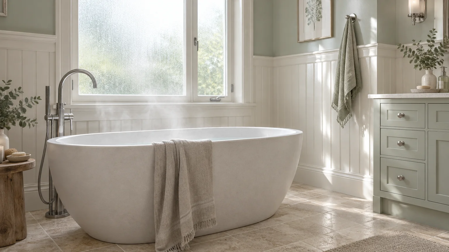
Trend #5: Semi-Gloss Precision for Spa-Inspired Bathrooms
Impermeable Moisture Barriers in Wellness Spaces
Bathrooms present demanding microclimates defined by heavy condensation, fluctuating temperatures, and direct water vapor. Designers select high-performance semi-gloss finishes to establish an impermeable barrier against airborne moisture.
When determining the best paint finish for each room prone to dampness, semi-gloss remains unmatched. Its tight resin network seals surfaces, effectively repelling humidity and inhibiting mildew formation.
Water droplets bead effortlessly on semi-gloss surfaces rather than soaking into plaster or wallboard. This structural resistance keeps walls pristine despite daily hot showers.
Architectural Highlighting on Millwork and Trim
Semi-gloss finishes reflect approximately thirty-five to fifty-five percent of ambient light. This radiant quality makes it exceptional for architectural baseboards, door casings, custom vanities, and coffered ceilings.
Applying semi-gloss to trim work frames softer wall sheens with crisp, tailored precision. The calculated contrast guides the eye through your interior architecture with intentional clarity.
On bathroom cabinetry, semi-gloss provides a smooth, factory-grade finish that resists chipping and water stains. It withstands frequent handling around drawer pulls and vanity handles.
Biophilic Harmony and Reflective Light
In compact powder rooms or spa baths, semi-gloss bounces light off mirrors and polished ceramic tiles. This dynamic luminescence brightens windowless alcoves while fostering an expansive, airy feel.
Pair eucalyptus greens, watery slates, or crisp porcelain whites with polished nickel plumbing fixtures. The glossy reflection evokes natural biophilic water elements, elevating your daily self-care ritual.
The glossy surface cleans completely with non-abrasive bathroom sanitizers. It offers the ultimate marriage of hygienic maintenance and high-design radiance.
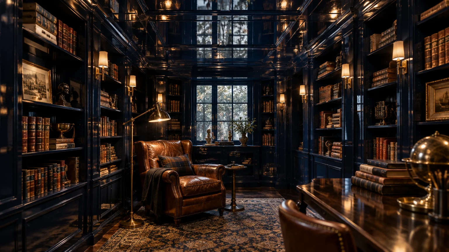
Trend #6: High-Gloss Lacquer for the Jewel-Box Library and Study
Maximalist Drama and Liquid Sheen
Home offices, library nooks, and formal bars are shedding utilitarian austerity for high-voltage opulence. Modern designers achieve this breathtaking transformation using mirror-like high-gloss lacquer paint finishes.
Any comprehensive paint sheen guide must celebrate high-gloss for its transformative architectural power. This wet-look finish reflects up to eighty-five percent of light, multiplying spatial depth dramatically.
A lacquered study envelops you in cinematic glamour, turning compact rooms into unforgettable sensory destinations. The reflective ceiling creates the illusion of boundless vertical height.
Meticulous Substrate Preparation
Achieving a flawless mirror finish requires extraordinary craftsmanship and patience. Master painters sand walls perfectly smooth and apply multiple micro-thin coats, because high gloss magnifies every underlying drywall defect.
Skim-coating walls with finishing compound ensures an unblemished, glass-flat canvas before painting begins. Skimping on preparation risks emphasizing surface ripples and uneven tape seams.
The labor-intensive process rewards you with a luminous, reflective jewel-box space. The resulting surface echoes the heritage finishes of historic European salons and bespoke luxury boutiques.
Styling with Bold, Saturated Hues
High gloss intensifies deep pigments, making rich oxblood, emerald, and dark sapphire hum with internal radiance. Natural daylight bounces across book-lined alcoves, animating rich leather furnishings and vintage brass accents.
If finishing entire walls feels too bold, apply high gloss selectively to ceiling planes or built-in cabinetry. This targeted application delivers opulent focal points without overwhelming your sensory experience.
Lacquered surfaces resist everyday scuffs and scratches better than any other sheen category. The cured urethane or alkyd surface hardens into an almost indestructible decorative shell.
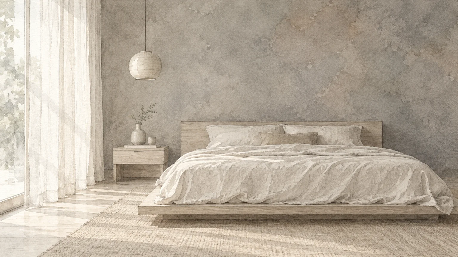
Trend #7: Dead-Flat Mineral Wash for the Restorative Bedroom
Promoting Restorative Sleep and Sensory Stillness
Bedrooms represent personal sanctuaries dedicated to decompression, intimacy, and biological restoration. Forward-thinking designers reject glossy reflections here in favor of velvety, light-absorbing dead-flat mineral sheens.
When choosing paint sheen by room, sensory psychology should guide your private quarters. Dead-flat finishes eliminate distracting glare from streetlights or nightstands, cultivating an environment of total visual peace.
The non-reflective surface creates a quiet visual backdrop that calms an overstimulated mind. It transforms your bedroom into an authentic sleep sanctuary.
The Allure of Natural Microcrystalline Finishes
Mineral paints and dead-flat acrylics contain microscopic crystalline structures that diffuse natural daylight into a soft haze. The resulting appearance mimics the timeless patina of historic European villas.
Because light does not bounce off the surface, walls appear deeper, softer, and more tactile. The finish envelopes the bed in an intimate cocoon that invites restorative slumber.
Mineral-based paints often feature zero volatile organic compounds (VOCs), fostering cleaner indoor air quality while you rest. They breathe naturally, regulating bedroom humidity throughout the changing seasons.
Pairing Matte Walls with Organic Textiles
Dead-flat walls create the perfect backdrop for tactile organic materials. The powdery finish highlights the weave of washed linen bedding, bouclé seating, and natural wool rugs.
Choose enveloping, earthy neutrals such as warm taupe, clay pink, or dusky heather. These serene tones absorb midday brightness and wrap you in effortless visual comfort.
Because bedrooms experience minimal wear and tear, dead-flat surfaces maintain their immaculate beauty for decades. They remain the ultimate manifestation of slow, intentional living.
The Big Picture: Weaving These Trends into Your Home
Constructing a Cohesive Sheen Progression
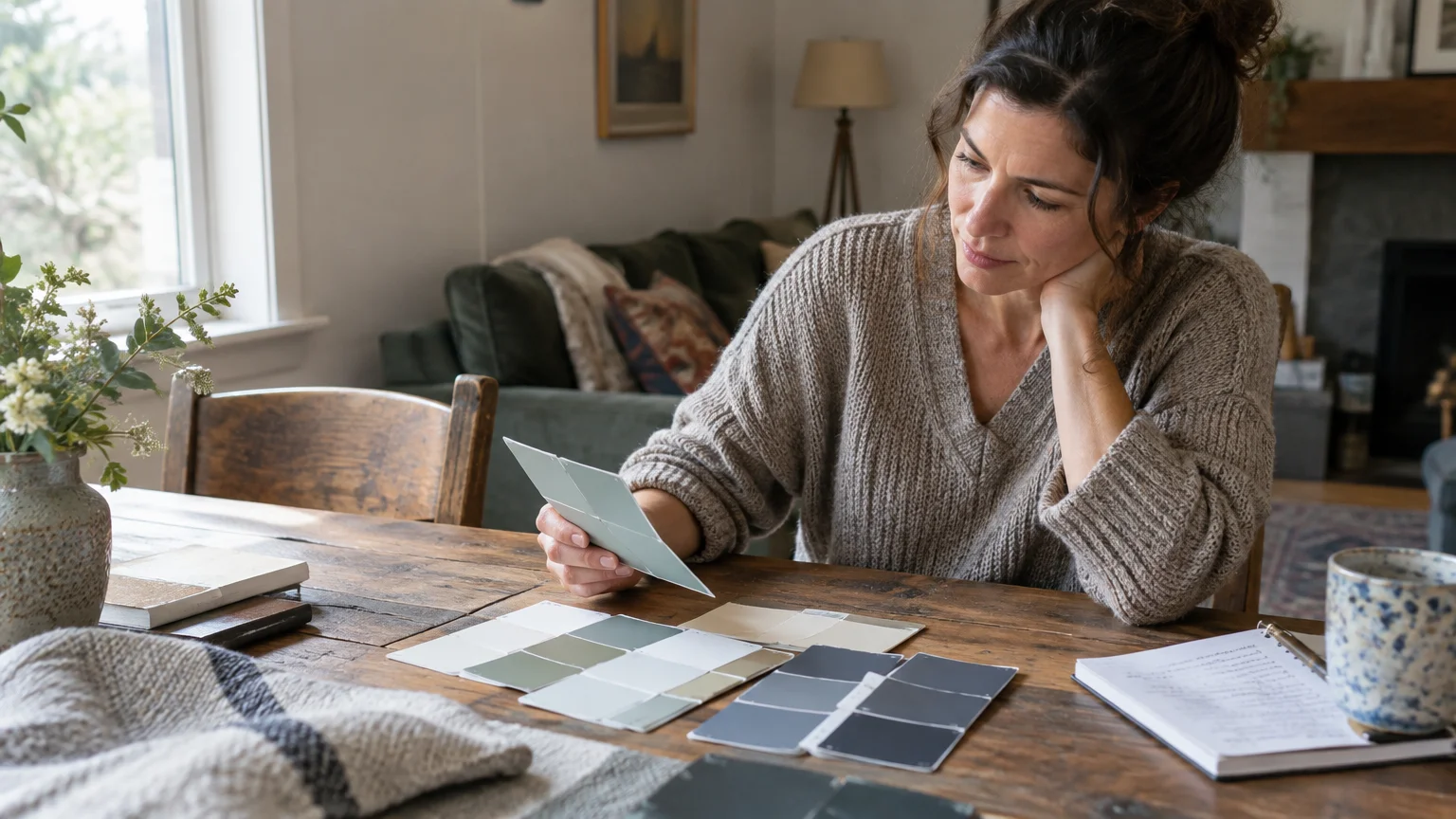
Orchestrating paint finishes requires the same structural discipline as balancing room proportions or floor plans. Rather than selecting sheens in isolation, consider how light transitions from room to room.
Moving from an ultra-matte living room into a satin-clad kitchen should feel intentional and organic. Maintain a coherent design narrative by keeping your trim finish consistent throughout adjoining open-concept spaces.
Gradual shifts in sheen guide the eye smoothly across doorways and corridors. Sudden transitions from high gloss to dead flat can feel jarring without intentional architectural framing.
Understanding Natural Light and Architectural Exposure
Sunlight direction dramatically alters sheen perception throughout the day. North-facing rooms receive cool, diffused light that benefits from the gentle radiance of eggshell or satin finishes.
Conversely, south-facing spaces bathed in intense sunlight can make high-sheen walls look unpleasantly glaring. Specifying matte finishes in sun-drenched rooms softens intense solar wash while preserving color clarity.
East-facing rooms capture golden morning light, while west-facing rooms glow with warm afternoon rays. Always observe sheen samples on multiple walls at different hours before finalizing specifications.
Preserving Timeless Harmony Across Millwork
The traditional design formula—pairing flat ceilings with satin walls and semi-gloss trim—remains beloved for a reason. It establishes logical hierarchy and highlights architectural molding without visual clutter.
Today’s bespoke interiors, however, invite experimentation with low-contrast sheen pairing. Specifying matte walls alongside satin baseboards creates a tailored look that exudes modern, understated refinement.
Paint ceiling surfaces in dead flat to make overhead imperfections and drywall seams virtually disappear. This anchors the room and directs attention toward intentional wall art and furnishings.
Frequently Asked Questions
How does natural light exposure influence your choice of paint finish?
North-facing rooms receive cool, shadowed natural light that can cause flat colors to appear dull. Eggshell and satin sheens introduce subtle luminescence, reflecting soft warmth into dimmer exposures.
In contrast, southern exposure bathes interiors in intense daylight throughout afternoon hours. Matte and dead-flat finishes absorb harsh glare, keeping saturated wall colors stable and comfortable for your eyes.
Can you combine multiple paint sheens within an open floor plan?
You can seamlessly unite different sheens across shared zones by maintaining a cohesive color palette. Transition finishes at natural architectural break points, such as cased openings, beam lines, or corner returns.
Keep ceiling and baseboard sheens uniform across contiguous spaces to preserve structural continuity. This deliberate consistency frames varying wall finishes without creating chaotic visual breaks.
What is the most durable paint finish for busy homes with children and pets?
Satin serves as the gold standard for high-activity households balancing beauty and durability. Its dense acrylic binder resists scuffing, muddy paws, and frequent scrubbing far better than traditional flat paints.
Modern premium eggshell formulations also offer surprising washability for family living rooms. When evaluating matte vs satin vs gloss paint, satin delivers unmatched daily resilience for active hallways and mudrooms.
Does paint sheen change how dark or light a color appears on your walls?
Sheen fundamentally alters how human eyes perceive pigment saturation and tonal depth. Higher gloss levels bounce light directly back to the viewer, making deep hues appear richer, darker, and more intense.
Conversely, matte paints scatter incoming light in multiple directions, creating a softer, chalkier appearance. Always test painted finish samples under both natural daylight and warm evening bulbs before painting.
For the latest color forecasts, consult industry leaders like Pantone and paint companies like Benjamin Moore. For professional design standards, refer to the American Society of Interior Designers (ASID).
Disclaimer: This article reflects design trend analysis and predictions. Personal taste and timeless design principles should always guide your decorating choices.