Strategic paint choices transform a claustrophobic corridor into an expansive architectural gallery. The right hue reflects ambient light and dissolves sharp corners to visually double your square footage.
Selecting paint colors narrow hallway spaces require hinges on chromatic balance and Light Reflectance Value. Cool undertones physically recede from the eye, while luminous warm neutrals bounce sunlight into dark recesses.
You can easily make hallway look wider with thoughtful pigment curation. These twelve transformative colors deliver sophisticated hallway paint ideas to elevate your home with effortless spatial grandeur.
Trend #1: Luminous Warm Alabaster
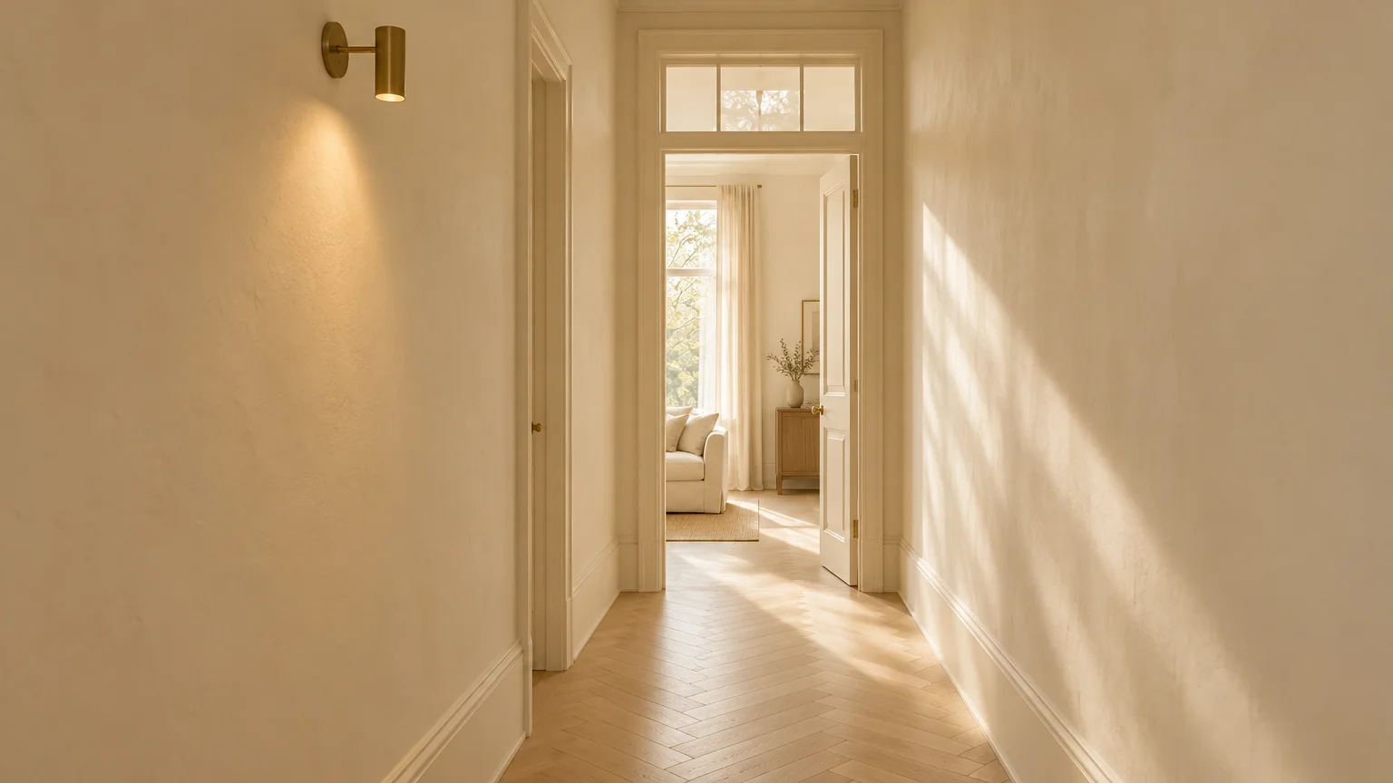
Luminous alabaster represents the height of quiet luxury, infusing narrow hallways with warmth and architectural clarity. This delicate shade reflects ambient illumination across tightly enclosed corridors.
Standard bright whites often make compact hallways feel clinical or dingy beneath artificial fixtures. In contrast, warm alabaster carries subtle cream undertones that eliminate gloomy corner shadows.
Designers favor this versatile hue because it visually pushes parallel hallway walls outward. Its gentle warmth creates an inviting transition between your entryway and adjoining living spaces.
Pair alabaster walls with matching trim to eliminate abrupt visual interruptions. When baseboards blend seamlessly into the wall plane, your eye perceives an expansive, uninterrupted surface.
This paint choice works wonders in historic homes and modern townhouses alike. It provides timeless provenance while brightening passages that receive minimal direct daylight.
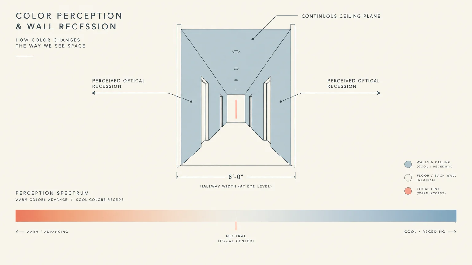
Trend #2: Receding Sky Azure
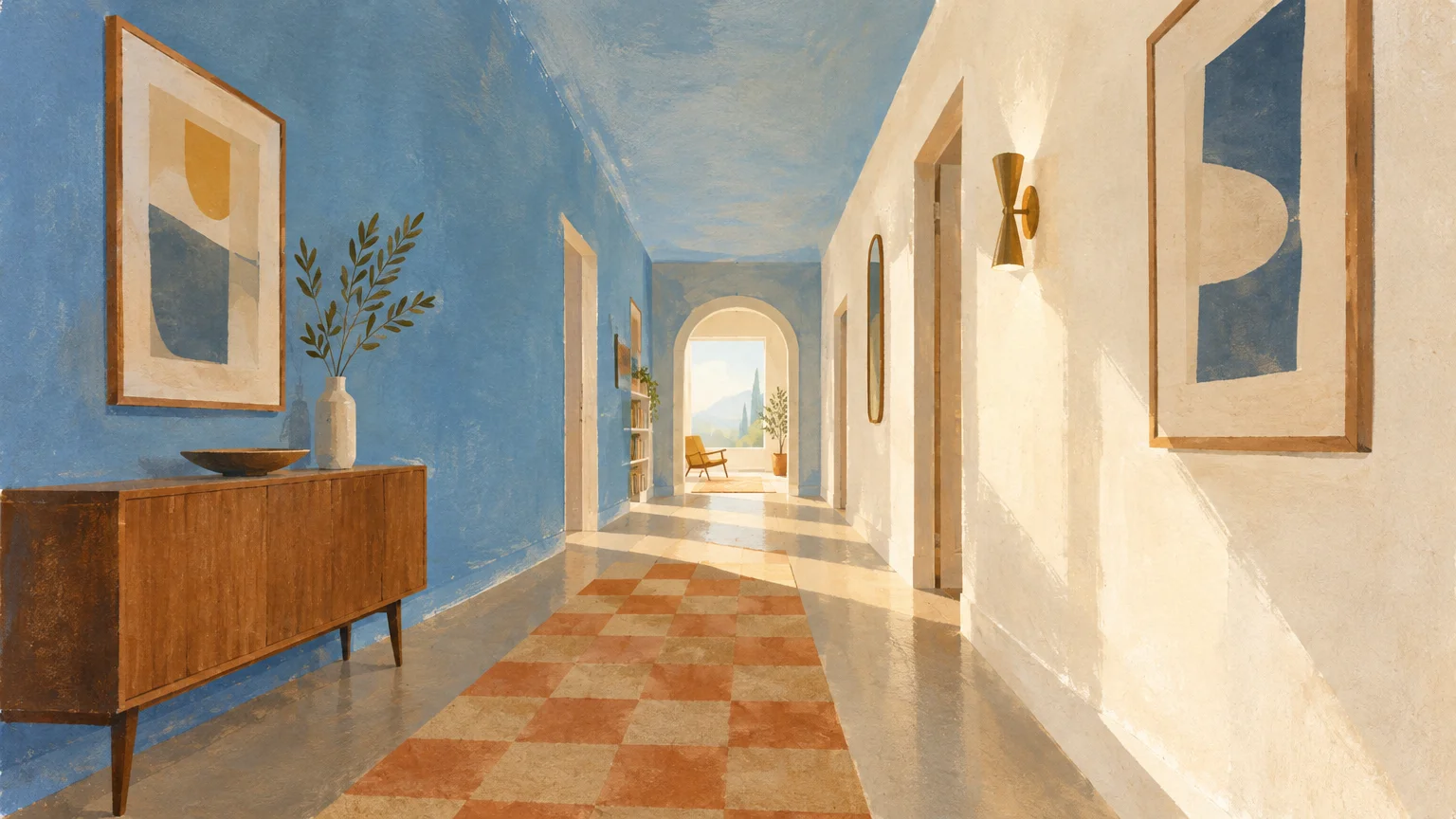
Sky azure harnesses the optical physics of color perception to expand narrow floor plans. Because the human eye perceives blue as physically receding, corridor walls appear significantly farther apart.
This hue introduces an ethereal, open-air feeling reminiscent of an expansive summer sky. It effortlessly turns an oppressive, windowless hallway into a bright and breathing breezeway.
Select a desaturated baby blue with slight slate undertones to maintain sophisticated maturity. Overly vibrant blues can overwhelm close quarters; muted iterations invite calm contemplation.
To maximize spatial dimension, integrate this crisp blue with pale blonde wood flooring. The organic grain anchors the airy wall color while establishing an inviting balance.
Extend this azure onto your ceiling in a flat finish. Erasing the dividing line between wall and ceiling visually lifts low architectural heights.
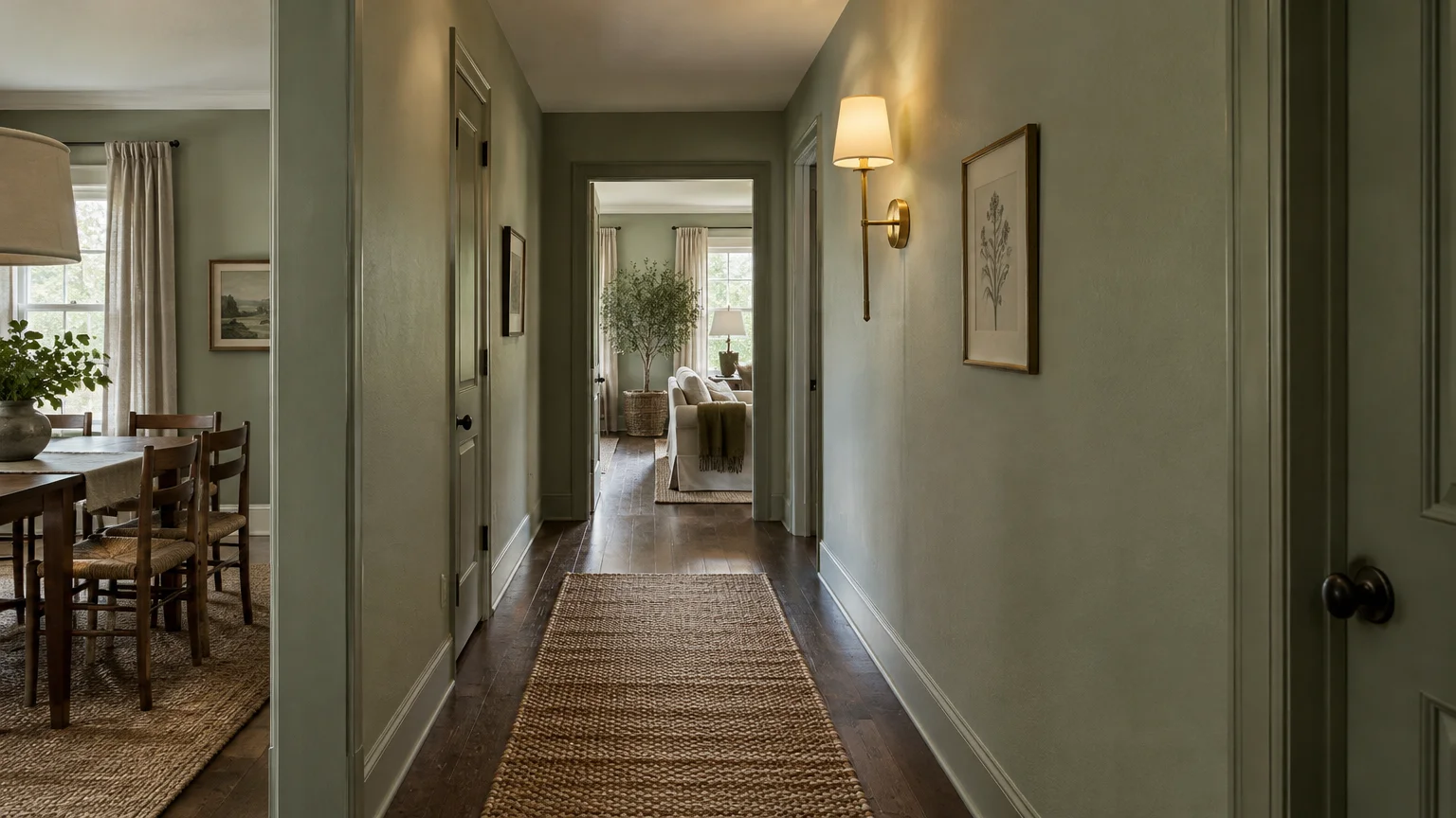
Trend #3: Misty Celadon Green
Misty celadon brings the restorative principles of biophilic design into transitional corridors. This muted green carries subtle gray undertones, lending it a sophisticated, chameleon-like versatility.
Soft green tones naturally blur spatial boundaries by evoking organic landscapes and lush outdoor paths. As a result, the eye registers continuous flow rather than rigid spatial confinement.
Apply this shade in narrow corridors that connect dining rooms to private living quarters. The calming hue establishes a serene rhythm as you move through your home.
Pair celadon walls with brushed brass sconces and woven runner rugs. The metallic warmth and natural textures enhance the organic, spacious aura of the corridor.
This refreshing hue balances artificial LED lighting and indirect daylight with effortless poise. It prevents narrow passageways from feeling like forgotten utilitarian tunnels.
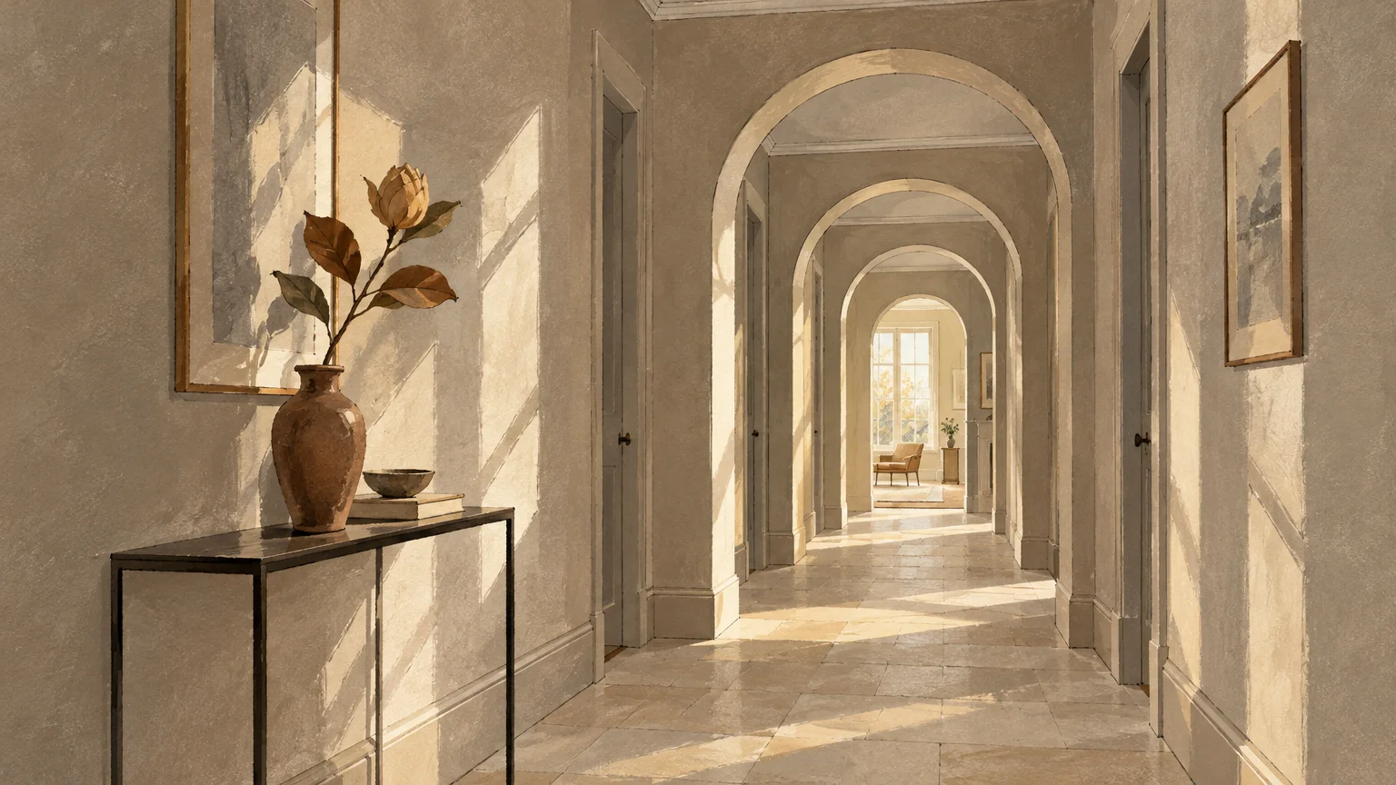
Trend #4: Silken Greige with Luminous Undertones
Silken greige remains an essential palette choice for homeowners seeking sophisticated, understated neutrality. It merges the modern elegance of gray with the inviting comfort of traditional beige.
In narrow passages, greige provides subtle chromatic depth without absorbing precious ambient light. Its balanced undertones adapt smoothly to shifting lighting conditions throughout the day.
This hue serves as an exceptional backdrop for curated hallway gallery walls. Fine art framed in black or gilt wood pops brilliantly against this versatile neutral canvas.
Choose an eggshell finish to gently disperse light across drywall surfaces. The subtle sheen adds dimension while resisting the scuffs common to high-traffic pathways.
Greige also unifies disparate room aesthetics that branch off from a central hall. It delivers visual harmony, making the entire floor plan feel deliberately interconnected.
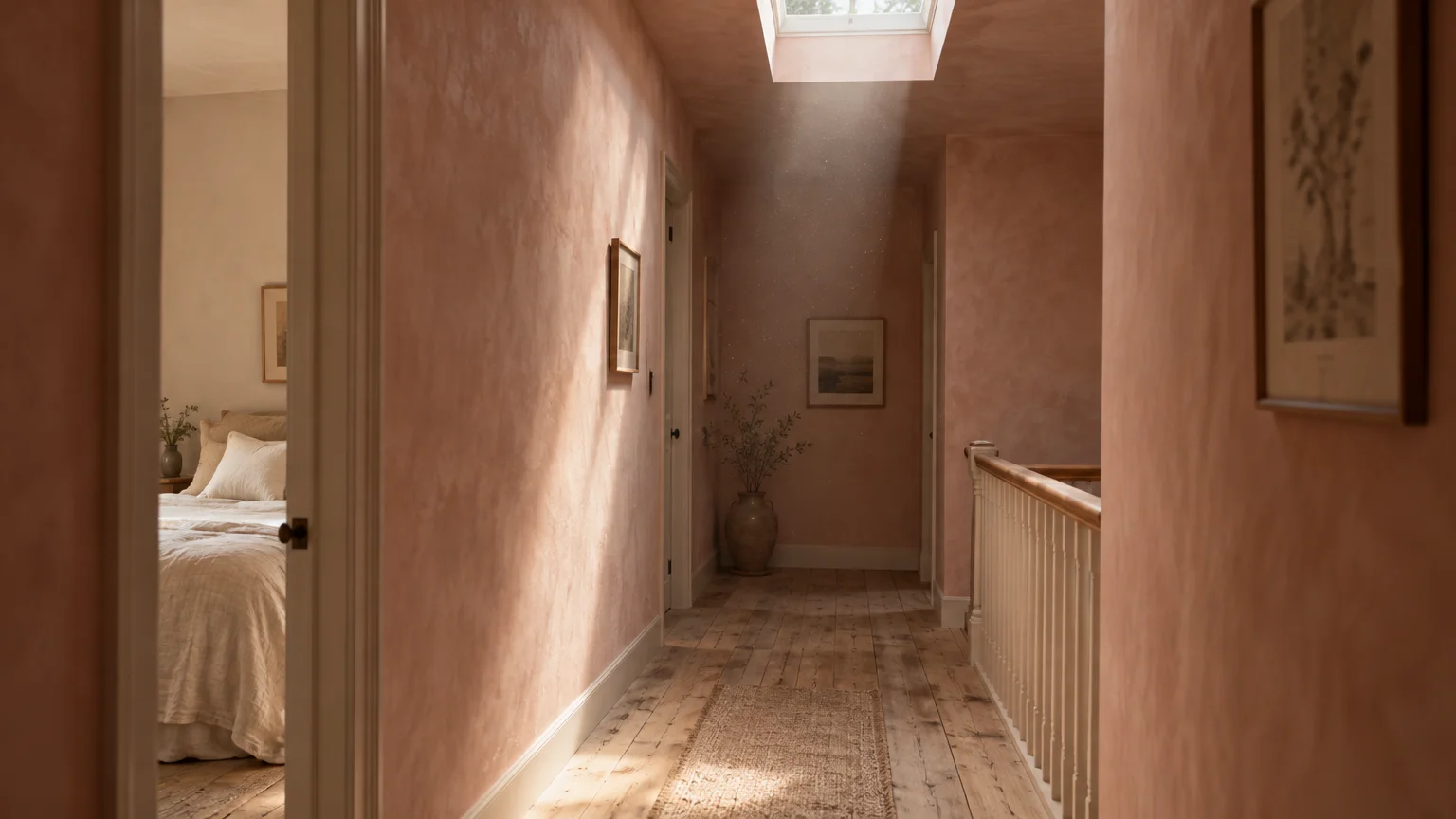
Trend #5: Diffused Plaster Blush
Far from juvenile, modern plaster blush is an architectural neutral infused with dusty rose and sand. This delicate tone bathes narrow, shadowy hallways in a radiant, flattering luminescence.
The warm pigments bounce soft light into adjoining rooms, neutralizing harsh directional shadows. Your hallway instantly feels like an intentional, curated destination rather than a utilitarian corridor.
Plaster blush harmonizes beautifully with limestone tile, fluted oak millwork, and matte black iron accents. These textured materials keep the overall aesthetic mature and deeply grounded.
Use light paint colors like this blush alongside concealed baseboard lighting. The gentle upward wash softens perimeter edges, generating the illusion of wider floor space.
This color also flatters skin tones, providing an uplifting ambiance every time you pass through. It adds warmth without the visual heaviness of darker terra-cotta hues.
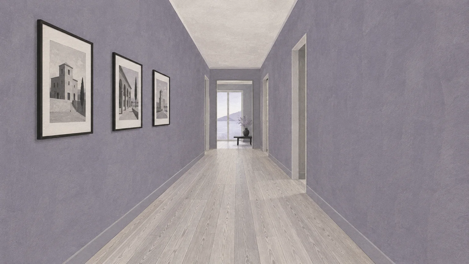
Trend #6: Atmospheric Lavender Gray
Atmospheric lavender gray offers an unexpected, couture approach to expanding narrow passageways. The faint violet undertone creates a dreamy, twilight-inspired depth that makes walls visually dissolve.
Because purple-gray lives on the cool end of the color spectrum, it pushes boundaries outward. It captures ambient lighting, subtly shifting from silvery gray by day to moody dusk by nightfall.
This distinctive color suits classic pre-war apartments and modern townhomes alike. It provides timeless provenance while feeling utterly fresh, artistic, and forward-thinking.
Contrast this ethereal shade with crisp white architectural crown molding. The crisp delineation accentuates vertical proportions while keeping the hallway feeling remarkably broad.
Complement lavender gray with silver or polished nickel hardware for a luminous, reflective sparkle. The cool metal accents amplify light diffusion throughout the narrow corridor.
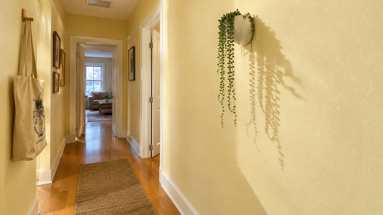
Trend #7: Pale Chiffon and Primrose Yellow
Pale chiffon yellow simulates perpetual morning sunlight within dark, claustrophobic corridors. This buoyant shade infuses windowless interior passages with cheerful clarity and radiant energy.
Avoid saturated neon yellows, which can overwhelm tight quarters and provoke visual fatigue. Instead, select buttery, whisper-soft hues with creamy ivory bases to ensure enduring sophistication.
This color works wonders in long hallways flanked by multiple closed bedroom doors. It unifies broken wall planes, creating a flowing and cohesive spatial journey.
Pair chiffon walls with polished nickel hardware and reflective glass pendants. The cool reflective surfaces balance the warm glow, cultivating an open and balanced atmosphere.
Soft yellow also reflects floor illumination, making narrow runner rugs appear broader. It turns an otherwise dim transitional space into a sun-drenched architectural feature.
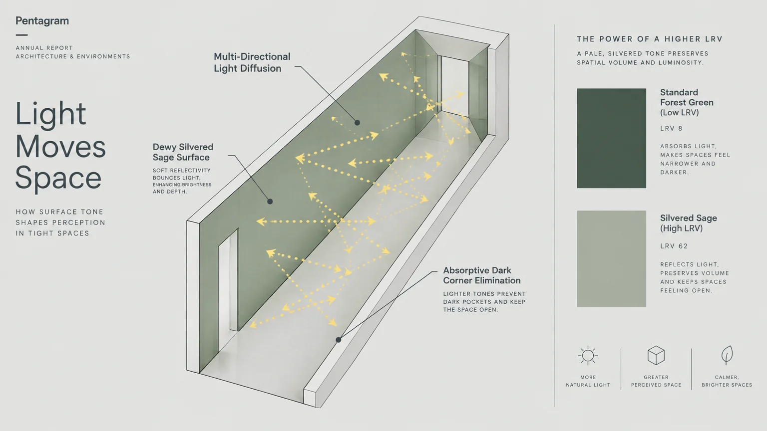
Trend #8: Dewy Silvered Sage
Dewy silvered sage brings a tranquil, whisper-light presence to tight and constricted spaces. Combining cool mineral gray with muted botanicals, this tone expands visual depth effortlessly.
The gray undertone keeps the green muted, allowing it to function as a versatile neutral. It reflects daylight softly without creating harsh glare against tight hallway corners.
Incorporate this shade to establish a seamless transition between indoor halls and outdoor garden views. This visual continuity tricks the mind into perceiving extended boundaries.
Layer silvered sage with light ash flooring and linen drum pendants. These natural elements underscore a biophilic ethos while preserving an airy, uncluttered aesthetic.
It coordinates effortlessly with off-white doors and molding. The soft contrast establishes visual interest without breaking up the expansive sightline of the hallway.
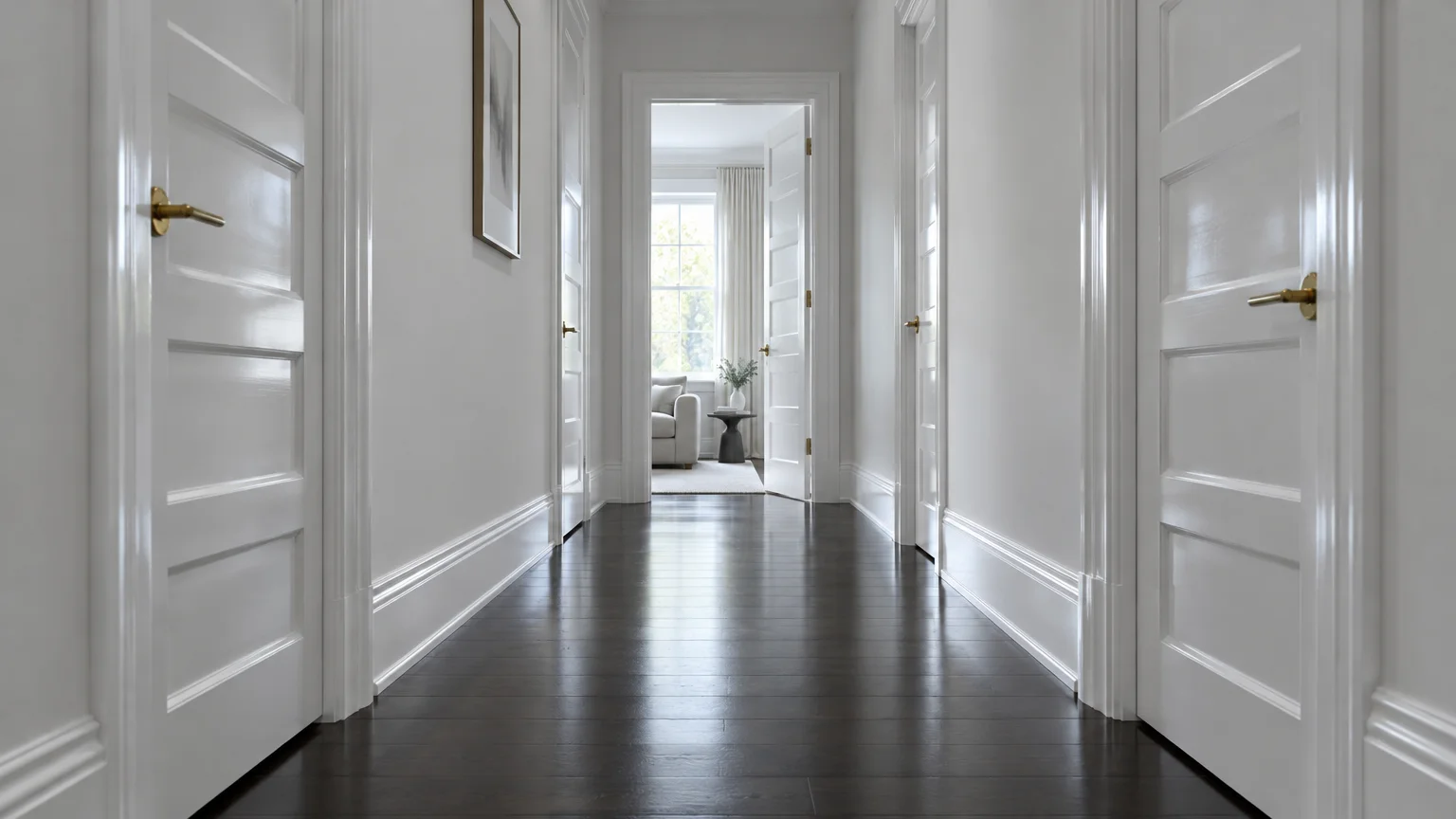
Trend #9: Crisp Chalk White with Semi-Gloss Accents
Crisp chalk white remains a classic minimalist device for transforming narrow domestic architecture. With an exceptionally high Light Reflectance Value, this shade amplifies every photon of available illumination.
To prevent this stark white from feeling sterile, introduce tactile plaster finishes or fine linen wall art. Subtle textural variances prevent tight halls from feeling flat or clinical.
Apply matte paint to the walls while finishing door frames in durable semi-gloss. This tonal contrast creates visual layering, drawing the eye forward and broadening the perceived width.
Chalk white serves as an immaculate framework for displaying photography portfolios or family heirlooms. It directs attention to artwork rather than the confinement of the corridor.
Maintain pristine cleanliness on chalk white walls by choosing scrubbable, premium paint formulas. High-traffic corridors require durable finishes that preserve their luminous quality over time.
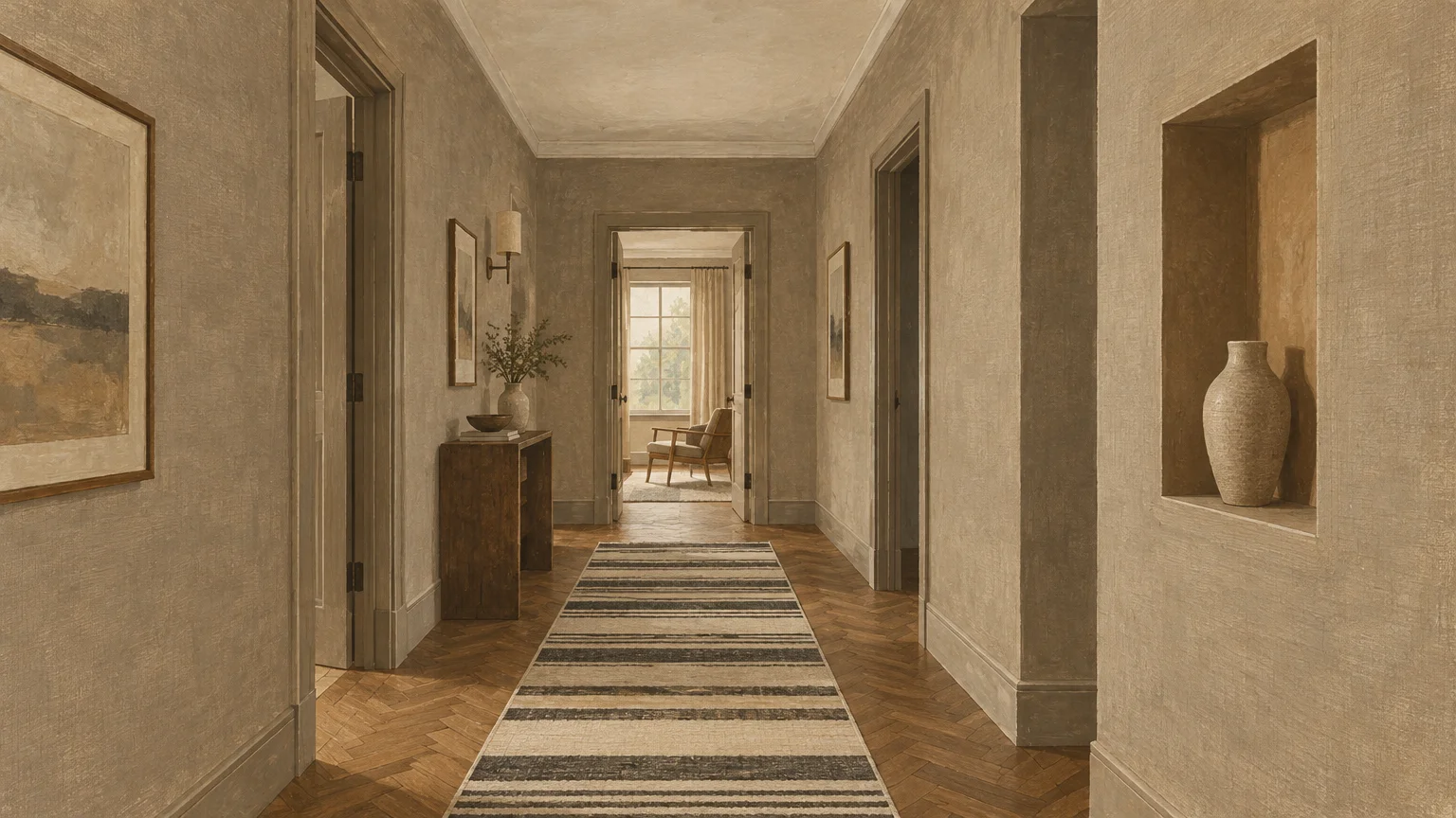
Trend #10: Muted Linen Taupe
Muted linen taupe delivers earthy groundedness while maintaining an expansive sense of perimeter. This nuanced balance of brown, gray, and white creates a cozy yet unexpectedly open corridor.
Taupe recedes gently under artificial lighting, softening the sharp architectural angles of narrow walls. It provides a luxurious alternative to predictable off-white paint selections.
Integrate this shade when connecting grand living rooms with intimate private suites. It serves as a soothing chromatic palate cleanser that balances diverse interior aesthetics.
Complement linen taupe with matte travertine flooring and unlacquered brass hardware. These tactile, high-end materials elevate your hallway from a transitional pass-through to a curated gallery.
Paint your interior doors in the same taupe shade for a tailored, architectural statement. This cohesive application eliminates visual clutter, allowing the walls to stretch uninterrupted.
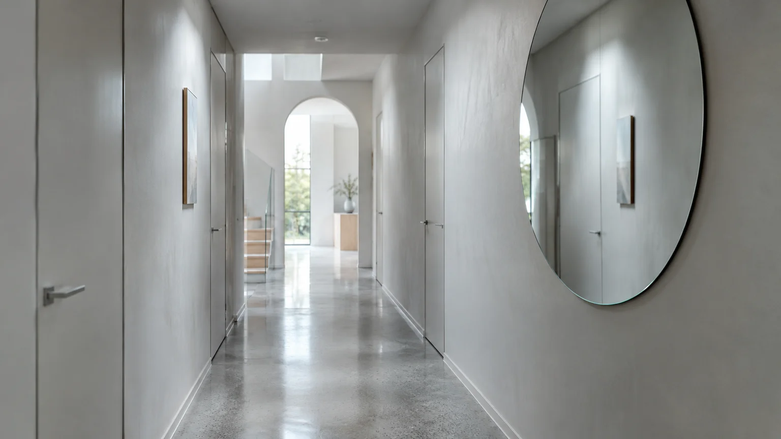
Trend #11: Luminous Pearl Gray
Luminous pearl gray captures the shimmering elegance of natural pearls, casting a diffused glow. Its silvery base bounces light across opposing walls, effectively counteracting tunnel-like claustrophobia.
Unlike flat gray, pearl gray contains subtle prismatic undertones that shift under varying illumination. It breathes vibrant life into corridors devoid of exterior window light.
Enhance this expansive paint with an oversized, slender wall mirror positioned opposite an adjacent doorway. The mirror catches cross-light, doubling the visual width of the passage.
Pair this tone with pale oak flooring arranged in a herringbone pattern. The directional flooring vectors combined with luminous walls draw focus outward rather than inward.
Pearl gray also softens high ceilings, preventing narrow hallways from feeling like deep elevator shafts. It balances horizontal and vertical proportions with graceful precision.
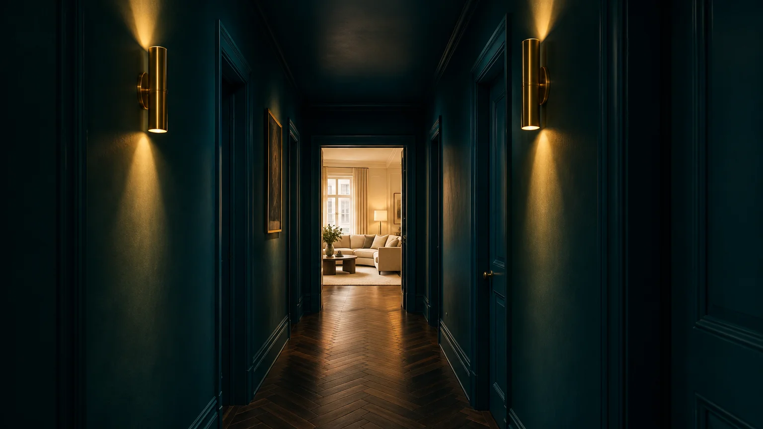
Trend #12: Infinite Midnight Teal
Designing with infinite midnight teal proves that small space paint tricks do not rely solely on pale hues. Counterintuitively, deep jewel tones can erase wall corners in dramatic fashion.
When a narrow hall lacks natural light, pale shades can occasionally appear murky and gray. A saturated midnight teal embraces the shadows, creating an illusion of boundless, infinite depth.
Paint the walls, baseboards, doors, and ceiling in this identical rich pigment. Color-drenching the entire space removes all visual boundaries, tricking the eye into perceiving limitless room.
Accentuate this moody atmosphere with directional picture lights and polished brass hardware. The metallic highlights gleam against the dark canvas, crafting an undeniably glamorous, spacious passage.
This bold choice turns an overlooked corridor into a memorable, theatrical threshold. Guests will marvel at the deliberate luxury as they transition between brightly lit rooms.
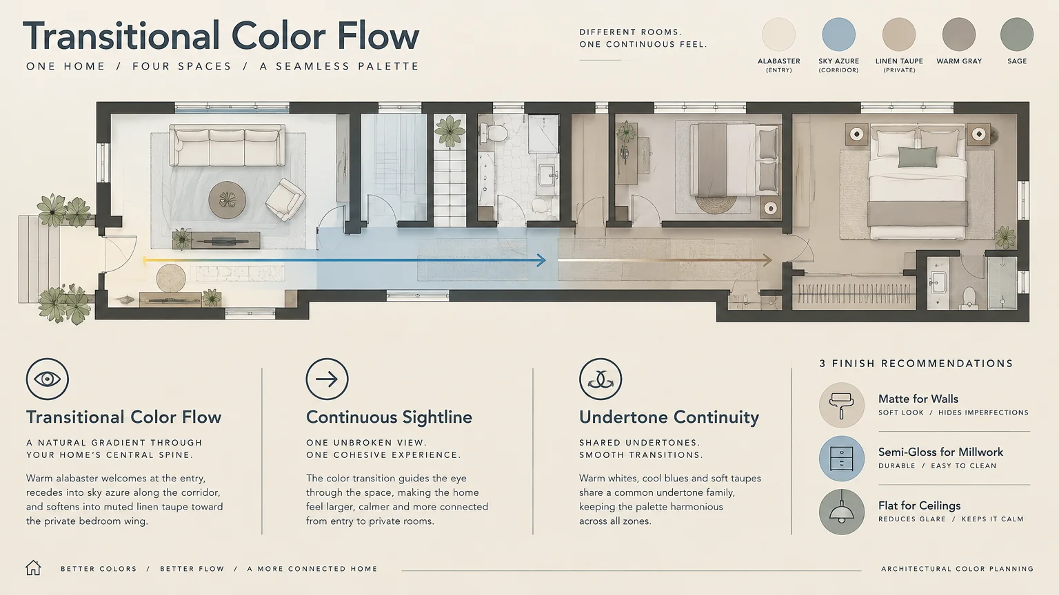
The Big Picture: Weaving These Trends into Your Home
Successfully widening a narrow hallway extends beyond simply choosing a gorgeous paint swatch. You must evaluate how natural illumination, directional sightlines, and adjacent rooms interact dynamically.
Start by assessing the light direction entering your corridor from adjacent living areas. North-facing hallways benefit from warm alabaster or blush, while south-facing spaces flourish with cool azure.
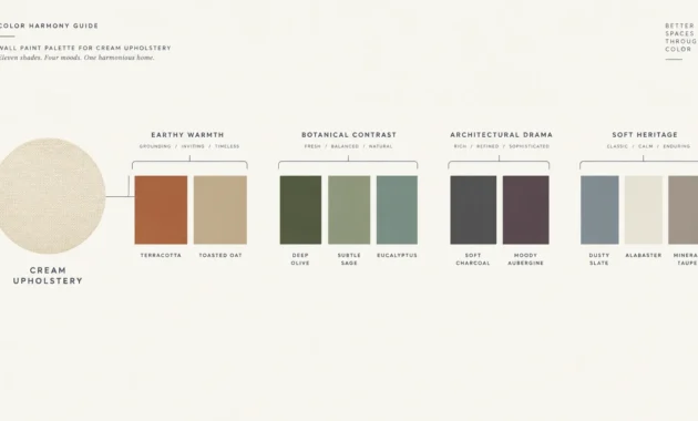
Maintain aesthetic cohesion by borrowing undertones from your living room and dining room palettes. A hallway should function as a harmonious bridge rather than a jarring chromatic departure.
Consider the finish carefully; eggshell and satin sheens reflect ambient light to maximize width. Flat matte finishes absorb light, which can inadvertently cause narrow walls to close inward.
Do not forget the transformative power of architectural lighting throughout your newly painted hall. Wall sconces directed upward wash light across ceilings, magnifying the open illusion of your walls.
For the latest color forecasts, consult industry leaders like Pantone and paint companies like Benjamin Moore. For professional design standards, refer to the American Society of Interior Designers (ASID).
Investing time in proper surface preparation guarantees smooth, light-reflective walls that showcase your chosen paint. Skim-coating bumpy plaster or sanding drywall seams eliminates shadowy indentations that visually narrow the corridor.
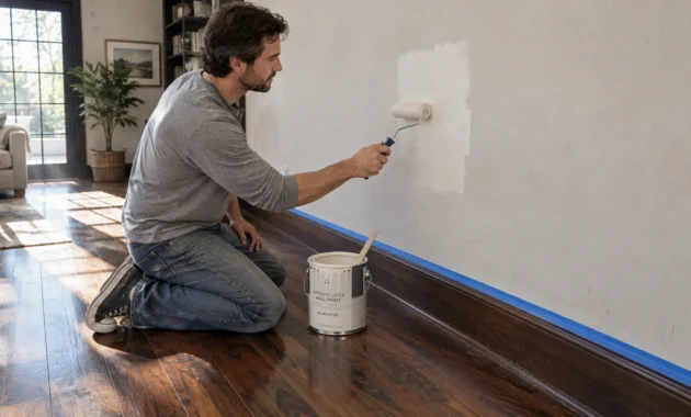
Sample large paint swatches directly onto multiple wall sections before committing to a final shade. Observe how ambient shadows alter each pigment at dawn, noon, and evening under artificial bulbs.
Thoughtful hallway paint ideas establish a sense of journey and destination inside your home. By harmonizing wall pigments with refined flooring and curated fixtures, you maximize both comfort and architectural presence.
Frequently Asked Questions
Should hallway ceilings be painted lighter than the walls?
Painting your ceiling a shade lighter than your walls draws the eye upward, exaggerating vertical height. This optical separation prevents narrow corridors from feeling compressed from above.
Alternatively, color-drenching the ceiling in the exact wall hue dissolves boundary lines entirely. This seamless technique creates an enveloping cocoon that blurs where walls end and ceilings begin.
What paint sheen best expands a narrow corridor?
An eggshell or satin finish provides optimal light bounce while hiding minor wall imperfections. These low-luster sheens reflect artificial and natural illumination across opposing walls effortlessly.
Avoid high-gloss finishes on large wall expanses, as extreme glare emphasizes surface flaws and amplifies tunnel vision. Reserve gloss exclusively for architectural doors and trim to create crisp visual contrast.
Can dark colors genuinely make a narrow hallway feel wider?
Yes, deeply saturated hues like midnight teal or charcoal can dissolve corners in low-light spaces. When light cannot define where wall planes meet, the space reads as endless depth.
To succeed with dark pigments, commit fully by painting doors, millwork, and ceilings identically. Pair the moody backdrop with warm directional lighting to highlight art and architectural details.
How do flooring patterns interact with hallway paint colors?
Running wood planks horizontally or installing herringbone patterns guides sightlines outward across the corridor. This lateral visual movement counteracts the long, tunnel-like sensation of typical hallways.
When paired with light paint colors, this dynamic geometry visually expands tight dimensions. The harmonious interplay between luminous walls and angled flooring maximizes perceived square footage.
Disclaimer: This article reflects design trend analysis and predictions. Personal taste and timeless design principles should always guide your decorating choices.