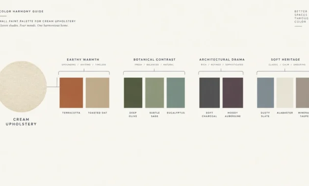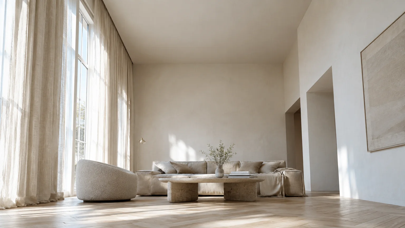
Strategic paint colors low ceiling solutions can visually elevate a low overhead plane by several inches overnight. Selecting the right interior paint colors eliminates visual friction and tricks the eye into perceiving boundless vertical volume.
Rather than feeling confined by tight architectural proportions, you can harness optical physics and light reflectance to lift your living spaces. Modern ceiling paint ideas now prioritize expansive atmospheric hues over conventional stark white.
Whether you favor airy ethereal tints or daring monochromatic color drenching, smart chromatic choices transform cramped rooms into grand sanctuaries. Explore these twelve designer-approved selections that make ceiling look taller instantly.
Trend #1: Ultra-Pure Reflective White
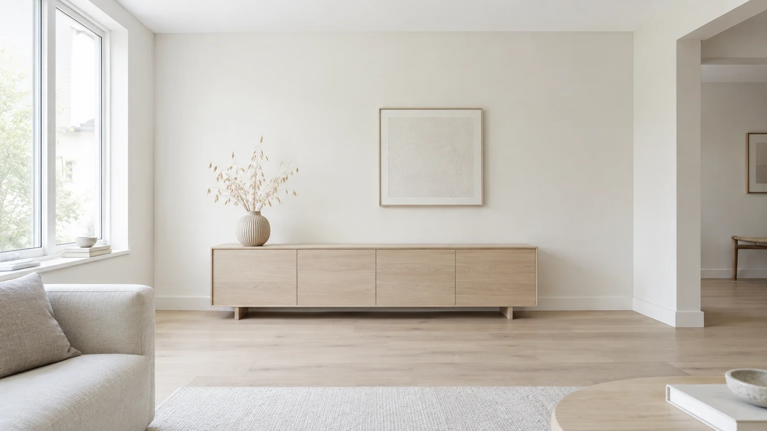
High Light Reflectance Value (LRV) whites bounce natural illumination into every corner of the room. A crisp, pure white devoid of heavy yellow or gray undertones visually dissolves the ceiling plane.
When you minimize shadow retention, you effectively erase the perceived overhead boundary. This classic approach remains a cornerstone of architectural minimalism and clean Scandinavian aesthetics.
Pair this finish with soft off-white walls to create a subtle vertical gradation. The slight contrast naturally draws your gaze upward, creating the illusion of heightened volume.
For the best results, select an ultra-flat matte finish on the overhead surface. Matte textures absorb specular glare, preventing light hotspots that reveal the ceiling’s actual proximity.
In low-ceilinged living rooms and compact hallways, this pristine palette provides an immediate sense of liberation. It maximizes daylight from adjacent windows without calling attention to overhead limits.
Consider pairing this crisp overhead white with light white-oak flooring and linen draperies. The natural textures ground the room while the ceiling floats away effortlessly.
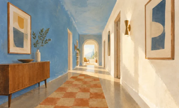
Trend #2: Atmospheric Sky Cerulean
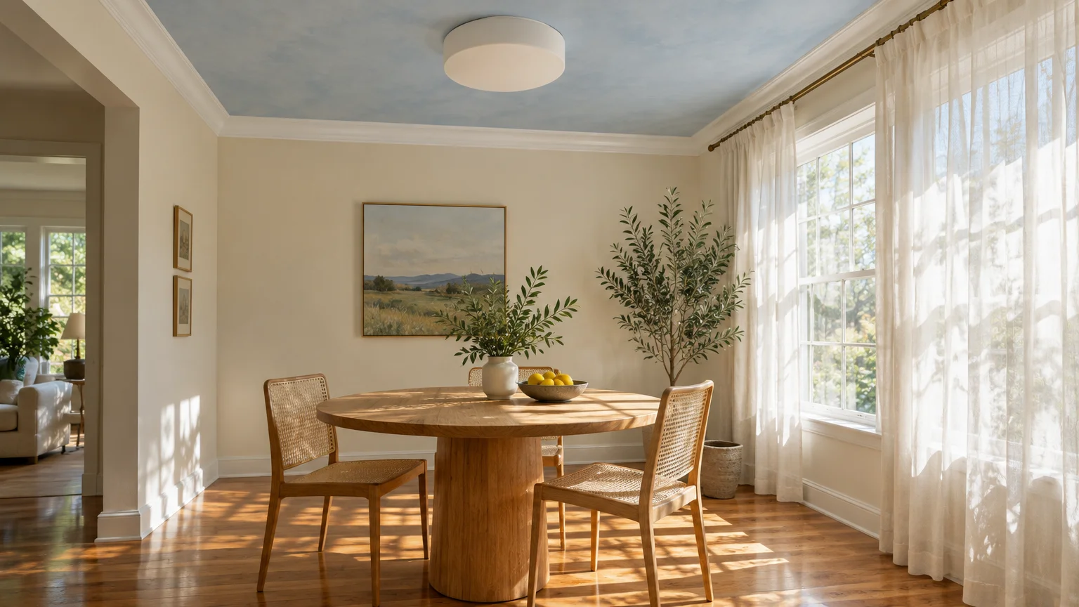
Pale, airy cerulean taps into biophilic design by mirroring the endless expanse of an open sky. Because cool tones naturally recede from human vision, blue surfaces appear farther away than they truly are.
This innate psychological cue makes your room feel naturally connected to the outdoors. It softens oppressive low ceilings in dining rooms, bedrooms, and enclosed sunrooms.
When curating ceiling paint ideas, look for delicate watery blues with quiet gray undertones. These muted notes prevent the surface from appearing overly juvenile or intensely saturated.
Contrast the ceiling with crisp alabaster millwork and warm light-oak hardwood flooring. The tension between warm organic floors and cool overhead hues maximizes vertical perception.
By transforming an overhead surface into an open horizon, you replace visual restriction with an aura of endless expanse. It remains an enduring, sophisticated interior design strategy.
Install slim, flush-mounted fixtures to prevent visual clutter against this skyward plane. Unbroken cerulean expanses give the eye room to travel freely upward.
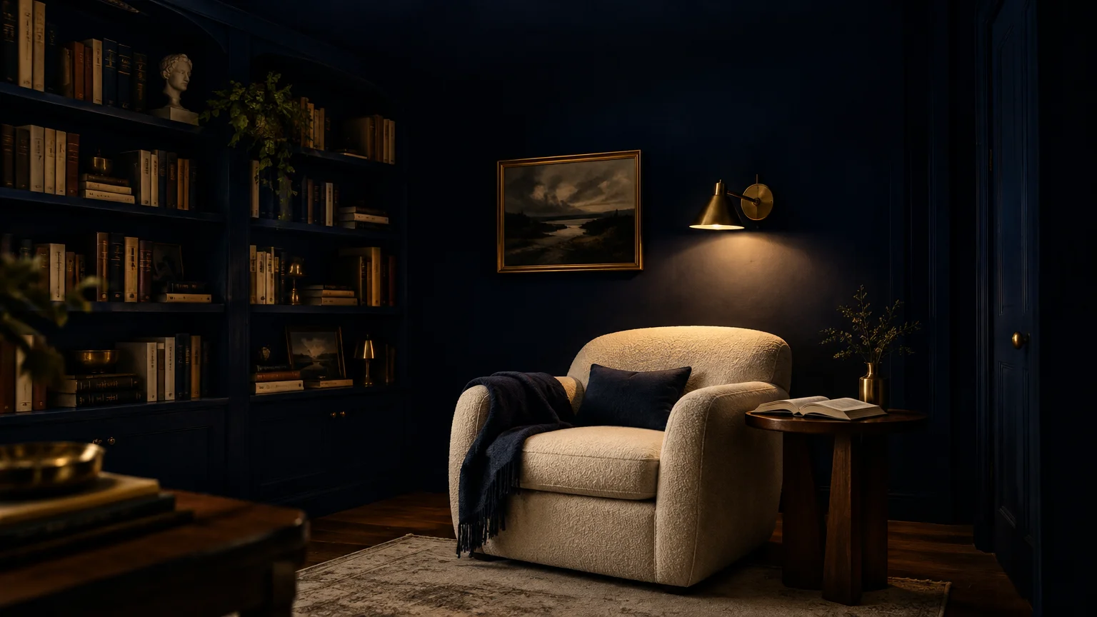
Trend #3: Color-Drenched Midnight Navy
While intuition suggests pale tints, deep moody navy offers an astonishingly effective design alternative. Color-drenching both walls and ceilings in a single dark shade erases the transitional shadow lines where planes meet.
Without contrasting baseboards or bright perimeter moldings, your eyes cannot easily map the room’s physical perimeter. The room expands outward and upward into velvety infinity.
This daring technique embodies modern quiet luxury, imparting refined intimacy and cinematic drama. It works exceptionally well in dining rooms, library nooks, and cozy media dens.
Choose a rich navy with indigo undertones to cultivate warmth beneath warm architectural lighting. Layer brushed brass fixtures and textural bouclés to catch the ambient glow against the dark canvas.
Embracing darkness transforms architectural shortcomings into intentional design statements. You trade perceived confinement for the boundless depth of a starlit night sky.
Keep the finish uniformly matte to absorb harsh reflections that betray where the wall ends. A flat sheen turns solid plaster into pure atmosphere.
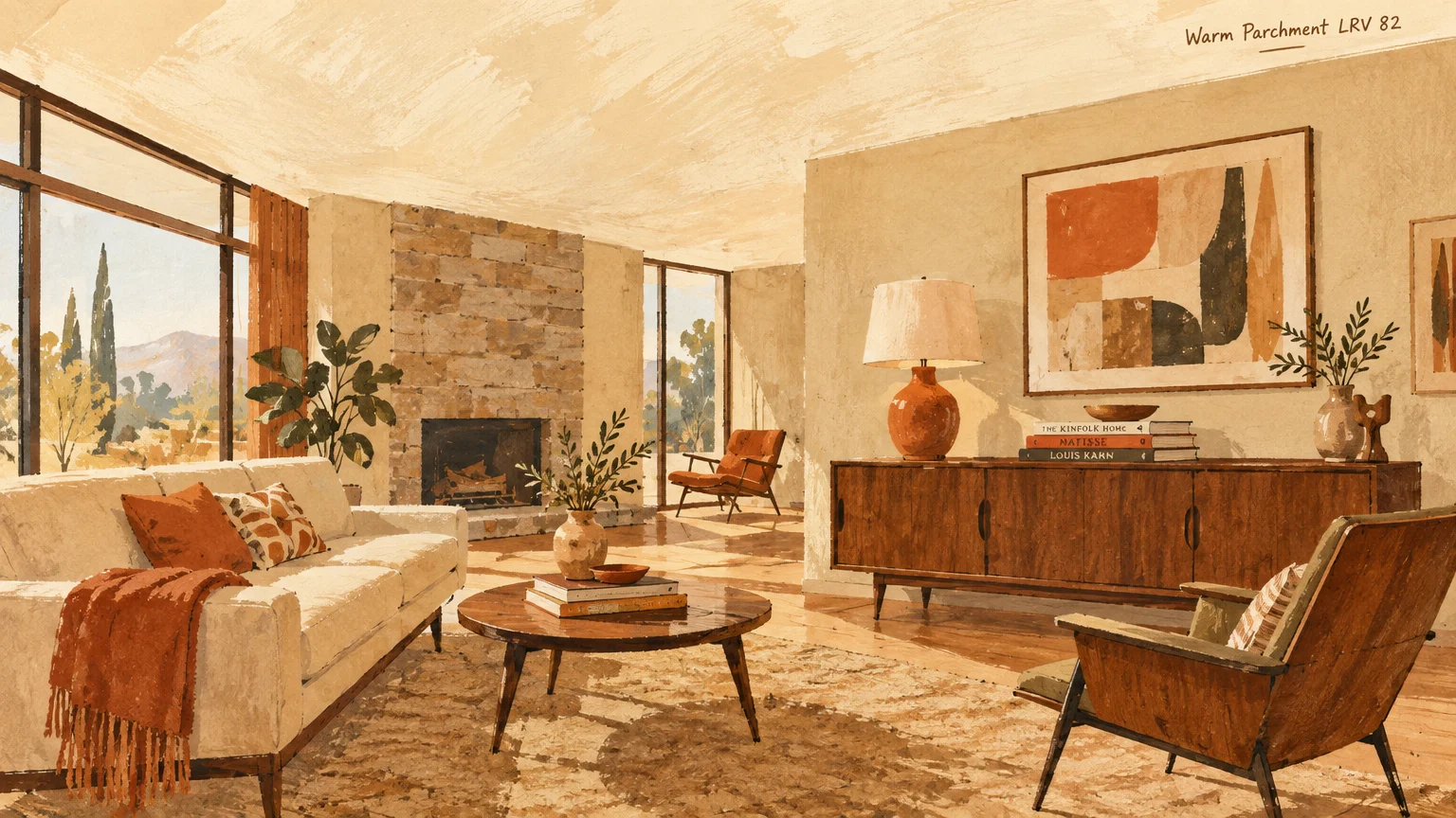
Trend #4: Alabaster and Warm Parchment
Stark, clinical whites can sometimes accentuate shadows in rooms with limited natural exposure. In contrast, creamy alabaster and warm parchment introduce soft, welcoming radiance that diffuses dim corners effortlessly.
These gentle tones harmonize seamlessly with organic modernism and lime-washed plaster finishes. They soften harsh ceiling lines while maintaining an elevated, airy aesthetic.
When applying this interior paint color, paint your walls in the exact same hue or half-strength tint. Eliminating high-contrast breaks prevents horizontal slicing, which notoriously makes a low ceiling feel lower.
Pair warm parchment with limestone accents, tailored linen draperies, and light travertine surfaces. This monochromatic continuity lets the eye float effortlessly upward without stumbling upon sharp divisions.
It delivers understated elegance that respects heritage architecture while quietly expanding vertical scope. Your living room immediately feels balanced, serene, and remarkably expansive.
Use warm 2700K ambient bulbs to bring out the buttery, golden undertones of parchment. This lighting strategy keeps low overhead planes feeling soft rather than oppressive.
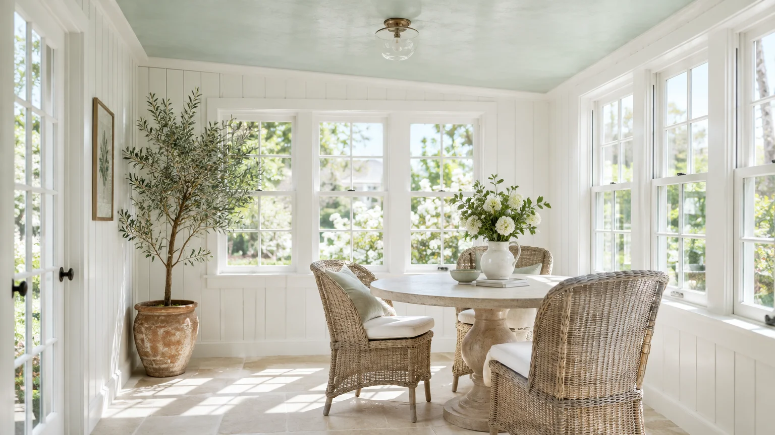
Trend #5: Translucent Frosted Mint
Translucent frosted mint infuses cramped spaces with fresh, crisp vitality. Like pale blue, soft green undertones sit on the cooler end of the spectrum, causing the plane to recede gracefully.
This subtle wash of color draws inspiration from lush garden canopies and dew-kissed foliage. It feels distinctly modern yet grounded in timeless biophilic principles.
Use this hue to brighten north-facing living rooms that receive cool, diffused natural light. The green balances cold daylight without overpowering delicate interior finishes.
Pair frosted mint with chalky off-white walls and light ash or birch furniture. The resulting juxtaposition feels breezy, organic, and distinctly Scandinavian in its understated simplicity.
By introducing a pale green ceiling, you create a restorative retreat that opens toward the canopy above. The visual lift feels natural, refreshing, and effortlessly refined.
Accent the room with potted fiddle-leaf figs or olive branches to echo the overhead tone. Connecting flora with the ceiling establishes a continuous vertical flow.
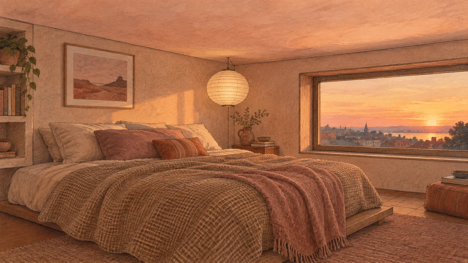
Trend #6: Luminescent Pale Blush
Pale blush operates as a sophisticated new neutral with unmatched flattering warmth. Its subtle red and amber undertones cast a flattering glow across the entire room while bouncing gentle ambient light.
Far from looking sugary, modern designer pinks feature dusty gray undertones that evoke Venetian plaster and sunset skies. The ceiling seems to float overhead like a warm cloud.
This shade is one of the premier paint tricks for small rooms lacking sufficient sunlight. It counteracts sterile gray shadows that often gather along low ceilings.
Complement blush with warm walnut millwork, polished marble, and woven wool textiles. The grounded richness of natural wood anchors the room while the blush ceiling floats effortlessly overhead.
You gain an inviting, intimate environment that still feels airy and expansive. It proves that ceilings do not require bright white to feel elevated.
Pair blush ceilings with cream trim to maintain a gentle, low-contrast transition. Soft borders prevent the eye from registering structural limits.
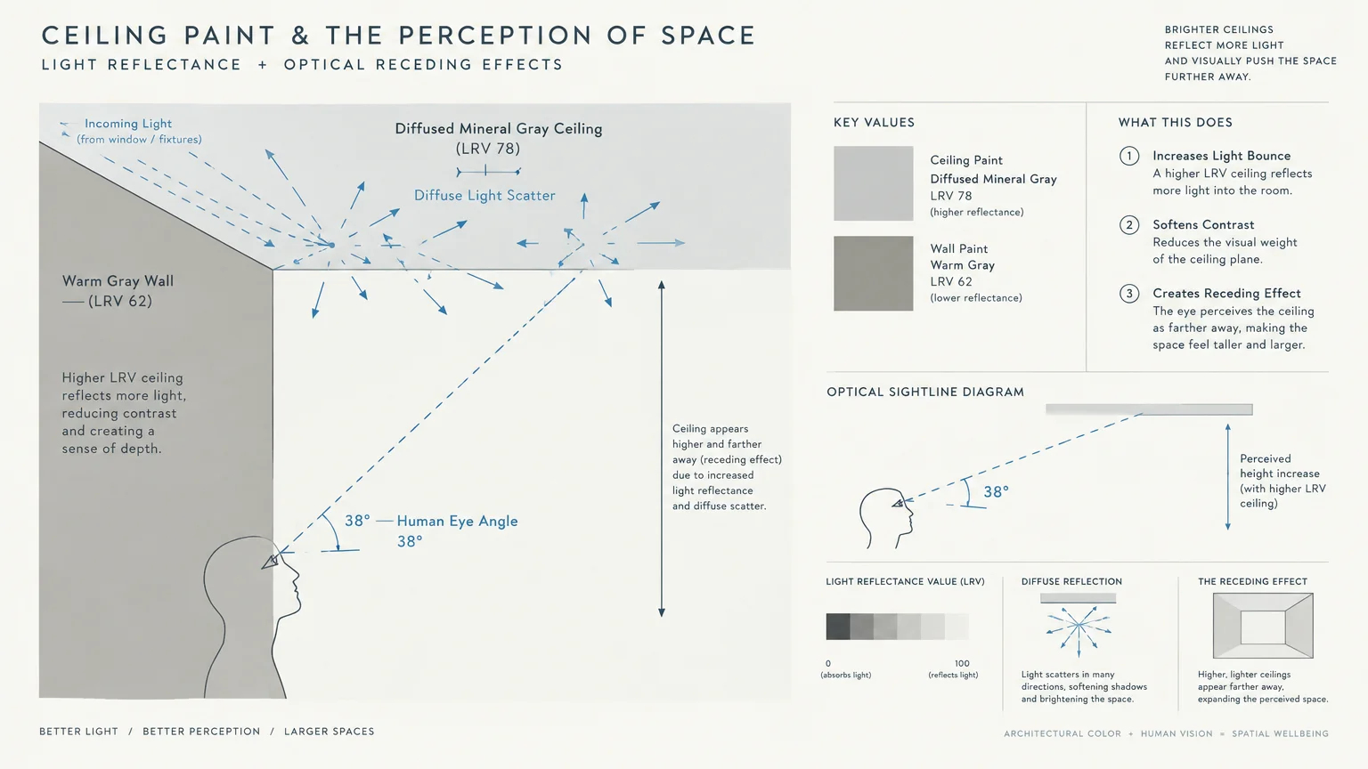
Trend #7: Diffused Mineral Gray
Soft mineral gray with cool slate undertones provides an impeccably tailored, urban alternative. Gray acts as a natural shadow neutralizer, disguising imperfect drywall joints and undulating plaster.
Because shadows overhead are naturally gray, coating the ceiling in this shade blurs the boundary between architecture and shadow. The ceiling appears to simply melt away into the background.
For modern apartments and contemporary loft settings, mineral gray delivers quiet architectural discipline. It frames minimalist furnishings while gently extending spatial dimensions.
Pair this ceiling hue with tonal greige walls and matte black linear lighting fixtures. The clean vertical lines of the lighting draw the eye upward into the misty, receding ceiling plane.
This restrained colorway provides effortless depth without demanding visual attention. It is the epitome of contemporary quiet luxury for urban residences.
Avoid dark charcoal tones in tight spaces, sticking strictly to pale silver and mineral tints. Delicate values retain essential light while offering tonal recession.
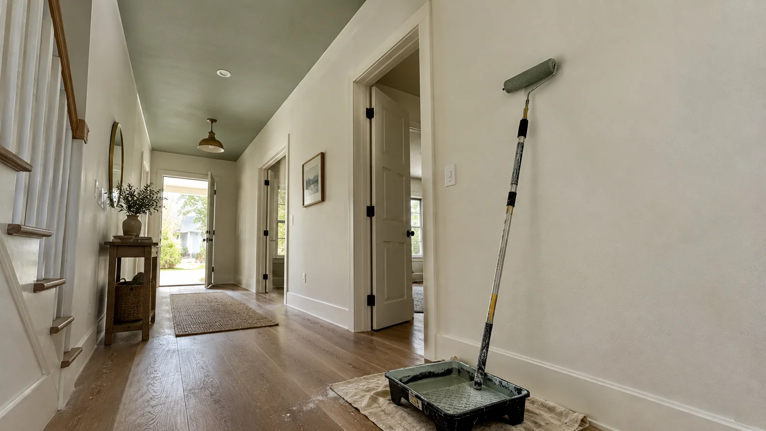
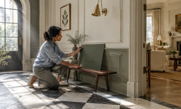
Trend #8: Whispering Sage
Whispering sage blends gray, green, and silver to create an earthy, tranquil ambiance overhead. This sophisticated hue brings an organic softness that bridges interior living with natural landscapes.
Because sage absorbs harsh glare while reflecting diffused ambient light, it prevents low ceilings from feeling claustrophobic. It creates a calming cocoon effect that feels expansive rather than restrictive.
In rooms with standard eight-foot ceilings, paint vertical millwork and window trims in the same tone. This unbroken vertical line carries the gaze straight up to the ceiling seamlessly.
Combine whispering sage with tactile bouclé fabrics, rustic white oak, and aged bronze hardware. The natural palette creates a cohesive aesthetic that feels both grounded and spacious.
This gentle biophilic tone transforms an ordinary ceiling into a poetic architectural canvas. It proves that subtle color can elevate a room just as effectively as pale neutrals.
Use sheer linen window treatments hung near the ceiling line to reinforce the vertical flow. The fabric draws your gaze directly into the muted green canopy.
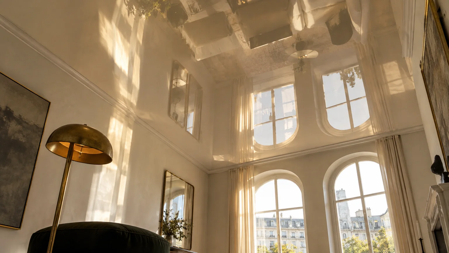
Trend #9: Lacquered High-Gloss Ivory
While matte paint remains the standard advice, a high-gloss lacquered ivory finish challenges convention with stunning results. A reflective ceiling functions like an overhead mirror, reflecting light and bouncing room architecture vertically.
This luminous sheen duplicates floor lamps, window light, and movement, effectively doubling perceived vertical proportions. The ceiling ceases to be a solid barrier and becomes a liquid reflection.
Flawless surface preparation is essential, as high-gloss sheens accentuate every minor texture irregularity. Pair skilled skim-coating with high-grade enamels for a glass-like designer finish.
Style this dramatic ceiling in formal dining rooms or entry foyers paired with tailored grasscloth wallcoverings. The textural contrast between matte walls and glossy ceiling maximizes vertical drama.
Lacquered ivory delivers old-world glamour coupled with modern visual trickery. It represents an unapologetically chic method to make ceiling look taller.
Incorporate dimmable cove lighting or shaded chandeliers to avoid harsh filament glare on the gloss. Gentle luminescence maximizes the reflective overhead depth.
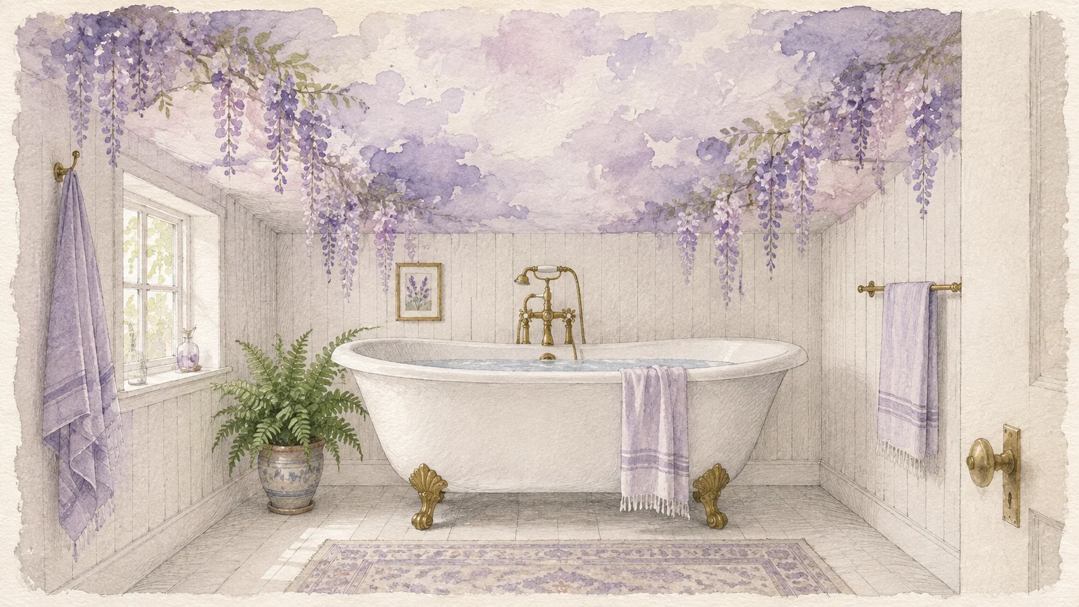
Trend #10: Ethereal Wisteria Mist
Ethereal wisteria mist introduces a faint veil of purple with substantial cool gray undertones. Violet resides at the shortest wavelength of visible light, making it visually recede into the distance.
When applied overhead, this subtle shade feels mysterious, airy, and deeply calming. It mimics twilight skies, prompting your mind to interpret the ceiling as boundless open air.
This refined tint functions exceptionally well in primary bedrooms and spa-like en suite bathrooms. It invites relaxation while quietly liberating low, boxed-in ceiling geometries.
Complement wisteria mist with crisp marble vanity tops, polished nickel accents, and soft white walls. The cool metallic hardware resonates with the purple undertones to heighten overall luxury.
Choosing ethereal wisteria demonstrates design confidence and creative refinement. It lifts compact quarters with a bespoke, whisper-soft wash of color.
Maintain low-profile ceiling fixtures to preserve the undisturbed beauty of this twilight hue. The uninterrupted surface feels expansive and wonderfully serene.
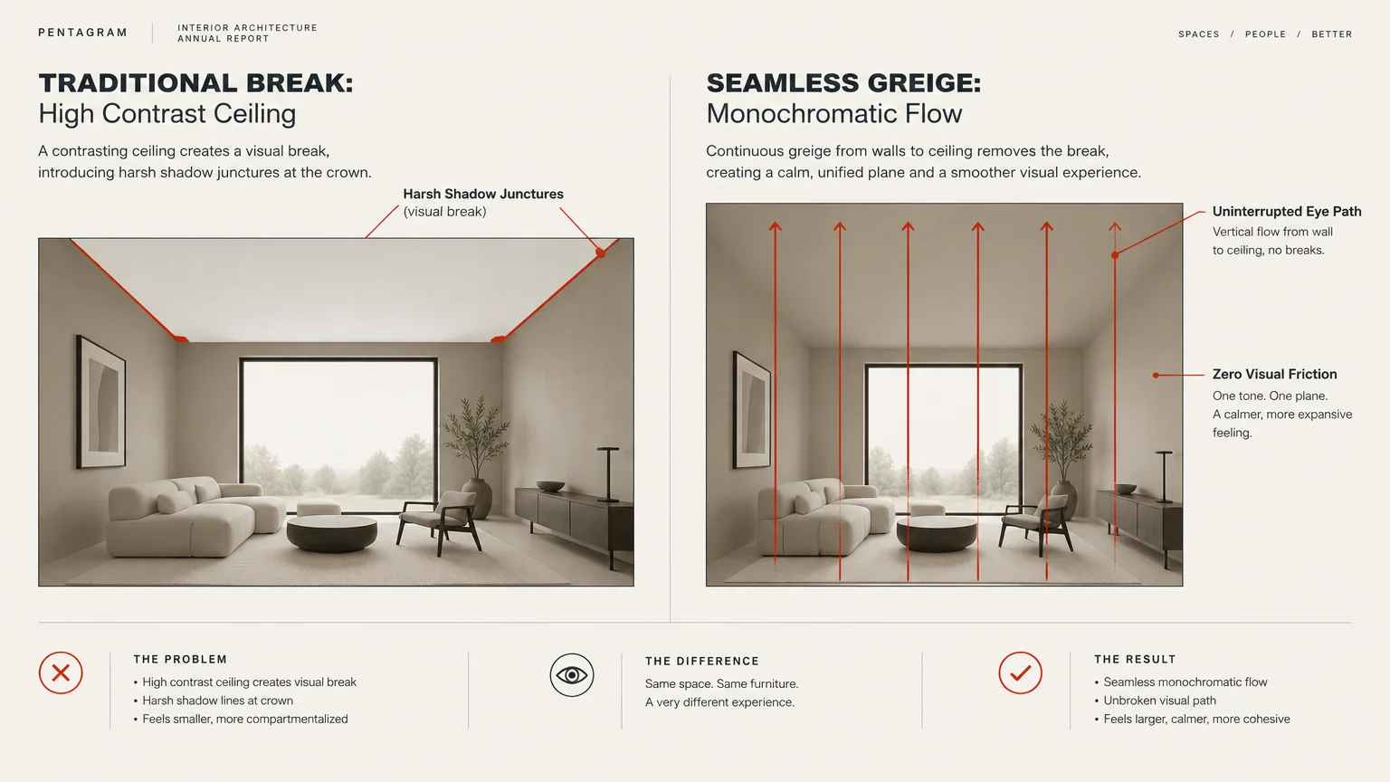
Trend #11: Monochromatic Seamless Greige
Greige seamlessly merges the warmth of beige with the modern serenity of true gray. When you envelope an entire room in one monochromatic greige wash, you blur the boundaries between wall and ceiling.
Eliminating the horizontal line of white molding removes the visual cue that signals where walls terminate. The human eye glides effortlessly around the envelope without perceiving a low overhead limit.
This cohesive look aligns perfectly with quiet luxury aesthetics, emphasizing holistic balance over jarring focal points. It feels intentional, calm, and tailored.
Accentuate this monochrome look with textured stone fireplaces, plush neutral rugs, and matte ceramics. Layering varied textures prevents the single-color scheme from feeling flat or sterile.
In small living spaces, greige creates a harmonious cocoon that feels remarkably spacious. It remains one of the most foolproof paint tricks for small rooms today.
Extend the exact paint color down through baseboards and door casings for total cohesion. Uninterrupted color fields eliminate choppy visual breaks completely.
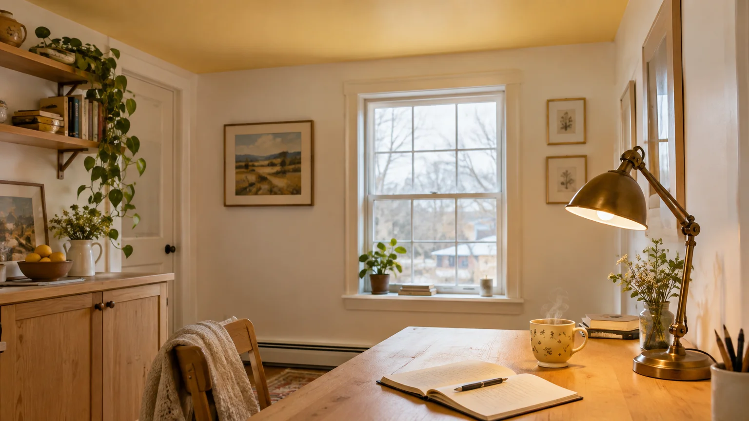
Trend #12: Pale Sunlight Buttercream
Pale buttercream yellow acts like an artificial skylight, bringing synthetic solar warmth into shadowy rooms. Its cheerful warmth mimics morning sunlight, lifting flat ceilings and warming chilly northern daylight.
Modern buttercream departs from outdated mustard or gold hues by embracing pale, airy luminosity. It provides gentle vibrancy without overwhelming the senses or casting garish reflections.
Use this hue in windowless basements, low-ceilinged kitchens, or dim laundry rooms to infuse instant optimism. The golden overhead glow lifts your mood while opening up tight proportions.
Pair pale buttercream with creamy ivory cabinets, soapstone countertops, and warm brass fixtures. The warm materials reinforce the sunlit aesthetic while keeping the room elegant and balanced.
By infusing overhead surfaces with radiant light, you banish heavy gloom effortlessly. Buttercream turns an architectural limitation into an invigorating focal feature.
Avoid pairing buttercream with bright stark whites, which can make the yellow look overly saturated. Soft warm neutrals maintain an organic, sunlight-drenched transition.
The Big Picture: Weaving These Trends into Your Home
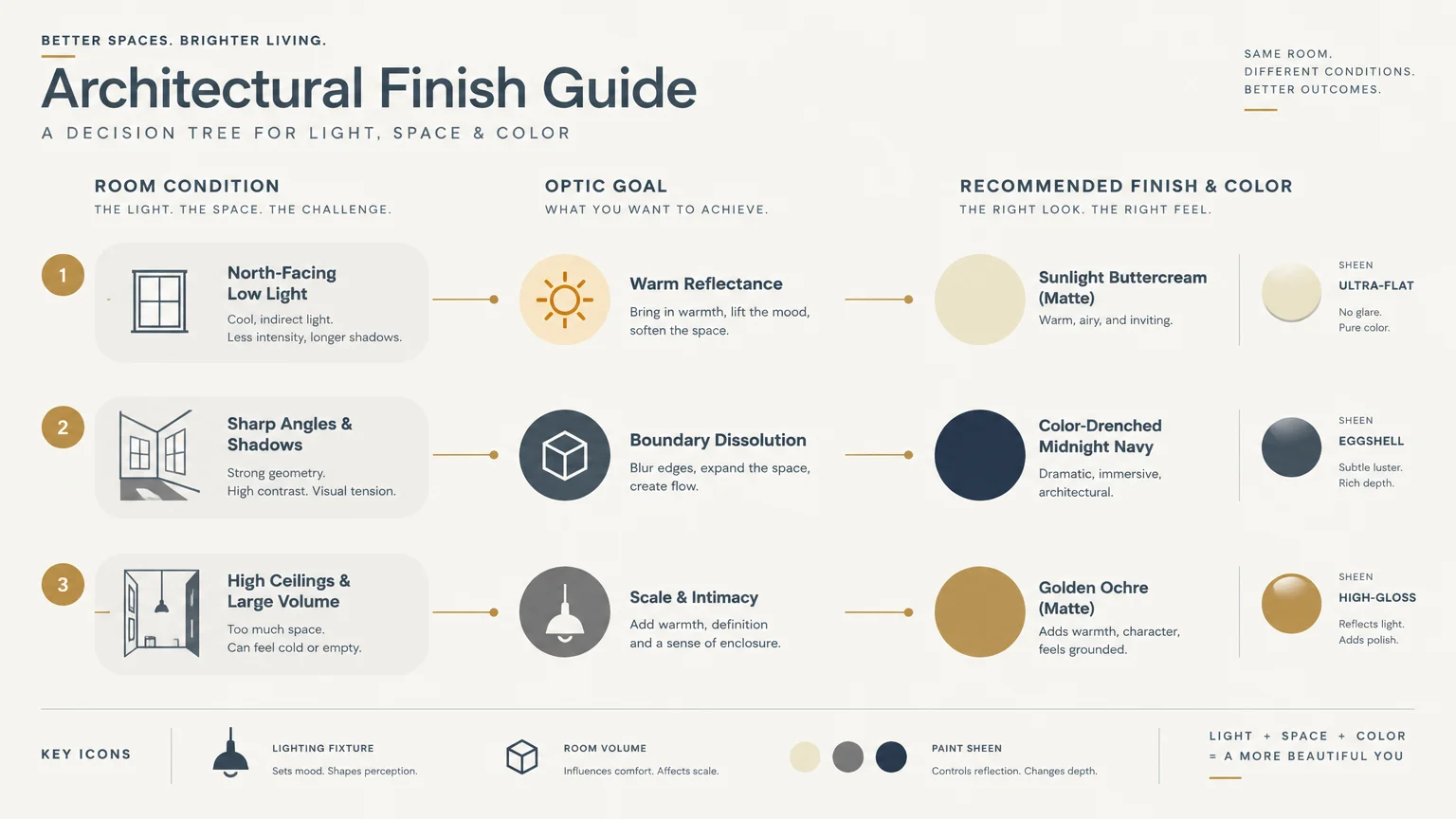
Executing vertical expansion through paint requires more than simply selecting an appealing swatch. You must assess how architecture, light orientation, and adjacent finishes interact across your living spaces.
Start by identifying your room’s natural light exposure before committing to undertones. Cool-toned ceilings thrive in abundant southern sun, while warm tints revive shadowy northern exposures.
Sheen selection plays an equally vital role in shaping overhead perception. While ultra-matte sheens absorb glare to hide proximity, high-gloss lacquers bounce light to double vertical space.
Consider eliminating contrasting crown molding to prevent unnecessary horizontal boundaries. Painting your trim the same color as your ceiling or walls creates unbroken vertical lines.
Incorporate full-height drapery mounted directly beneath the ceiling plane to amplify height further. Long vertical textile drops naturally lead the eye straight to your elevated ceiling hue.
For the latest color forecasts, consult industry leaders like Pantone and paint companies like Benjamin Moore. For professional design standards, refer to the American Society of Interior Designers (ASID).
Disclaimer: This article reflects design trend analysis and predictions. Personal taste and timeless design principles should always guide your decorating choices.
Frequently Asked Questions
Should a low ceiling always be painted lighter than the walls?
While painting a ceiling lighter than the walls is a reliable technique, it is not your only option. Monochromatic color-drenching in a single hue often blurs corners and elongates height more effectively.
Lighter ceilings work best in high-contrast schemes where you want crisp visual separation. Color drenching excels when you want an immersive, continuous spatial volume.
What paint sheen is best for making low ceilings look taller?
Flat or ultra-matte finishes are generally ideal because they diffuse light and hide surface imperfections. They prevent specular glare from exposing the ceiling’s actual proximity.
However, an expertly applied high-gloss lacquer creates a mirror-like illusion that doubles vertical space in formal dining rooms. Choose high-gloss only if your ceiling plane is flawlessly smooth.
Can vertical wall patterns help enhance ceiling paint tricks?
Yes, pairing strategic ceiling paint with vertical wall treatments creates an unbeatable optical lift. Subtle vertical shiplap, striped wallcoverings, and floor-to-ceiling drapery guide the eye continuously upward.
When these vertical elements meet a softly tinted ceiling, the entire room feels significantly taller and more gracious.
How does natural light affect ceiling paint colors?
North-facing rooms receive cool, shadowy light, requiring warm tones like alabaster or blush to avoid feeling dingy. South-facing rooms enjoy warm daylight, which pairs beautifully with cool blues, mints, and misty grays.
Always test paint swatches on your actual ceiling plane at different times of day before committing. Lighting conditions dramatically alter how undertones perform overhead.