Walnut floors instantly anchor your living space with rich grain, enduring warmth, and architectural weight. Selecting the right wall colors dark wood floors require unlocks their true potential while completely transforming your room’s natural atmosphere.
Whether you crave dramatic contrast or seamless monochromatic harmony, your wall paint dictates how the timber’s brown, caramel, and ash undertones behave. Thoughtful interior paint pairings turn heavy wood planks into an intentional style statement.
Explore these eleven designer-approved paint colors walnut floors complement effortlessly, paired with practical styling advice to elevate your home.
Trend #1: Warm Alabaster and Gallery Whites
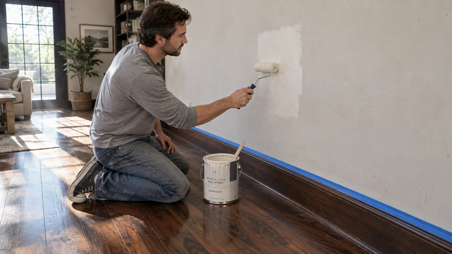
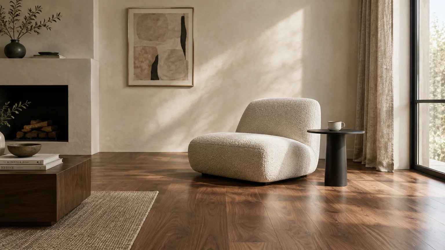
Crisp pure whites often look stark and clinical against the deep, organic patina of walnut boards. Instead, creamy alabaster paints bring out the wood’s honeyed undertones without competing for visual dominance.
Look for warm whites with subtle yellow, beige, or greige bases featuring a Light Reflectance Value between 80 and 85. These reflective hues bounce illumination across the room to counter the timber’s natural light-absorbing quality.
This combination forms the cornerstone of quiet luxury, allowing dark floor planks to function as rich art pieces beneath neutral architecture. You create an airy, expansive envelope while maintaining an inviting residential warmth.
Pair this palette with linen upholstery, bouclé accents, and matte black lighting hardware. The creamy wall surface highlights the wood’s swirling cathedral grain rather than drowning it in cold glare.
Apply this pairing in open-concept living rooms where preserving natural sunlight is your primary objective. It offers effortless versatility, accommodating both minimalist curation and layered historical furnishings.
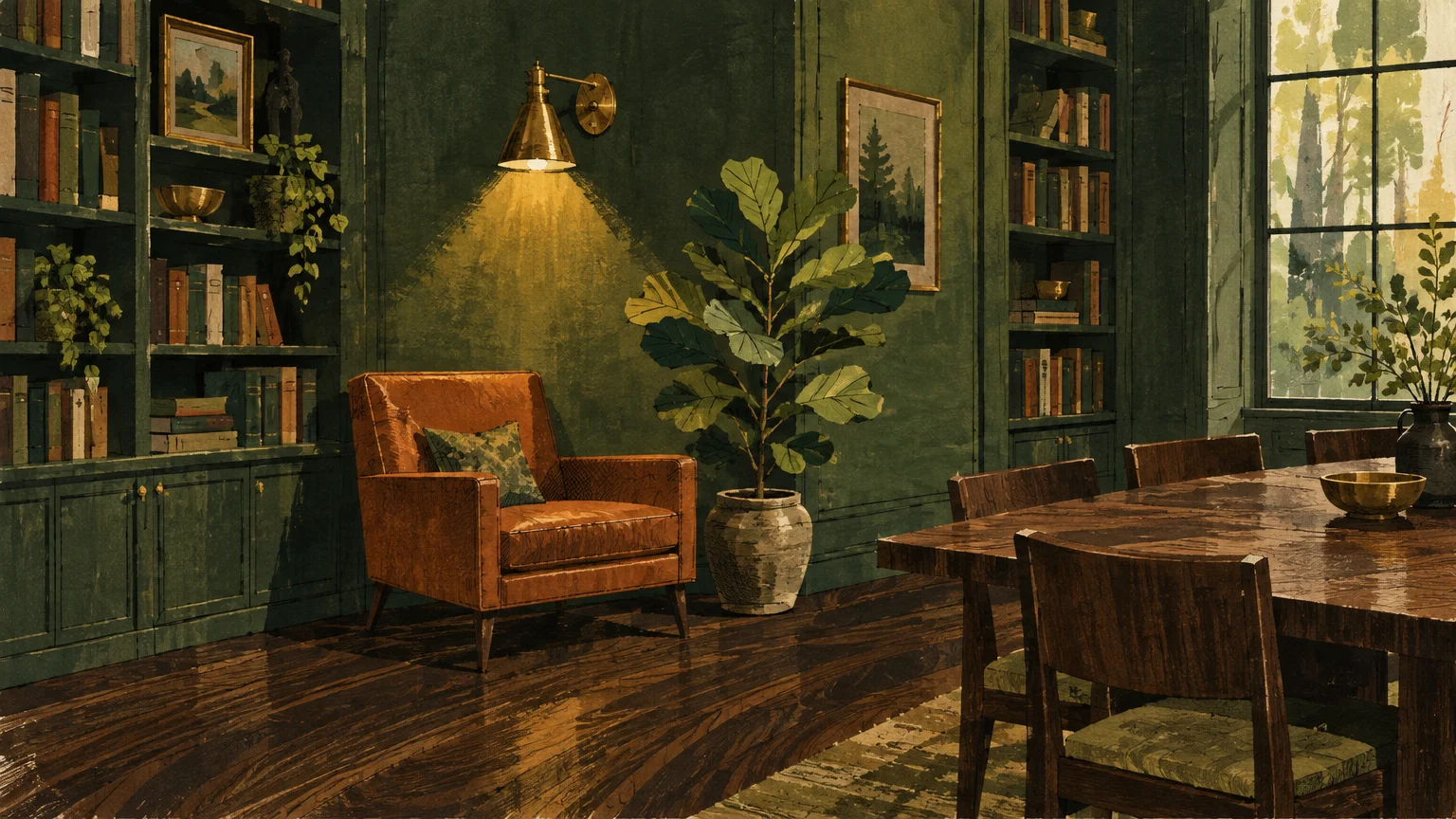
Trend #2: Deep Forest and Biophilic Emerald
Biophilic design continues to dominate contemporary interiors, and dark walnut flooring provides the ideal foundation for botanical colorways. Deep forest greens ground your room, drawing inspiration from natural woodland canopies.
Because green sits opposite red on the color wheel, forest pigments neutralize and complement the reddish-amber undertones found in American walnut. The resulting juxtaposition produces an intimate, cocooning ambiance with undeniable sophistication.
Choose saturated shades with muted olive or moss undertones rather than bright primary emeralds. Matte or eggshell sheens keep the walls velvety, preventing harsh reflections from competing with satiny floor finishes.
Layer your space with unlacquered brass switchplates, aged cognac leather armchairs, and lush potted foliage. These accents tie the walls and floors together, creating an organic modernism aesthetic.
Use moody emeralds in dining rooms, home libraries, or powder baths where you want to foster drama and focused conversation. The dark flooring anchors the intensity, ensuring the bold walls feel grounded.
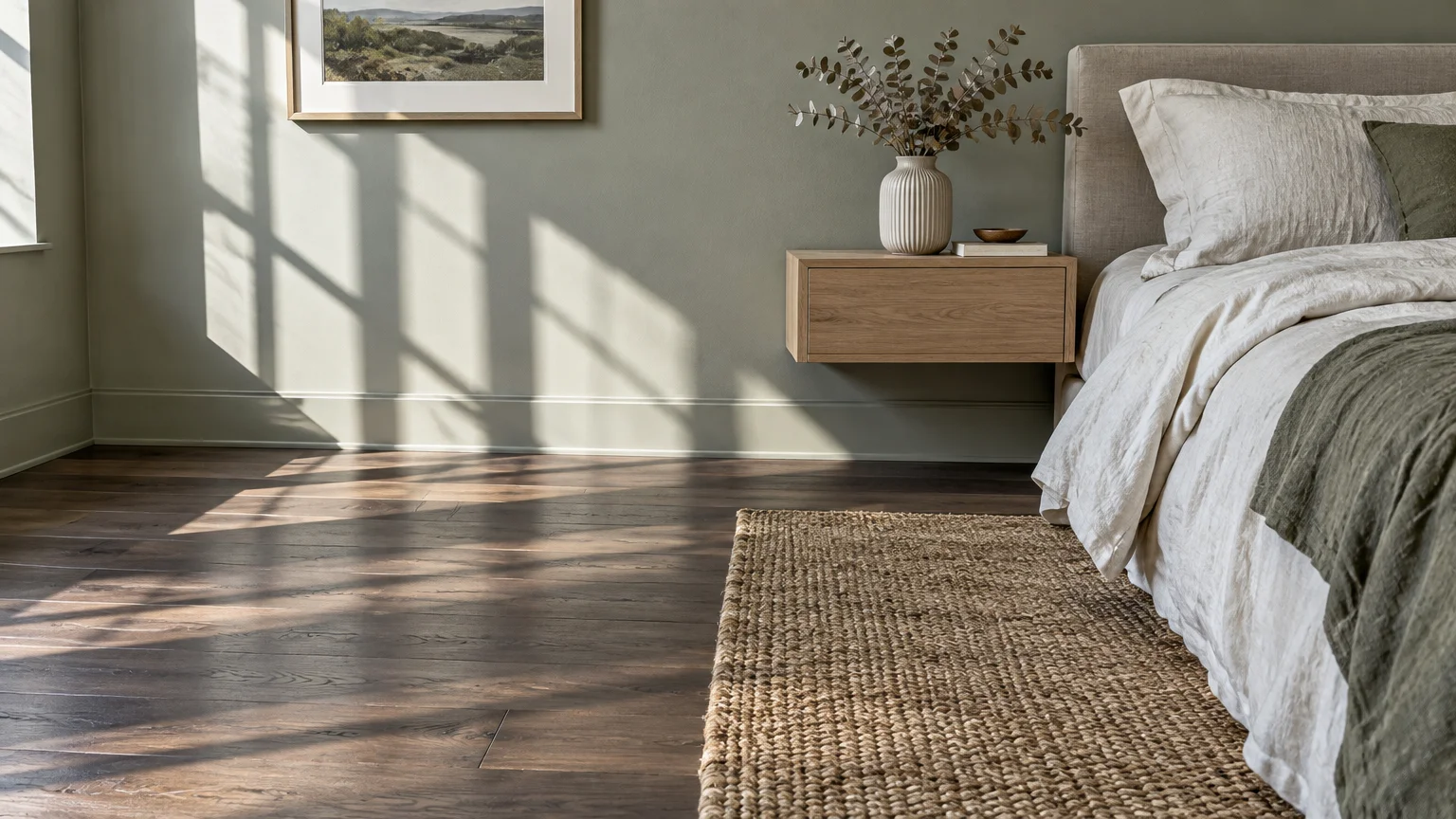
Trend #3: Mineral Sage and Muted Eucalyptus
If deep forest green feels too daring, mineral sage offers a soothing, light-filled alternative. Its dusty gray-green base balances the heavy visual gravity of walnut without darkening your space.
This color pairing draws on Scandinavian and Japanese design principles, emphasizing calm environments and honest materials. The herbal tint cools warm timber while maintaining an organic connection to nature.
Select a sage with slate-gray undertones rather than yellow-heavy pistachios. Gray pigments harmonize with the naturally cool, grayish grain lines that often streak through genuine walnut planks.
Complement sage walls with white oak cabinetry, woven jute runners, and textured ceramic vessels. These pale organic materials bridge the contrast gap between the pale walls and dark flooring.
We recommend this palette for primary bedrooms, sunrooms, and spa-inspired bathrooms where restorative relaxation remains the goal. It delivers an effortless, perennial freshness that never overwhelms daily life.
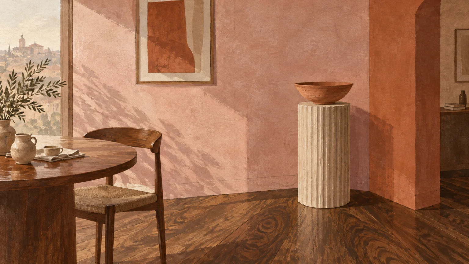
Trend #4: Ethereal Dusty Rose and Terracotta
Earthy pinks and sun-baked terracottas have shed their novelty status to become refined modern neutrals. When paired with walnut flooring decor, these pigments amplify the subtle chestnut and cinnamon tones within the wood.
Avoid bubblegum pastels in favor of complex, desaturated rose hues infused with gray or brown umber. These mature blush tones provide an unexpected counterpoint to walnut’s masculine weight.
The visual chemistry works because both surfaces share a grounding earth-born provenance. Terracotta infuses living spaces with Mediterranean warmth, creating spaces that feel sun-drenched and welcoming throughout every season.
Style this palette with travertine coffee tables, fluted plaster details, and brushed bronze metals. The tactile stone surfaces temper the pink’s warmth while matching the floor’s organic sophistication.
Introduce dusty rose into formal dining rooms or sitting parlors bathed in southern sunlight. The afternoon light ignites the blush pigments, bathing your walnut floors in an enchanting golden glow.
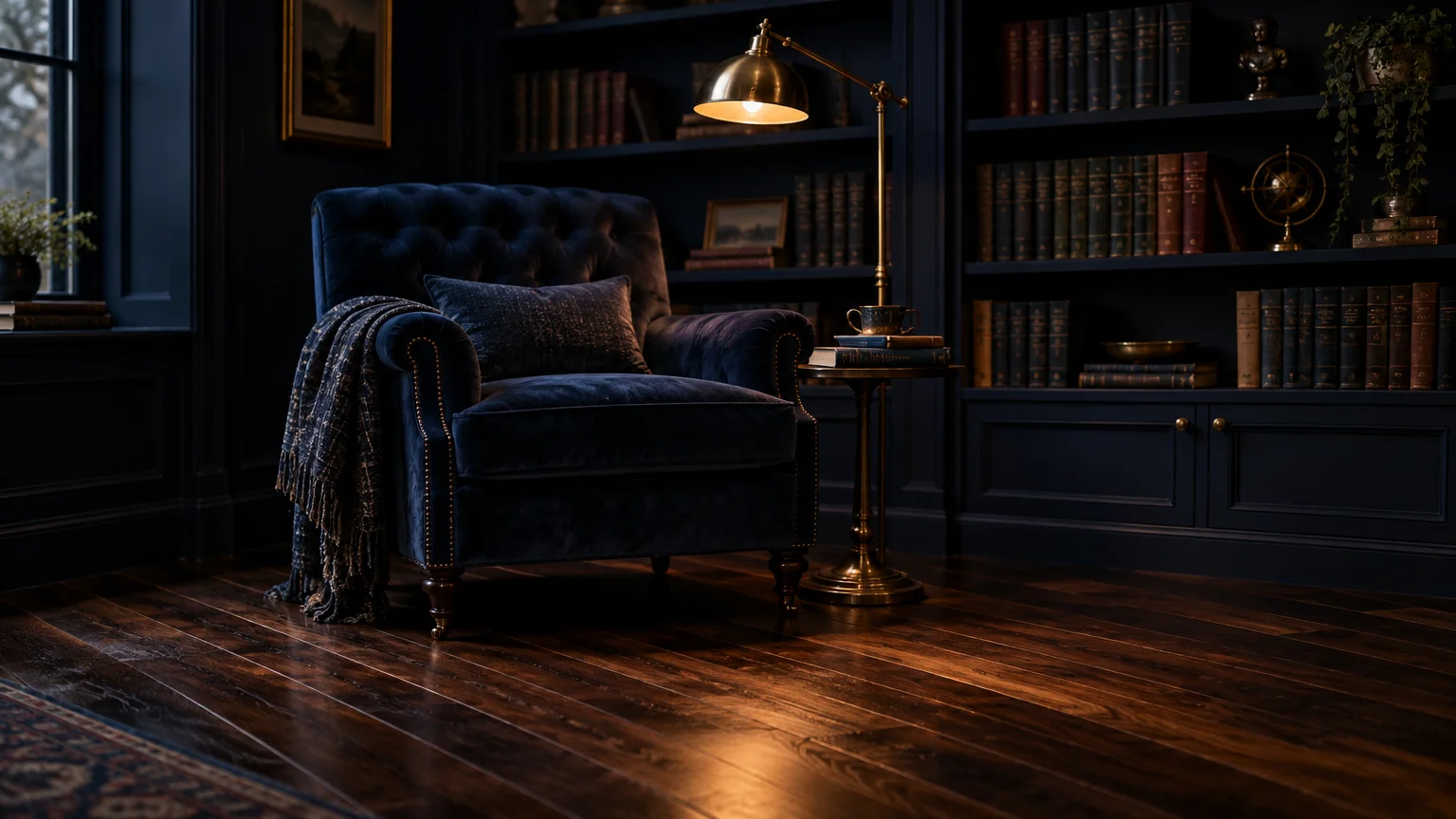
Trend #5: Rich Navy and Midnight Indigo
Navy blue and dark wood floors represent a classic pairing that exudes architectural confidence. Deep indigo walls cast your walnut floors in a tailored, masculine light that evokes timeless heritage estates.
The contrast relies on classic color theory. The deep blue tones accentuate the warm gold and reddish flecks running through the timber’s heartwood.
Select an inky navy with black or charcoal undertones to avoid a dated nautical look. High-pigment midnight blue walls absorb excess glare, creating an enveloping, cocooning retreat.
Offset the intense saturation with crisp white crown molding, polished chrome fixtures, and off-white wool rugs. These sharp white accents break up the dark expanses, ensuring the room feels intentional rather than cavernous.
This pairing excels in executive home offices, media dens, and primary suites. It sets an intellectual, commanding tone that honors the architectural presence of luxury hardwood flooring.
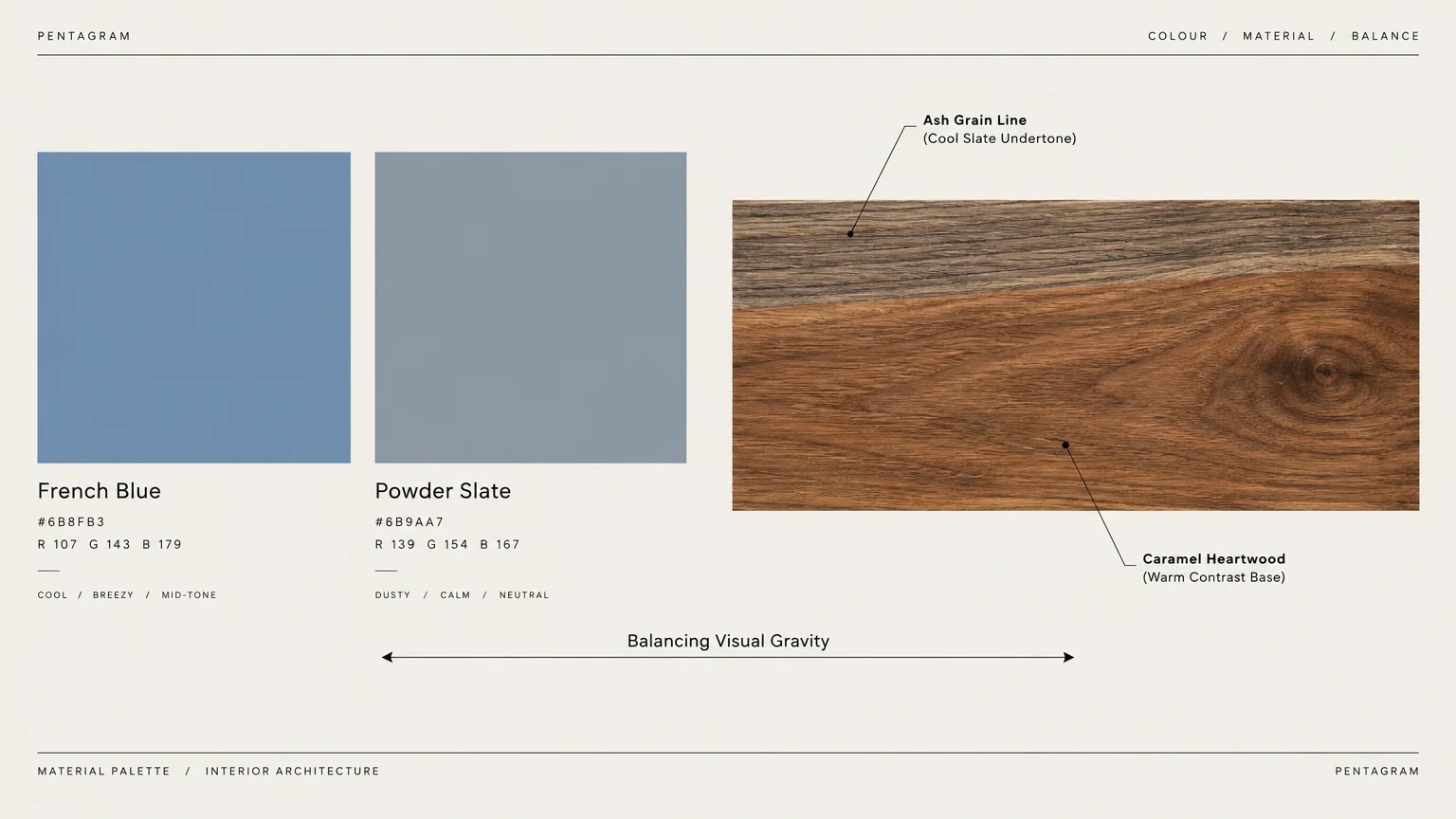
Trend #6: French Blue and Powder Slate
If you love blue but want to maximize ambient light, consider French blue or powder slate. These dusty, mid-tone blues deliver sophisticated charm without dimming your room’s natural daylighting.
Powder slate contains a measured dose of gray that tempers the blue’s intensity. That gray component aligns with the cool undertones of walnut, producing an integrated, harmonious scheme.
The light-to-medium contrast allows dark planks to stand out as defining floor planes. Meanwhile, the walls recede gently, visually expanding the room’s boundaries.
Furnish this layout with bleached oak sideboards, light gray velvet seating, and antiqued silver mirrors. The juxtaposition between icy wall tints and warm wood floors generates a captivating visual tension.
This paint concept works exceptionally well in transitional kitchens, guest suites, and entry foyers. It delivers refined character while retaining an airy, welcoming quality for visiting guests.
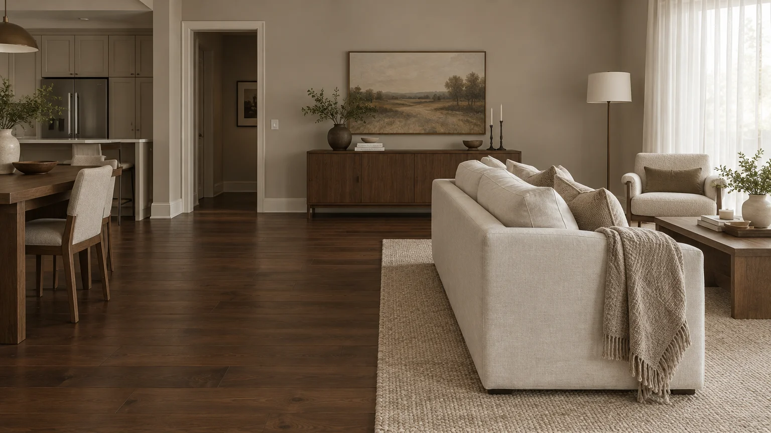
Trend #7: Warm Greige and Cashmere Taupe
Pure cool gray can leave dark hardwood looking lifeless and disconnected. In contrast, warm greige and cashmere taupe establish a bridge between contemporary neutrality and rich organic timber.
Greige blends cool gray with warm beige, echoing both the smoky grain and the amber undertones of walnut boards. It provides just enough pigment to define walls against white baseboards without feeling heavy.
Look for paints with red or green undertones rather than stark blue bases. The right taupe adapts to changing sunlight, appearing fresh at noon and decadently cozy by candlelight.
Style your room with creamy bouclé sectionals, walnut accent tables, and layered sheepskin throws. Repeating the floor’s wood tone in smaller furniture pieces unites your whole color story.
Greige is the premier choice for continuous open-concept living zones and hallways. It flows effortlessly across different rooms, establishing visual continuity throughout your home’s public areas.
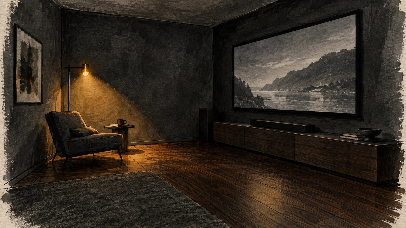
Trend #8: Moody Charcoal and Soft Graphite
Embracing dark-on-dark aesthetics yields rooms of extraordinary drama and modern prestige. Charcoal and soft graphite walls treat your walnut flooring as an extension of an architectural sculpture.
Rather than trying to brighten the dark floorboards, you celebrate their moody nature. The dark wall surface blurs room perimeters, generating an optical illusion of endless space.
Choose charcoal paints with subtle brown or warm black bases rather than icy slate tones. This subtle thermal warmth prevents the walls from clashing with the walnut’s rich biological warmth.
Incorporate dynamic texture to keep the scheme from feeling flat. Fluted millwork, low-sheen velvet drapery, and rough-hewn stone fireplaces add sensory depth that catches shifting shadows.
Deploy this scheme in wine cellars, home theaters, and moody cocktail lounges. The combination crafts an immersive sensory experience ideal for evening entertaining and intimate lounging.
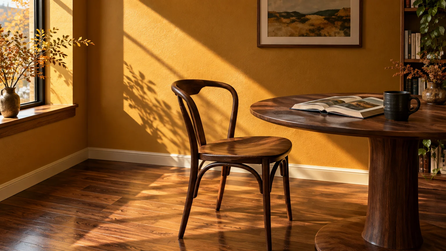
Trend #9: Ochre, Mustard, and Warm Amber
Mid-century modern aesthetics consistently celebrate walnut wood alongside energetic golden tones. Rich ochre, spicy mustard, and warm amber paints bring radiant heat into rooms with dark wood floors.
These golden tones pull the hidden amber streaks directly out of walnut planks. The resulting energy feels optimistic, creative, and steeped in mid-twentieth-century design pedigree.
Select an earthy mustard with brown undertones rather than a synthetic, sunny yellow. Earth-pigmented ochre honors the floor’s organic qualities while preventing visual fatigue.
Accentuate this color direction with walnut credenzas, matte black accents, and textured woven wall hangings. Terrazzo surfaces and olive green textiles also blend seamlessly with this retro-informed scheme.
This palette shines in creative studios, breakfast nooks, and dynamic living spaces. It infuses your home with enduring character that feels both vintage and boldly modern.
Trend #10: Dove Gray and Pale Fog
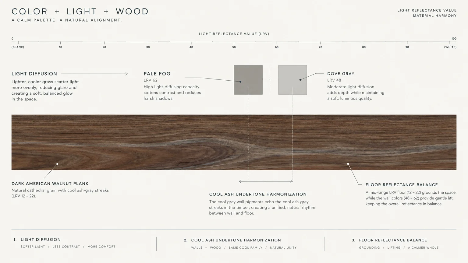
For lovers of minimalist Scandinavian design, pale fog and dove gray provide clean sophistication. This pairing creates a soft contrast that lets the grain of your walnut floors take center stage.
Unlike harsh sterile grays, dove gray contains a whispered drop of umber. That minute touch of pigment prevents the walls from feeling icy against the rich wood.
An LRV around 70 to 75 ensures that light bounces cleanly throughout your living environment. This keeps north-facing rooms bright even when anchored by heavy, dark timber floorboards.
Combine these pale walls with Scandinavian furniture, blonde timber accents, and clean black steel frames. The mix of light and dark woods prevents your interior from appearing one-dimensional.
Apply pale fog in bedrooms, modern hallways, and minimalist living areas. It acts as a serene, neutral canvas that elevates your prized furnishings and architectural flooring.
Trend #11: Espresso and Deep Black-Brown Drenching
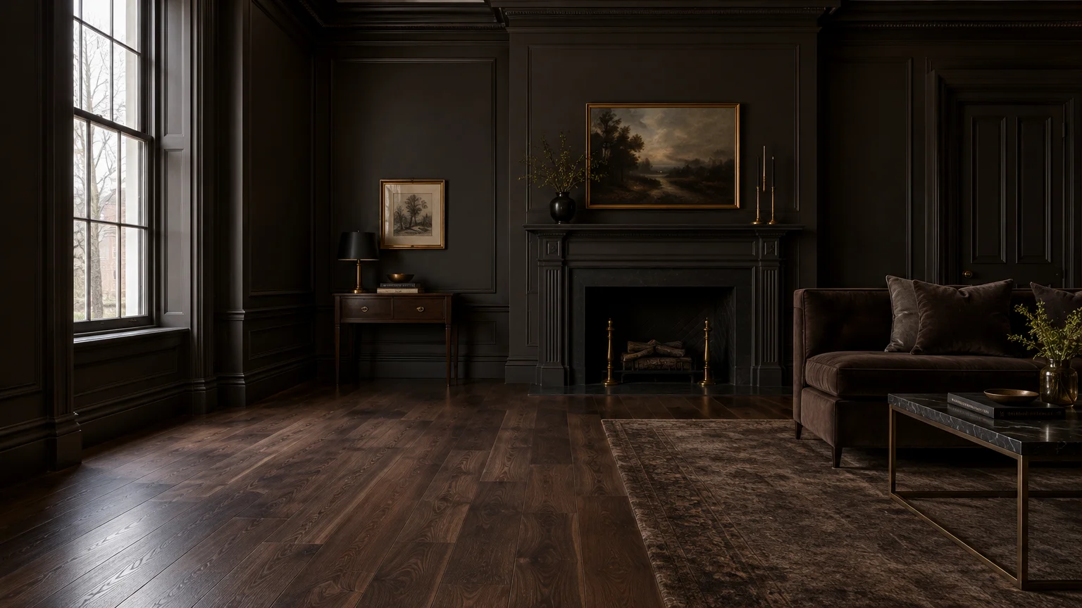
Color drenching has emerged as one of the design world’s most luxurious strategies. Coating your walls, baseboards, and ceilings in espresso or bitter chocolate produces an intoxicating, cohesive sanctuary.
This technique erases the harsh boundary line where your walnut floors meet your drywall. The eye perceives a continuous, uninterrupted expanse of luxurious, moody tone.
Match the undertone of your paint precisely to the dominant hue of your floor’s finish. A walnut floor with purple-black cast demands a black-brown paint with matching cool undertones.
Layer the space with reflective glass, polished bronze, and tactile bouclé textiles to break up the darkness. Strategic ambient lighting, like warm LED cove strips, highlights the velvety paint surface.
Reserve this bold technique for primary powder rooms, intimate music rooms, or library studies. It embodies unapologetic quiet luxury, making a memorable impression on anyone who enters.
The Big Picture: Weaving These Trends into Your Home
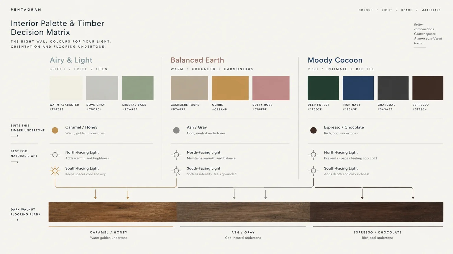
Successfully executing paint ideas wood floors require starts with identifying your specific timber’s underlying color temperature. Genuine walnut displays varied characteristics depending on its milling provenance, stain, and age.
Direct sunlight pulls warm golden and honeyed highlights from walnut planks over time. Conversely, rooms lit with cool, artificial LED bulbs emphasize the floor’s deeper charcoal and violet-brown shadows.
Always test candidate paint colors walnut floors support on large foam boards rather than directly on drywall. Move these swatches across different rooms and examine them at morning, midday, and twilight.
Place the color sample directly against your floorboards to observe how reflections interact. A paint that appears perfectly neutral under showroom lighting might cast an unflattering muddy tone beside dark timber.
Consider your baseboards and architectural trim as intentional visual buffers. Crisp white trim provides a sharp border between saturated walls and dark floors, while tone-on-tone trim softens transitions.
Balance the visual weight of dark hardwood by distributing rich tones upward through your room. Incorporate walnut shelving, picture frames, or dark lighting fixtures to tie your vertical planes to the floor.
For the latest color forecasts, consult industry leaders like Pantone and paint companies like Benjamin Moore. For professional design standards, refer to the American Society of Interior Designers (ASID).
Disclaimer: This article reflects design trend analysis and predictions. Personal taste and timeless design principles should always guide your decorating choices.
Frequently Asked Questions
How do I determine whether my walnut floors have warm or cool undertones?
Inspect your floorboards in natural daylight away from artificial lamps. American black walnut typically possesses cool, purple-gray and chocolate-brown undertones, while European walnut often exhibits warmer golden-amber flecks.
Hold a sheet of pure white paper directly on the boards to isolate the wood’s true character. The paper makes hidden red, yellow, or gray pigments instantly visible to your eye.
Will dark wall colors make my room feel small when paired with walnut flooring?
Deep colors do not inherently shrink a room; instead, they blur edges and remove visual corners. When you pair dark walls with walnut flooring decor, the boundaries recede, creating depth and intimacy.
Ensure adequate ambient, task, and accent illumination to prevent gloomy pockets. Using satin finishes or light-colored textiles keeps the atmosphere sophisticated rather than claustrophobic.
What ceiling paint color should I choose when pairing dark walls with walnut floors?
A bright, flat white ceiling can create a harsh, disjointed cutoff if your walls are deeply saturated. Select an off-white tinted with a tiny drop of your wall color for a smoother transition.
Alternatively, wrap the wall color continuously over the ceiling for an immersive color-drenching effect. This contemporary approach removes visual clutter and makes standard eight-foot ceilings feel surprisingly expansive.
How can I prevent light neutral walls from looking sterile against walnut planks?
Choose off-whites and greiges that share an organic, creamy base rather than stark, blue-toned whites. Nuanced neutrals highlight the natural richness of the timber without establishing an aggressive contrast.
Layer textured furnishings such as linen drapery, bouclé seating, and natural stone tables throughout your space. These tactile surfaces catch natural sunlight, lending vital warmth to your pale walls.