Light oak floors provide a luminous, organic architectural canvas for your home. Selecting the right wall colors unlocks their natural grain while establishing an elevated, cohesive interior palette.
Whether your timber features Scandinavian pale wheat undertones or European wire-brushed honey accents, strategic contrast creates an immediate visual harmony. The right tones balance light reflection and tonal depth effortlessly.
This curated guide highlights sophisticated wall shades engineered to accentuate light oak floors across contemporary, transitional, and quiet luxury aesthetics. Transform your living spaces with colors that showcase your flooring with enduring elegance.
Trend #1: Warm Alabaster and Soft Chalk
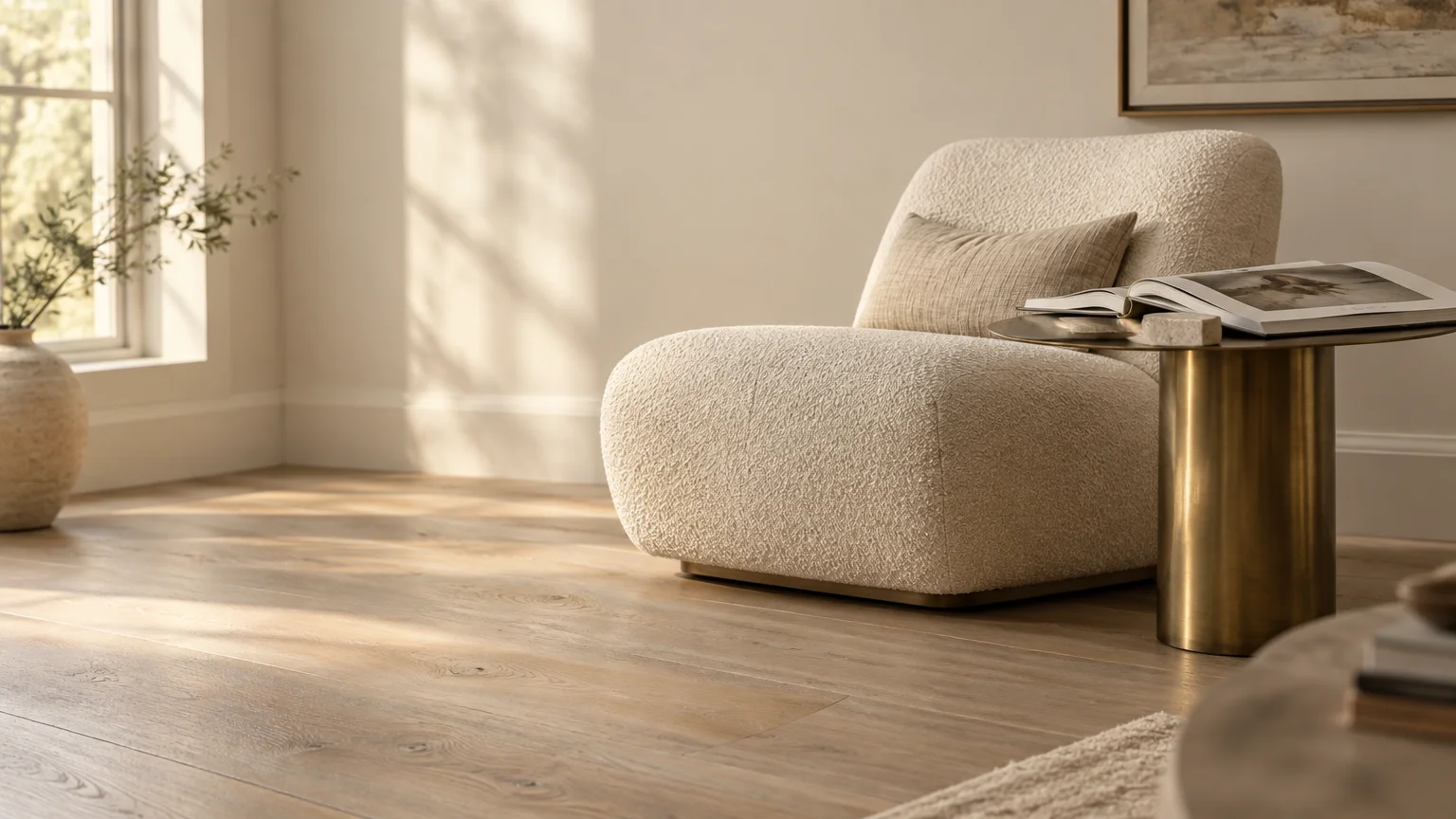
Warm alabaster embodies the quiet luxury movement by wrapping your space in creamy, comforting elegance. This shade softens natural daylight while accentuating the gentle golden grain of your timber.
When searching for paint colors for light oak floors, a velvety off-white provides a welcoming foundation. It prevents the stark, clinical ambiance often produced by pure builder-grade white emulsions.
Cultivate an organic modern aesthetic by pairing Sherwin-Williams Alabaster with wire-brushed white oak; the harmonious tonal depth makes open-concept living rooms feel intentional and cohesive.
Balance this pairing with boucle textiles, raw travertine accents, and unlacquered brass hardware. These tactile layers celebrate authentic craftsmanship and quiet architectural restraint throughout your interior.
Apply an eggshell finish on your main walls to bounce soft ambient light across the room. Reserve flat sheens for ceilings to complete this seamless, enveloping sanctuary.
Trend #2: Biophilic Sage and Muted Olive
Biophilic design continues to dominate high-end interiors by reconnecting indoor living spaces with the calming natural environment. Soft sage introduces an organic serenity that feels timeless and grounded.
Muted greens act as complementary counterparts to the pale yellow and honey undertones in light oak. By neutralizing overly warm planks, sage creates an effortlessly balanced visual atmosphere.
Farrow & Ball French Gray and Benjamin Moore October Mist provide exquisite tonal subtlety. These complex hues shift gracefully throughout the day as natural sunlight travels across your room.
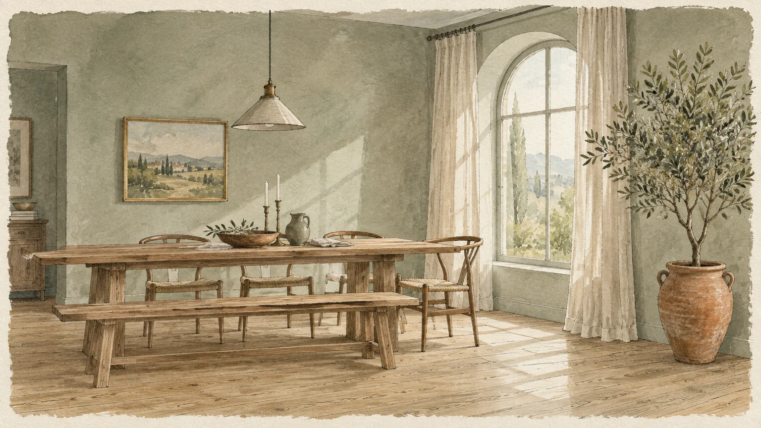
Incorporate linen drapery, hand-thrown ceramics, and potted olive trees to amplify this botanical sanctuary. The earthy timber grain echoes the organic pigment, establishing an authentic sense of provenance.
This combination thrives exceptionally well in sun-drenched dining rooms and tranquil primary bedrooms. You achieve an inspiring balance of restorative calm and sophisticated design excellence.
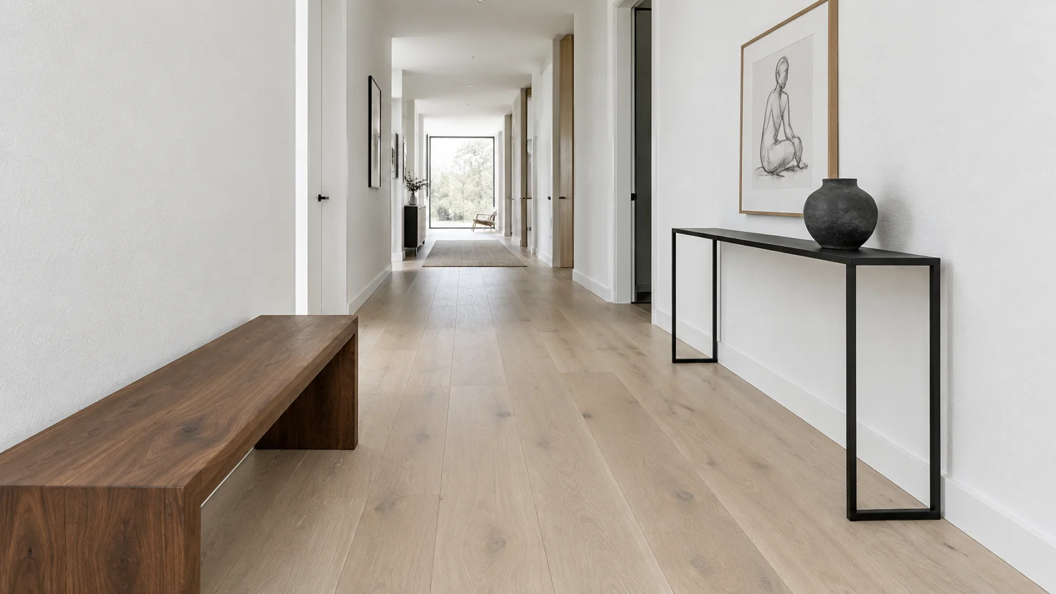
Trend #3: Crisp Architectural White
Crisp architectural white delivers a sharp, gallery-inspired aesthetic that honors Scandinavian minimalism. This high-contrast choice allows the intricate grain of pale oak flooring to command center stage.
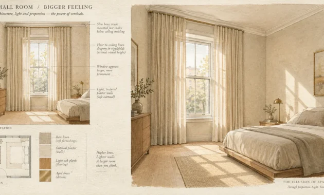
Selecting an ultra-clean hue like Benjamin Moore Chantilly Lace maximizes ambient light reflection. It creates an expansive, airy feeling that transforms compact floor plans into luminous living areas.
Precision matters when working with high-reflectance whites against warm timber planks. Avoid chalky paints with cold blue undertones, which can inadvertently cause natural oak to appear yellowed.
Style this pairing with matte black steel framing, minimalist walnut furniture, and oversized contemporary art. The calculated tension between crisp drywall and organic timber generates captivating visual interest.
Use this striking aesthetic in open entryways and expansive modernist living rooms. The pristine canvas highlights your curated furnishings while celebrating architectural purity.
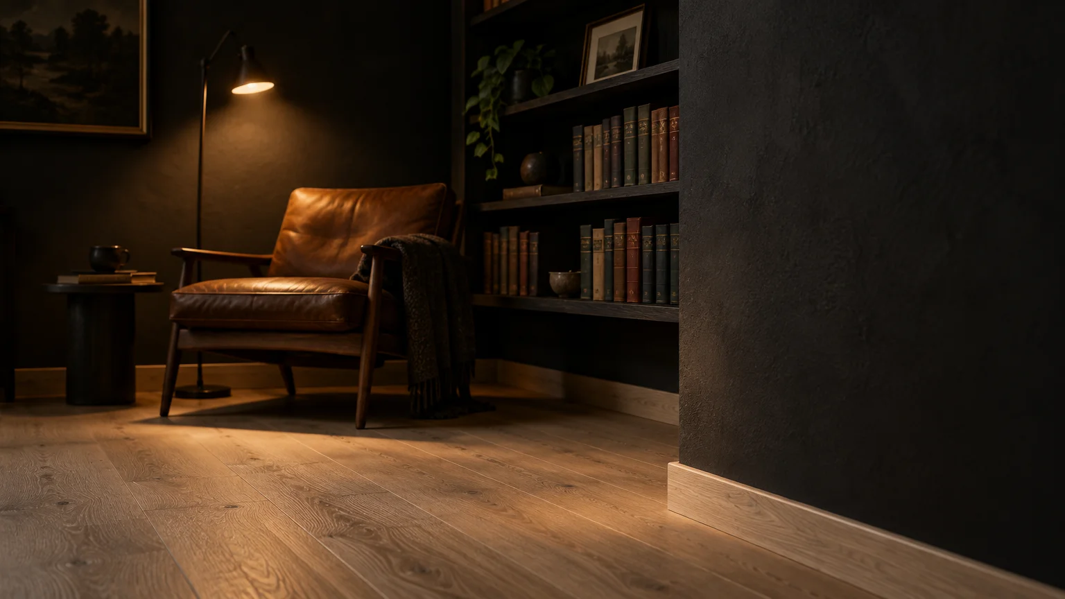
Trend #4: Moody Charcoal and Deep Slate
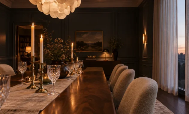
Moody charcoal introduces deliberate drama and modern theatricality into residential spaces. Far from feeling oppressive, dark charcoal anchors your rooms and accentuates the pale brightness of blonde wood floors.
Sherwin-Williams Iron Ore and Benjamin Moore Kendall Charcoal provide rich, velvety depth. Their muted mineral base keeps the atmosphere sophisticated rather than harsh or industrial.
This dynamic pairing represents one of the best paint colors with wood floors for creating moody, intimate gathering spaces. The light oak prevents the charcoal walls from overwhelming your sensory experience.
Layer in brushed bronze fixtures, amber glass lighting, and camel leather upholstery. These rich accents reflect warm illumination against the velvety dark backdrop, elevating your room’s tactile dimension.
Consider applying this commanding shade across private home libraries, formal dining spaces, or media suites. The deliberate tonal contrast delivers an unforgettable, luxury-tier statement.
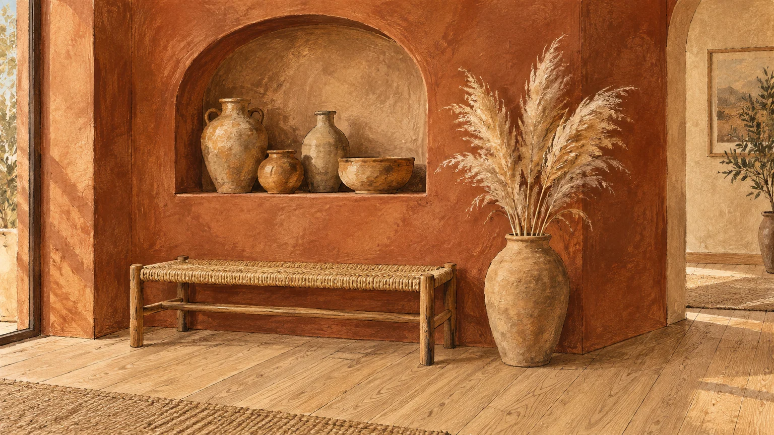
Trend #5: Earthy Terracotta and Sunbaked Clay
Earthy terracotta infuses living spaces with Mediterranean provenance and sun-drenched warmth. This artisanal color trend celebrates raw natural pigments that harmonize beautifully with golden timber flooring.
Clay-based wall tones share analogous warm undertones with natural oak, producing an enveloping monochromatic resonance. The natural wood grain mirrors the handcrafted warmth of baked earth and raw ceramic tiles.
Benjamin Moore Terra Cotta Tile and Farrow & Ball Red Earth embody this grounding warmth. These pigments lend instant architectural character to modern interiors seeking soul and historic depth.
Complement terracotta walls with woven jute rugs, limewash textures, and vintage forged iron elements. These tactile materials enhance the sensory depth of your curated aesthetic effortlessly.
Use this radiant shade in breakfast nooks or casual family dens to foster deep social connection. The embracing hue turns ordinary rooms into deeply welcoming domestic retreats.
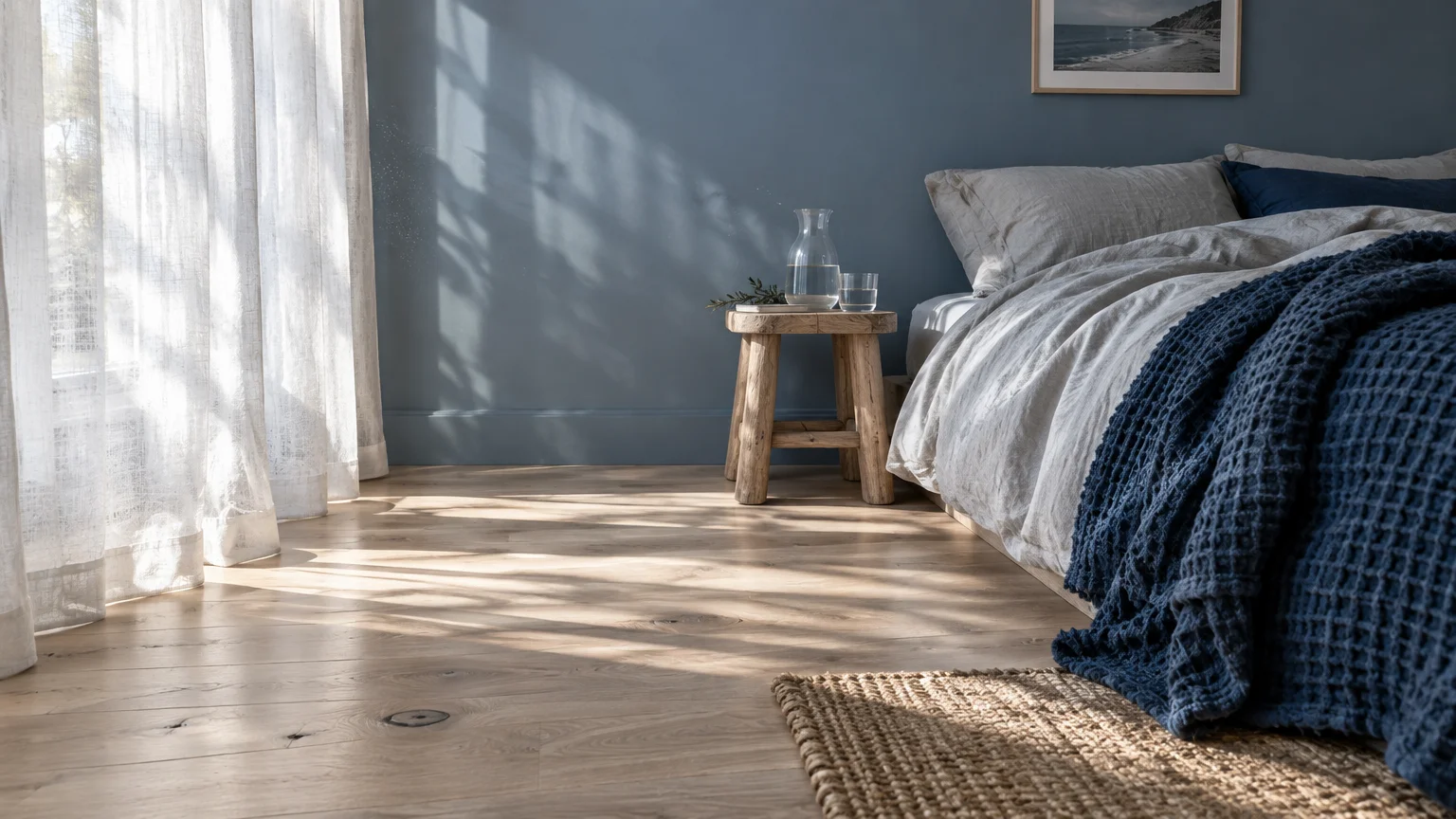
Trend #6: Dusty French Blue and Slate
Dusty French blue offers a refreshing, historically rooted alternative to ubiquitous neutral palettes. Its soft slate undertones cool down yellow-toned oak planks without creating jarring temperature conflicts.
In color theory, blue and yellow sit directly opposite one another across the color wheel. This complementary relationship creates natural dynamic balance between your flooring and wall surfaces.
Farrow & Ball De Nimes or Benjamin Moore Smoke evoke a bespoke, coastal-inspired elegance. These nuanced shades feel grounded and mature, bypassing nautical clichés with quiet grace.
Pair dusty blue walls with crisp white moldings, tailored wool rugs, and warm brass sconces. The golden oak floor beneath grounds the cool vertical planes with organic warmth.
Introduce this palette into living rooms, guest suites, or creative home studios. The serene backdrop fosters thoughtful focus while preserving an air of understated luxury.
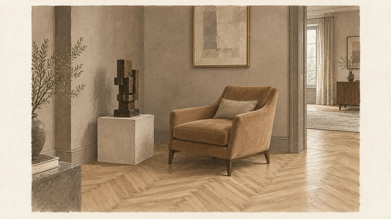
Trend #7: Velvety Mushroom and Warm Greige
Velvety mushroom represents the pinnacle of modern transitional design, bridging warm beige and refined gray. This sophisticated intermediate hue creates a tranquil envelope that feels effortlessly timeless.
When choosing wall colors with oak floors, mushroom tones maintain identical color temperatures to natural wood. They deliver subtle contrast without interrupting visual flow across adjoining living spaces.
Benjamin Moore Pale Oak and Sherwin-Williams Accessible Beige provide subtle warmth. These designer favorites adjust fluidly to shifting daylight, avoiding dull gray casts under low-light conditions.
Style this neutral foundation with reeded wood accents, Belgian linen upholstery, and polished marble coffee tables. The layered monochromatic textures exude quiet luxury and impeccable discernment.
Apply this versatile color across expansive open-plan interiors to establish seamless continuity. It anchors disparate furniture styles into a single harmonious narrative.
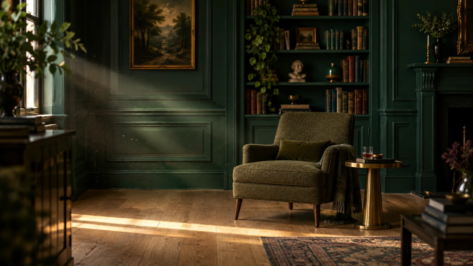
Trend #8: Forest Emerald and Deep Juniper
Forest emerald introduces a dramatic biophilic statement characterized by regal opulence and botanical heritage. This saturated tone envelops spaces in moody grandeur while illuminating pale oak floorboards below.
The deep green pigmentation contrasts with the pale timber, making blonde oak grain patterns pop with clarity. This pairing produces a bespoke, high-fashion atmosphere inside traditional or modern homes.
Benjamin Moore Essex Green and Sherwin-Williams Night Owl showcase exceptional pigment concentration. These rich hues absorb excess light, imparting a cozy, cocoon-like presence to dramatic rooms.
Enhance the botanical immersion with rich velvet upholstery, unlacquered copper accents, and dark stained millwork. The light oak prevents the deeply saturated room from feeling heavy or enclosed.
Utilize deep emerald across intimate study rooms, powder rooms, or sophisticated cocktail lounges. It creates an undeniably cinematic environment that guests will remember long after visiting.
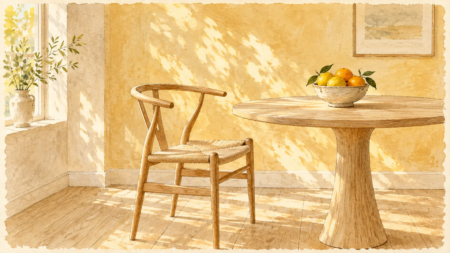
Trend #9: Washed Linen and Pale Ochre
Pale ochre captures the soft, radiant glow of golden hour sunlight across your living spaces. This delicate tone pairs seamlessly with light European oak, amplifying the timber’s natural vitality.
This warm pairing reflects the wabi-sabi philosophy by honoring natural light and organic materials. The gentle yellow undertone enlivens dimly lit spaces without ever feeling artificial or loud.
Farrow & Ball Hay and Benjamin Moore Spanish White provide this gentle, sunlight-dappled glow. They introduce subtle solar warmth that flatters white oak with honey or caramel grain lines.
Complement the scheme with vintage kilim rugs, aged wood consoles, and tactile linen curtains. The harmonious composition creates an inviting, lived-in character rich with relaxed sophistication.
Apply this welcoming color across north-facing living rooms that crave additional ambient warmth. It transforms cool natural exposure into a cozy, golden environment you will adore.
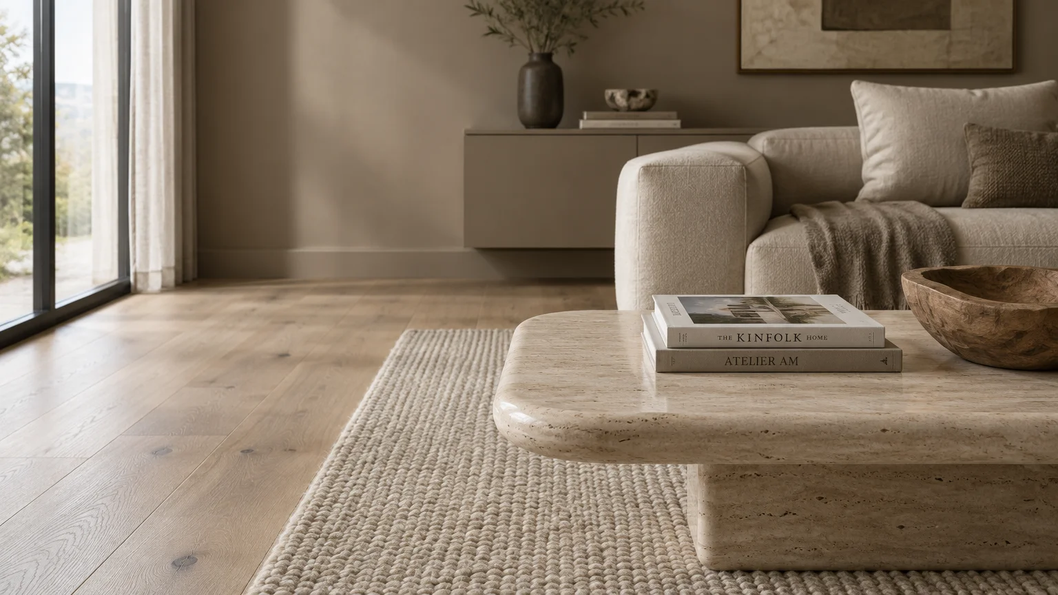
Trend #10: Soft Cashmere and Complex Taupe
Soft cashmere introduces subtle lilac and stone undertones that neutralize excessive yellow in vintage oak flooring. This nuanced neutral provides a velvety backdrop that redefines modern understated elegance.
As one of the most reliable interior paint ideas, taupe balances cool architecture with organic warmth. It bridges modern chrome furnishings and traditional wood millwork with effortless poise.
Farrow & Ball Elephant’s Breath and Benjamin Moore Balboa Mist illustrate this exquisite tonal balance. Their multifaceted pigments reveal shifting layers of gray, cream, and violet throughout changing daylight.
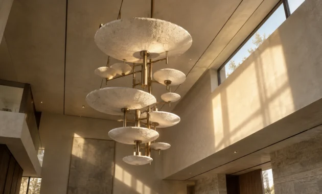
Accessorize with brushed nickel fixtures, alpaca wool throws, and sculpted plaster light pendants. These delicate textures mirror the sophisticated complexity of your painted wall surfaces.
Choose this refined palette for primary bedroom retreats and formal sitting areas. It generates a peaceful, museum-quality backdrop that elevates your prized decorative objects.
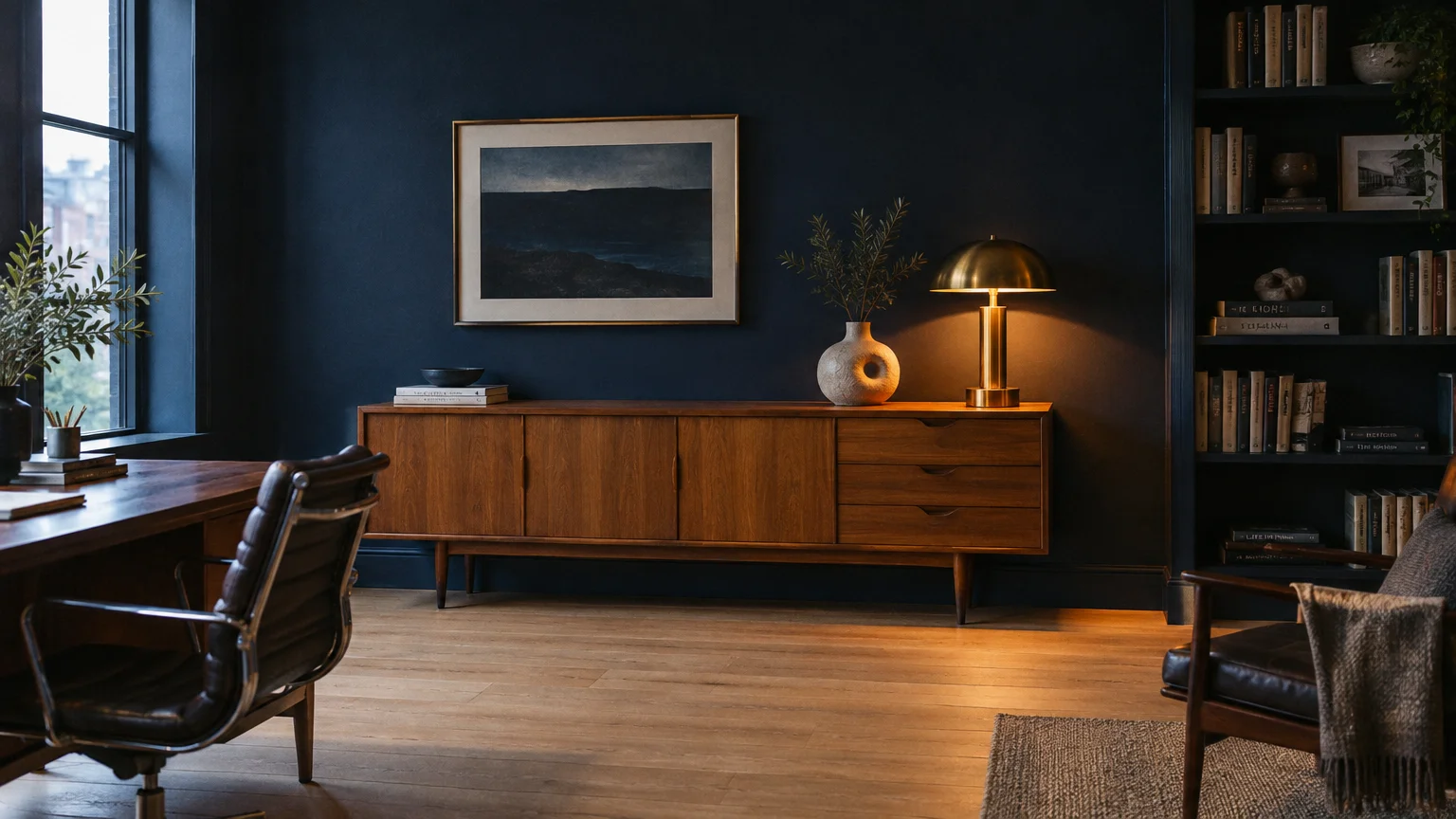
Trend #11: Dramatic Midnight Navy
Dramatic midnight navy delivers majestic depth and maritime provenance to contemporary residential architecture. Paired with light oak planks, deep blue evokes an enduring sense of structural balance and grandeur.
The stark value contrast between navy walls and blonde wood creates a grounded architectural envelope. The pale wood grain glows like raw sunlight set against the evening sky.
Benjamin Moore Hale Navy and Sherwin-Williams Naval rank as premier choices for this dramatic oak floor color pairing. Their classic formulations ensure depth without shifting purple under incandescent lighting.
Style your space with woven rattan chairs, polished brass sconces, and neutral sisal carpets. This blend of organic fiber and tailored color establishes an exquisite transitional living environment.
Deploy midnight navy across sophisticated home offices, dining halls, or accent feature walls. Its commanding presence anchors expansive spaces while honoring your fine timber flooring.
The Big Picture: Weaving These Trends into Your Home
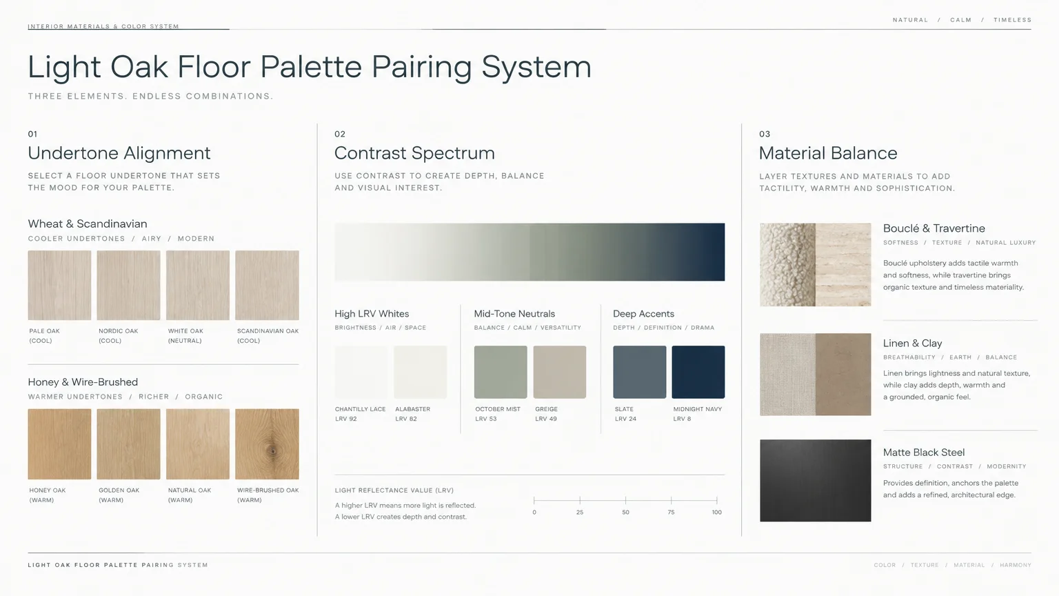
Creating a cohesive home requires balancing foundational flooring tones with intentional wall pigments. Always assess the specific undertone of your light oak planks before committing to a paint bucket.
Natural white oak frequently displays subtle green, gray, or soft wheat undertones beneath clear polyurethane seals. In contrast, red oak or honey finishes emit warmer amber and golden reflections.
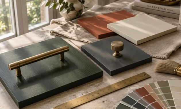
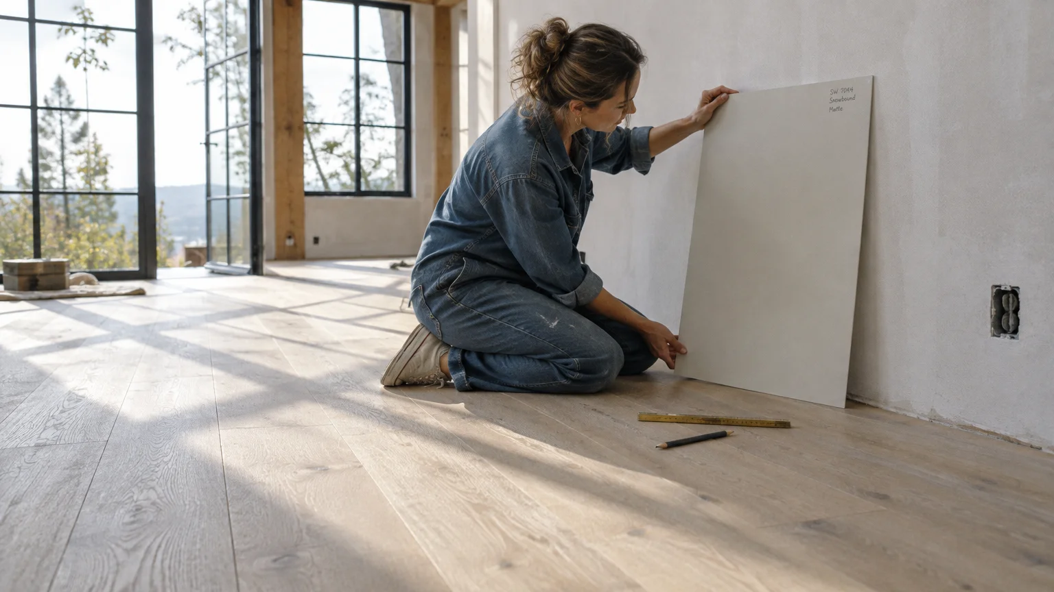
Sample your prospective colors on large poster boards and observe them during morning and evening light cycles. Changing sunlight drastically alters paint perception across open-concept spaces throughout the day.
Maintain continuity across your home by repeating complementary undertones through cabinetry, trim, and textile finishes. Cohesion springs from subtle tonal relationships rather than applying identical paint in every room.
For the latest color forecasts, consult industry leaders like Pantone and paint companies like Benjamin Moore. For professional design standards, refer to the American Society of Interior Designers (ASID).
Disclaimer: This article reflects design trend analysis and predictions. Personal taste and timeless design principles should always guide your decorating choices.
Frequently Asked Questions
How do you identify the specific undertone of your light oak floors?
Place a sheet of pure white printer paper directly against your clean oak floorboards in daylight. The contrast will immediately reveal whether your wood skews golden, pinkish-red, or neutral gray.
Identifying this primary undertone enables you to select paint colors that either harmonize or balance your planks. Understanding this baseline prevents costly repainting projects down the road.
Should trim and baseboards match wall colors or floor tones?
Matching trim to your wall color creates a contemporary, monochromatic envelope that expands visual ceiling height. This technique highlights light oak floors by eliminating distracting horizontal dividing lines.
Alternatively, pairing a crisp off-white trim with saturated walls frames the architecture with classical distinction. Both approaches showcase your flooring beautifully when applied with consistent craftsmanship.
Can you pair cool gray walls with warm light oak flooring?
You can pair cool grays with warm oak if the paint contains nuanced undertones like green or violet. Flat steel grays often clash with golden wood, making spaces feel disjointed.
Opt for greige or mushroom tones instead of pure industrial grays. These transitional pigments bridge cool contemporary furnishings with the organic warmth of your flooring.
What paint sheen looks best with wire-brushed or matte oak floors?
Matte, chalk, and eggshell paint finishes complement the low-luster aesthetic of wire-brushed light oak flooring flawlessly. They diffuse daylight evenly without creating harsh surface glares.
Reserve satin or semi-gloss finishes exclusively for architectural moldings, doors, and high-traffic cabinetry. This strategic sheen contrast elevates tactile depth while maintaining an effortless, organic ambiance.