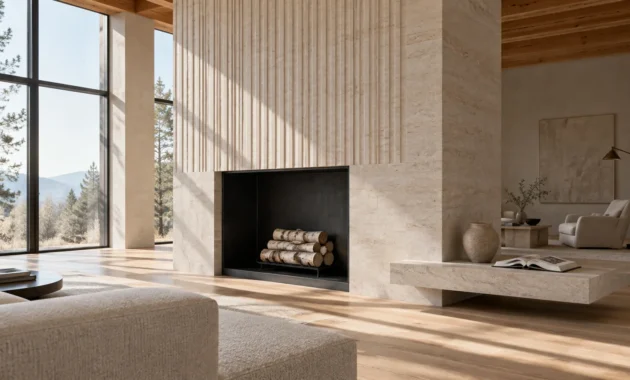
Vintage furniture breathes irreplaceable soul, historical narrative, and authentic provenance into modern interiors. Pairing these storied timber silhouettes with the proper wall palette unlocks their full architectural depth and sculptured character.
The correct paint choices harmonize heavy patinas with modern design sensibilities; they prevent your curated spaces from feeling like dusty museum archives. Thoughtful undertones establish an intentional, seamless dialogue between design eras.
Discover the eleven designer-curated wall colors for wood furniture and vintage decor colors that honor heritage craftsmanship while revitalizing your home.
Trend #1: Muted Olive Green
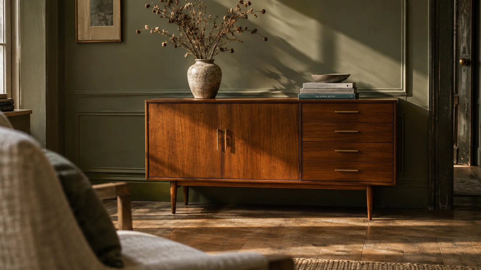
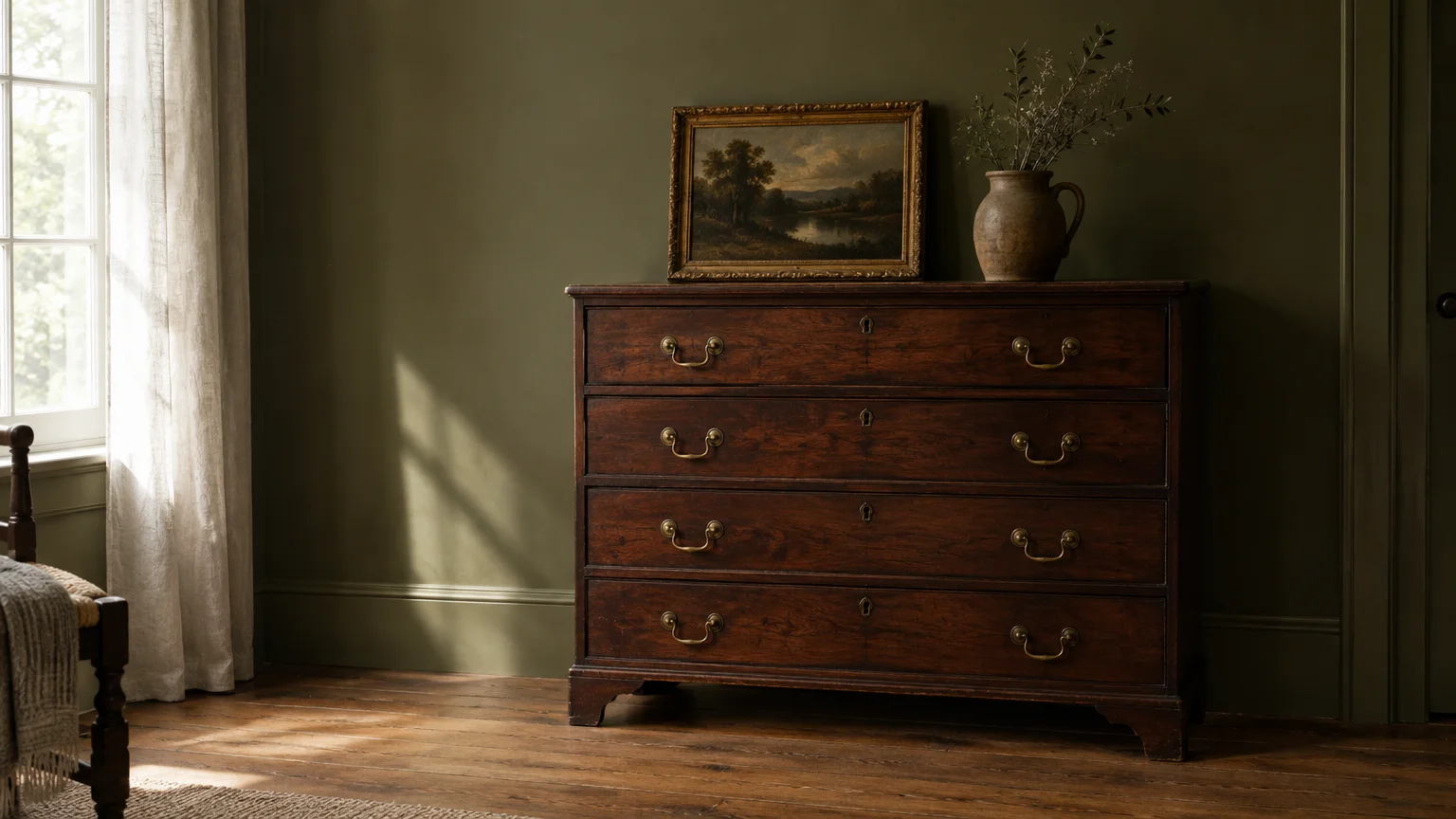
Muted olive delivers a grounded, biophilic elegance that effortlessly connects modern tastes with historic artifacts. Its gentle yellow and gray undertones complement the golden warmth radiating from aged timber.
This shade flatters dark walnut dressers and turn-of-the-century mahogany dining sets. Rather than competing with red undertones in antique wood, olive neutralizes them, creating an organic harmony.
Designers embrace this hue as part of the quiet luxury movement because it feels both historic and remarkably fresh. It evokes traditional European manor houses without the stuffy formality.
Use an eggshell finish on your walls to enhance light diffusion without causing distracting glare. Pair this backdrop with unlacquered brass hardware, woven linen drapes, and oiled oak floorboards.
In north-facing rooms, choose an olive with stronger amber undertones to keep the atmosphere inviting. In south-facing spaces, a cooler sage-olive prevents intense sunlight from skewing the space overly warm.
Complete your vignette with vintage landscape oil paintings and textured ceramic vessels. These curated accents bridge the gap between historic timber and your contemporary wall finish.
Trend #2: Tailored Ochre
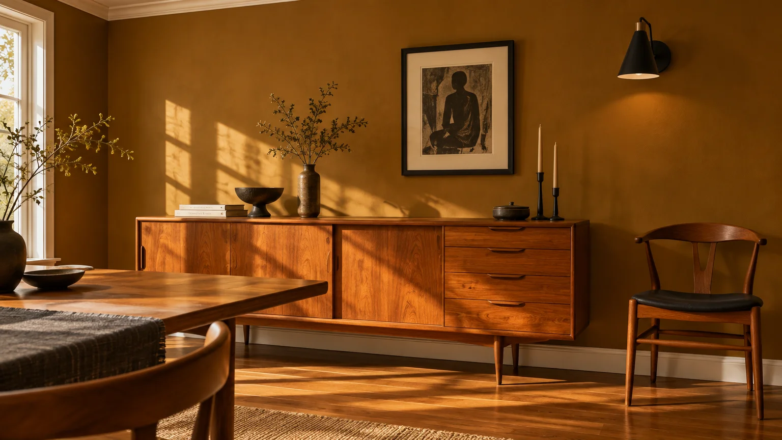
Tailored ochre revitalizes vintage interiors by introducing golden warmth with architectural discipline. This rich, spiced pigment pulls directly from retro interior colors while reading decidedly modern.
It shines brilliantly against mid-century teak sideboards and Danish modern dining chairs. The amber pigments in ochre draw out the honeyed grain of mid-century woods without overwhelming their sleek profiles.
This color works exceptionally well in dining rooms and creative studios where dynamic conversation thrives. It generates radiant energy by day and wraps the room in candlelit intimacy by night.
Avoid bright primary yellows; instead, select an ochre grounded with brown and mustard undertones. These earthy undertones respect the dignified provenance of your vintage finds.
Contrast ochre walls against crisp off-white crown molding and ebonized picture frames. This boundary prevents the warm color from melting indiscriminately into your timber furniture.
Incorporate charcoal gray textiles and matte black lighting fixtures to anchor the golden warmth. These dark contrasts prevent the golden scheme from feeling retro in a dated way.
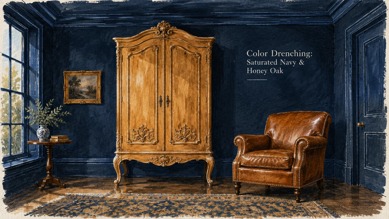
Trend #3: Saturated Moody Navy
Deep, saturated navy operates as a dramatic foil that propels vintage furnishings into the spotlight. It provides an opulent, shadowy field against which warm wooden patinas brilliantly illuminate.
Honey oak, antique pine, and cognac leather armchairs command instant attention against this midnight hue. The high chromatic contrast sharpens the ornate silhouettes of carved armoires and Victorian cabriole legs.
Modern homeowners increasingly gravitate toward color drenching—painting walls, baseboards, and ceilings in the same inky blue. This enveloping technique eliminates visual clutter, allowing antique furniture paint pairings to stand out distinctly.
Select an ultra-matte or chalk finish to absorb reflections and deepen the perceived depth of the room. This velvety quality softens hard wooden edges, making intimate parlors feel timeless and cocooning.
Layer in vintage Persian rugs featuring rust and crimson motifs to ground the cool navy envelope. Polished chrome lamps or antique sconces bring rhythmic highlights to the darker corners.
The resulting juxtaposition elevates the craftsmanship of every carved timber detail. Dark navy transforms an otherwise ordinary room into an artful, collectors sanctuary.
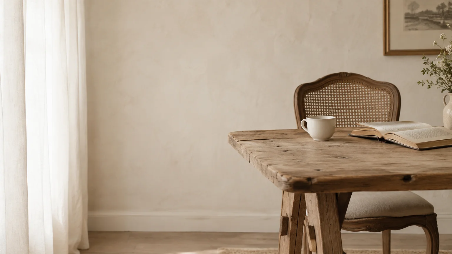
Trend #4: Warm Alabaster White
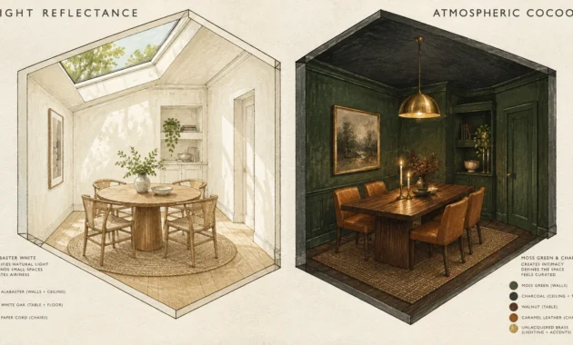
Warm alabaster white serves as the supreme gallery canvas for eclectically curated vintage furniture. It offers pristine brightness while possessing subtle creamy undertones that keep spaces tender and welcoming.
Harsh, sterile whites can make vintage furniture appear dirty, dingy, or neglected. In contrast, alabaster reflects ample ambient light while gently honoring natural wear and time-earned timber patinas.
This neutral proves ideal for minimalist interiors celebrating mid-century credenzas or primitive country worktables. It preserves breathing room between distinct historical periods, fostering visual clarity.
Assess the Light Reflectance Value (LRV) when selecting your white; aim for an LRV between 75 and 82. This range guarantees cheerful illumination without washing out your vintage timber textures.
Combine alabaster walls with textured boucle upholstery, raw ceramic vessels, and antique brass candlesticks. These textural variations inject depth, keeping an all-neutral space from feeling clinical.
Frame your vintage items with plenty of negative space along the walls. This intentional restraint turns individual heirlooms into compelling focal sculptures.
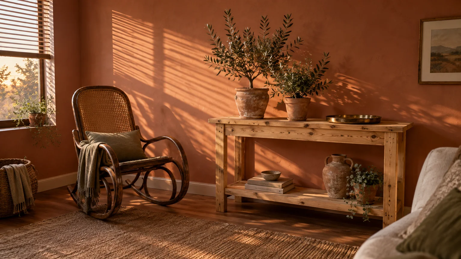
Trend #5: Dusty Terracotta
Dusty terracotta brings rustic Mediterranean warmth and raw artisanal charm directly into your living spaces. Its clay undertones celebrate the earth, providing an instinctive sanctuary for vintage decor colors.
This tone flatters weathered pine farm tables, bentwood chairs, and hand-carved vintage credenzas. The baked-earth pigment resonates naturally with timeworn wood, drawing out subtle golden and reddish streaks.
Design enthusiasts favor terracotta because it bridges rustic craftsmanship and contemporary bohemian design. It instills an immediate lived-in authenticity that brand-new furnishings simply cannot replicate.
Use lime wash or mineral paint to achieve a soft, mottled texture across the surface. This dimensional finish echoes the vintage age of your furnishings rather than creating a flat, artificial shell.
Style terracotta rooms with olive branches in stoneware crocks, wrought-iron accents, and natural jute rugs. These earthy textures ground your antique finds within a cohesive artisanal aesthetic.
Natural sunlight brings terracotta to life, casting an amber glow throughout the afternoon. At night, warm lamplight preserves that comforting, hearth-like sensation.
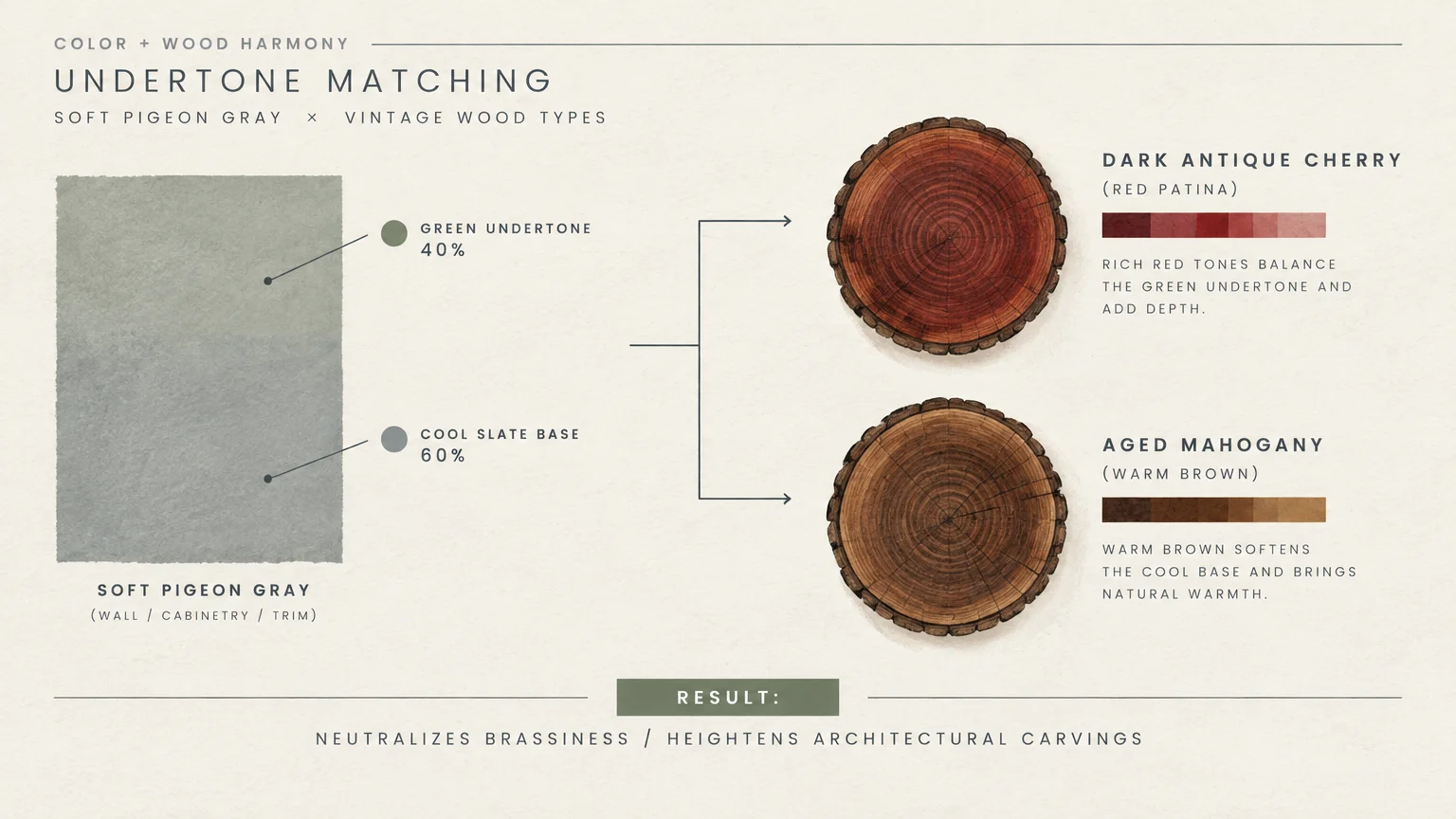
Trend #6: Soft Pigeon Gray
Soft pigeon gray is a chameleon shade that blurs the boundary between quiet gray, pale blue, and gentle green. Its muted complexity makes it one of the most versatile wall colors for wood furniture.
This historic hue tempers the fiery orange tones often found in vintage cherry and reddish mahogany. By softly neutralizing excessive warmth, it restores visual balance across traditional formal rooms.
Its popularity stems from the rise of classic English country aesthetics and understated Nordic design. It provides a timeless, dignified atmosphere that transcends fleeting micro-trends.
Apply a dead-flat finish in low-traffic living spaces to evoke historic estate charm. For high-traffic hallways and dining rooms, a satin sheen provides necessary durability while retaining an antique feel.
Incorporate vintage botanical prints in slender gilded frames to punctuate the gray-green surface. Tailored linen slipcovers on soft furnishings complete this serene, sophisticated narrative.
The color shifts delightfully under changing daylight, moving from pale sage at dawn to moody slate at sunset. This shifting dynamic keeps traditional furnishings visually intriguing all day long.
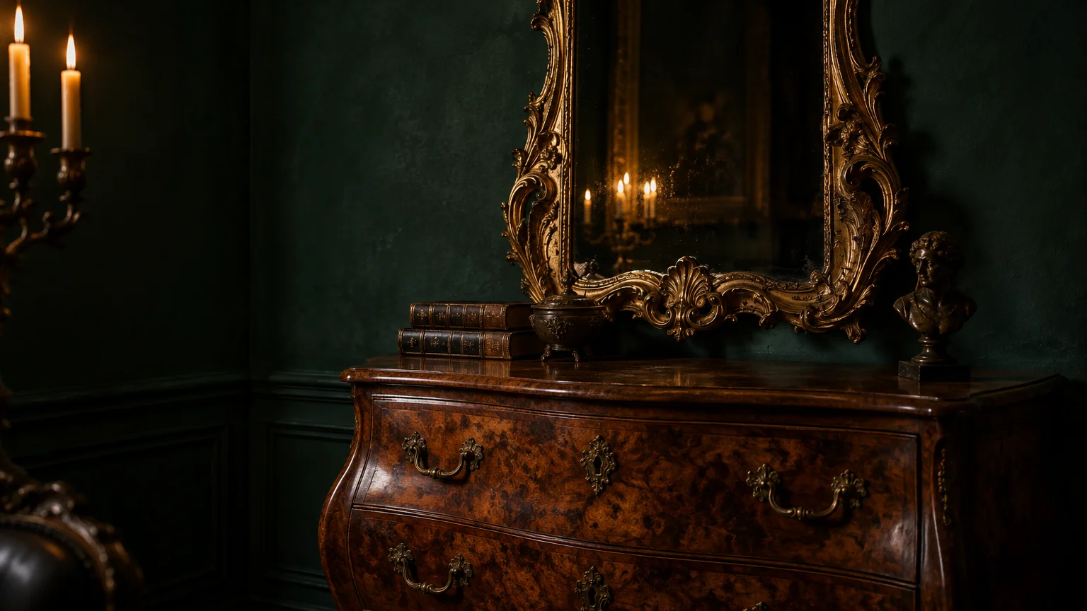
Trend #7: Deep Forest Emerald
Deep forest emerald wraps living spaces in regal drama and lush, atmospheric sophistication. This saturated jewel tone honors natural foliage while infusing vintage rooms with cinematic presence.
It flatters burled walnut tables, ornate Victorian mirrors, and warm caramel leather club chairs. The deep green backdrop accentuates complex wood grain patterns, making antique textures vibrate with life.
Interior designers deploy emerald green to create jewel-box libraries, home bars, and sophisticated powder rooms. The color exudes vintage provenance, instantly anchoring contemporary home architecture.
Complement this rich green with high-gloss woodwork or crown moldings in the same hue. Color-saturating the entire trim creates a seamless, immersive atmosphere that highlights each freestanding vintage piece.
Introduce brass picture lights and vintage oil paintings to catch reflective highlights on the dark walls. Thick velvet drapery in tobacco or rust shades provides tactile warmth against the emerald ground.
Balance the moody atmosphere by selecting vintage items with lighter marble tops or polished brass ferrules. These metallic accents sparkle like jewelry against the forest-toned walls.
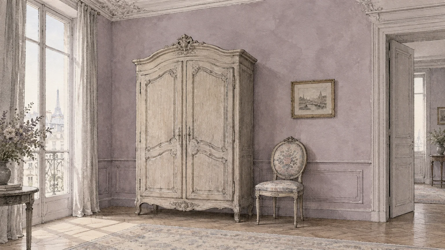
Trend #8: Chalky French Mauve
Chalky French mauve is an unexpected heritage neutral that combines dusty lavender, smoky taupe, and antique rose. It offers subtle romance without tumbling into sickly sweetness.
This tone pairs exquisitely with bleached pine chests, Louis XVI armchairs, and Art Deco rosewood cabinets. The grayed-out lilac undertones balance warm timber stains with quiet poetic grace.
As homeowners pivot away from cold grays, mauve has re-emerged as a sophisticated alternative. It brings warmth, intrigue, and gentle nostalgic whimsy to primary bedrooms and quiet parlors.
Seek out formulas infused with slate undertones rather than pink dyes. A chalky, mineral-heavy finish prevents light bouncing aggressively, cultivating a velvety, dreamlike retreat.
Pair this wall treatment with oxidized pewter sconces, aged crystal accents, and faded antique oushak rugs. The resulting interplay between dusky walls and timeworn antiques feels layered and deliberate.
Use dark ebonized frames or black iron side tables to prevent the room from appearing overly delicate. These grounded accents give the romantic backdrop an editorial, contemporary edge.
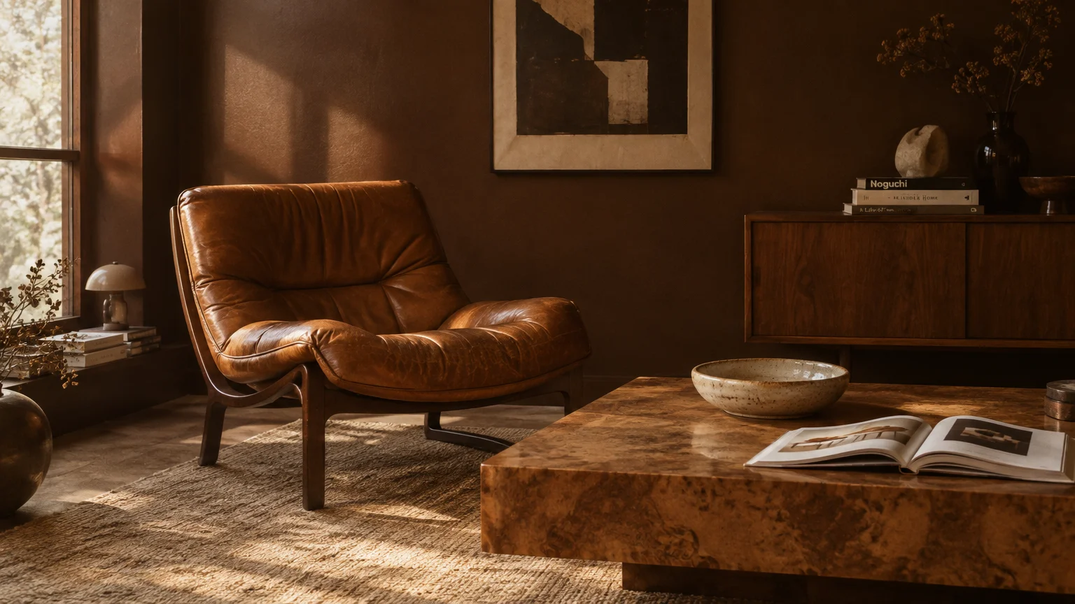
Trend #9: Rich Chocolate Brown
Rich chocolate brown is surging back as a cornerstone of cozy, high-end interior architecture. Far from being drab, this indulgent tone envelopes rooms in tailored opulence and timeless comfort.
When paired with blonde mid-century birch or pale antique pine, brown creates an unexpected, sculptural contrast. Alternatively, pairing it with dark mahogany creates a sultry, monochromatic tone-on-tone environment.
The design world’s craving for late-1970s sophistication has fueled the revival of these retro interior colors. It grounds sprawling open layouts, imparting intimacy and architectural weight.
Choose a satin finish on millwork and flat matte on the walls to establish subtle visual rhythm. This variation in sheen creates dynamic highlights, highlighting the craftsmanship of vintage furniture silhouettes.
Brighten the dark foundation with creamy shearling cushions, travertine accessories, and vintage brass lamps. These luminous accents prevent the rich brown from reading overly dark or somber.
Vintage chrome furniture from the mid-century era looks exceptionally striking against brown walls. The reflective metallic surfaces create high-contrast glamour alongside deep, velvety paint.
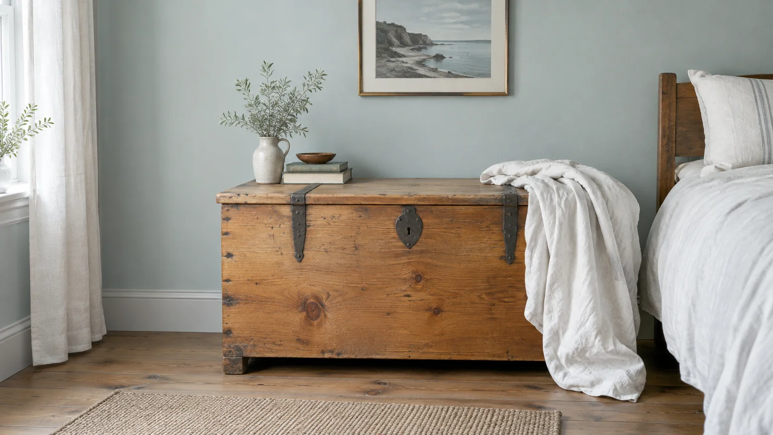
Trend #10: Restorative Duck Egg Blue
Restorative duck egg blue is a historic staple that introduces breezy airiness and neoclassical serenity. Containing equal parts soft blue, gentle green, and slate gray, it remains quietly unassuming.
This shade cuts effortlessly through the heavy, dark visual bulk of ornate antique oak and mahogany wardrobes. It introduces a lighthearted balance, preventing heritage woodwork from visually weighing down your room.
Originating in Georgian manor design, duck egg blue embodies timeless residential heritage. It offers a gentle breath of fresh color without demanding all visual attention for itself.
Paint south-facing sitting rooms and breakfast nooks in this restorative hue to optimize natural light. The changing solar spectrum reveals its blue character at noon and soft green demeanor at dusk.
Style this backdrop alongside French cane chairs, botanical upholstery, and wirework vintage planters. Crisp ivory trim frames the color cleanly, creating a tailored, classic composition.
Accentuate the blue-green nuances with off-white porcelain plates and antique ironstone displayed on open shelving. This vintage display reinforces the crisp, airy balance of the entire room.
Trend #11: Raw Greige
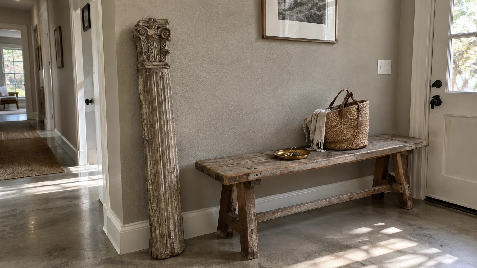
Raw greige masterfully combines the cooling discipline of gray with the enveloping warmth of beige. It serves as an adaptable bridge between antique wood stains and modern architectural elements.
This balanced neutral highlights primitive wooden benches, antique ladders, and salvaged architectural salvage. Its neutral foundation honors grain variations without forcing wooden surfaces to compete against vibrant color.
Greige aligns with the modern wabi-sabi philosophy, which finds beauty in natural impermanence and weathered patinas. It creates serene, restorative rooms where antique silhouettes command quiet contemplation.
Select a greige with stony, limestone undertones rather than yellow pigments. This keeps your walls crisp under artificial lighting and stops them from looking muddy in dim evening light.
Layer greige spaces with textured wool throws, matte black metal accents, and unvarnished timber stools. This textural palette yields a cohesive, sophisticated interior rich in tactile character.
Use limewash greige on chimney breasts or feature alcoves to add subtle architectural texture. This painterly detail complements the rustic provenance of primitive wooden furniture.
The Big Picture: Weaving These Trends into Your Home
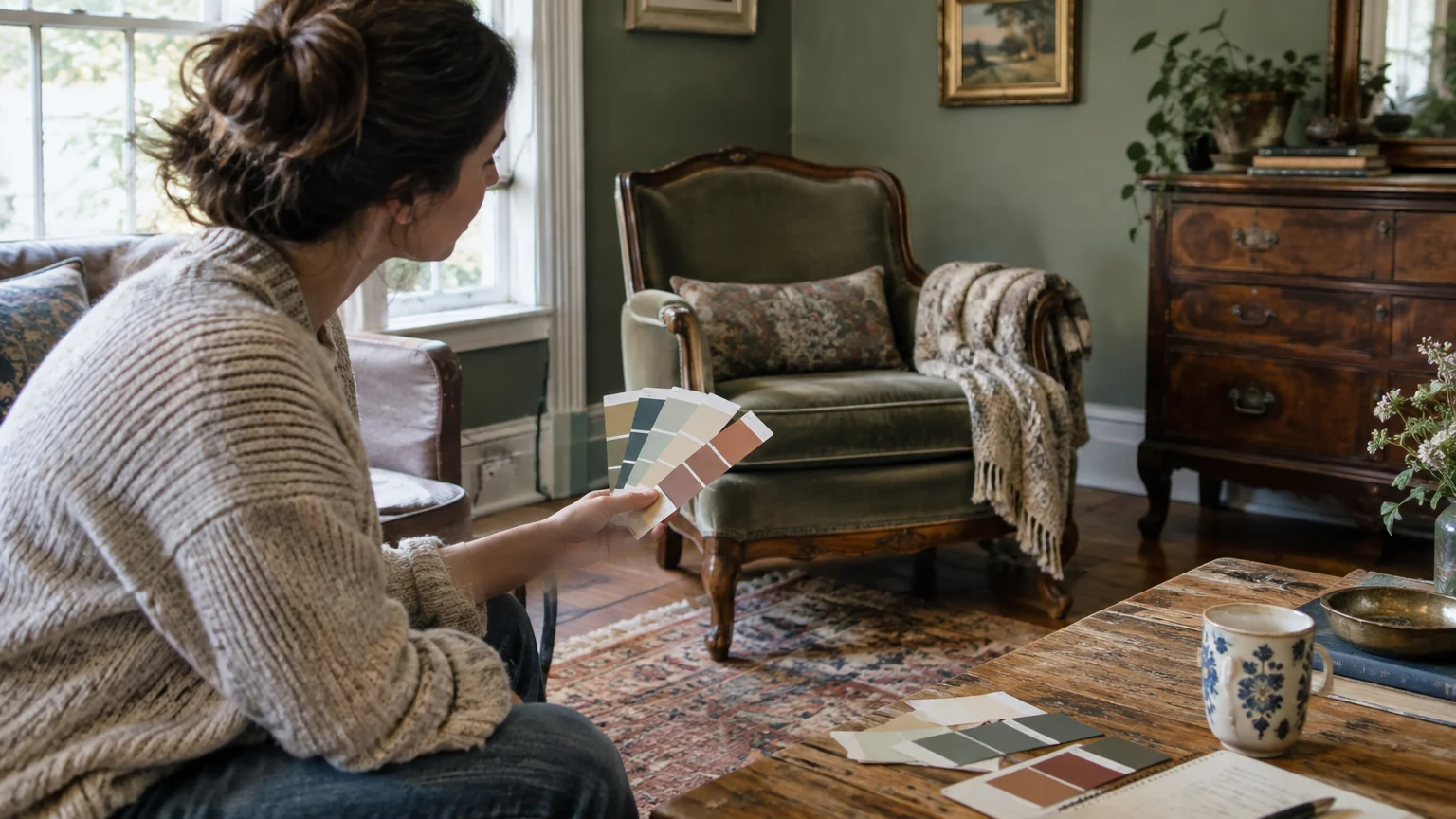
Integrating new paint colors with beloved vintage furniture requires a thoughtful balance between honoring provenance and asserting personal expression. You do not need to turn your home into a rigid period museum.
Instead, curate your home by blending eras, finishes, and textures with deliberate intention. Let your oldest statement piece dictate the temperature of your wall paint.
When working with heavy, reddish woods like cherry or mahogany, lean into complementary cool neutrals or contrasting muted greens. These pairings neutralize overwhelming orange tones while accentuating hand-carved details.
Conversely, blonde woods and mid-century teak welcome saturated jewel tones, tailored ochres, and moody navies. These intense hues inject dynamic contrast that highlights clean, architectural silhouettes.
Always test your paint swatches on large boards positioned directly behind your vintage furniture. Observe how changing daylight and evening lamplight interact with the aged timber varnish across several days.
Remember that the most memorable homes feel collected over time rather than purchased in a single weekend showroom visit. Paint provides the unifying thread that ties disparate eras into one cohesive story.
Frequently Asked Questions
How do you match wall paint to multiple different wood tones in one room?
When mixing different vintage wood finishes, identify the dominant undertone shared across the pieces, whether warm, cool, or neutral. Select a wall color that echoes or intentionally balances that primary undertone.
Neutral backdrops like warm alabaster white or raw greige allow diverse wood species to coexist without visual chaos. These subtle shades provide breathing space so walnut, pine, and oak feel curated together.
Repeat timber tones through small decorative accents, such as picture frames or wooden bowls, to distribute color evenly. This creates visual rhythm throughout the entire living space.
What paint finish works best with vintage and antique furniture?
Matte, chalk, and eggshell finishes work best when pairing wall paint with antique furniture. These low-sheen options absorb harsh light and establish a velvety backdrop that flatters time-worn timber patinas.
High-gloss paint can occasionally look jarring next to aged wood, although it creates dramatic contrast on contemporary trim work. Reserve satin and semi-gloss finishes for architectural moldings, doors, and high-traffic cabinetry.
Can you pair bold, modern paint colors with delicate antique furniture?
Yes, pairing bold modern shades with delicate antique furnishings creates captivating tension and high-end editorial flair. Saturated emeralds, deep navies, and tailored ochres bring fresh relevance to fragile, ornate silhouettes.
Keep surrounding accessories minimal when using saturated paint to avoid visual overload. Let the vintage piece stand as a sculptural focal point against the dramatic backdrop.
How do undertones in vintage wood affect paint selection?
Vintage timber often features pronounced undertones, such as red in mahogany, yellow in pine, and orange in aged oak. Identifying these pigments prevents clashing and guides your paint choice.
Using complementary colors from the opposite side of the color wheel neutralizes aggressive wood tones. For instance, muted green walls soften red mahogany, while warm ochre highlights golden teak.
For the latest color forecasts, consult industry leaders like Pantone and paint companies like Benjamin Moore. For professional design standards, refer to the American Society of Interior Designers (ASID).
Disclaimer: This article reflects design trend analysis and predictions. Personal taste and timeless design principles should always guide your decorating choices.