Forget the rigid checklist that told you every ceiling must stay stark white and every sofa must face a single focal point. Today’s sharpest interiors thrive on deliberate rule-bending that prioritizes mood, proportion, and lived-in character.
Mastering classic interior design rules gives you the confidence to dismantle them with precision. When you understand why a proportion works, breaking it looks intentional rather than accidental.
These nine designer decorating tips reveal how seasoned pros subvert outdated formulas—and which structural codes they still treat as sacred. Use these interior styling tricks to bring editorial tension to your own rooms.
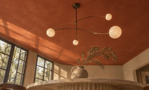
Trend #1: Color Drenching Over the White-Ceiling Mandate
Traditional decorating insists that you keep ceilings and millwork bright white while dividing rooms by the strict 60-30-10 color rule. Under that old formula, sixty percent of a room stayed neutral, thirty percent carried secondary upholstery, and ten percent held accents.
Color drenching throws that boundary out by wrapping walls, baseboards, doors, and ceilings in a single continuous hue. According to Zillow’s October 2025 Home Trends Report, mentions of color drenching surged 149 percent year over year in U.S. listings.
Momentum did not slow down the following year. Zillow’s November 2026 report tracked an additional 84 percent year-over-year jump in listings highlighting color-drenched walls.
Working With Light Reflectance Value
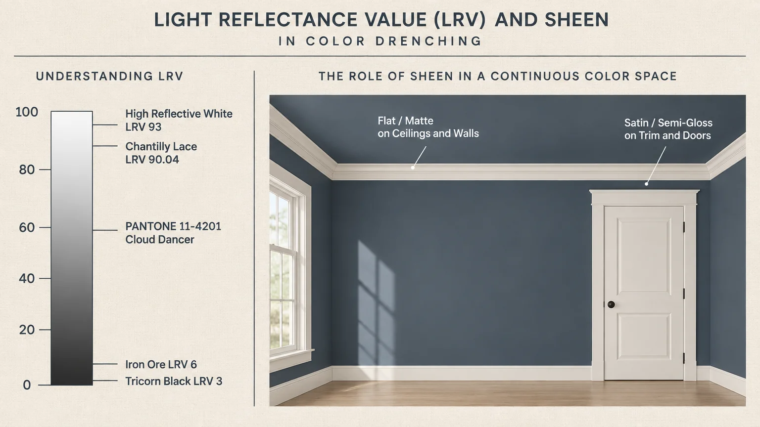
Understanding Light Reflectance Value (LRV)—the 0 to 100 scale measuring how much visible light a paint reflects—helps you control the mood. Bright whites sit near the top, with Sherwin-Williams High Reflective White at 93 and Benjamin Moore Chantilly Lace at 90.04.
Deep blacks drop to the bottom, such as Sherwin-Williams Tricorn Black at LRV 3 and Iron Ore at LRV 6. Even when Pantone Color Institute chose soft white PANTONE 11-4201 Cloud Dancer as its 2026 Color of the Year, saturation remained dominant.
In its February 2026 Trends Outlook report sponsored by Sherwin-Williams, the American Society of Interior Designers (ASID) noted immediate debate around that white selection. Designers simultaneously reported a renewed appetite for rich, saturated color across residential projects.
How to Pull It Off
Start with a powder room, study, or bedroom where enveloping darkness feels cocooning rather than cave-like. Zillow paint-color research shows that a deep blue bedroom alone is associated with boosting home sale prices by more than $1,800.
Keep your drenched room dimensional by varying paint sheen across surfaces. Use flat or matte paint on walls and ceilings, then switch to satin or semi-gloss on trim and interior doors.
Trend #2: Mixing Woods, Metals, and Eras Instead of Matching Sets
For decades, showroom floor plans encouraged homeowners to purchase coordinated bedroom suites and match every cabinet pull to the faucet. Breaking design rules today means rejecting uniform sets in favor of friction between eras and finishes.
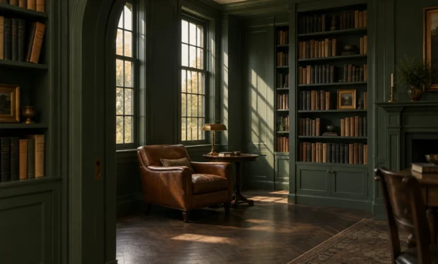
Houzz’s September 2026 U.S. Fall Design Trends Report, surveying nearly 50 design professionals, confirmed a clear departure from stark white and gray rooms. Homeowners increasingly layer warm wood tones, earthy pigments, vintage finds, and mixed bold patterns.
Provenance Meets Quiet Luxury
Two industry concepts explain this shift: provenance and quiet luxury. Provenance refers to the traceable history and origin of an antique or vintage object, which lends a room instant authenticity.
Quiet luxury prioritizes tactile materials and understated craftsmanship over flashy logos or matching showroom glitter. Meanwhile, Houzz recorded Art Deco interior searches jumping 22 percent year over year entering 2026, bringing sculptural silhouettes back into play.
At the same time, Zillow’s November 2026 keyword analysis revealed drops in cozy (-22 percent), eclectic (-19 percent), and boho (-13 percent). Listings featuring elevated styling rose 71 percent, proving that mixed rooms now look edited rather than cluttered.
How to Pull It Off
Establish one dominant wood tone across your flooring or largest casegood, then introduce a contrasting stain through a vintage chair or side table. Repeat every metal finish at least twice in the same sightline so brass, blackened bronze, and nickel converse smoothly.
Trend #3: Hanging Art Low, High, and Intentionally Off-Center
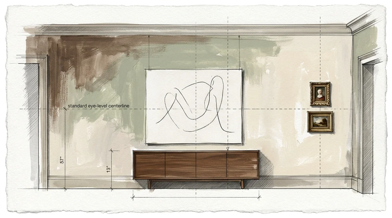
Museums and galleries rely on the classic 57-inch rule, centering artwork—or the midpoint of a grouped arrangement—57 inches (145 centimeters) above the floor. Organizations like AS Hanging Display Systems, Park West Gallery, and Rossetti Art treat this height as average standing eye level.
Trade standards also place art six to eight inches above sofas, or eight to ten inches per The Home Depot, spanning roughly two-thirds of the furniture width. Designers bend these coordinates whenever architecture or seating posture demands better balance.
Breaking the Grid With Intention
In dining rooms and lounges where you spend hours seated, Rossetti Art and Austin Gallery note that pros routinely drop centers to 53 or 55 inches. Pushing further, designers now hang dramatic salon clusters from baseboard to crown molding.
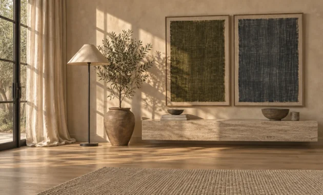
Off-center placement works brilliantly above long consoles or asymmetrical fireplaces. Anchoring one large frame slightly left of center leaves breathing room for a sculptural floor lamp or ceramic vessel on the right.
How to Pull It Off
Lean oversized framed photography directly onto a deep mantel or wide media credenza instead of drilling into tile or plaster. On staircases, keep rhythm crisp by measuring 57 inches straight up from each individual stair tread beneath the frame.
When building an asymmetrical gallery wall, unify the composition through a shared mat color, consistent frame depth, or an invisible horizontal baseline. That single point of discipline keeps spontaneous home decor ideas looking gallery-grade.
Trend #4: Oversized Puddle Drapery and Strategic Bare Windows
Standard window-dressing guides suggest mounting rods five to twelve inches above the frame—or four to six inches below the ceiling—using panels 1.5 to 2 times the rod width. Brands like TWOPAGES Curtains and Nicetown recommend double fullness especially for airy sheers.
Traditional hems either float 0.5 to 1 inch off the floor or kiss it within 0.25 to 0.5 inches, per inCustom and JJones Design Co. Designers break both camps by embracing dramatic floor puddles or stripping windows completely bare.
Drama Versus Biophilic Clarity
Sweep or puddle drapery adds one to three extra inches of fabric that pools casually across hardwood or stone. That soft heap of heavyweight linen, wool, or silk velvet introduces old-world romance to spare contemporary architecture.
Conversely, biophilic design—an approach that strengthens your sensory and visual connection to living nature—often calls for no fabric at all. Leaving crisp steel or timber casements uncovered frames exterior trees and shifting daylight as moving artwork.
How to Pull It Off
Save one-to-three-inch puddles for formal dining rooms or quiet primary suites where heavy foot traffic and shedding pets will not tangle the hems. In high-traffic living rooms, stick to a clean kiss hem so panels stay pristine.
Choose bare glass in rooms overlooking private gardens, water, or architectural courtyards. If glare becomes an issue at noon, recess discreet motorized roller shades inside the upper window jamb where they disappear when raised.
Trend #5: Tension-Driven Rug Sizing and Asymmetric Furniture Layouts
Textbook living room guidelines leave 12 to 18 inches (30 to 45 centimeters) of bare floor between a rug’s perimeter and the walls, per The Global Abode. Dining standards insist on rugs at least 24 inches wider than the table on every side.
Similarly, RoomSketch3D outlines a 14-to-20-inch sofa-to-coffee-table reach (18 inches ideal) and a 6-to-9-foot conversation span, capping at 10 feet. Designers disrupt floor plans by layering skewed textiles and floating seating off the room’s central axis.
Creating Dynamic Negative Space
Instead of centering one predictable rectangle under four squared-up legs, pros anchor an open-concept lounge with an expansive natural-fiber base, then angle a smaller antique flatweave across the top. Asymmetric rugs visually carve out reading corners without erecting walls.
Pulling sofas forward at a slight diagonal breaks boxy room geometry and opens unexpected sightlines toward windows or bookshelves. You keep the room livable by honoring human reach rather than wall alignment.
How to Pull It Off
Keep your coffee table strictly 16 to 18 inches from the main seat cushion even when the entire seating cluster turns off-axis. Maintain that six-to-nine-foot conversational distance between facing armchairs so guests never have to raise their voices.
If a vintage heirloom rug feels too narrow for your dining table, layer it perpendicularly over a broad sisal mat that still clears pulled-out chair legs. You gain heritage pattern without watching chair feet snag every evening.
Trend #6: Sculptural Dimness and Warm-Cool Lighting Friction
On February 18, 2026, the Illuminating Engineering Society (IES) and the American Lighting Association released ANSI/IES/ALA RP-11-26 for residential lighting. IES benchmarks suggest 10 to 20 footcandles for living and dining spaces, and 20 to 50 for kitchens, baths, and bedrooms.
Task areas such as reading corners and prep counters call for 50 to 100 footcandles, while hallways sit comfortably at 5 to 10 footcandles. Warm 2700K to 3000K bulbs remain standard, alongside chandeliers hung 30 to 36 inches above dining tables and sconces at 60 inches.
Shadow as an Architectural Material
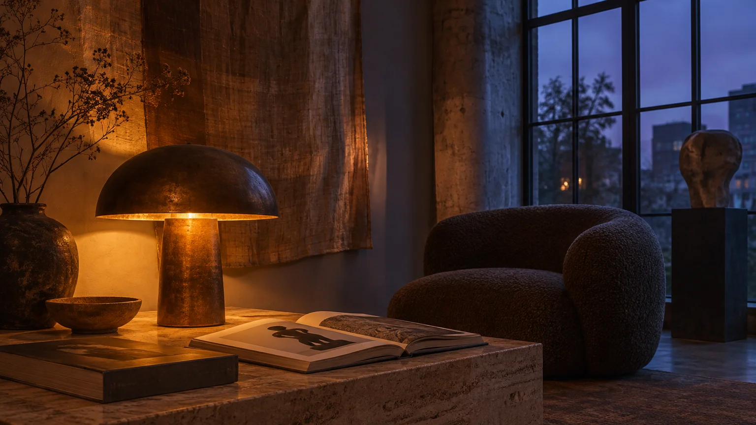
Designers routinely break uniform illumination rules by eliminating recessed ceiling cans from living rooms and bedrooms altogether. Smooth, shadowless brightness flattens textures and makes evening interiors feel like corporate waiting rooms.
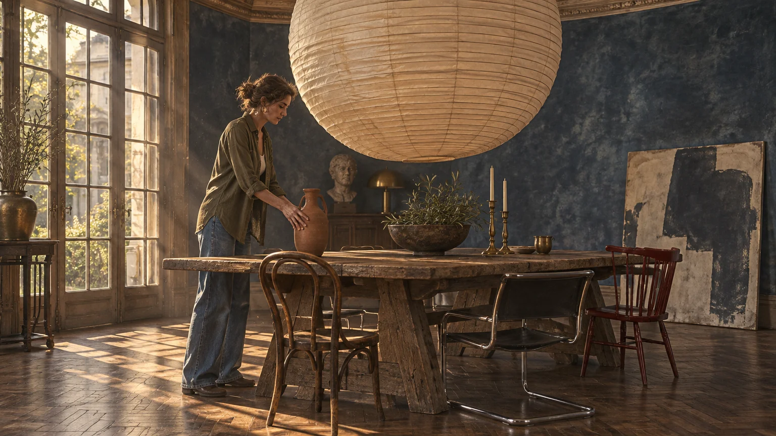
Pros also lower oversized paper lanterns or sculptural pendants well below standard heights over coffee tables, or mount wall sconces asymmetrically at chest level beside low beds. Mixing warm 2700K ambient glow with crisp neutral task beams builds instant focal tension.
How to Pull It Off
Place every ambient lamp, sconce, and chandelier on smart or manual dimmers so evening light can drop into moody, low-footcandle pools. Add directional reading lamps or under-cabinet strips wherever you need high-clarity 50-to-100-footcandle illumination.
Keep hanging dining fixtures low enough to feel intimate while seated, yet verify they never block eye contact across the table. Test the drop with painter’s tape and cardboard before cutting any cord.
Trend #7: Bold Texture and High-Contrast Patina Over Safe Minimalism
Conventional advice warns homeowners with modest square footage to keep walls pale, smooth, and unadorned so rooms appear larger. Modern interior styling tricks flip that logic by trading flat white drywall for tactile surfaces that invite touch.
Houzz’s 2026 Fall Design Trends Report points to a widespread pivot toward bold patterns, rich wood grain, and layered textures. Zillow’s November 2026 listing analysis similarly tracked a 27 percent jump in painted brick exteriors alongside that 71 percent surge in elevated styling.
Depth Creates Perceived Volume
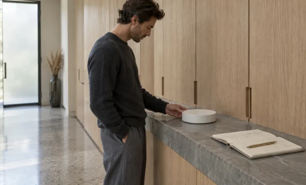
Flat, chalky white walls show every shadow defect and bounce harsh glare. By contrast, hand-troweled limewash, fluted oak paneling, grasscloth, and honed travertine absorb light unevenly and blur hard room corners.
When corners visually soften, your eye reads atmospheric depth instead of rigid box dimensions. Pairing unlacquered brass hardware with chalky plaster or nubby bouclé upholstery produces effortless tactile contrast.
How to Pull It Off
Wrap a narrow foyer or windowless powder room in mineral limewash or textured clay plaster rather than hiding it under high-gloss white paint. Pair raw architectural surfaces with sleek upholstery so the space feels refined rather than rustic.
If full wall treatments feel daunting, introduce contrast through one deeply veined marble side table or a hand-knotted high-pile rug. Let patina accumulate naturally on brass and soapstone instead of polishing away every mark.
Trend #8: Intentionally Oversized Scale in Compact Rooms
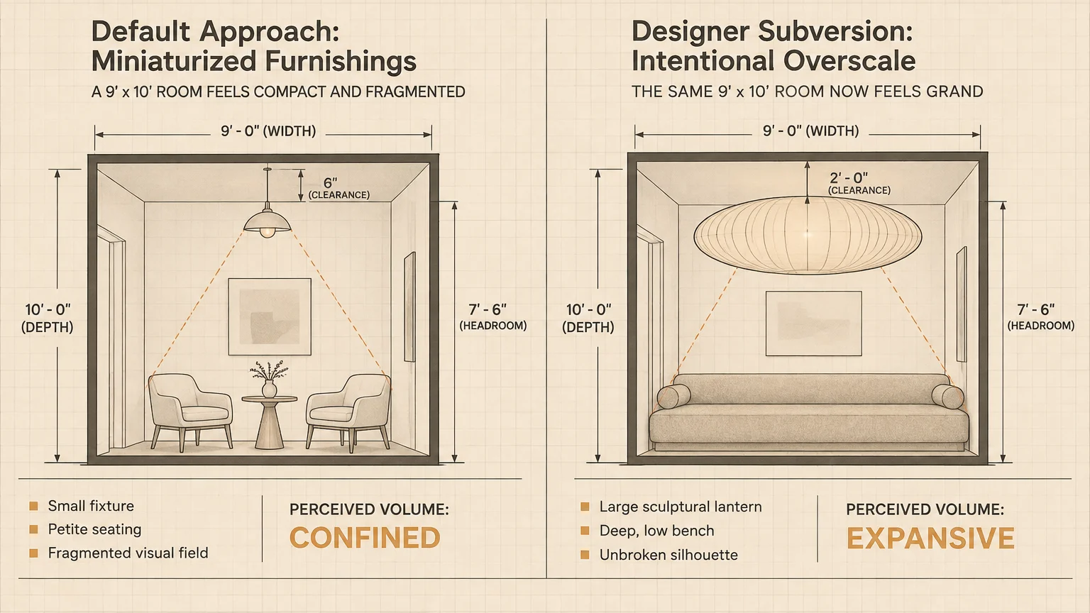
One of the oldest interior design rules insists that small rooms demand dainty sofas, narrow consoles, and miniature wall prints. Filling a compact footprint with tiny pieces usually creates visual clutter and makes the room feel cramped.
Seasoned designers reverse the equation by placing one generous anchor piece in a tight space. A sweeping modular sofa, an eight-foot linen canopy bed, or a single monumental painting calms the eye by reducing broken lines.
Fewer Objects, Stronger Impact
Your brain reads a room filled with ten small accents as busy and tight. Replacing three leggy side chairs and two small tables with one deep, plush sectional immediately simplifies the perimeter.
Oversized pendant shades or tall arched mirrors perform a similar trick by pulling your gaze upward toward the ceiling plane. Generous scale signals quiet confidence and makes modest apartments feel bespoke.
How to Pull It Off
Before ordering an oversized piece, tape its exact footprint onto your floor and verify every circulation path around it. Keep general walkways at least 36 inches wide so big furniture never forces an awkward sideways shuffle.
Confirm delivery logistics early, especially in older homes with tight turns or narrow trim. Standard accessibility guidance calls for at least a 32-inch clear doorway—or 34 inches with a 36-inch door—so measure elevators and stair landings before falling in love.
Trend #9: Ditching the Open-Concept Default for Intimate, Code-Smart Zones
For twenty years, remodeling orthodoxy demanded knocking down every interior partition to create one vast open-plan box. Designers are breaking that dogma by reinstating cased archways, steel-framed glass partitions, pocket doors, and tucked-away sculleries.
Restoring defined zones curbs kitchen noise, hides prep clutter, and returns wall space for art and storage. Across the U.S. interior design sector—a $26.5 billion industry spanning roughly 157,000 firms, 75 percent of which are small businesses per ASID’s 2025 report and IBISWorld’s 2026 analysis—pros balance privacy with flow.
Many firms now test partition layouts digitally before swinging a hammer. Houzz’s 2025 State of AI in Construction and Design survey of 722 U.S. businesses found 31 percent of design firms already use AI tools in their workflows.
The Codes Designers Never Break
Breaking aesthetic rules only succeeds when ergonomic clearances and legal safety standards stay rock-solid. Designers strictly honor National Kitchen & Bath Association (NKBA) benchmarks, keeping single-cook work aisles at least 42 inches wide and multi-cook aisles at 48 inches.
They also protect the kitchen work triangle—linking sink, refrigerator, and range—so its three legs total no more than 26 feet, with each leg measuring four to nine feet. Around dining tables, pros preserve 32 inches of clearance with no traffic, 36 inches to edge past, or 44 inches to walk behind seated guests.
Life-safety statutes in the International Residential Code (IRC 2021 and 2024) remain equally non-negotiable. Habitable rooms and hallways require at least seven-foot ceilings (6 feet 8 inches in baths and laundry rooms), while stair handrails must sit 34 to 38 inches above stair nosings with risers varying by no more than 3/8 inch.
Open sides dropping more than 30 inches demand guards at least 36 inches high engineered to resist a 200-pound concentrated load. Bedrooms require egress windows with 5.7 square feet of clear opening (5.0 at grade), 24-inch minimum clear height, 20-inch minimum clear width, sills no higher than 44 inches, plus GFCI outlets in wet zones and panel surge-protective devices.
How to Pull It Off
Reclaim intimacy without losing daylight by installing fluted glass pocket doors or wide cased openings between your kitchen and dining room. Always verify local permit rules and NKBA aisle widths with a licensed contractor before moving any wall or fixture.
The Big Picture: Weaving These Trends into Your Home
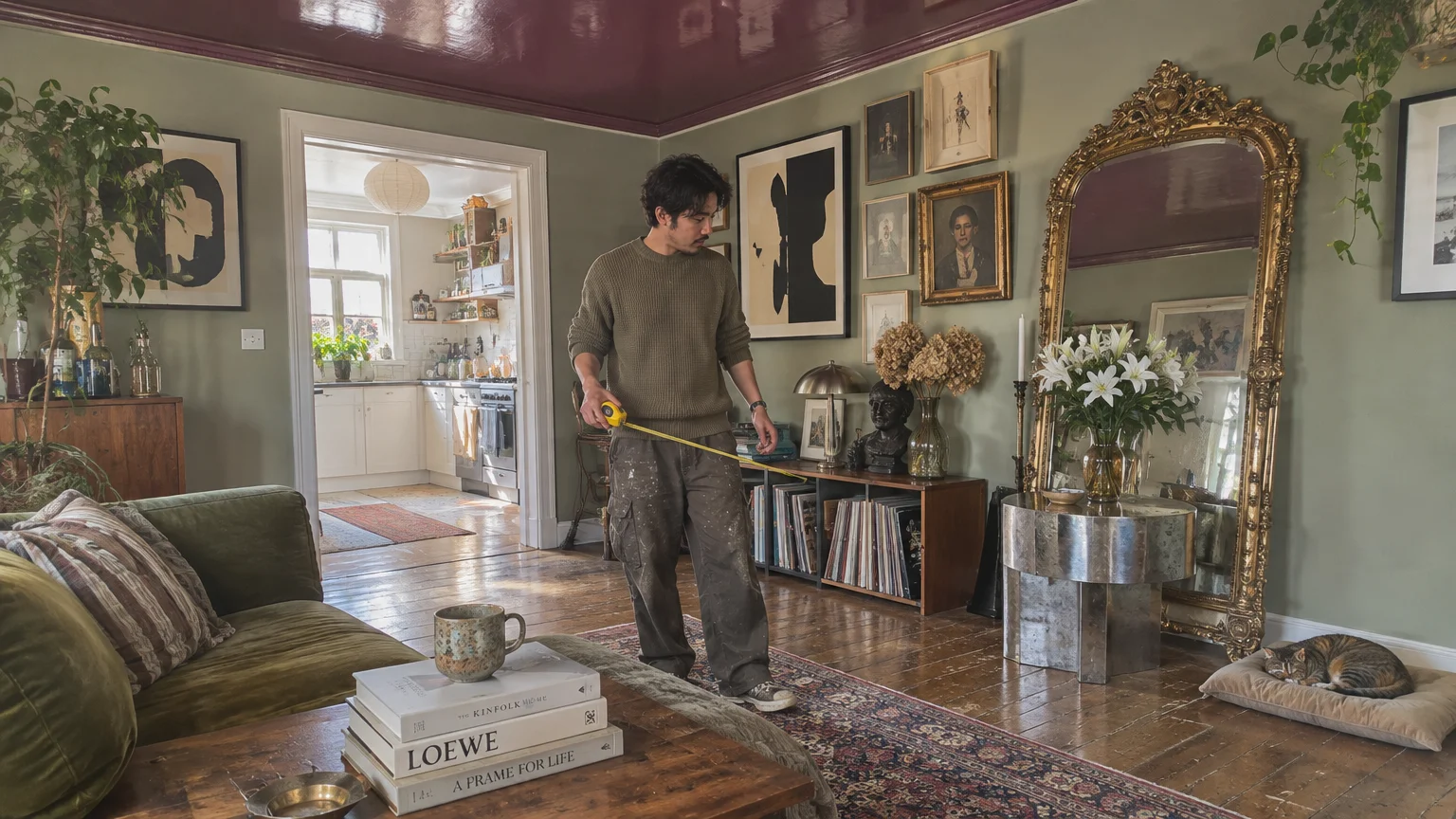
Breaking every rule in one room creates visual fatigue rather than editorial sophistication. Choose two or three deliberate rule breaks per space while letting classic proportions ground everything else.
For example, you might drench a study in deep slate-blue paint and hang an oversized canvas slightly off-center, yet keep your seating distances and doorway clearances completely textbook. Tension between restraint and rebellion makes a home memorable.
Test bold shifts in low-risk ways before altering millwork or masonry. Swap lamp shades, puddle temporary linen panels, or rearrange your rug angles over a weekend to see how your household responds to the new rhythm.
For the latest color forecasts, consult industry leaders like Pantone and paint companies like Benjamin Moore. For professional design standards, refer to the American Society of Interior Designers (ASID).
Frequently Asked Questions
Can you combine color drenching with mixed wood tones?
Yes, monochrome walls actually act as a calm backdrop that makes contrasting timber stains stand out cleanly. Pair a matte earthy wall and ceiling with one warm vintage oak dresser and dark walnut dining chairs to keep the mix cohesive.
Does breaking the 57-inch art rule work with low ceilings?
In rooms with seven- or eight-foot ceilings, dropping art slightly lower—closer to 53 or 55 inches—often feels more balanced when furniture sits low. Alternatively, hanging a vertical salon column floor-to-ceiling draws the eye upward and exaggerates wall height.
How do you know if oversized furniture will overwhelm a small room?
Check your clearances on the floor with painter’s tape before buying. As long as you preserve 36-inch general walkways, an 18-inch coffee table gap, and unobstructed door swings, one large sofa will make a compact room feel calmer than several small chairs.
Are puddle curtains practical for everyday family homes?
One-to-three-inch puddle hems work best in adult bedrooms or formal dining rooms with light foot traffic. For busy family lounges, kitchens, or homes with pets, stick with a clean kiss hem hovering 0.25 to 0.5 inches above the floor.
Which interior design rules should homeowners never break?
Never compromise on building codes or ergonomic safety clearances. Maintain 42-inch minimum kitchen work aisles, legal stair handrail heights of 34 to 38 inches, required bedroom egress window dimensions, and GFCI electrical protection near water.
Disclaimer: This article reflects design trend analysis and predictions. Personal taste and timeless design principles should always guide your decorating choices.