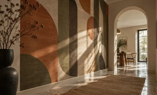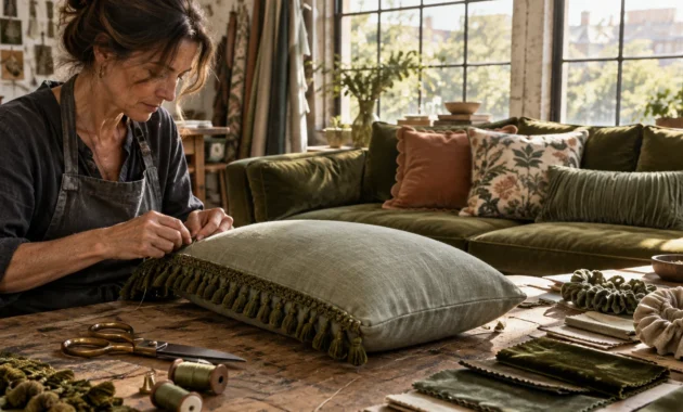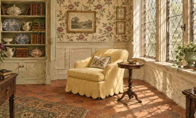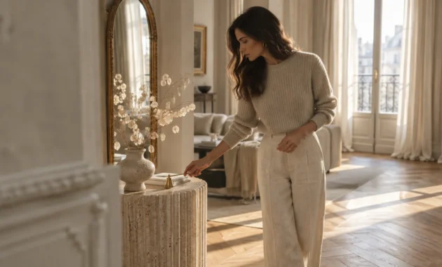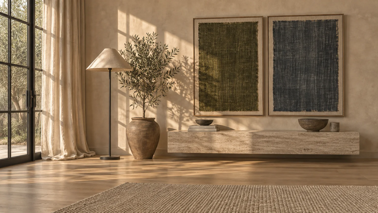
Warm neutral walls no longer play it safe—they set the stage for confident color storytelling. Choosing the right accent colors beige living room spaces crave turns a quiet backdrop into an intentional, layered sanctuary.
Major color forecasts for 2026 and 2027 pair sandy neutrals with mossy greens, smoky blues, and earthy terracotta. These curated color combinations bring architectural depth while protecting long-term resale appeal.
Whether you want subtle tonal warmth or crisp contrast, you can refresh your living room decor without repainting every wall. Use these designer-vetted pairings, lighting rules, and paint specs to transform your space with confidence.
Trend #1: Mossy Olive and Herbal Sage Greens
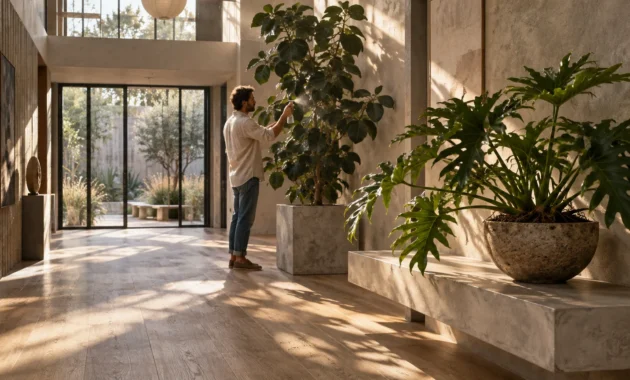
Biophilic design—the practice of connecting indoor spaces to natural ecosystems—continues to anchor residential architecture. Pairing beige upholstery or walls with organic greens immediately softens sharp corners and creates restorative calm.
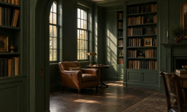
Paint authorities overwhelmingly favor muted, botanical greens across their 2026 and 2027 forecasts. Valspar named Warm Eucalyptus (8004-28F), an earthy gray-green with warm undertones, its 2026 Color of the Year.
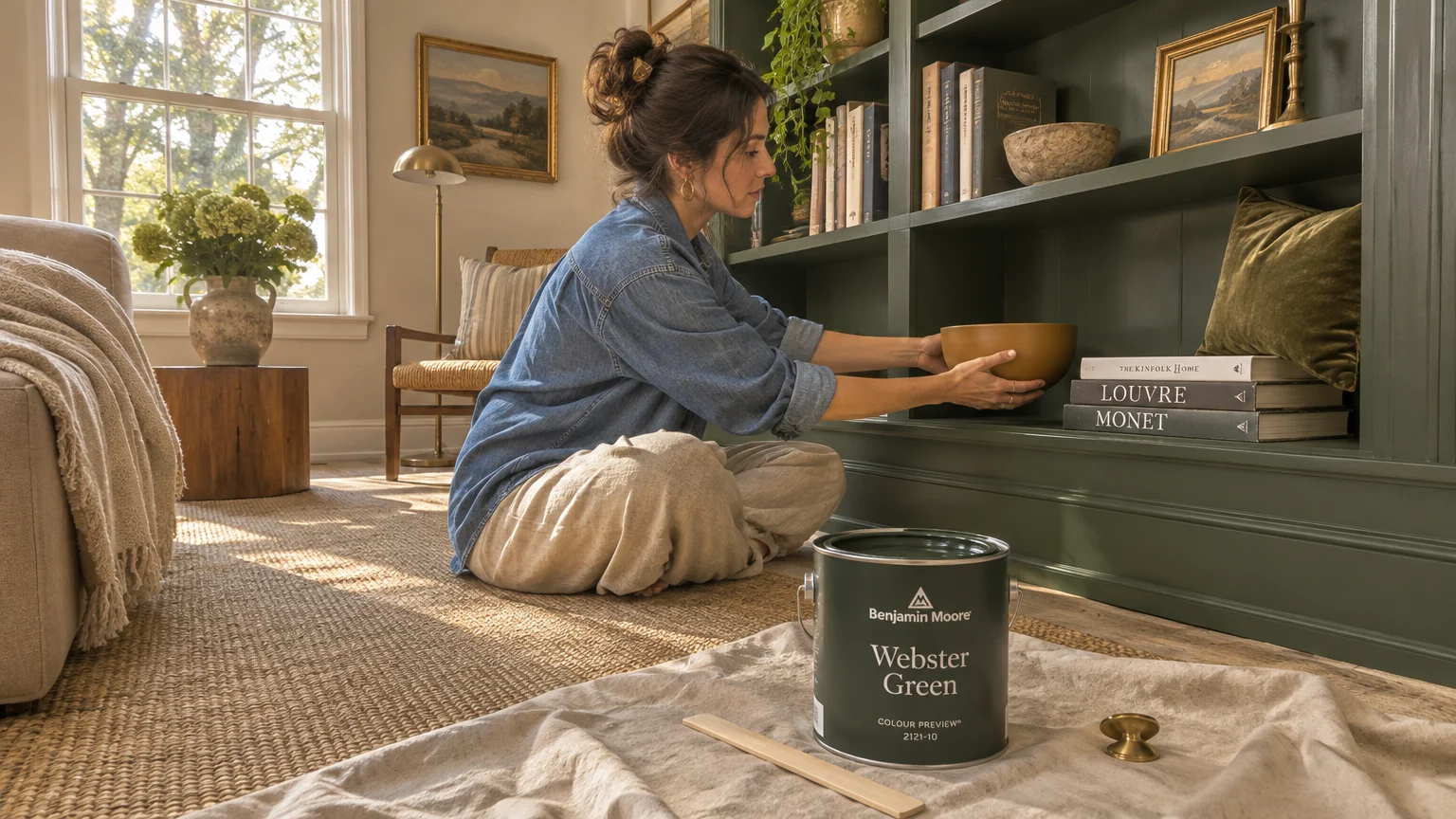
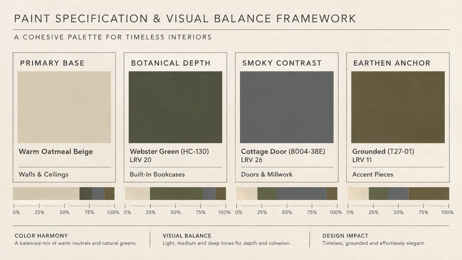
Looking ahead to 2027, Behr selected Grounded (T27-01), a mossy olive with rich brown undertones and a Light Reflectance Value (LRV) around 11. Benjamin Moore chose Webster Green (HC-130) at LRV 20, while Dulux introduced silvery Soulful Sage.
If your room lacks natural daylight, lighter herbal tones keep the atmosphere buoyant. Sherwin-Williams selected Celery (SW 6421), an airy herbal green with yellow undertones and an LRV of 71, as its 2027 Color of the Year.
Homebuyers respond favorably to this organic direction as well. According to a 2026 Zillow Behavioral Science survey of 4,000 recent and prospective buyers, sage green living rooms earned offers nearly $500 higher than standard white spaces.
Put this trend to work by painting built-in bookcases in Webster Green against warm oatmeal walls. For a lower-commitment update, layer olive velvet throw pillows, botanical artwork, and raw travertine side tables across a beige linen sectional.
Warm brass lamps and cognac leather accents bridge the gap between sandy walls and deep foliage tones. Keep cool neon greens out of the palette, since their synthetic cast makes beige look muddy.
Trend #2: Smoky Jade and Steely Slate Blues
Cool-toned blues bring crisp architectural tension to warm beige rooms. This pairing balances temperature rather than matching it, preventing a neutral space from feeling overly golden or sleepy.
Rather than bright coastal turquoise, today’s designers lean toward smoky, mineral-rich blues. Behr led this shift in 2026 with Hidden Gem (N430-6A), a complex blue-green jade that shifts gracefully from morning sunlight to evening lamplight.
For 2027, Valspar unveiled Cottage Door (8004-38E), a steely mid-tone blue with an LRV of 26. Glidden and PPG followed closely with Artifact (PPG10-16), a moody smoky blue sitting at LRV 20.
Soft sky-inspired blues also deliver measurable financial upside when you plan to sell. Zillow’s 2026 analysis revealed that pale blue living rooms were valued $1,723 higher than plain white rooms.
To execute this look, reserve smoky blue for large secondary elements like heavy wool drapery or a pair of barrel-back accent chairs. These substantial pieces anchor your beige living room ideas without overwhelming the eye.
You can also paint interior doors, window casings, or a fireplace mantel in Cottage Door while leaving surrounding walls sandy beige. Pair the blue woodwork with brushed nickel hardware and pale oak floors for effortless polish.
When working with darker smoky blues, ensure your sofa and area rug remain light cream or warm stone. That brightness keeps the low-LRV accent crisp rather than heavy.
Trend #3: Deep Espresso and Roasted Umber Browns
Monochromatic layering sits at the heart of quiet luxury—an aesthetic defined by understated materials, refined tailoring, and timeless provenance. Deep brown accents elevate beige from predictable builder-grade to gallery-worthy sophistication.
This tonal movement gained major momentum in 2026 when Benjamin Moore crowned Silhouette (AF-655), a deep espresso brown with charcoal undertones and an LRV of 10.18, as its Color of the Year. Meanwhile, Sherwin-Williams spotlighted Universal Khaki (SW 6150), proving earthy tans remain foundational.
Rich browns carry surprising appeal in the real estate market, too. While Zillow’s 2026 data highlighted warm chocolate brown’s $2,277 premium in bedrooms, that same appetite for enveloping cocoa hues is reshaping modern living rooms.
The secret to making brown and beige sing together lies in texture contrast. Pair smooth matte espresso-painted trim with chunky bouclé chairs, woven jute rugs, and unvarnished walnut coffee tables.
Avoid matching every wood stain to the exact same shade, which makes a room look catalog-bought. Instead, mix dark smoked oak shelving with warm chestnut leather and pale travertine stone.
If you test espresso paint accent ideas on a feature wall, choose a flat or matte finish to absorb harsh glare. Glossy dark browns often highlight drywall seams and feel dated under overhead recessed lights.
Trend #4: Sunbaked Terracotta and Clay Rust
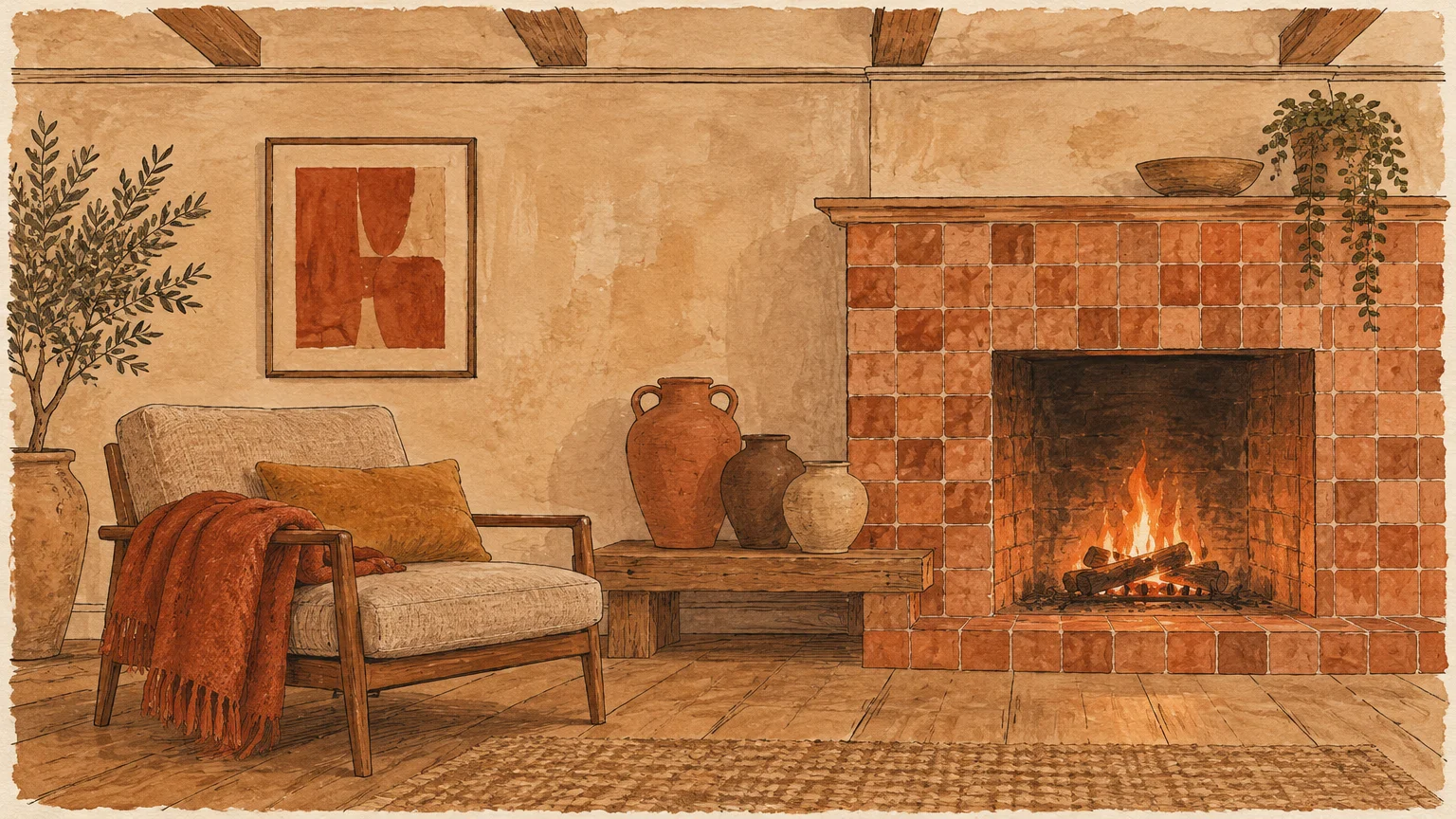
Architectural interiors are moving away from sterile minimalism toward tactile, sun-baked warmth. Earthy terracotta and clay accents inject Mediterranean vitality into beige rooms without feeling loud or synthetic.
Dutch Boy captured this earthy craving by naming Deep Rooted (311-7DB)—an organic terracotta orange with an LRV of 17—its 2027 Color of the Year. Because clay tones share warm red and brown pigments with beige, the transition feels seamless.
Color discipline matters enormously when exploring warm earth accents, however. Zillow’s 2026 paint study found that sharp ochre yellow actually reduced perceived home value by $18,164.
Muted, brown-based terracotta avoids that jarring yellow cast while delivering comforting depth. Stick to burnt sienna, rust, and dried paprika shades rather than goldenrod or mustard.
Incorporate clay tones through textured ceramic vessels, patterned kilim pillows, or a rust-toned mohair throw draped over an oatmeal armchair. These movable layers let you dial warmth up in autumn and lighten it during summer.
For permanent impact, consider limewash paint or plaster-effect finishes in diluted clay on a chimney breast. Pair that tactile surface with aged bronze sconces and creamy linen curtains.
Trend #5: Charcoal Slate and Architectural Graphite
Every pale neutral room benefits from a touch of dark graphite to establish visual gravity. Without dark anchors, beige sofas, rugs, and walls blend into an indistinct wash.
Charcoal accents carve clean silhouettes across a soft backdrop, giving traditional molding and modern furniture equal clarity. Buyers appreciate that crisp definition: Zillow’s 2026 analysis reported a $1,509 offer premium for charcoal and dark gray living rooms.
You do not need to paint an entire room dark gray to capture this architectural edge. Swap silver curtain rods for matte graphite iron, or frame black-and-white photography in slim charcoal ash frames.
Painting a brick fireplace surround or recessed media wall in soft graphite turns a functional focal point into sculptural art. Keep the shade slightly dusty rather than jet black so it harmonizes with creamy undertones.
Balance dark slate elements with plush ivory shearling pillows and warm amber table lamps. That high-low interplay prevents the room from feeling stark or cold after sunset.
Trend #6: Soft Cloud White and Chalky Limestone
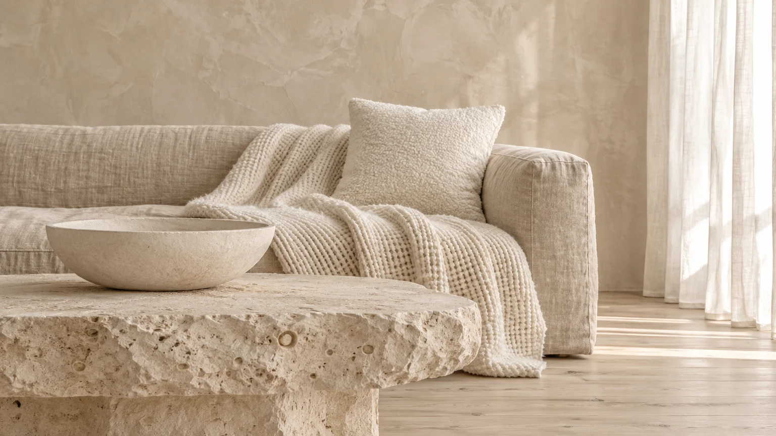
Tonal minimalism relies on subtle shifts in brightness rather than dramatic hue changes. Layering crisp, balanced whites against beige creates an airy gallery vibe that highlights architectural form and natural light.
This serene direction gained historic validation when Pantone named PANTONE 11-4201 Cloud Dancer its 2026 Color of the Year on December 4, 2025. It marked the first white chosen since the program launched in 1999.
To keep white accents from looking stark or sterile next to warm beige, inspect each paint chip’s undertone carefully. Avoid ultra-bright clinical whites in cozy rooms; instead, bridge shades with soft chalky tones.
Knowing Light Reflectance Value helps you calibrate contrast accurately. For example, Sherwin-Williams High Reflective White (7757) measures LRV 93, while Benjamin Moore Chantilly Lace (OC-65) sits at LRV 90.04.
Use high-LRV whites on ceiling coffers, crown molding, and tall baseboards to frame sandy walls. Add tactile white plaster lamps, alabaster bowls, and sheer cotton drapery to catch daylight across the room.
Trend #7: Color-Drenched Monochromatic Accents
Traditional accent walls—where a single flat sheet of drywall receives bold paint—are losing ground to immersive architectural zoning. Color drenching coats walls, trim, baseboards, and sometimes ceilings in one unified hue.
Homeowner interest in this technique is surging rapidly. According to Zillow’s 2026 Home Trends Report, mentions of color drenching jumped 149% year-over-year in real estate listing descriptions.
You can adapt color drenching inside a beige living room by targeting recessed alcoves, reading nooks, or adjacent dining pass-throughs. Coat the alcove walls, shelving, and trim in smoky blue Artifact or mossy Grounded while keeping the main lounge warm beige.
This deliberate saturation eliminates choppy white trim lines and makes small architectural pockets look custom-built. Your beige living area stays bright and welcoming while gaining a jewel-box focal point.
Keep sheen variations subtle when drenching a nook—use matte on drywall and eggshell or satin on woodwork. Matching the exact color formula across surfaces ensures seamless visual continuity.
Trend #8: Undertone-Matched Textiles and Tactile Metallics
Paint is never your only tool for introducing compelling color combinations. Textiles, stone veining, and living metal finishes act as dynamic accents that shift gently throughout the day.
Start by identifying your beige wall’s hidden undertone against a sheet of plain white printer paper. Pink-beige walls pair effortlessly with dusty mauve velvet and rose-veined marble, whereas yellow-beige walls shine alongside olive linen and warm antique brass.
Greige rooms—blends of gray and beige—welcome cool pewter hardware, slate wool throws, and smoky blue ceramics. Ignoring undertones causes subtle visual friction even when every piece looks expensive on its own.
Mix at least three tactile finishes within your accent palette to keep neutral rooms engaging. Combine slubby raw silk pillows, hammered bronze trays, and honed limestone coasters on a smooth wood coffee table.
Living metals such as unlacquered brass develop natural patina over time, deepening alongside warm beige walls. Replace builder-grade chrome lamp bases with aged brass or blackened steel for instant provenance.
The Big Picture: Weaving These Trends into Your Home
Great color choices fail when proportions, lighting, and paint chemistry work against your room. Follow proven designer formulas to move from inspiration boards to durable, livable execution.
Mastering the 60-30-10 Proportion Rule
Both Sherwin-Williams and Benjamin Moore endorse the 60-30-10 rule to maintain visual equilibrium. Dedicate 60% of the room to your dominant beige base across walls, flooring, or primary seating.
Allocate 30% to a secondary hue through heavy curtains, an area rug, accent chairs, or built-in cabinetry. Reserve the final 10% for high-impact accents like throw pillows, ceramics, framed art, and metallic hardware.
When a room feels chaotic, check whether your 10% accent color crept past 30% across multiple competing pieces. Dialing small accessories back restores calm immediately.
Reading Light Reflectance Value and Bulb Temperature
Paint colors look vastly different under showroom fluorescents than inside your home. Paint brands measure light reflection on an LRV scale from 0 to 100, with architectural paints typically spanning roughly LRV 3 up to LRV 94.
Colors scoring LRV 60 and higher bounce abundant daylight, helping compact rooms feel open and airy. Mid-tones between LRV 40 and 60 offer balanced versatility, while shades at LRV 40 and below create moody, cocooning intimacy.
Light bulbs control how accurately you perceive those undertones after dark. Guidance from ENERGY STAR, the U.S. Department of Energy, and the Illuminating Engineering Society (IES) recommends 2700K to 3000K warm-white bulbs for living rooms.
Skip harsh 4100K to 6500K daylight bulbs, which strip warmth from beige and turn sage green icy. Look for bulbs rated at least 80 CRI under ENERGY STAR standards, or choose 90+ CRI bulbs per IES guidance for true color rendering.
Planning Paint Budgets, Coverage, and Air Safety
Accurate quantity math prevents mid-project trips to the hardware store and mismatched dye lots. Major manufacturers including Sherwin-Williams, Benjamin Moore, and Behr estimate 350 to 400 square feet per gallon per coat on smooth interior walls.
Plan on applying two full coats for uniform depth, especially when painting low-LRV accent colors over pale beige. Under standard conditions of 77 degrees Fahrenheit and 50% relative humidity, Sherwin-Williams water-based acrylic latex dries to the touch in one hour and accepts a second coat after four hours.
Budget interior latex averages $25 to $35 per gallon, while mid-range options run $35 to $55 per gallon—Sherwin-Williams homeowner lines start at a $38.49 list price, and Benjamin Moore Ben retails around $44.50. Premium coatings cost $55 to over $80 per gallon, with Cashmere at $59.99 and SuperPaint at $64.49.
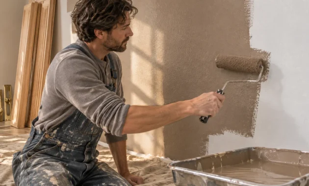
Hiring a professional painting crew for an average living room typically runs $2,000 to $4,000, or $9.50 to $20 per square foot depending on trim detail and ceiling height. Tackling an accent wall or bookcase yourself over a weekend saves substantial labor expense.
Prioritize indoor air quality whenever you open a paint can. Federal U.S. EPA regulations cap architectural flat coatings at 250 grams per liter (g/L) of volatile organic compounds (VOCs) and nonflat coatings at 380 g/L.
Regional standards go much further: California caps flat paints at 50 g/L and nonflat at 100 g/L, while European Union rules limit matte interior wall paints to 30 g/L. Many top national lines, including Sherwin-Williams Emerald and SuperPaint, formulate below 50 g/L.
Because indoor VOC levels can spike up to 10 times higher than outdoor air, the EPA advises running maximum ventilation during painting and for at least 72 hours afterward. Crack cross-breeze windows and run exhaust fans until curing odors clear completely.
For the latest color forecasts, consult industry leaders like Pantone and paint companies like Benjamin Moore. For professional design standards, refer to the American Society of Interior Designers (ASID).
Frequently Asked Questions
What accent colors look best with yellow-undertone beige walls?
Olive green, earthy terracotta, and deep espresso brown harmonize naturally with yellow-beige walls because they share warm undertones. Steer clear of icy lavender or cool pink accents, which can make yellow-beige appear dingy.
Which accent color adds the most resale value to a beige living room?
According to Zillow’s 2026 buyer research, pale blue living rooms commanded $1,723 more than white rooms, while charcoal gray earned a $1,509 premium. Sage green also added nearly $500 while ranking consistently strong across every room.
Should accent colors be darker or lighter than beige walls?
Darker accents with an LRV below 40—such as smoky blue, deep espresso, or mossy olive—usually deliver stronger architectural definition against mid-tone beige. However, crisp chalky whites above LRV 90 work beautifully on trim and moldings.
How can I add accent colors without painting my walls?
Use the 30% and 10% portions of the 60-30-10 rule for curtains, patterned rugs, velvet armchairs, and throw pillows. Swapping lampshades, artwork, and ceramic accessories lets you test bold hues risk-free before opening a paint can.
What light bulb temperature works best with beige and warm accents?
Install 2700K to 3000K warm-white LED bulbs with a Color Rendering Index (CRI) of 90 or higher. Warm light preserves creamy neutral undertones and prevents green or terracotta accents from looking flat after sundown.
Can I use two accent colors in the same beige living room?
Yes—combining a cool accent like smoky jade with a warm grounding tone like espresso brown creates designer-level depth. Just keep one hue dominant at roughly 30% and limit the second accent to 10% across small decor.
Disclaimer: This article reflects design trend analysis and predictions. Personal taste and timeless design principles should always guide your decorating choices.