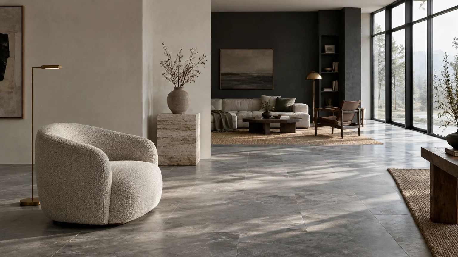
Pairing paint colors for cool-toned floors transforms cold undertones into a deliberate, magazine-worthy design statement. You can instantly warm up chilled slate or balance gray-washed wood by selecting wall colors with intentional undertones.
Successful cool-toned interior design relies on balancing undertones and light reflectance values across your architectural surfaces. The right palette unlocks sophisticated depth, turning stark floors into an elegant design anchor.
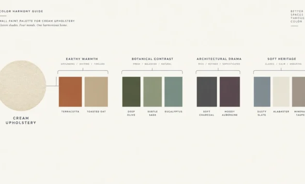
Discover eleven designer-approved paint colors that match cool wood floors, tiles, and polished concrete effortlessly. These curated shades bring cohesion, warmth, and tailored luxury to your living spaces.
Trend #1: Crisp Alabaster White
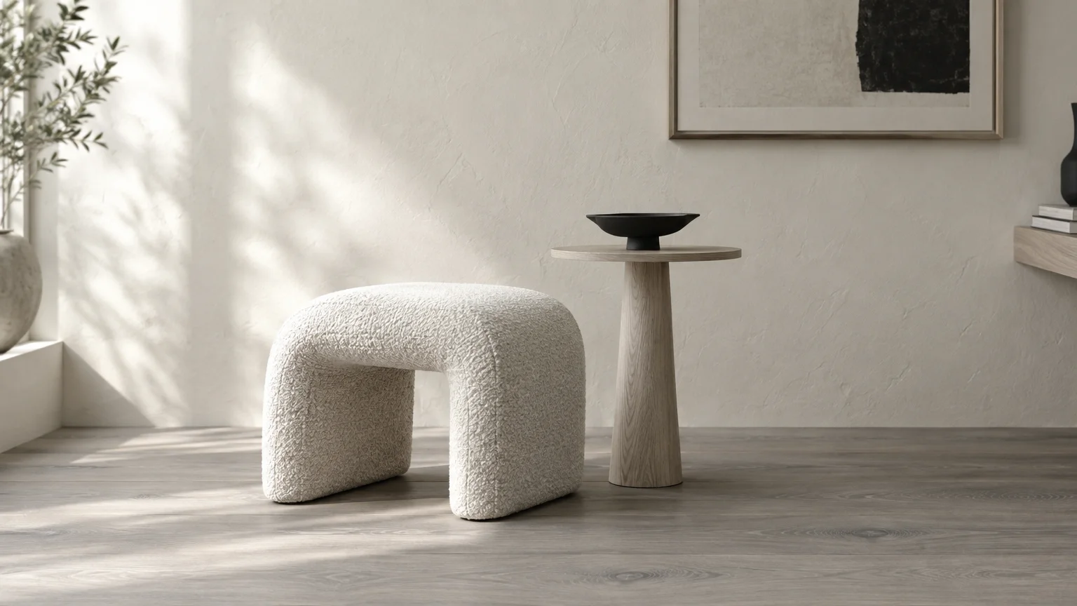
Crisp alabaster white creates a luminous, gallery-style aesthetic against cool-toned floors. This clean pairing maximizes natural light while allowing ash wood or slate textures to take center stage.
When selecting wall colors for gray floors, choose an alabaster with subtle neutral pigments. Pure, unpigmented whites can look sterile under fluorescent or northern light.
The popularity of this look stems from the rise of quiet luxury and architectural minimalism. Homeowners crave serene backdrops that elevate prized furnishings without visual noise.
Pair this wall color with matte black hardware, bouclé upholstery, and bleached oak accents. The subtle contrast defines the room while maintaining an ethereal, open environment.
Test samples with a high Light Reflectance Value (LRV) near 85. This ensures the walls bounce light effectively across your chilled floor surfaces.
You will establish a refined, timeless foundation that lets architectural details shine effortlessly.
Trend #2: Saturated Charcoal
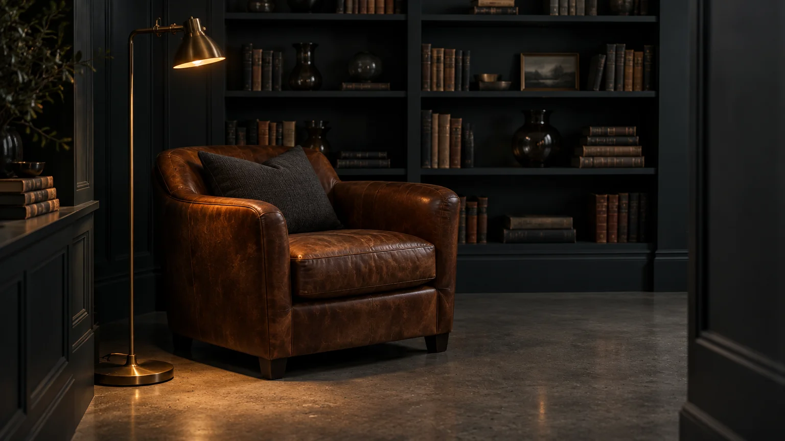
Saturated charcoal delivers an enveloping, monochromatic drama when paired with gray timber or poured concrete. This daring hue embraces the floor’s icy undertones rather than fighting them.
By matching cool floor values with deep wall tones, you establish sophisticated tonal continuity. The visual boundaries of the room soften, creating an intimate sanctuary.
This moody aesthetic reflects a cultural shift toward cocooning spaces and boutique hotel opulence. Designers increasingly abandon timid neutrals in favor of assertive, immersive environments.
Layer raw linen drapery, burnished brass sconces, and smoked glass to add textural richness. These metallic and fibrous elements prevent the dark palette from feeling flat.
Use this pairing in dining rooms, home libraries, or powder rooms. The dramatic contrast elevates flooring and paint color pairing into a true artistic statement.
Balance the low LRV by introducing layered lighting at multiple heights to avoid dim corners.
Trend #3: Muted Sage and Eucalyptus
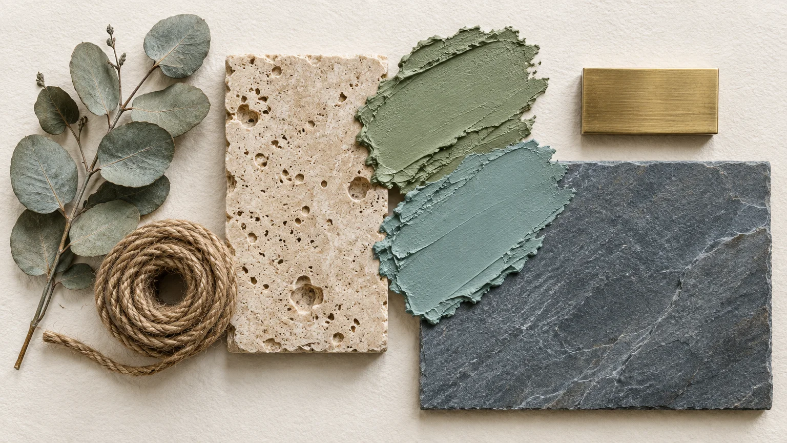
Muted sage and eucalyptus tones inject serene, biophilic energy into spaces anchored by cool stone or ash planks. These botanical tints introduce soft organic life to modern layouts.
Because green sits opposite red on the color wheel, cool greens harmonize naturally with slate and gray-washed finishes. The effect feels both restorative and distinctly grounded.
Modern homeowners actively seek restorative interiors that blur the boundary between indoors and outdoors. Muted botanical shades provide a tranquil antidote to busy urban lifestyles.
Complement this wall color with raw travertine, woven jute accents, and unlacquered brass. These tactile additions provide physical warmth against the cool ground plane.
This pairing thrives in sunlit living rooms and spa-inspired master bathrooms. It softens the hard architectural lines of cool tile without clashing with gray undertones.
Opt for an eggshell or chalky matte finish to enhance the organic, powdery quality of the green pigment.
Trend #4: Dusty Mineral Blue
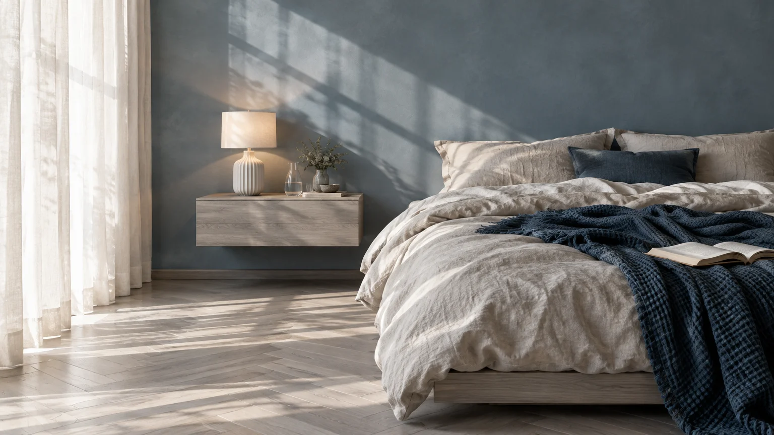
Dusty mineral blue creates an ethereal, tone-on-tone composition alongside slate tile and cool oak. It leans directly into the existing cool palette to produce effortless harmony.
This shade contains subtle gray undertones that tie your walls directly to the pigment in your flooring. The result is a unified envelope that feels intentionally curated.
The demand for cool-toned interior design with a coastal or Scandinavian ethos keeps mineral blue at the forefront of contemporary decorating. It offers color without visual agitation.
Introduce light maple furniture, brushed nickel fixtures, and crisp white architectural moldings. These components brighten the space and create crisp visual thresholds.
Apply this color in home offices or primary bedrooms where focus and tranquility are paramount. The cool synergy naturally lowers visual stimulation and promotes relaxation.
Choose a paint formula with slate undertones to guarantee a seamless match with your flooring.
Trend #5: Warm Greige
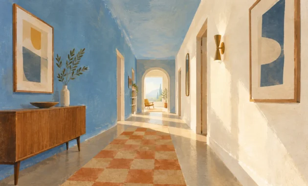
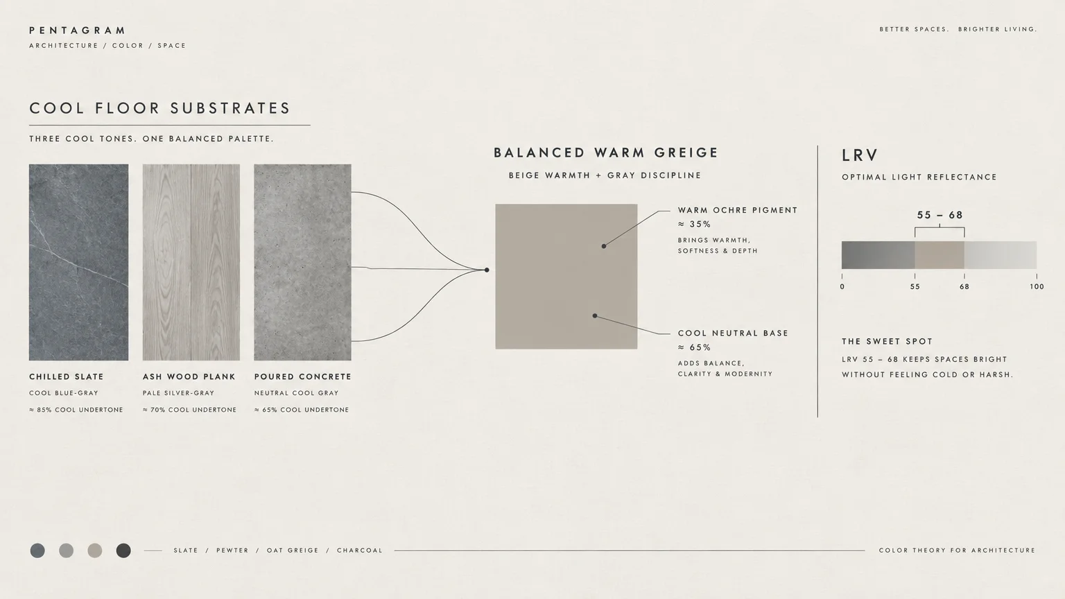
Warm greige serves as the ultimate bridge between chilled flooring and cozy furnishings. This versatile hybrid balances beige warmth with gray coolness for flawless transitional elegance.
If you want paint colors that match cool wood floors while keeping your space inviting, greige is the definitive professional choice. It prevents gray floors from appearing unwelcoming.
This color answers the post-gray design movement, where decorators sought warmer alternatives without replacing cool-toned hard flooring surfaces. Greige rescues existing renovations with contemporary grace.
Style this canvas with warm walnut furniture, nubby bouclé textiles, and cognac leather accessories. These rich elements amplify the beige notes on your walls.
Focus on greiges with beige-yellow or taupe undertones rather than violet casts. This ensures a clean transition between vertical surfaces and the floor.
You will achieve a timeless, flexible backdrop suitable for open-concept floor plans and connecting hallways.
Trend #6: Spiced Ochre and Terracotta
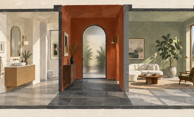
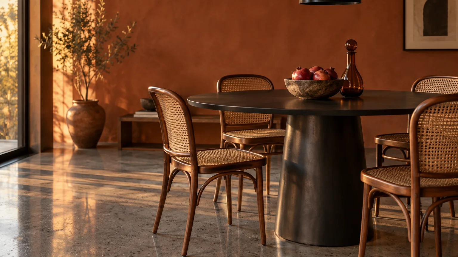
Spiced ochre and earthen terracotta introduce vivid chromatic tension when placed against icy floors. This high-contrast pairing energizes cool tile and pale ash wood immediately.
Color theory demonstrates that pairing warm earth tones against cool grounds creates vibrant visual resonance. The warmth of clay balances the icy detachment of gray.
Modern interiors increasingly celebrate artisanal provenance and global desert aesthetics. Homeowners want spirited, soulful colors that break away from sterile, monochromatic schemes.
Furnish the room with dark bronze metalwork, aged oak tables, and woven kilim textiles. These earthy elements echo the wall color while grounding the chilled floor plane.
Use this palette boldly in dining spaces, reading nooks, or entryways. It generates an immediate sensation of welcoming intimacy upon entering your home.
Always select muted terracotta with dusty undertones rather than bright orange to keep the aesthetic sophisticated.
Trend #7: Soft Dove Gray
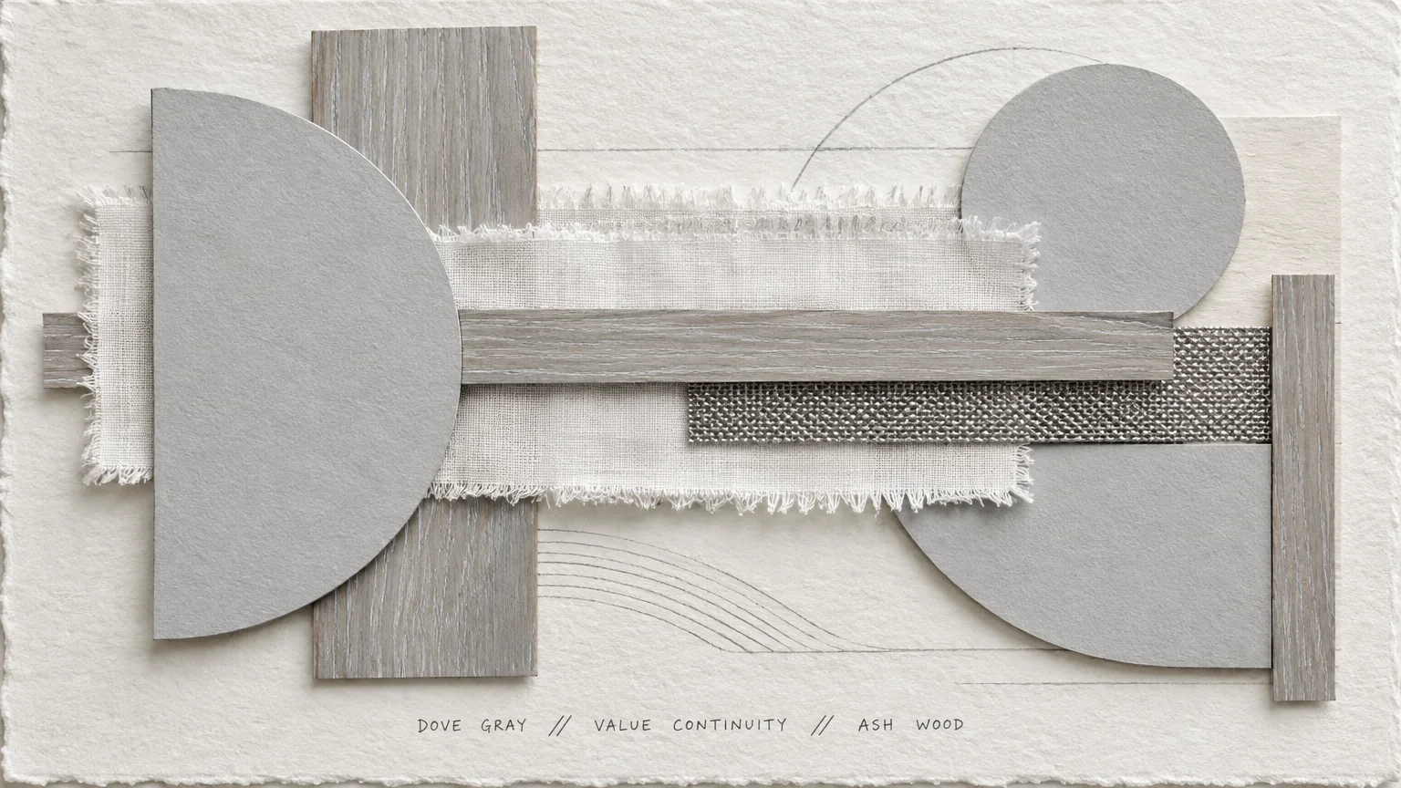
Soft dove gray offers a whisper-quiet, monochromatic gradient when paired with cool-toned hardwood or stone. It creates a tranquil envelope with barely perceptible tonal transitions.
By picking wall colors for gray floors that are two shades lighter than the floor itself, you establish effortless architectural dimension. The room breathes without stark division.
This pairing epitomizes the Scandinavian aesthetic of understated functional beauty. It appeals to minimalists who appreciate nuanced shifts in value rather than bold color clashes.
Add depth by incorporating ribbed glass, polished chrome, and ribbed wool rugs into the decor. Texture takes the lead when color contrast remains intentionally restrained.
Apply dove gray across open living rooms and bright hallways. It maintains luminosity and maximizes the sense of square footage across modern floor plans.
Check your paint chips against north-facing windows to avoid unwanted violet undertones from emerging.
Trend #8: Deep Forest Green
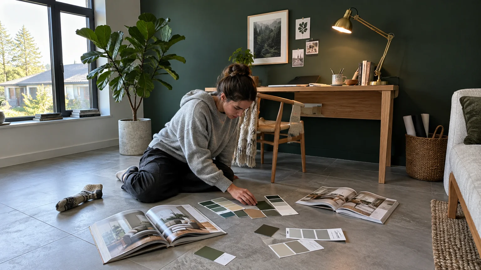
Deep forest green imparts regal architectural depth to cool concrete, charcoal slate, or ash timber. Its dark, saturated personality anchors the room in timeless majesty.
The deep green pigments absorb light dramatically, transforming cool floors into striking reflective platforms. The balance between dark walls and cool floors feels intentional and opulent.
This trend reflects the enduring allure of heritage interiors and moody biophilic sanctuaries. Design enthusiasts want cozy, dignified rooms that evoke historic libraries and country manors.
Introduce polished brass fixtures, velvet seating, and rich mahogany or walnut accents. These luxurious materials counteract the coolness of the flooring with tangible, sensory warmth.
Utilize this hue in dens, powder rooms, or master bedrooms to build dramatic ambiance. The deep green envelops the architecture and elevates the entire room.
Select a formula with blackened undertones to ensure it complements gray and ash floors without looking overly festive.
Trend #9: Architectural Plaster Pink
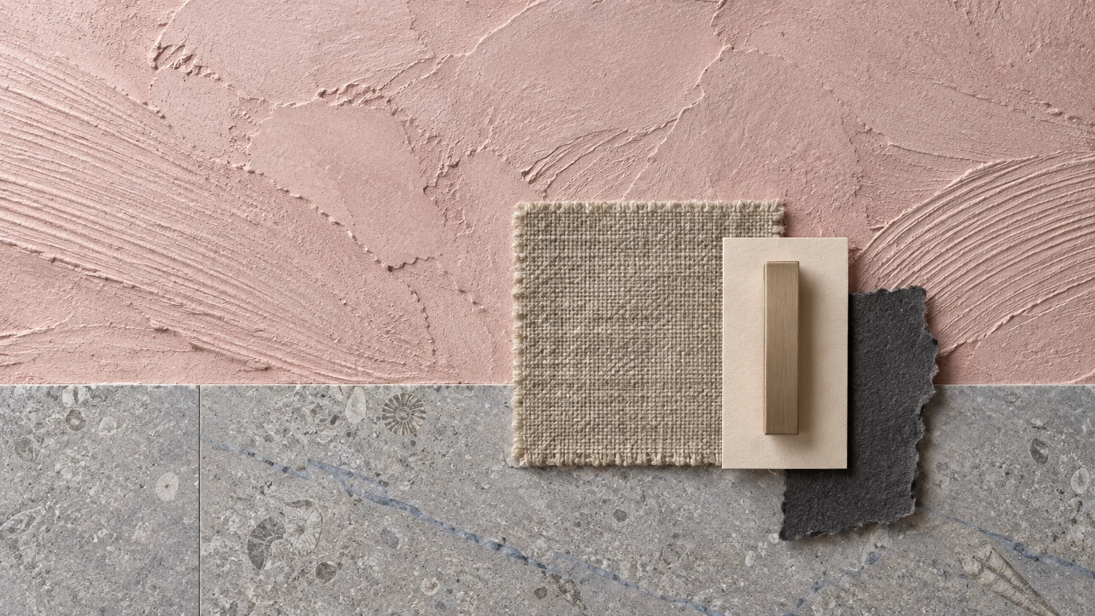
Architectural plaster pink provides a gentle, chalky warmth that softens the austerity of cool floors. Far from juvenile, this muted blush acts as an elegant neutral.
The dusty red undertones in plaster pink subtly counteract the blue-gray hues found in cool-toned wood. This creates a balanced, flattering ambient light throughout the space.
Contemporary decorators embrace plaster finishes and muted skin tones as fresh alternatives to traditional beige. This trend signals a movement toward human-centered, tactile architecture.
Pair plaster pink with blackened iron furniture, honed marble accents, and natural linen curtains. The combination feels modern, refined, and distinctly high-end.
This color works exceptionally well in master suites, creative studios, and sun-drenched formal living spaces. It infuses cool rooms with flattering, rosy light.
Choose matte or chalk finishes to emphasize the soft, mineral texture of the wall surface.
Trend #10: Tailored Classic Navy
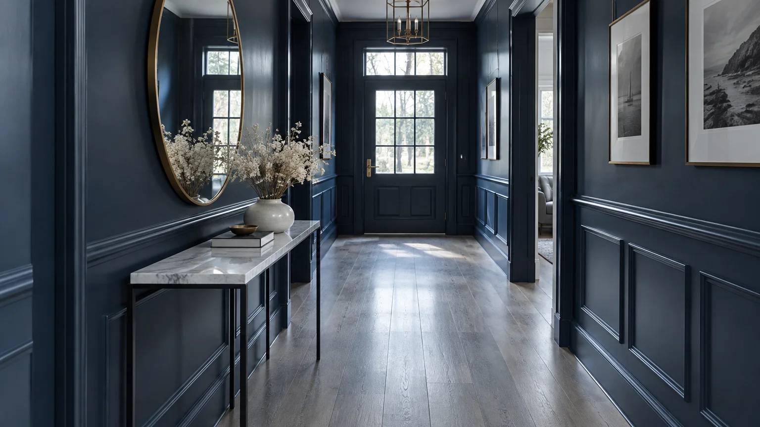
Tailored classic navy brings crisp, architectural distinction to cool-toned floors. This commanding blue sharpens the pale grain of ash wood and clarifies gray floor tiles.
As a deep cool tone, navy establishes a natural relationship with gray and slate flooring. The high contrast generates a striking, tailored look reminiscent of Savile Row suiting.
Navy remains an untouchable staple in luxury design due to its enduring versatility. It provides the moody drama of black while preserving a distinct richness of color.
Style navy walls with warm brass lighting, crisp white trim, and rich caramel leather chairs. These warm counterweights balance the cool foundation perfectly.
Reserve navy for statement dining rooms, executive studies, or dramatic formal entrances. It establishes an immediate impression of poise, order, and curated elegance.
Always verify the undertone under artificial light to ensure the navy does not cast unwanted purple shadows.
Trend #11: Creamy Buttermilk
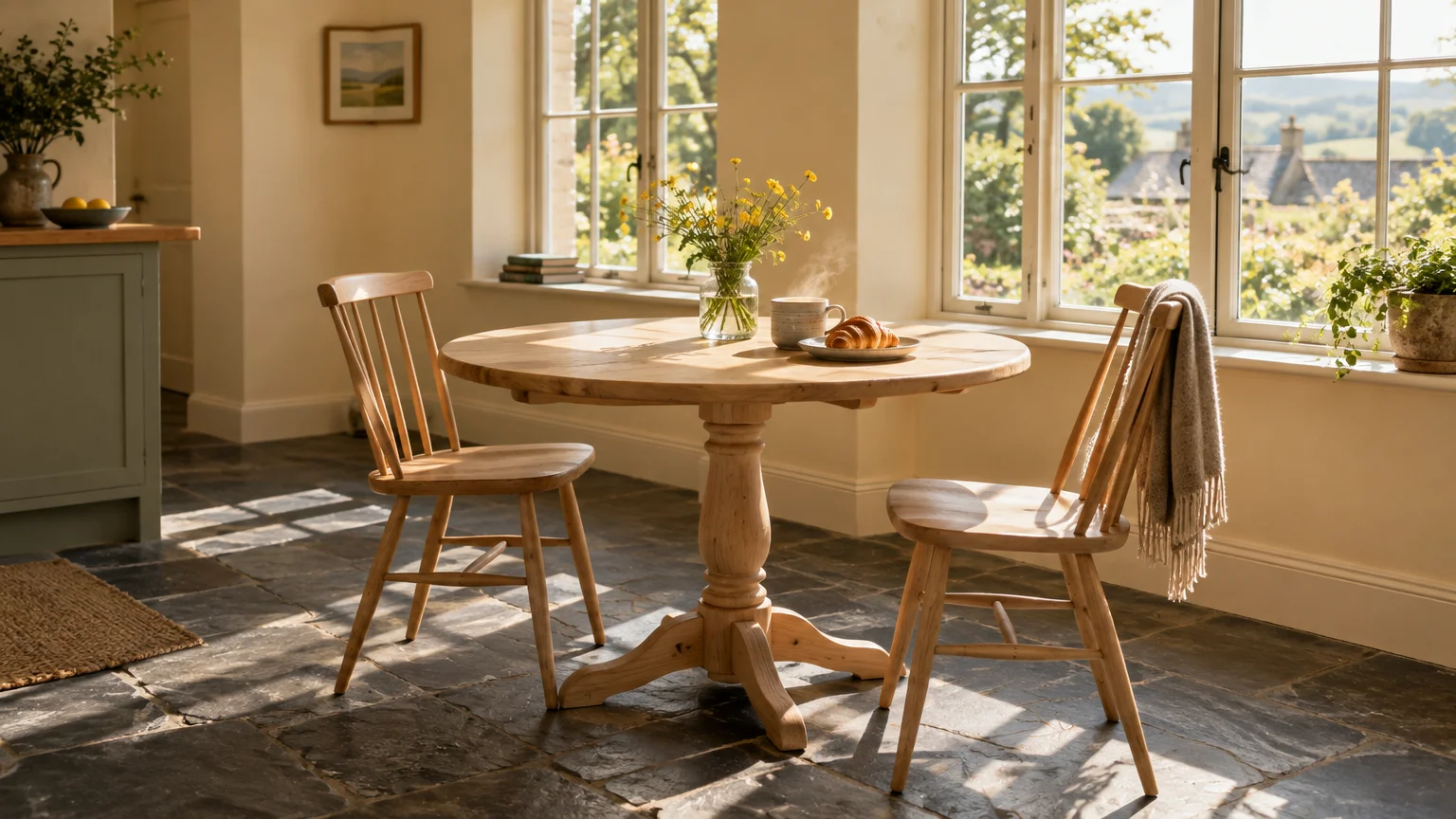
Creamy buttermilk introduces delicious, vintage warmth to interiors anchored by cool-toned flooring. This soft, buttery hue directly counteracts the industrial chill of gray surfaces.
Pairing yellow-based cream with cool wood creates a vibrant, lived-in tension. It proves that warm and cool elements can coexist in comfortable harmony.
The resurgence of historic farmhouse charm and traditional English country design drove buttermilk into modern prominence. People are gravitating toward nostalgic, welcoming comfort in their daily spaces.
Decorate this setting with antique pine furniture, aged copper cookware, and textured wool throws. These historic materials bridge the gap between historic warmth and modern flooring.
Use this radiant shade in kitchens, breakfast nooks, and north-facing rooms that lack direct sunlight. It instantly lifts the space with cheerful, welcoming brightness.
Test samples during morning and evening light to ensure the yellow undertones stay gentle and soft.
The Big Picture: Weaving These Trends into Your Home
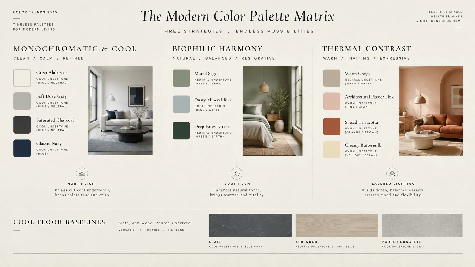
Successful interior design relies on balancing undertones across every horizontal and vertical plane in your home. You do not need to replace cool-toned floors to create a warm, inviting atmosphere.
Examine your floor under natural daylight to identify whether it leans toward blue, green, or violet undertones. Matching or deliberately contrasting that underlying hue guides your wall color selection.
When you choose paint colors for cool-toned floors, consider the sixty-thirty-ten color rule. Dedicate sixty percent of your room to walls, thirty percent to flooring and large furniture, and ten percent to accents.
Integrate natural materials like warm woods, woven textiles, and live foliage to bridge any temperature gap. These organic elements soften the hard transition between cool floors and painted walls.
Layer your artificial lighting with warm 2700K bulbs across table lamps, sconces, and overhead fixtures. Warm lighting prevents cool floor pigments from reading flat or institutional after sunset.
Incorporate large area rugs that feature both warm creams and cool grays within their weave. A transitional rug acts as a visual mediator that ties the entire scheme together.
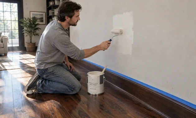
Always sample your chosen paint colors on multiple walls using large adhesive swatches before painting. Observe how shifting sunlight alters the color relationship between the walls and floors throughout the day.
Thoughtful flooring and paint color pairing transforms disparate architectural finishes into a cohesive, high-end design narrative.
Frequently Asked Questions
Can you use warm paint colors with cool-toned gray floors?
Yes, warm paint colors create dynamic contrast against cool-toned gray floors. Shades like warm greige, terracotta, and creamy buttermilk balance cool floor undertones and prevent rooms from feeling sterile.
To make the pairing work, tie the temperatures together using wood furniture, textured rugs, and metallic accents. This creates intentional tension rather than an accidental visual mismatch.
How do you determine the undertone of cool-toned wood floors?
Place a sheet of pure white paper directly onto your flooring under natural daylight. Look closely at the contrast to reveal whether your floor casts blue, slate gray, green, or subtle purple undertones.
Identifying this underlying tint helps you select paint colors that match cool wood floors with precision. Working with your floor’s undertone creates an effortless, professional outcome.
Are cool-toned floors still in style for modern interiors?
Cool-toned floors remain a versatile architectural staple in modern, Scandinavian, and coastal aesthetics. While warmer hardwood tones are trending, cool floors continue to provide a sleek, minimalist foundation.
Updating your wall paint, textiles, and lighting easily modernizes cool flooring without the expense of full renovation. Thoughtful wall colors give existing floors renewed relevance.
What paint finish works best with cool-toned flooring?
Matte, eggshell, and velvet finishes work best because they diffuse light softly across the room. High-gloss finishes reflect too much glare, which can accentuate the coldness of gray or concrete floors.
Low-sheen walls also impart a velvety, sophisticated texture that makes the entire room feel more comfortable. The softer finish enhances quiet luxury in any residential space.
For the latest color forecasts, consult industry leaders like Pantone and paint companies like Benjamin Moore. For professional design standards, refer to the American Society of Interior Designers (ASID).
Disclaimer: This article reflects design trend analysis and predictions. Personal taste and timeless design principles should always guide your decorating choices.