You can dramatically transform your living space with vibrant energy without opening a single paint can. Strategic styling choices introduce rich depth and personality while preserving your pristine drywall and rental deposits.
From saturated statement textiles to curated gallery walls, clever chromatic interventions revitalize tired rooms instantly. These tactical updates let you experiment with daring palettes completely commitment-free.
Whether you embrace quiet luxury or eclectic modernism, targeted decor shifts redefine your environment effortlessly. Here is how you can master high-impact color through intentional design curation.
Trend #1: Curated Textile Layering
Saturated textiles provide the most versatile vehicle to add color without painting your perimeter walls. Swapping muted cushions for chartreuse velvet or saffron linen transforms a neutral sofa immediately.
High-end designers often rely on tactile contrasts to make dynamic shades feel grounded and intentional. When you pair heavy ribbed wool with slubby raw silk, the color gains dimensional richness.
Window treatments offer an expansive vertical plane that mirrors the scale of an accent wall. Floor-to-ceiling drapery in dusty cobalt or terracotta frames your architecture without requiring a single paint roller.
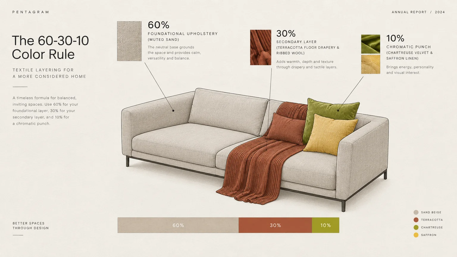
You can balance these additions by adhering to the classic 60-30-10 color rule. Keep your foundational upholstery neutral; let dynamic throws and bolsters supply that energetic ten percent chromatic punch.
Pattern mixing also amplifies the impact of your textile palette without visual chaos. Pair a large-scale floral with a subtle pinstripe in matching undertones to create refined cohesion.
This tactile method delivers instant seasonal flexibility whenever your aesthetic preferences evolve. You merely swap covers to pivot from sun-drenched ochre in autumn to brisk cerulean in spring.
Trend #2: High-Impact Statement Rugs
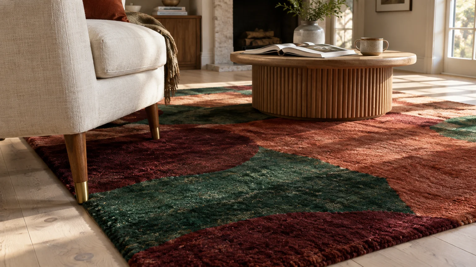
Floors represent your room’s fifth wall and command massive visual real estate. An oversized, chromatic area rug anchors the entire seating arrangement while establishing a decisive tonal foundation.
Modern rug design blurs the boundary between functional floor covering and fine fiber art. Hand-knotted wool pieces featuring abstract expressionist motifs infuse underfoot surfaces with vibrant emeralds and rich burgundies.
When you position an eye-catching rug against neutral flooring, it defines clear zones in open-concept spaces. The dense wool pile absorbs ambient noise while creating an inviting, luxurious sanctuary.
Look for artisanal rugs dyed with natural vegetable pigments to achieve authentic visual provenance. These organic undertones harmonize effortlessly with wooden furnishings, stone tables, and metallic fixtures.
Layering a smaller patterned rug over a broad neutral sisal base creates refined spatial depth. This designer trick highlights vivid jewel tones while preserving an earthy, grounded baseline throughout the room.
Ensure your rug extends under the front legs of major seating pieces to avoid a floating look. Proper scale transforms a colorful rug from an afterthought into the room’s primary anchor.
Trend #3: Large-Scale Expressive Artwork
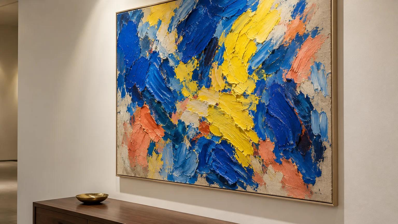
Oversized fine art delivers the visual saturation of an accent wall with far superior sophistication. A massive canvas soaked in ultramarine or cadmium yellow draws focus immediately.
Prominent artwork brings cultural provenance and personal identity into your home decor color ideas. It commands attention, directing the eye toward an intentional, captivating focal plane.
Select pieces with energetic brushwork and dimensional impasto to give blank drywall dramatic intrigue. The physical texture catches directional lighting, shifting the artwork’s color profile throughout the day.
You can also lean on unframed canvas wraps or floating timber frames to elevate modern visual appeal. Float frames create negative relief, emphasizing bright pigment boundaries without overwhelming surrounding woodwork.
If you prefer salon-style presentations, group smaller vintage oil paintings into a tight cluster. This collective color arrangement offers striking visual power that rivals any custom paint job.
Hang your focal art so its center sits at standard eye level—roughly 57 inches from the floor. This museum standard grounds the composition and invites close inspection of every brushstroke.
Trend #4: Saturated Upholstered Accent Seating
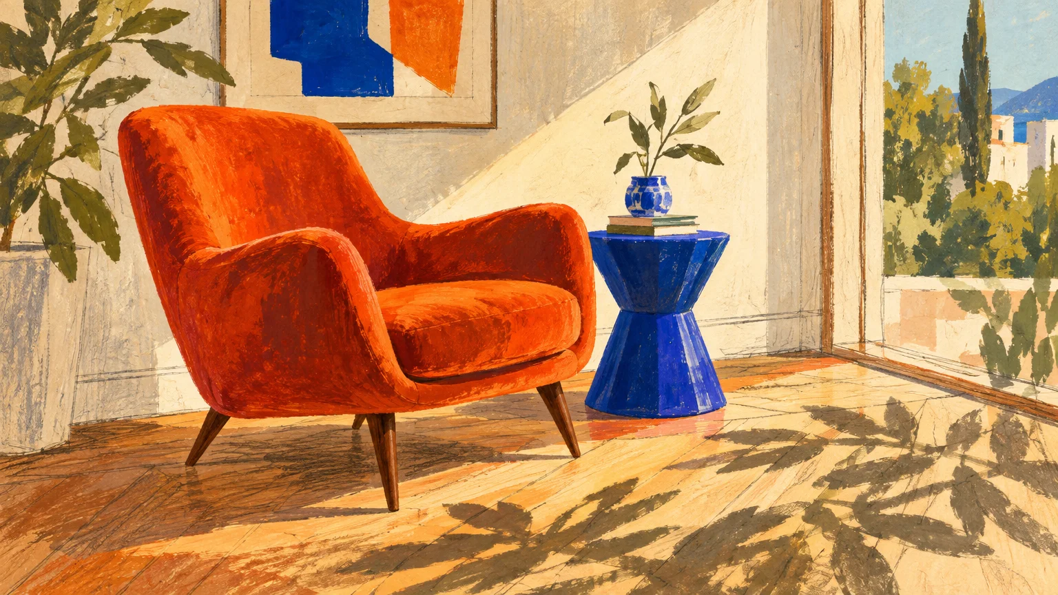
Investing in vibrant secondary seating is a masterclass in decorating without paint. A pair of sculpted armchairs wrapped in burnt amber velvet energizes an otherwise subdued room.
Accent chairs occupy the critical middle layer of your space’s vertical sightline. Their structural silhouettes present rich swaths of pigment precisely at conversational eye level.
Modern luxury favors sensual curves paired with unapologetic, gem-inspired hues. Consider a serpentine lounge chair finished in moss green or royal lapis to break up geometric monotony.
Upholstered dining chairs also introduce an exhilarating rhythm across expansive entertaining zones. Alternating complementary hues along the table creates a dynamic dining room environment that feels bespoke and convivial.
Contrast these saturated textiles against unlacquered brass legs or matte black metal bases. These metallic accents provide crisp structural punctuation that keeps opulent shades feeling modern.
Performance velvets and treated wools ensure your bold seating withstands daily wear without fading. Durable textiles let you enjoy vivid upholstery without worrying about spills or wear patterns.
Trend #5: Architectural Peel-and-Stick Murals
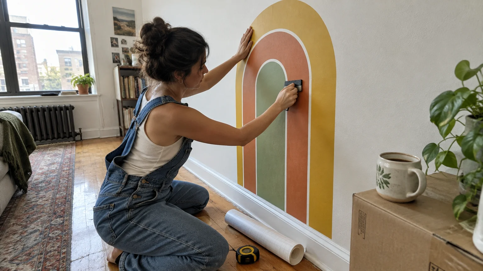
Removable wallpaper technology has evolved far beyond the flimsy temporary contact paper of previous decades. Premium non-woven peel-and-stick murals deliver dramatic, museum-quality color that peels off cleanly when desired.
Dramatic scenic vistas, oversized botanicals, and retro geometric patterns establish instant structural character. They simulate hand-painted frescoes without the permanence or labor-intensive installation.
Install a scenic mural inside an architectural alcove, behind a headboard, or inside a dining room recess. This contained application frames the vibrant palette, transforming plain plaster into an engaging narrative vignette.
Renters and design purists alike can embrace daring motifs without risking their security deposits. When moving day arrives, the substrate releases cleanly from drywall without leaving sticky adhesive residues.
Pair your mural with tailored wood molding to create the illusion of permanent, heritage millwork. This polished trompe l’œil technique marries modern practicality with timeless European elegance.
Wipe down your wall with rubbing alcohol before hanging panels to ensure maximum long-term adhesion. Clean surfaces prevent edge peeling while guaranteeing a seamless, bubble-free panoramic display.
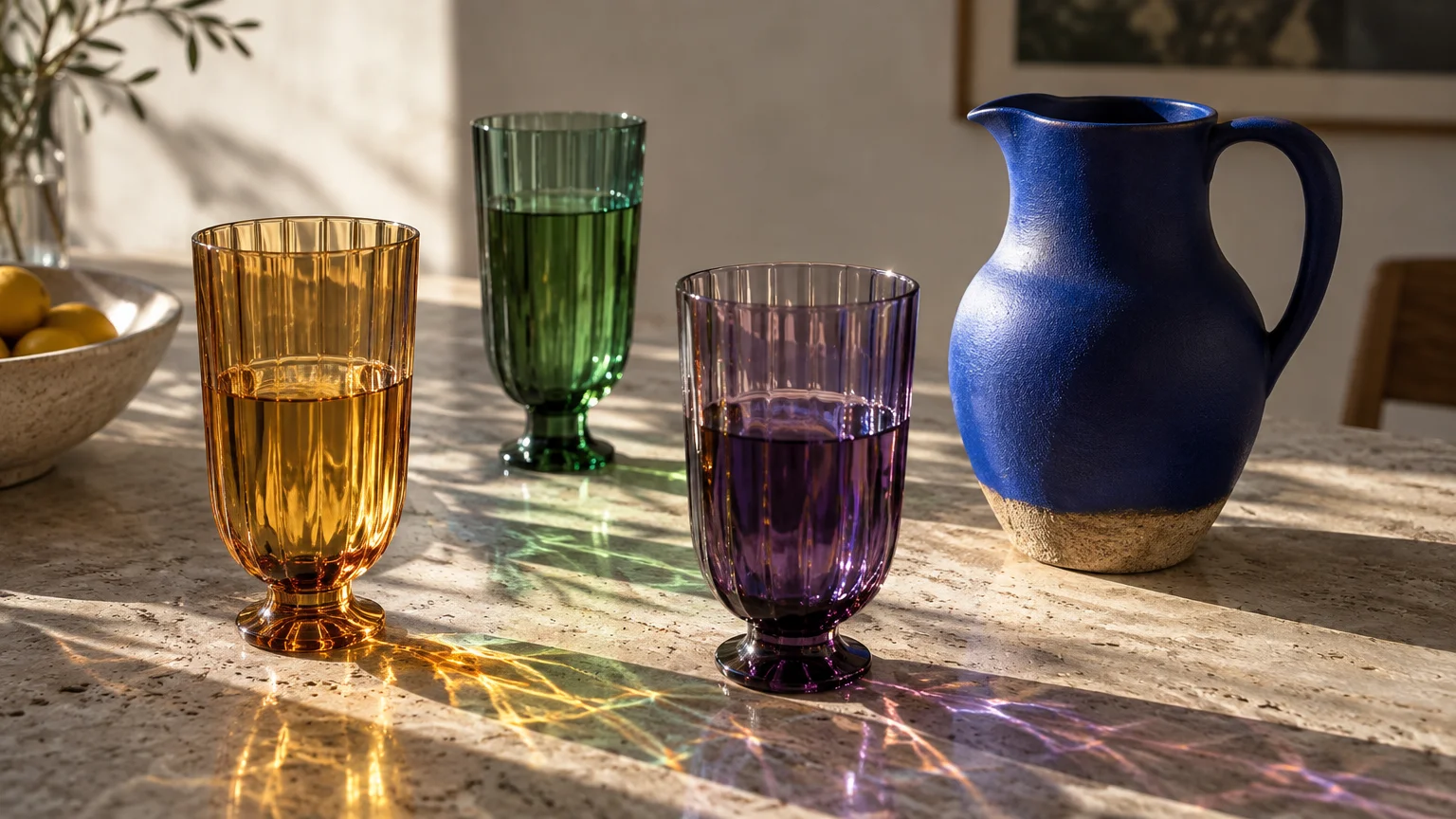
Trend #6: Sculptural Colored Glassware and Ceramics
Luminescent tabletop accessories offer an enchanting method for scattering colorful home accents across living spaces. Mouth-blown Murano glassware and glazed earthenware catch sunlight and project radiant chromatic reflections.
Grouping translucent colored vessels along windowsills produces an ever-changing stained-glass effect. As daylight passes through amber, amethyst, and olive glass, it casts tinted warmth across neutral surfaces.
High-gloss ceramics introduce deep, liquid-like color onto credenzas, coffee tables, and floating shelves. Their glassy surfaces bounce natural light around the room, brightening dark corners effortlessly.
Handcrafted artisanal objects carry tactile glaze irregularities that underscore quiet luxury values. These slight imperfections broadcast artisanal provenance, preventing saturated accessories from looking mass-produced or flat.
Rotate your glass and ceramic vignettes across different rooms to refresh your sightlines regularly. This mobile curation provides endless creative freedom without requiring any permanent home renovations.
Combine pieces of varying heights and diameters to create visually engaging, multi-dimensional tabletop arrangements. Staggering silhouettes ensures the collected color feels intentional, artistic, and relaxed.
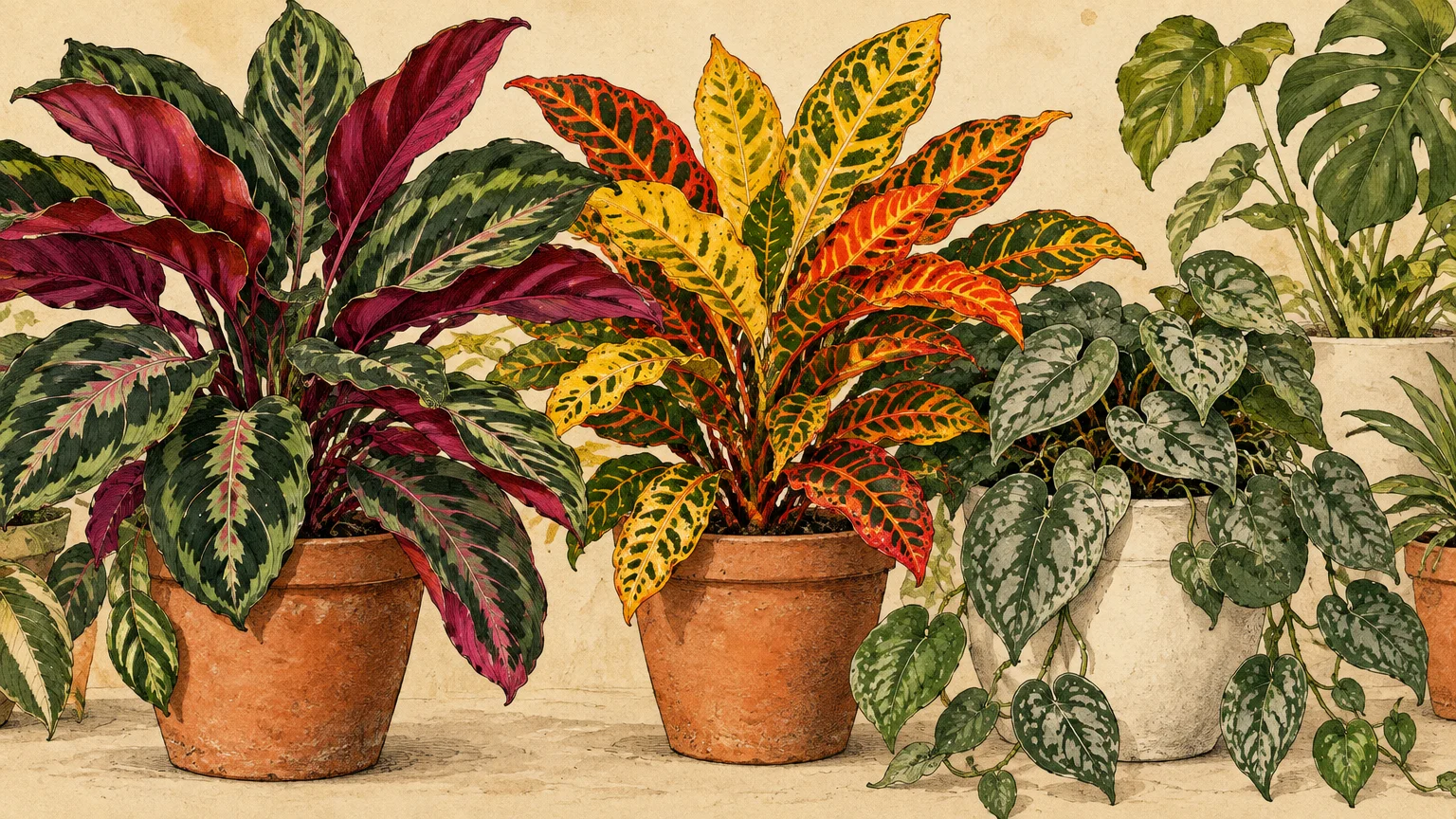
Trend #7: Biophilic Living Color
Living foliage serves as nature’s most sophisticated interior color palette. Indoor plants introduce complex verdant tones that instantly awaken flat, lifeless rooms with biophilic energy.
Look beyond ordinary green specimens by integrating flora with variegated, pink, or deep burgundy foliage. Varieties like the Calathea, rubber tree, or Stromanthe Triostar flaunt striking, organic chromatic complexity.
House your botanical specimens in sculptural, brightly enameled planters or terracotta urns. The dialogue between vibrant plant tissue and artisanal pottery multiplies the color impact across your floors.
Positioning a large fiddle-leaf fig or towering olive tree draws the eye upward toward ceiling margins. This vertical lift breaks visual monotony and introduces rich organic texture against white drywall.
Group plants in clusters of three with varying leaf shapes to build depth. Juxtaposing broad glossy leaves against feathery fronds creates a layered conservatory aesthetic in any living zone.
Biophilic accents soothe psychological stress while contributing authentic organic vitality to modern living environments. They provide a dynamic, growing chromatic layer that artificial decor can never replicate.
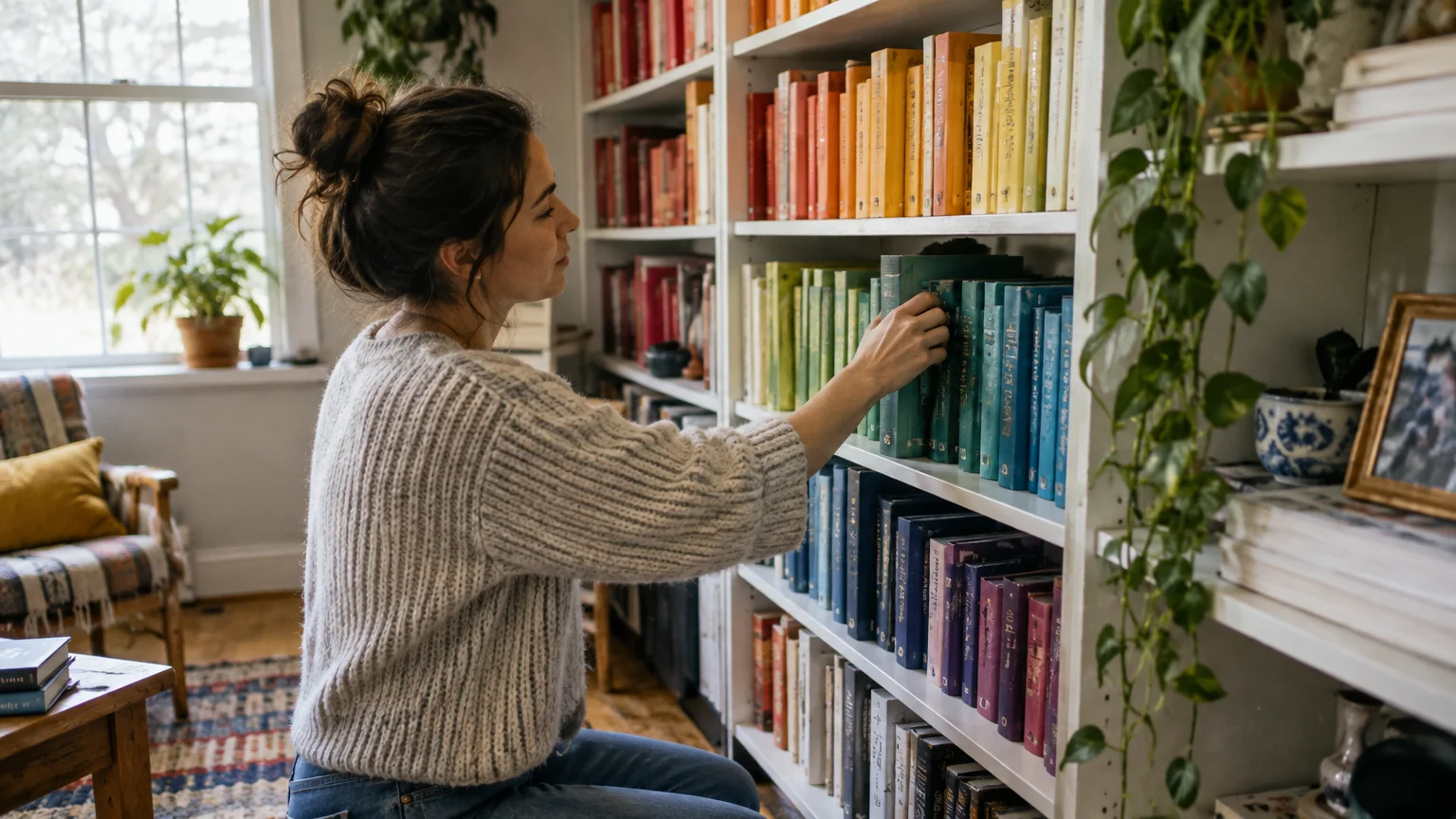
Trend #8: Chromatic Bookshelf Curation
Built-in shelving and free-standing bookcases present a vast canvas for thoughtful interior color tips. Transforming your book spines into curated color blocks generates an engaging, graphic focal point.
Curate oversized art, architecture, and fashion monographs by cloth binding and vibrant dust jackets. Arranging volumes by chromatic tone produces a rhythmic gradient that energizes the entire room.
Break up dense rows of reading material by inserting glossy lacquered bookends and colorful minerals. Geode slices, malachite boxes, and polished brass figures punctuate the shelving with shimmering, jeweled tones.
You can also line the interior backs of your shelving compartments with vibrant removable fabric. This creates a luxurious, jewel-box backdrop that frames your decorative curios without touching the wall.
Alternate between vertical stacks and horizontal rows of books to establish pleasing visual cadence. Horizontal stacks double as pedestals for miniature bronze sculptures or colorful blown-glass paperweights.
The resulting display reflects your personal intellectual curiosity while providing rich, multi-layered visual intrigue. It demonstrates that purposeful styling turns functional storage into an expressive design statement.
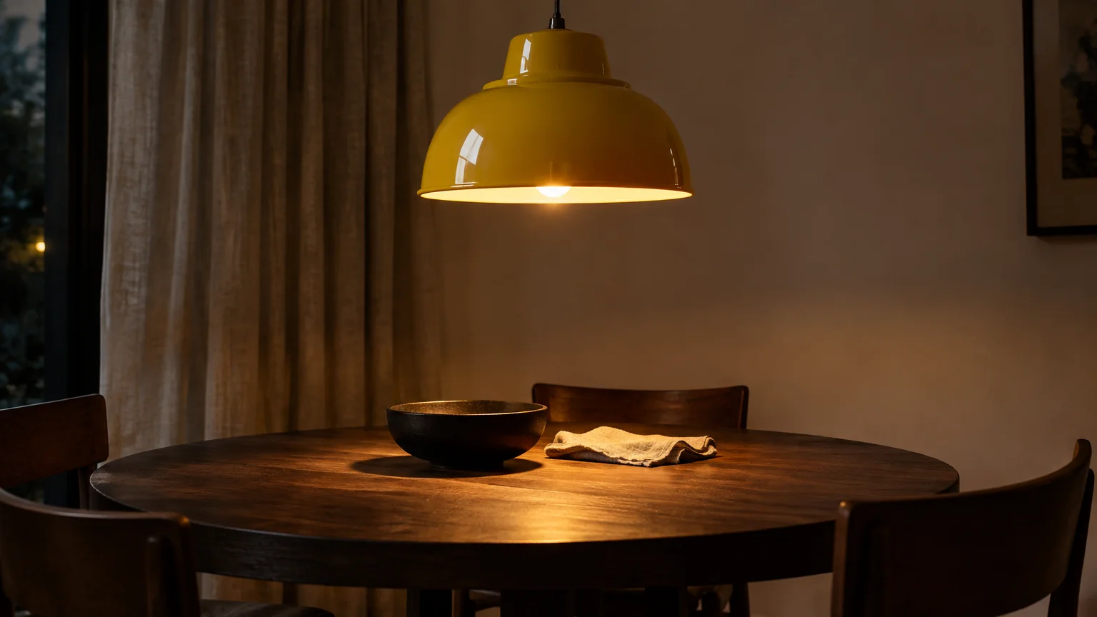
Trend #9: Statement Lighting with Colored Shades and Enamel
Lighting fixtures are the jewelry of interior design, making them ideal vehicles for vibrant hues. A glossy, tomato-red pendant lamp or a cobalt powder-coated sconce commands immediate attention.
Swapping standard white lamp shades for pleated silk shades in saffron or mulberry yields mesmerizing effects. They cast a warm, flattering glow that alters the ambient room temperature dramatically.
Pendant lights suspended over a kitchen island or dining table punctuate sightlines with crisp enamel color. These striking fixtures anchor conversational zones while adding architectural panache above eye level.
Table lamps featuring colored ceramic or hand-blown glass bases ground your lighting scheme with sculptural elegance. Their glossy finishes catch ambient reflections, creating subtle chromatic twinkles during evening hours.
Colored cord sets and decorative ceiling canopies offer subtle avenues for clever, unexpected pigment. Running a braided crimson fabric cord down an exposed conduit turns functional wiring into sculpture.
When selecting bulbs, opt for warm 2700K color temperatures to enhance your shade’s saturation. Warm light enriches jewel tones, keeping bold shades from looking sterile or clinical under modern illumination.
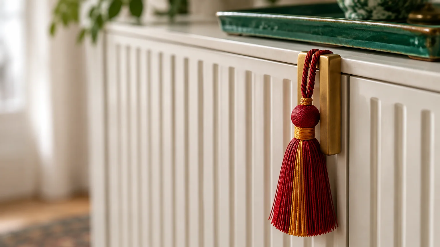
Trend #10: Ornamental Trimmings and Hardware
Never underestimate the transformative power of micro-details across your cabinetry and furniture. Upgrading utilitarian pulls with malachite, rose quartz, or enameled hardware introduces subtle, exquisite color accents.
These precious hardware upgrades catch the light and transform builder-grade dressers into custom artisan centerpieces. They act as delicate chromatic jewelry for case goods throughout your home.
In soft furnishings, passementerie—decorative fringes, tassels, and contrast piping—is enjoying a major resurgence. Adding vermilion brush fringe to a neutral linen cushion injects artisanal flair and playful pigment.
Trim your plain curtains with a wide, geometric Greek key tape along the leading edge. That tailored band provides high-contrast architectural framing without requiring custom window treatment fabrication.
You can also line dresser drawers or tray bottoms with patterned, high-contrast marbled papers. Pulling open a drawer reveals an unexpected burst of color that enchants everyday routines.
These bespoke micro-embellishments highlight your discerning eye for craftsmanship and curated detail. They infuse rooms with vibrant luxury in places ordinary decorating schemes often overlook.
The Big Picture: Weaving These Trends into Your Home
Integrating bold hues into a neutral space requires restraint and a clear structural strategy. You do not need to adopt all ten techniques simultaneously to make an indelible impression.
Begin by selecting an anchor piece that sparks joy, such as a hand-knotted rug or statement painting. Let that singular investment item dictate the accent palette for your secondary textiles and glassware.
Maintain visual breathing room by balancing vibrant accents with abundant negative space. Neutral walls, natural timber, and clean architectural lines keep saturated hues from overwhelming your senses.
Evaluate your color palette across shifting light conditions throughout the morning, afternoon, and night. Daylight illuminates vibrant tints, while warm evening lamps draw out deeper, moody undertones.
Remember that decorating without paint affords you the ultimate luxury: fearless experimentation. If a shade feels jarring over time, rearranging accessories restores balance in minutes.
Cohesive design reflects your lived experiences rather than rigid adherence to temporary fads. Let your personal intuition and authentic lifestyle guide which chromatic elements you welcome home.
For the latest color forecasts, consult industry leaders like Pantone and paint companies like Benjamin Moore. For professional design standards, refer to the American Society of Interior Designers (ASID).
Disclaimer: This article reflects design trend analysis and predictions. Personal taste and timeless design principles should always guide your decorating choices.
Frequently Asked Questions
How can I make disparate colorful accents feel cohesive rather than chaotic?
Anchor your space around a disciplined three-color palette using the 60-30-10 guideline. Distribute your secondary and accent hues repeatedly across different heights and textures throughout the room.
Repeating a specific tone across a throw pillow, a ceramic vase, and a book spine establishes subconscious visual harmony. This deliberate repetition signals intentionality to the viewer.
Will investing in colorful furniture date my interior faster than neutral upholstery?
Classic silhouettes finished in heritage tones like forest green, navy, or burnt ochre remain timeless for decades. Avoid hyper-trendy neon shades in favor of colors with historical provenance and depth.
If you feel nervous about longevity, invest primarily in colorful accent chairs rather than massive sectional sofas. Smaller armchairs can easily shift into guest rooms or reading nooks later.
What is the easiest way to introduce color into a dark, north-facing room?
Incorporate warm, radiant accents in ochre, terracotta, and amber through glazed ceramics and plush textiles. These warm pigments counteract cool northern daylight and amplify visual warmth.
Incorporate high-gloss finishes and tinted glassware near illumination sources to bounce warm reflections across the room. Avoid pale pastels, which tend to read dingy and gray under low natural light.
Can I combine peel-and-stick wallpaper with statement rugs without visual clash?
Yes, provided you vary the scale of the patterns significantly. Pair a large-scale botanical mural with a micro-geometric rug, or combine a fine stripe with an expressive abstract floor piece.
Ensure both patterns share at least one anchoring neutral or coordinating undertone. This common chromatic thread ties the vertical and horizontal planes into a unified aesthetic.