Selecting the right wall color transforms your home from disjointed spaces into a seamless, high-design sanctuary. The most versatile paint colors for any room balance complex undertones with shifting natural light to flatter architectural details effortlessly.
Whether you want to expand a dim hallway or bathe your living room in quiet luxury, foolproof pigments eliminate costly decorating missteps. Designers rely on adaptable room paint colors that effortlessly complement diverse millwork, textiles, and varied light exposures.
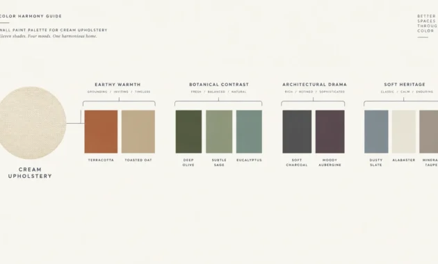
Here are ten exquisite, proven shades that deliver timeless harmony and spatial continuity throughout your entire floor plan.
Trend #1: Warm Alabaster
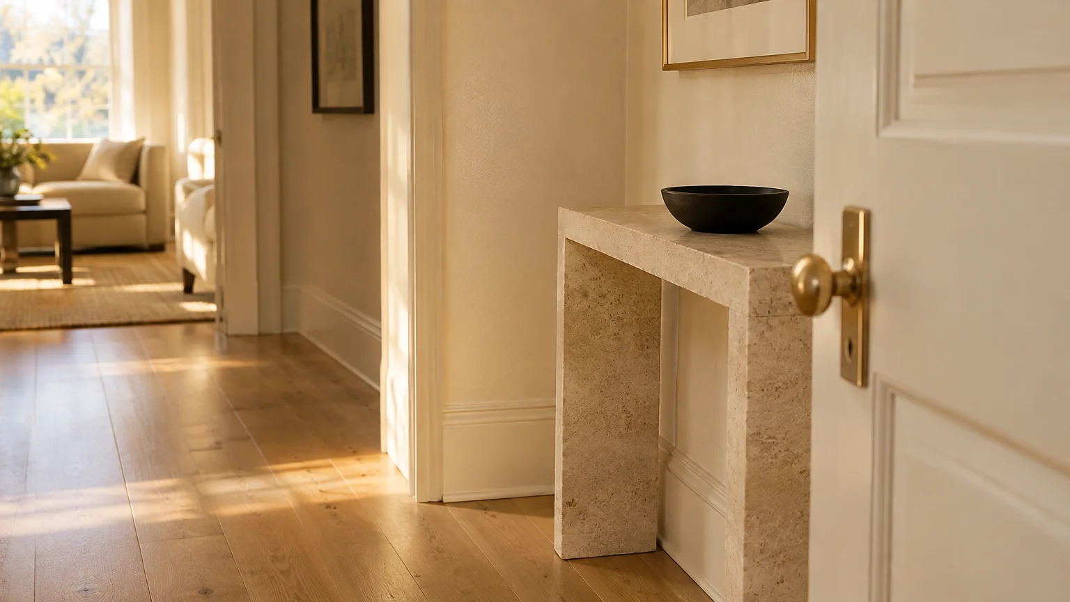
Crisp, stark whites often feel clinical under low ambient light. Warm alabaster infuses spaces with subtle yellow and beige undertones, creating an inviting glow without leaning overtly cream.
This shade serves as the foundation of modern organic minimalism. It bridges the gap between raw white oak floors and linen upholstery while bouncing light into darker corridors.
Designers choose warm alabaster because it reflects daylight cleanly without sharp glare. Under north-facing light, it stays soft; under southern sun, it radiates gentle warmth.
Pair this tone with honed limestone, unlacquered brass hardware, and matte black steel fixtures. The color softens industrial accents while elevating classic moldings.
When you need reliable canvas shades, warm alabaster ranks among the best all purpose paint colors for modern open layouts. It unites disparate rooms effortlessly.
Consider using it across baseboards and doors in a satin finish. This monochromatic strategy subtly expands sightlines throughout smaller entryways and adjoining living spaces.
Trend #2: Greige with Mauve Undertones
Gray dominated interiors for over a decade, yet flat stone hues frequently feel sterile. Infusing classic greige with subtle violet and mauve undertones introduces a layer of bespoke sophistication.
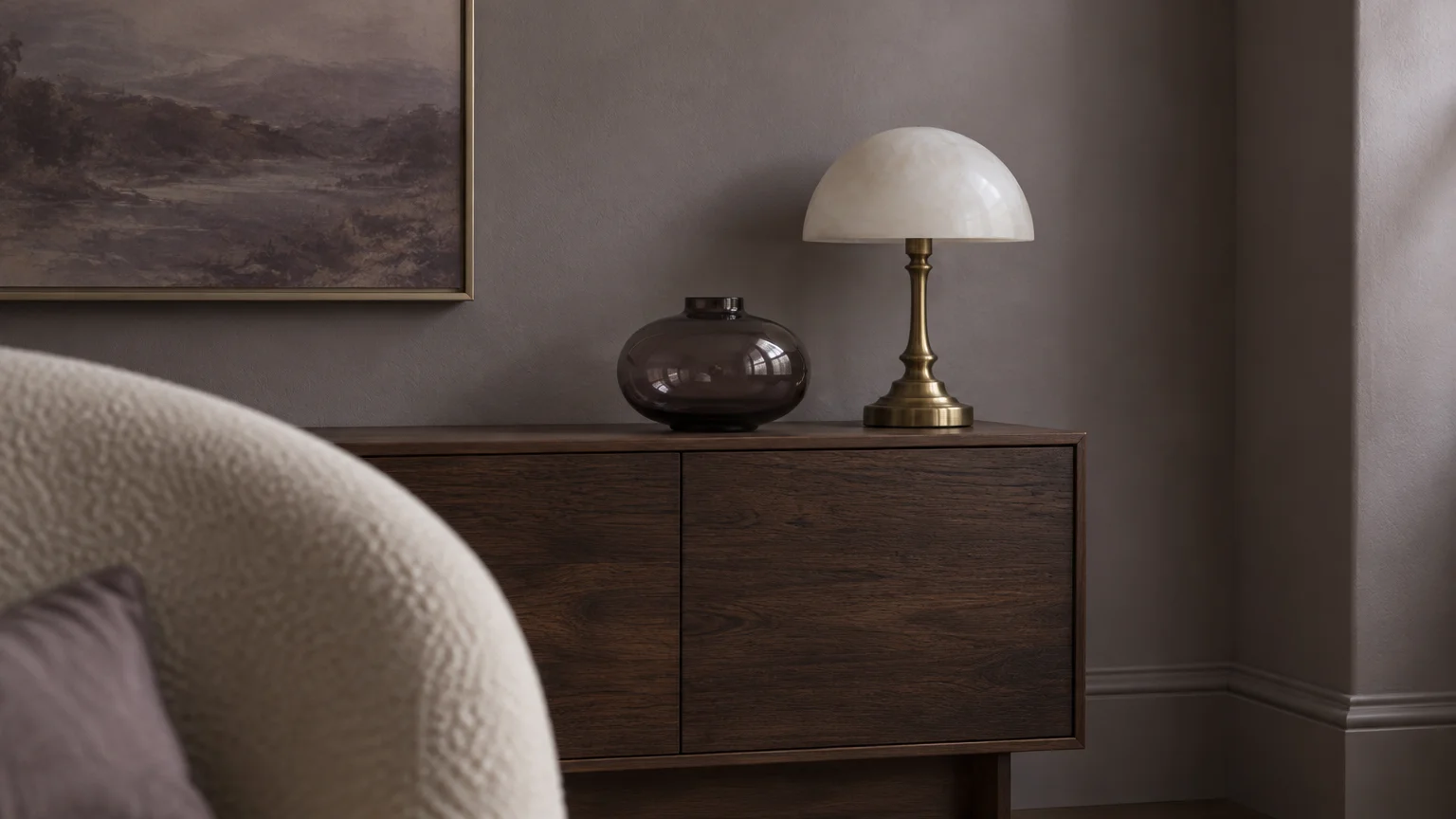
This nuanced tone exemplifies quiet luxury. It reads as a calming neutral from afar, but close inspection reveals an alluring, velvet-like warmth that enriches formal sitting rooms and bedrooms.
The underlying red pigments counter chilly northern exposures effectively. Conversely, golden afternoon light draws out its romantic, dusky character without appearing heavy or dated.
Style this shade alongside dark walnut cabinetry, boucle seating, and smoked glass tables. It anchors furniture effortlessly across open transitions.
As one of the most flexible interior paint choices, greige with mauve undertones adapts gracefully to traditional and contemporary architectural envelopes.
The complex undertones harmonize beautifully with brushed nickel and antique brass alike. You can blend mixed metal plumbing and hardware without clashing against your walls.
Trend #3: Muted Sage
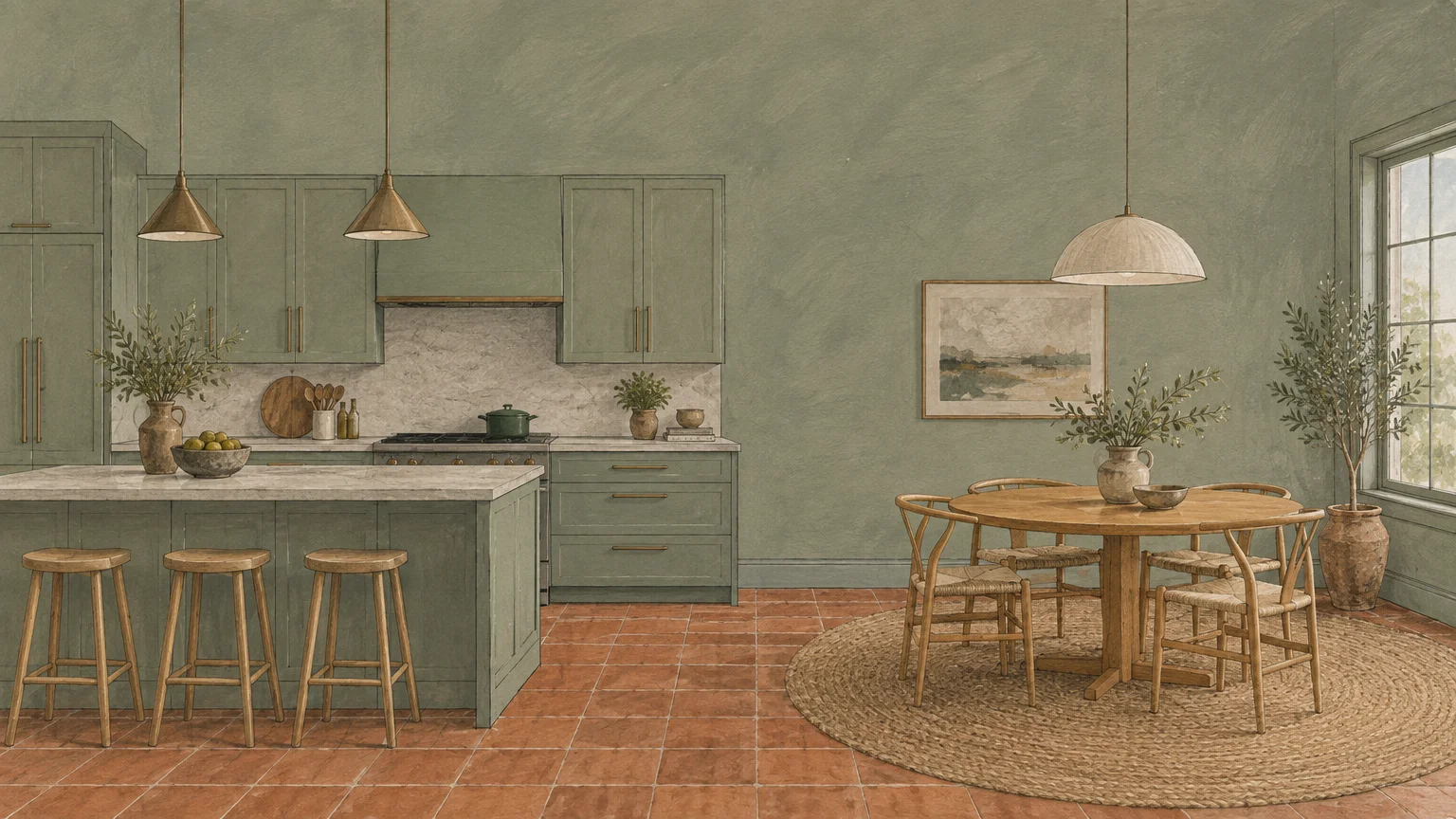
Biophilic design continues to redefine contemporary living by reintroducing nature into residential interiors. Muted sage operates as an organic neutral rather than an overt accent color.
With substantial gray undertones, this herbal hue suppresses chromatic saturation. It delivers a calming, restorative backdrop that works seamlessly across dining areas, home offices, and guest suites.
Southern exposure enhances its verdant freshness, while artificial evening light pulls forward its cozy gray base. You never have to worry about this green feeling garish.
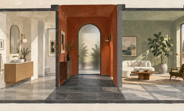
Complement muted sage with terracotta floor tiles, natural jute rugs, and brushed bronze fixtures. Its grounded demeanor complements natural woods exceptionally well.
Homeowners seeking paint colors that work everywhere frequently turn to muted sage for its unique ability to soothe senses without fading into anonymity.
In open kitchens, applying this shade to perimeter cabinetry establishes an earthy focal point. It bridges white quartz countertops with hardwood flooring seamlessly.
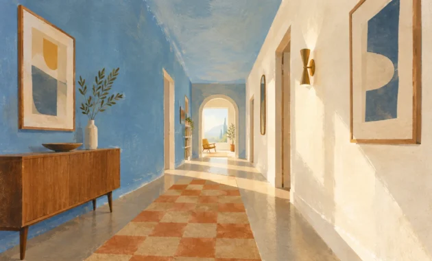
Trend #4: Dusty French Blue
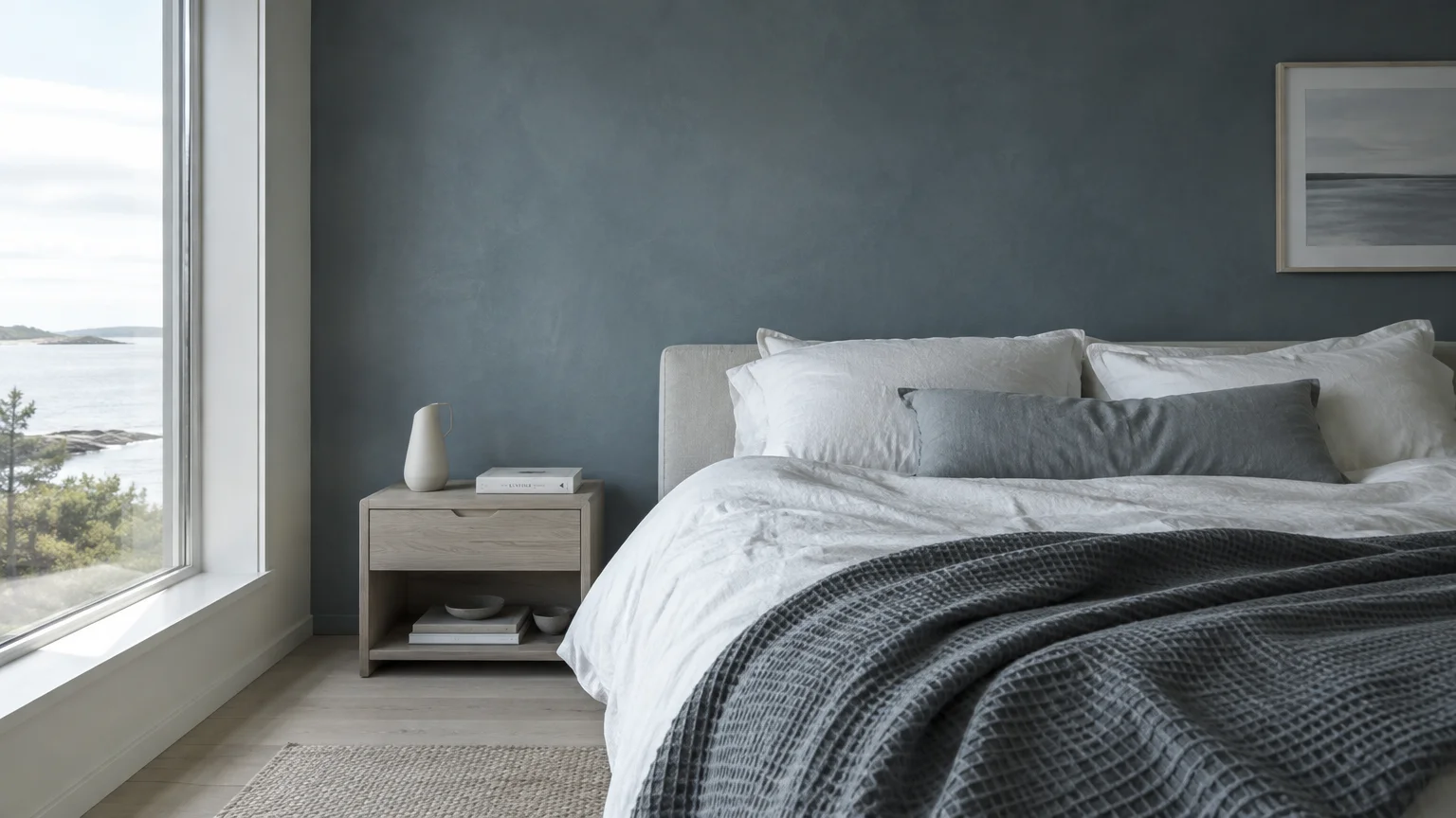
True blues can skew excessively primary or juvenile if you choose saturated variants. Dusty French blue counters this risk by suspending soft slate and gray within a historic denim base.
This color channels classical European provenance while feeling thoroughly modern. It generates an atmospheric, breezy ambiance in compact powder rooms and expansive living rooms alike.
In east-facing rooms, dusty blue awakens with crisp morning sunlight. In west-facing spaces, sunset renders the hue dramatically cozy and introspective.
Highlight this color with warm cognac leather, crisp white millwork, and polished nickel plumbing. The contrast between warm leather and cool blue delivers balanced visual interest.
By prioritizing softened pigments, dusty French blue functions as an effortlessly versatile paint color for any room seeking quiet architectural distinction.
Try coating ceiling surfaces in this color within sunlit breakfast nooks. The technique evokes open skies and brings charming character into understated spaces.
Trend #5: Creamy Parchment
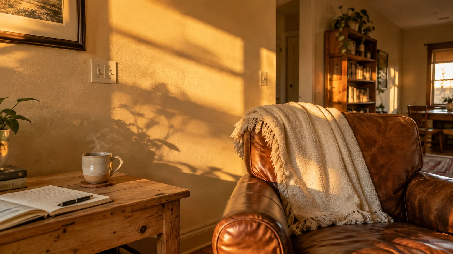
Cool grays have yielded ground to rich, tactile neutrals that evoke heritage library volumes. Creamy parchment delivers an enveloping, candlelit sensation without sliding into heavy beige.
This shade mimics unbleached linen and antique vellum. It establishes an understated, tailored setting that flatters vintage oil paintings and sculptural plaster fixtures.
Unlike cool whites, parchment softens high-contrast morning daylight. It excels in low-light basements or north-facing bedrooms by gently reflecting light with buttery ease.
Pair creamy parchment with reclaimed timber beams, travertine coffee tables, and raw silk drapery. The neutral palette celebrates texture over bold saturated statements.
Designers celebrate this pigment as one of the best all purpose paint colors for creating inviting spaces that feel lived-in yet exceptionally polished.
When applied across shiplap or beadboard paneling, creamy parchment lends an authentic historic aesthetic. It grounds rustic modern interiors with effortless warmth.
Trend #6: Smoked Charcoal
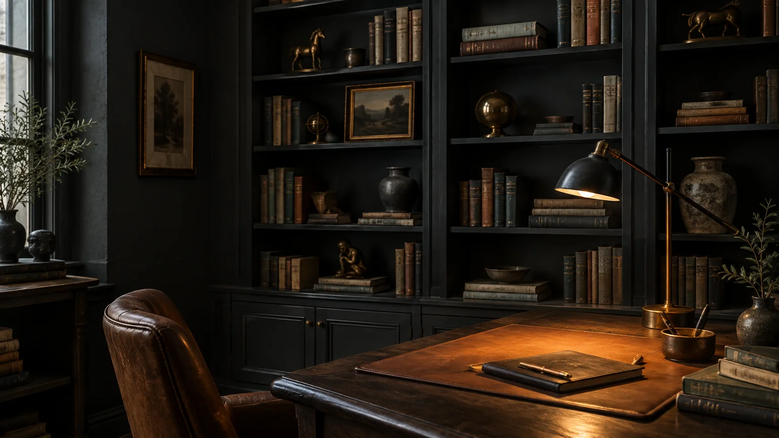
Many decorators fear dark shades, worrying they compress spatial boundaries. Smoked charcoal actually blurs perimeter lines, creating an illusion of infinite depth when applied across walls and ceilings.
This architectural tone contains soft brown and slate notes that prevent harsh glare. It transforms dining spaces into moody evening retreats and home libraries into cozy dens.
Drench small powder rooms in smoked charcoal to build theatrical drama. Pair it with soft 2700K incandescent lighting to unlock its rich, velvety characteristics.
Juxtapose this deep hue against polished calacatta marble, brushed brass lighting, and light oak floors. The high-contrast interaction produces immediate visual intrigue.
When used intentionally, smoked charcoal proves that deep, moody tones serve as remarkably adaptable room paint colors across diverse architectural settings.
Use it on interior doors to introduce structure into otherwise neutral hallways. The dark punctuation instantly gives spec-home architecture an elevated custom feel.
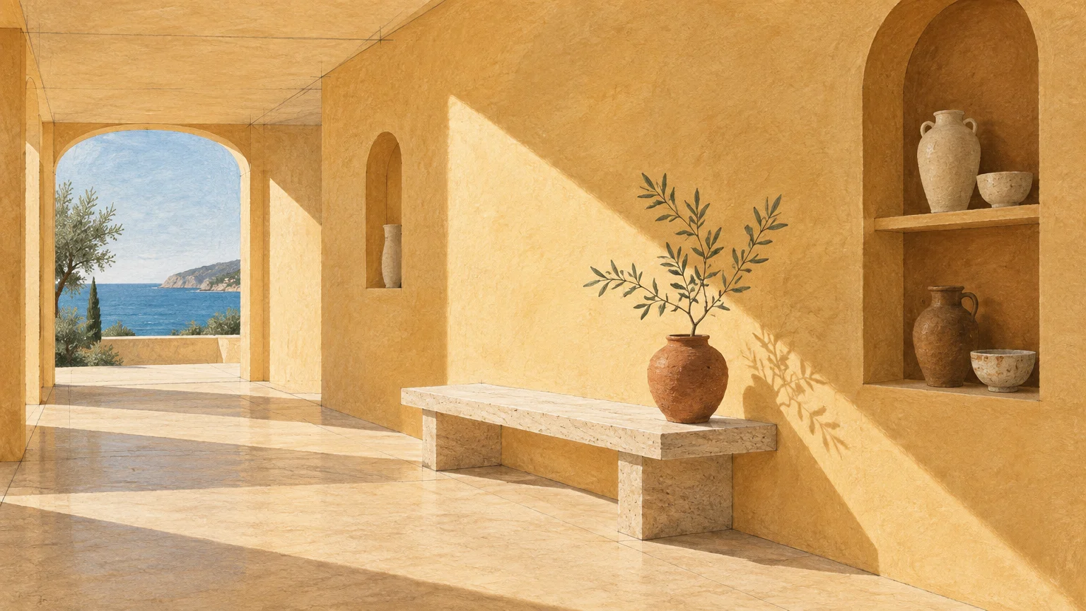
Trend #7: Pale Ochre Sand
Sun-drenched Mediterranean interiors inspire our desire for organic mineral pigments. Pale ochre sand introduces gentle desert warmth without the aggressiveness of standard terracotta or peach.
This pigment functions as a radiant neutral that flatters human skin tones. It envelops dressing rooms, dining spaces, and open-concept kitchens in an optimistic daylight glow.
In north-facing spaces starved for sunlight, ochre sand compensates by infusing the ambiance with faux warmth. In bright sunrooms, it reflects a golden, resort-like aura.
Coordinate this shade with blackened steel accents, limewash textures, and fluted white oak furniture. The earthy grounding balances sleek, minimal elements.
Homeowners seeking paint colors that work everywhere value pale ochre sand for its natural ability to banish sterile architectural gloom.
The color pairs exceptionally well with woven cane seating and zellige tiles. It lends transitional dining rooms an inviting, sun-kissed European mood.
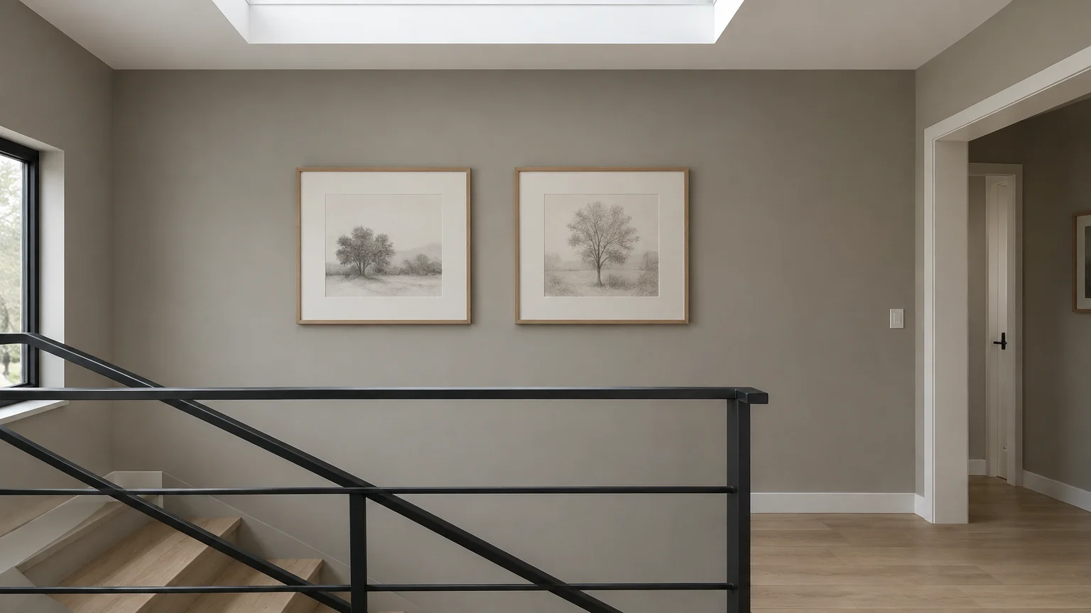
Trend #8: Mineral Pewter
Finding a cool neutral that avoids sterile undertones requires precise pigment balance. Mineral pewter solves this dilemma by blending gray, green, and silver into a chameleon-like mixture.
This shade reflects the quiet luxury ethos through understated subtlety. It anchors contemporary art collections effortlessly while providing subtle contrast against crisp ceiling moldings.
Under bright noon daylight, mineral pewter presents a crisp, clean appearance. As shadows lengthen, its green undertones emerge to create a cozy, grounded sanctuary.
Combine pewter walls with black granite surfaces, rich velvet textiles, and brushed stainless steel accents. It manages transitions between industrial and refined decor seamlessly.
Its balanced nature establishes mineral pewter as one of the most reliable, flexible interior paint choices for continuous whole-home color schemes.
Apply mineral pewter in high-traffic laundry rooms or mudrooms. It hides routine scuffs and dust far better than traditional off-whites while maintaining elegance.
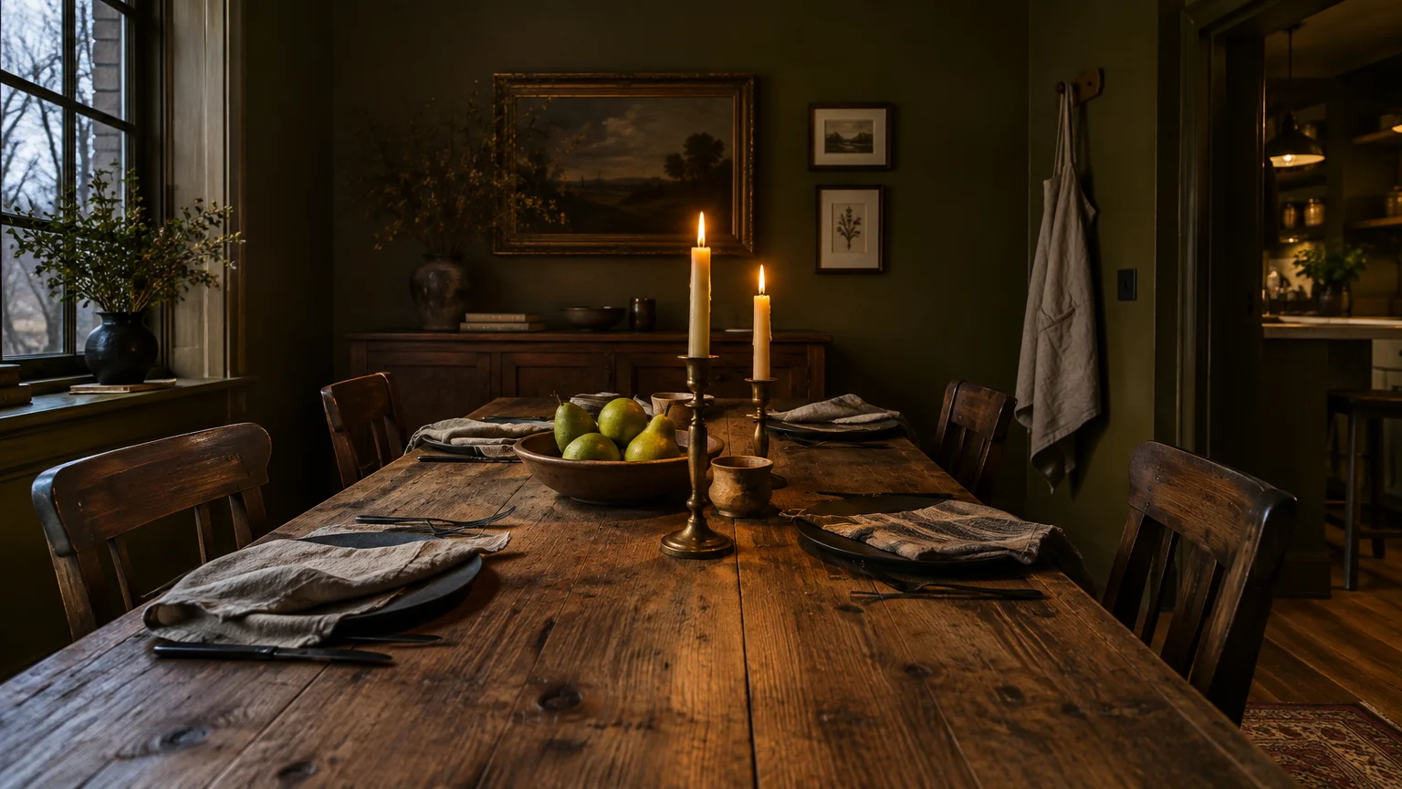
Trend #9: Deep Olive Drab
Deep olive drab draws inspiration from historic English country houses. This brooding green bridges the gap between earthy organic design and moody classical drama.
Its muted, muddy undertones absorb light, creating an enveloping cocoon in media rooms or primary bedrooms. Yet, it remains neutral enough to accommodate vibrant artwork.
Olive responds dynamically to interior lighting temperatures. Incandescent light highlights its rich golden nuances, while natural morning sun exposes its refined mossy core.
Accompany deep olive with antique bronze hardware, honey-toned leather, and raw stone hearths. It feels ancestral, grounded, and intrinsically linked to the outdoor landscape.
Embracing deep olive illustrates how dark, heritage-inspired hues can act as remarkably versatile paint colors for any room requiring elevated character.
In open-concept living rooms, an olive-accented reading corner establishes intimacy without disconnecting you from the larger living space.
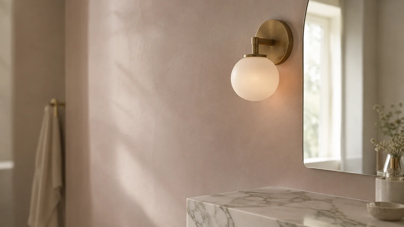
Trend #10: Soft Blush Plaster
Forget bubblegum pink; soft blush plaster acts as a sophisticated, warm-toned neutral. Infused with ample gray and beige pigments, it suggests artisanal Italian marmorino plaster.
Designers treat blush plaster as an alternative to beige or ivory. It imparts a luminous, flattering warmth that softens hard angles in transitional and contemporary homes.
In dimly lit corridors, blush plaster adds vital warmth without skewing dark. In sun-drenched living rooms, it reflects a delicate, champagne-hued illumination that enhances architectural molding.
Accentuate blush walls with matte black fixtures, bleached ash flooring, and linen furnishings. The subtle rosy undertone creates an elegant, calming atmosphere everywhere.
This gentle hue confirms that pink, when muted with mineral gray, becomes one of the best all purpose paint colors available today.
Use soft blush plaster in primary bathrooms around vanity mirrors. Its warm spectral reflection flatters complexions noticeably better than cold white tiles.
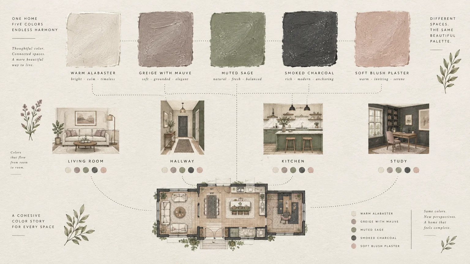
The Big Picture: Weaving These Trends into Your Home
Selecting harmonious paint colors involves more than matching swatches on a display board. You must consider sightlines, transitional thresholds, and natural lighting shifts throughout the day.
Begin by analyzing the orientation of your home’s windows. North-facing rooms benefit from warm pigments like alabaster or pale ochre, while south-facing spaces easily accommodate cool slate or pewter.
Maintain spatial continuity by adhering to a cohesive tonal value across adjoining rooms. If your hallway features soft parchment, transitioning into muted sage in the living room feels natural.
Consider color drenching to create a seamless architectural statement. Painting baseboards, window casings, and ceilings in the same hue eliminates visual breaks and elevates ceiling heights.
Always test generous paint swatches directly on your walls before committing. Observe how your selected pigments behave at sunrise, midday, and under warm 2700K evening fixtures.
Pay close attention to your home’s existing hard finishes. Flooring undertones, countertop veining, and tile work must harmonize with your wall color choices to create total aesthetic cohesion.
Layer varying sheens to introduce tactile contrast without switching paint colors. A flat wall finish juxtaposed with semi-gloss trim adds architectural dimension without visual clutter.
Invest in high-quality paint finishes that offer both durability and depth of color. Matte or eggshell sheens absorb harsh reflections, giving versatile paint colors an expensive, velvety texture.
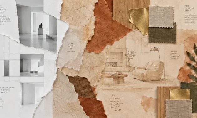
Balance your painted surfaces with rich organic textiles and natural woods. Boucle, linen, walnut, and unlacquered brass prevent paint choices from looking flat or sterile.
Ultimately, your palette should evoke comfort and timeless elegance. Crafting a cohesive environment with adaptable room paint colors ensures your home feels intentionally designed for decades to come.
Frequently Asked Questions
How do I test paint swatches accurately across multiple rooms?
Paint large two-foot sample boards rather than painting directly onto existing walls. Move these boards around your rooms at different times of day to observe changing undertones.
Position the samples near your flooring, upholstery, and window frames. This technique prevents your existing wall color from skewing your perception of the new pigment.
What sheen works best for adaptable room paint colors?
Select a matte or eggshell finish for walls in living areas, dining spaces, and bedrooms. These low-sheen finishes diffuse light gently and hide surface imperfections exceptionally well.
For high-moisture bathrooms or busy kitchens, opt for a washable satin or eggshell formulation. Use semi-gloss or satin exclusively on trim, doors, and millwork for durable contrast.
Can dark colors like smoked charcoal or deep olive really work in small rooms?
Dark tones often perform better in compact footprints than bright whites. Saturated shades blur boundary corners, creating visual depth that makes small powder rooms and studies feel boundless.
Pair these moody pigments with warm layered lighting and reflective accents like mirrors or brass hardware. This contrast creates an intimate, jewel-box effect without feeling cramped.
How do undertones impact paint colors in north-facing versus south-facing rooms?
North-facing rooms receive cool, bluish daylight that can make sterile grays feel cold. Select colors with warm yellow, pink, or red undertones to neutralize that chilly daylight.
South-facing rooms receive intense, warm sunlight throughout the afternoon. These spaces can easily handle cool blues, mineral grays, or desaturated greens without washing out.
For the latest color forecasts, consult industry leaders like Pantone and paint companies like Benjamin Moore. For professional design standards, refer to the American Society of Interior Designers (ASID).
Disclaimer: This article reflects design trend analysis and predictions. Personal taste and timeless design principles should always guide your decorating choices.