Choosing the right wall shade transforms your living environment while protecting your home’s long-term market value. Timeless paint colors offer an effortless backdrop that adapts gracefully to changing interior design movements.
In fact, the National Association of Realtors reports that interior painting is the single most recommended project before listing a property. A strategic palette brings an immediate sense of quiet luxury and architectural intention to your rooms.
By selecting classic interior paint colors rooted in natural undertones, you cultivate enduring spaces that resist fleeting fads. Here are ten celebrated hues that designers rely on for beauty, permanence, and maximum resale appeal.

Trend #1: Warm Alabaster White
Sherwin-Williams Alabaster (SW 7008) remains a foundational cornerstone in contemporary architectural design. Its delicate balance of warm beige and clean white prevents living spaces from feeling cold or sterile.
This nuanced shade embodies the quiet luxury aesthetic by creating a soft, luminous envelope in your rooms. Designers champion Alabaster because it harmonizes effortlessly with wide-plank white oak flooring and raw stonework.
Unlike stark gallery whites that reflect harsh glare, this gentle hue diffuses south-facing sunlight into a welcoming glow. It acts as an understated canvas that highlights artisanal furniture and layered textiles.
When selecting popular neutral paint shades, this warm white ensures exceptional decorative versatility. You can refresh your furnishings over decades without repainting the surrounding perimeter.
For trim and ceiling pairings, apply Alabaster in a semi-gloss finish alongside matte walls. This tone-on-tone technique creates subtle architectural dimension while keeping the room peaceful and unified.
The color also complements unlacquered brass and blackened iron fixtures with ease. It delivers an inviting baseline that makes art collections and architectural moldings pop.

Trend #2: Gentle Luminous Off-White
Benjamin Moore White Dove (OC-17) and Simply White (OC-117) represent the pinnacle of classic interior paint colors. These iconic selections offer an ethereal balance that brightens rooms without introducing clinical blue undertones.
White Dove features a subtle drop of gray pigment, making it ideal for historic crown moldings and traditional millwork. In contrast, Simply White delivers a warmer brilliance that enlivens low-light, north-facing dining rooms.
Both shades serve as paint colors that never date, anchoring distinguished residences across the globe. They bridge historic provenance with modern restraint, elevating wainscoting and lime-washed surfaces alike.
Pair these off-whites with natural woven Roman shades and linen drapery to enhance their textural warmth. You will achieve a tailored look that feels inherently comfortable and perpetually modern.
These luminous whites reflect natural daylight smoothly across plaster walls, eliminating harsh shadows in dim corners. They provide a crisp, clean aesthetic that never feels cold or sterile.
Homeowners who prioritize flexibility love how these shades adapt to evolving accent colors. They allow you to swap decorative art or rugs each season without clashing.

Trend #3: Harmonious Greige
Sherwin-Williams Agreeable Gray (SW 7029) solved the long-standing debate between warm beige and cool slate. By uniting gray and beige, this adaptable tone creates an inviting atmosphere across open floor plans.
It adapts chameleon-like to changing diurnal illumination, reading crisp at midday and enveloping under warm evening lamplight. This flexibility makes it one of the best paint colors for resale.
Research confirms that cohesive, warm neutrals help prospective buyers envision their personal belongings immediately. Agreeable Gray eliminates visual tension, uniting open living, dining, and kitchen areas seamlessly.
Complement this versatile shade with matte black iron accents and honed Calacatta marble surfaces. The resulting interior feels curated, deeply grounded, and immune to short-lived micro-trends.
Greige also forms an ideal bridge between vintage wood antiques and sleek modern cabinetry. It softens stark industrial lines while accentuating the rich patina of natural timber.
If your home features mixed flooring—such as light tile and dark hardwood—this neutral unites them effortlessly. It provides visual continuity that makes smaller floor plans feel expansive.

Trend #4: Historic Warm Gray
Benjamin Moore Revere Pewter (HC-172) offers exceptional visual weight and time-honored craftsmanship. As a standout in historic collections, this muddy neutral bridges mid-century modern style and classic traditionalism.
Its rich undertones introduce depth that flat neutrals simply cannot achieve on drywall surfaces. The color creates an intimate, grounded ambiance in spacious living rooms with double-height ceilings.
For elevated longevity, specify designer-grade formulas such as Benjamin Moore Regal Select, priced between $65 and $95 per gallon. Premium resins guarantee saturated pigmentation that withstands heavy daily wear.
Revere Pewter thrives when juxtaposed against crisp white baseboards and rich walnut cabinetry. It proves that timeless paint colors can possess distinct character without dominating the overall design scheme.
Apply this shade in spaces where you want to encourage conversation and lingering dinners. It generates a warm, cocooning ambiance that flatters both warm candlelight and ambient daylight.
The color also complements natural stone fireplaces, whether cut limestone or rough river rock. It balances rugged materials with quiet residential sophistication.

Trend #5: Calibrated Cool-Warm Neutral
Sherwin-Williams Repose Gray (SW 7015) provides a cooler, more contemporary interpretation of classic neutral palettes. A hint of brown keeps this soft gray feeling warm, while a subtle purple undertone prevents dullness.
This delicate balance prevents the sterile chill often associated with cold industrial grays. It remains an enduring designer staple for open-concept kitchens, primary suites, and bright formal entryways.
Because it reflects natural light gracefully, Repose Gray enhances architectural angles and custom wainscoting. You can pair it with cool quartz countertops or warm butcher block islands without visual friction.
Interior stylists frequently recommend this shade when staging homes for discerning buyers. Its universal appeal creates an airy, polished environment that leaves a positive, lasting impression during home tours.
Repose Gray also transitions effortlessly into adjacent rooms painted in off-white or deep charcoal. This versatility allows you to establish cohesive color palettes without monotonous repetition.
Use an eggshell finish on your walls to enhance light diffusion throughout the day. The gentle sheen softens shadows while maintaining reliable washability.

Trend #6: Biophilic Sage Green
Biophilic design principles have elevated soft sage green from a seasonal accent to an indispensable modern neutral. Sage introduces the restorative calm of outdoor foliage directly into bedrooms, powder rooms, and home offices.
Recent behavioral real estate research by Zillow reveals that sage green walls consistently outperform stark white across every room. Properties featuring sage tones frequently attract offer premiums ranging from $500 to over $1,000.
This gentle earthy shade connects interior spaces to natural environments, promoting psychological relaxation. It provides sufficient color to spark visual interest while functioning as a quiet backdrop for natural wood.
Incorporate botanical sage alongside linen drapes, rattan furniture, and artisanal terracotta vessels. The composition yields an organic, grounded haven that honors traditional country manors and modern retreats alike.
Sage green also creates an exquisite contrast when paired with crisp white crown molding. The crisp architectural boundary highlights the natural serenity of the green pigment.
Whether you paint an entire library or wrap a sunroom, sage delivers restorative beauty. It brings the outdoors inside, reinforcing your connection to nature.

Trend #7: Muted Coastal Sea Glass
Sherwin-Williams Sea Salt (SW 6204) captures the tranquil essence of misted coastal waters. With its intricate mix of cool gray, subtle green, and ocean blue, Sea Salt redefines relaxed elegance.
This understated hue avoids the kitschy connotations of bright turquoise or pastel aqua. Instead, it offers an atmospheric wash of color that expands smaller powder rooms and primary bathrooms visually.
Unlike trendy, hyper-saturated shades that date quickly, Sea Salt possesses lasting architectural restraint. It pairs flawlessly with polished nickel plumbing fixtures, woven jute rugs, and classic beadboard paneling.
If you desire subtle color without sacrificing neutral flexibility, this chameleon-like tone delivers unmatched results. It calms busy morning routines and creates a restorative, spa-like sanctuary in your home.
In rooms with abundant western sun, the gray undertones keep the walls feeling cool and refreshing. In northern light, the soft green notes surface to provide gentle warmth.
Pair Sea Salt with bleached oak vanities and Carrara marble countertops. The combination embodies casual coastal luxury that remains effortlessly timeless.

Trend #8: Classic Maritime Navy
Benjamin Moore Hale Navy (HC-154) stands as the quintessential anchor shade for sophisticated residential interiors. Deep, saturated, and authentically maritime, this hue delivers dramatic depth without skewing overly purple or flat black.
Designers utilize Hale Navy to establish striking focal points on kitchen islands, library built-ins, and dining room walls. It delivers the same regal timelessness as a bespoke navy wool blazer in haute couture.
While erratic colors like fire-hydrant red kitchens decrease home offers by $6,000 to $8,000 according to Zillow analysis, Hale Navy conveys permanence. It signals bespoke craftsmanship, historic provenance, and intentional taste.
Pair deep maritime navy with brushed gold sconces and rich cognac leather lounge chairs. The juxtaposition of cool shadow and warm metallic glow fosters an unforgettable, luxurious ambiance.
Consider color-drenching your home study by coating the walls, trim, and ceiling in Hale Navy. This enveloping monochromatic treatment creates an inspiring, distraction-free environment for reading and creative thought.
When applied to kitchen cabinetry, this deep navy grounds the lower perimeter beautifully. Balance it with crisp white upper walls to maintain a bright, welcoming cooking space.

Trend #9: Architectural Charcoal and Off-Black
Sherwin-Williams Iron Ore (SW 7069) demonstrates the transformative power of deep, velvety dark tones. This rich charcoal avoids harsh coldness by embracing subtle brown undertones, making it dramatically livable.
Market data underscores the financial value of thoughtful, moody palettes. Zillow found that living rooms painted in charcoal gray commanded offer premiums of $1,509 to $2,593 compared to standard flat white.
Iron Ore works wonderfully on interior doors, trim moldings, fireplace mantels, or cozy home theater walls. Its matte velvet finish absorbs light gently, making intimate rooms feel boundless rather than confined.
When used intentionally, deep charcoal creates a crisp graphic outline that modernizes traditional crown molding. It provides a striking frame for curated gallery walls and sculptural contemporary lighting fixtures.
Soften the impact of dark walls by incorporating textured boucle fabrics, light wool throws, and honey-toned woods. The interplay of dark walls and tactile elements yields cozy, modern sophistication.
Use warm 2700K lighting to bring out the subtle brown notes within the charcoal base. Proper illumination transforms dark rooms into dramatic, welcoming jewel boxes.

Trend #10: Earthy Camel and Warm Taupe
Earthy camel and velvety taupe tones have reclaimed their status as luxurious anchors of high-end design. These organic shades evoke raw cashmere, untreated leather, and Tuscan plaster, channeling effortless warmth.
Unlike polarizing ochre yellow, which Zillow studies show can slash whole-home offers by up to $18,164, warm camel radiates refined elegance. It invites tactile relaxation while serving as an organic counterweight to cold glass.
Warm taupes envelop north-facing rooms with gentle radiance, compensating for cold winter natural lighting. They bridge mid-century retro aesthetics with twenty-first-century minimalism seamlessly.
Layer these heritage earth tones with bouclé textiles, travertine coffee tables, and aged bronze details. The resulting composition yields an interior steeped in grounded, enduring comfort that transcends cyclical trends.
These rich earth tones also flatter natural stone flooring, such as limestone or tumbled travertine. They create a seamless visual connection between your floors, walls, and bespoke upholstery.
If you crave warmth without yellow undertones, camel provides an ideal alternative. It infuses bedrooms and sitting rooms with timeless luxury and quiet contentment.

The Big Picture: Weaving These Trends into Your Home
Applying timeless paint colors throughout your floor plan requires strategic planning and disciplined color execution. A unified home palette creates architectural harmony by allowing rooms to transition naturally into one another.
The National Association of Realtors and NARI Remodeling Impact Report highlights interior painting as the top project recommended before listing. In fact, 50 percent of agents advise whole-home repainting, while 41 percent recommend refreshing individual rooms.
Homeowners also awarded interior painting an exceptional Joy Score of 9.3 out of 10. Few home renovations deliver such immense psychological satisfaction paired with proven property appreciation.
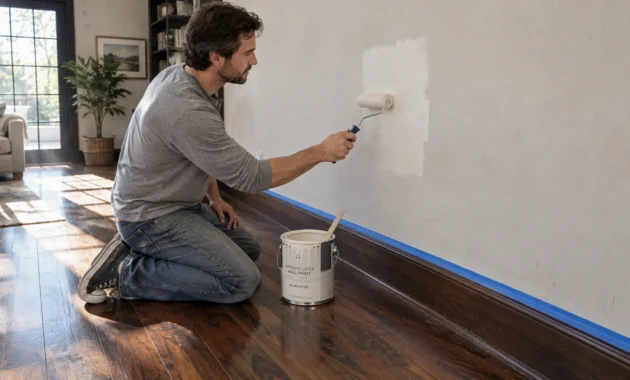
When calculating your project budget, consider standard material coverage and labor requirements carefully. A standard gallon of quality interior latex paint reliably covers 350 to 400 square feet with a single coat.
Most standard drywall repaints demand two complete coats to achieve true color depth and uniform surface opacity. Skimping on that second coat often leads to uneven undertones and premature scuffing.
DIY painters typically spend between $100 and $300 to paint a standard 12-by-12-foot room with supplies. However, hiring a professional painter typically costs between $2.00 and $6.00 per square foot of wall space.
This benchmark places professional room estimates between $400 and $1,100, where skilled labor represents 70 to 85 percent of the invoice. Professional prep work guarantees crisp cut lines, seamless repairs, and durable paint adhesion.
Standard interior architectural paint generally retails from $25 to $55 per gallon. In contrast, premium designer-grade finishes—such as Sherwin-Williams Emerald or Benjamin Moore Regal Select—average between $65 and $95 per gallon.
Premium paints contain superior binders and finely ground pigments that deliver exceptional washability and scuff resistance. Investing in top-tier formulations protects your investment against daily family wear and frequent cleaning.
Always test large sample swatches on multiple walls before committing to gallons of paint. Watch how changing morning, midday, and artificial evening lighting influences the undertones across different times of day.
For the latest color forecasts, consult industry leaders like Pantone and paint companies like Benjamin Moore. For professional design standards, refer to the American Society of Interior Designers (ASID).
Disclaimer: This article reflects design trend analysis and predictions. Personal taste and timeless design principles should always guide your decorating choices.
Frequently Asked Questions
How do I select the best paint finish for high-traffic zones?
Eggshell and satin sheens offer the ideal balance of gentle luster and durability for busy hallways and living areas. They resist fingerprints, wipe down easily, and highlight the depth of your chosen color without excessive shine.
Reserve flat or matte finishes for low-traffic master bedrooms and ceilings, where light diffusion hides drywall blemishes. Use semi-gloss exclusively on trim, doors, and wainscoting for maximum scrub resistance.
In moisture-prone spaces like bathrooms and laundry rooms, satin or semi-gloss paints prevent moisture penetration and mildew growth. Selecting the proper sheen ensures your walls look pristine for years.
Can you mix warm and cool paint colors throughout one home?
You can seamlessly pair warm and cool tones by anchoring them with unifying architectural trim in an off-white shade. Maintaining a consistent trim color establishes visual rhythm as you transition between distinct functional spaces.
Additionally, repeat materials like warm oak flooring or brushed brass hardware across all rooms to bind the palettes together. This thoughtful repetition ensures each space feels intentional rather than disconnected.
Consider establishing a 60-30-10 palette ratio throughout the entire floor plan. Use a dominant neutral for sixty percent, a secondary tone for thirty, and reserved accents for ten.
Why do saturated colors negatively impact home resale value?
Highly saturated wall colors, like vibrant red or mustard yellow, impose a specific stylistic identity on prospective buyers. They create visual friction, making spaces feel smaller and signaling immediate repainting labor and expense.
In contrast, timeless paint colors provide an adaptable backdrop that allows buyers to envision their own furniture. Understated hues maximize perceived light, airiness, and interior square footage during walkthroughs.
Neutral walls also signal that a property has been carefully maintained. When buyers feel calm in a space, they make higher offers.
How does lighting orientation alter timeless neutral shades?
North-facing rooms receive cool, bluish light that can make stark whites feel uninviting and icy. Balancing these spaces requires warm off-whites, creamy greiges, or earthy sage tones with yellow undertones.
South-facing rooms receive warm, intense illumination throughout the day, allowing you to incorporate cooler grays and muted blues without fear. Always evaluate physical paint swatches in your specific space at morning, noon, and dusk.
Artificial lighting also plays a critical role in color perception. Pair warm neutrals with LED bulbs rated at 2700K to 3000K to maintain natural warmth after sundown.