Trend #4: Saturated Ochre
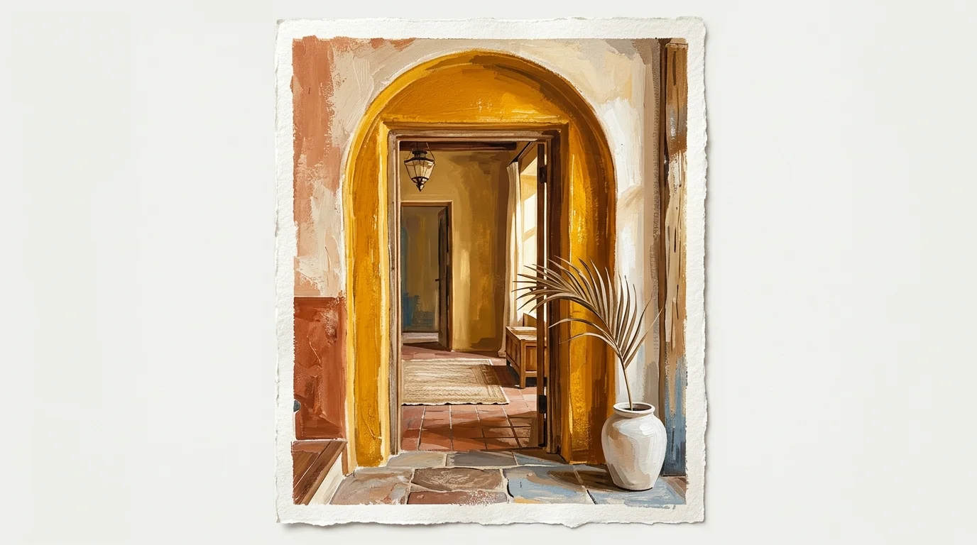
As the global mood shifts toward optimism and creative expression, interior palettes are reflecting a renewed sense of joy. Saturated Ochre represents this energetic shift, offering a rich, mustard-toned yellow that feels historical rather than harsh.
Standard yellows often skew too acidic or overly sweet, but the 2027 Ochre relies on deep, earthy umber undertones to maintain its sophistication. This color commands attention, making it the perfect choice for transition spaces where you want to make a strong first impression.
Applying Saturated Ochre in your entryway or a powder room creates an immediate sense of warmth and hospitality. You can also utilize this shade in a formal dining room to stimulate conversation and appetite—a trick interior designers have leveraged for centuries.
Market forecasting reports indicate that consumers are actively moving away from safe, monochromatic homes in favor of spaces infused with personality and bold, saturated color.
To ground the vibrancy of Saturated Ochre, you must pair it with heavily contrasting elements. Think rich walnut furniture, deep charcoal accents, and heavy textiles like velvet or wool.
The juxtaposition of the sunny wall color with dark, structured furniture creates a dynamic visual tension that feels incredibly chic. For those hesitant to commit to fully saturated walls, Saturated Ochre serves as a phenomenal accent color.
You can introduce it through painted wainscoting or a beautifully lacquered interior front door. Psychologists specializing in environmental design note that exposure to grounded yellow tones actively stimulates positive energy, proving that your paint choices directly influence your daily emotional health.