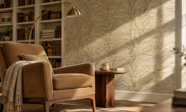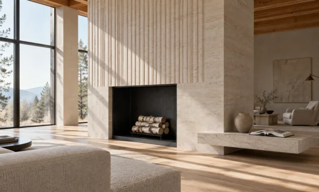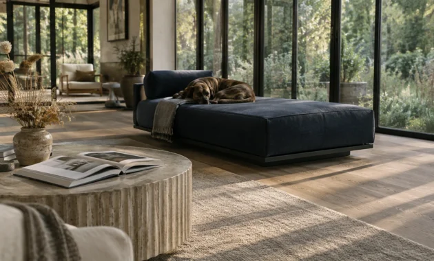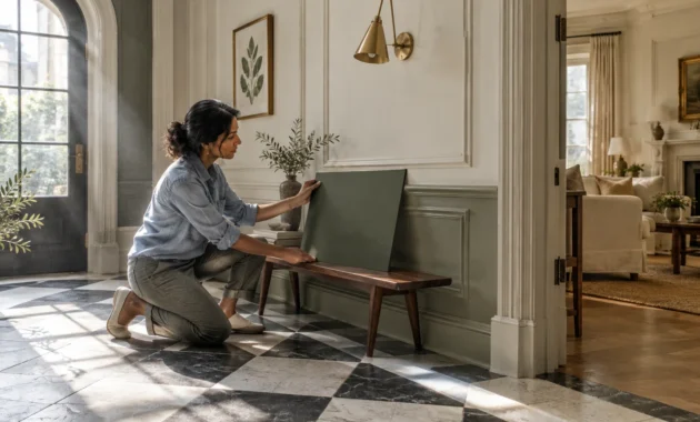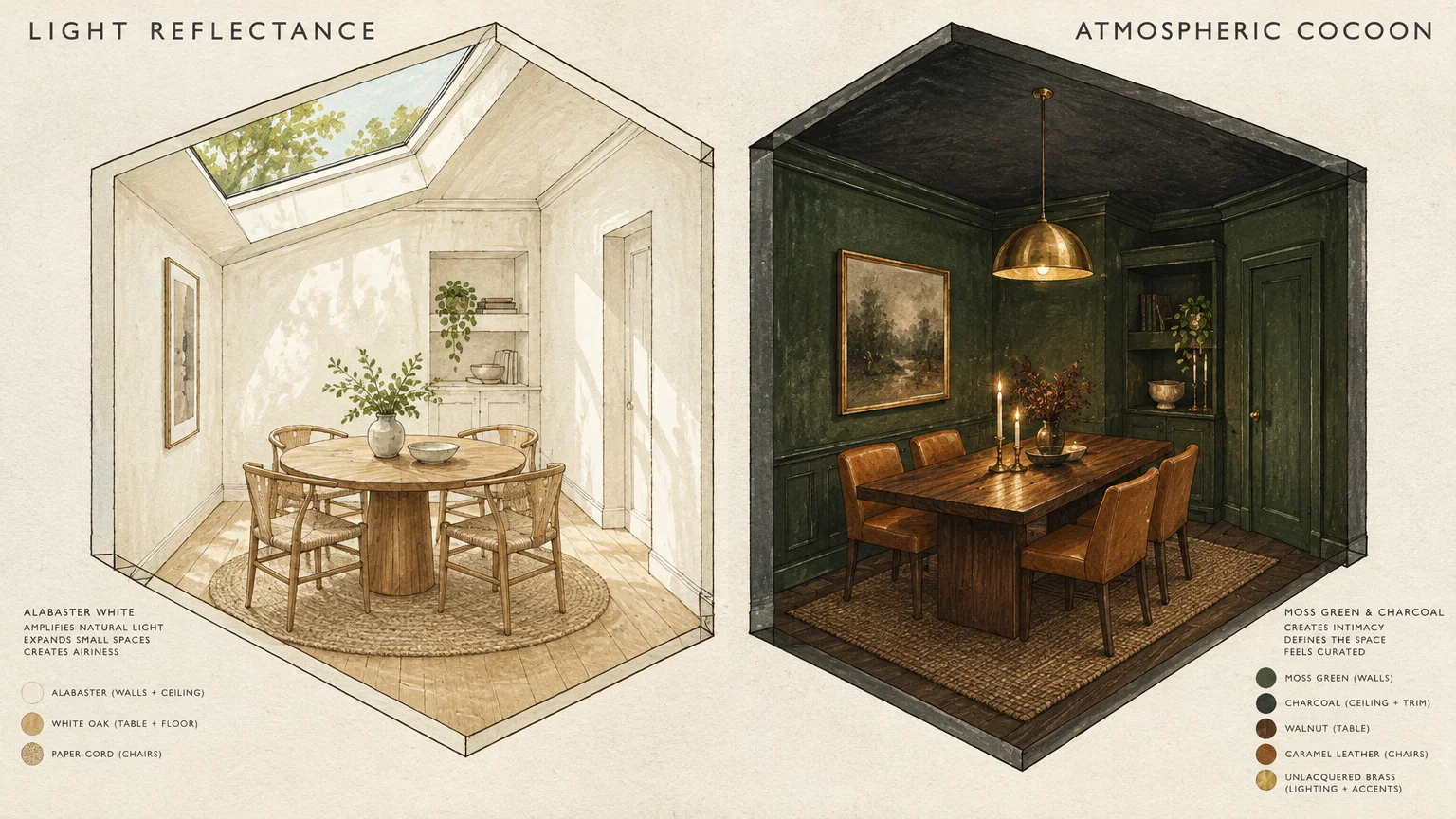
Selecting the right small dining room paint colors transforms cramped quarters into an intentional, visually captivating entertaining space. Strategic shades manipulate natural light, dissolve confining boundaries, and establish an inviting backdrop for memorable dinner conversations.
Whether you want to make dining room look bigger with high-reflectance neutrals or craft dramatic intimacy using moody saturations, your palette dictates spatial perception. Expertly chosen tones turn compact dimensions into your home’s greatest design asset.
Architectural undertones and curated finishes elevate humble square footage into a sophisticated retreat. Discover how high-impact color selections unlock expansive style across intimate dining footprints.
Trend #1: Architectural Alabaster
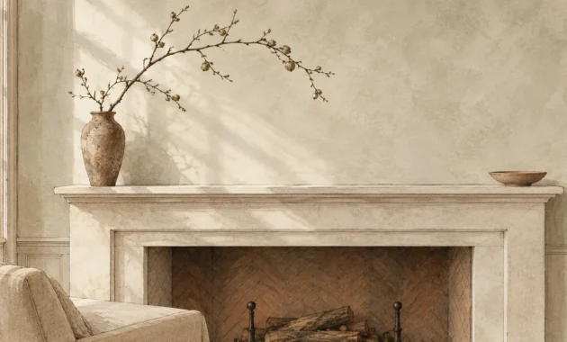
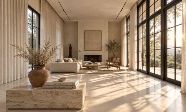
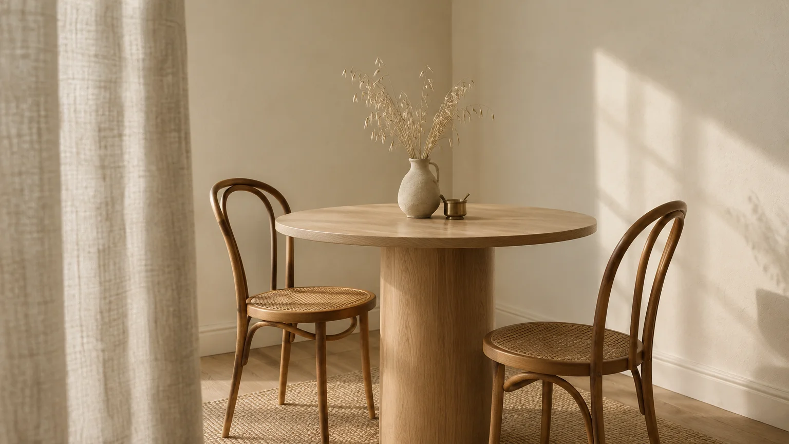
Architectural alabaster introduces a warm, luminous off-white that maximizes ambient light without appearing sterile. High Light Reflectance Value pigments diffuse illumination across compact walls to make dining room look bigger.
Unlike cool stark whites, alabaster carries subtle yellow and beige undertones that soften tight corners. This hue creates a pristine canvas that celebrates mid-century dining furniture and textured linen drapery.
Paint the baseboards, walls, and ceiling in identical alabaster using subtle variations in sheen. This monochromatic application eliminates contrasting trim lines, visually stretching your vertical proportions.
Pair this ethereal shade with natural white oak, woven accents, and unlacquered brass hardware. The resulting aesthetic feels organic, curated, and bathed in quiet luxury.
For evening gatherings, alabaster reflects candlelight softly, preventing harsh glare while maintaining an open, airy presence.
Trend #2: Biophilic Moss Green
Biophilic design continues to dominate modern interiors by establishing a direct psychological bridge to the natural world. Saturated moss green wraps intimate rooms in an organic warmth that feels distinctly grounded.
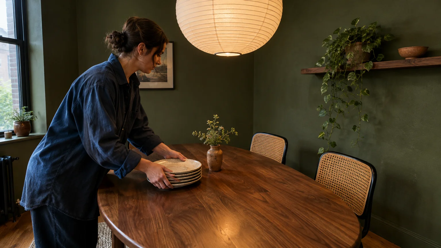
Deep botanical shades absorb glare while softening the rigid perimeter of compact layouts. Instead of highlighting confined room boundaries, moss green creates an atmospheric cocoon that invites guests to linger.
This earthy tone pairs exceptionally well with rich walnut dining tables and woven cane chairs. Natural timber materials enhance the woodland atmosphere, turning mealtime into a serene sensory retreat.
Use a velvety eggshell finish to heighten the pigment’s organic texture under soft pendant light. Accent with live foliage and ceramic tableware to celebrate authentic indoor-outdoor harmony.
The soothing undertones calm visual noise, allowing compact architecture to feel generous, restful, and deeply connected to nature.
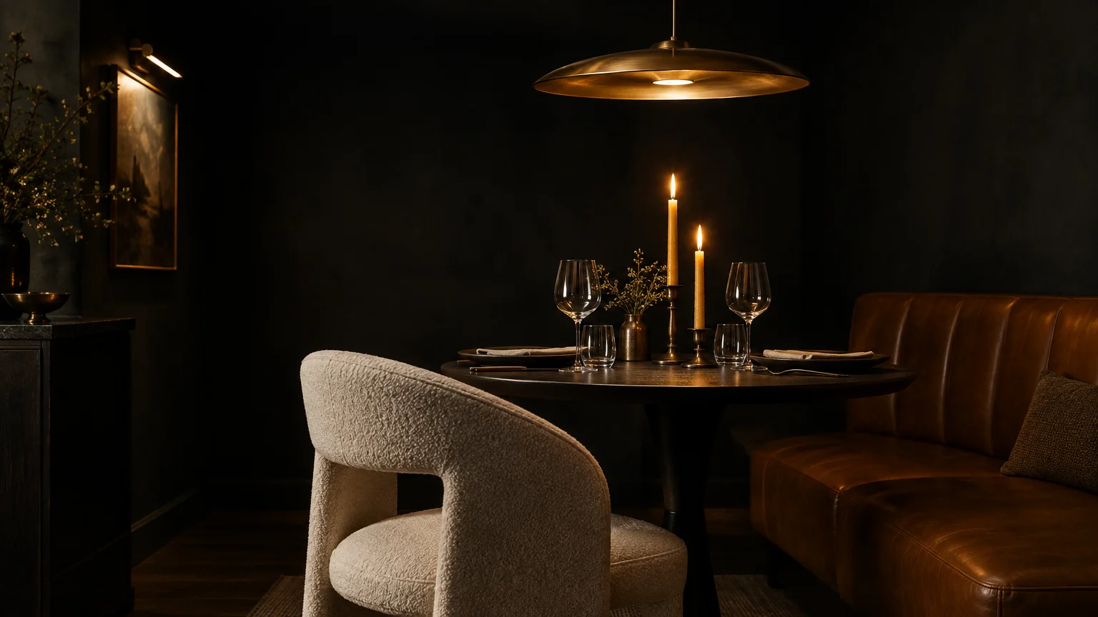
Trend #3: Moody Saturated Charcoal
Modern design philosophy embraces the jewel-box concept, turning tight proportions into a dramatic virtue. Inky charcoal creates an unforgettable envelope that delivers supreme theatrical depth to evening gatherings.
Deep dining room colors trick the human eye by obscuring where wall planes meet the ceiling. Because the corners visually recede into shadow, the space reads as boundless rather than restricted.
Incorporate warm metallic lighting fixtures, such as aged bronze or brushed gold, to punctuate the dark backdrop. The warm illumination creates dazzling focal points that enliven dinner service.
Balance the dark envelope with sculptural dining chairs upholstered in ivory boucle or caramel leather. The striking contrast introduces tailored elegance worthy of an intimate private supper club.
By leaning into drama, you transform a tiny alcove into your home’s most memorable destination.
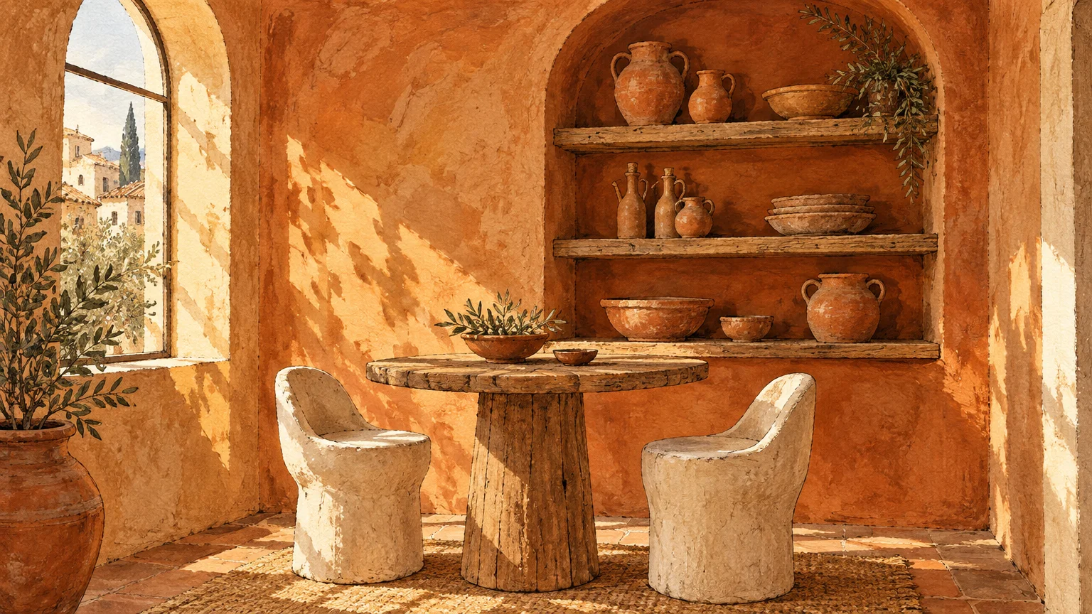
Trend #4: Sun-Drenched Terracotta
Terracotta introduces an artisanal warmth rooted in Mediterranean heritage and handcrafted pottery. This clay-based hue instantly energizes small dining room paint colors with convivial charm and grounded hospitality.
The reddish-orange undertones stimulate appetite and inspire lively dinner conversation around the table. Its inherent richness creates an enveloping, sun-baked radiance that feels welcoming during both midday brunch and candlelit suppers.
Complement terracotta walls with honed travertine stone elements, matte black iron details, and raw linen napkins. These tactile accompaniments heighten the rustic yet refined ambiance.
In north-facing rooms lacking warm sunlight, terracotta acts as an antidote to cold grey shadows. It infuses your dining alcove with a continuous amber sunset glow.
The earthy provenance of clay shades lends casual sophistication to tight urban spaces.
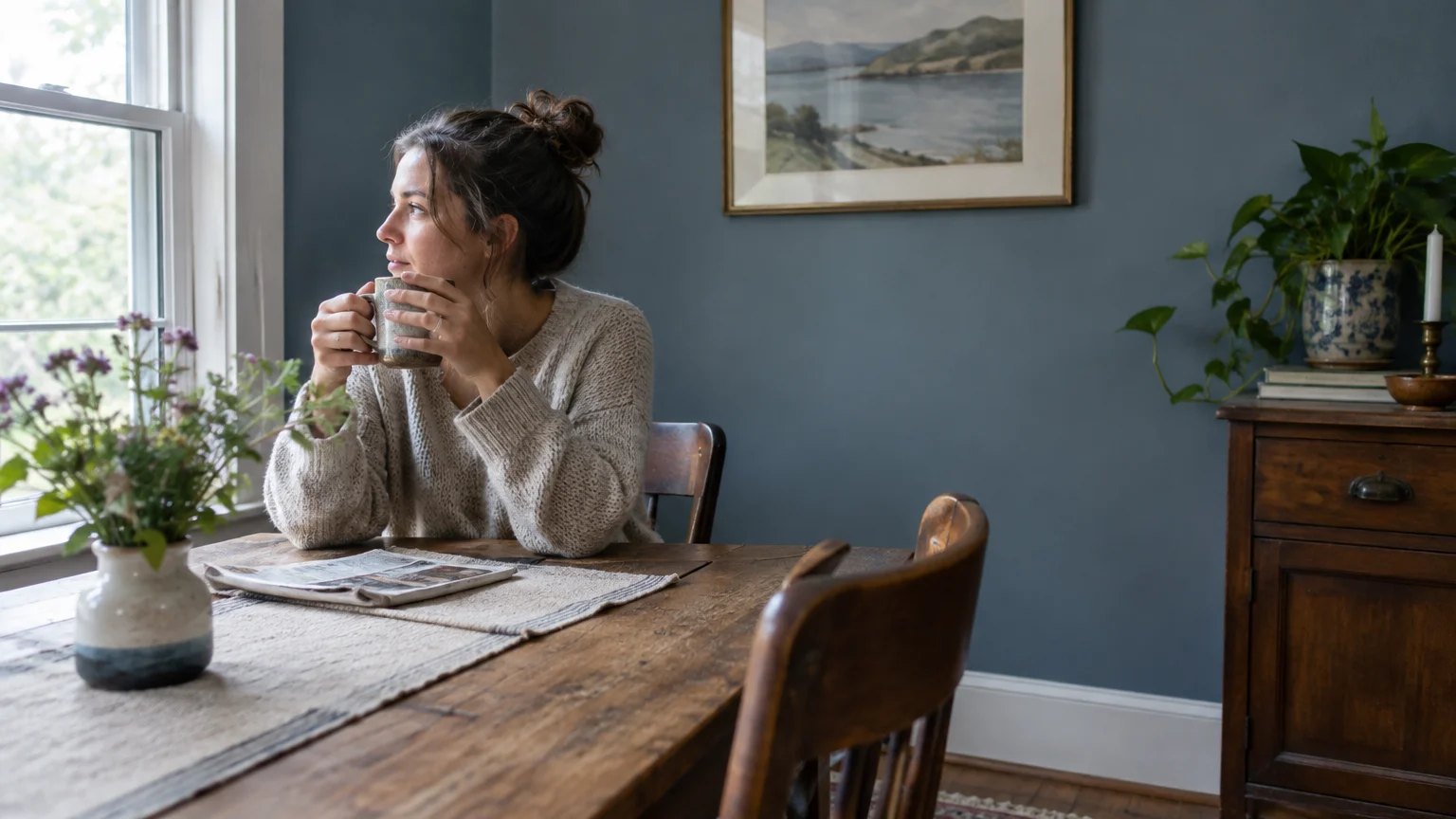
Trend #5: Receding Slate Blue
Color psychology proves that cool hues visually recede from the observer’s eye. Slate blue leverages this spatial phenomenon, making adjacent walls appear farther apart than their actual physical footprint.
Infused with subtle grey and smoky undertones, slate blue avoids cold institutional tones. Instead, it imparts timeless dignity that anchors transitional and classic decor styles alike.
Contrast these misty blue surfaces with warm timber flooring and crisp white crown molding. The crisp architectural framing sharpens the room while magnifying perceived square footage.
Select polished nickel or silver chandeliers to reflect cool highlights across your ceiling plane. The resulting dining space feels fresh, tranquil, and noticeably more expansive.
This maritime-inspired tone grounds small rooms without ever imposing heavy optical weight upon your guests.
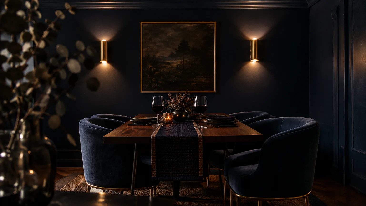
Trend #6: Dramatic Midnight Navy
Classic midnight navy delivers an aura of tailored precision, evocative of bespoke suits and heritage estates. When you envelop a compact space in navy, the dining area gains instant prestige.
Deep oceanic hues blur wall intersections, producing an optical illusion that makes dining room look bigger at dusk. Under dim light, the walls seem to dissolve into deep twilight.
Elevate midnight blue with large-scale framed photography framed in wide white mats. The bright art breaks up the deep saturation while keeping the room dynamic and curated.
Integrate warm cognac leather seating and brass candelabras for rich sensory warmth. This sophisticated juxtaposition balances formal structure with irresistible hospitality.
Midnight tones provide an exquisite backdrop for sparkling glassware and polished table settings.
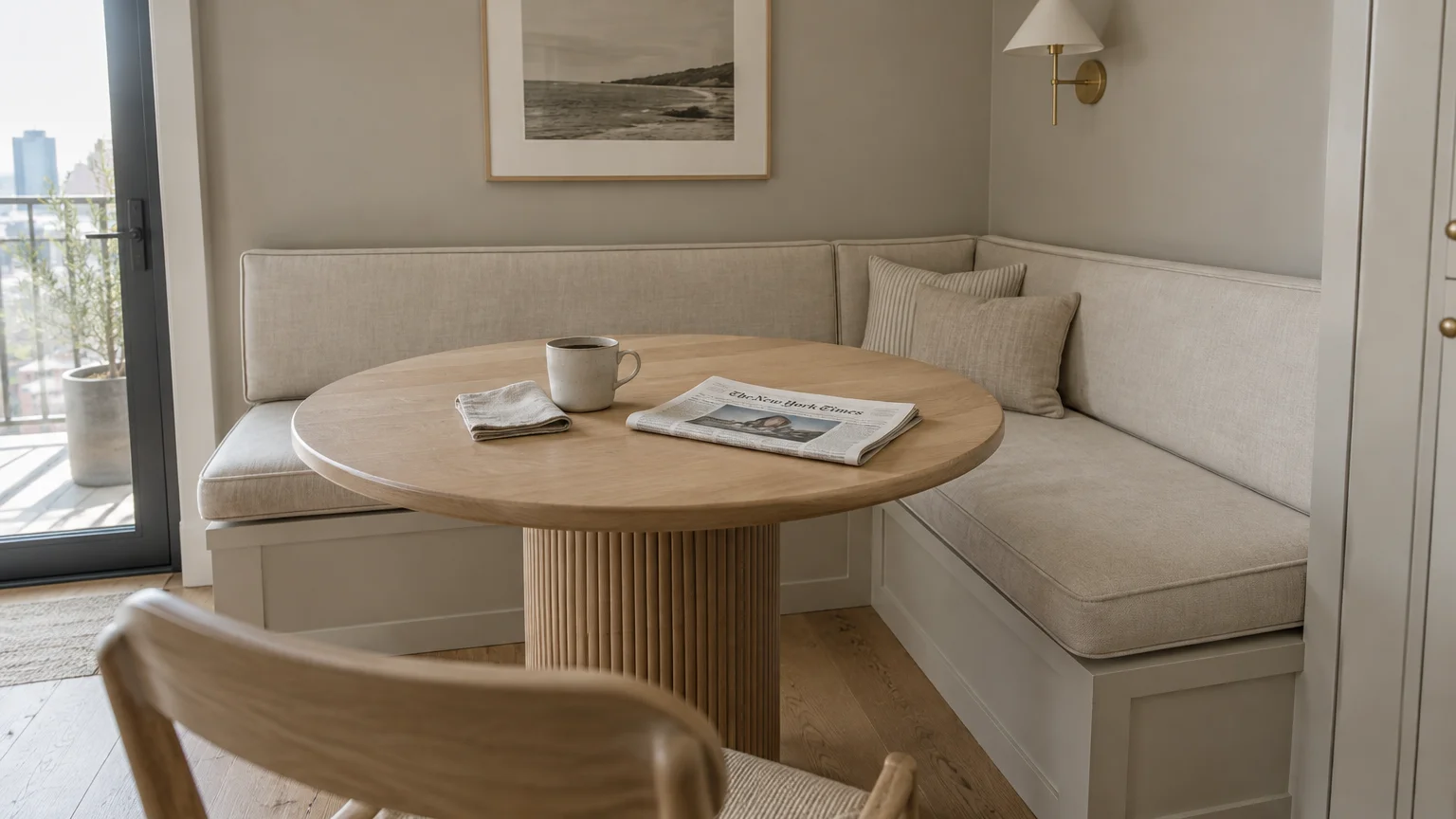
Trend #7: Quiet Luxury Greige
Embodying the quiet luxury aesthetic, soft greige fuses the modernity of grey with the warmth of beige. This understated hue establishes a calm, unpretentious elegance within tight floor plans.
Greige shifts delightfully under changing light conditions, appearing cool in morning sun and cozier as night falls. This adaptability makes it one of the most versatile paint ideas dining room designers favor.
Layer diverse tonal textures, such as ribbed ceramic vases, fluted wood pedestals, and shearling seat cushions. Keeping colors uniform while varying tactile surfaces creates refined depth without visual chaos.
Use this balanced neutral when your dining area flows seamlessly into an open-concept kitchen or living space. It establishes gentle spatial cohesion across modern open-plan residences.
The muted backdrop allows statement chandeliers and designer dining chairs to command effortless attention.
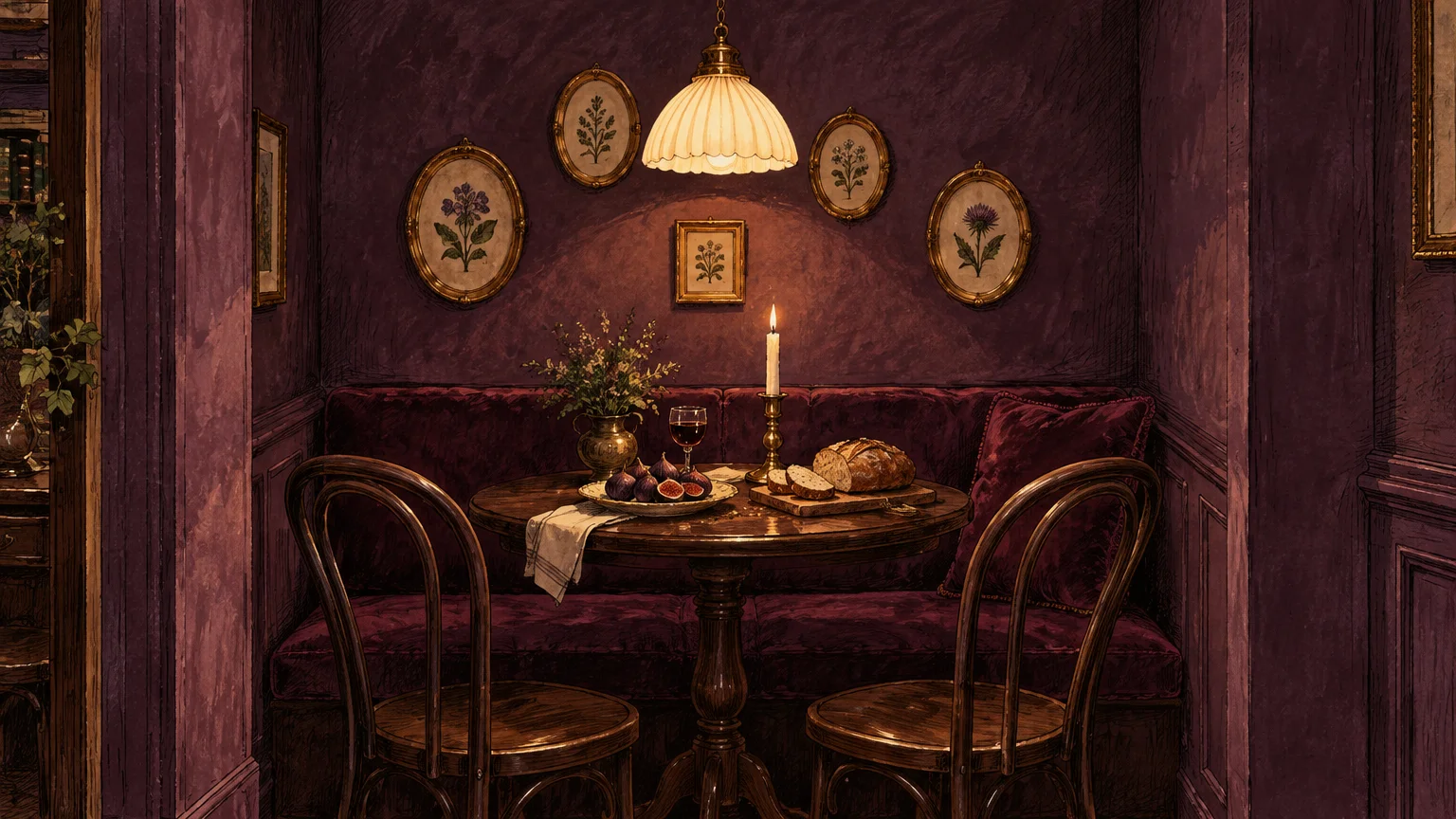
Trend #8: Enveloping Aubergine
Aubergine and plum noir represent the pinnacle of decadent, cozy dining room colors. This deep red-purple shade creates a captivating, moody jewel box tailored for late-night entertaining.
While pastel purples can overwhelm compact spaces, deep aubergine acts as a dramatic, sophisticated neutral. Its complex red undertones flatter dining guests under soft, diffused candlelight.
Pair aubergine walls with smoked glass accents, dark stained oak, and antiqued bronze light fixtures. These dusky pairings produce an alluring atmosphere reminiscent of a boutique European wine lounge.
Paint the ceiling two shades lighter or match it completely for a seamless, continuous cocoon. The bold commitment rewards you with an exceptionally memorable dining environment.
Rich plum saturations lend a royal warmth that transforms modest dimensions into a lavish retreat.
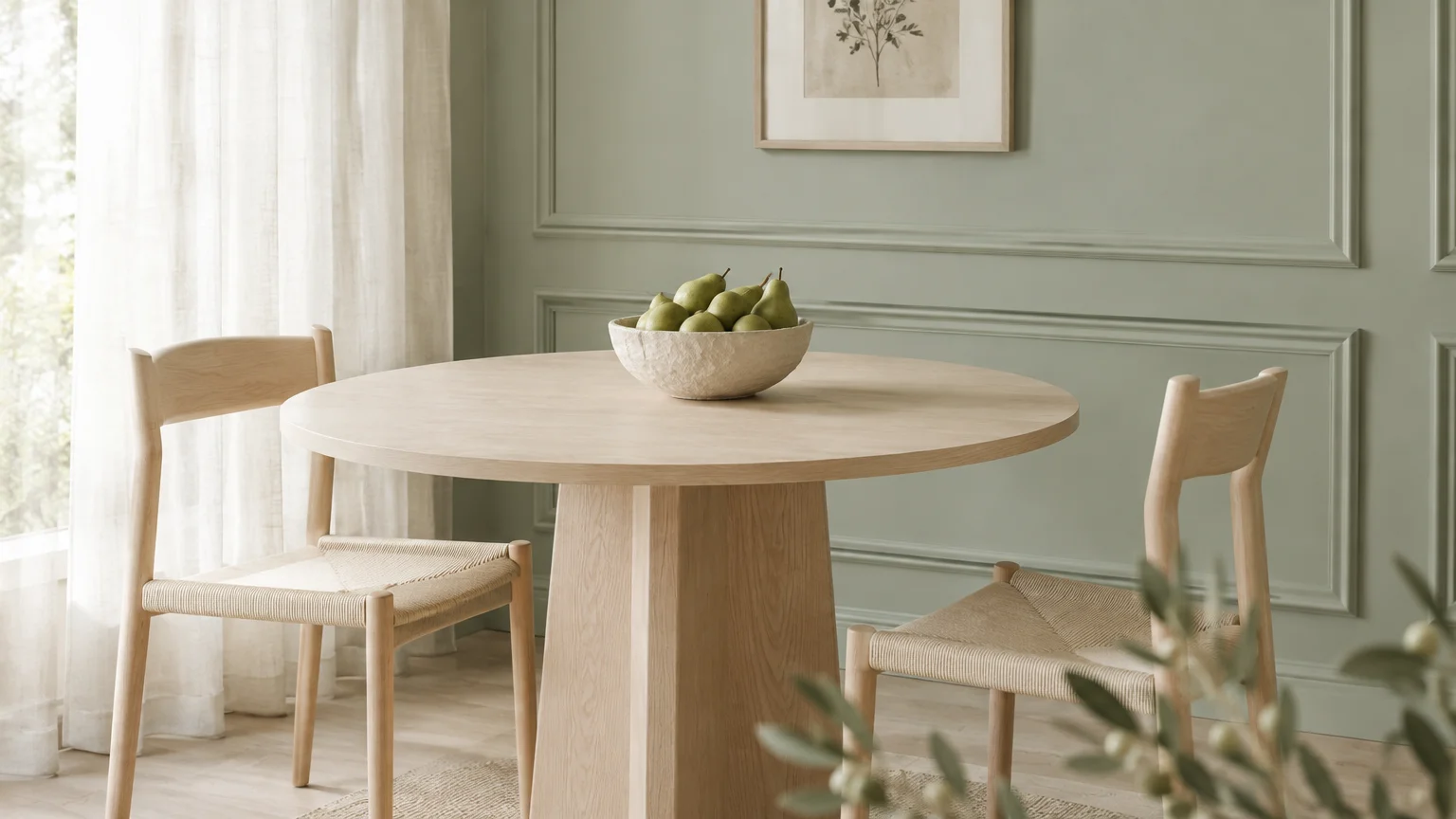
Trend #9: Restorative Soft Sage
Soft sage introduces an airy, botanical serenity that instantly refreshes tight architectural layouts. As a delicate grey-green, sage reflects natural daylight while offering considerably more character than conventional white paint.
This gentle hue visually blurs the transition between indoor furnishings and exterior garden vistas. By creating this seamless outdoor connection, your dining alcove feels substantially larger and more open.
Complement soft sage with Scandinavian blonde woods, hand-thrown stoneware, and woven jute area rugs. These elemental accents reinforce an organic modern atmosphere that feels calming and restorative.
Apply an eggshell finish on walls to capture soft illumination throughout daytime brunch gatherings. The hue retains its balanced clarity under both bright sunlight and artificial incandescent glow.
Sage brings refreshing equilibrium to compact spaces, relieving the visual weight of heavy dining tables.
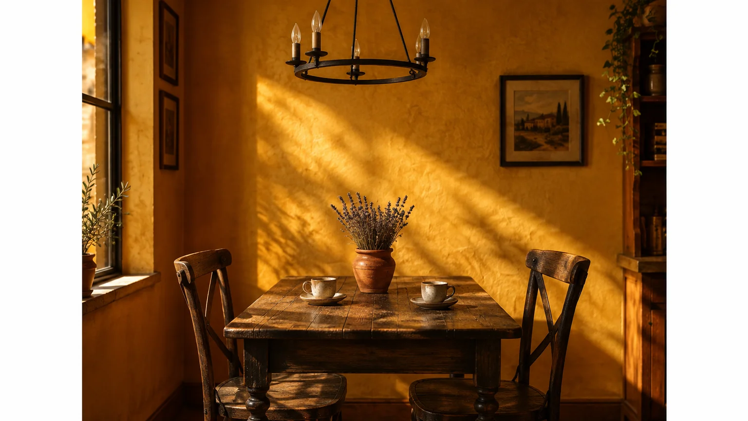
Trend #10: Luminous Spiced Ochre
Spiced ochre and golden Dijon bring radiant, historic charm to small dining rooms. This rich, golden-yellow hue captures and amplifies minimal light, casting a flattering golden-hour glow.
For dining rooms starved of exterior windows, ochre simulates the enveloping warmth of continuous sunshine. It creates an uplifting, nostalgic backdrop that energizes dinner parties with effortless charisma.
Contrast golden ochre with cool slate accents, matte black frames, and rich charcoal velvet textiles. These grounding elements balance the warmth, preventing the hue from overpowering the small space.
Install a dimmable frosted glass chandelier to disperse even illumination across the mustard surfaces. The room radiates hospitality, turning compact square footage into a vibrant gathering hub.
The velvety, spiced undertones produce an inviting hearth-like setting where guests naturally linger longer.
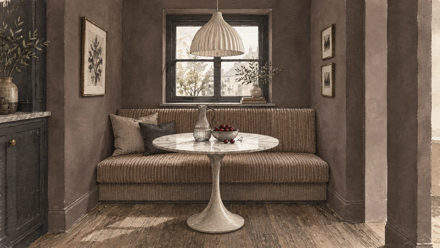
Trend #11: Velvet Smoked Taupe
Smoked taupe bridges the boundary between grey and brown, providing an intensely comforting, tactile ambiance. This grounding shade provides a sumptuous architectural envelope without shrinking your visual horizon.
Often associated with couture tailoring and heritage libraries, smoked taupe brings sophisticated provenance to compact dining rooms. It feels undeniably grounded, substantial, and effortlessly upscale.
Pair smoked taupe with creamy plaster pendant lights, bleached ash dining tables, and brushed nickel hardware. The play of light and dark neutrals generates sophisticated, modern dimension.
Paint the trim, crown molding, and doors in the same taupe shade for a clean, tailored finish. Color drenching the entire space smooths out awkward alcoves and irregular angles.
Taupe creates a cozy refuge that flatters both daytime brunches and moody candlelit dinners.
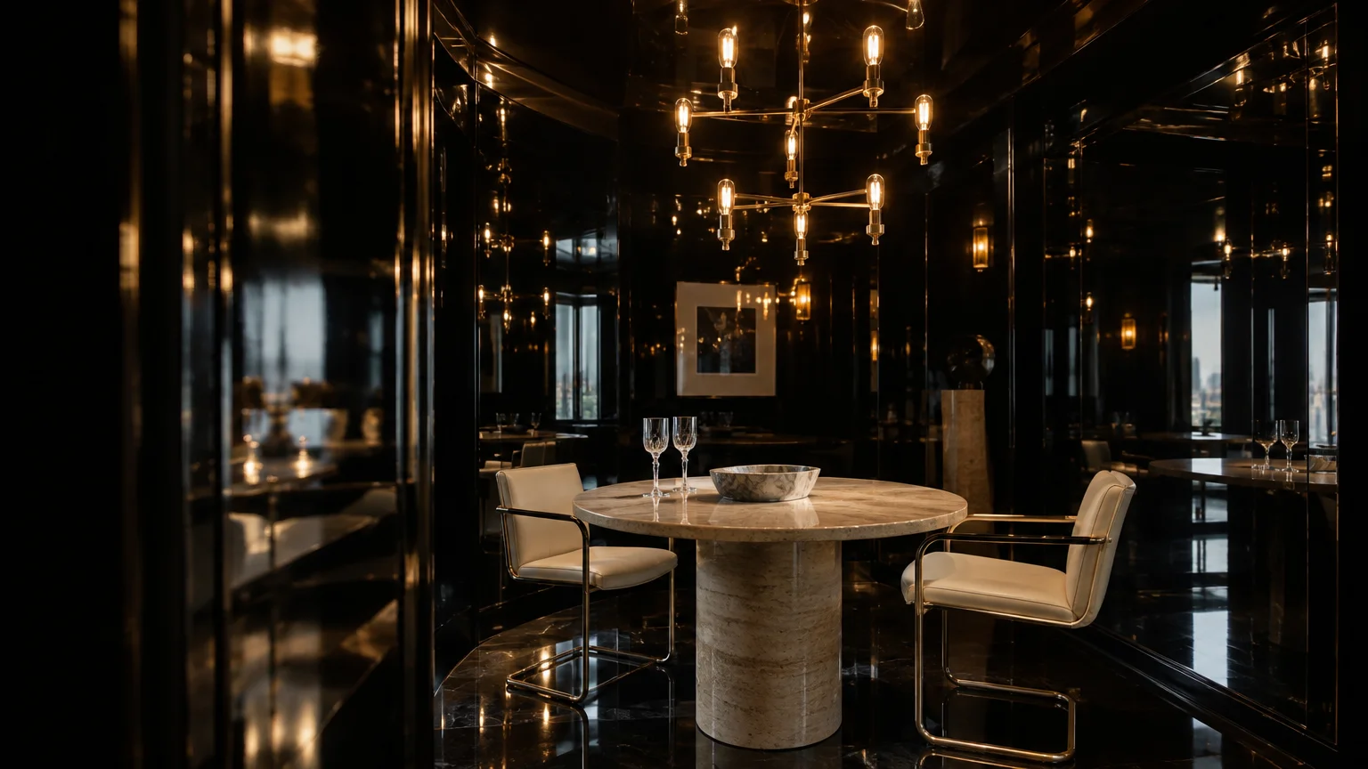
Trend #12: High-Gloss Obsidian
While standard wisdom suggests light colors for small spaces, high-gloss obsidian defies expectations. Applying a mirror-like lacquer finish to deep black walls multiplies ambient light across the entire room.
The high-sheen surface acts like a subtle mirror, reflecting candlelight, table crystal, and silhouette movement. This reflective dimension creates an optical depth that effectively dissolves physical wall planes.
Ensure flawless wall preparation, as high-gloss paint magnifies every underlying surface texture and imperfection. Skim-coat walls smooth before spraying or rolling a premium lacquer or high-gloss enamel.
Contrast the glossy obsidian perimeter with a warm matte wood table and velvet-upholstered seating. The tactile interplay between sleek lacquer and plush textiles crafts an unforgettable dining experience.
Obsidian delivers unparalleled modern luxury, proving that courageous design choices thrive in compact quarters.
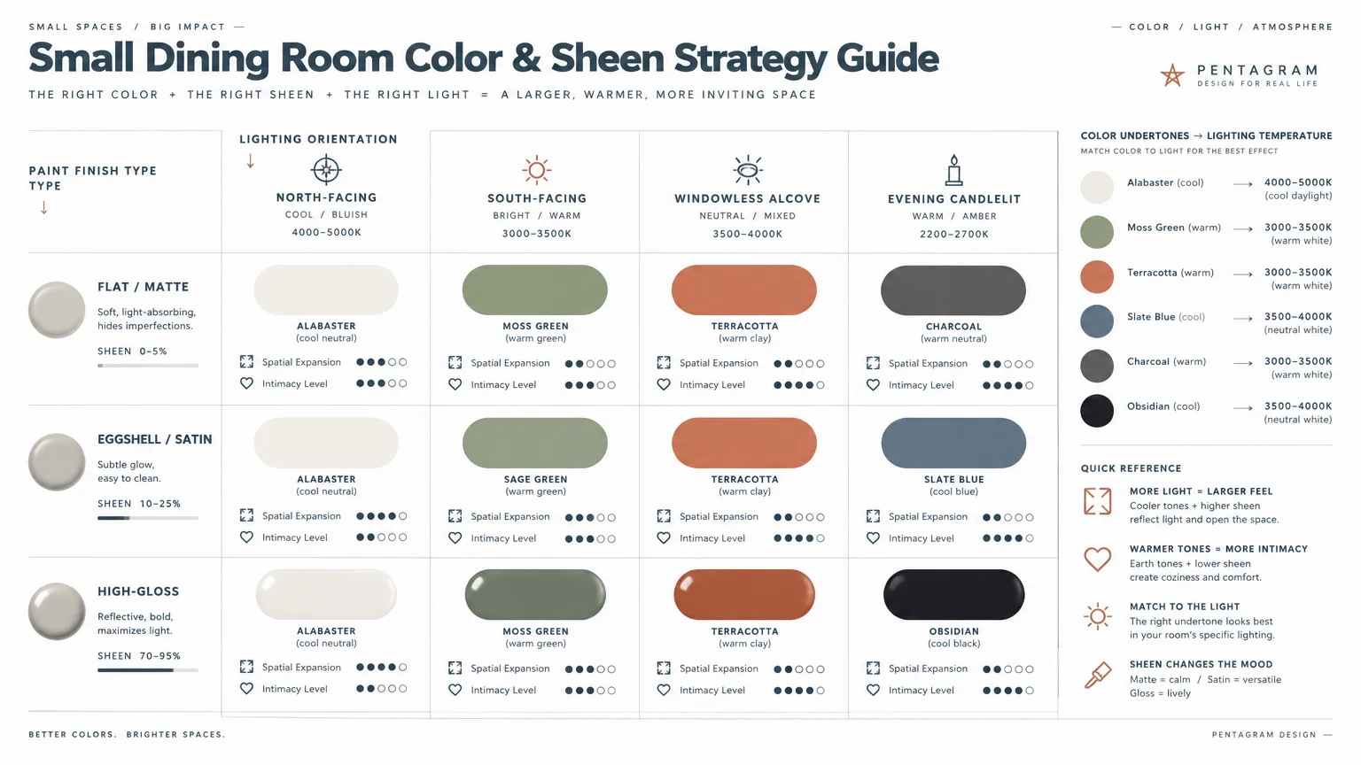
The Big Picture: Weaving These Trends into Your Home
Designing an intimate dining room requires an intentional spatial strategy rather than cautious hesitation. Select a color that aligns with your primary entertaining hours and the natural light exposure of your room.
If you host predominantly evening dinners, lean into saturated jewel tones like midnight navy or deep aubergine. These colors embrace nightfall, creating an alluring supper-club intimacy that light paint cannot replicate.
For multi-functional dining areas used for remote work or morning coffee, prioritize high-reflectance hues like architectural alabaster or soft sage. These reflective shades keep the perimeter bright, fresh, and productive throughout the day.
Adopt the technique of color drenching by coating your walls, baseboards, and window trim in identical paint. Eliminating high-contrast visual breaks fools the eye, causing walls to feel continuous and unrestricted.
Lighting serves as the indispensable partner to your chosen wall color. Install dimmable layered illumination, including statement pendants, perimeter sconces, and candles, to orchestrate the room’s evening mood.
Balance saturated wall colors with tactile, organic dining furniture and neutral rugs. Allowing the wall color to serve as the dominant backdrop creates a cohesive and uncrowded environment.
Always test swatches in your unique lighting environment before committing to gallons of paint. Observe large sample boards at morning, midday, and twilight to confirm how shifting undertones behave.
Thoughtful color choices elevate compact dining footprints into magnetic social destinations. When you honor your home’s proportions with tailored hues, small spaces deliver outsized luxury.
For the latest color forecasts, consult industry leaders like Pantone and paint companies like Benjamin Moore. For professional design standards, refer to the American Society of Interior Designers (ASID).
Disclaimer: This article reflects design trend analysis and predictions. Personal taste and timeless design principles should always guide your decorating choices.
Frequently Asked Questions
Can dark paint colors truly make a small dining room look bigger?
Yes, dark paint colors can make compact dining rooms appear significantly larger by blurring wall boundaries. Because corners and shadow lines recede in low light, the perimeter feels distant and indefinite.
Pair dark walls with targeted warm lighting to create depth and prevent the space from feeling cave-like.
Which paint finish works best in a compact dining space?
Matte and eggshell finishes work best for absorbing unwanted glare and creating an intimate, velvety surface. These low-sheen finishes soften imperfections on older plaster walls.
Alternatively, choose high-gloss enamel on smooth accent walls or ceilings to reflect light and expand spatial depth.
How do I choose between warm and cool paint ideas for a dining room?
Assess your dining room window exposure and natural lighting patterns before committing to a paint palette. North-facing rooms benefit from warm terracotta or ochre to counteract cool, shadowy daylight.
South-facing rooms receive intense, warm sunlight and pair beautifully with cool slate blue or botanical sage.
Should I paint the dining room ceiling the same color as the walls?
Painting your ceiling the same hue as the walls creates an unbroken monochromatic envelope that elevates visual height. This technique eliminates harsh contrasting border lines, making your ceiling feel taller.
If your chosen wall color is exceptionally dark, select a ceiling shade two tints lighter to maintain airiness.