Trend #4: Primary Canary Yellow
High-saturation canary yellow creates immediate visual fatigue and ranks high among paint colors designers hate in residential interiors. Bright primary yellow overstimulates the nervous system, overwhelms adjacent furnishings, and casts an unnatural glow across natural wood trim and polished concrete floors.
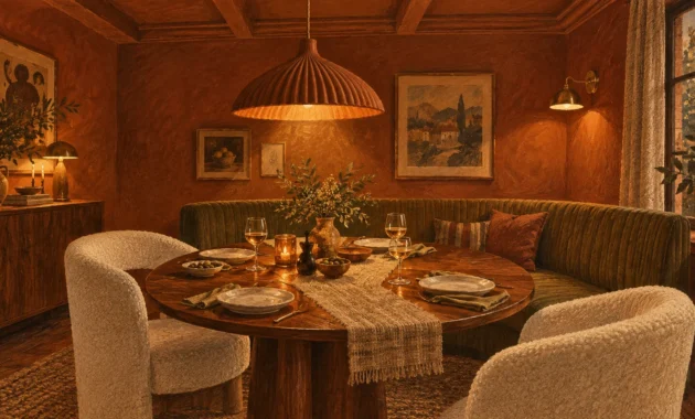
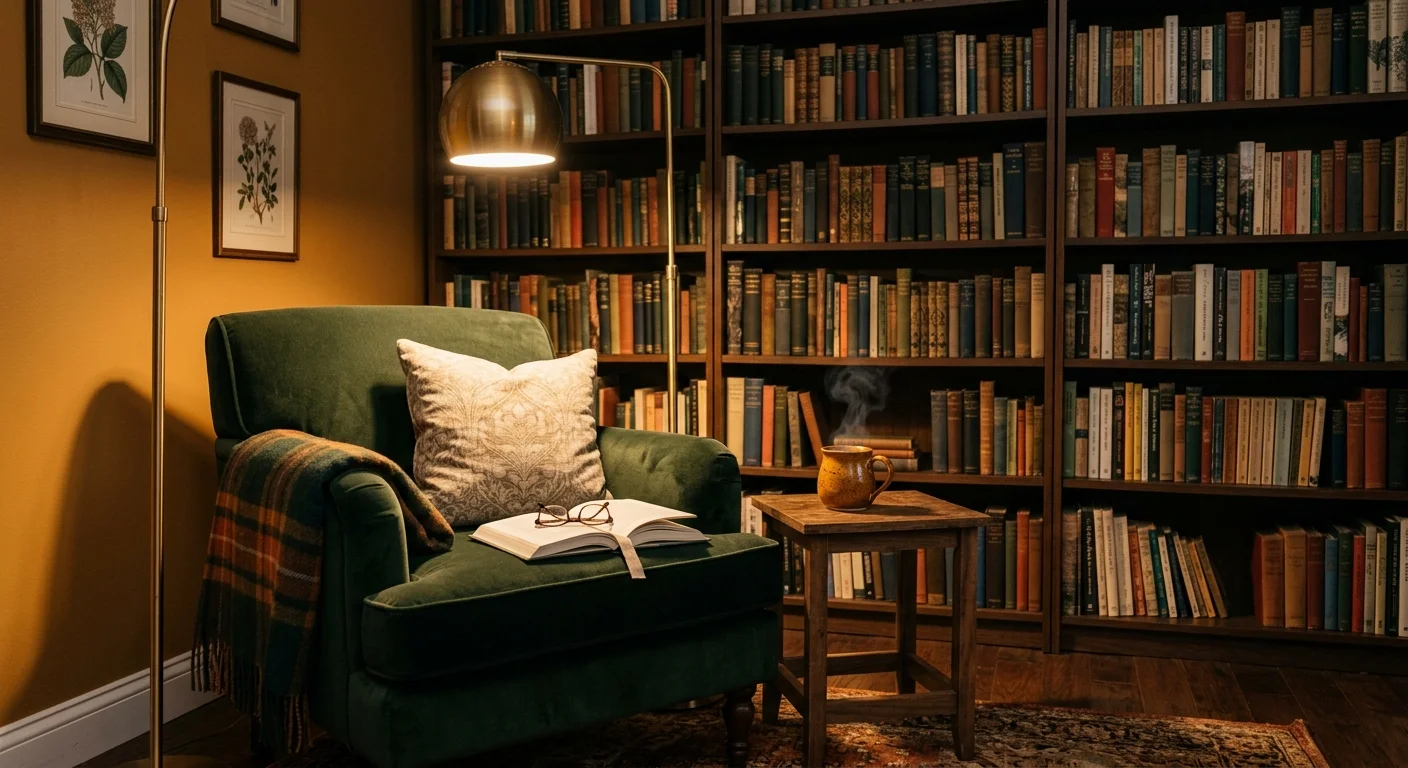
If you love the joyful energy of yellow, shift your focus toward grounded, earth-inspired alternatives. Designers in 2027 favor honeyed ochre, mustard seed, and soft butter yellow with warm brown undertones. These sun-baked shades bring inviting warmth and historic elegance to kitchens, breakfast nooks, and sunrooms without overwhelming your senses.