Trend #2: High-Gloss Titanium White
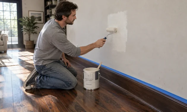
Un-tinted, brilliant titanium white in high-gloss or satin finishes creates an unforgiving visual surface. Designers consistently list pure industrial white among the worst paint colors for expansive interior walls. Brilliant white reflects every shadow, accentuates minor drywall imperfections, and casts a harsh glare across your living space. Rather than conferring a sense of luxury, it leaves rooms feeling hollow, unfinished, and devoid of tactile personality.
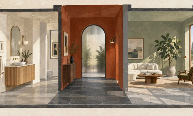
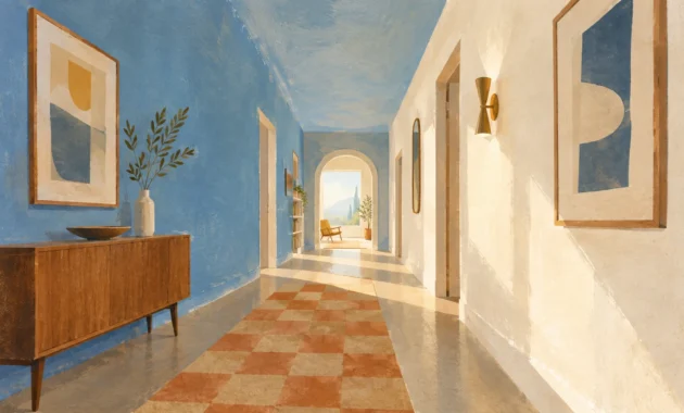
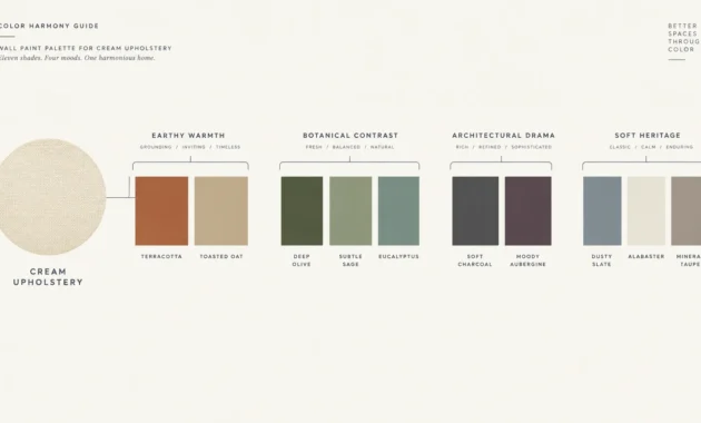
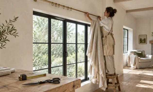
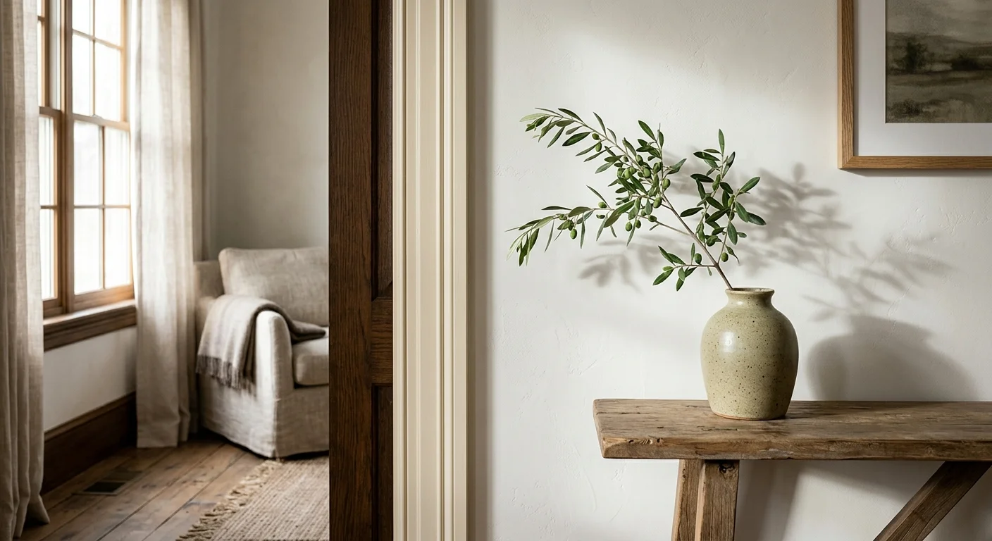
You can achieve a bright, airy aesthetic without sacrificing comfort by selecting soft alabaster, chalky bone white, or muted ivory with warm ochre undertones. Choose chalky matte or velvet finishes for main walls; reserve subtle satin sheen exclusively for architectural millwork and doors to establish refined tonal contrast.