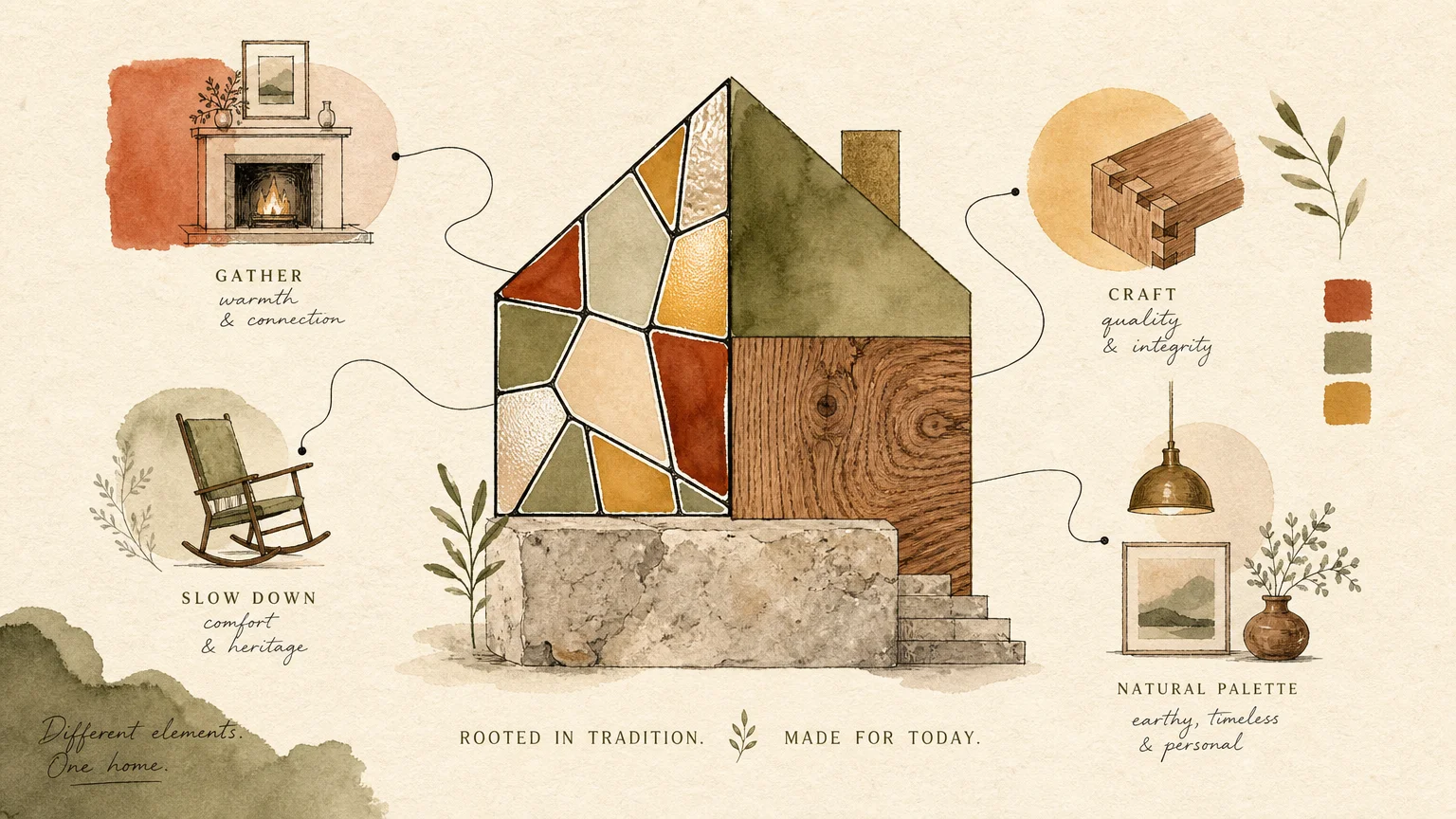
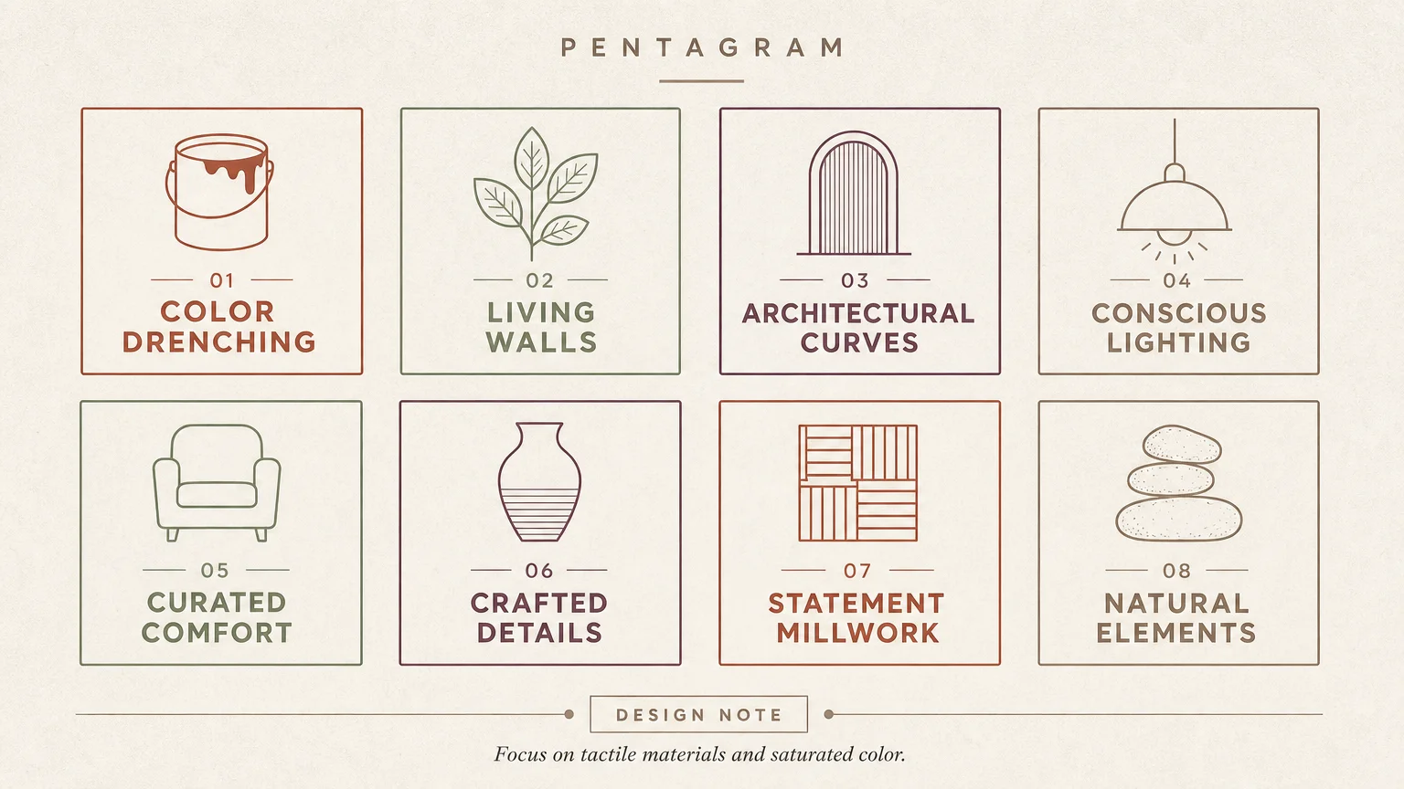
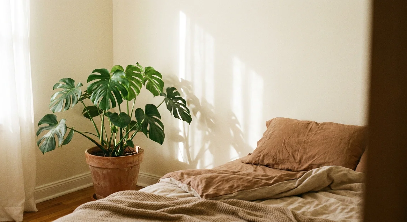
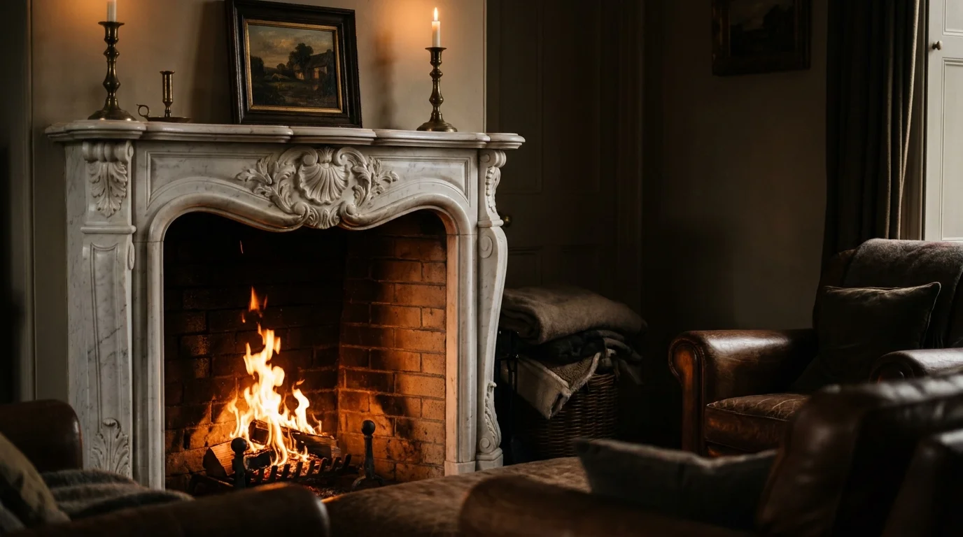
Designing a timeless home requires anticipating your future needs while maintaining a sophisticated aesthetic. You can cultivate a space that supports long-term comfort and independence by integrating subtle, universal design principles long before they become medical necessities. Aging in place no longer means sacrificing style for safety; today, the most coveted interior trends naturally align with accessible home living. Through mindful material selection, intuitive spatial planning, and strategic lighting, your sanctuary can gracefully evolve alongside you. By blending quiet luxury with practical foresight, you ensure your residence remains both a stunning architectural showcase and an effortlessly functional retreat for decades to come.
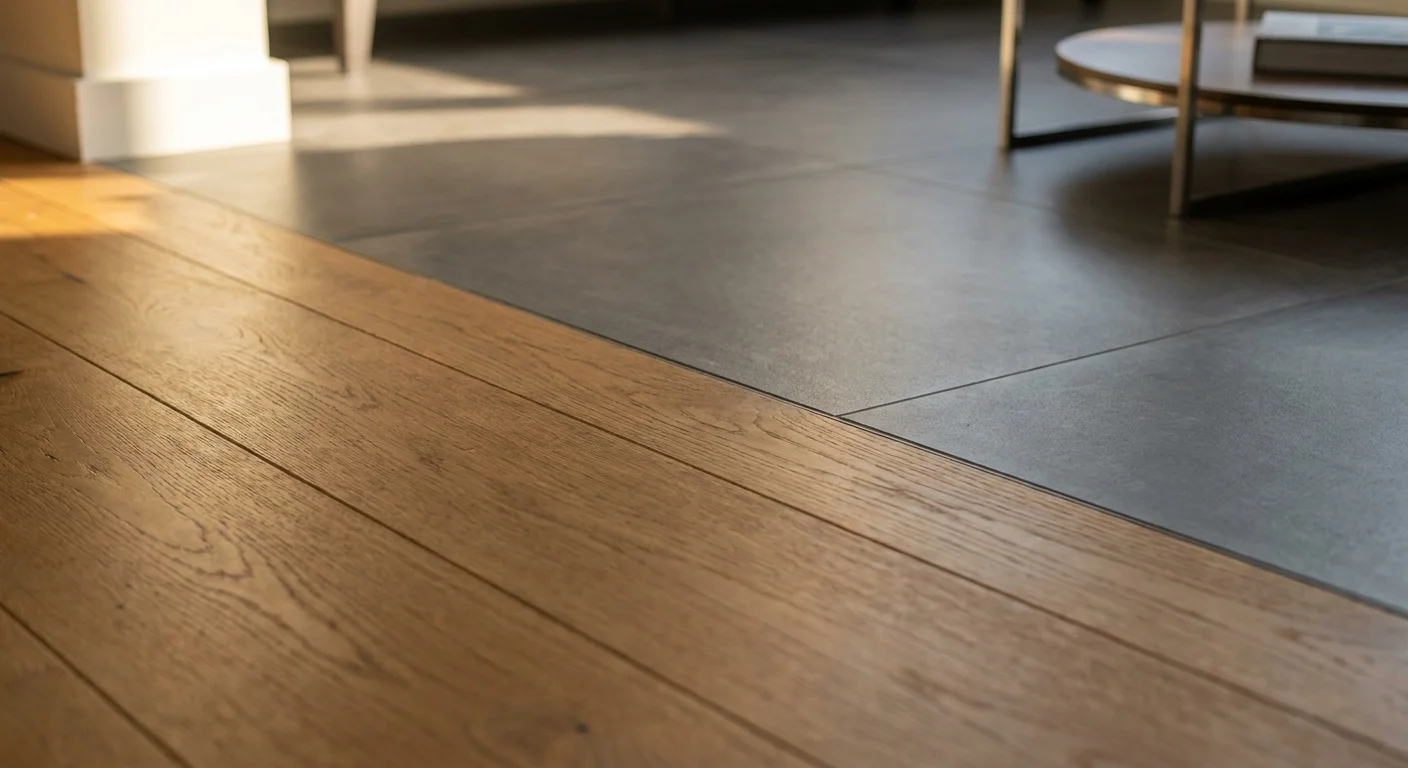
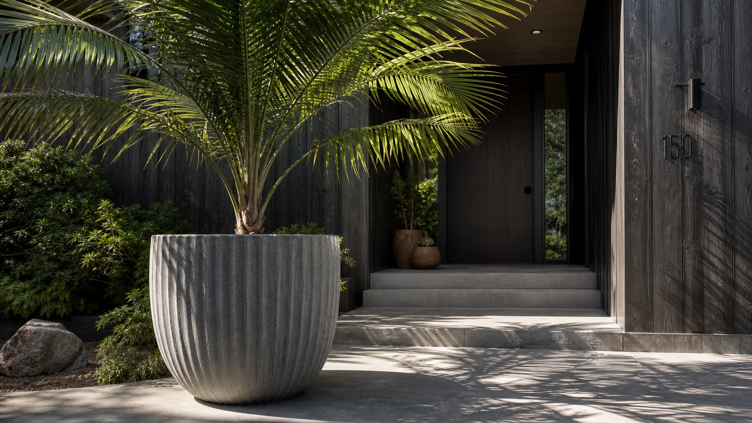
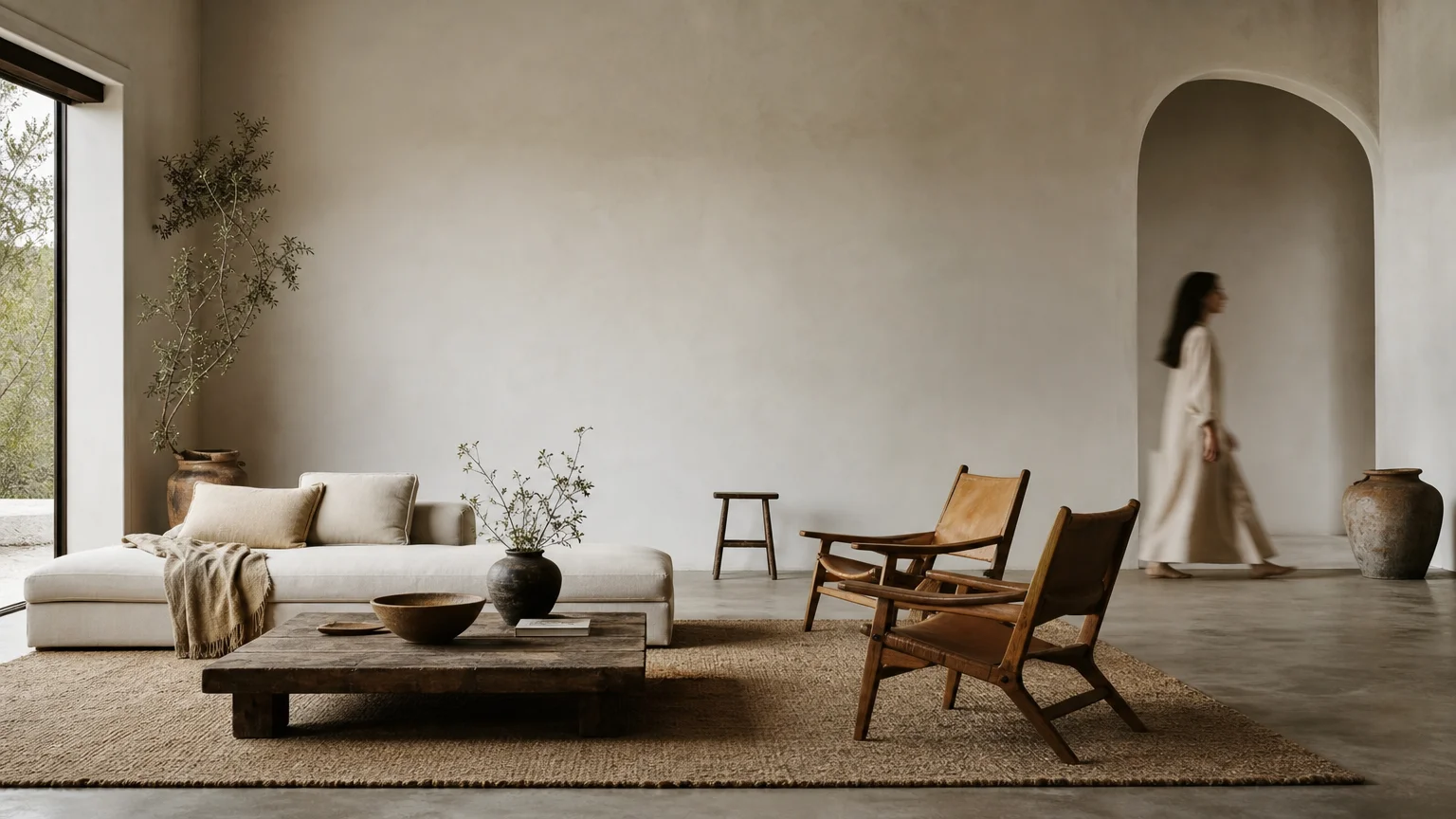
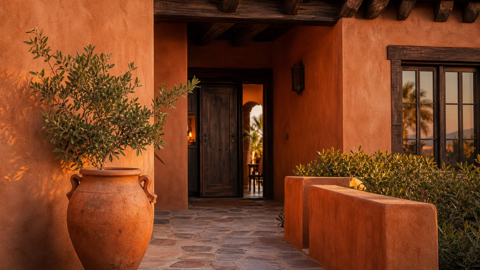
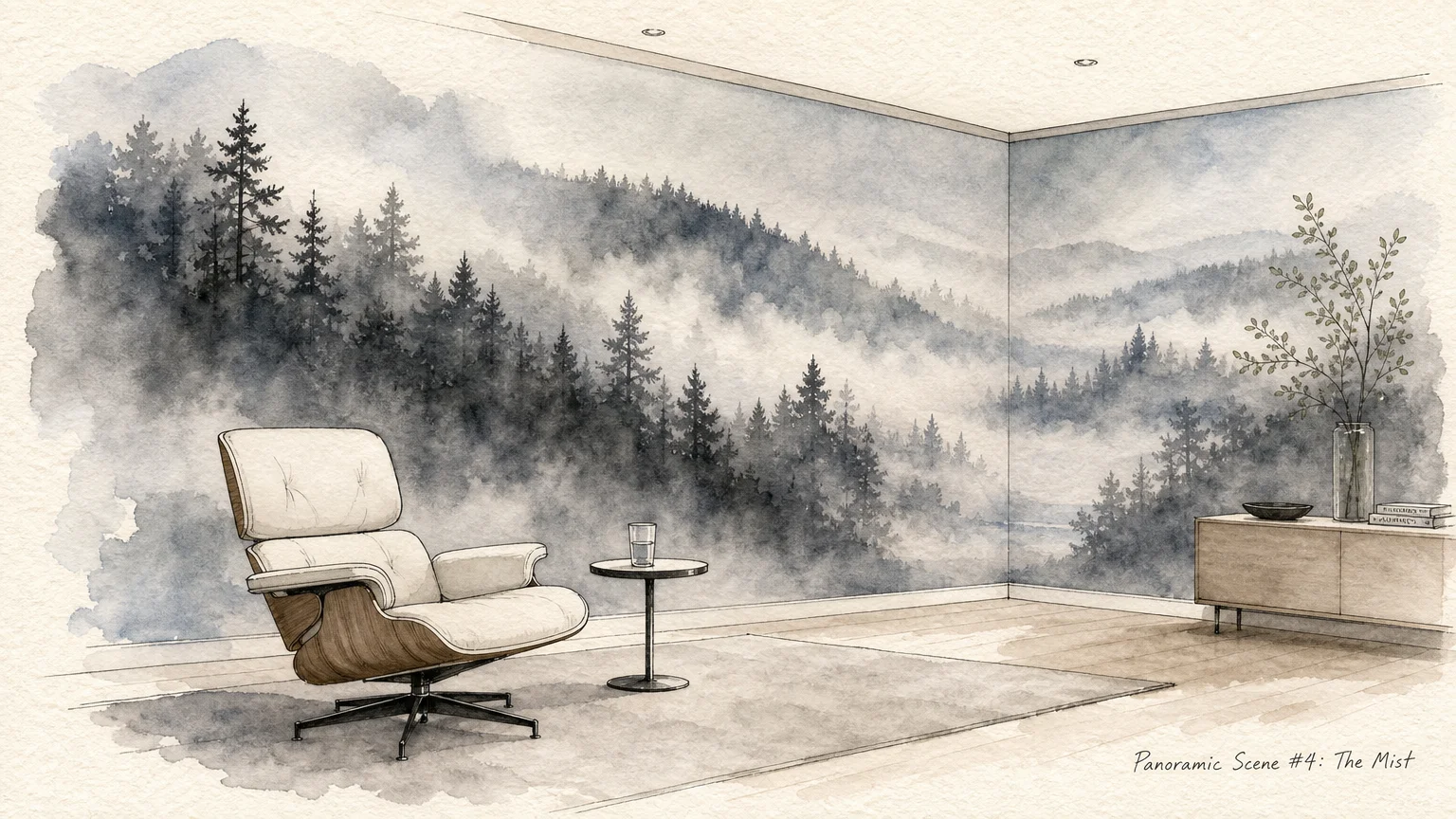
Trend #1: Seamless Zero-Transition Flooring
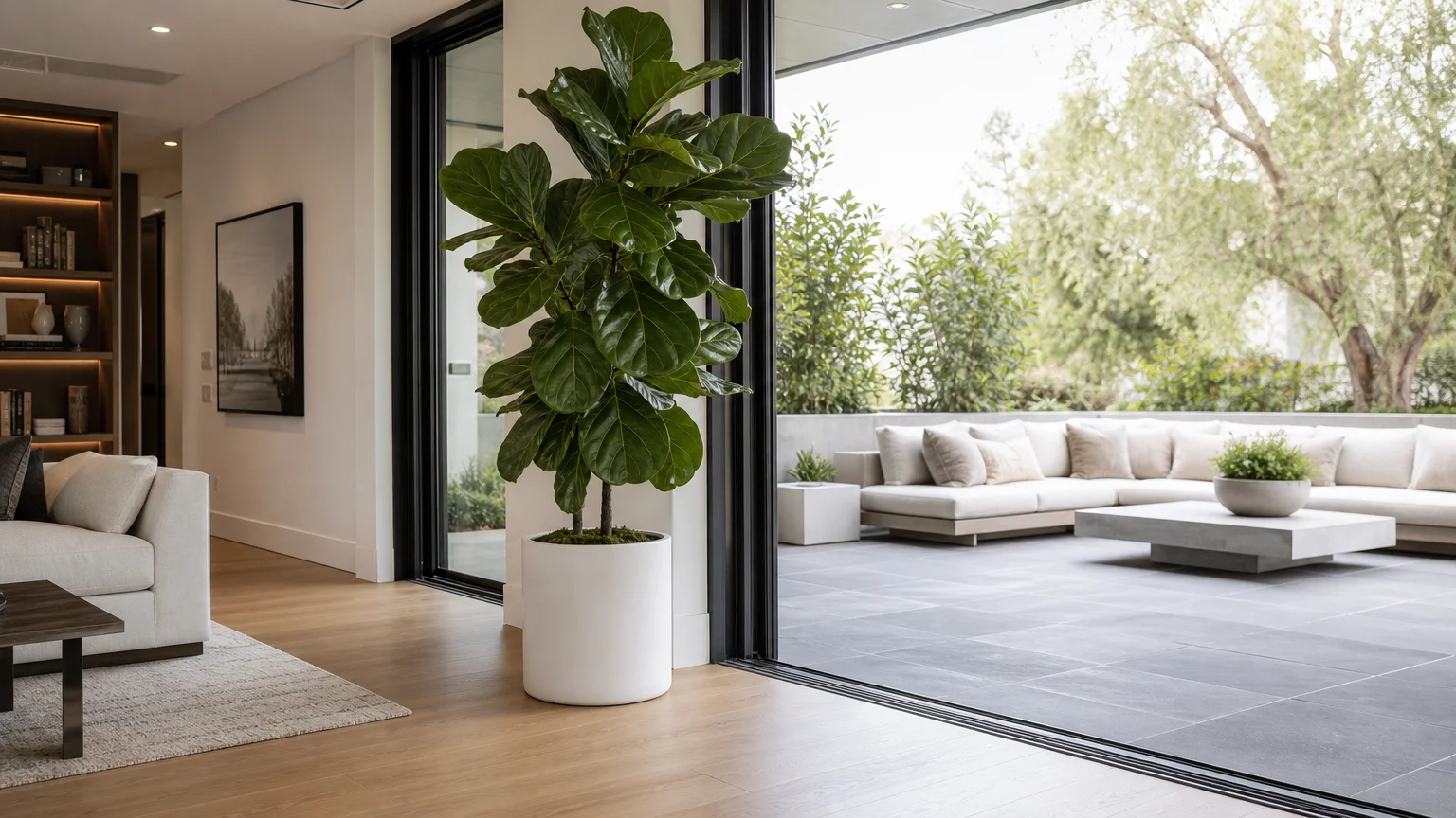
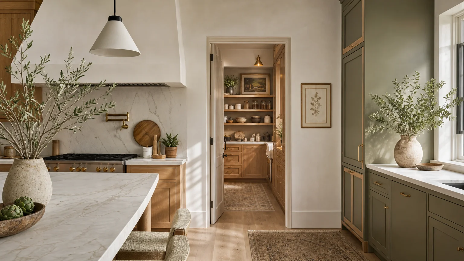
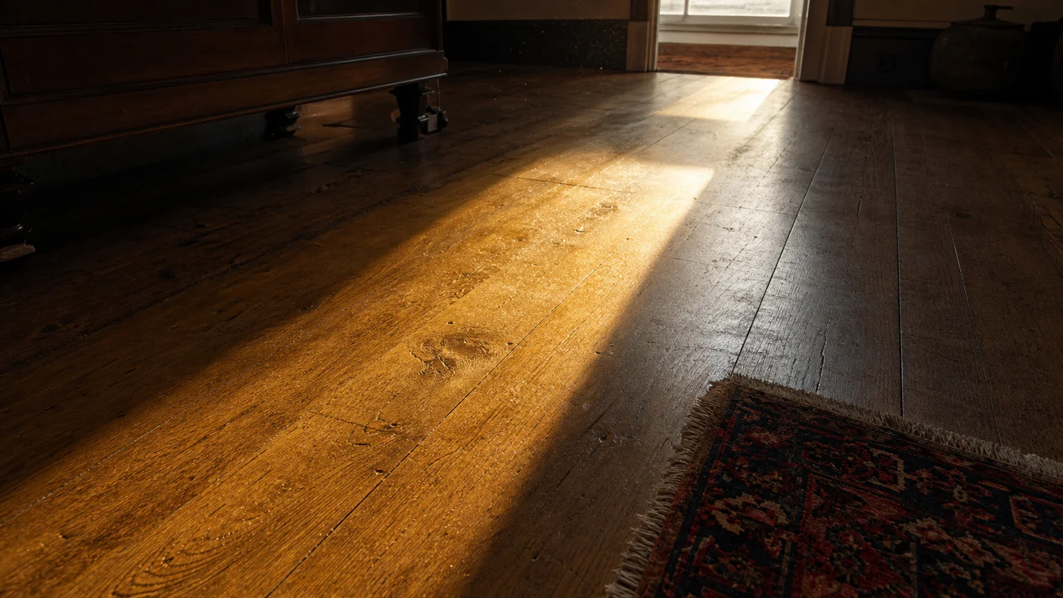
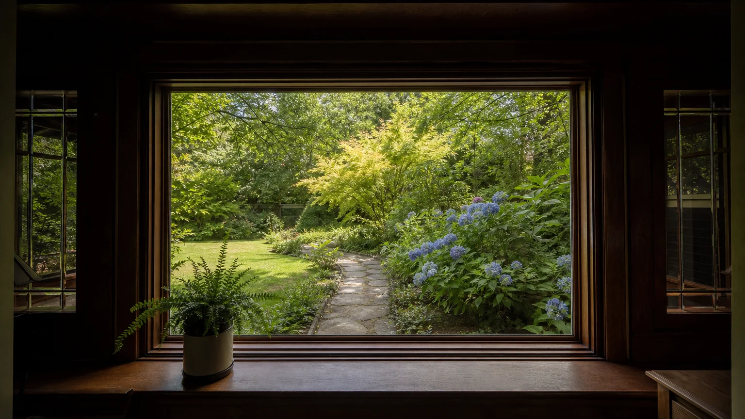
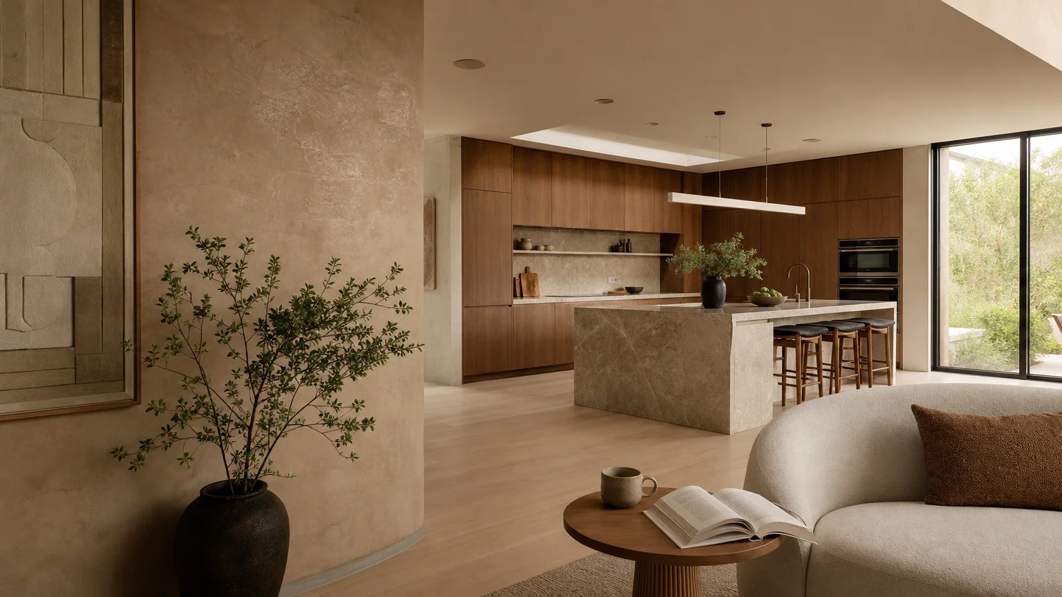
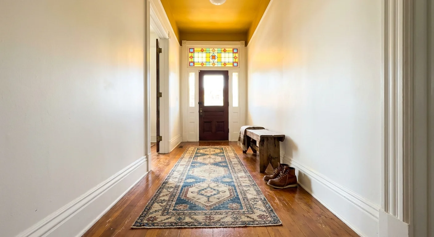
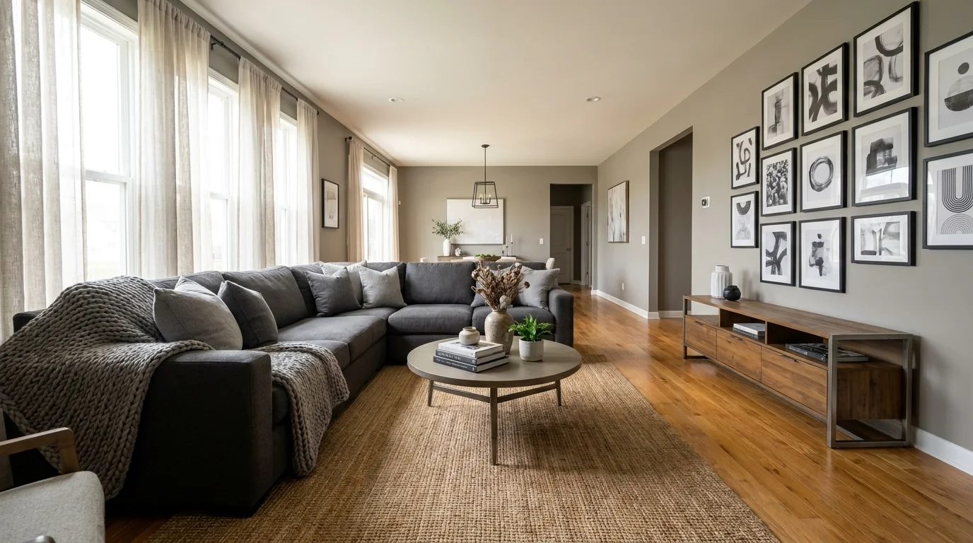
Modern architectural preferences heavily favor open, unbroken sightlines across a single level, and this visual preference aligns flawlessly with long-term home safety. Zero-transition flooring eliminates the raised thresholds between rooms that disrupt spatial flow and create dangerous tripping hazards. By carrying one continuous, high-quality material throughout your primary living spaces, you establish a sense of expansive grandeur while simultaneously making your home infinitely easier to navigate.
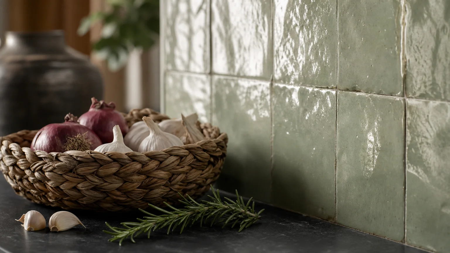
Material provenance and texture play critical roles in this design choice. High-gloss polished stones and smooth laminates reflect light beautifully, but they provide minimal traction and can lead to devastating falls. Instead, you should specify luxury materials with inherent grip. Wide-plank European oak with a wire-brushed, matte finish offers exquisite tactile beauty and excellent slip resistance. Alternatively, large-format porcelain tiles treated with a honed, slip-resistant glaze deliver the upscale look of natural limestone without the associated maintenance or slickness.
When executing this trend, insist on flush transitions even where flooring materials must change, such as between a bedroom and a master bathroom. You can achieve this by having your contractor properly level the subfloor during renovation. This meticulous attention to structural detail preserves the refined aesthetic of your interior while laying the groundwork for a truly accessible home.
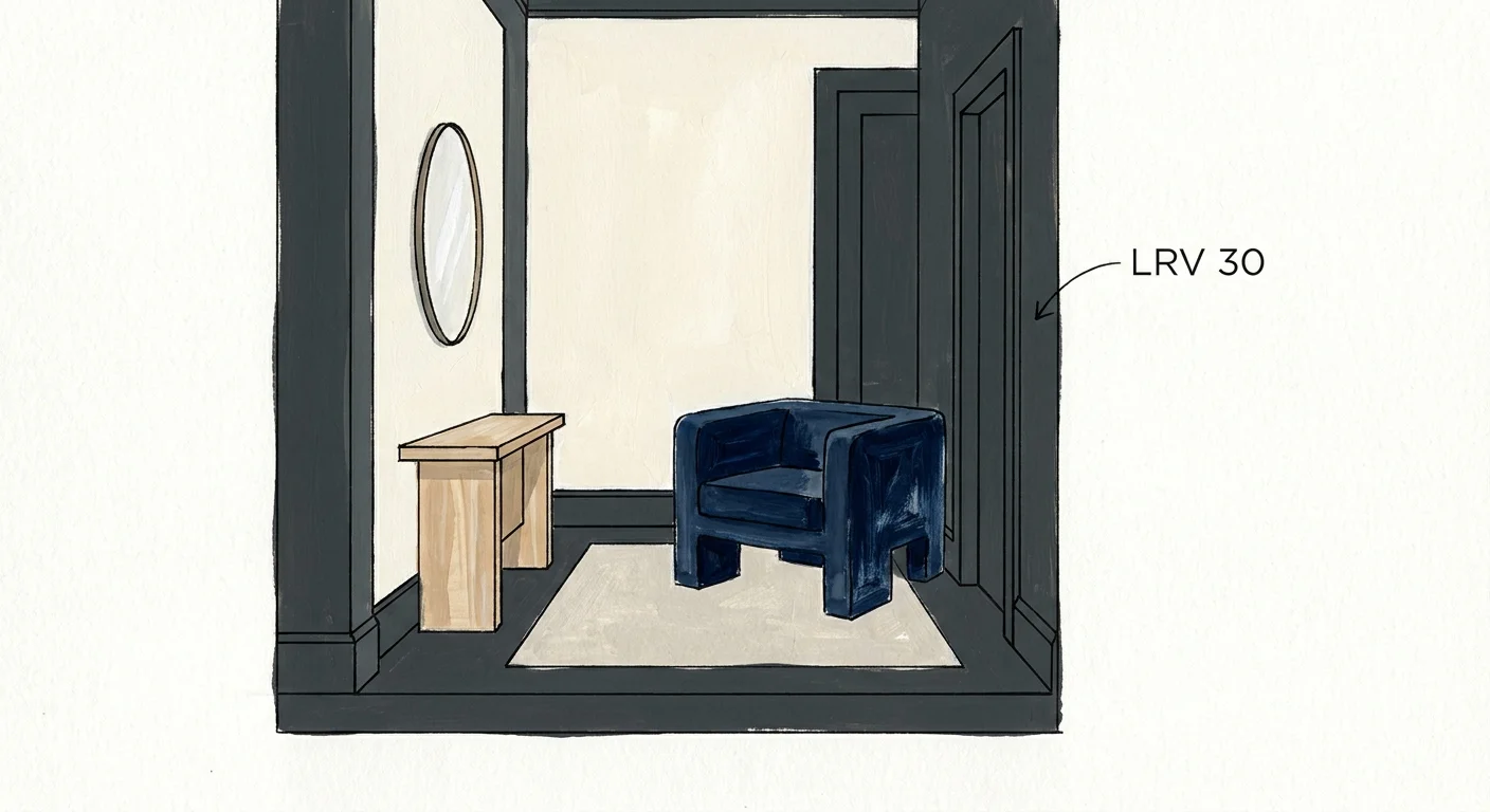
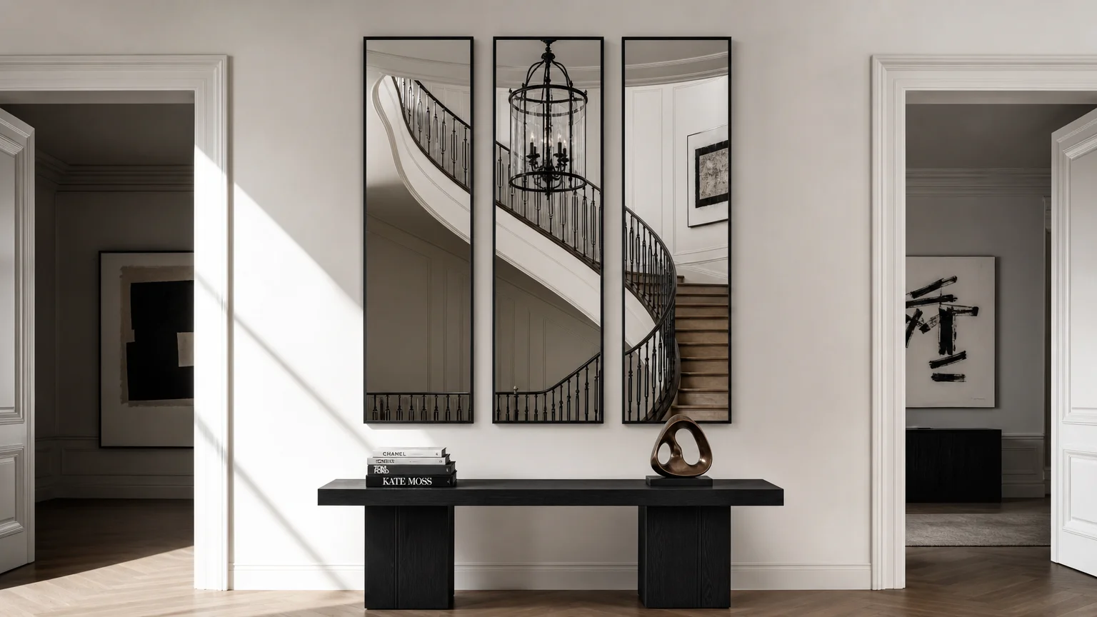
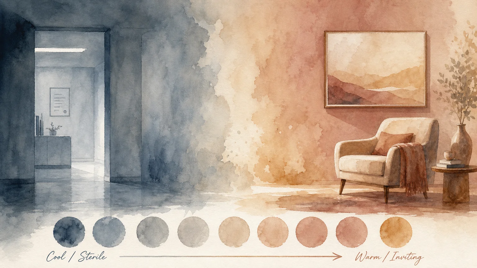
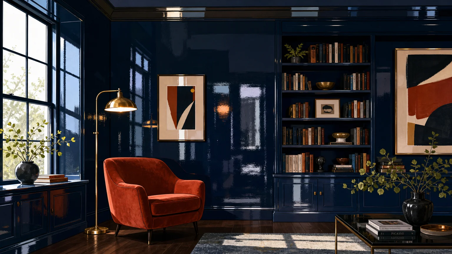
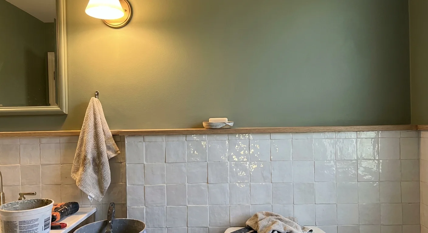
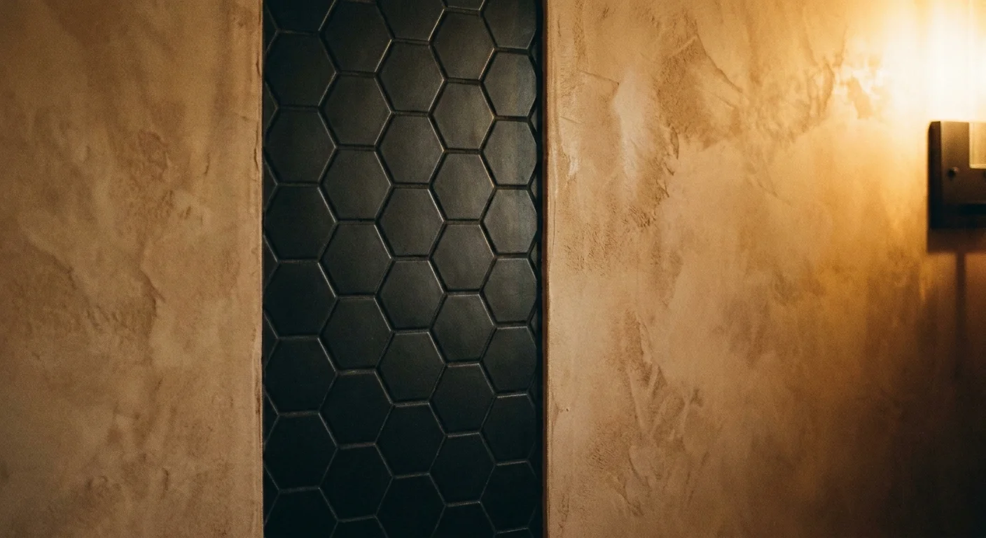
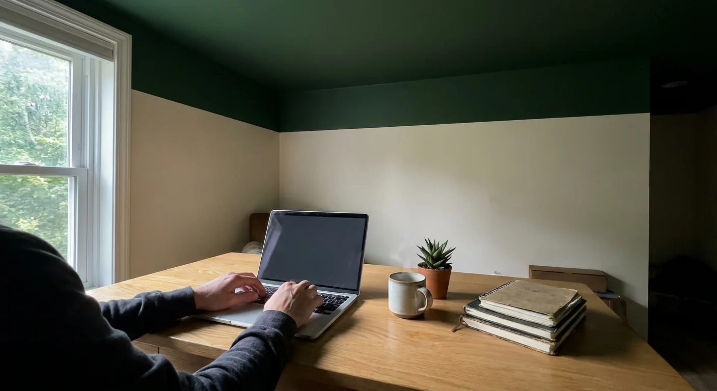
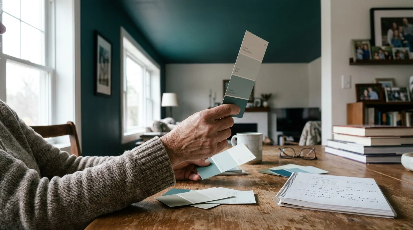
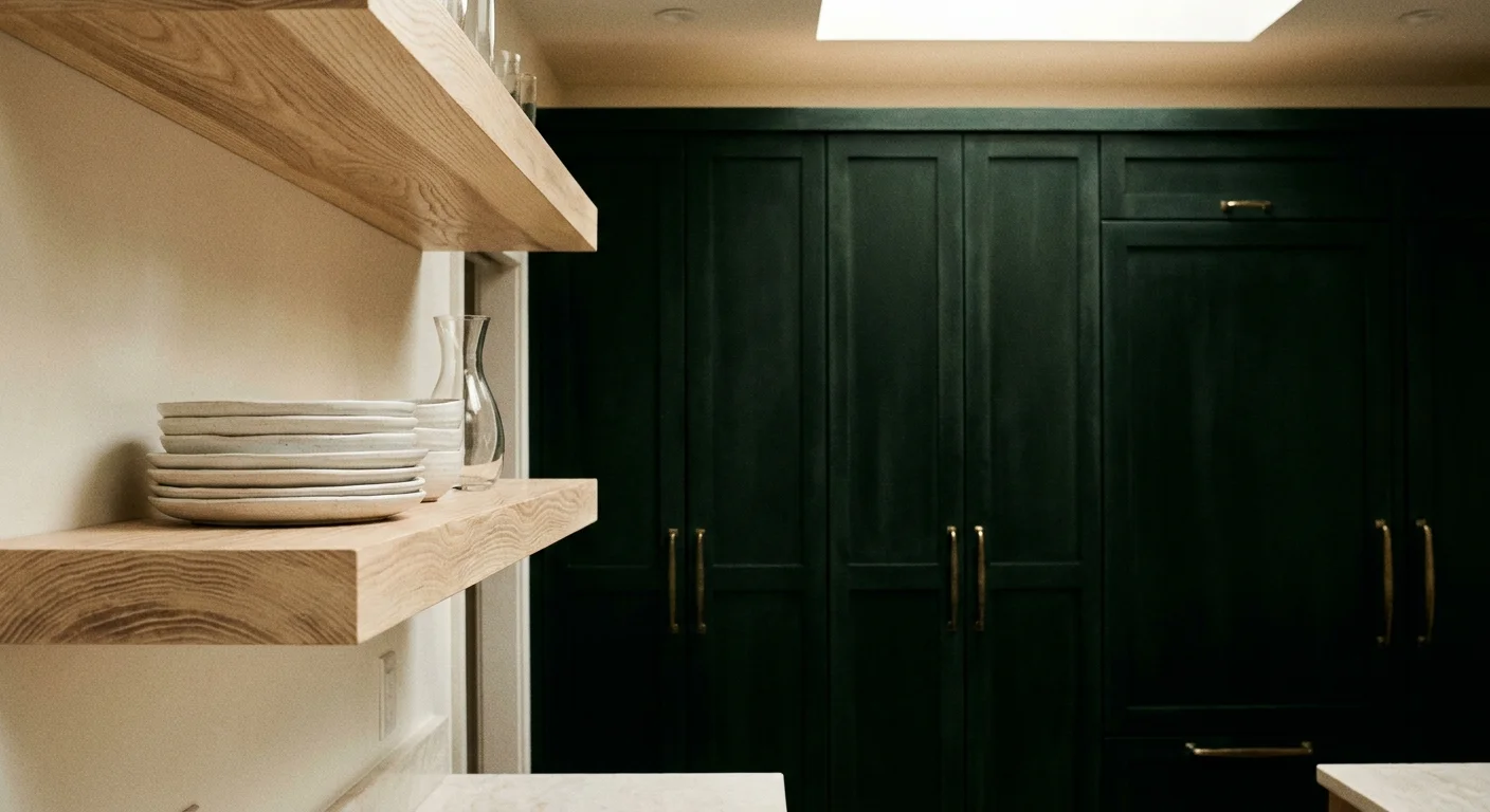
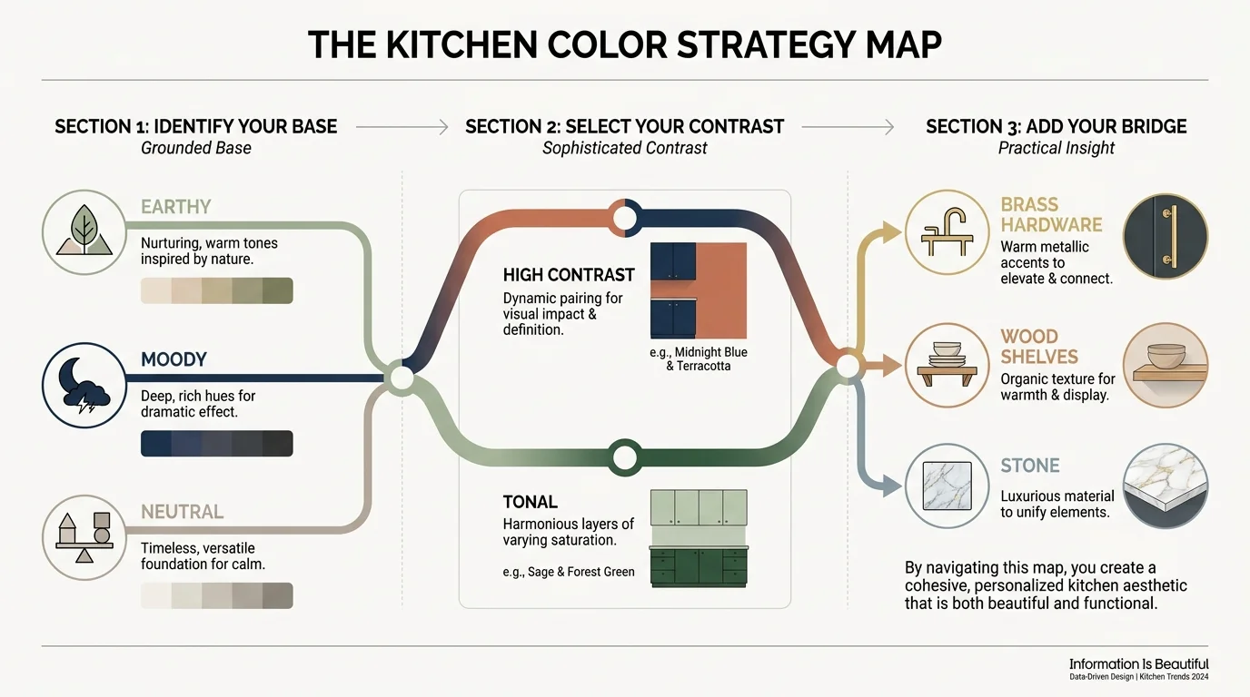
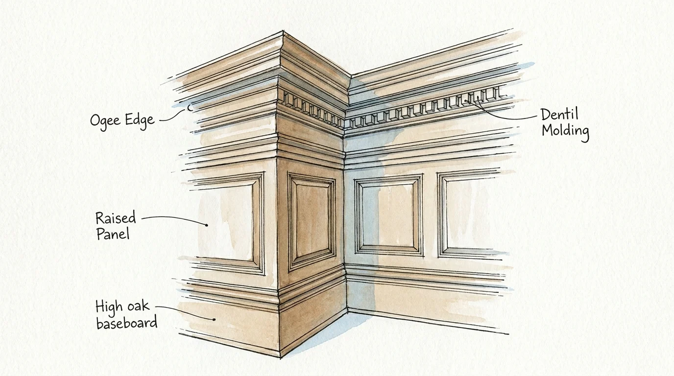
Trend #2: High-Contrast Color Mapping
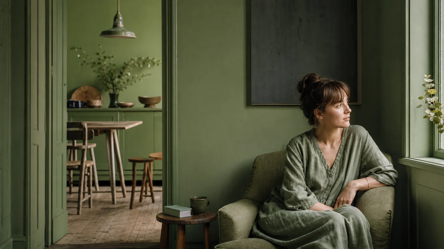
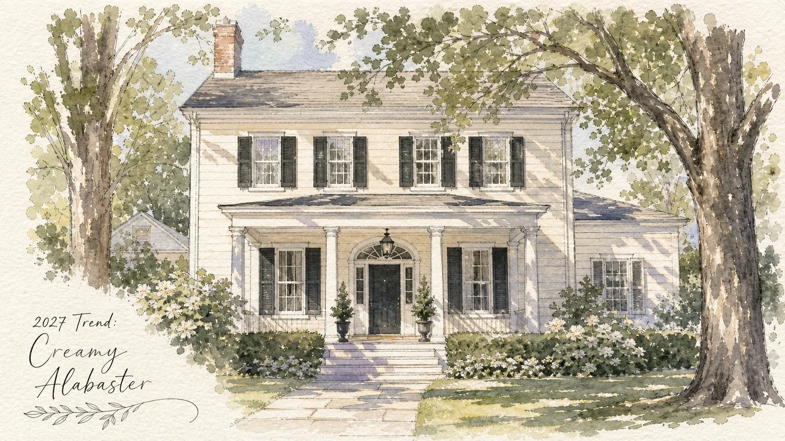
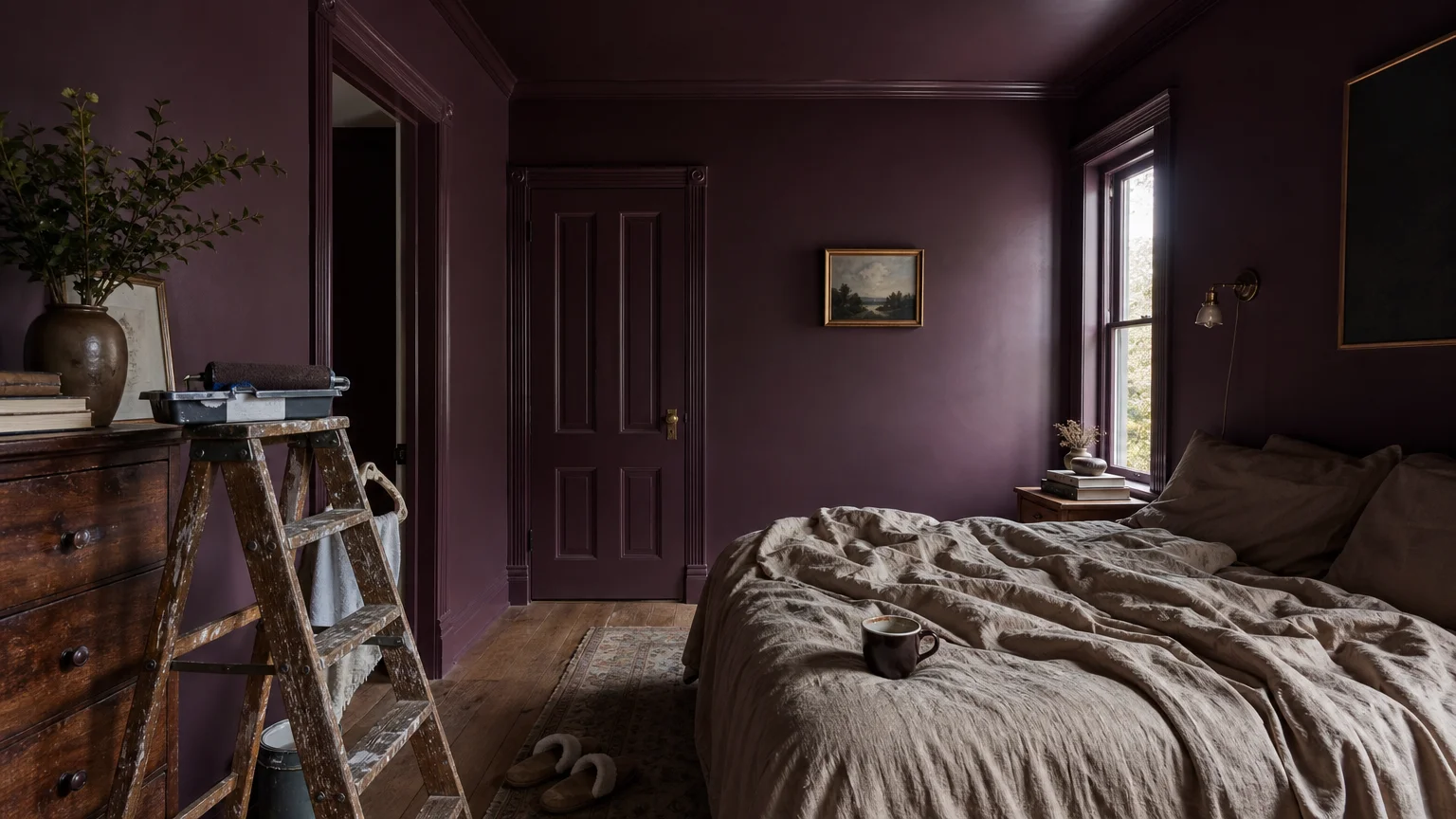
The concept of “color drenching”—painting walls, trim, and ceilings a single uniform hue—has dominated recent design cycles. However, the emerging trend of high-contrast color mapping offers a far more supportive environment for aging eyes. As our vision naturally changes, distinguishing between different spatial planes becomes increasingly difficult. Low-contrast environments often blur the boundaries between floors, walls, and furniture, subtly contributing to disorientation and a higher risk of accidents.
You can solve this challenge through strategic, sophisticated color blocking. By intentionally contrasting the color of your baseboards, door frames, and flooring with your wall color, you create an elegant visual map of the room. Design professionals often measure this contrast using Light Reflectance Value (LRV); aiming for an LRV difference of at least 30 points between adjacent surfaces ensures clear visibility.
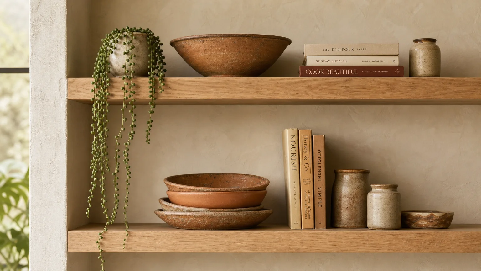
This approach lends itself perfectly to high-end, tailored aesthetics. Picture rich, charcoal wainscoting set against warm alabaster walls, or deep navy door casings framing an entryway in a crisp, cream-colored hallway. You should also apply this principle to your furnishings; placing a boldly colored velvet armchair over a light, neutral rug ensures the seating area immediately stands out. This deliberate use of contrast enriches your senior home design with depth and drama while offering vital spatial cues.
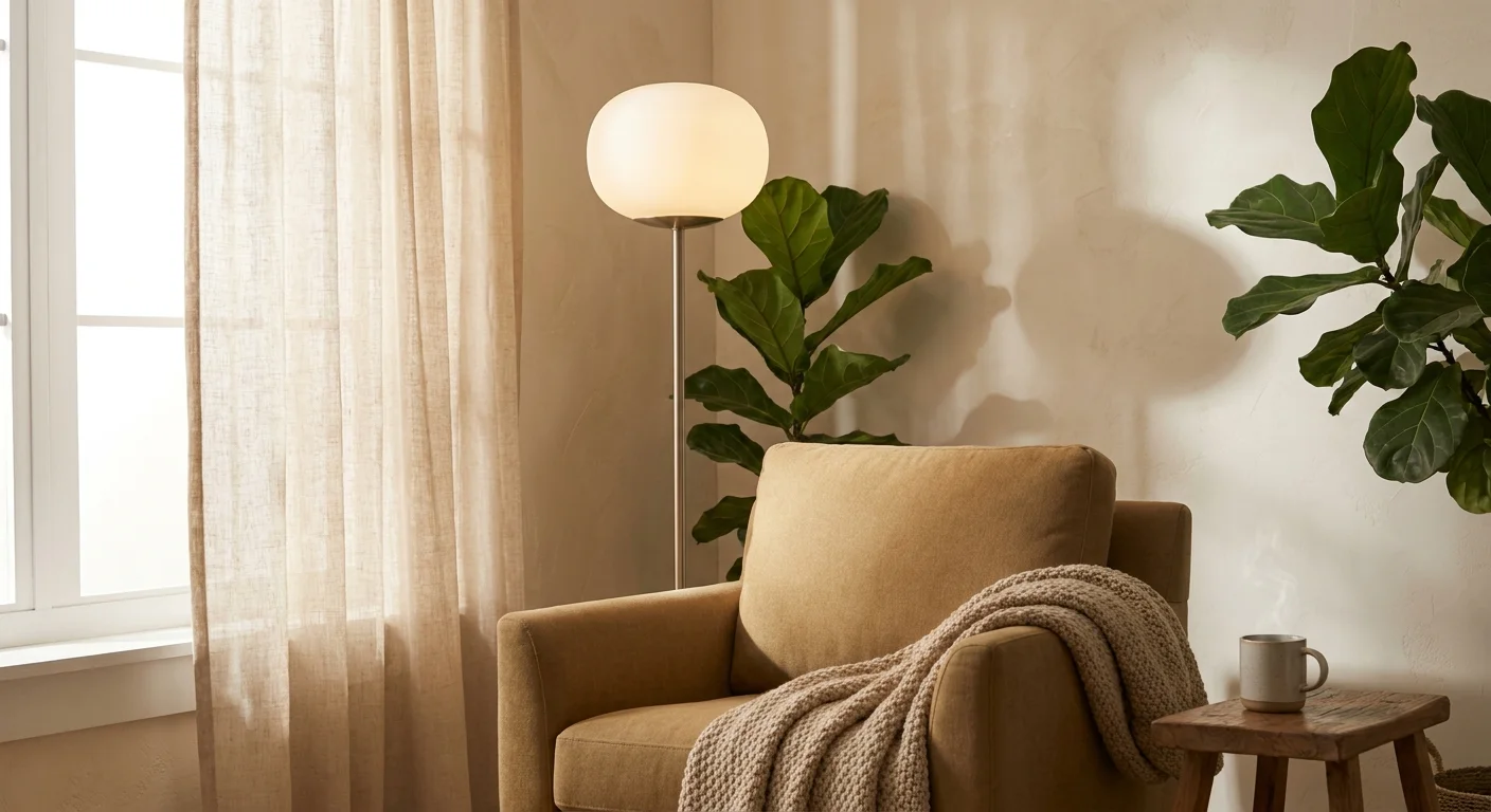
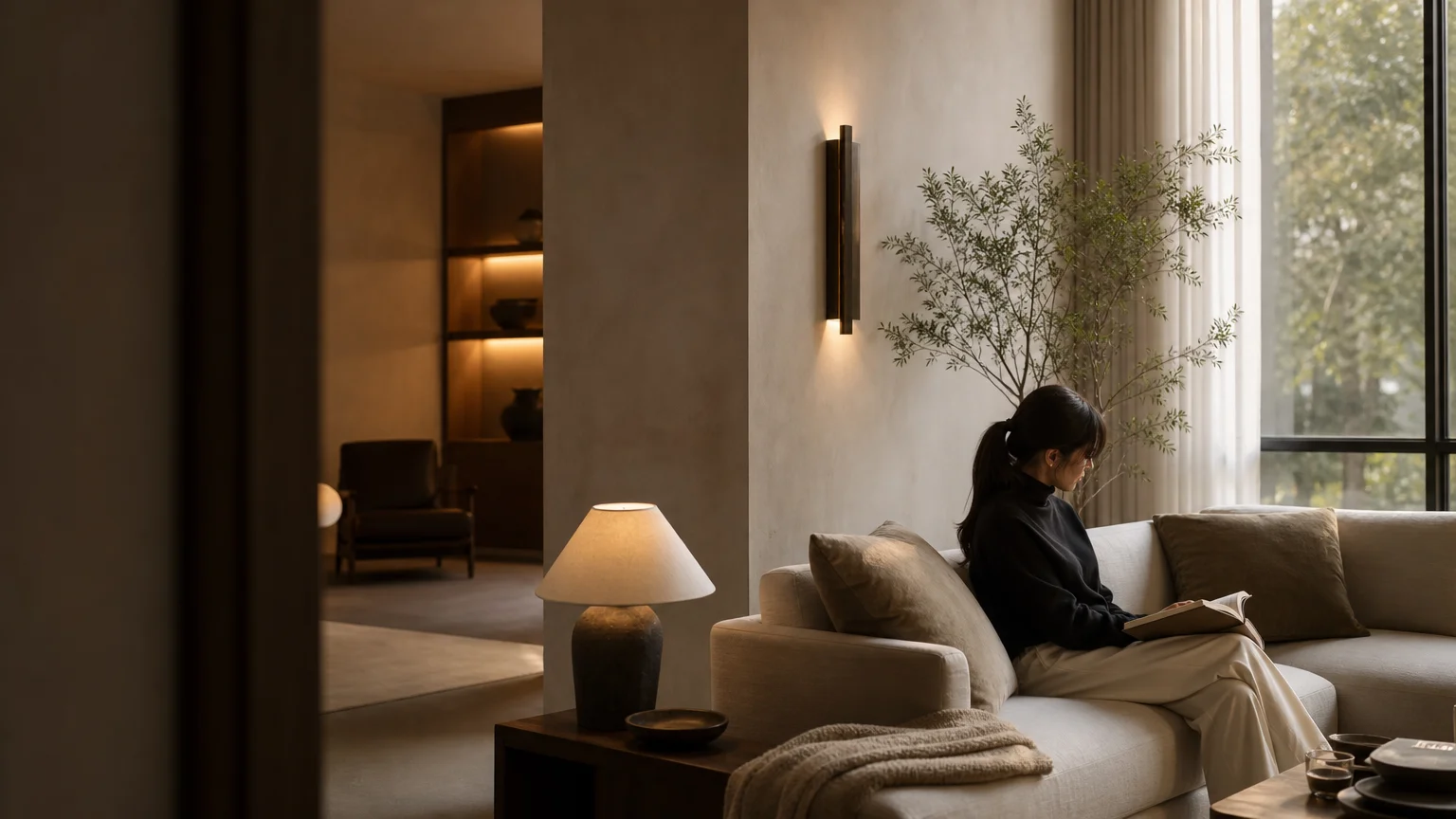
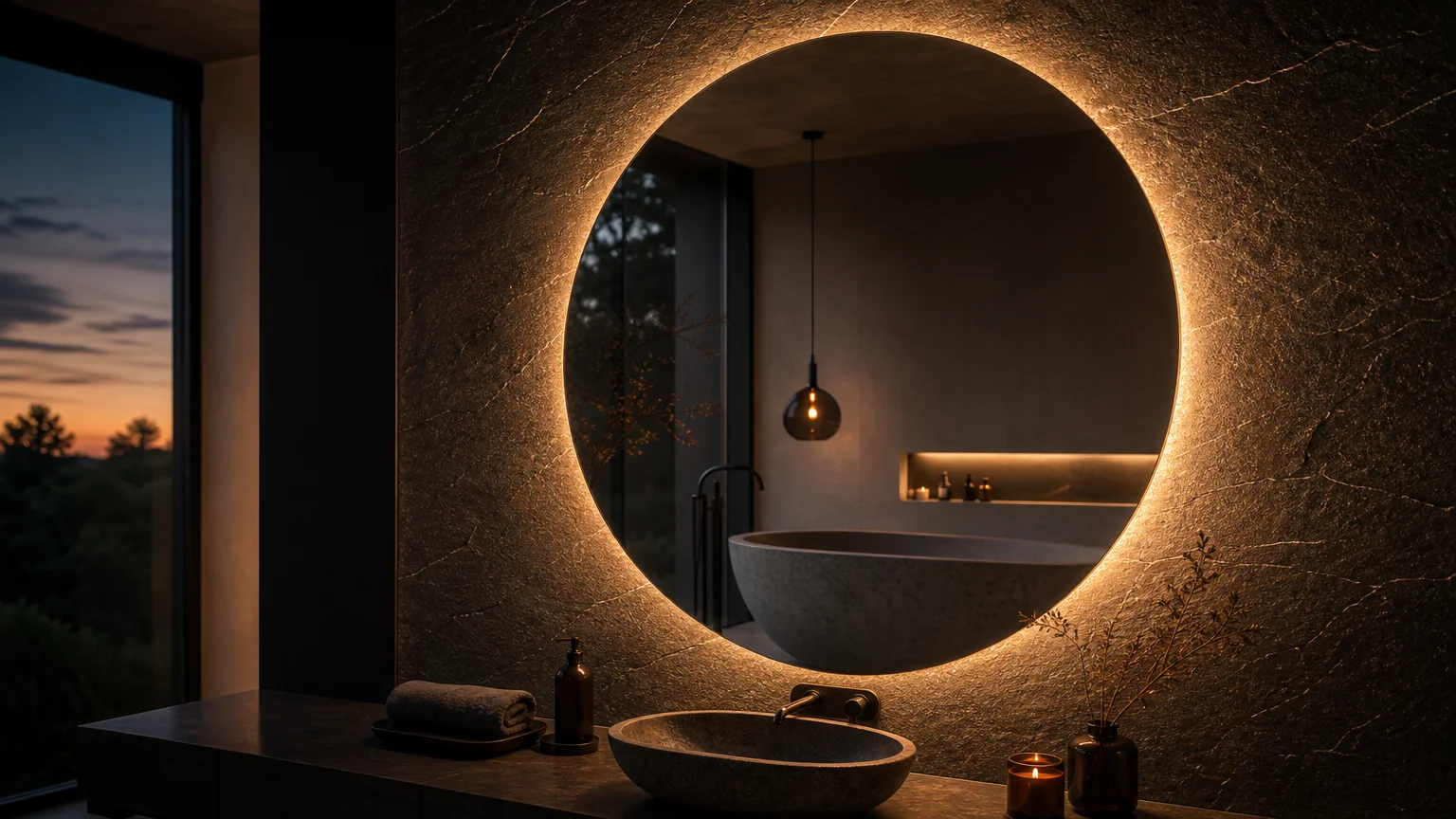
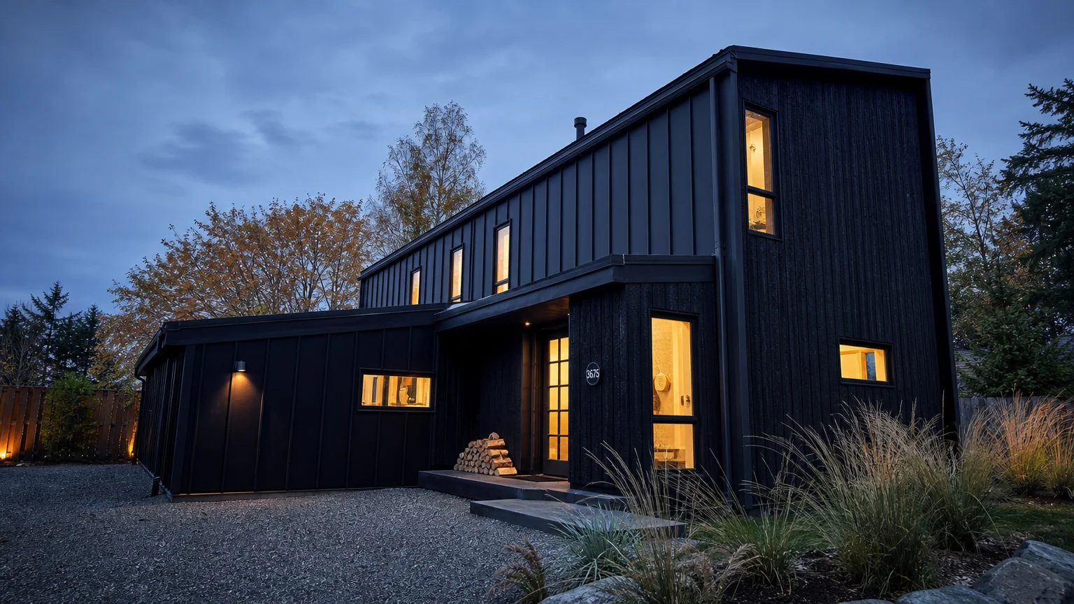
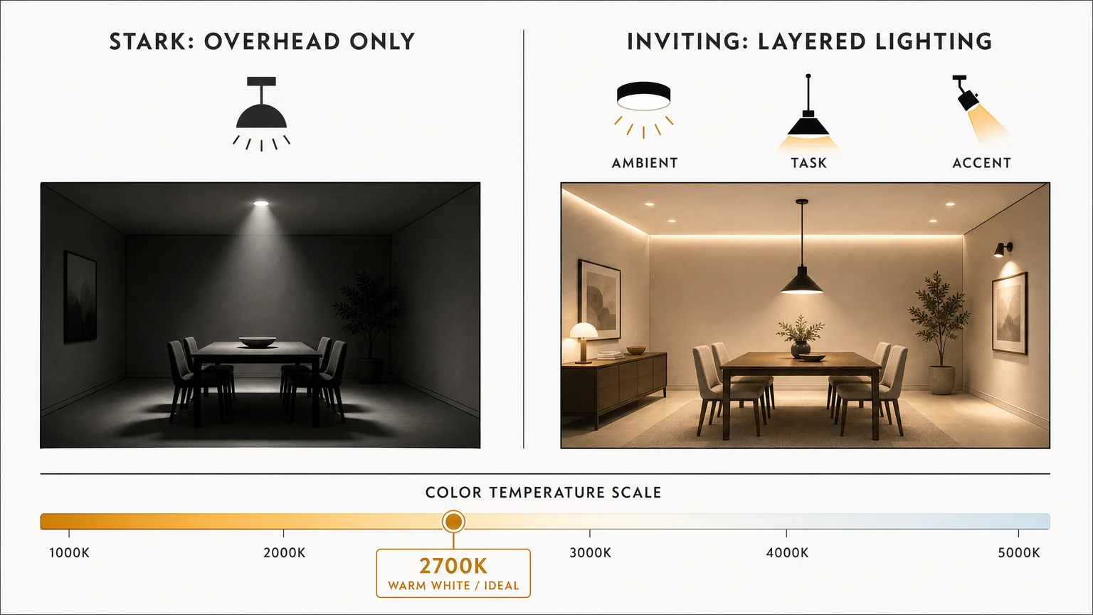
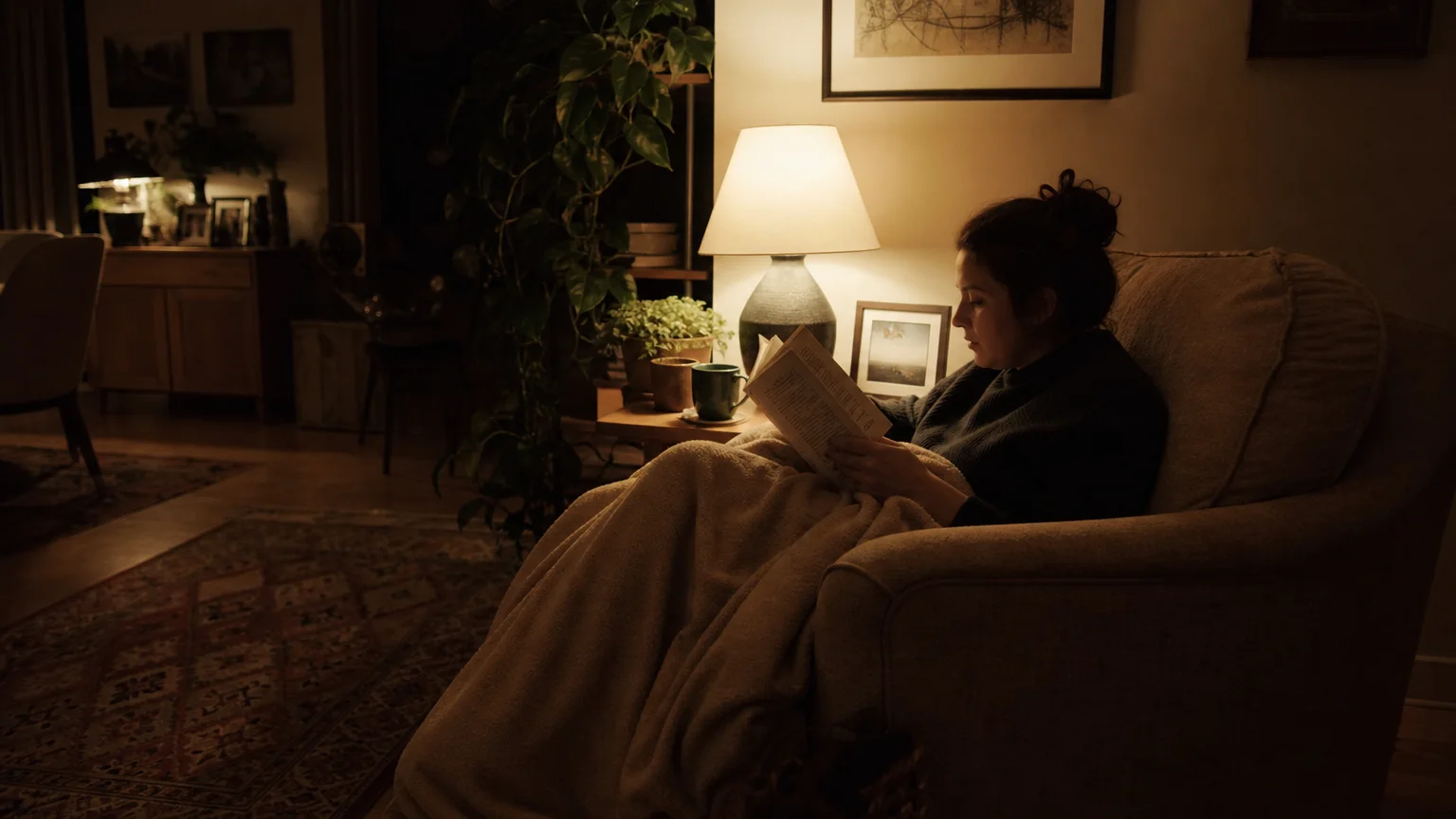
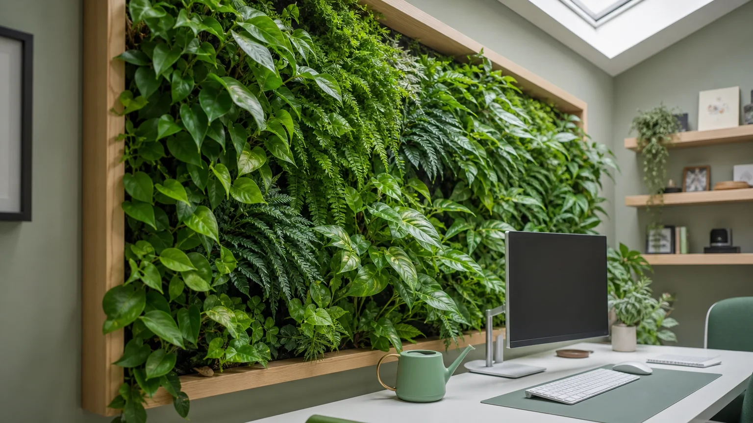
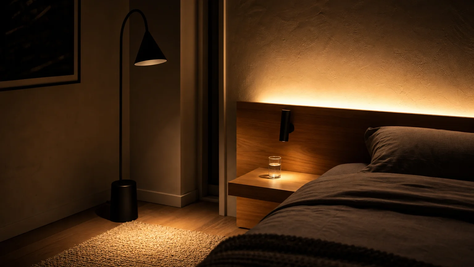
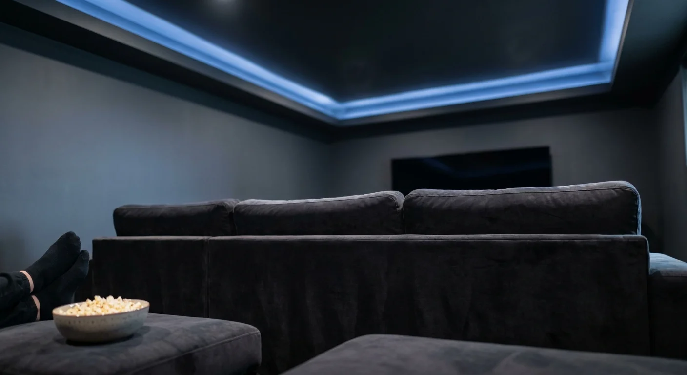
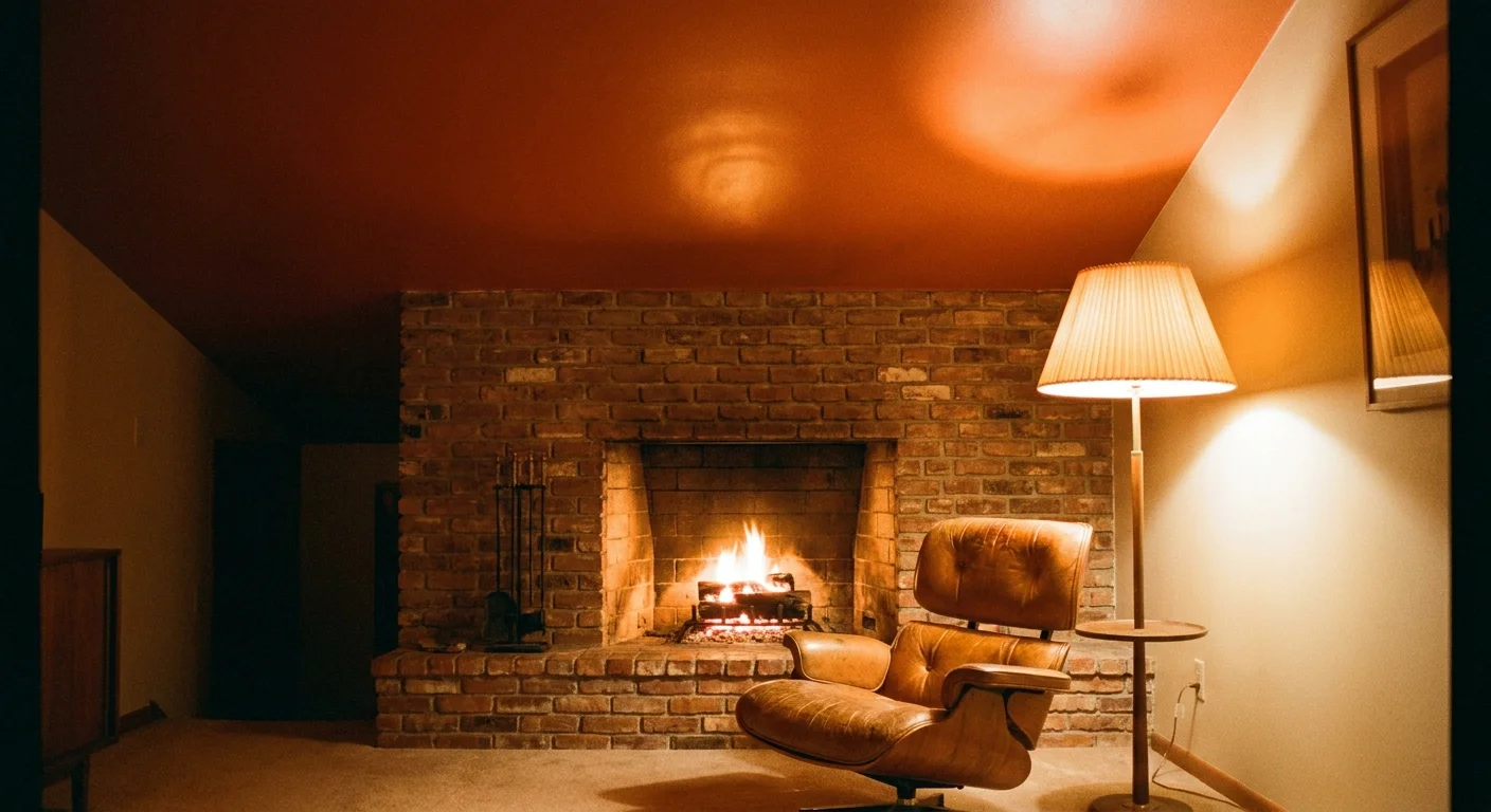
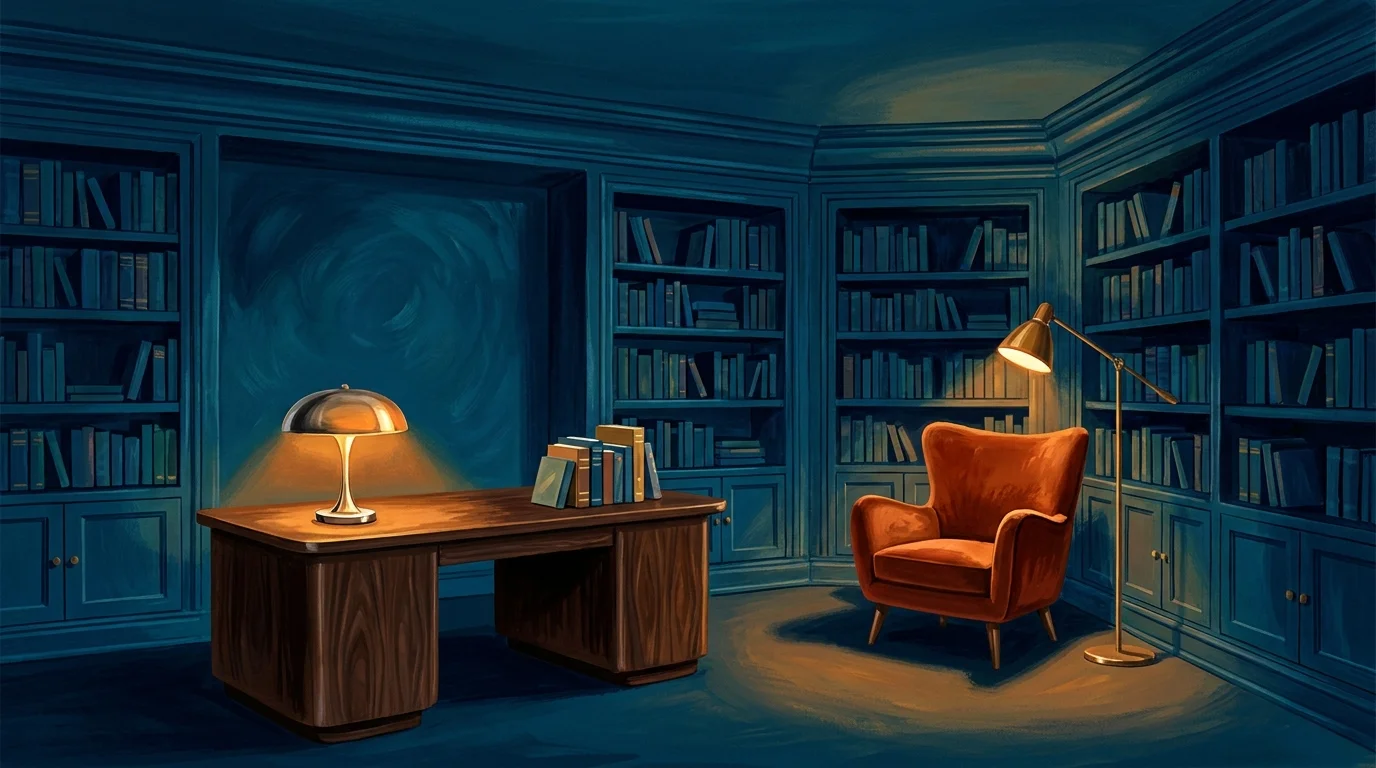
Trend #3: Layered, Anti-Glare Biophilic Lighting
A beautifully illuminated room dictates the mood, highlights your architectural features, and ensures everyday safety. Aging eyes require up to three times more light to discern details than younger eyes, but simply increasing bulb wattage creates harsh, blinding glare. The current shift toward layered, biophilic lighting resolves this issue by mimicking natural daylight patterns and distributing illumination evenly across multiple sources.
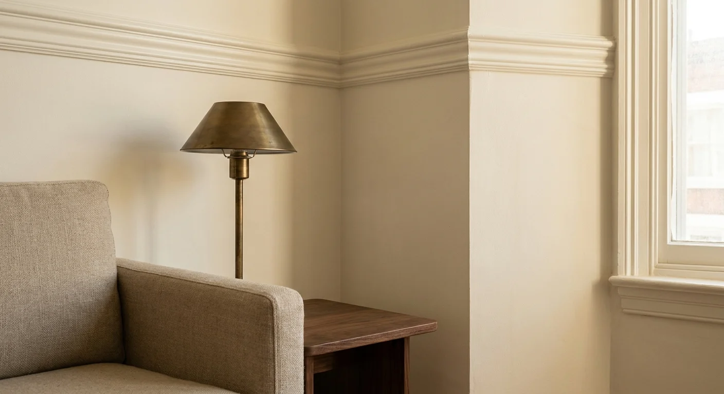
You must abandon the reliance on a single, blazing overhead fixture. Instead, construct a sophisticated lighting scheme utilizing three distinct layers: ambient, task, and accent lighting. Install dimmable LED cove lighting to wash your ceilings with a soft, indirect glow that illuminates the room without reflecting off polished surfaces. Supplement this ambient layer with articulated, brass reading lamps near seating areas and motion-activated, illuminated toe-kicks beneath bathroom vanities and kitchen cabinetry.
Integrate smart-home technology to elevate this setup. Automated lighting systems can shift their color temperature throughout the day—from crisp, invigorating daylight tones in the morning to warm, amber hues in the evening. This circadian lighting strategy regulates sleep cycles, reduces eye strain, and completely removes the burden of navigating dark corridors at night. You gain a dramatic, gallery-like atmosphere that discreetly safeguards your mobility.
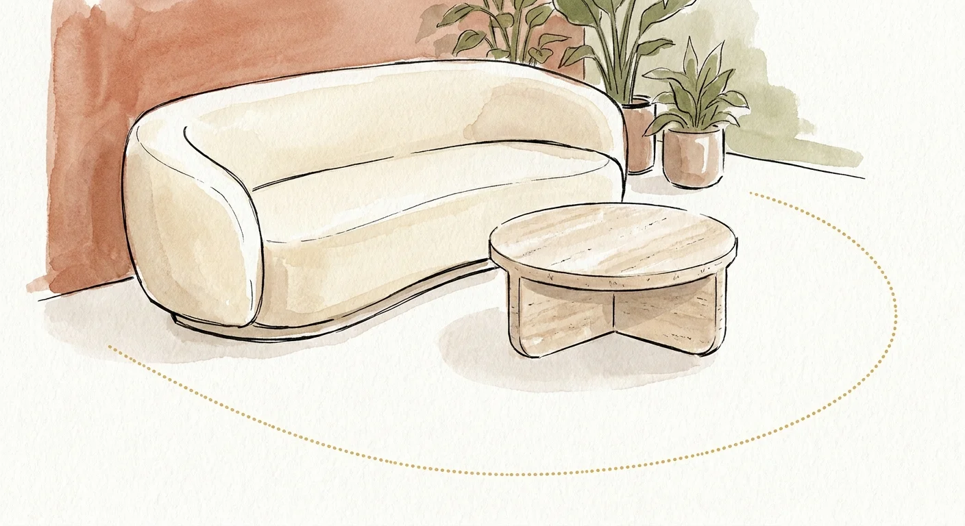
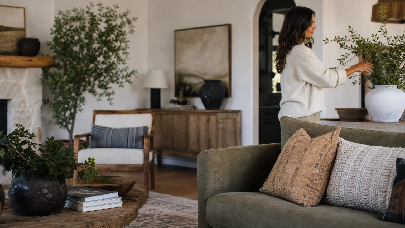
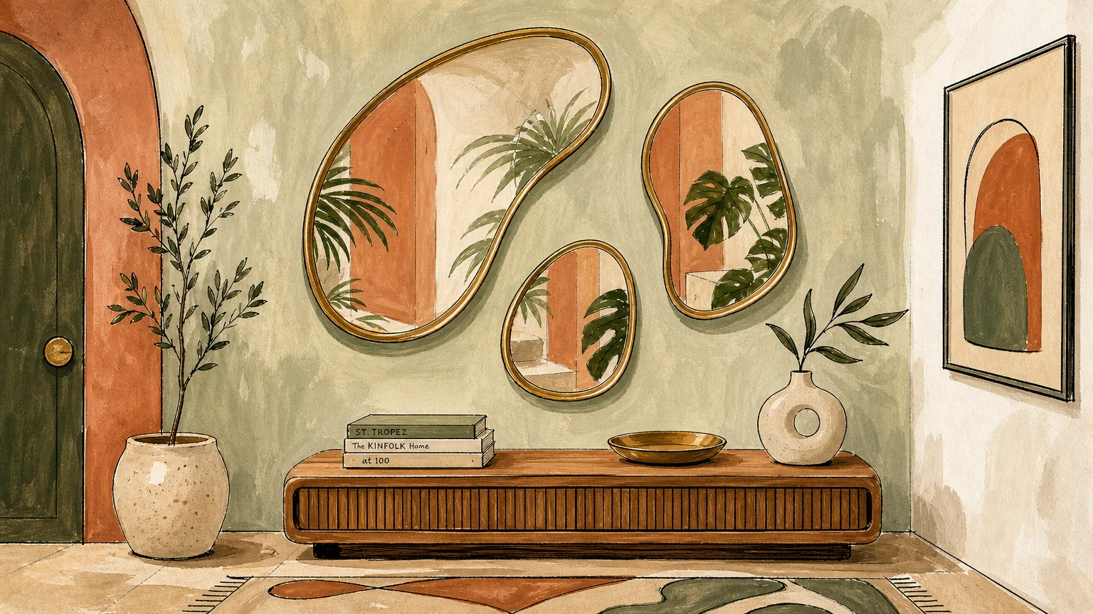
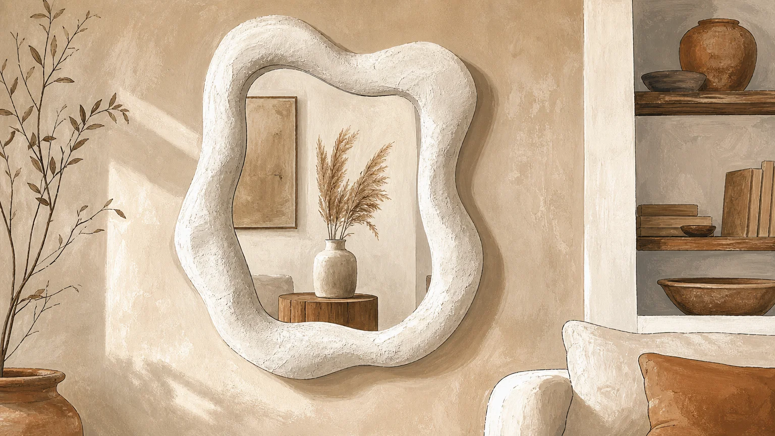
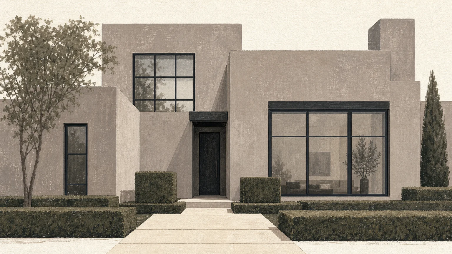
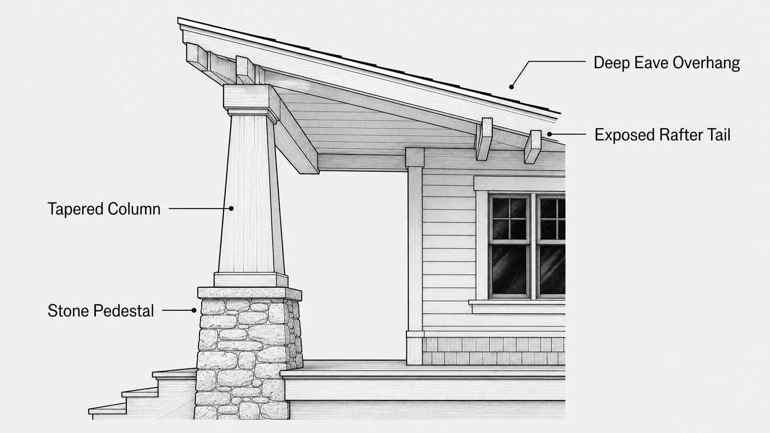
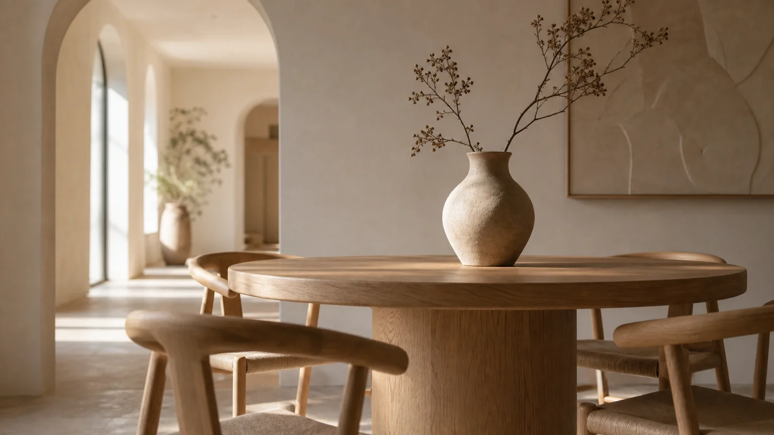
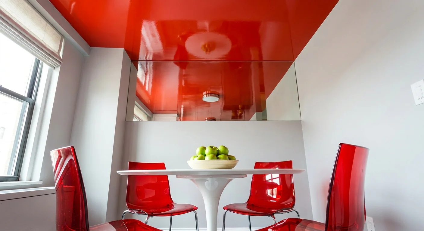
Trend #4: Curved Silhouettes and Fluid Navigation
Organic modernism continues to reshape the interior design landscape, replacing rigid geometry with softened, natural forms. The proliferation of curved silhouettes in both architecture and furniture represents a brilliant intersection of avant-garde style and practical safety. Sharp corners on coffee tables, heavily structured armchairs, and squared-off kitchen islands pose significant bruising and injury risks as we age.
Transform your living spaces by prioritizing furniture with rounded, enveloping edges. A kidney-shaped bouclé sectional paired with an oversized, upholstered ottoman completely eradicates sharp impact points in the center of your living room. In the dining room, an oval or pedestal-style dining table facilitates better conversation flow while providing ample clearance for comfortable movement around the perimeter.
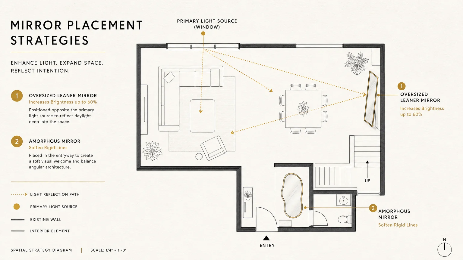
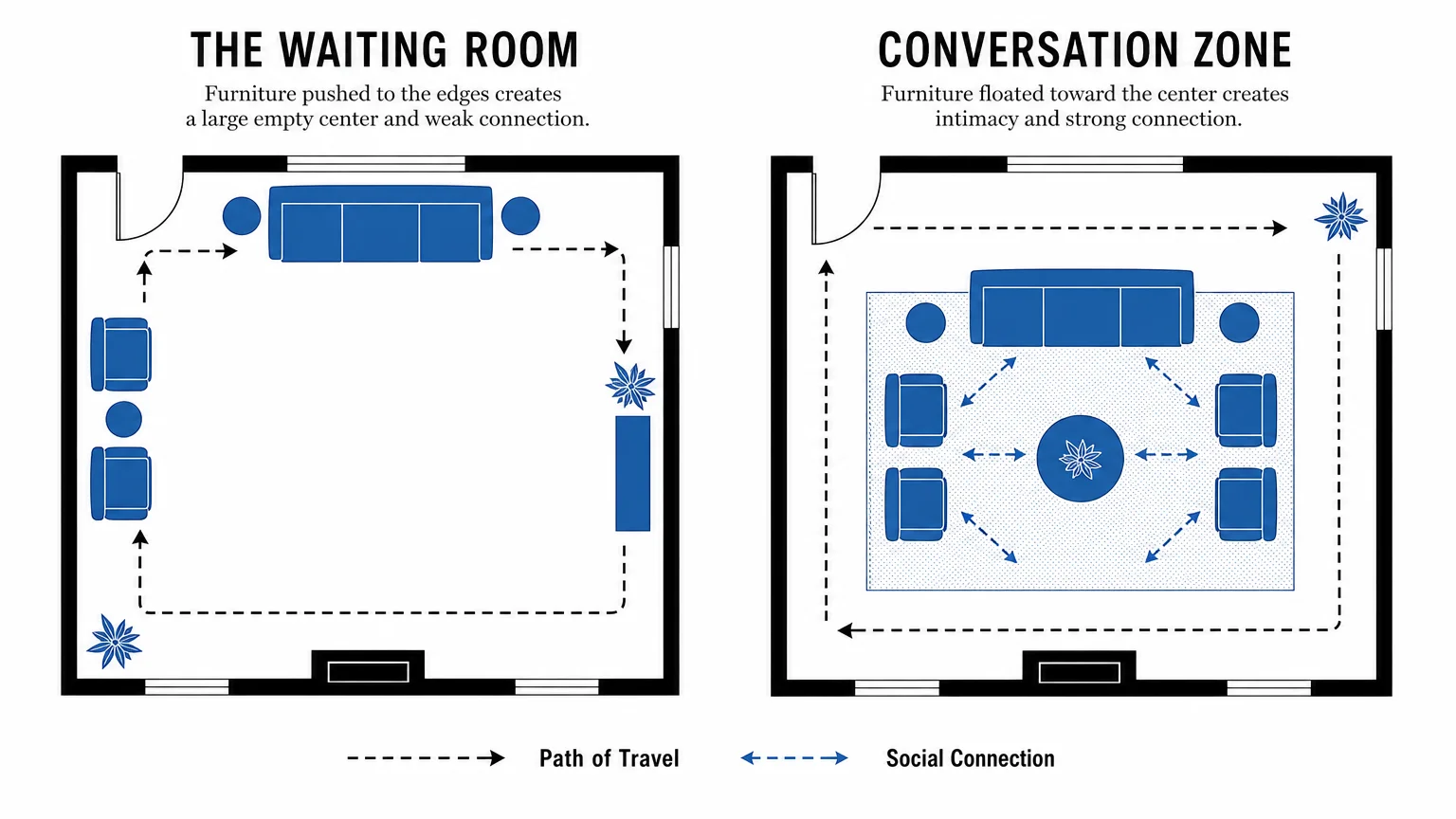
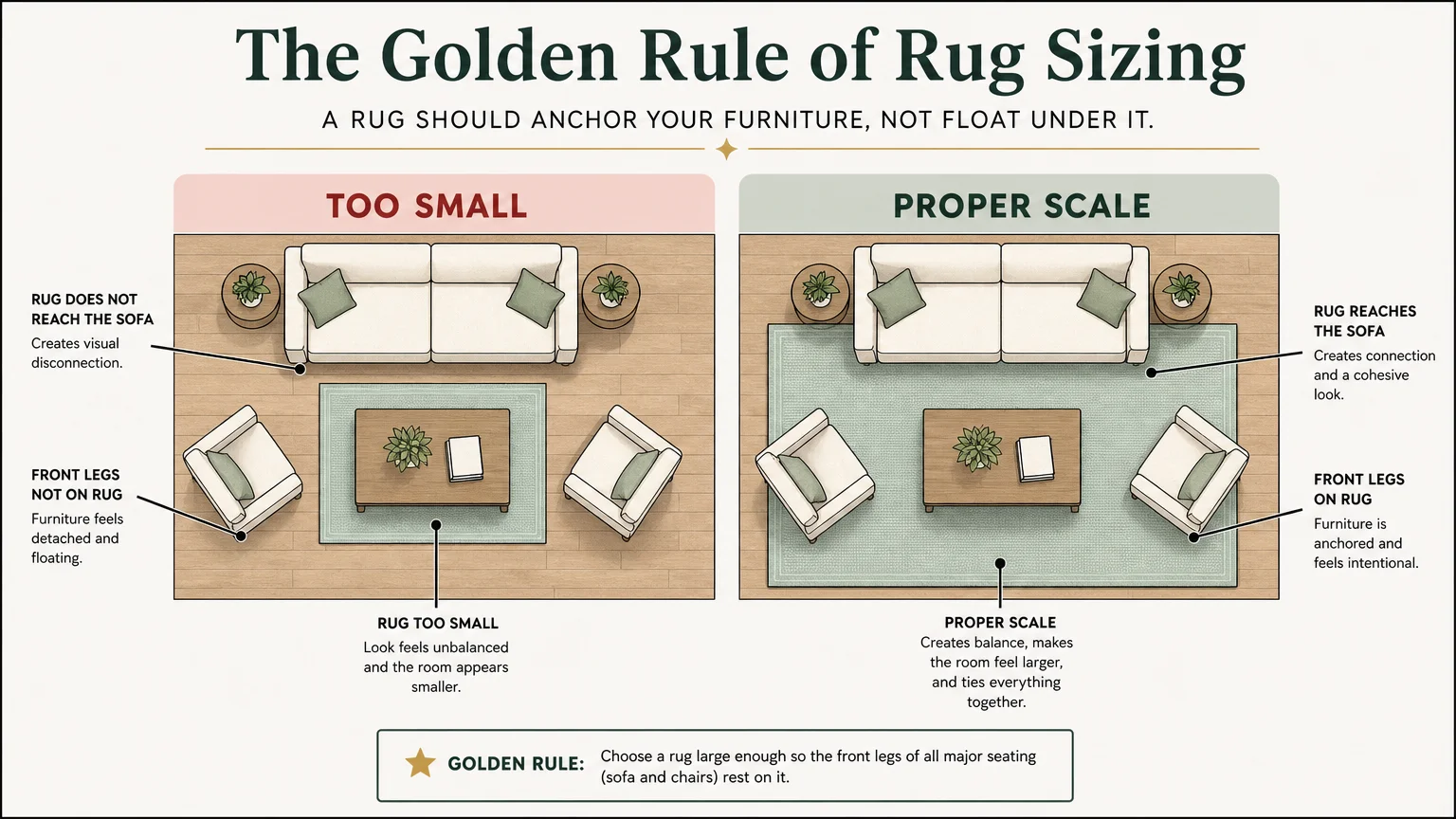
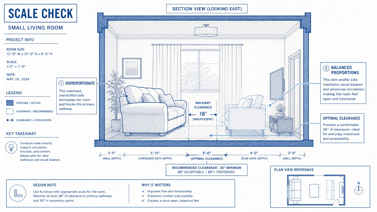
This commitment to fluidity extends to your spatial planning. You should design your furniture layout to support generous, sweeping pathways rather than tight, right-angled corridors. Industry standards recommend maintaining at least 42 to 48 inches of clearance between major furniture groupings. By embracing rounded archways and curvilinear furnishings, you generate a relaxed, highly sophisticated energy in your home that inherently supports unobstructed, hazard-free navigation.
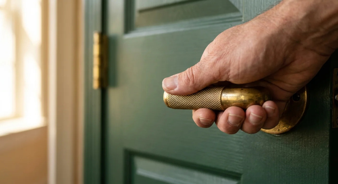
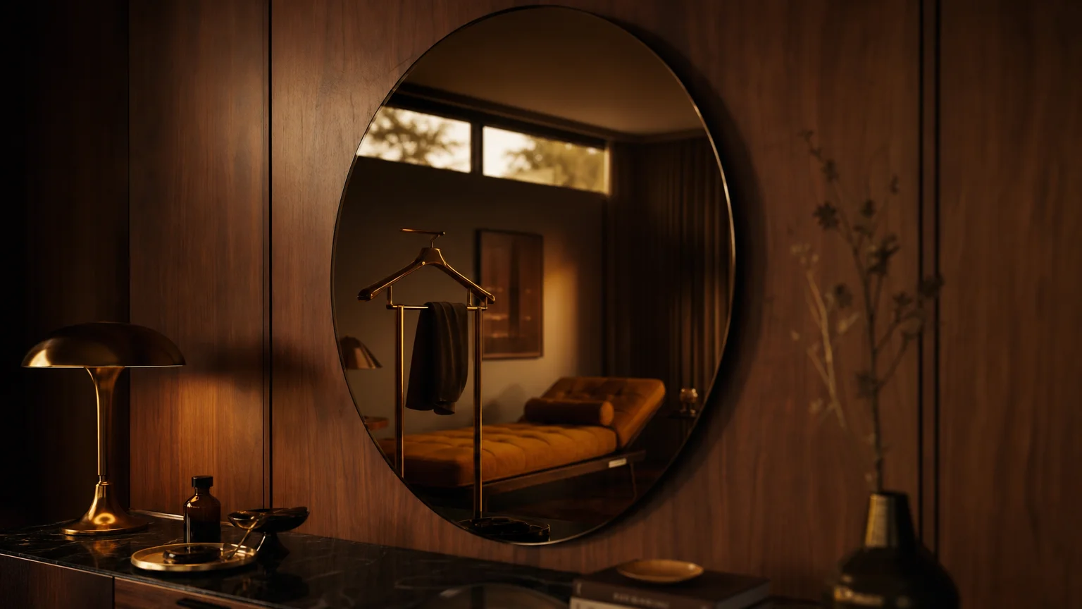
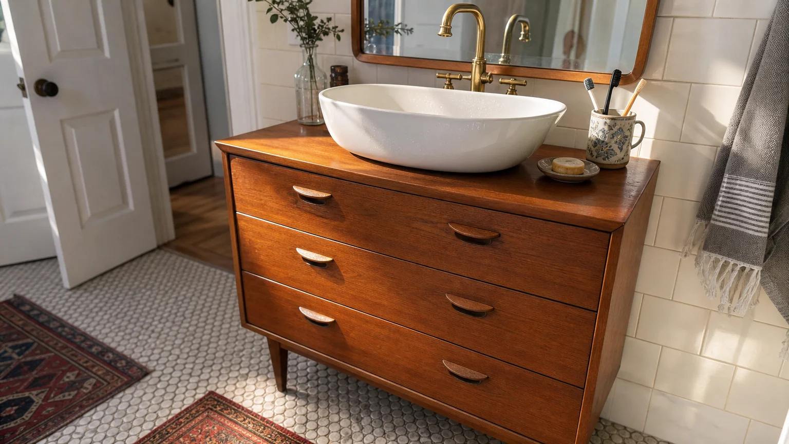
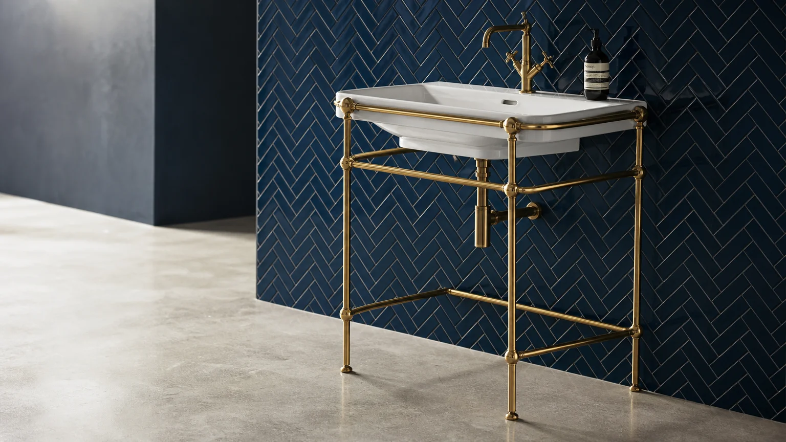
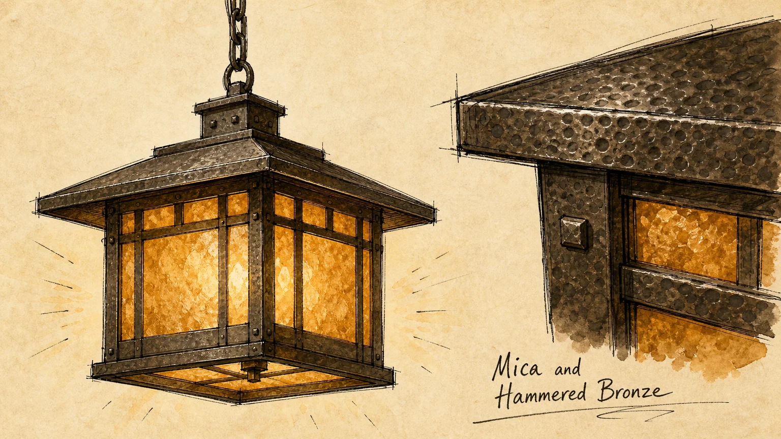
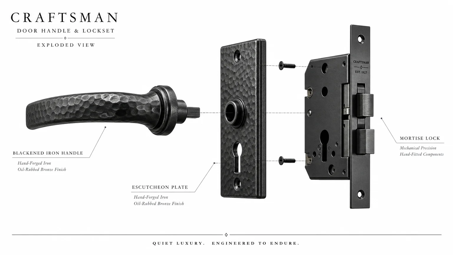
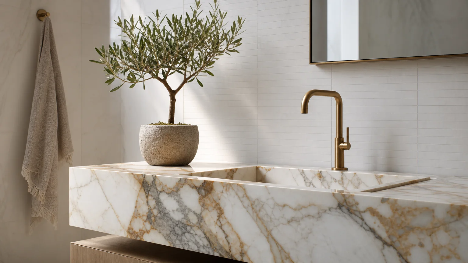
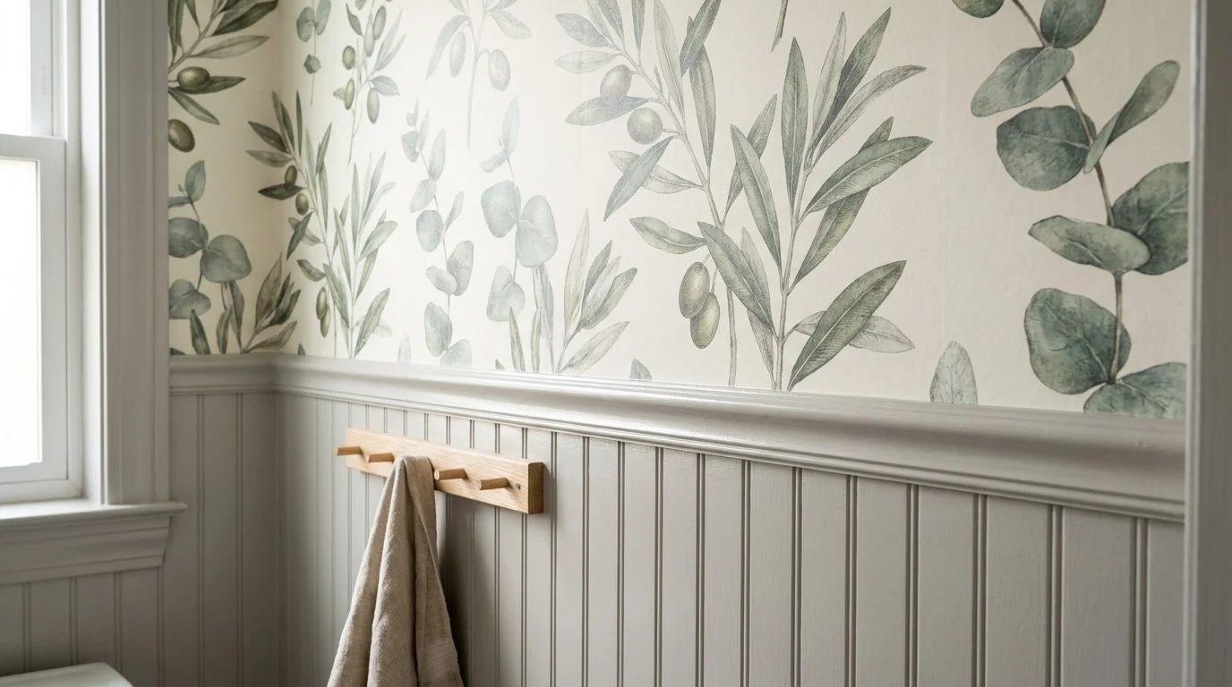
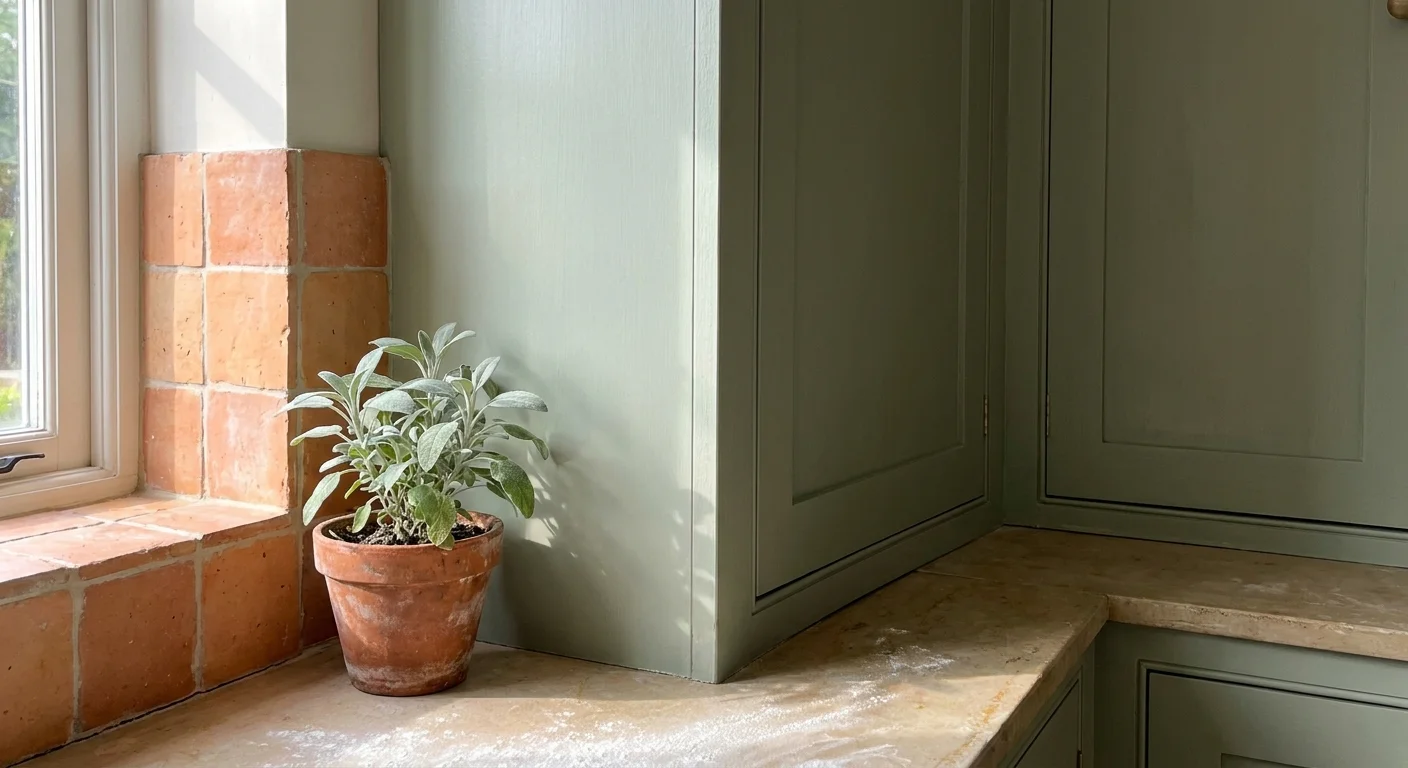
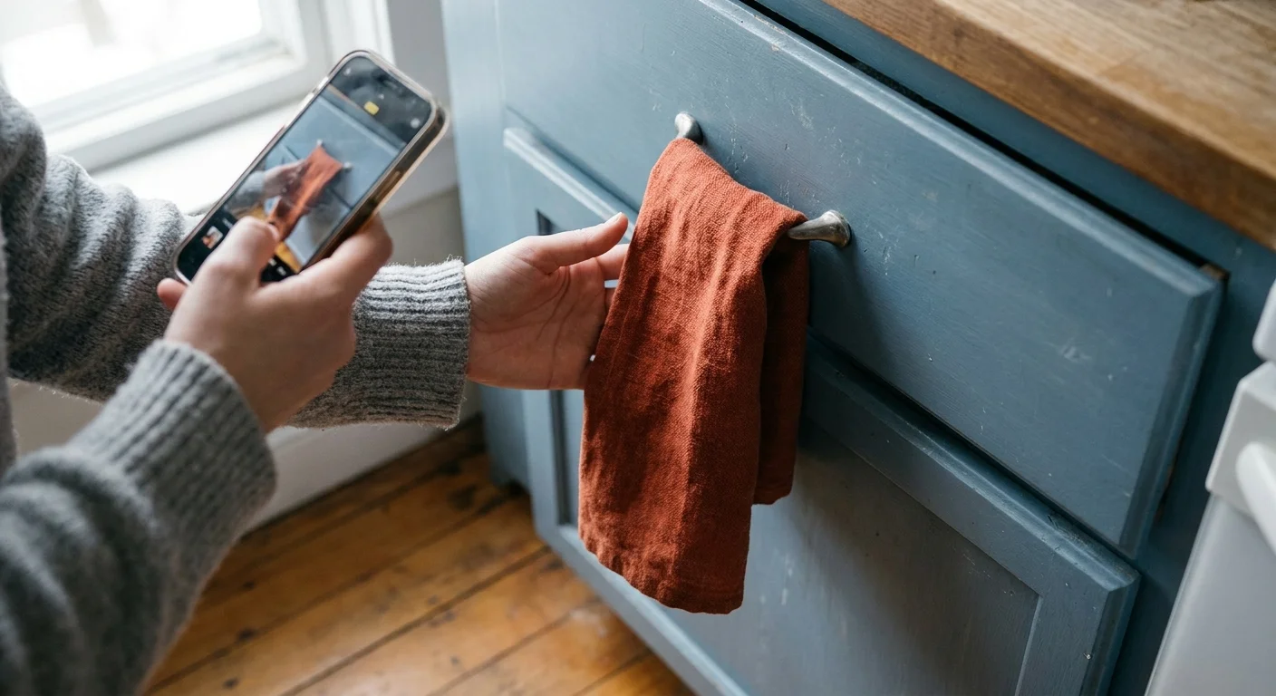
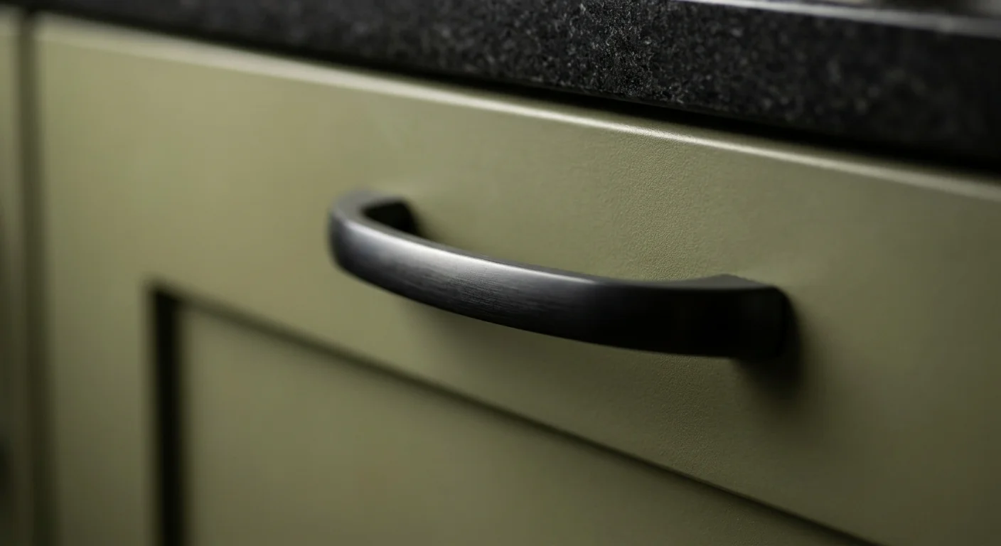
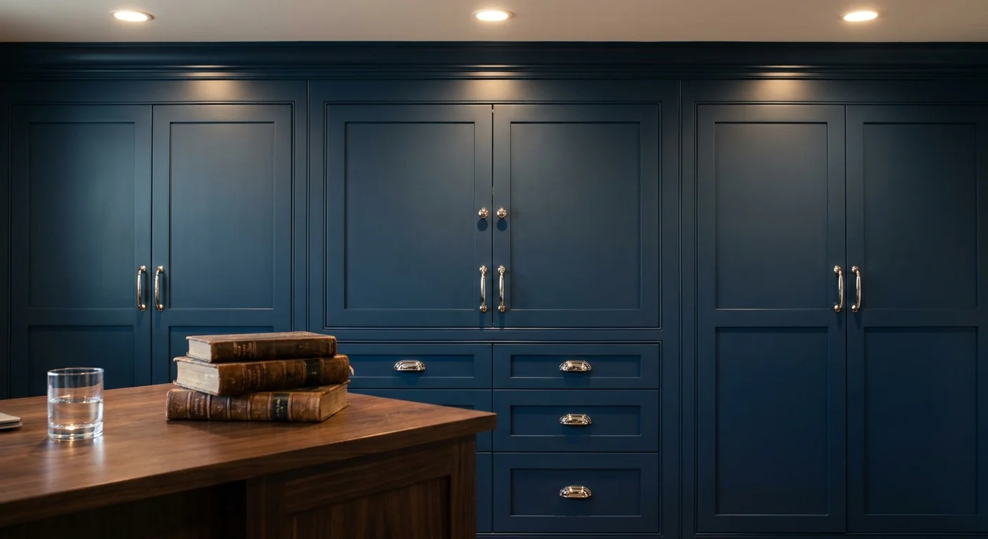
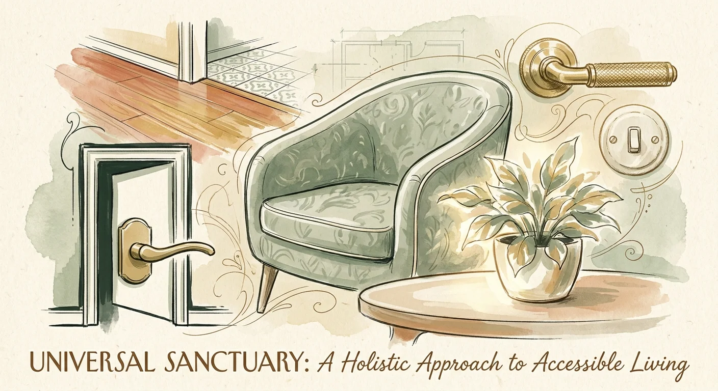
Trend #5: Tactile, Ergonomic Hardware Upgrades
True luxury resides in the details you touch every day. The hardware you select for your doors, cabinets, and plumbing fixtures dramatically influences the daily functionality of your home. Traditional round doorknobs and minuscule cabinet pulls require tight gripping and painful twisting motions, which can quickly become burdensome for hands dealing with arthritis or reduced dexterity.
The design world has fully embraced substantial, tactile hardware that effortlessly upgrades your home’s accessibility. Replace standard doorknobs with heavy, lever-style handles. Choose wide, easy-to-grasp D-pulls or cup pulls for your kitchen cabinetry. In the bathroom and kitchen, opt for touchless faucets or elegant, single-handle cross designs that allow you to control water flow and temperature with the gentle push of a wrist.
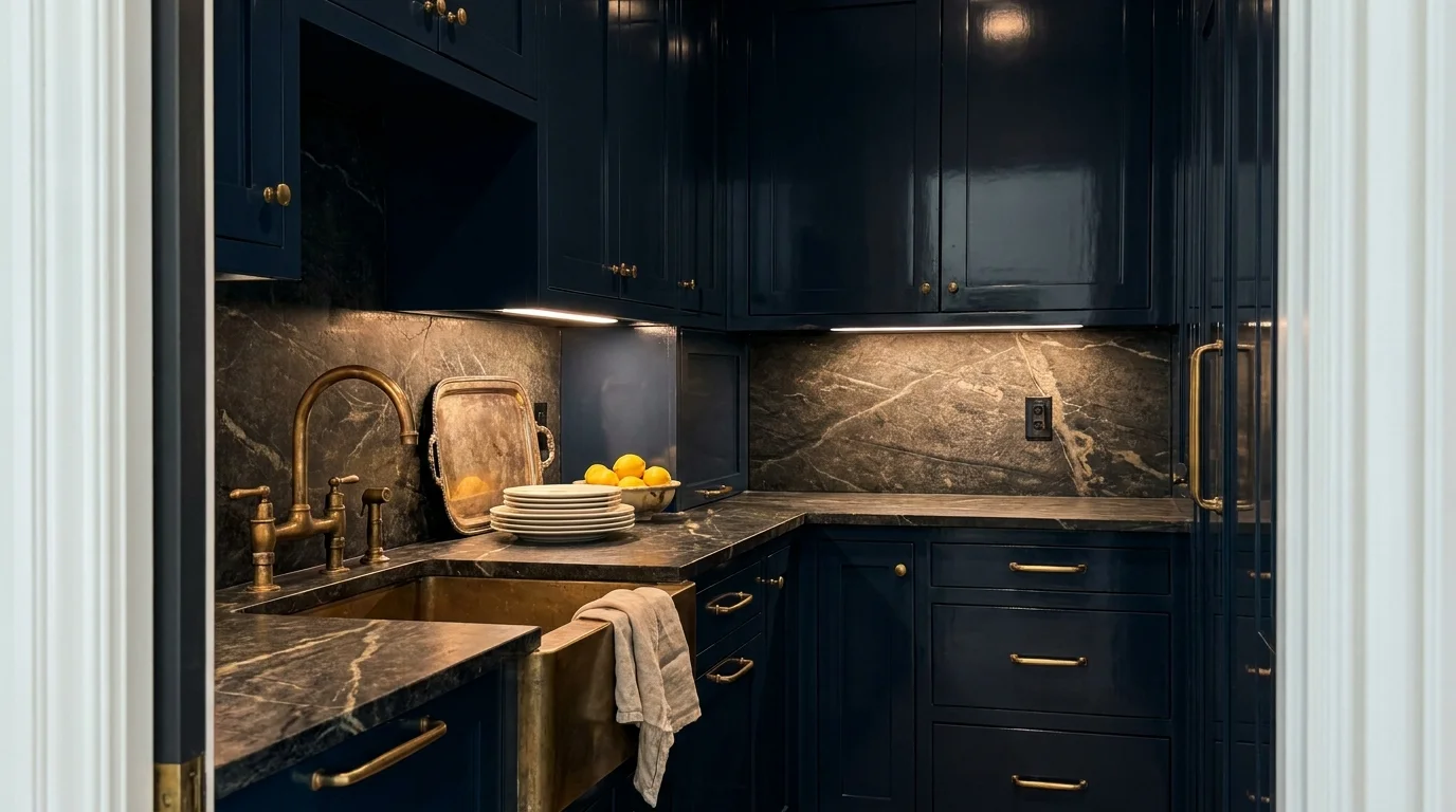
These ergonomic features do not require aesthetic compromise. Premium hardware manufacturers produce lever handles and pulls in exquisite finishes like unlacquered brass, which develops a rich, bespoke patina over time, or matte black, which provides excellent visual contrast against light-colored cabinetry. By treating your hardware as functional jewelry, you integrate invisible assistance into the very fabric of your rooms.
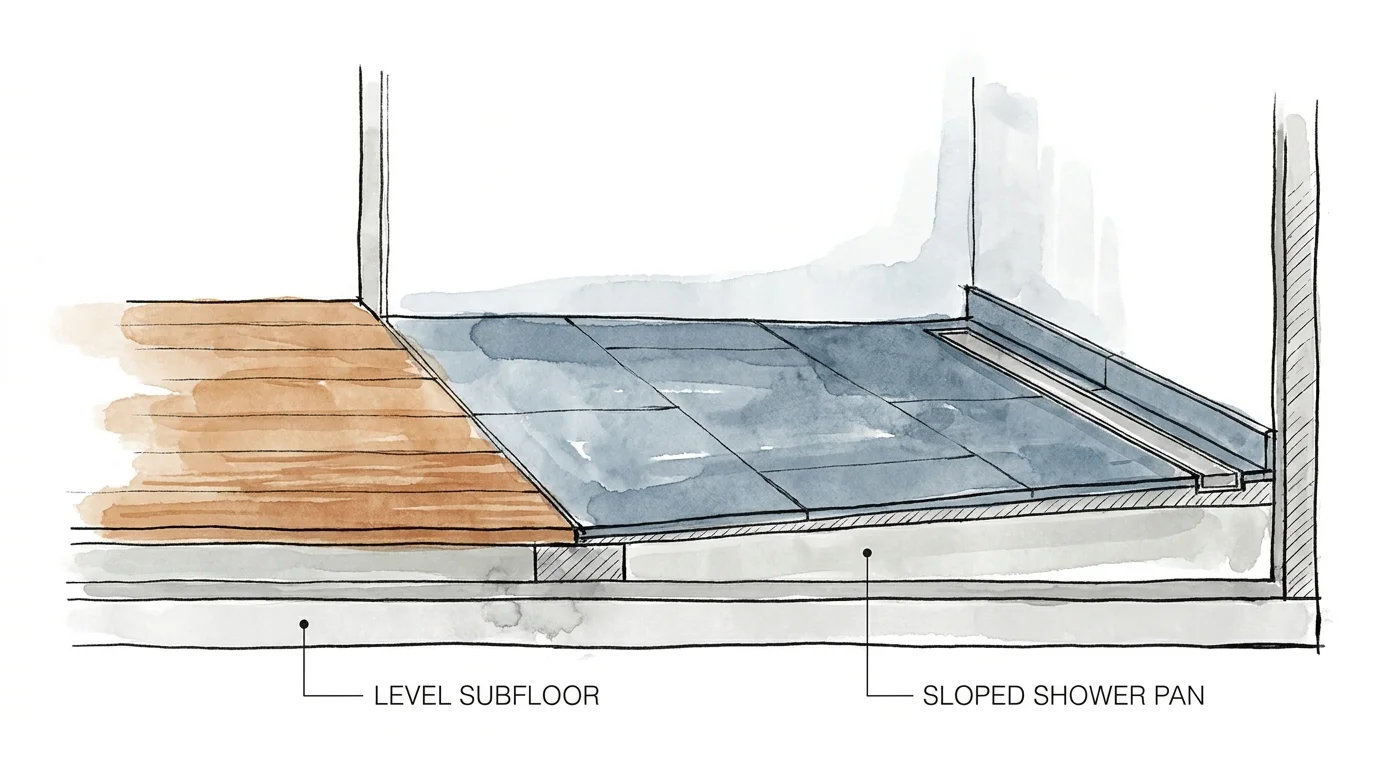
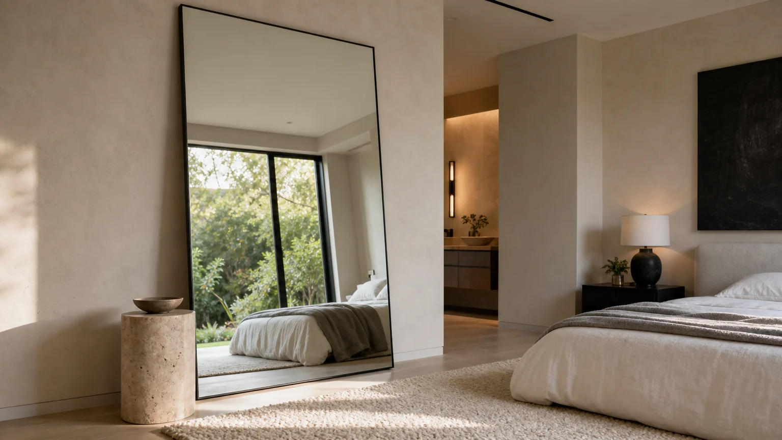
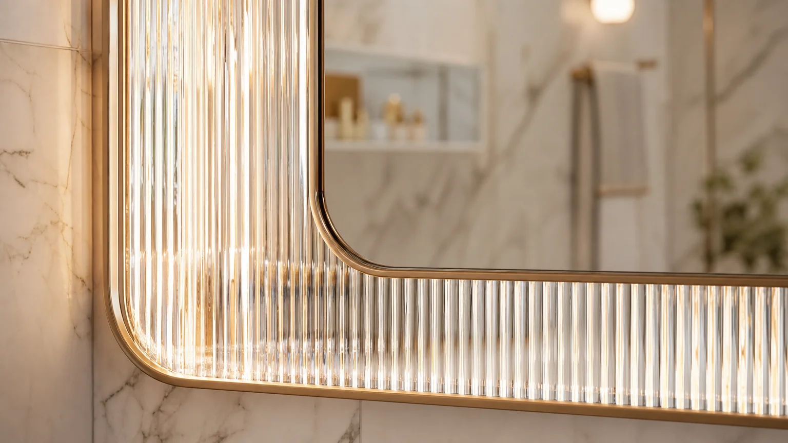
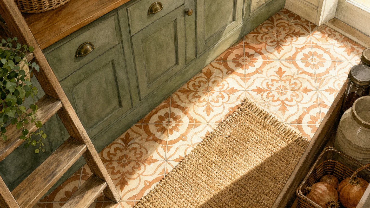
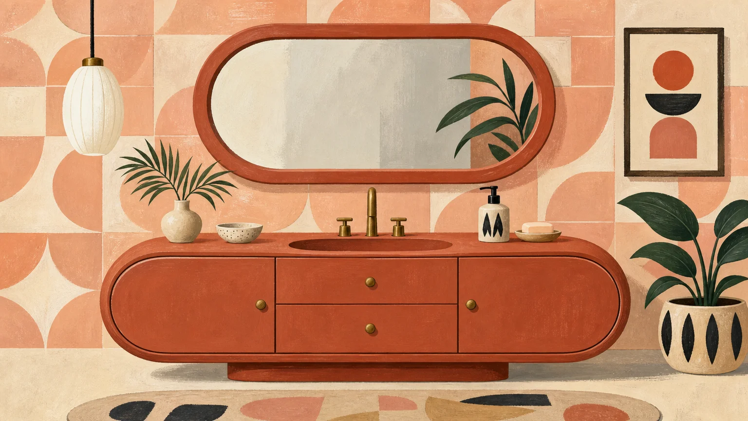
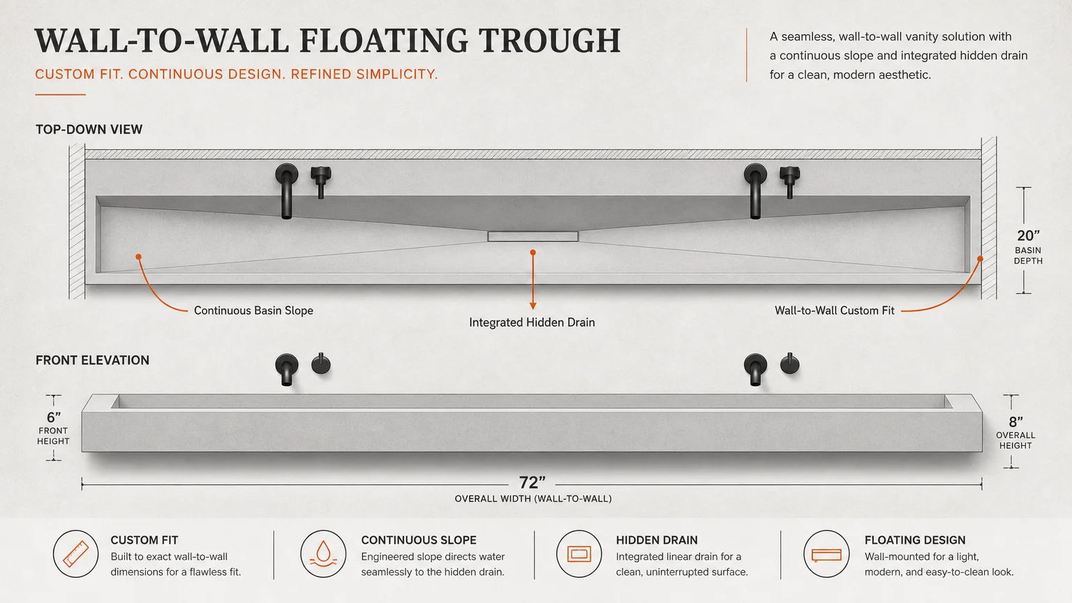
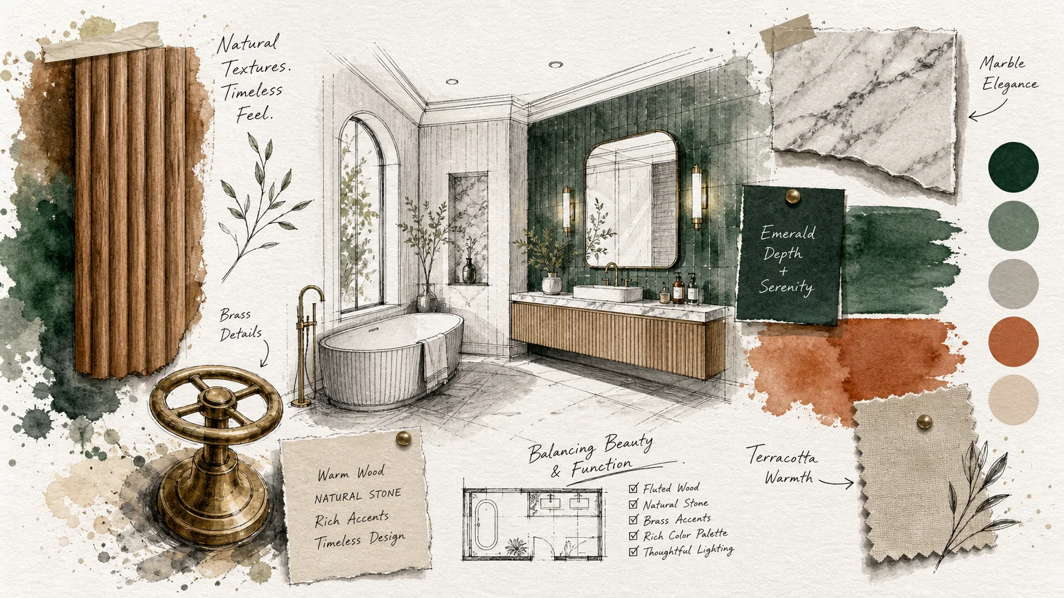
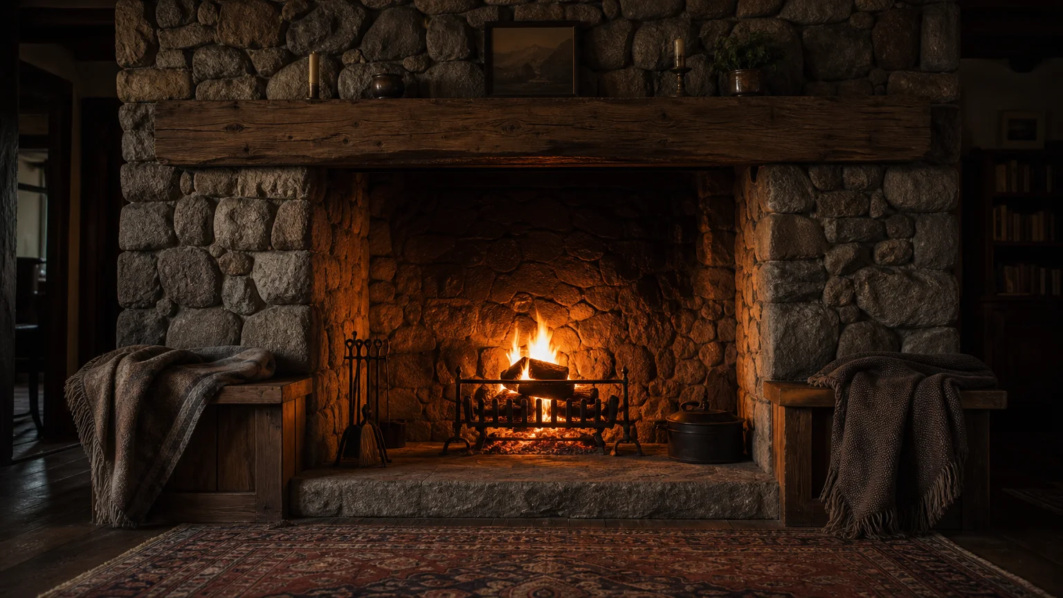
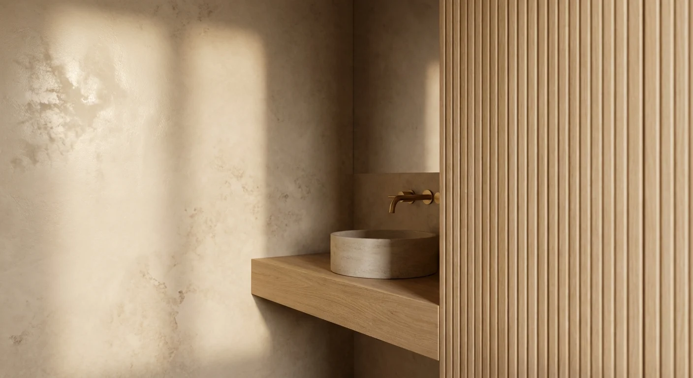
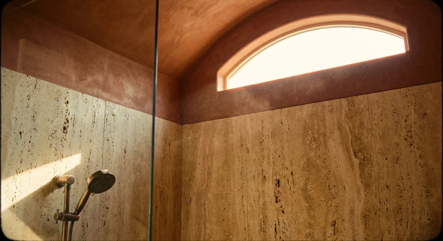
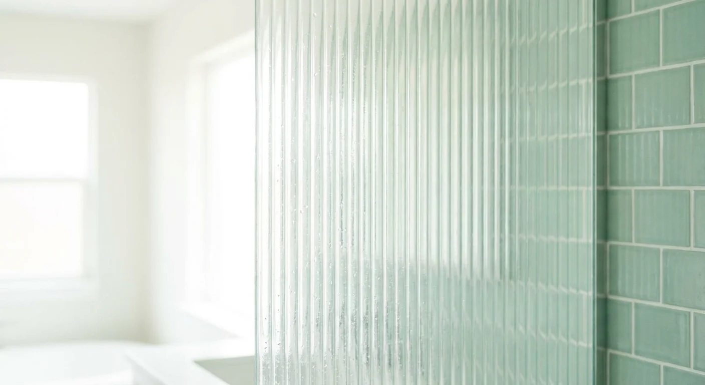
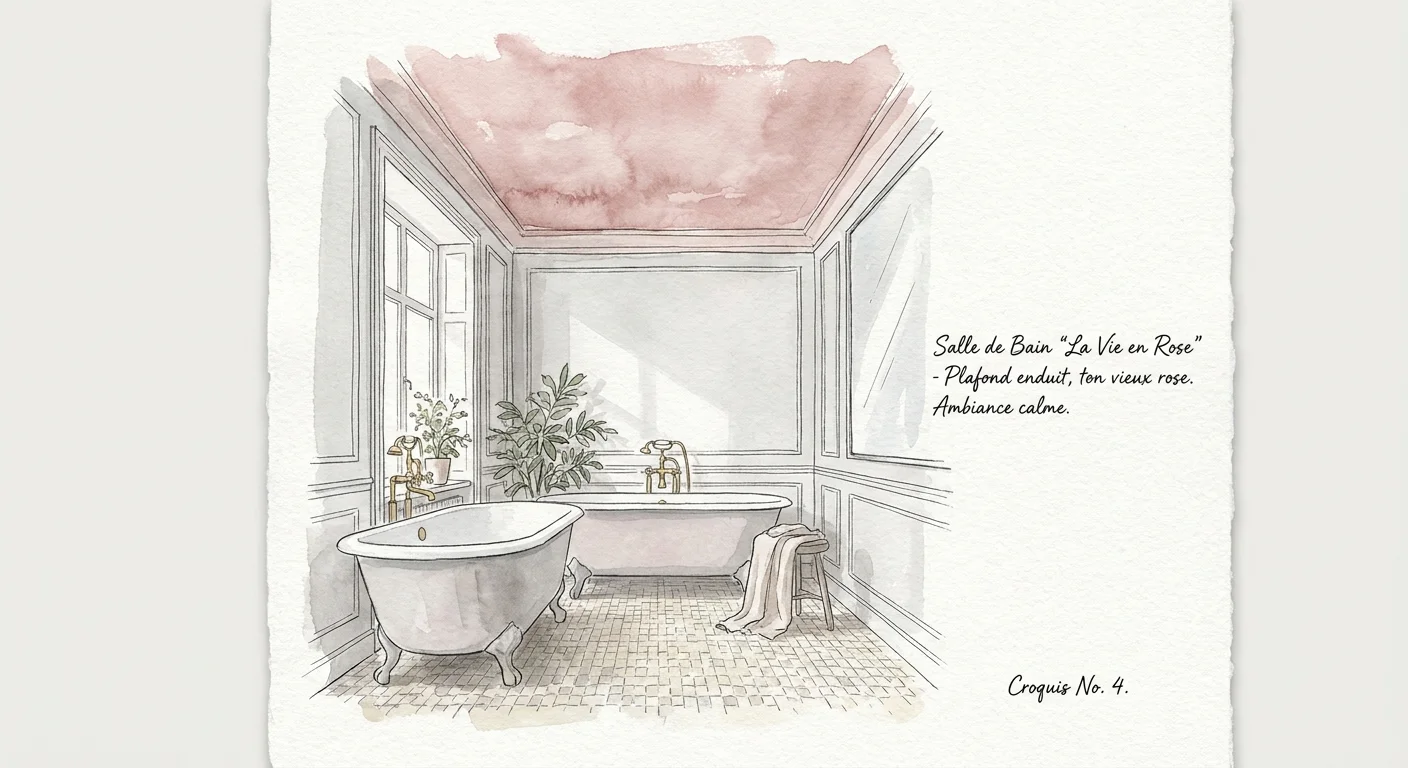
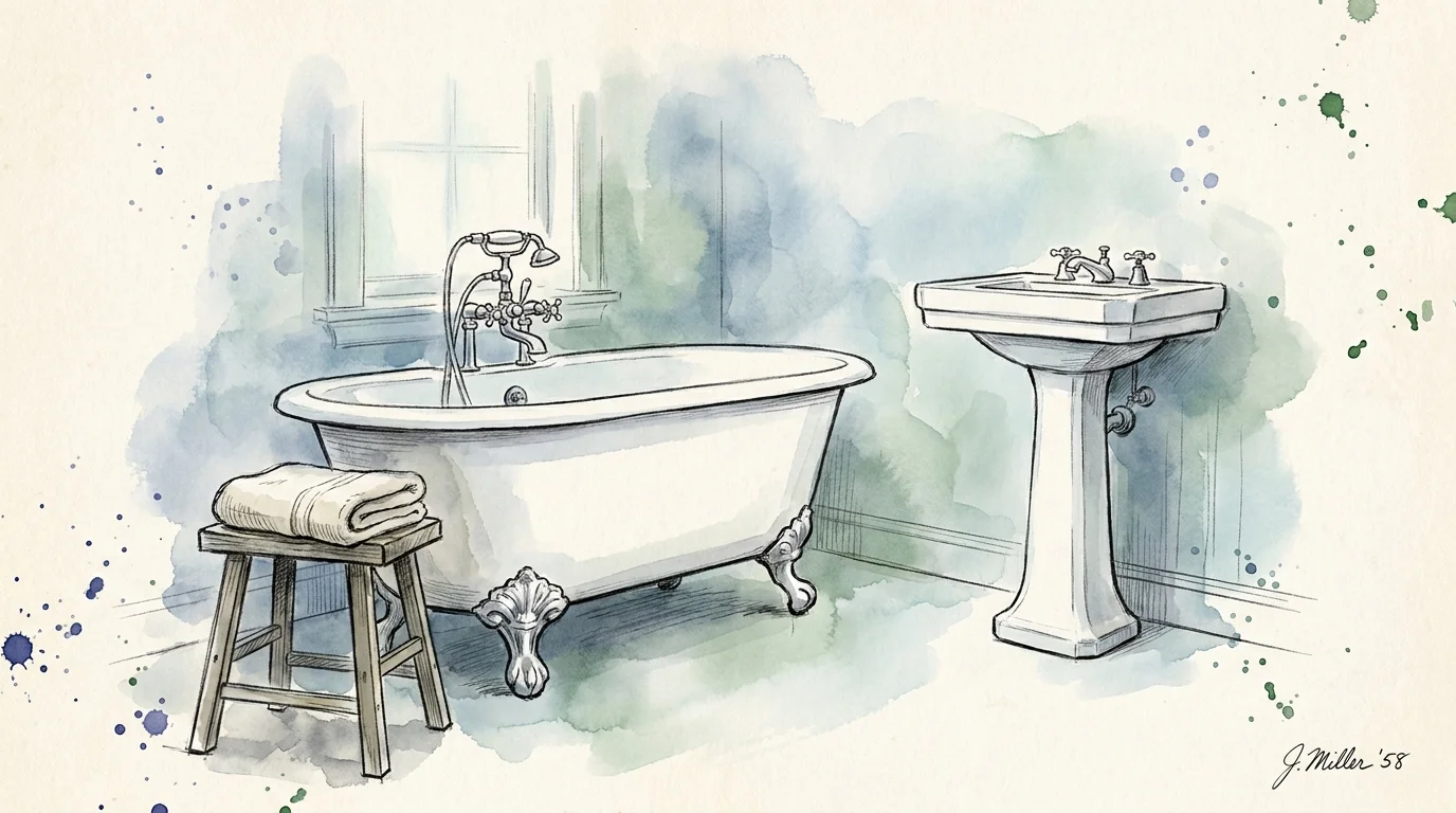
Trend #6: Elevated Curbless Wet Rooms
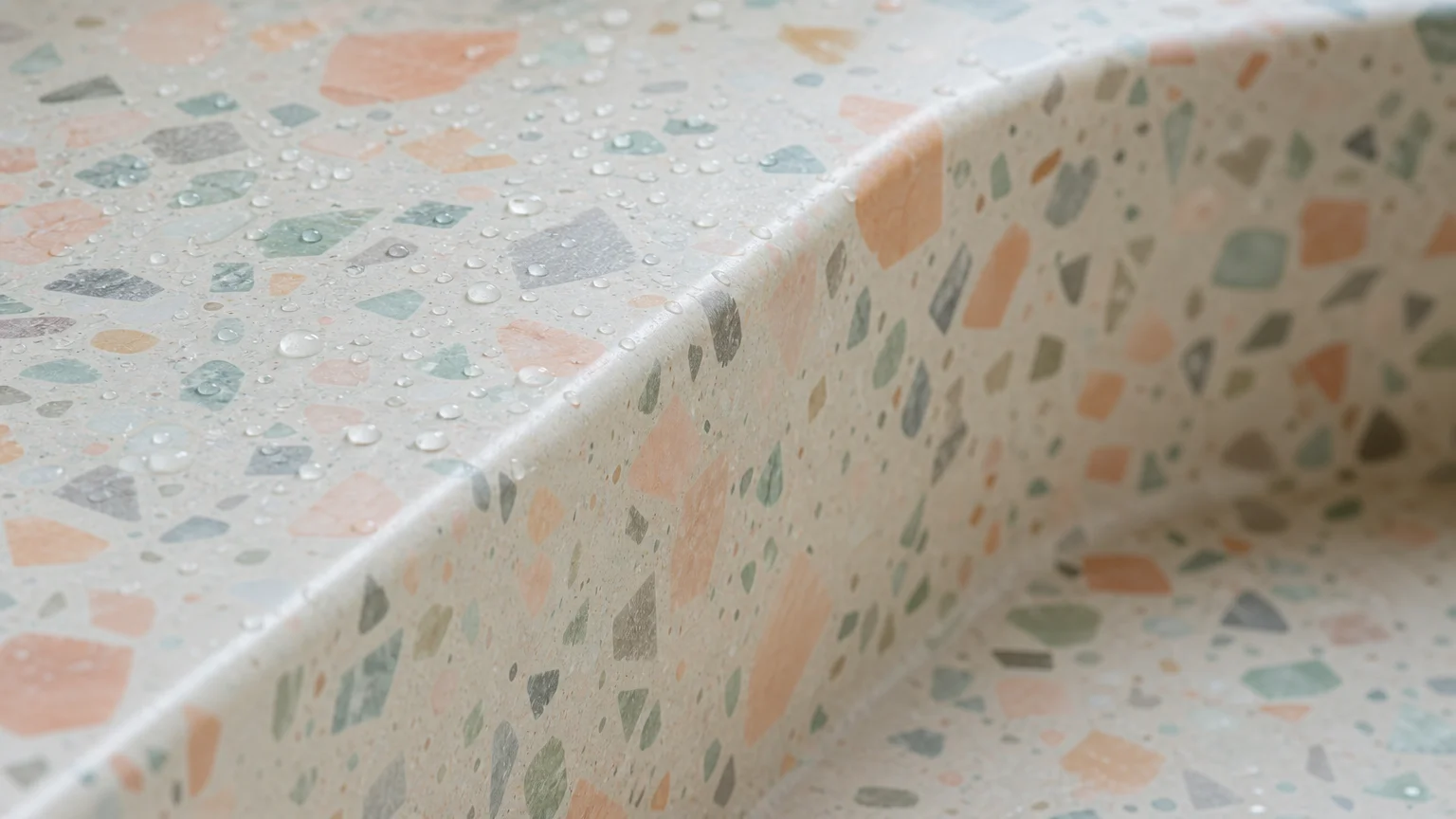
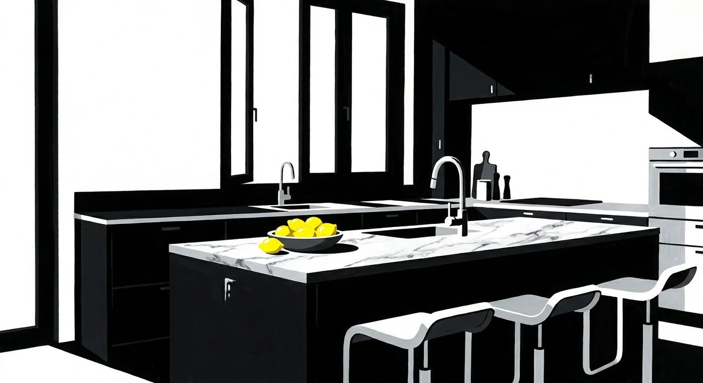
The modern bathroom has evolved from a purely utilitarian space into a dedicated wellness sanctuary. The most significant trend driving this transformation is the curbless wet room. Traditional shower enclosures feature raised thresholds that create notorious tripping hazards and complicate future mobility assistance. A curbless shower eliminates this barrier entirely, utilizing a subtly sloped floor and a sleek linear drain to manage water flow within a seamless, open-concept environment.
To execute this universal design masterpiece, focus on high-performance luxury materials. Cover the shower floor in small-scale mosaic tiles or textured natural pebbles; the multitude of grout lines provides exceptional grip under bare feet. Build a permanent, floating stone bench into the shower wall to offer a stable seating option that feels like a feature of a high-end spa rather than a medical necessity.
You can further disguise safety features through brilliant hardware integration. Today’s luxury market offers designer grab bars camouflaged as sleek towel racks, shampoo shelves, and adjustable slide bars for handheld showerheads. By specifying these heavy-duty, dual-purpose fixtures in polished nickel or brushed gold, you secure the structural support you may eventually need without ever signaling vulnerability.
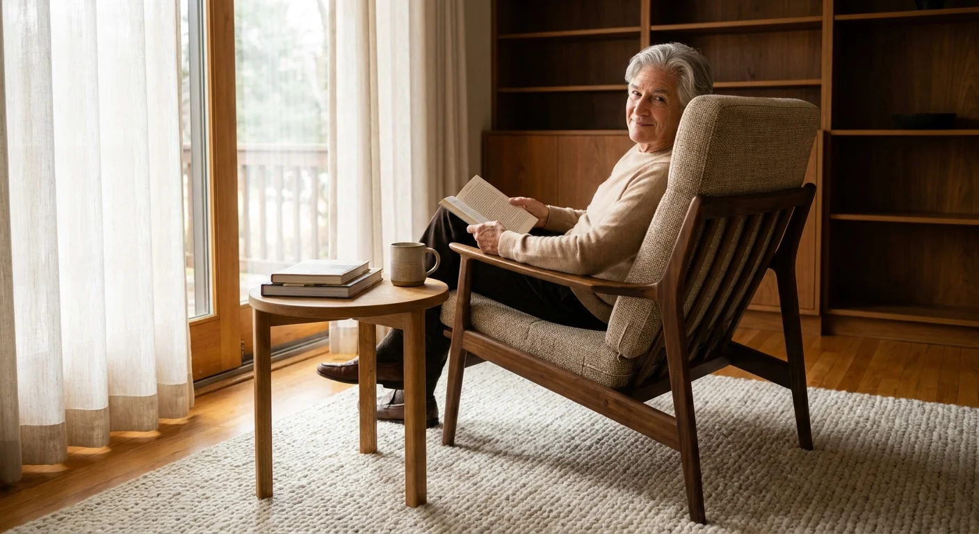
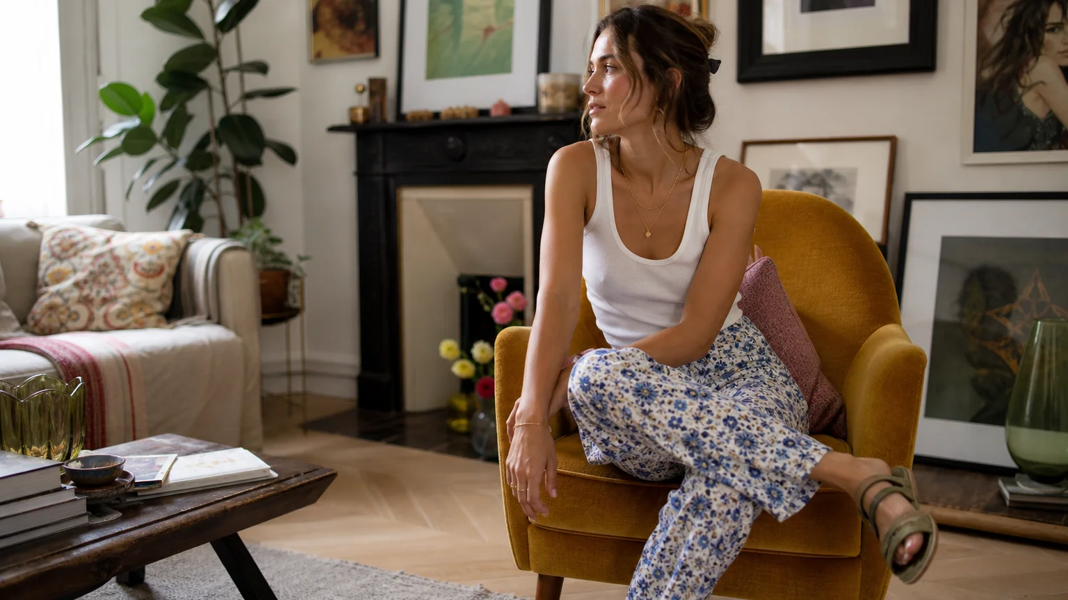
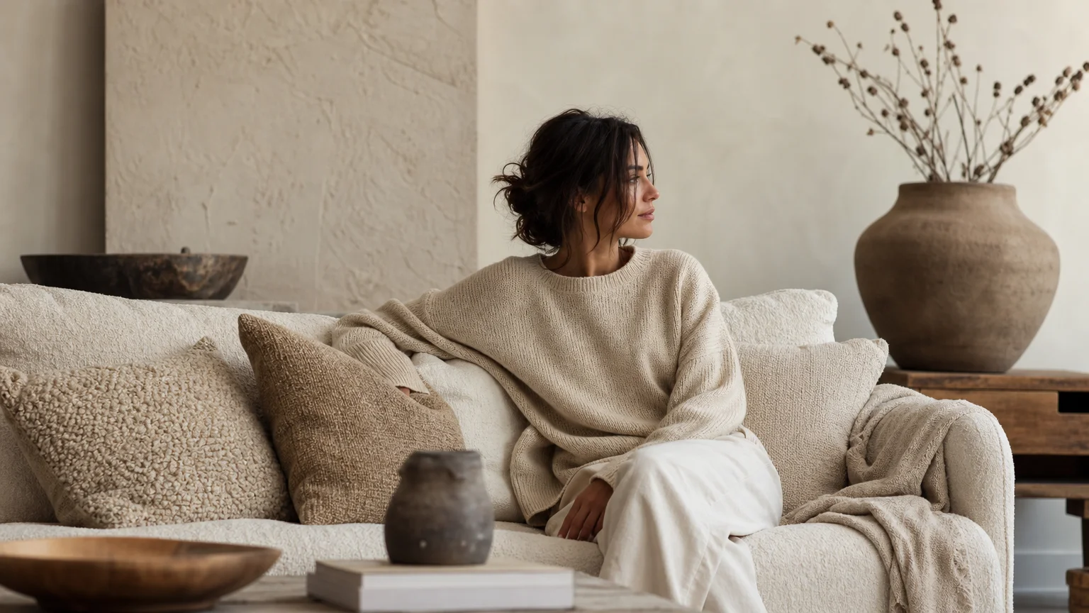
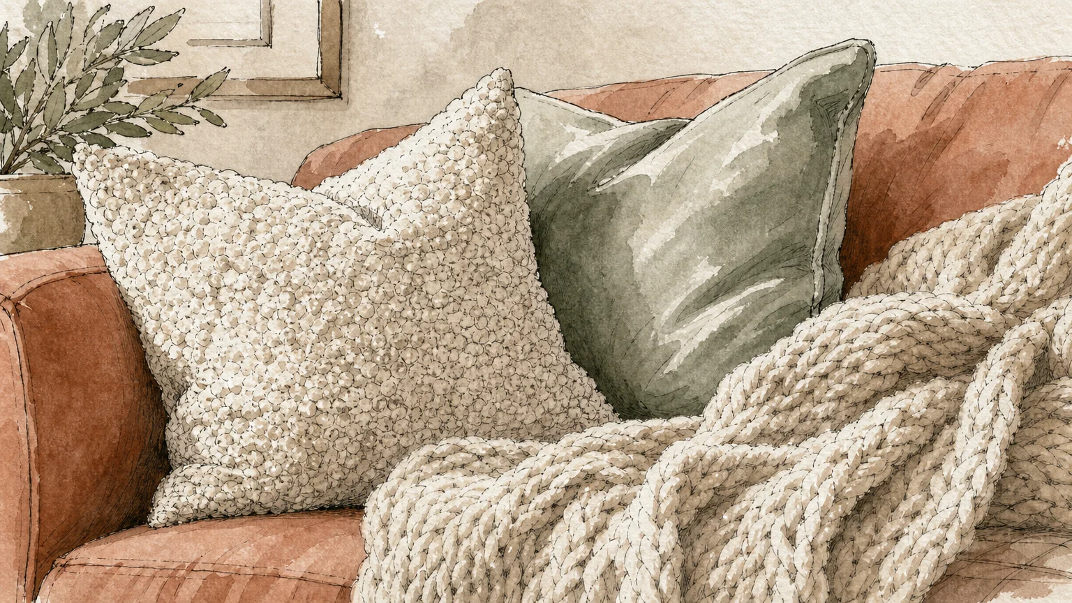
Trend #7: Firm, Supportive, and Proportional Furnishings
The era of ultra-deep, sink-in lounge sofas is giving way to tailored, structured seating that commands a room while properly supporting the human body. As we age, the mechanics of sitting down and standing up require significantly more effort. Low-slung seating with excessively plush, down-filled cushions traps the user, placing undue strain on the knees and lower back during egress.
Curating a retirement home demands a rigorous evaluation of furniture proportions. Select sofas and armchairs that feature a firmer seat density, utilizing high-resiliency foam cores wrapped in a thin layer of down for surface comfort. Pay strict attention to dimensions; an ideal seat height hovers between 18 and 20 inches from the floor, and the seat depth should allow your feet to rest flat while your back is fully supported.
Do not overlook the importance of robust armrests. A sturdy, well-padded armrest provides critical leverage when transitioning from sitting to standing. Upholster these structural pieces in quiet luxury performance fabrics, such as solution-dyed acrylics or tightly woven alpacas, which resist stains and wear while offering supreme tactile comfort. Your seating arrangements will radiate confident, bespoke tailoring while actively promoting your physical well-being.
The Big Picture: Weaving These Trends into Your Home
Adapting your residence for the decades ahead does not require a sudden, disruptive overhaul that strips away your personal style. Instead, view these seven design choices as a cohesive framework for your next series of renovations. You can weave these updates into your home systematically, allowing the design to mature alongside your changing lifestyle.
Begin with the most immediate, low-impact upgrades. Swap out restrictive hardware for elegant lever handles and replace harsh overhead bulbs with automated, layered lighting systems. As you plan larger investments, prioritize structural continuity. Committing to a zero-transition, slip-resistant flooring plan across your entire main level provides the greatest long-term return on investment for your safety and property value.
Ultimately, successful universal design operates invisibly. By demanding high-end materials, insisting on rigorous color contrast, and favoring organic, ergonomic shapes, you build a safety net that looks like an architectural triumph. You are not simply preparing for old age; you are refining your home into a frictionless, welcoming sanctuary that effortlessly accommodates every phase of your life.
Frequently Asked Questions
How do I mix these accessible home trends without making my space look too clinical?
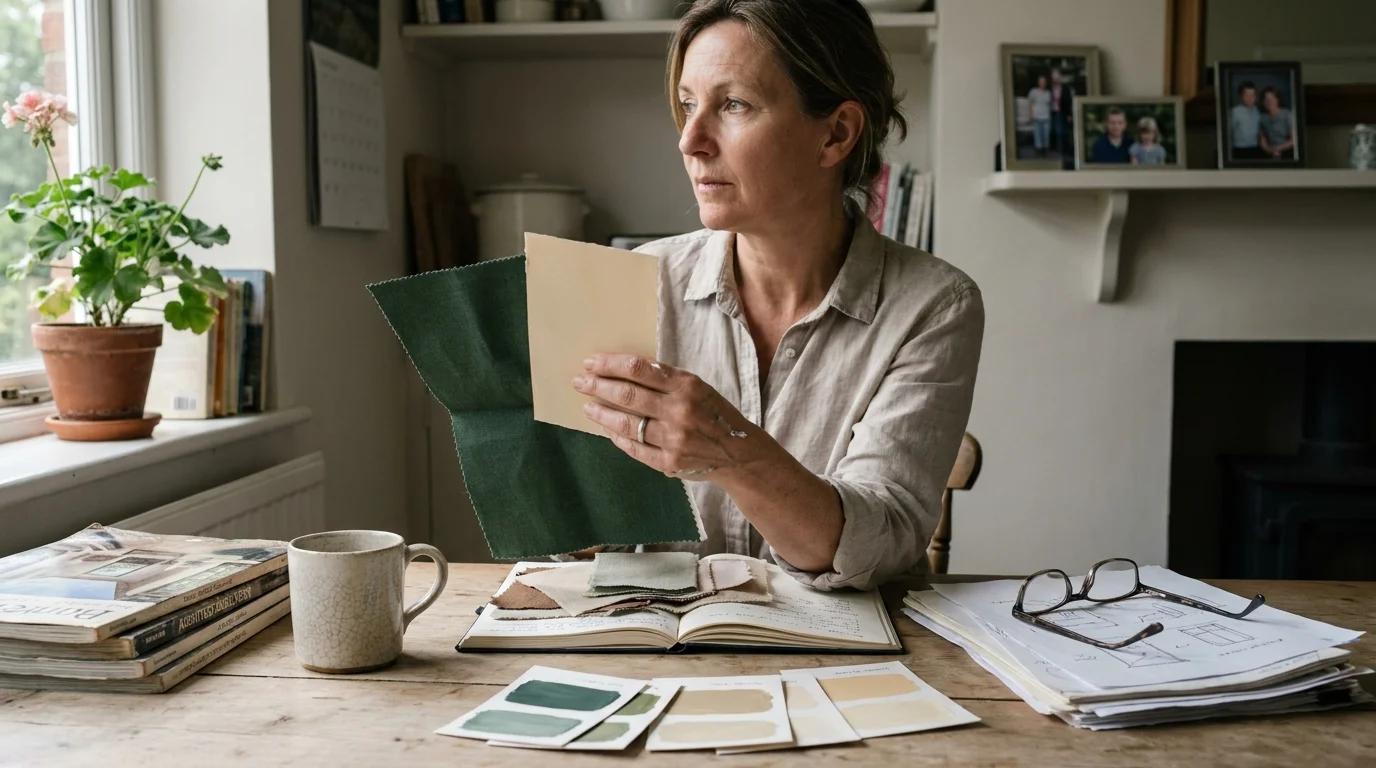
The secret to avoiding a clinical aesthetic lies in your material palette and lighting. Institutional spaces rely on sterile whites, harsh fluorescent lights, and cheap plastics. You must actively counter this by selecting materials with deep provenance and rich textures. Pair an unlacquered brass lever handle with a dark, moody door color. Soften a curbless shower with warm, ambient LED cove lighting and heavily veined marble. When you prioritize organic textures and layered illumination, the accessibility features completely vanish into the luxury of the design.
What is the most critical design choice to tackle first in a retirement home renovation?
Flooring and lighting demand your immediate attention. These two elements fundamentally dictate how you navigate your space. Eliminating tripping hazards by installing zero-transition, slip-resistant floors instantly reduces your risk of falls. Coupling this with an automated, layered lighting system ensures you can clearly see the secure pathways you have created. Furniture and hardware can be swapped easily, but flooring and electrical work form the structural baseline of your safety.
Does implementing universal design negatively impact my property value?
Quite the opposite. High-end universal design significantly increases your property value and widens your pool of potential buyers. Features like curbless luxury showers, widened archways, and open-concept, zero-transition floor plans are highly coveted in the general real estate market because they look expansive and custom-built. Because these trends prioritize spaciousness and premium materials, buyers perceive them as luxury upgrades rather than age-specific accommodations.
How can I update my current furniture layout to better support aging in place?
You should immediately edit your floor plan to prioritize wide, unobstructed pathways. Remove small, decorative accent tables or low-profile ottomans that jut into walkways and create tripping hazards. Pull your seating arrangements slightly closer together to ensure someone can easily reach an armrest or table surface for balance as they move through the room. Ensure that every major transit route in your home—especially the path from the bedroom to the bathroom—features a minimum of 42 inches of clearance.
For the latest color forecasts, consult industry leaders like Pantone and paint companies like Benjamin Moore. For professional design standards, refer to the American Society of Interior Designers (ASID).
Disclaimer: This article reflects design trend analysis and predictions. Personal taste and timeless design principles should always guide your decorating choices.