
Maximizing square footage relies more on strategic visual perception than physical boundaries; poor design choices effortlessly induce claustrophobia in even the most generously proportioned spaces. You can drastically alter your home’s atmosphere by correcting common spatial errors that trap light and disrupt architectural flow. Interior design hinges on scale, proportion, and lighting. When these elements fall out of balance, rooms instantly feel cramped and uninviting. Identifying the specific decorating habits that visually shrink your rooms empowers you to implement sophisticated, expansive solutions. Professional home styling shifts focus toward continuous sightlines, allowing your environment to breathe. Mastering these crucial principles transforms tight quarters into expansive sanctuaries without requiring a single expensive structural renovation.
Mistake #1: Pushing Furniture Completely Against the Walls
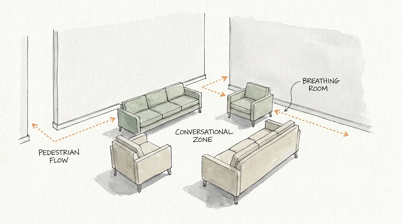
Novice decorators instinctively shove sofas and chairs against the perimeter of a room, assuming this maximizes the open floor space in the center. This approach backfires entirely; it creates a cavernous, empty void in the middle of the room while highlighting the restrictive physical boundaries of the walls. Instead, embrace the sophisticated practice of floating your furniture. By pulling seating arrangements even a few inches away from the wall, you establish intentional breathing room that tricks the eye into perceiving greater depth. Floating furniture fosters intimate, conversational groupings and establishes a clear, comfortable pedestrian flow around the room’s perimeter. In open-concept living areas, this technique becomes crucial for defining specific functional zones without relying on visual partitions. Designers often employ curved silhouettes—a dominant trend in contemporary interiors—when floating furniture, as the softened edges further ease the visual transition between pieces and the surrounding negative space. When you prioritize continuous spatial flow over a vacant center, your room instantly adopts a grander, more intentional scale.
Mistake #2: Relying Exclusively on Overhead Lighting
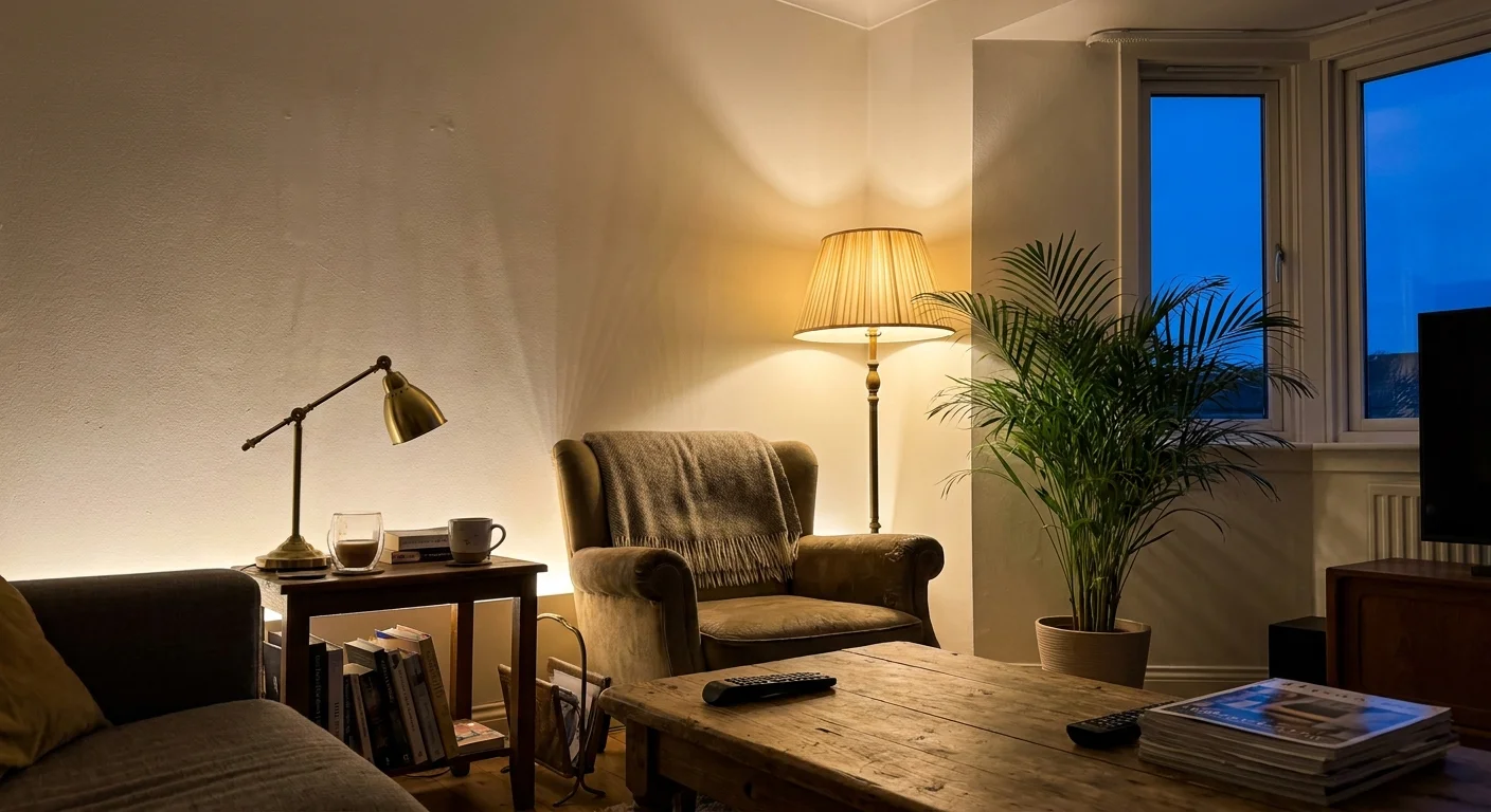
Relying solely on a single, central ceiling fixture casts aggressive, unflattering shadows into the corners of a room, visually drawing the walls inward and lowering the ceiling. This flat, one-dimensional illumination strips the environment of its architectural nuances and shrinks the visible footprint. To cultivate a spacious, high-end atmosphere, you must layer your lighting. Integrate a sophisticated mix of ambient, task, and accent lighting at varying heights to draw the eye gracefully around the entire room. Floor lamps, wall sconces, and table lamps create localized pools of warm light that gently illuminate shadowy corners, thereby expanding the perceived boundaries of the space. Embracing the quiet luxury aesthetic involves utilizing fixtures with dimmable capabilities, allowing you to manipulate the mood and depth of the room dynamically. Uplighting placed strategically behind large floor plants or architectural features heavily emphasizes verticality. By dispersing your light sources, you effectively banish the encroaching darkness and give your small spaces the luminous, expansive quality of a professionally curated gallery.
Mistake #3: Ignoring the Vertical Axis and Ceiling Height
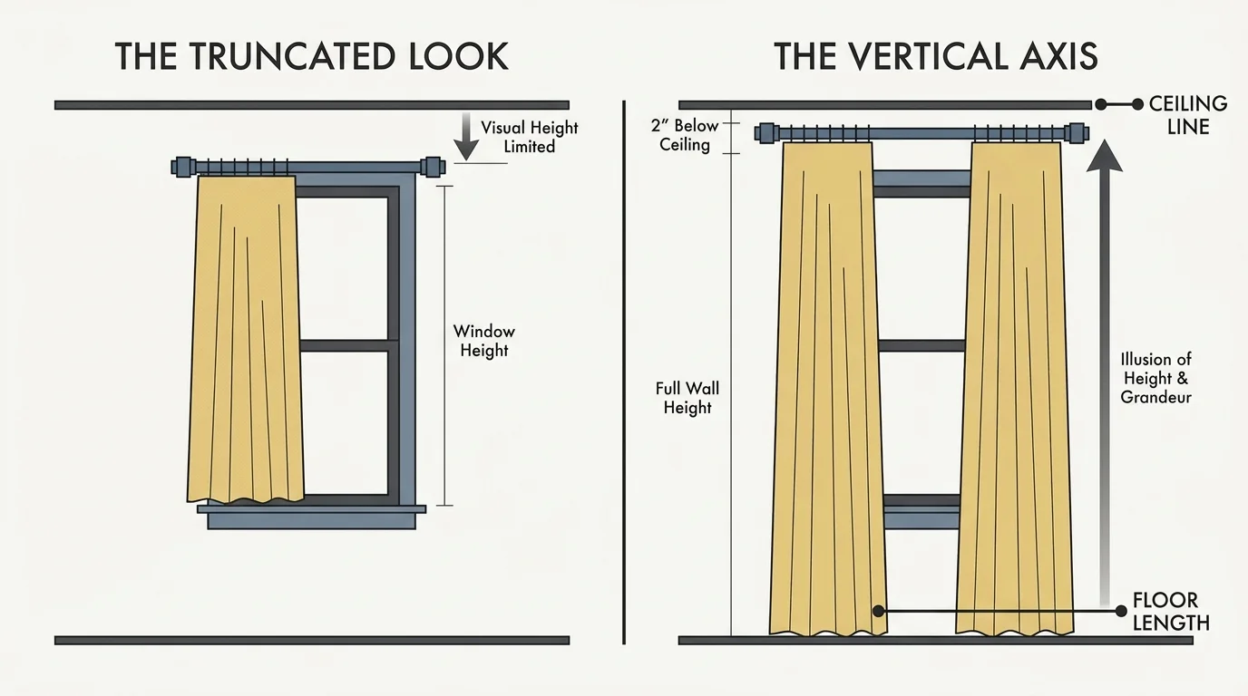
When decorating small spaces, focusing entirely on the floor plan while ignoring the walls and ceiling represents a massive missed opportunity. Horizontal lines ground a room, but vertical lines elevate it. Hanging window treatments directly above the window frame severely truncates the perceived height of your ceiling. Instead, mount your drapery rods as close to the ceiling line as possible and let the fabric cascade all the way to the floor; this simple optical illusion dramatically lengthens the walls. Apply this same vertical logic to your shelving and artwork. Opt for floor-to-ceiling bookcases that guide the gaze upward, rather than short, squat units that visually chop the wall in half. Incorporate tall, sculptural branches or towering indoor trees—nodding to biophilic design principles—to add necessary height and organic texture. Furthermore, consider adding vertical shiplap or tall wainscoting to stretch the room’s proportions further. When you force the eye to travel upward, you engage the full volume of the room, making the physical square footage feel entirely secondary to the majestic vertical space.
Mistake #4: Interrupting Sightlines with Bulky, Opaque Silhouettes
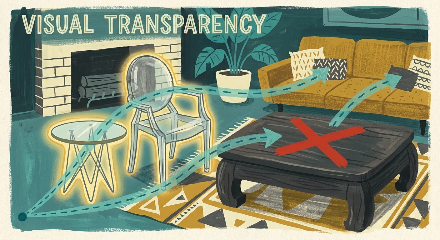
Filling a tight room with heavy, block-like furniture creates visual roadblocks that immediately shrink the available space. A solid, skirted sofa paired with a chunky wooden coffee table traps light and stops the eye from traveling seamlessly across the floor. You can easily remedy this by selecting pieces with exposed legs and slender, refined profiles. Furniture elevated off the ground allows light to pass underneath, maintaining an uninterrupted view of the flooring—a vital component of expansive home styling. Furthermore, integrate transparent or highly reflective materials into your design scheme. A glass, lucite, or polished wire-frame coffee table performs its function while remaining visually weightless. Contemporary design currently favors organic modernism, relying on sleek, curved silhouettes over harsh, angular boxes, precisely because these organic shapes allow energy and light to flow seamlessly around them. Consider the visual weight of your dining chairs as well; swapping heavy, fully upholstered armchairs for slender seating opens up the dining area. Prioritize pieces that offer necessary functionality without dominating the visual landscape.
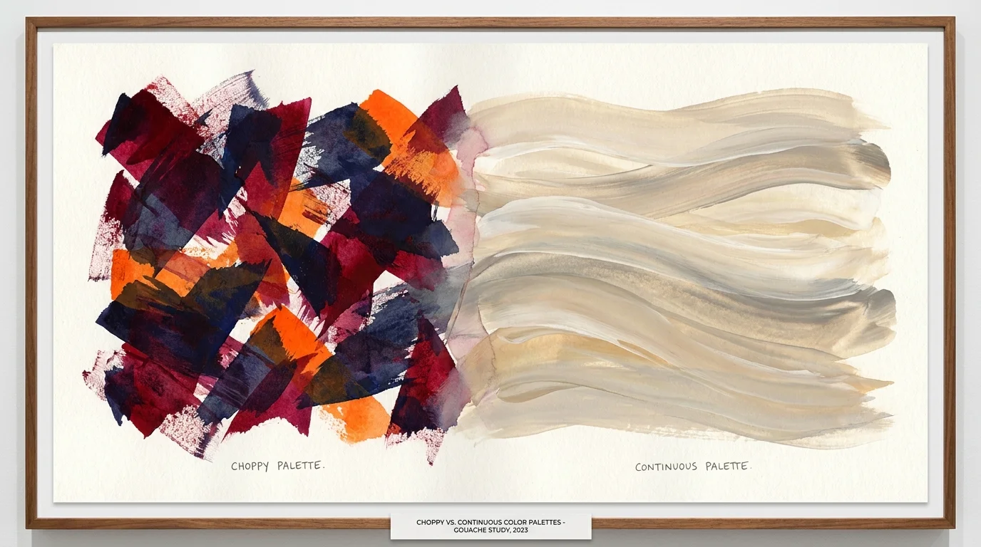
Mistake #5: Utilizing Overly Complex and Choppy Color Palettes
Painting adjacent rooms wildly different colors or featuring starkly contrasting accent walls fractures your home into disjointed, bite-sized visual compartments. High-contrast transitions force the eye to stop at every boundary, reinforcing the exact structural limitations of the space. To counter this, employ monochromatic or tonal color palettes that blur the edges of the room. The contemporary technique of color drenching—painting the walls, trim, doors, and sometimes even the ceiling in a single, cohesive shade—erases the harsh lines where the wall meets the ceiling. This uninterrupted wash of color creates an enveloping, infinite quality that makes the room feel boundless. If you prefer lighter interiors, utilize variations of soft, warm neutrals to reflect maximum natural light and promote an airy ambiance. When incorporating darker, moodier shades, maintain consistency across the surfaces to create a jewel-box effect that successfully masks the room’s corners in shadow. A unified, deliberate palette guarantees a seamless visual journey, greatly enhancing the overall expansiveness of your home.
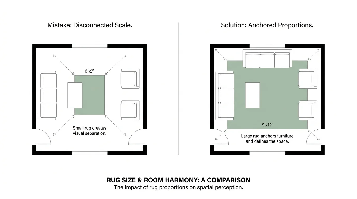
Mistake #6: Choosing the Wrong Scale for Area Rugs
Few decorating errors shrink a living room faster than an area rug that resembles a postage stamp placed directly in the center of the floor. A rug that is too small forces all the furniture to sit entirely off its edges, creating a visually disjointed, chaotic, and cramped layout. Area rugs serve as the foundational anchor for your design scheme; they define functional zones and dictate the scale of the furniture arrangement. You must select a rug large enough so that at least the front legs of every major piece of furniture rest comfortably upon it. In a dining room, the rug should extend generously beyond the table so chairs remain entirely on the fabric even when pulled out. Oversized rugs visually stretch the floor plan outward, creating the illusion of a much broader footprint. Beyond dimensions, consider the pattern of your chosen textile; subdued, textural weaves add sophisticated visual interest without overpowering the senses. When you invest in appropriately scaled textiles, you unify your disparate furnishings into a single, cohesive island.
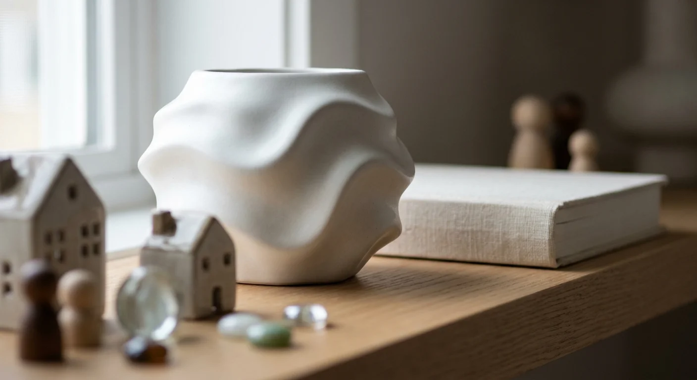
Mistake #7: Over-Accessorizing with Micro-Decor
An abundance of tiny trinkets, small picture frames, and disparate accessories creates visual noise that overwhelms the senses and encroaches on the room’s breathable space. Small spaces completely lack the bandwidth to absorb relentless clutter. Transition your styling approach toward deliberate curation rather than thoughtless accumulation. Champion the less-is-more philosophy by replacing dozens of small decor pieces with a few bold, large-scale statements. Swap a cluttered gallery wall of tiny, mismatched frames for one oversized piece of striking contemporary art; the single focal point commands attention and visually pushes the wall outward. When styling shelves or coffee tables, group items strategically and leave intentional negative space between the vignettes. Select objects of provenance—items with authentic history or artisanal craftsmanship—that speak to a sophisticated aesthetic without demanding excess room. Editing your decor down to its most impactful, meaningful elements eliminates the chaotic visual friction that notoriously shrinks a room, returning a sense of calm and expanse to your home.
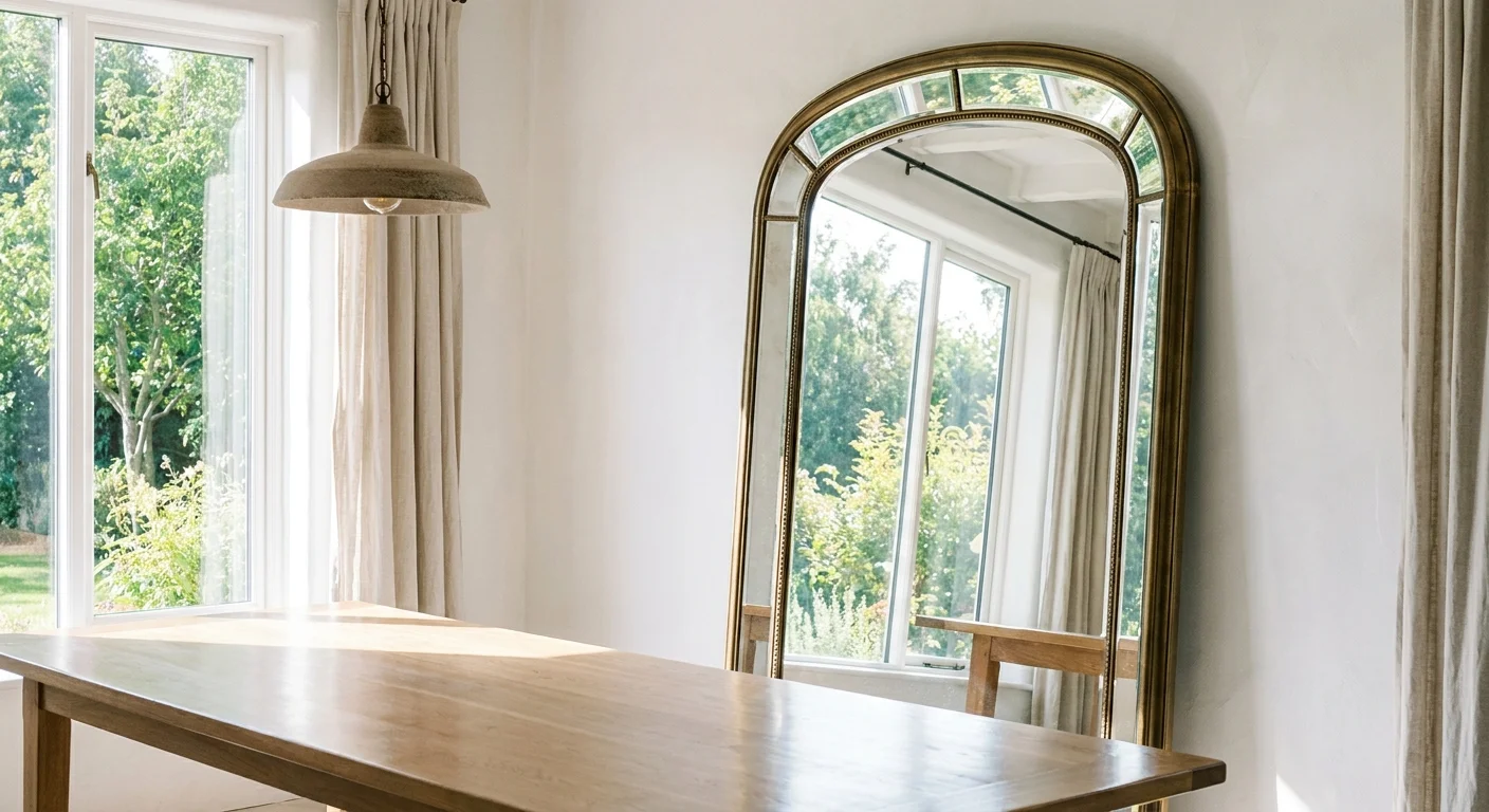
Mistake #8: Neglecting the Reflective Power of Mirrors and Finishes
Failing to utilize mirrors in a small room essentially leaves free square footage on the table. Solid, matte walls absorb natural light, whereas reflective surfaces bounce that incoming light back into the environment, artificially doubling the perceived depth of the room. A beautifully framed, oversized floor mirror leaning casually against a wall mimics the effect of an additional doorway or window, instantly alleviating feelings of confinement. Placement dictates the ultimate success of this strategy; position your mirrors directly opposite your largest windows to maximize the reflection of outdoor scenery and incoming sunlight. You can also utilize antiqued or smoked glass on cabinet fronts to introduce subtle luminosity without the stark, sometimes harsh glare of a traditional mirror. High-gloss paint finishes on the ceiling or polished metallic accents on light fixtures also contribute significantly to this radiant effect. Harnessing reflectivity strategically dissolves the rigid, physical boundaries of your walls, granting your home an illuminated, expansive grace.
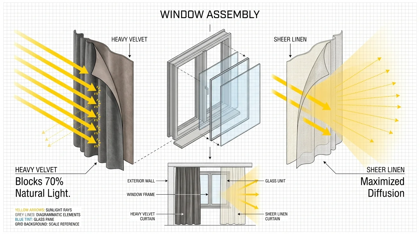
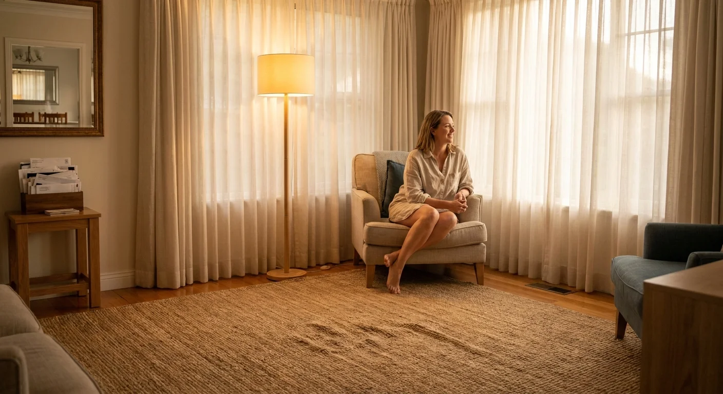
Mistake #9: Selecting Heavy, Light-Blocking Window Treatments
Thick, dark drapery fabrics like velvet or heavy brocade act as visual anchors that weigh down a room and swallow precious natural light. In small spaces, abundant sunlight remains your greatest asset for establishing an airy, expansive feel. Swap out oppressive window coverings for sheer, lightweight textiles like natural linen or cotton blends that gracefully diffuse harsh rays while allowing ambient light to penetrate the interior. If privacy demands a more opaque solution, install sleek, low-profile roller shades or Roman blinds tucked neatly inside the window frame, pairing them with sheer decorative panels on the outside. Ensure your drapery hardware extends several inches past the actual window casing on either side. This crucial detail allows you to pull the curtains entirely clear of the glass during the day, perfectly framing the window and creating the illusion of a substantially larger architectural feature. Connecting your interior sightlines to the outdoors through unencumbered windows is a masterclass in spatial expansion.
The Big Picture: Weaving These Trends into Your Home
Transforming a small floor plan requires a strategic shift in how you perceive scale, light, and negative space. Correcting these nine spatial mistakes does not mean you must strip your home of its unique character; rather, it allows your personal aesthetic to shine brightly without the burden of visual clutter. Focus on establishing a cohesive, expansive foundation through harmonious color palettes and appropriately scaled foundational furnishings. Introduce contemporary trends thoughtfully, ensuring they enhance the room’s flow rather than interrupting it. Invest in fewer, higher-quality items with authentic provenance to cultivate an environment rooted in quiet luxury. Embrace the negative space in your floor plan as a critical design element rather than an empty void begging to be filled. By elevating your sightlines, layering your illumination, and prioritizing unencumbered architectural flow, you successfully weave these sophisticated practices into a home that feels effortlessly expansive, highly functional, and deeply personal.
Frequently Asked Questions
How do I mix dark colors in a small space without making it feel claustrophobic?
Dark palettes can actually expand a space if applied correctly. Utilize the color-drenching technique by painting the walls, trim, and the ceiling in the same moody hue. This visually blurs the room’s boundaries, creating a sophisticated, infinite backdrop. Balance the deep tones with highly reflective surfaces, oversized mirrors, and warm, layered lighting to prevent the space from feeling heavy.
Does oversized furniture always overwhelm a compact living room?
Counterintuitively, a few large, well-chosen pieces make a small room feel significantly larger than a vast collection of miniature furniture. One substantial, comfortable sofa visually anchors the space much better than a loveseat paired with two small accent chairs, which quickly produces a cluttered, chaotic visual landscape. Scale your major pieces to the room, but keep the total number of items low.
How can I incorporate current decor trends without sacrificing timeless design principles?
Anchor your room with classic, appropriately scaled foundational pieces—like your sofa, area rugs, and major cabinetry. Then, inject contemporary trends through easily swappable elements such as sculptural lighting fixtures, tactile throw pillows, or modern artwork. This layered approach honors the architectural integrity of the space while keeping your home’s aesthetic fresh and relevant.
Are open-concept layouts always the best solution for making a home feel larger?
While tearing down walls physically opens a floor plan, it can backfire if the resulting space lacks definition. Without clear functional zones, an open layout easily becomes an undefined, overwhelming cavern. You must utilize strategic furniture placement, properly scaled area rugs, and shifting lighting schemes to delineate living, dining, and working areas. This structured zoning ensures the expansive space remains functional and aesthetically grounded.
For the latest color forecasts, consult industry leaders like Pantone and paint companies like Benjamin Moore. For professional design standards, refer to the American Society of Interior Designers (ASID).
Disclaimer: This article reflects design trend analysis and predictions. Personal taste and timeless design principles should always guide your decorating choices.