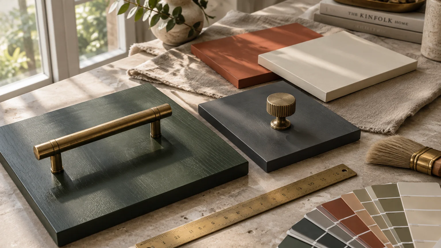
Lustrous brass hardware instantly elevates custom cabinetry, interior doors, and architectural millwork across your home. Pairing these metallic accents with the right surface tones unlocks an intentional, designer-grade aesthetic.
Whether you prefer dramatic contrasts or tonal warmth, your color foundation dictates how metallic finishes read within an interior. The correct shade transforms standard fixtures into bespoke focal points of quiet luxury.
Explore twelve directional paint colors with brass hardware that leading interior designers rely on to establish timeless elegance, visual balance, and enduring style in every room.
Trend #1: Deep Forest Green
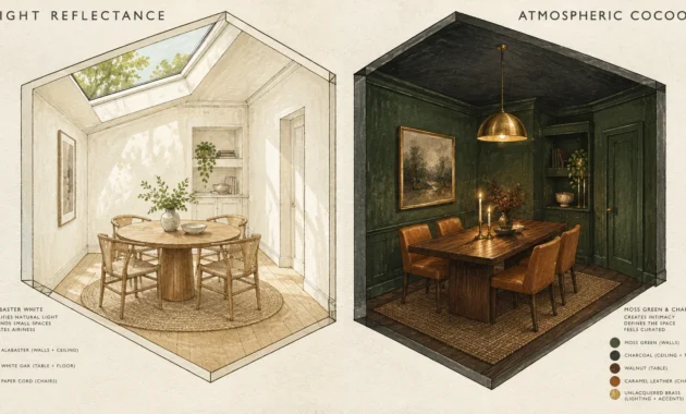
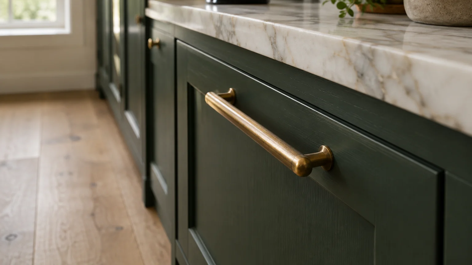
Deep forest green delivers an organic, biophilic richness that immediately complements the radiant warmth of unlacquered brass. This verdant hue evokes historic country estates while maintaining a crisp, contemporary sensibility in modern spaces.
When designing a brass hardware kitchen, pairing emerald or deep hunter cabinetry with brushed gold pulls establishes grounded sophistication. The deep undertones absorb daylight, allowing the reflective metallic surfaces to command immediate visual attention.
Industry color forecasts show deep green cabinetry remains one of the most durable choices for bespoke residential remodeling. The hue bridges traditional cabinetry architecture with organic modernism.
Integrate natural white oak flooring and honed marble counters alongside this pairing to prevent visual heaviness. You achieve an enduring, tactile aesthetic that matures gracefully across decades of daily living.
Consider using a rich eggshell sheen on the woodwork to capture subtle light shifts throughout the day. The interplay between soft satin sheen and reflective brass pulls creates a calm, layered ambiance.
Trend #2: Dramatic Matte Charcoal
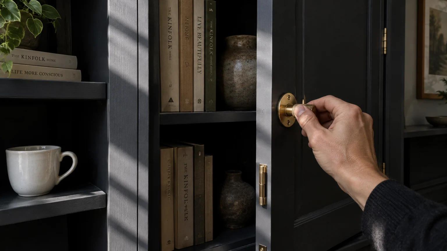
Matte charcoal provides a moody, architectural backdrop that makes warm metallic elements gleam with heightened clarity. This near-black tone tempers high contrast with velvety undertones, softening what might otherwise feel austere.
Evaluating cabinet colors brass hardware pairs with reveals that dark slate creates an undeniable aura of quiet luxury. The understated depth of charcoal allows burnished pulls and brass latches to read like bespoke jewelry.
Designers gravitate toward deep graphite for library shelving, vanity suites, and tailored kitchen islands. The high-contrast relationship generates spatial drama without sacrificing classic tailored restraint.
Balance charcoal joinery with lighter perimeter walls or subtle reeded glass panels. This rhythmic variation keeps your living spaces luminous while highlighting every warm metallic contour.
Applying an ultra-matte finish prevents unwanted glare while absorbing natural shadows. The resulting depth allows the golden warmth of your brass pulls to step forward into sharp focus.
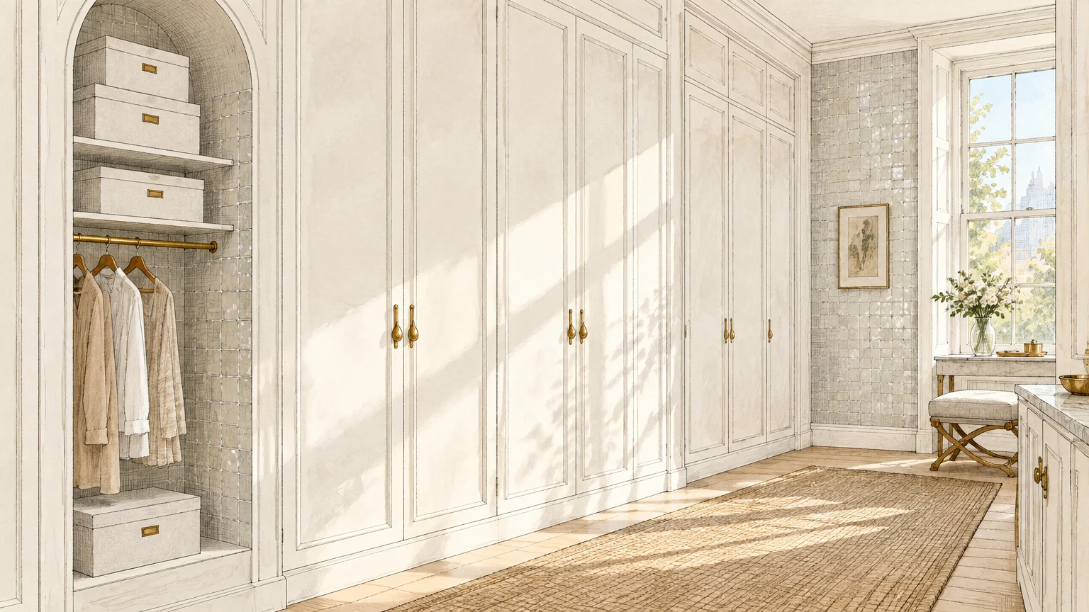
Trend #3: Crisp Architectural White
Architectural white delivers a luminous canvas that honors the craftsmanship and clean profile of brass hardware. Pure white generates stark tonal clarity, accentuating the golden undertones of your metallic accents without color distortion.
This pairing thrives in galley kitchens, master closets, and sun-drenched coastal living rooms. Designers often balance white surfaces with satin brass to prevent sterile glares under direct artificial downlights.
You can layer tactile materials like zellige tiles, fluted plaster, and white linen drapery to foster depth. These textural accents ensure a monochromatic white space feels warm, layered, and thoroughly intentional.
Architectural finishes in satin or unlacquered finishes age organically against pristine white woodwork. Over time, subtle patina forms, establishing authentic historical provenance within an otherwise contemporary interior.
Choose a warm white with subtle yellow or greige undertones rather than an icy blue-white base. This warmth prevents your white walls from clashing with the golden luster of solid brass fittings.
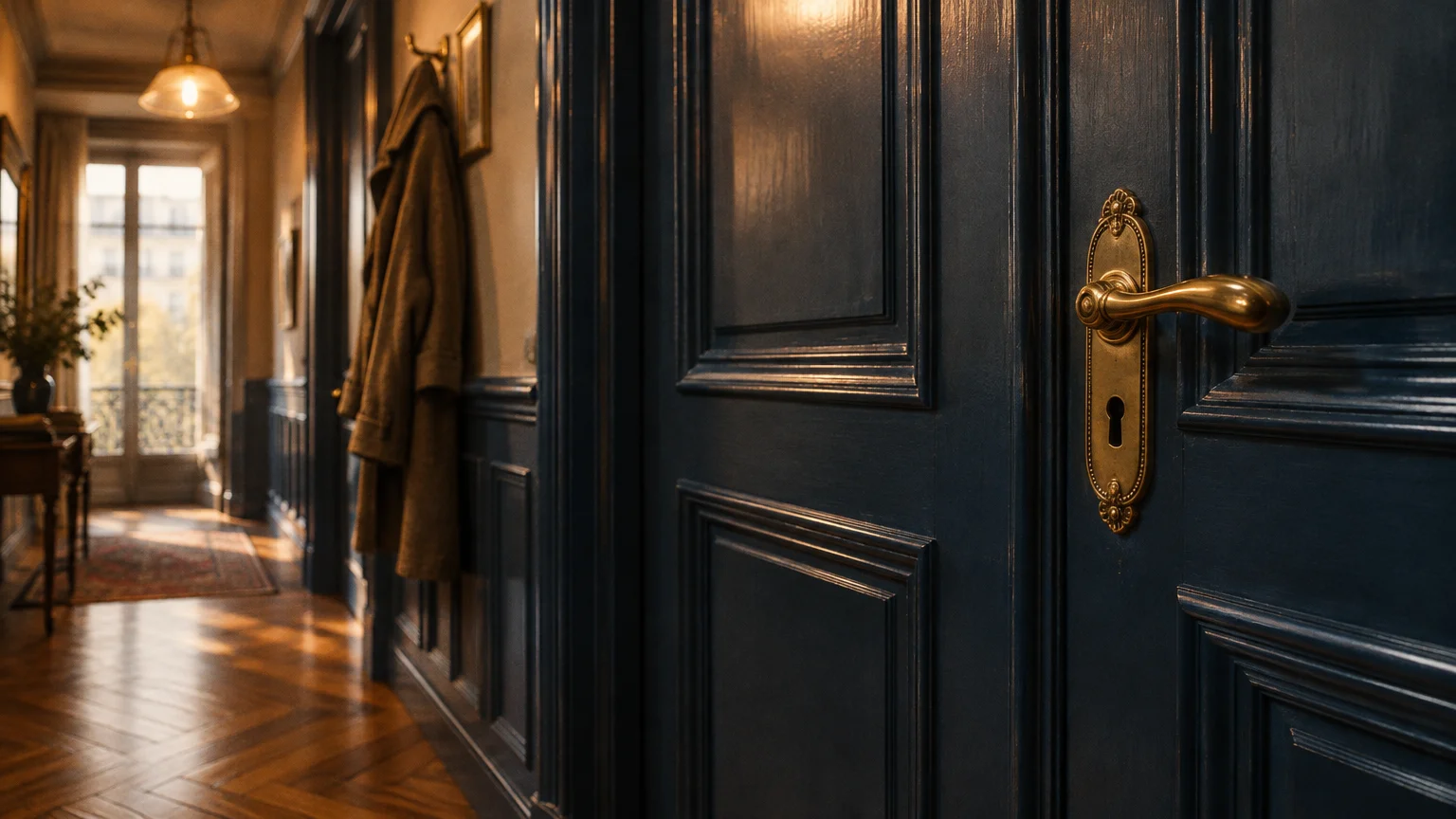
Trend #4: Rich Parisian Navy
Rich navy blue remains a benchmark classic when juxtaposed against lustrous, hand-rubbed brass accents decor. The deep nautical resonance harmonizes effortlessly with yellow and amber undertones across cabinet pulls and fixtures.
In transitional spaces, navy cabinetry anchors a room while bright metallic hardware introduces vibrant movement. This chromatic pairing recalls classical Haussmannian apartments where heritage moldings and gilded details shine alongside saturated walls.
Apply navy with high-gloss lacquer finishes to amplify ambient light reflection across dining rooms or butler pantries. The reflective surface echoes the metallic sheen, crafting a layered jewel-box effect.
Pair navy millwork with natural soapstone surfaces or warm walnut elements to ground the scheme. The balance keeps the environment welcoming rather than overly formal.
Incorporating antique unlacquered brass pulls against dark navy cabinetry creates an authentic, lived-in patina over time. You will appreciate how the hardware softens and deepens with frequent daily touch.
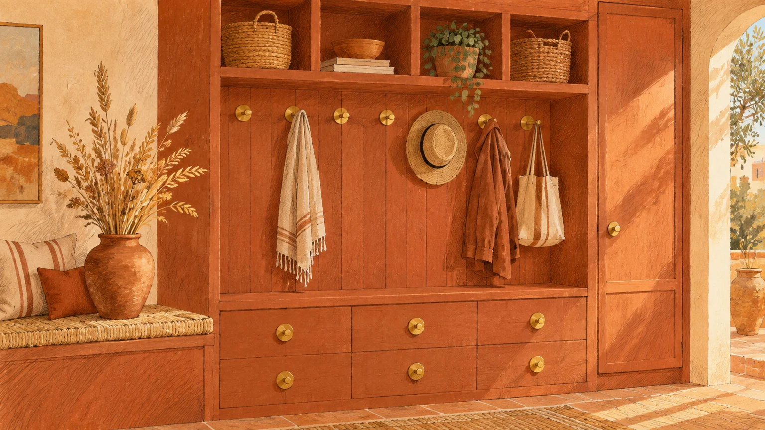
Trend #5: Warm Terracotta and Baked Clay
Warm paint colors like terracotta, sienna, and baked clay bring an earthy Mediterranean allure to modern interiors. When paired with aged brass, these warm pigments create a harmonious, low-contrast composition rich with warmth.
Rather than relying on sharp contrast, clay tones blend with golden hardware for a continuous, atmospheric glow. This gentle transition flatters powder rooms, dining salons, and sunrooms that celebrate artisanal authenticity.
Select raw, unlacquered brass pulls that develop a living patina over time alongside natural earthen plaster. The aging metal mirrors the organic variance inherent in clay-inspired color swatches.
Introduce travertine plinths, rough-spun wool rugs, and dark iron light fixtures to ground the composition. This interplay between rustic texture and polished metal anchors a genuinely timeless aesthetic.
Baked clay walls absorb harsh afternoon glare and cast a flattering, candlelit glow in the evening. Polished brass accents shimmer against this velvety background, creating an inviting visual sanctuary.
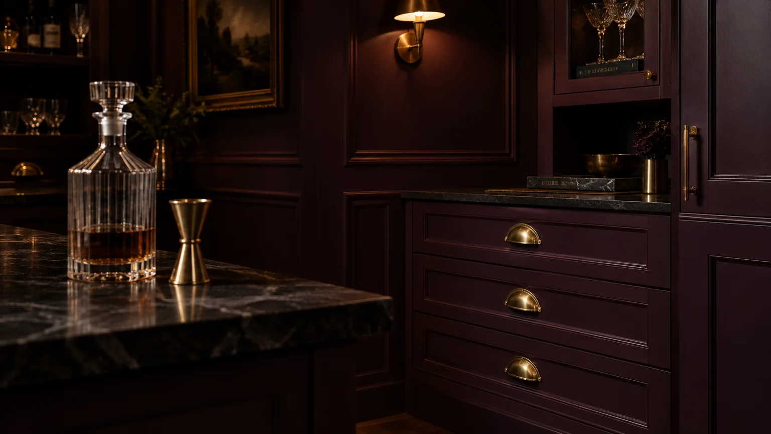
Trend #6: Moody Aubergine and Plum
Aubergine offers an unexpected, aristocratic depth that elevates standard cabinetry into museum-worthy millwork. Its regal purple-black undertones pull golden luster from brass hinges, handles, and escutcheons with dramatic finesse.
Designers embrace saturated plum in intimate spaces like home cocktail bars, executive studies, and formal reading rooms. The shade feels enveloping and mysterious, transforming simple casework into high-impact architectural features.
Against aubergine paint colors with brass hardware, polished brass provides a vivid flash of light. The metallic warmth breaks up saturated depths, ensuring small rooms retain an inviting, candlelit luminescence.
Incorporate velvet upholstery and dark herringbone timber flooring to reinforce this decadent color story. The result feels thoughtfully curated, expressing bespoke European romanticism without tipping into theatrical excess.
Using deep plum on architectural door trims and window mullions creates subtle, immersive luxury throughout your home. Brass turn latches and lever handles punctuate the dark frames with refined brilliance.
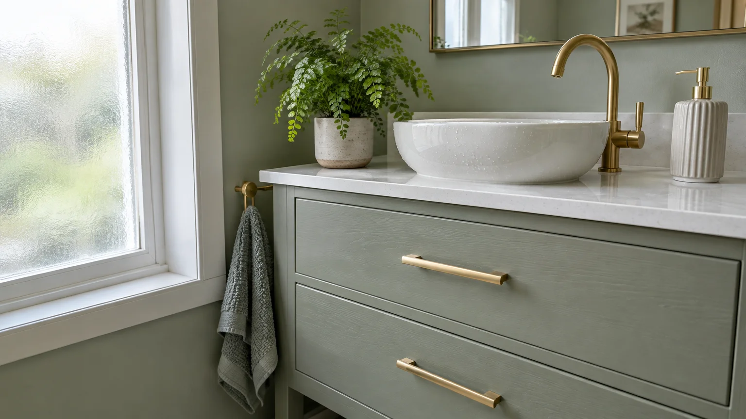
Trend #7: Soft Sage and Biophilic Greens
Soft sage injects tranquil, nature-inspired serenity into kitchens, laundry rooms, and primary bath suites. Its subdued grey undertones provide a subtle background that lets unlacquered brass glow without visual competition.
This nuanced green works exceptionally well across Shaker-style cabinet doors and custom tongue-and-groove paneling. Sage reflects changing natural daylight effortlessly, shifting from dusty silver at dawn to warm olive by dusk.
Brushed and antique brass hardware complements sage cabinetry by infusing a gentle vintage patina. This chromatic pairing creates an airy, restorative environment that embraces botanical simplicity and wellness-centered design.
Combine sage surfaces with polished nickel plumbing fixtures or aged copper pots for an eclectic, collected charm. Mixing complementary metals underscores a curated home that evolved thoughtfully over many years.
For a tailored look, apply sage to both base cabinetry and integrated open shelving. The brass shelf brackets and hardware pulls will unite the vertical plane in a subtle, harmonious cadence.
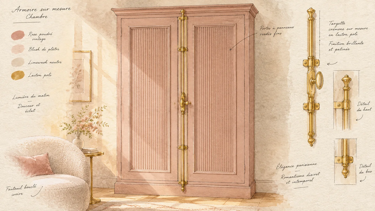
Trend #8: Dusty Rose and Muted Blush
Dusty rose has evolved beyond novelty into an indispensable sophisticated neutral within modern color forecasting. Its desiccated, earth-infused undertone flatters champagne brass fixtures without appearing overtly feminine or youthful.
When applied to dressing rooms, boutique powder suites, or statement credenzas, blush acts as an elegant backdrop. Warm metallic knobs and pulls accentuate the underlying warmth of the pigment.
Interior stylists frequently use dusty rose alongside honed Calacatta marble and warm oak joinery. This material palette softens architectural corners, cultivating a restorative sanctuary within high-traffic domestic environments.
Opt for matte or eggshell paint sheens to keep blush looking tailored rather than glossy or playful. A velvety finish grounds the color, allowing your hardware to provide necessary luster and polish.
Pair this pale rose tone with brushed brass bar pulls on built-in wardrobes. The golden finish adds structure, elevating the delicate color into a confident architectural design statement.
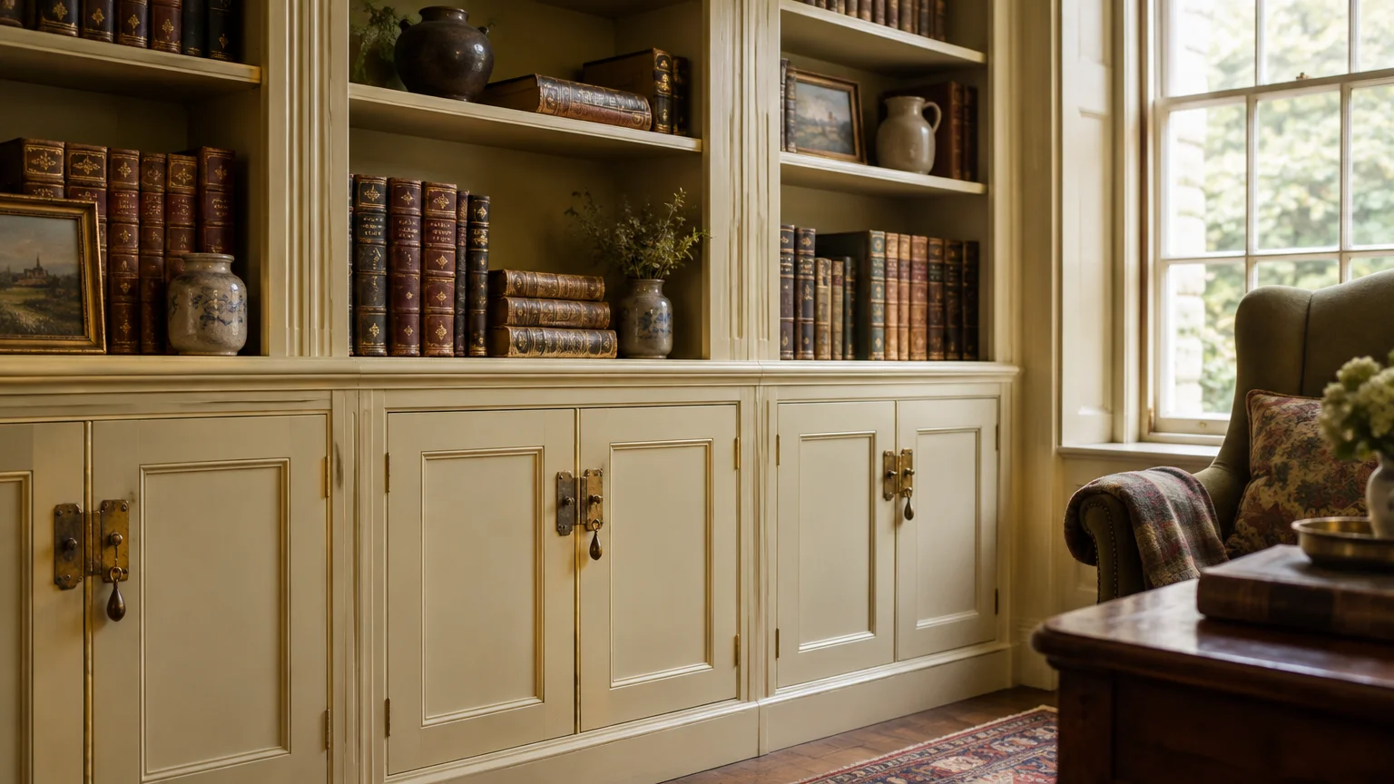
Trend #9: Heritage Cream and Warm Alabaster
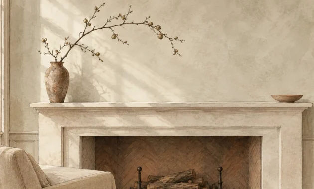
Moving away from stark cool tones, designers now favor heritage creams and rich alabaster whites. These gentle, buttered neutrals infuse living spaces with inviting historical authenticity while serving as versatile backdrops for brass accents decor.
Layering warm paint colors alongside antique brass creates an atmosphere of quiet luxury and relaxed refinement. The low-contrast pairing avoids visual fatigue, creating spaces that feel comfortable, timeless, and effortlessly put together.
Use heritage alabaster across library bookcases, wainscoting, and kitchen pantry storage. The gentle warmth prevents northern daylight from making the room feel stark, chilly, or clinical.
Complete this traditional aesthetic by layering woven rush seating, reclaimed floorboards, and antique oil paintings. The resulting setting honors architectural heritage while feeling fresh, functional, and enduring.
Unlacquered brass cup pulls on cream drawers develop a darkened halo around handle contact points. This natural oxidation gives freshly renovated millwork the gentle grace of a historic manor.
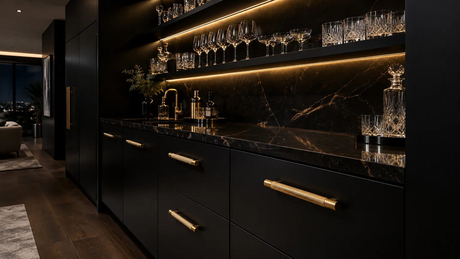
Trend #10: Midnight Black and Ink
Midnight black paired with polished brass represents the ultimate expression of graphic elegance in interior design. This high-contrast pairing immediately commands attention, transforming basic millwork into sculptural, monolithic art.
In modern kitchens, matte black cabinetry coupled with knurled brass hardware delivers crisp industrial precision. The metallic elements function as punctuation marks, delineating cabinetry lines with jewel-like clarity.
Balance saturated inky walls with abundant natural daylight and pale stone surfaces like quartz or quartzite. This equilibrium ensures that dark surfaces read as sophisticated and grounding rather than confining.
Choose solid brass hardware with clean, linear profiles to match the sharp modernity of deep black paint. The minimalist silhouettes reinforce an architectural aesthetic rooted in precision, restraint, and deliberate contrast.
In small powder rooms, drenching walls and trim in pitch black creates an intimate cocoon. Polished brass faucets and sconces glow like suspended lanterns against the dark perimeter.
Trend #11: Saturated Ochre and Warm Camel
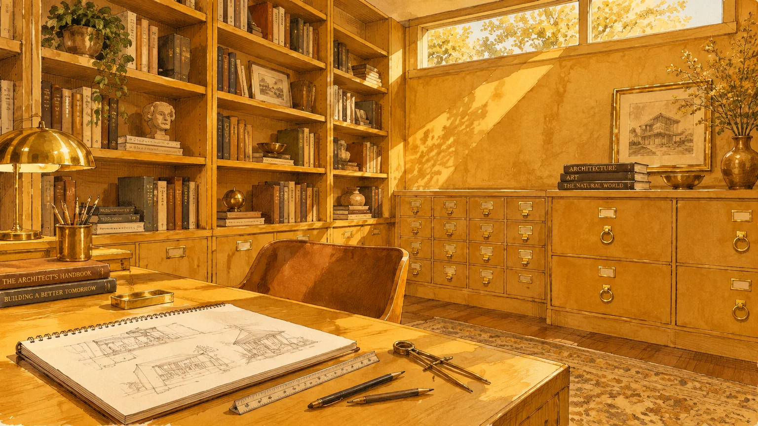
Ochre, camel, and spiced mustard offer rich, sun-drenched resonance that bridges retro mid-century charm with modern warmth. These radiant earth tones amplify the amber quality of aged brass pulls, crafting an enveloping, monochromatic glow.
When selecting cabinet colors brass accents enhance, warm ochre creates a cheerful yet deeply sophisticated dining or living zone. The tonality reflects artificial light beautifully, radiating hospitable warmth during evening gatherings.
Incorporate unlacquered brass hardware so its developing brown patina mirrors the deeper undertones of camel walls. This dynamic aging process prevents the vibrant color from feeling static or overly stylized.
Pair camel joinery with mid-century teak, boucle fabrics, and brushed bronze lighting for visual intrigue. The tonal harmony yields a cozy, design-forward sanctuary that feels nostalgic yet decidedly modern.
Applying ochre to interior library cabinetry creates an inviting space for evening work. Brass book rails and cremone bolts provide tactile elegance that complements the rich, scholarly aesthetic.
Trend #12: Pale French Blue and Pigeon Grey
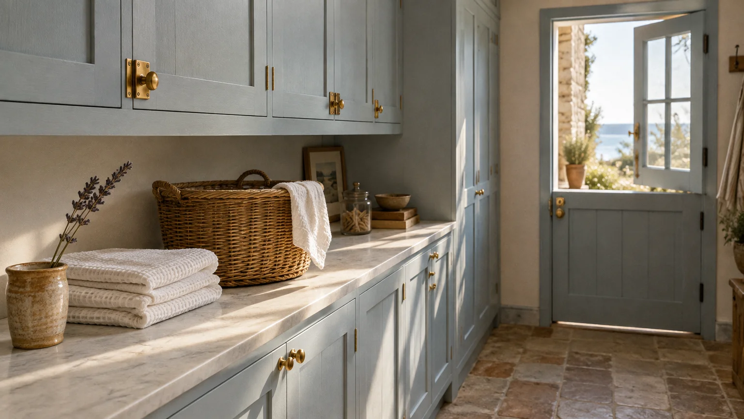
Pale French blue paired with soft pigeon grey delivers an understated, aristocratic balance of cool and warm elements. The subtle blue tones cool down visual temperatures, while warm brass hardware injects necessary sunshine and balance.
This tranquil color combination is particularly stunning in boutique bathrooms, sunrooms, and country sculleries. It recalls classical European estates where gilded accents illuminate cool limestone and weathered blue woodwork.
Select antique brass or burnished gold fittings to create a soft, romantic dialogue with the powdery paint. The gentle contrast avoids jarring juxtapositions, ensuring your decorative scheme stays light, airy, and visually coherent.
Accentuate this delicate palette with polished white marble counters and natural linen shades. The resulting ambiance exudes relaxed elegance, blending historical references with fresh, contemporary livability.
In utility spaces, paint the beadboard paneling in pale pigeon blue and add brass cup hooks. The utilitarian brass items instantly elevate everyday chores into an aesthetically pleasing ritual.
The Big Picture: Weaving These Trends into Your Home
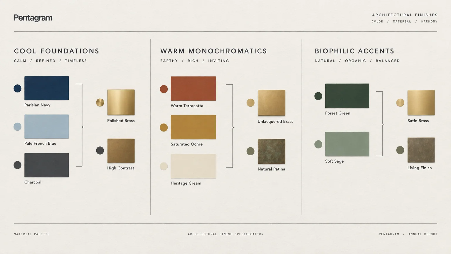
Harmonizing paint and hardware requires viewing your home through a lens of holistic spatial flow. Rather than treating each room in isolation, select a continuous narrative of materials and finish sheens.
Assess the quality of natural light entering your space throughout the day before finalizing any paint swatch. Cool northern exposure deadens cold whites, whereas southern sunlight intensifies saturated terracotta and jewel tones.
Consider your hardware finish with the same rigor you apply to paint selection. Unlacquered brass offers living, evolving provenance, whereas satin and brushed brass provide predictable uniformity across modern architectural joinery.
Do not fear mixing metals across a single space when executed with deliberate proportion. A dominant field of brass hardware pairs beautifully with matte black light fixtures or polished nickel tapware.
Keep large architectural surfaces anchored in classic neutrals if you prefer introducing vivid color in smaller doses. Pocket doors, bar credenzas, and vanity units provide low-risk canvases for saturated experimentation.
Prioritize craftsmanship and material integrity over fleeting viral trends. When you invest in solid brass hardware and premium pigmented paints, your home develops timeless elegance that outlasts seasonal shifts.
For the latest color forecasts, consult industry leaders like Pantone and paint companies like Benjamin Moore. For professional design standards, refer to the American Society of Interior Designers (ASID).
Disclaimer: This article reflects design trend analysis and predictions. Personal taste and timeless design principles should always guide your decorating choices.
Frequently Asked Questions
Does brass hardware work with cool paint undertones?
Yes, brass pairs exceptionally well with cool tones like navy, slate, and pale French blue. The warm metallic surface balances the cool base, creating dynamic visual tension and harmonious equilibrium.
To make this pairing successful, choose brushed or antique brass rather than hyper-polished gold finishes. Softer metallic finishes bridge the thermal gap between warm hardware and cool architectural paint.
What is the difference between unlacquered brass and brushed brass?
Unlacquered brass features raw, unprotected metal that oxidizes and patinas over time with air and skin contact. It delivers unmatched historical charm, making it a favorite for traditional and heritage restorations.
In contrast, brushed brass receives a durable protective sealant that locks in a uniform, satin appearance. It remains consistent over years of daily handling, fitting contemporary and modern transitional spaces perfectly.
Can you mix brass hardware with stainless steel appliances?
Absolutely; mixing metals creates a curated, layered look that avoids the monotony of matching finishes. In high-end kitchens, pairing stainless appliances with brass cabinet hardware looks deliberate and sophisticated.
Maintain a 70-to-30 visual ratio where one metal clearly dominates while the other serves as an accent. Repeating each metal at least twice ensures the finished space feels unified and balanced.
Will brass hardware look dated in a few years?
Solid brass is a foundational architectural metal with centuries of historical provenance. Unlike trendy synthetic finishes, genuine brass represents an enduring classic that transcends fleeting decorative cycles.
To ensure your hardware remains timeless, select classic silhouettes like simple round knobs and tailored rectangular pulls. Timeless geometry paired with authentic materials protects your interior against looking dated.