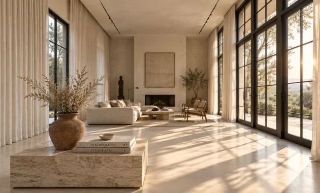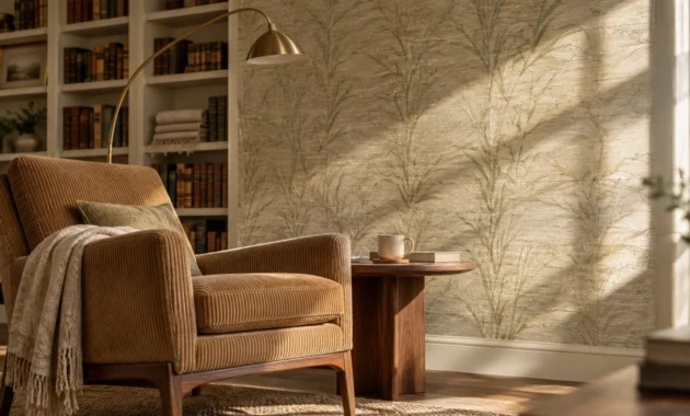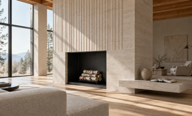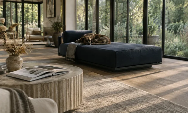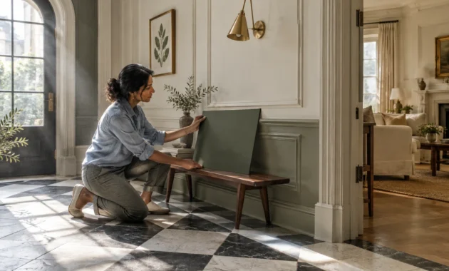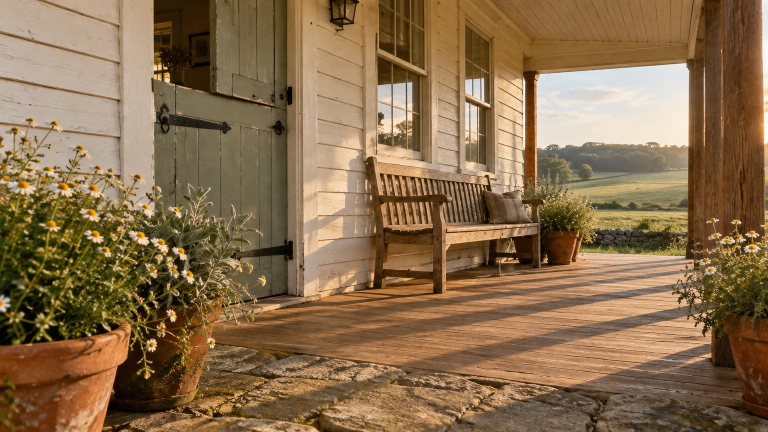
You can transform your living space into a restful retreat by choosing authentic farmhouse paint colors that blend timeless warmth with modern elegance. The right palette harmonizes architectural texture, natural sunlight, and rustic materials into an effortlessly cohesive sanctuary.
Today’s farmhouse aesthetic moves beyond stark white minimalism, embracing layered earth tones, quiet luxury, and historic provenance. These curated shades invite organic character into every room while preserving clean, airy sightlines throughout your floor plan.
Whether you are renovating an authentic heritage property or refreshing a suburban home, these proven selections will anchor your vision with understated sophistication.
Trend #1: Creamy Alabaster White
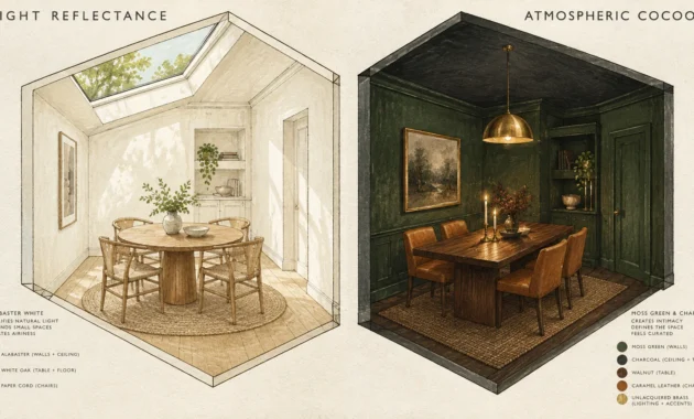
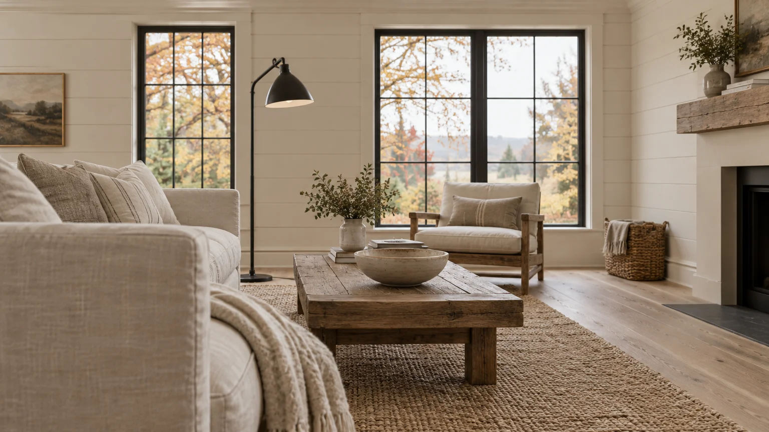
Sherwin-Williams Alabaster SW 7008 establishes an inviting foundation without the clinical chill of stark gallery whites. Its subtle beige undertones balance natural light beautifully across expansive great rooms and open-concept kitchens.
Pair this hue with wire-brushed white oak flooring and raw iron accents to achieve an authentic modern farmhouse aesthetic. The gentle warmth prevents northern daylight from making your shiplap walls look cast in shadow.
Homeowners gravitate toward this shade because it effortlessly reflects the principles of quiet luxury. It provides a peaceful backdrop that honors historical architecture while welcoming contemporary minimalism.
Apply an eggshell finish on your living room walls to capture soft ambient reflections throughout the day. Coat baseboards and crown molding in a matching semi-gloss finish to create subtle, tonal dimension.
Incorporate natural woven jute rugs and unbleached linen drapes to highlight the organic character of this versatile shade. It remains one of the best farmhouse whites for creating enduring comfort.
For exterior siding or porch ceilings, this creamy tone delivers immediate curb appeal; it softens harsh outdoor sunlight while harmonizing with brick foundations.
Trend #2: Soft Feathered Greige
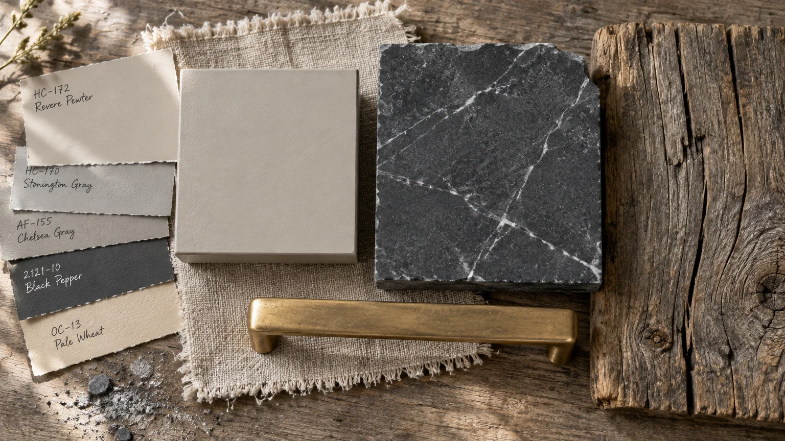
Benjamin Moore Revere Pewter HC-172 bridges classic rustic charm and refined contemporary living. This iconic greige adapts seamlessly to shifting daylight, presenting warm beige notes by afternoon and calm gray tones at dusk.
You can ground large dining spaces by pairing this color with reclaimed trestle tables and matte black iron chandeliers. The shade accentuates the weathered patina of vintage timber without overwhelming the room.
Designers champion this hue as an antidote to cold, monochromatic interiors that dominated previous decades. Its earthy neutrality fosters comfort, reinforcing the nostalgic connection people crave in rural-inspired dwellings.
Use this color on kitchen cabinetry alongside honed soapstone countertops for a timeless, unfussy focal point. Brass hardware creates a warm, luminous contrast that elevates the cabinetry’s clean shaker profile.
For high-traffic hallways, choose a durable washable matte finish to diffuse natural light smoothly across long wall surfaces.
If your home features open floor plans, paint connecting corridors in this shade to establish seamless, sophisticated transitions between adjoining living spaces.
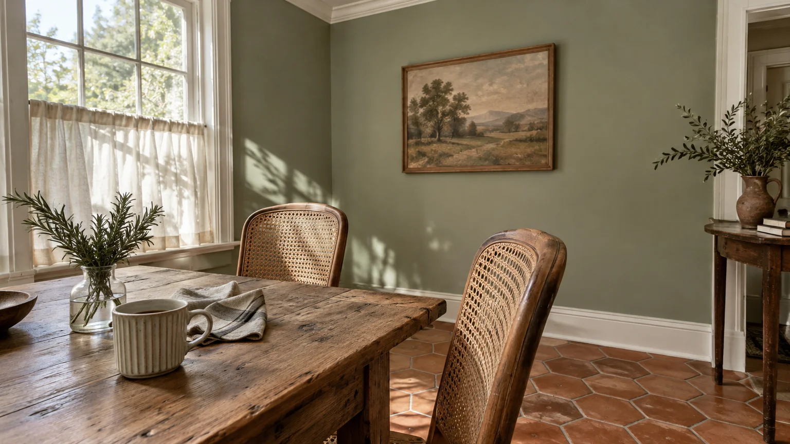
Trend #3: Weathered Sage Green
Sherwin-Williams Clary Sage SW 6178 brings the tranquility of heritage herb gardens into your interior spaces. This botanical neutral softens living rooms and bedrooms with its muted, herbal undertones.
The surge in biophilic design explains why homeowners embrace soft greens inside modern farmhouse colors. By echoing the surrounding pastoral landscape, this color deepens your home’s connection to the outdoors.
Match this soothing green with natural cane furniture, textured terracotta floor tiles, and crisp off-white ceilings. The earthy composition fosters a restorative environment suited for unwinding after busy days.
Paint your mudroom or laundry room cabinetry in Clary Sage to turn utilitarian work zones into charming focal points. Matte black hardware lends crisp architectural contrast to the muted cabinetry surfaces.
Test this shade against south-facing windows, where bright natural sunlight brings out its delicate, silvery leaf qualities.
You can also wrap bedroom walls in this gentle hue; it creates a restful sanctuary that promotes restorative sleep and calm mornings.
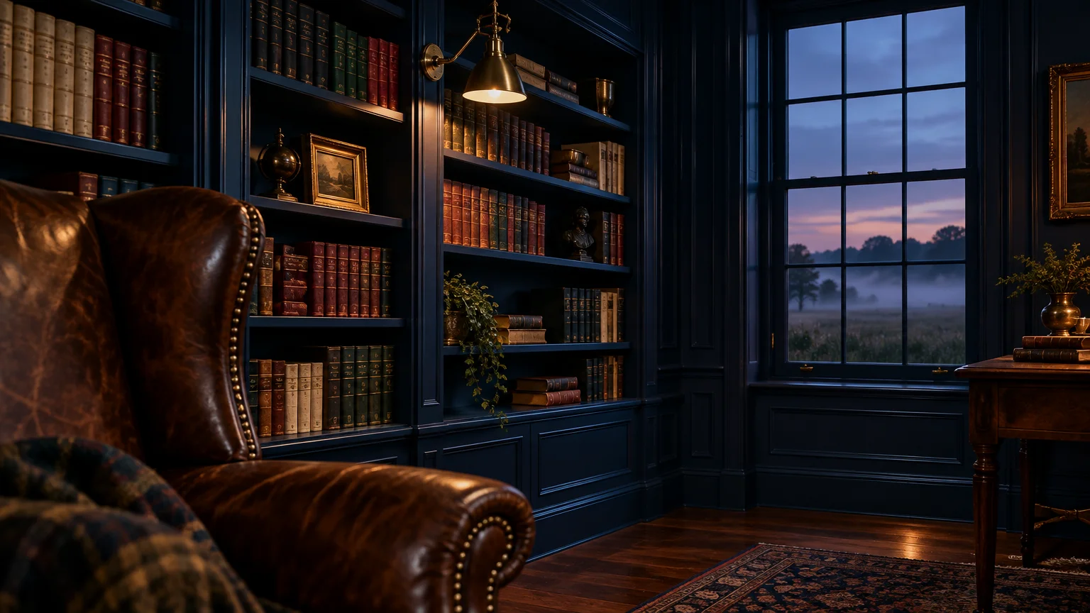
Trend #4: Heritage Deep Navy
Benjamin Moore Hale Navy HC-154 delivers saturated depth that anchors open spaces with historic authority. This classic maritime shade commands attention on kitchen islands, library walls, and exterior entry doors.
Traditional farmhouse style relies heavily on deliberate high-contrast accents to delineate functional living zones. Hale Navy offers dramatic definition without displaying the harsh severity of pitch black.
Complement this deep hue with warm butcher block countertops, exposed timber ceiling beams, and unlacquered brass faucets. The warm wood and living metals prevent the rich blue pigment from feeling overly formal.
Apply satin enamel on interior pantry doors or built-in bookshelves to produce an exquisite, furniture-grade finish. The subtle sheen showcases board-and-batten millwork with exceptional clarity.
When painting an entire study or powder room, balance the dark envelopes with generous natural light and linen window treatments.
Pair this authoritative navy with warm white perimeter cabinets to generate a striking two-tone aesthetic that feels both bespoke and timeless.
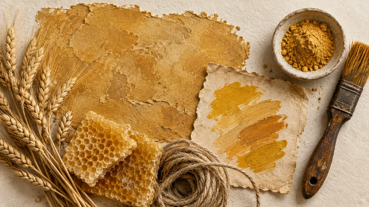
Trend #5: Warm Pastoral Ochre
Sherwin-Williams Hubbard Squash SW 0044 radiates agrarian warmth, reminiscent of golden wheat fields and sun-drenched European farmsteads. This rich, golden-toned yellow infuses breakfast nooks and sunrooms with welcoming cheer.
Modern homeowners turn to warm ochres to counteract gloomy weather and infuse historic soul into sterile drywall spaces. This color introduces authentic pastoral provenance, celebrating traditional craftsmanship and handmade charm.
Combine this inviting hue with rustic wide-plank pine floors, cream-painted millwork, and antique copper cookware displays. The interplay of golden walls and warm copper creates a luminous, lived-in atmosphere.
Use this shade strategically in north-facing rooms that lack direct afternoon warmth to simulate constant golden-hour illumination. Its yellow-brown undertone keeps the ambiance sophisticated rather than overly bright or juvenile.
Keep adjacent trims painted in muted ivory to soften the transitions between rooms and sustain visual harmony.
Introduce handcrafted ceramic lamps and textured wool throws across seating areas to emphasize the tactile nostalgia of this radiant shade.
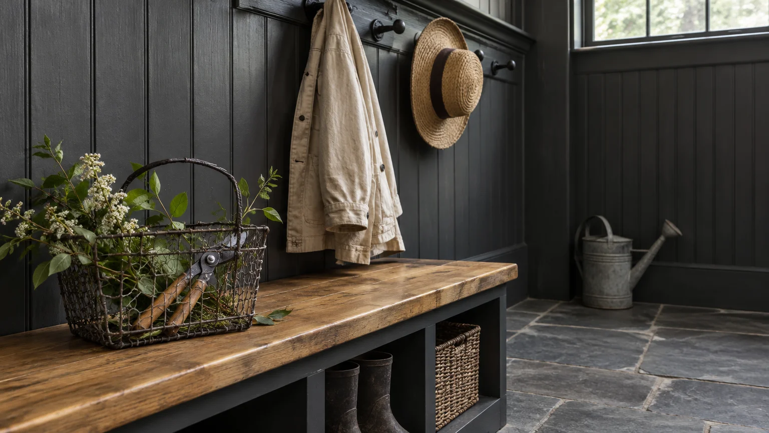
Trend #6: Antiqued Charcoal
Sherwin-Williams Iron Ore SW 7069 offers a velvety charcoal alternative to harsh industrial black tones. It grounds modern farmhouse colors with sophisticated weight on fireplace mantels, window sashes, and interior doors.
This color’s enduring popularity stems from its ability to sharpen relaxed, rustic paint colors into contemporary statements. It provides architectural cadence, guiding your eye toward craftsmanship and structural ceiling beams.
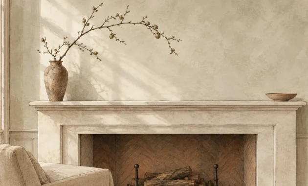
Pair Iron Ore with limewashed stone fireplaces, white board-and-batten walls, and distressed leather armchairs. The contrast enhances textural diversity, making cozy spaces feel deliberately curated and layered.
Select an ultra-flat or matte finish for accent walls to absorb light and create an intimate, cocoon-like presence. For interior doors, choose satin sheen to resist scuffs while adding tactile elegance.
Balance this bold tone with warm white ambient light bulbs so the room remains inviting once evening falls.
Use it sparingly on kitchen base cabinets beneath light marble counters to anchor your workspace with substantial visual gravitas.
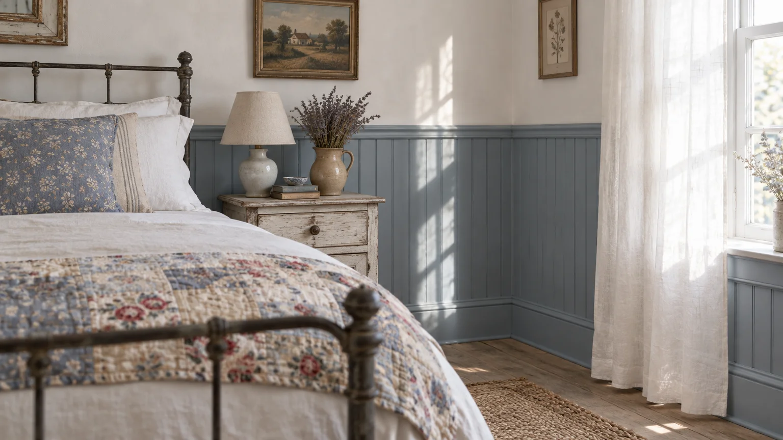
Trend #7: Dusky French Blue
Benjamin Moore Van Courtland Blue HC-145 captures the timeless romance of weathered shutters and French country estates. Its intricate blend of blue and gray undertones feels grounded, relaxed, and endlessly versatile.
Cultural demand for mindful domestic spaces has pushed watery historic blues to the forefront of rural aesthetics. This tone introduces peaceful color into living areas while maintaining an understated, quiet presence.
Style this dusty blue alongside beaded-board wainscoting, weathered zinc planters, and natural sisal floor coverings. The coastal-pastoral fusion produces a relaxed ambiance that honors time-tested farmhouse traditions.
Brush this color across bedroom walls or dining room sideboards to cultivate an atmosphere of tranquil hospitality. It pairs beautifully with warm antique pine furniture and vintage ironstone dinnerware displays.
Use low-luster eggshell paint to highlight the subtle architectural contours of tongue-and-groove paneling.
This muted hue also excels on exterior front doors; it greets visitors with cheerful elegance while framing entry hardware with grace.
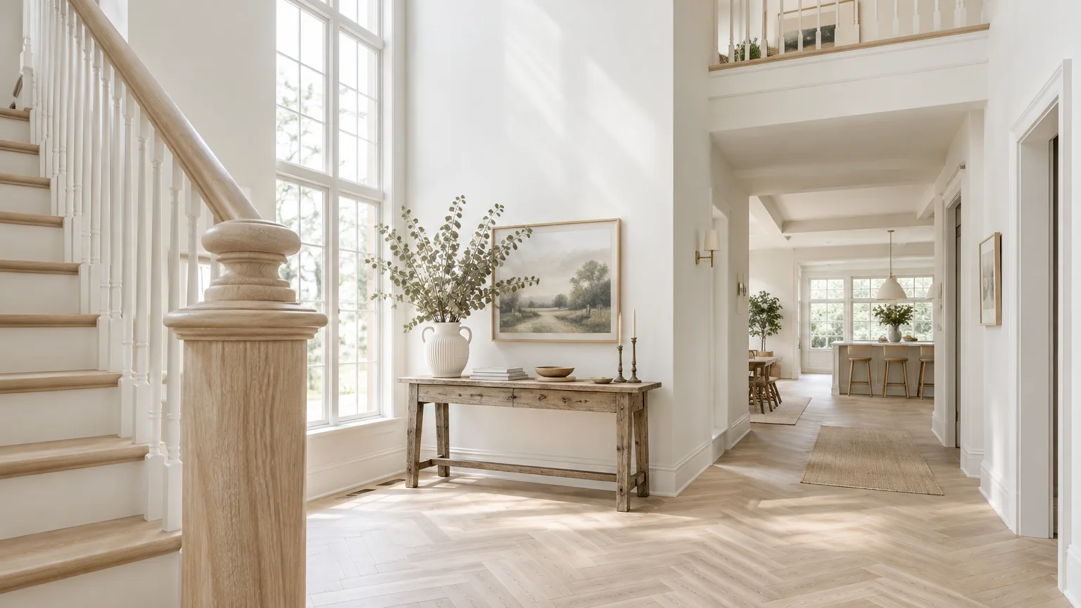
Trend #8: Luminous Dove White
Benjamin Moore White Dove OC-17 reigns supreme as one of the best farmhouse whites across premier historic restorations. A hint of warm gray softens this off-white, preventing glare while preserving radiant light.
It answers the common homeowner dilemma of brightening dark interiors without introducing sterile blue undertones. This color flatters vintage woodwork, antique textiles, and modern open-plan floor layouts alike.
Layer White Dove on walls, ceilings, and trim using varied sheens to achieve subtle, monochromatic elegance throughout your home. Matte ceilings and satin moldings create depth while keeping your palette streamlined and peaceful.
Combine this classic white with natural slate tile entryways and hand-hewn oak ceiling beams for organic balance. The warm undertones effortlessly highlight the authentic imperfections of rustic building materials.
Test this dependable white in rooms with fluctuating daylight; it preserves its balanced poise under both morning sun and lamplight.
Install simple linen Roman shades to softly filter incoming sunlight, accentuating the velvety quality of this celebrated designer staple.
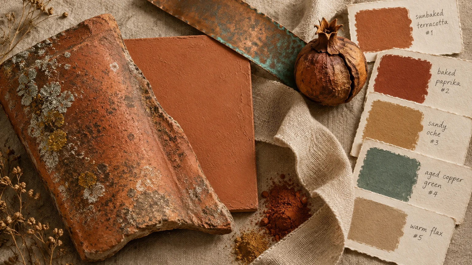
Trend #9: Sunbaked Terracotta
Sherwin-Williams Cavern Clay SW 7701 channels sun-drenched Mediterranean and southwestern agrarian traditions into cozy domestic rooms. Its warm clay pigment creates an inviting environment rich with artisan character.
Today’s design lovers crave tactile earthiness, turning away from synthetic finishes toward colors inspired by natural clay and pottery. Cavern Clay satisfies that desire by infusing dining spaces and dens with grounded vitality.
Blend this expressive shade with rough-sawn cedar mantels, hand-thrown ceramic planters, and creamy off-white textiles. The contrast between warm terracotta and neutral fabric delivers effortless, bohemian farmhouse style.
Use this rich hue in dining rooms to encourage lively conversations and create an intimate gathering space. Warm Edison bulbs and flickering candlelight enhance its natural golden-orange undertones during evening dinner parties.
Apply this color in an ultra-matte finish to emulate authentic limewash or unglazed clay plaster walls.
Accessorize with woven baskets and aged bronze switch plates to complete a rich, earthy sensory experience across the space.
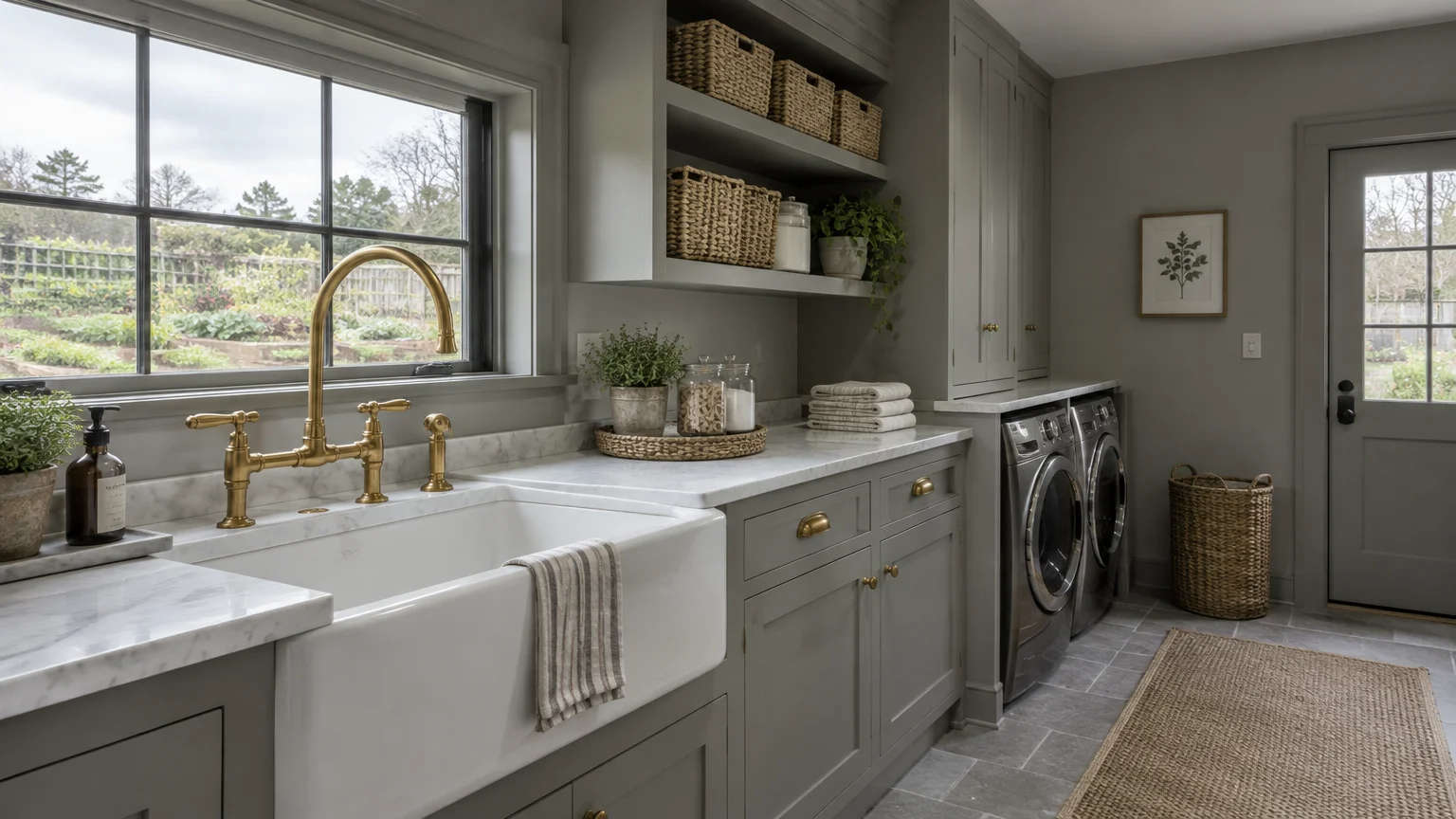
Trend #10: Restful Pewter Gray
Sherwin-Williams Repose Gray SW 7015 delivers the ultimate neutral canvas for layered interior design. With slight greige undertones, this adaptable gray never reads chilly or detached in natural light.
It serves as the cornerstone of transitional modern farmhouse colors, effortlessly connecting varied materials and accent tones. Homeowners choose this shade to create cohesive transitions across sprawling open-concept living zones.
Complement Repose Gray with light-toned hardwood floors, quartz countertops, and brushed nickel hardware accents. This neutral lets vintage rugs, textured throw pillows, and family heirlooms take center stage.
Apply an eggshell finish on expansive living room and entryway walls to balance cleanability with soft light diffusion. The color remains crisp and modern while offering substantial warmth under varied artificial lighting.
For trim work, choose a bright white contrast like Sherwin-Williams Pure White SW 7005 to frame walls cleanly.
Use it on painted open shelving to display white pottery collections; the delicate contrast makes ceramics pop without visual clutter.
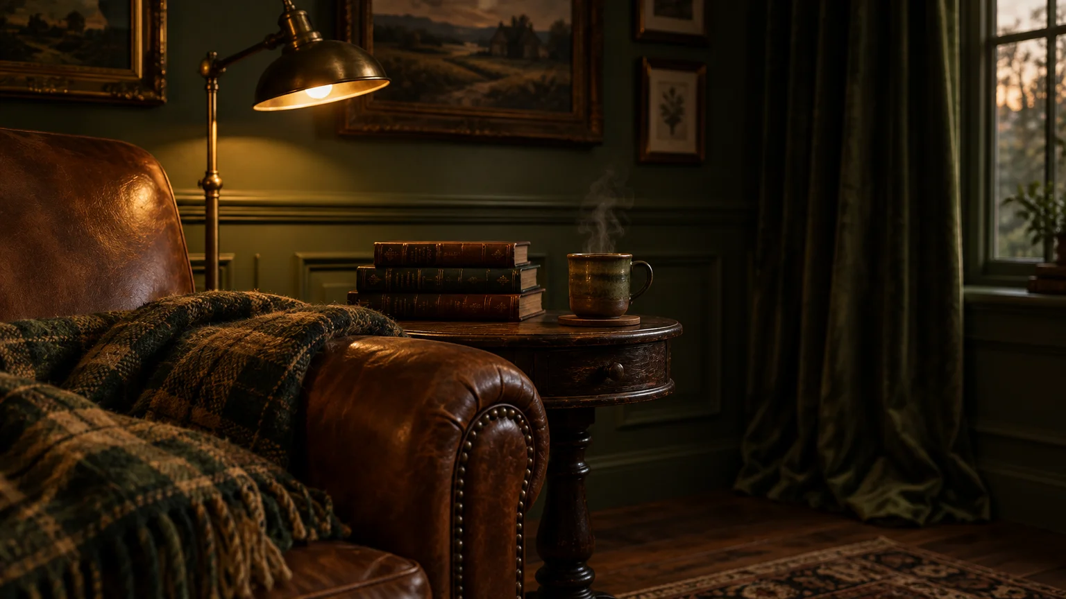
Trend #11: Moody Agrarian Olive
Benjamin Moore Dark Olive 2140-30 envelops spaces in moody elegance, echoing deep forest canopies and heritage orchards. This sophisticated tone brings tailored drama to studies, butler pantries, and cozy primary suites.
Homeowners increasingly embrace moody colors to build intimate sanctuaries that contrast with wide, sunlit communal areas. Dark Olive provides this sanctuary feel without losing its deep connection to the natural world.
Pair this brooding green with rich walnut furniture, unlacquered brass cabinet hardware, and cream boucle upholstery. The combination produces a captivating study in rustic quiet luxury and tactile contrast.
Paint floor-to-ceiling shiplap or beadboard in this shade using a rich satin sheen to amplify shadow and depth. The rich pigments transform simple vertical planks into high-end architectural focal pieces.
Incorporate mirrors and ambient sconce lighting to catch golden undertones hidden within this deep green pigment.
Style the room with botanical art prints and dried florals to celebrate the pastoral heritage of this rich, earthy hue.
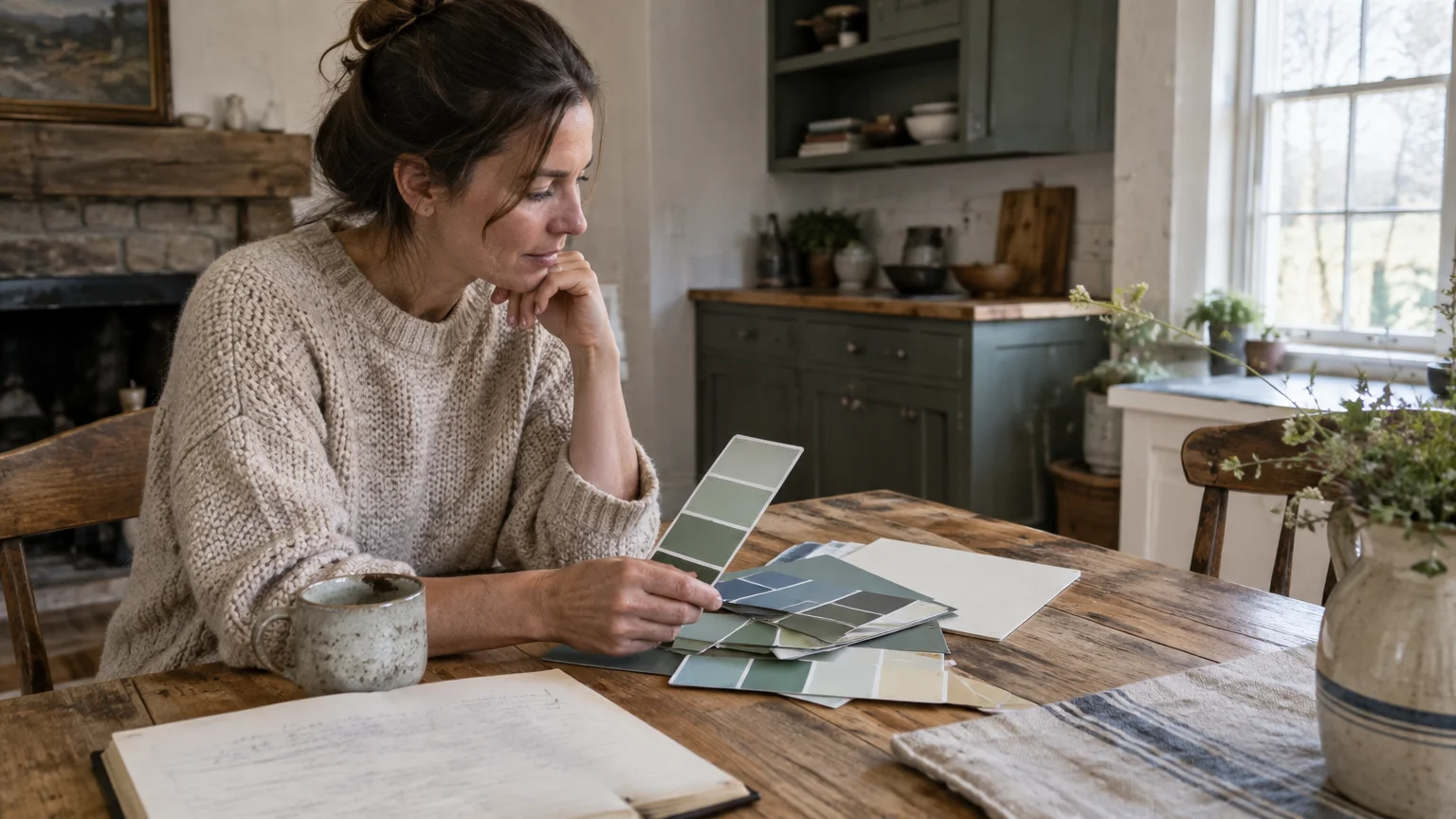
The Big Picture: Weaving These Trends into Your Home
Building a timeless farmhouse palette requires balancing historical warmth with your home’s unique architectural framework. Rather than saturating every surface with bold color, establish a cohesive whole-house foundation using two neutral tones.
Introduce deeper shades like charcoal, deep navy, or moody olive through millwork, cabinetry, and interior passage doors. This strategic application creates rhythmic visual anchors as you move from room to room.
Lighting plays a decisive role in how these farmhouse paint colors perform across different seasons and times of day. Always paint large sample swatches directly on your walls to observe how undertones respond to natural illumination.
Layer organic textures—such as hand-scraped flooring, linen drapes, and woven rush seating—to complement your painted surfaces. Natural materials soften bold contrasts and keep your living spaces feeling genuinely relaxed rather than staged.
Edit your selections thoughtfully by focusing on colors that reflect your personal lifestyle and daily routines. When you prioritize authentic materials over fleeting fads, your farmhouse style will remain elegant for decades to come.
Pay careful attention to sheen variations across your spaces, using lower sheens for walls and higher sheens for woodwork. This disciplined contrast delivers subtle dimension while protecting high-touch surfaces from daily wear and tear.
For the latest color forecasts, consult industry leaders like Pantone and paint companies like Benjamin Moore. For professional design standards, refer to the American Society of Interior Designers (ASID).
Frequently Asked Questions
How do I select the best farmhouse whites for a room with northern light?
Northern daylight carries cool, bluish casts that can make stark whites feel clinical and dingy. Choose warm whites with creamy or beige undertones, such as Sherwin-Williams Alabaster, to inject artificial sunshine and coziness.
Avoid cool, blue-based whites in north-facing areas because they flatten architectural millwork and mute textured decor.
Can I combine warm and cool modern farmhouse colors in the same living area?
Yes, you can successfully balance warm and cool tones by anchoring them with natural wood and neutral transitions. Pair cool navy or charcoal accents with warm greige walls and honey-toned oak flooring for balanced visual contrast.
Incorporating tactile woven textiles and unlacquered brass details bridges temperature differences smoothly across your open spaces.
Which paint sheen works best for modern farmhouse board-and-batten millwork?
A satin or semi-gloss finish works best on board-and-batten millwork and cabinetry. These sheens resist scuffs from daily wear while reflecting just enough light to define the architectural shadows and craftsmanship.
For drywall expanses, apply an eggshell or flat matte finish to keep walls looking soft and velvety.
Are moody, dark rustic paint colors replacing traditional all-white farmhouse interiors?
Dark colors are not replacing whites, but designers are using them strategically to create contrast and intimate zones. Blending rich olives or deep navies with warm off-white envelopes produces a layered, collected-over-time ambiance.
This thoughtful juxtaposition elevates rustic paint colors from purely utilitarian finishes to curated, high-end interior statements.
Disclaimer: This article reflects design trend analysis and predictions. Personal taste and timeless design principles should always guide your decorating choices.