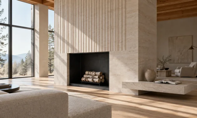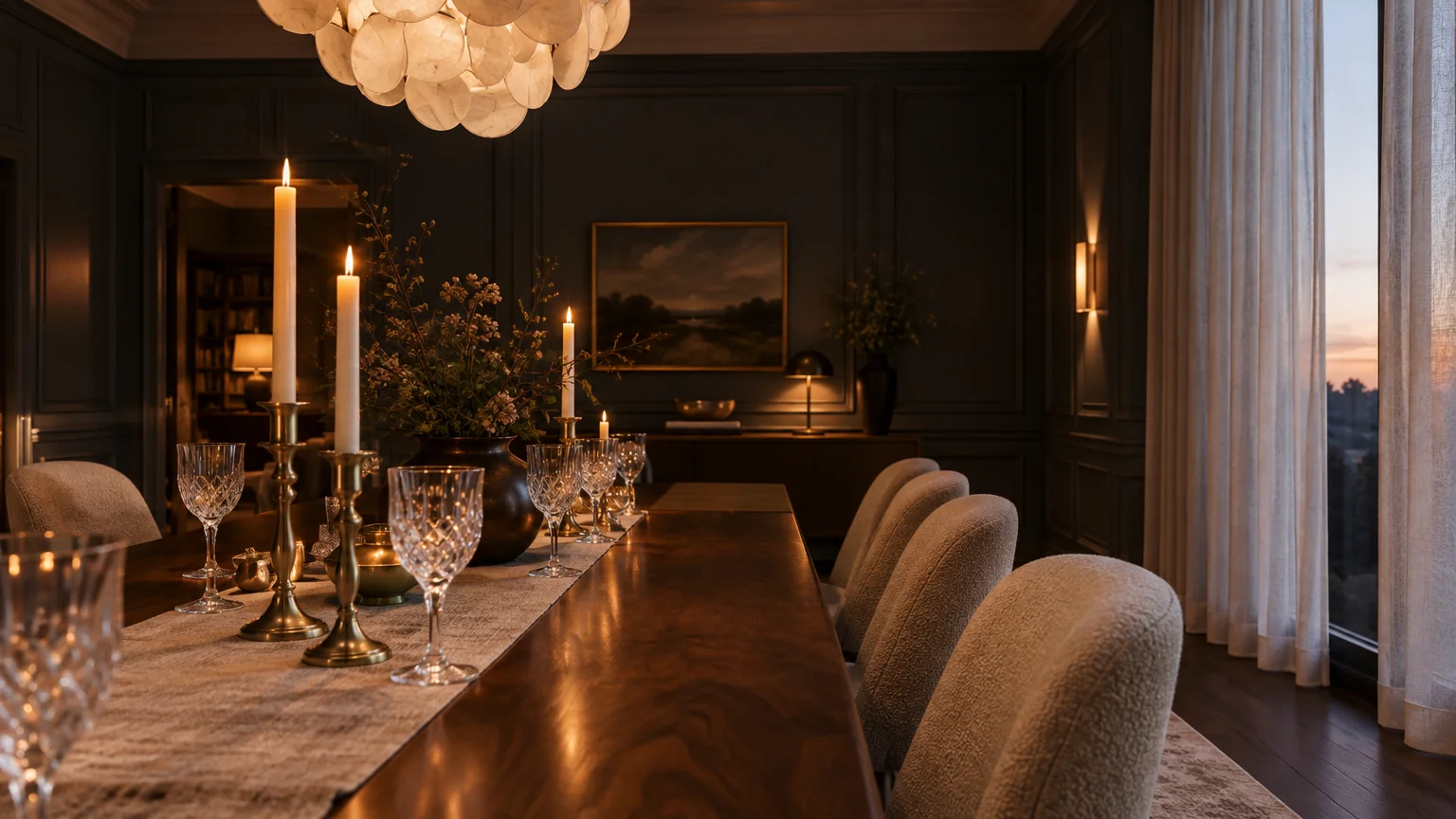
Choosing formal dining room paint colors transforms a utilitarian mealtime space into an immersive sensory stage. The right hue sets an intentional mood, anchoring dinner parties with architectural depth and refined ambiance.
Today’s dining room paint ideas balance timeless gravitas with modern drama. Whether you crave the enveloping warmth of rich wall colors or the calm restraint of tailored neutrals, color commands the room.
Explore these curated dining room color schemes to elevate your evening entertaining. Each sophisticated shade delivers high-impact elegance while honoring your home’s historic proportions.
Trend #1: Deep Parisian Navy
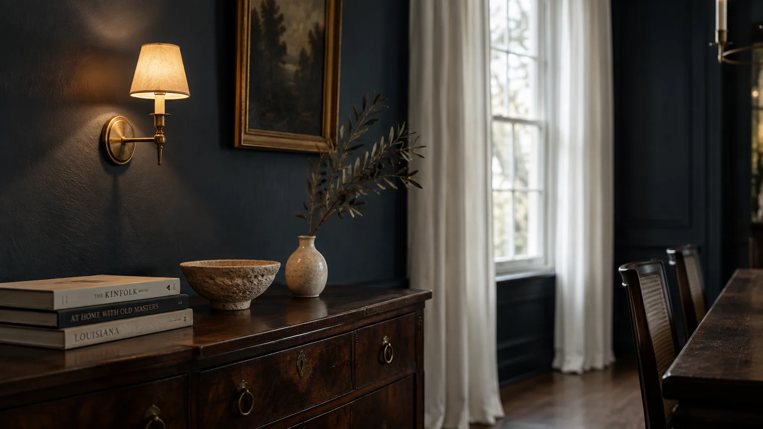
Deep Parisian navy provides an aristocratic backdrop that immediately elevates formal entertaining spaces. This hue embraces quiet luxury by projecting confidence without overwhelming your guests.
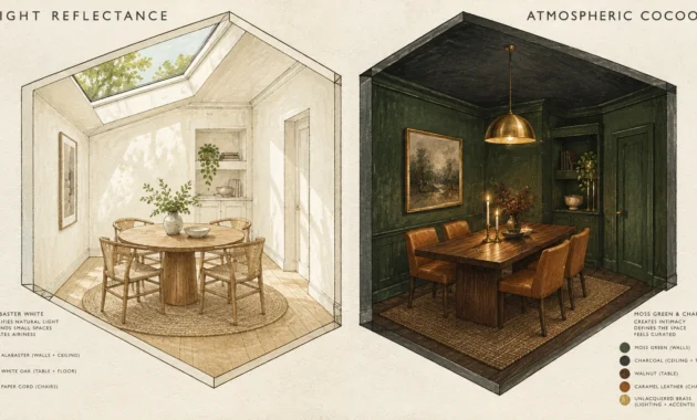
Pair this shade with unlacquered brass sconces to create a striking chiaroscuro effect. Natural candlelight flickers brilliantly against dark walls with low Light Reflectance Values.
This color works exceptionally well alongside antique walnut furniture and polished marble surfaces. It adds historic provenance to contemporary rooms without demanding complex wall paneling.
Coat your walls and baseboards in an eggshell sheen for a seamless, tailored envelope. The velvety finish diffuses overhead glare while cultivating an exclusive, private-club ambiance.
Soften the rich wall color with crisp white linen drapes and upholstered seating. These bright textiles inject balance, ensuring your dining space feels inviting and spacious.
Consider painting the ceiling two shades lighter than the navy walls to preserve vertical height. This gradient keeps your formal dining room feeling expansive while maintaining an intimate dining focus.
Trend #2: Heritage Forest Green
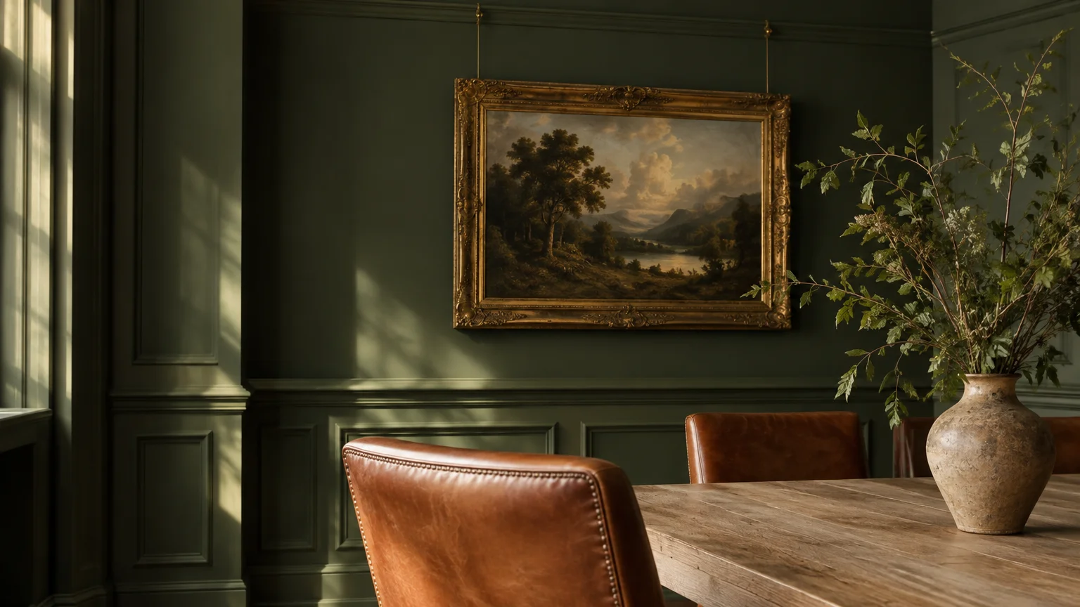
Heritage forest green infuses formal dining rooms with restorative biophilic energy and stately charm. It grounds large gathering rooms by recalling the grandeur of traditional English country manors.
This deep botanical hue highlights existing architectural moldings, wainscoting, and coffered ceilings. Its nuanced undertones soften sharp edges, creating an enveloping, harmonious visual experience.
Layer this green with gilded vintage frames, antique mirrors, and heavy brocade textiles. Natural white oak dining tables emphasize the organic, artisanal provenance of the overall design.
Specify a dead-flat matte finish to enhance the pigment’s saturated visual depth. This velvety treatment absorbs bright light sources, flattering your guests throughout intimate dinner parties.
Accent the space with warm cognac leather dining chairs and botanical branch arrangements. These earthy elements echo the outdoor references and reinforce your sophisticated design narrative.
Install picture rail moldings painted in the same forest hue to showcase framed oil paintings. The monochrome green trim provides a dignified, gallery-style aesthetic for classical dinner events.
Trend #3: Saturated Bordeaux and Oxblood
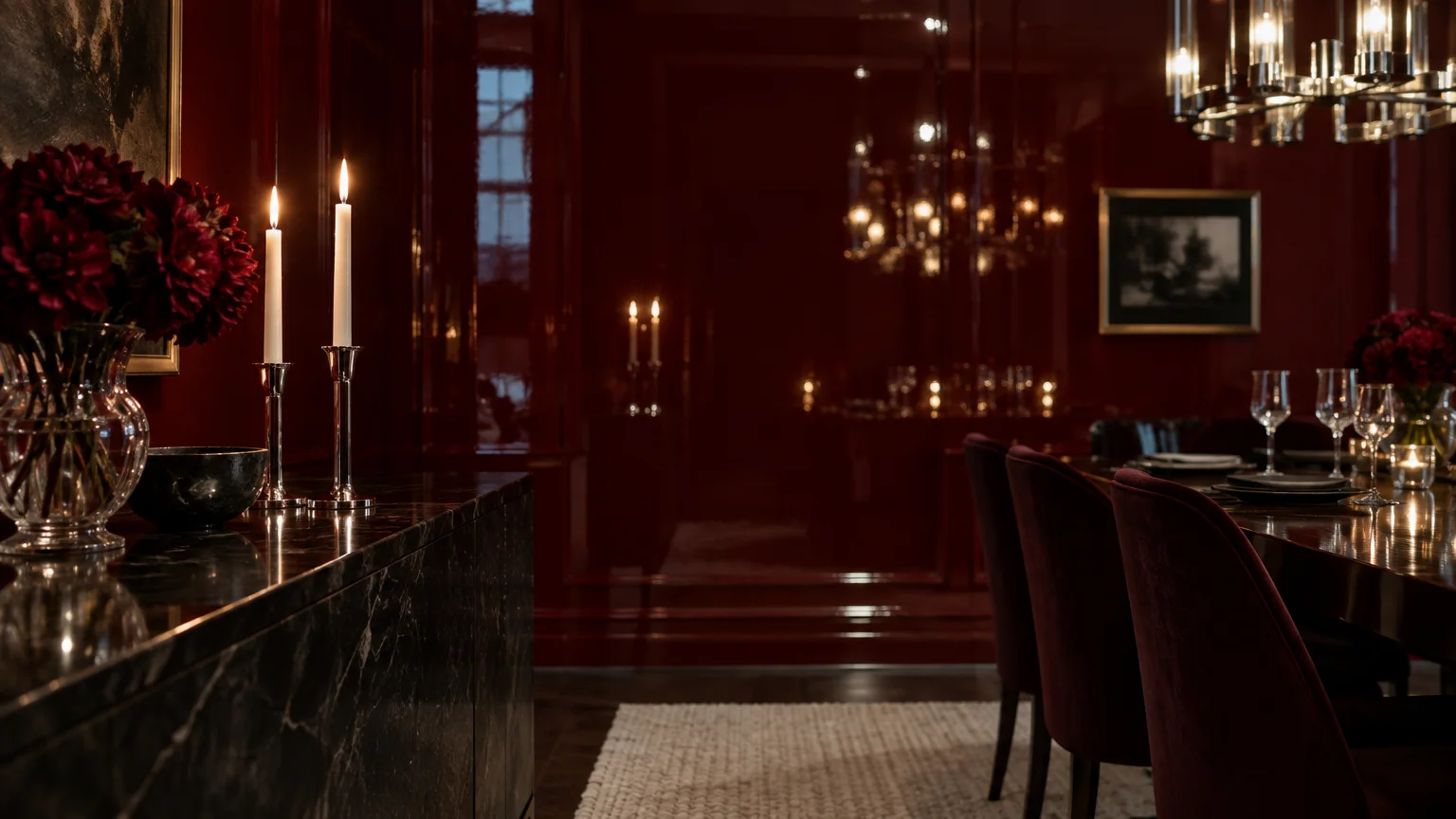
Saturated bordeaux and oxblood evoke the drama of historic European dining salons. These rich wall colors stimulate appetite and inspire passionate dinner table conversations late into the evening.
The heavy chromatic weight of oxblood grounds rooms with tall or vaulted ceilings. It wraps your guests in an opulent cocoon that feels celebratory and distinctly formal.
Pair this deep wine shade with honed black marble, smoked mirrors, and polished mahogany. Polished nickel accents provide a clean, modern counterpoint to the warm burgundy paint.
Apply a full-gloss lacquer finish to oxblood walls if you crave theatrical glamour. The reflective surface captures the shimmer of crystal stemware and chandeliers with hypnotic vibrancy.
Balance the intensity of saturated red walls with an ivory wool area rug. This neutral foundation lightens the floor plane and anchors your central dining furniture.
Frame your dining entrance with matching oxblood portiere curtains to enhance acoustic intimacy. Heavy velvet drapery dampens ambient dinner noise, encouraging softer, more personal conversations.
Trend #4: Warm Alabaster and Soft Chalk
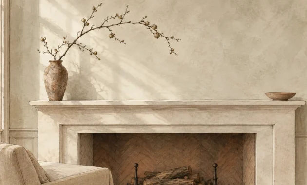
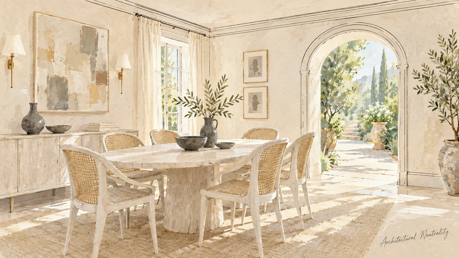
Warm alabaster redefines modern minimalism by replacing stark, sterile whites with rich complexity. It provides an understated canvas that celebrates heirloom dining tables and bespoke artwork.
Unlike cool gallery whites, soft chalk contains delicate yellow, grey, and taupe undertones. These pigments react gracefully to natural daylight and warm evening chandelier illumination.
Use this versatile shade to balance oversized architectural lighting fixtures and dark flooring. It provides visual breathing room, allowing sculpted furniture silhouettes to take center stage.
Prevent the neutral scheme from feeling flat by layering diverse, tactile materials throughout. Incorporate boucle dining chairs, raw travertine centerpieces, and heavy linen drapes for necessary depth.
Paint both walls and millwork in alabaster using varying sheens for understated sophistication. Try flat on ceilings, eggshell on walls, and satin on trim.
Introduce a dark charcoal dining table as an intentional visual anchor against the pale walls. This dramatic contrast prevents the creamy perimeter from feeling ungrounded or overly delicate.
Trend #5: Muted Terracotta and Spiced Clay
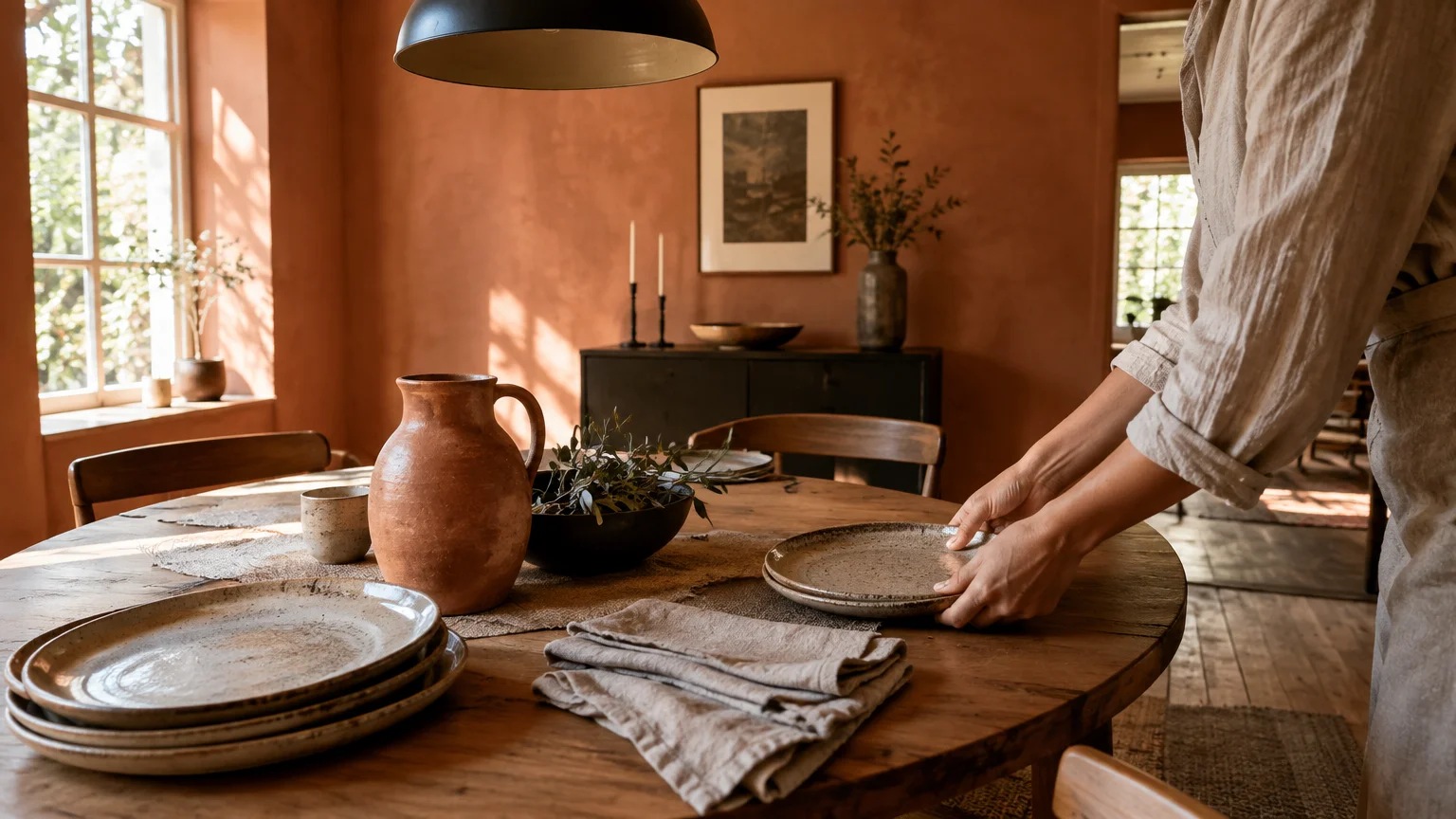
Muted terracotta infuses formal dining rooms with earthy warmth and Mediterranean romance. This sun-baked shade delivers tactile comfort while upholding a distinctly tailored aesthetic.
The spiced clay undertones generate a radiant, flattering glow during evening gatherings. This welcoming ambience makes guests feel instantly comfortable, encouraging them to linger over lingering courses.
Contrast terracotta walls with matte black architectural lighting and dark iron curtain hardware. These crisp dark accents ground the warm wall color, preventing it from appearing rustic.
Apply a lime wash or Roman clay finish for subtle, artisanal surface variation. This historic texture lends your dining room a storied, European villa sensibility.
Complement the warm walls with rich olive green foliage and unglazed pottery accents. This botanical pairing reinforces the organic, biophilic qualities of the warm earth pigments.
Pair clay walls with white oak wainscoting to introduce clean, structural lines. The juxtaposition of natural blonde wood and terracotta infuses modern Scandinavian restraint into Mediterranean warmth.
Trend #6: Moody Charcoal and Soft Noir
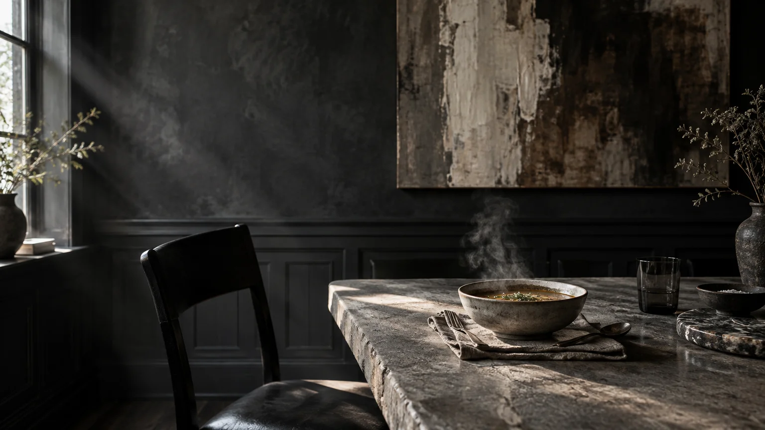
Moody charcoal delivers contemporary sophistication through high-contrast drama and tailored architectural poise. This deep palette blurs room boundaries, making modest dining areas appear surprisingly expansive.
Charcoal acts as an exceptional gallery backdrop for vibrant modern art and gilded frames. Bright white porcelain dinnerware and sterling silver accessories pop boldly against the dark perimeter.
Counterbalance deep charcoal walls with rich natural woods, such as walnut or cerused oak. These warm wood grains inject human warmth and organic texture into the room.
Color drench the entire room by painting baseboards, doors, and window trim in charcoal. This uninterrupted application creates a seamless architectural container that feels cohesive and intentional.
Integrate dimmable ambient sconces and candlelight to soften the room’s dark shadows. Controlled lighting ensures the dark scheme feels intimate and moody rather than harsh.
Hang an oversized gilded antique mirror on the main charcoal accent wall. The reflective glass doubles the ambient chandelier light while visually breaking up the immense dark plane.
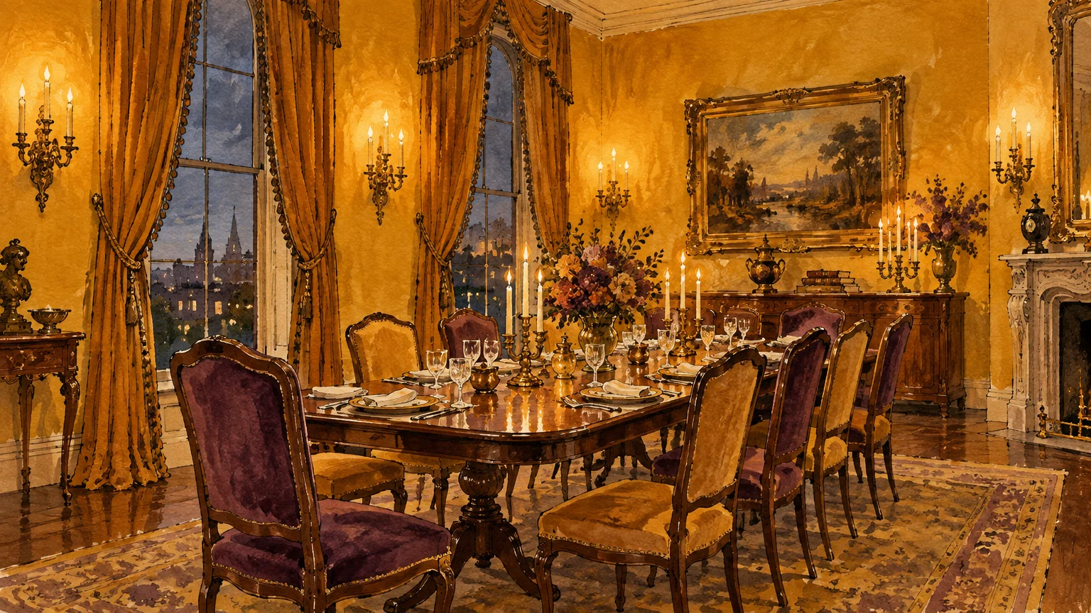
Trend #7: Antiqued Ochre and Spiced Dijon
Antiqued ochre revives the spirited warmth of eighteenth-century European reception salons. This spicy golden shade generates an inviting, luminous glow that enriches formal evening gatherings.
Dijon yellow communicates intellectual confidence, avoiding the predictability of conventional neutral color palettes. It brings historic provenance to life while pairing effortlessly with mid-century dining furniture.
Pair ochre walls with deep sapphire velvet seating or rich aubergine window drapery. These saturated jewel-tone pairings create an opulent, layered atmosphere reminiscent of classic historic homes.
Utilize a subtle Venetian plaster treatment when working with rich golden pigments. The artisanal texture catches changing light levels, mimicking the sun-faded walls of old-world Italian villas.
Add patinated bronze hardware and dark antique rugs to ground the vibrant yellow. These deep accents stabilize the room and complete your sophisticated dining room color scheme.
Introduce dark walnut crown molding to frame the golden walls like a work of art. This rich perimeter defines the ceiling line with timeless classical authority.
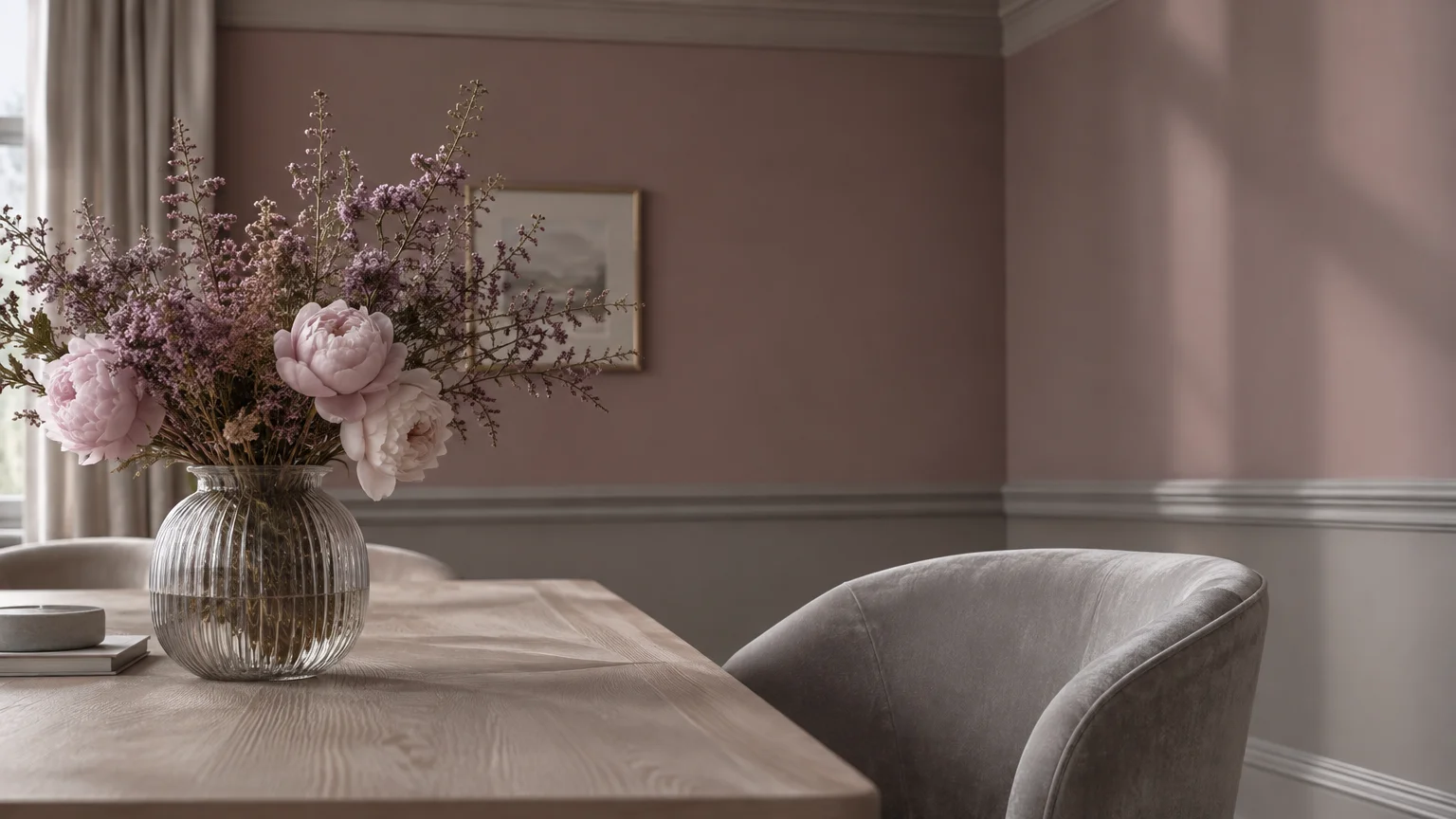
Trend #8: Dusty Mauve and Heather Lilac
Dusty mauve introduces unexpected romantic nuance to classic formal dining room designs. This grey-tinged lilac reads as an intriguing modern neutral with undeniable vintage appeal.
Slate and stone undertones temper the purple pigment, preventing it from feeling overly sweet. The resulting shade creates a tranquil, sophisticated setting designed for relaxed dinner conversations.
Complement dusty mauve with cool white marble tabletops, polished chrome fixtures, and crystal decor. This balance between cool stone, sleek metal, and warm paint generates captivating design tension.
Anchor the ethereal wall color with dark fumed oak flooring and rich charcoal textiles. The dark flooring prevents the light mauve walls from feeling too delicate.
Use matte paint finishes on the walls to preserve the dusty, chalky character of mauve. This soft surface texture diffuses chandelier light across your entertaining space with subtle grace.
Accentuate the romantic wall color with deep plum velvet seat cushions on your dining chairs. This tone-on-tone purple scheme demonstrates confident color mastery without overwhelming the senses.
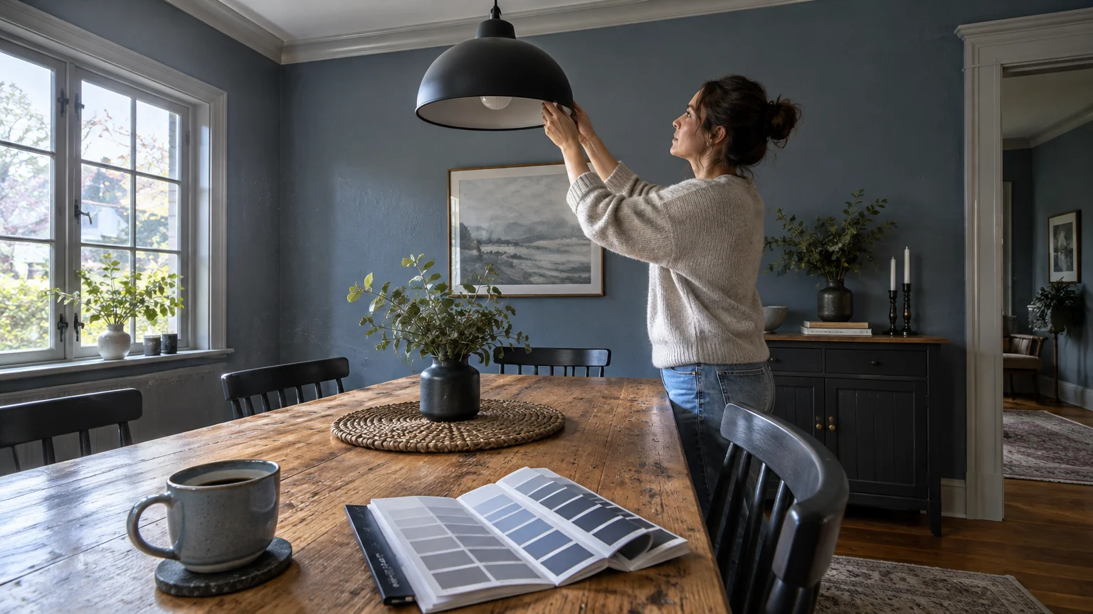
Trend #9: Slate Blue and Fog Grey
Slate blue marries tailored coastal serenity with structured architectural formality. This adaptable hue shifts mood dynamically throughout the day, moving from crisp daylight to cozy dusk.
A high ratio of grey pigment prevents slate blue from reading like standard nursery blue. It imparts a quiet confidence that complements traditional wainscoting and custom built-in cabinetry.
Contrast slate blue walls with warm cognac leather dining chairs and bleached oak floors. The warm leather tones balance the cool blue, fostering a harmonious visual equilibrium.
Apply an eggshell finish on the walls paired with satin finish trim in warm off-white. This subtle contrast highlights classic crown molding and emphasizes architectural craftsmanship.
Accent the space with contemporary abstract artwork and brushed brass chandeliers. These polished details ensure your slate blue dining room feels distinctly modern and design-forward.
Extend slate blue across built-in china cabinets to turn your storage into an architectural focal point. Brass cabinet latches will gleam brightly against the cool, painted shelving.
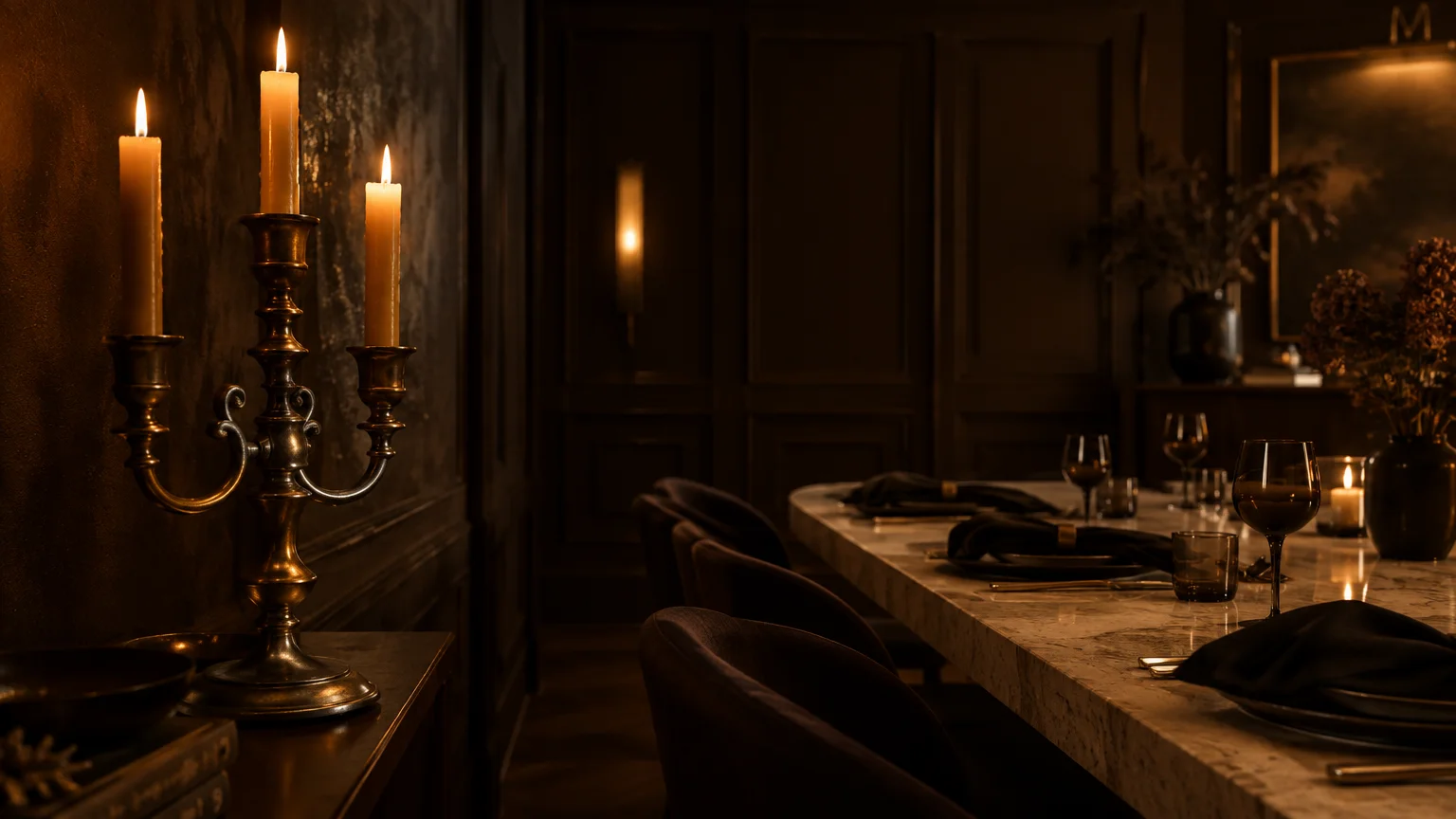
Trend #10: Rich Espresso and Bitter Chocolate
Rich espresso delivers profound depth that feels luxurious, grounding, and thoroughly modern. High-end designers embrace dark brown as an inviting, softer alternative to severe black walls.
Bitter chocolate walls create a secure, cocooning dining sanctuary for your family and guests. This enveloping tone flatters every complexion under warm, dimmed chandelier lighting.
Pair espresso paint with unlacquered brass hardware, aged bronze sconces, and caramel velvet upholstery. The metallic accents gleam like jewelry against the velvety, dark brown walls.
Paint your window trim and wainscoting in matching espresso to achieve full immersion. This unified approach blurs room corners, making standard-height dining rooms feel remarkably grand.
Layer light cream draperies and a patterned wool rug to brighten the dark envelope. These lighter textiles ensure your dining room remains balanced, sophisticated, and comfortable.
Install alabaster wall sconces that cast a gentle, diffused glow directly against the dark brown walls. The luminous stone fixtures stand out like radiant sculptures against the chocolate background.
Trend #11: Luminous Sage and Olive Celadon
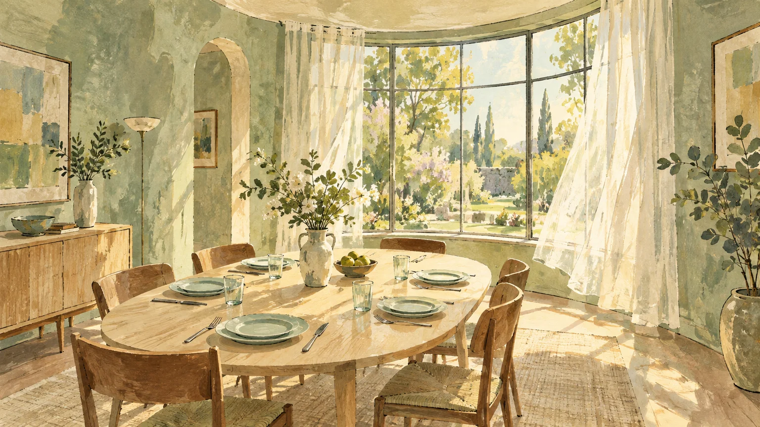
Luminous sage bridges organic outdoor serenity and formal residential interior decoration. This refreshing biophilic green creates an uplifting dining atmosphere that calms and delights dinner guests.
Olive celadon features warm golden undertones that prevent the green from feeling clinical. It catches shifting daylight effortlessly and glows with subtle warmth under evening table candles.
Pair this refreshing green with natural cane dining chairs, bleached ash tables, and white linen. These organic textures reinforce the tranquil, nature-inspired spirit of the color palette.
Coat both walls and window mullions in sage to frame outdoor greenery outside. This paint strategy pulls exterior landscaping indoors, visually expanding your formal dining space.
Add polished brass lighting and contemporary mirrors to inject formality into the natural scheme. These reflective elements elevate sage walls from simple rustic charm to undeniable elegance.
Combine sage walls with a coffered ceiling detailed in subtle off-white paint. This architectural framework elevates the soft green pigment, establishing a formal and timeless gathering space.
The Big Picture: Weaving These Trends into Your Home
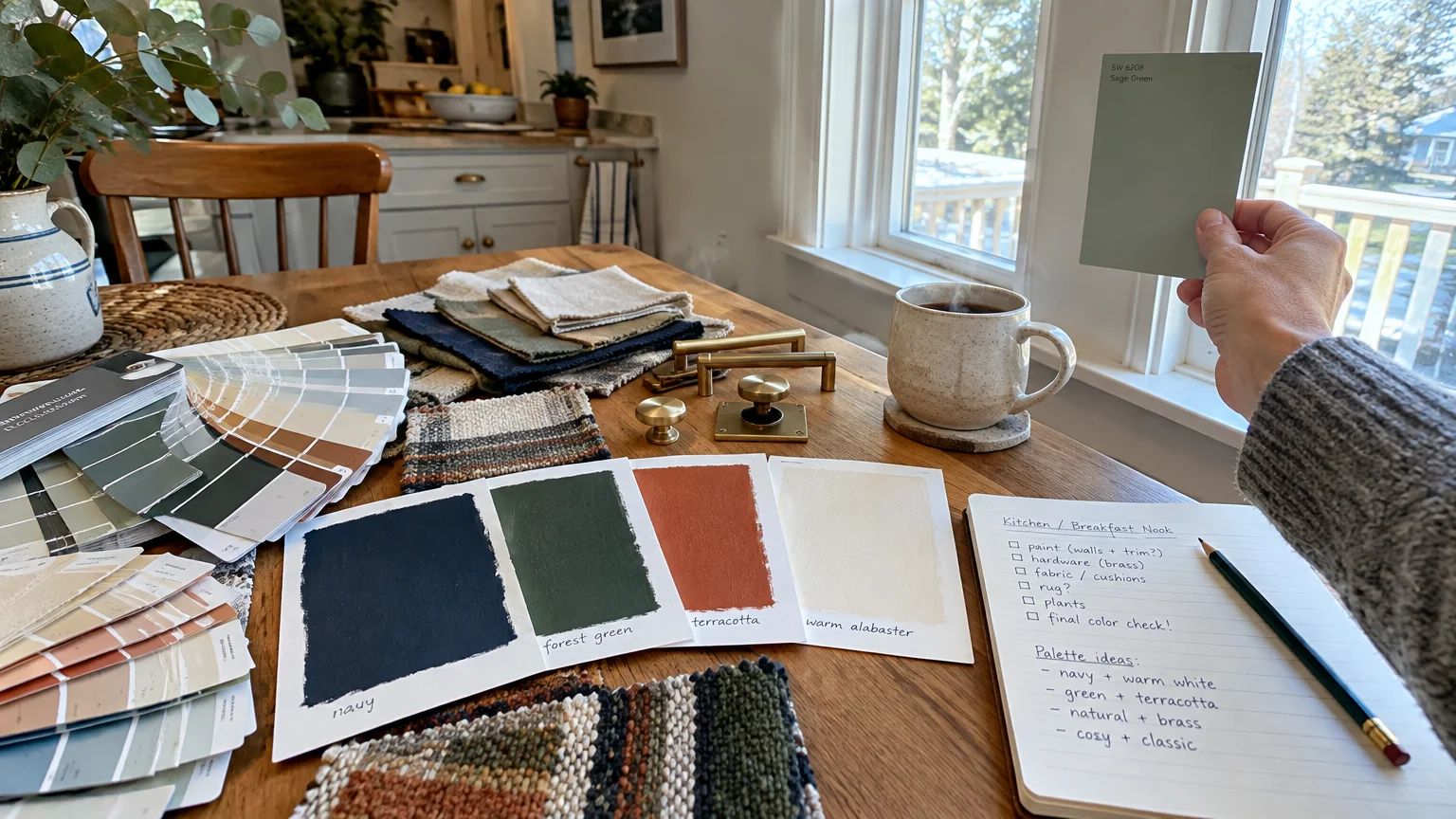
Choosing the ideal formal dining room paint colors requires analyzing how you entertain. Consider whether you prefer lively, sunlit brunch gatherings or dramatic, candlelit dinner parties.
Test your chosen dining room paint ideas under both daylight and artificial evening lighting. Saturated pigments change character dramatically when exposed to 2700K warm incandescent or LED fixtures.
Maintain architectural harmony by coordinating your dining room color schemes with adjacent hallways. A thoughtful transitional palette prevents jarring visual breaks as guests move through your home.
Treat your ceiling as a fifth wall to complete the room’s cohesive design narrative. You can paint it in a soft neutral or extend the wall color overhead.
Select your paint sheen based on wall texture and desired ambient mood. Matte and eggshell finishes hide minor wall imperfections, whereas high-gloss lacquer delivers striking evening drama.
Balance rich wall colors with thoughtful furniture choices and layered lighting sources. A harmonious mix of vintage provenance and contemporary design ensures lasting aesthetic longevity.
For the latest color forecasts, consult industry leaders like Pantone and paint companies like Benjamin Moore. For professional design standards, refer to the American Society of Interior Designers (ASID).
Disclaimer: This article reflects design trend analysis and predictions. Personal taste and timeless design principles should always guide your decorating choices.
Frequently Asked Questions
What paint sheen works best in a formal dining room?
Eggshell and matte finishes remain the premier choices for formal dining room walls. They absorb glare from overhead chandeliers while hiding subtle drywall and plaster imperfections.
For millwork and wainscoting, choose a durable satin or semi-gloss finish. This sheen distinction highlights architectural moldings while resisting scuffs from dining chairs and foot traffic.
Should your dining room match the adjacent living spaces?
Your dining room does not need to match adjacent spaces identically. Instead, aim for a cohesive color story that shares complementary undertones with connecting hallways.
Formal dining spaces offer the perfect opportunity to go bolder than your main living areas. A deeper hue creates an exciting destination room for evening entertaining.
Do dark wall colors make a small dining room look cramped?
Rich wall colors often make small formal dining rooms feel larger rather than smaller. Dark, saturated tones blur wall corners, creating an illusion of depth and boundless space.
Pair dark dining walls with strategic lighting and large mirrors to maximize ambient reflection. This combination turns a modest dining space into a dramatic, jewel-box setting.
How does artificial lighting affect deep dining room colors?
Select light bulbs rated between 2400K and 2700K for formal dining environments. This warm color temperature enhances saturated wall pigments and mimics the cozy glow of real candlelight.
Install dimmer switches on all overhead chandeliers and wall sconces. Dimmers allow you to tailor the lighting level to suit casual family breakfasts or formal evening dinners.