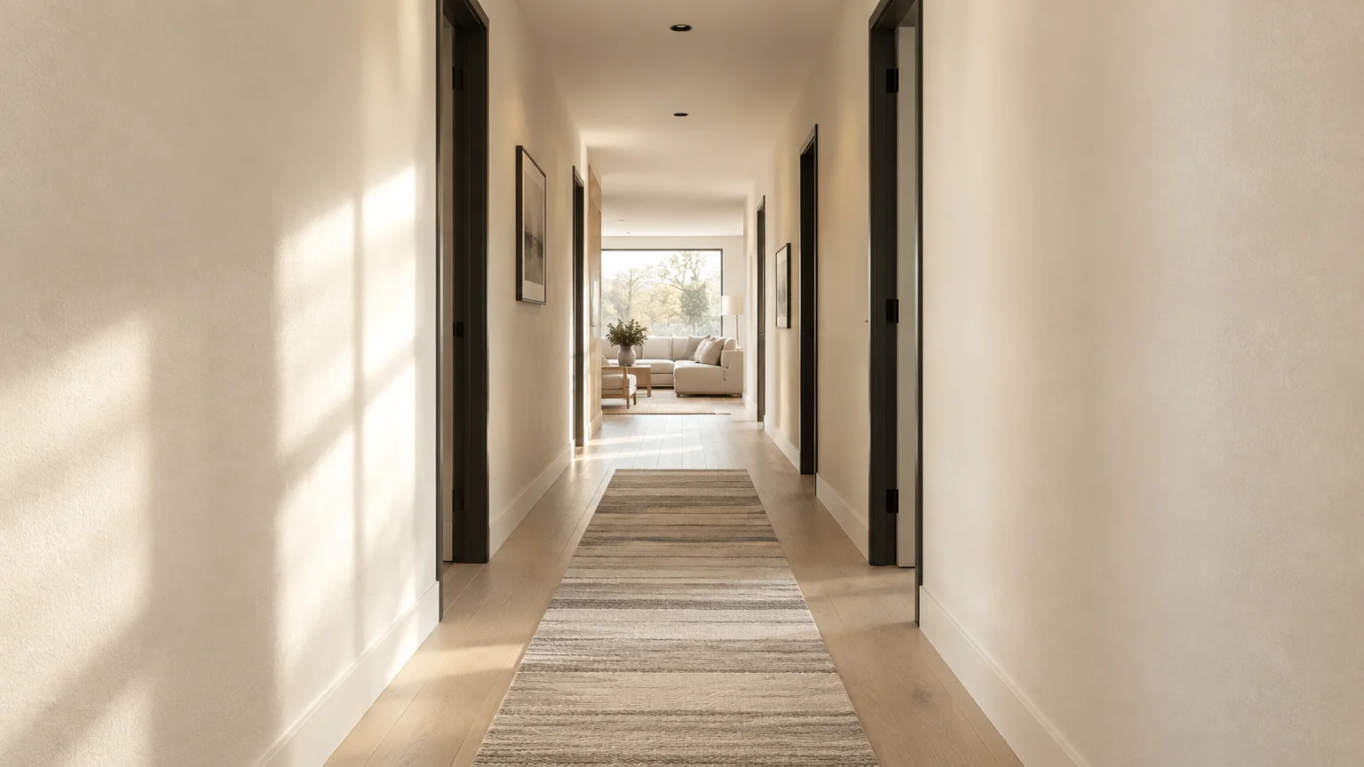
You can visually double the dimensions of a constricted corridor with strategic chromatic selection. The right paint colors narrow hallway boundaries by altering how light scatters across opposing vertical planes.
Selecting transformative hallway color schemes allows tight corridors to borrow illumination from adjacent living rooms and dining rooms. This deliberate technique dissolves claustrophobic architectural boundaries effortlessly.
Modern hallway paint ideas prioritize high Light Reflectance Values and dimensional undertones over flat pigmentation. These sophisticated shades will make hallway look wider while establishing an elevated design narrative throughout your interior.
Trend #1: Alabaster Warmth and Quiet Luxury
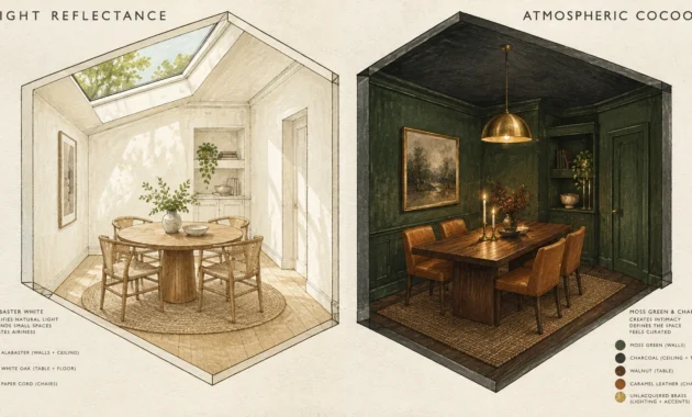
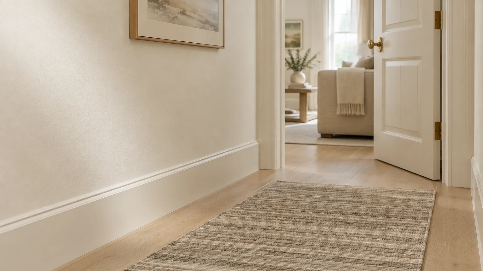
Alabaster off-white establishes an immediate sense of effortless expanse. It reflects ambient glow without the clinical starkness of unprocessed titanium white.
With a Light Reflectance Value (LRV) near 82, this tone gently amplifies low lumen levels. It prevents the dreary, shadowy corners typical of windowless passages.
Pair this hue with pale white oak flooring and minimalist brass hardware. The creamy undertones soften long sightlines, making tight perimeters feel deliberately serene.
Apply an eggshell finish on the walls and satin on the millwork. This tonal variation creates subtle depth while maintaining high durability against daily scuffs.
You can run this versatile color continuously into adjacent living rooms. Doing so unites disparate zones and prevents jarring visual interruptions.
For baseboards, choose a scuff-resistant urethane enamel. Hallways encounter high foot traffic, and durable paint protects your investment over time.
Incorporate a low-profile runner rug featuring subtle horizontal striping. Horizontal floor patterns visually push parallel hallway walls further apart.
Trend #2: Misty Sage and Biophilic Airiness
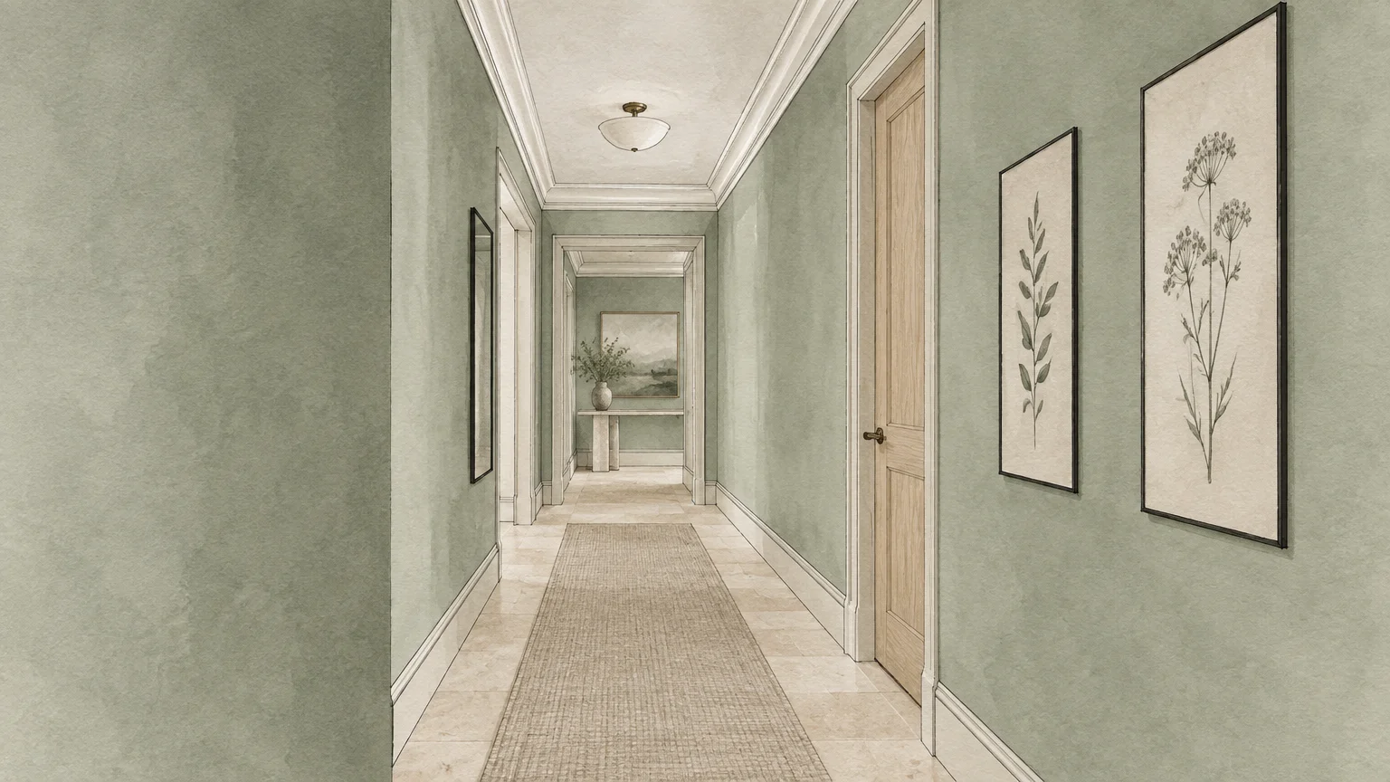
Soft botanical greens bring organic serenity into narrow residential corridors. Muted sage connects windowless transit zones directly to the calming cadence of nature.
Cool green undertones naturally recede from the human eye. This optical phenomenon pushes opposing corridor walls outward, creating an immediate illusion of breathing room.
Integrate this biophilic tone alongside raw linen runners and light travertine accents. The earthy balance grounds narrow footprints without absorbing critical ambient light.
Specify a washable matte emulsion to diffuse light evenly along the vertical surfaces. This texture minimizes wall blemishes and prevents harsh glare from directional ceiling spotlights.
If your hallway lacks exterior windows, install 3000K warm-white recessed fixtures. The neutral temperature prevents sage undertones from skewing dull or muddy.
Pair sage walls with light-toned oak doors to enhance the organic aesthetic. Natural wood grains bring warm tactile contrast to cool botanical hues.
Add slim botanical line art in ultra-thin black frames. The fine lines punctuate the soft green backdrop without dominating the narrow corridor.
Trend #3: Atmospheric Powder Cerulean
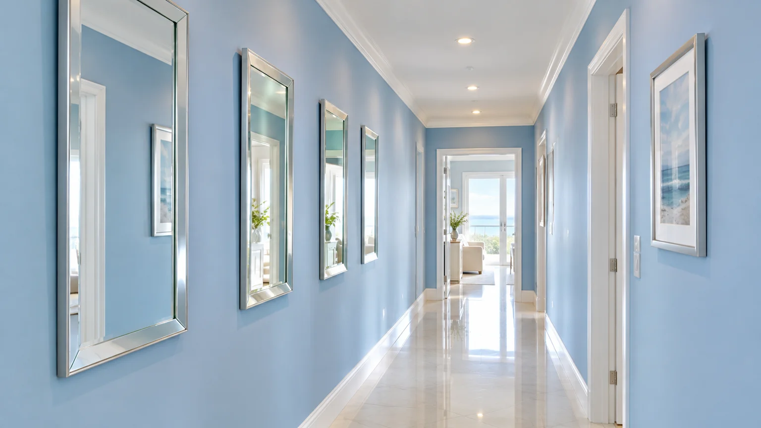
Soft sky cerulean dissolves physical boundaries by mimicking the open atmosphere. Its gentle vibration makes tight passageways feel boundless and sunlit.
Architectural color psychology proves that pale blues trick our depth perception. The brain interprets blue as open sky, visually expanding low ceilings and tight corridors.
Match this ethereal shade with crisp white picture rails and pale porcelain tile. The resulting high-contrast perimeter pulls natural light deep into your floor plan.
This color works exceptionally well in homes with dim hallway lighting. Even under 2700K warm LED illumination, it retains an airy, breezy clarity.
Hang slim, silver-framed mirrors along one side of the blue corridor. The specular reflections will simulate additional exterior window openings.
Extend this powder cerulean over the baseboards and door casings for a color-drenched look. Eliminating contrasting trim lines prevents visual clutter in narrow spaces.
Install polished nickel hardware on doors to reflect pinpoint highlights. The cool metallic glint harmonizes seamlessly with the airy cerulean atmosphere.
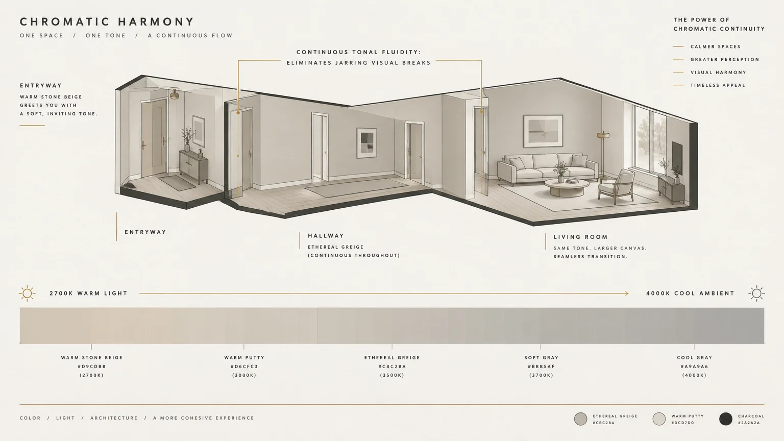
Trend #4: Ethereal Greige and Tonal Fluidity
Ethereal greige strikes the perfect balance between cool gray geometry and warm beige comfort. It provides an understated backdrop that enhances contiguous architectural flow.
Interior designers favor greige because it bridges warm hardwood flooring with modern minimalist ceilings. This harmony eliminates the visual fragmentation that makes small halls feel cramped.
Choose a formula with balanced stone undertones and an LRV around 70. This specific density catches natural light spilling from adjacent living rooms without turning muddy.
Accentuate the length of the hall with large, frameless mirrors. Greige reflects beautifully across glass, amplifying both illumination and spatial volume simultaneously.
Keep door casings and baseboards in the identical greige hue. This continuous envelope creates an unbroken plane that stretches your corridor horizontally.
Test your greige sample under both morning daylight and artificial evening lighting. Because greige shifts dramatically with color temperatures, verify its undertones before rolling.
Anchor the corridor with wide-plank European oak flooring laid lengthwise. The continuous planks lead the eye smoothly forward, exaggerating spatial depth.
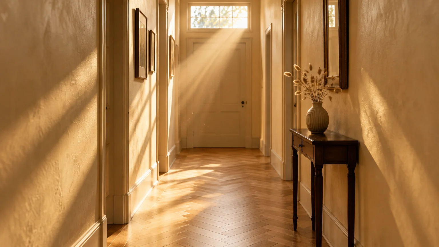
Trend #5: Luminous Parchment and Diffused Sunlight
Luminous parchment yellow infuses narrow, north-facing corridors with the gentle warmth of dawn. It provides an instant architectural antidote to cold, shadowy interior pathways.
Unlike aggressive primary yellows, parchment relies on milky, desaturated undertones. It mimics southern sun exposure, bathing dim transition zones in radiant, cheerful energy.
Combine this shade with walnut accents and matte black sconces. The stark mid-century contrast elevates the yellow from country-cottage charm to sleek contemporary luxury.
Use a low-luster satin finish to maximize light distribution down the hall. The slight sheen bounces directional illumination without highlighting drywall imperfections.
Pair parchment walls with a crisp flat-white ceiling. The clean ceiling boundary emphasizes vertical clearance, making narrow corridors feel dramatically taller.
Balance parchment yellow with crisp architectural moldings painted in cool white. This contrast prevents the yellow from reading overly saturated or dated.
Position a round wall mirror near the entry point. Curved glass breaks the monotonous rectangular grid typical of tight, boxy corridors.
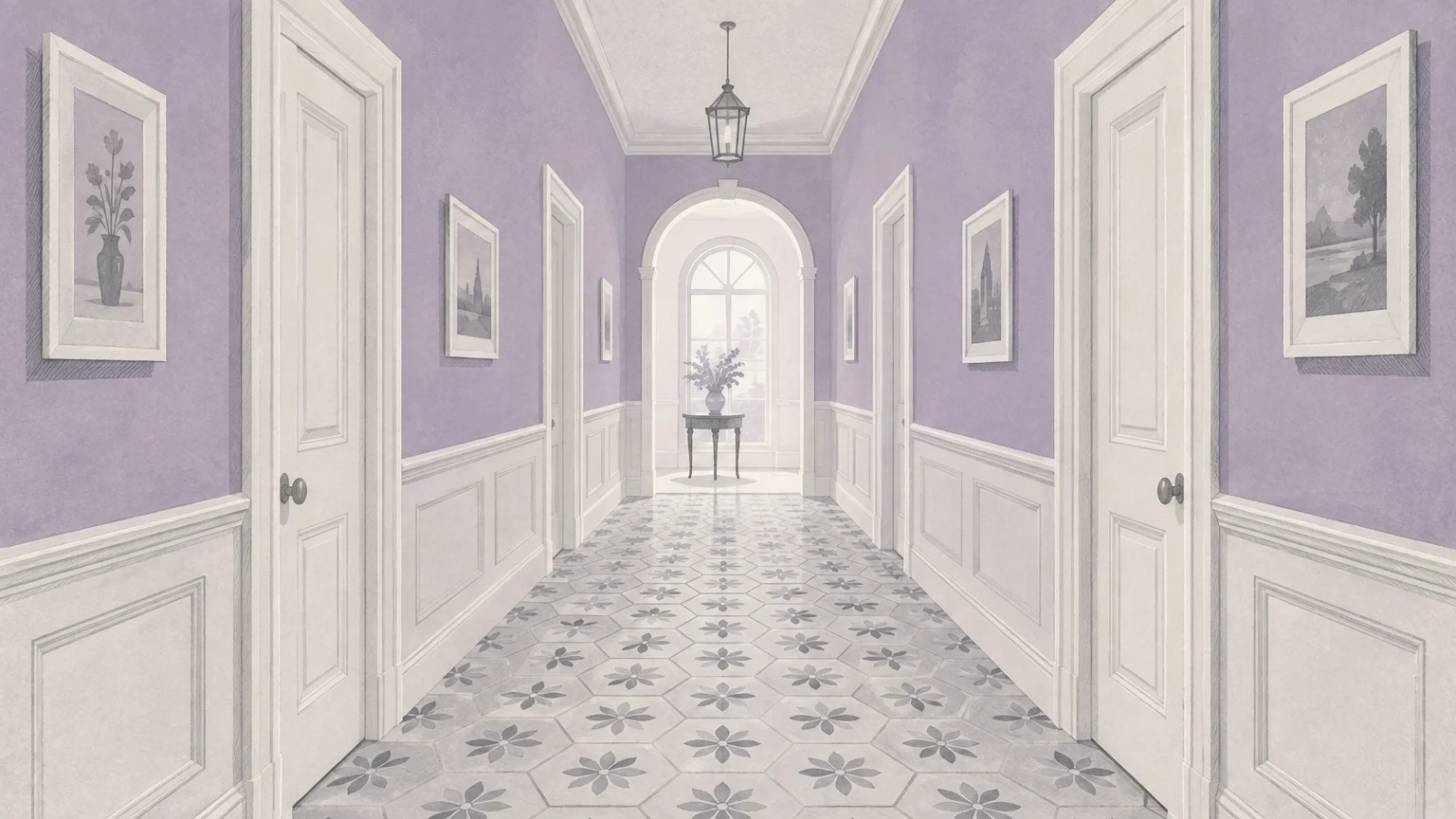
Trend #6: Soft Lavender and Chromatic Recess
Soft lavender represents a sophisticated, unexpected selection for tight corridors. Its muted, smoky undertones lend a high-fashion sensibility to utilitarian home circulation zones.
Lilac and faint thistle tones possess unique optical properties. Their short chromatic wavelengths cause surfaces to recede, actively opening cramped spatial footprints.
Layer this hue with aged brass fixtures and warm chevron parquet floors. The tension between warm timber and cool violet creates an alluring, gallery-like corridor.
Paint the ceiling half-strength of the wall color to draw the gaze skyward. This technique elevates ceiling height while expanding the perceived lateral clearance.
Choose a chalky ultramatte formulation to soften harsh downlighting. The velvety finish diffuses harsh shadow lines along narrow entry walls.
Combine soft lavender with fluted glass wall sconces. The ribbed glass scatters light unevenly across the violet surface, generating rich visual texture.
Select matte black lever door handles for a punchy modern graphic note. The dark hardware grounds the ethereal lilac, lending it sophisticated maturity.
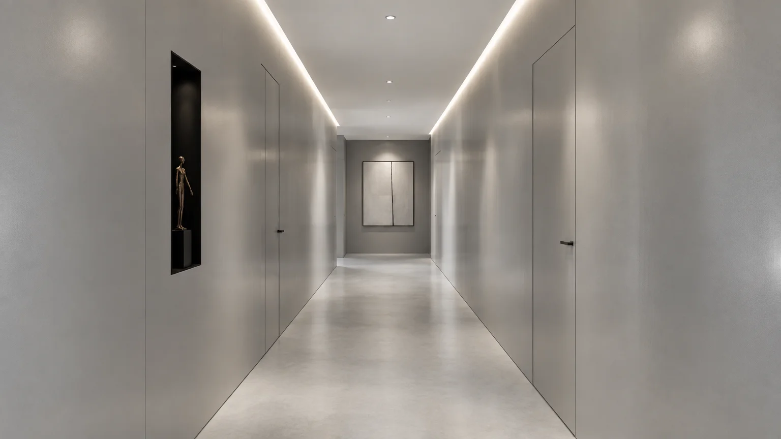
Trend #7: Silken Pearl Gray and Modern Sheen
Silken pearl gray provides a luminous, silver-inflected neutrality for contemporary hallways. It offers crisp architectural definition while maintaining an exceptionally light footprint.
This shade actively counteracts dullness by bouncing ambient photons between opposing drywall panels. It serves as an ideal canvas for rotating art collections.
Pair pearl gray with monochrome black-and-white photography and minimalist picture lights. The hallway instantly transitions from a restrictive corridor into a curated gallery corridor.
Opt for an ultra-durable scrubbable matte paint. It provides the seamless appearance of flat paint while resisting frequent shoulder rubs and handprints.
Complement pearl gray with polished chrome or brushed nickel switch plates. These reflective metals introduce jewel-like focal points that distract from narrow spatial proportions.
Pearl gray pairs exceptionally well with concrete or gray ceramic flooring. A tonal floor transition dissolves the floor-to-wall line, maximizing perceived square footage.
Hang a series of framed vertical mirrors along one wall. Vertical glass panels bounce light back and forth across the narrow walking path.
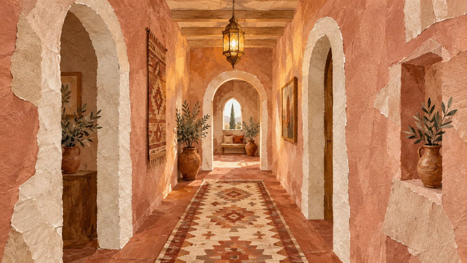
Trend #8: Pale Terracotta Blush and Tactile Warmth
Pale terracotta blush introduces tactile, Mediterranean-inspired warmth to modern entryways and hallways. It turns utilitarian passageways into inviting, sensory architectural experiences.
Soft peachy pinks create a subtle, flattering glow that softens harsh interior angles. The welcoming chromatic temperature visually smooths the sharp confines of long halls.
Ground this blush tone with rich terracotta tile or deep espresso floorboards. The earthy grounding anchors the space, while the walls float weightlessly outward.
Introduce lime wash or subtle plaster finishes for organic micro-texture. This artisanal technique catches light dynamically, distracting the eye from the narrow dimensions.
Incorporate fluted wall paneling painted in the same tone along the lower third. The vertical ridges accentuate verticality, drawing eyes upward and outward.
Accentuate terracotta blush with warm bronze lighting fixtures. Bronze brings out the rich clay undertones, wrapping the corridor in cozy refinement.
Introduce a jute or sisal runner along the floorboards. The coarse organic texture complements the Mediterranean warmth of the blushed drywall.
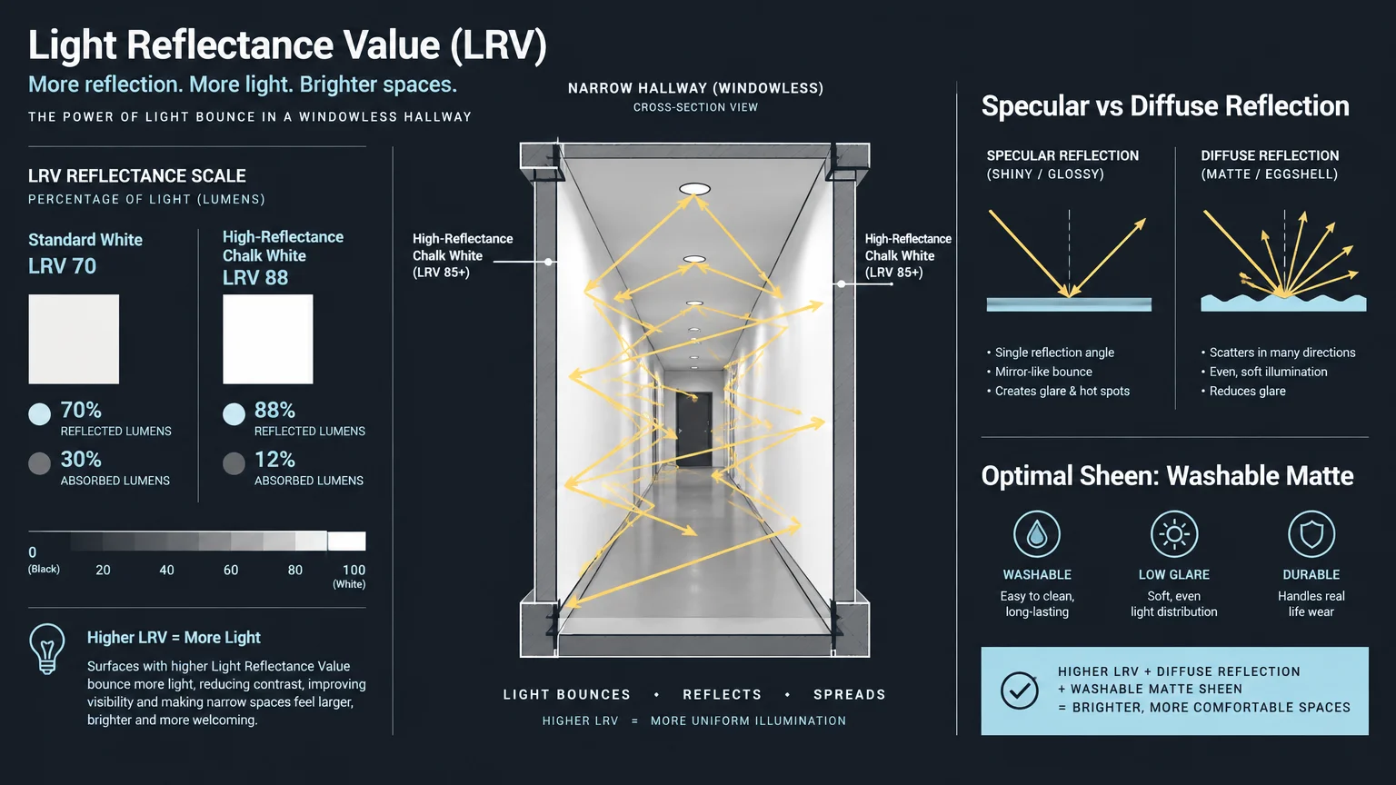
Trend #9: High-Reflectance Chalk White
Pure chalk white maximizes raw illumination more aggressively than any tinted pigment. Boasting an LRV above 85, it extracts maximum brightness from every available lumen.
In windowless apartments, this color creates an expansive, loft-like spatial continuum. It blurs the corners where walls meet ceilings, effectively erasing confining perimeters.
Pair this clean white with light ash flooring and hidden cove LED lighting. Indirect illumination washes down the walls, dissolving harsh shadows and expanding visual width.
Keep millwork and trim in the exact same shade using a semi-gloss finish. Monochromatic trim eliminates visual interruptions that chop long corridors into smaller segments.
Add a single, oversized abstract canvas at the hallway terminus. The bold focal anchor draws the eye forward, establishing an impressive architectural perspective.
Select a scrubbable ceramic-infused white paint to repel everyday scuffs and marks. Narrow halls invite frequent contact, making washability an essential practical requirement.
Install floating wall shelves in matching chalk white for keys and mail. Seamless floating storage maintains clean sightlines without protruding awkwardly into your path.
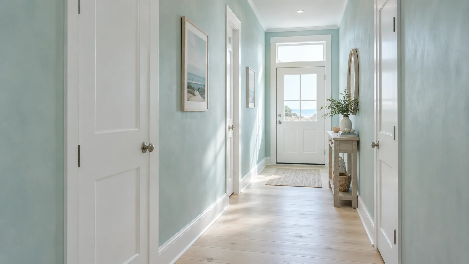
Trend #10: Muted Horizon Aqua
Muted horizon aqua blends crisp oceanic blue with grounding mineral green. The resulting shade evokes endless coastal vistas within the most restrictive structural hallways.
Light paint colors small spaces rely on must balance clarity with calm. Horizon aqua introduces fresh color without visually overwhelming narrow, high-traffic corridors.
Style this color with bleached oak consoles and woven jute floor runners. The organic textures play against the crisp watery pigment, creating a restorative hallway aesthetic.
Paint interior passage doors a crisp, pure white against the aqua walls. This deliberate contrast punctuates the wall plane, creating architectural rhythm along the walkway.
Mount linear flush-mount lighting fixtures with frosted glass diffusers along the ceiling center. The soft diffusion eliminates sharp shadows on the aqua walls.
Complement horizon aqua with warm brass picture lights and brushed gold accents. The warm metallic tones counterbalance the aqua’s cool oceanic frequency.
Keep wall decor minimal and curated to preserve a clutter-free sightline. Two well-spaced art prints establish breathing room along the extended passage.
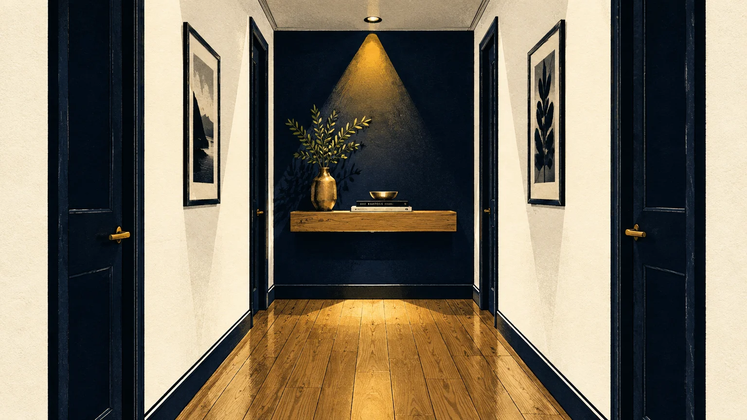
Trend #11: Dramatic Midnight Contrast
A dramatic dark hue like obsidian or deep navy leverages the power of optical contrast. While light hues reflect photons, deep colors create an illusion of infinite depth.
Painting a narrow hall in deep charcoal makes the adjacent, sunlit rooms appear dramatically larger. It acts as an architectural compression chamber before a bright spatial release.
Ensure your hallway receives intentional, layered lighting if you choose this moody route. Brass picture lights and architectural sconces illuminate focal points while corners fade into infinity.
Complement the dark palette with glossy black trim or velvet-finish charcoal walls. The rich saturation transforms an awkward transitional zone into a deliberate, theatrical statement.
Position warm LED up-lights near architectural details or tall sculptures. Focused illumination carves sculptural dimension out of the dark, receding background.
Pair deep charcoal with a brilliant high-gloss white ceiling. The stark ceiling contrast draws the eye upward, significantly heightening vertical perception.
Paint all interior doors within the corridor in the same dark hue. Uniformity prevents door frames from breaking up the immersive, expansive tunnel effect.
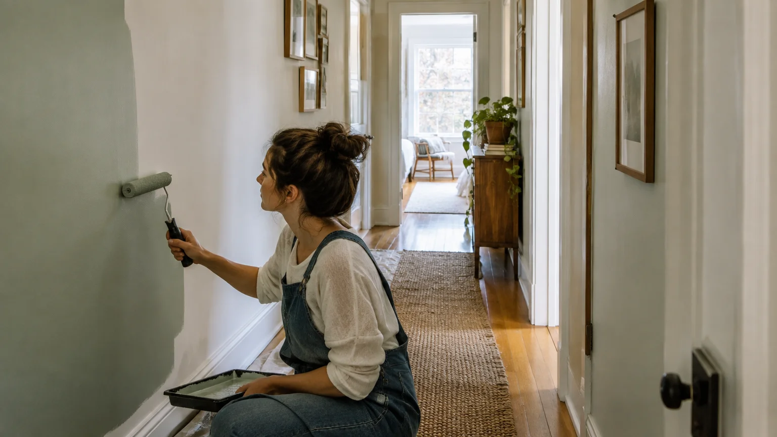
The Big Picture: Weaving These Trends into Your Home
Opening a narrow hallway requires more than applying a fresh coat of paint. You must orchestrate a balanced interplay between chromatic selection, lighting design, and flooring alignment.
Assess the natural illumination entering from surrounding dining rooms and entryways. Cool tones recede in bright rooms, whereas warm neutrals rescue shadowy, windowless corridors.
Coordinate your hallway palette with contiguous living areas to ensure seamless transitions. Abrupt color shifts between rooms disrupt spatial continuity, making your home feel fragmented and smaller.
Remember that paint sheen directly impacts how wide a hallway feels. While flat finishes hide drywall flaws, low-sheen satin and eggshell formulas bounce light across narrow gaps.
Lighting temperature also plays a pivotal role in spatial perception. Target a 2700K to 3000K LED spectrum to maintain true color rendition without casting yellow shadows.
Floor selection completes the optical illusion. Laying long floorboards or continuous tile parallel to the hallway length guides sightlines forward into wider spaces.
By curating colors, finishes, and lighting thoughtfully, you transform a claustrophobic thoroughfare into an expansive architectural feature.
Frequently Asked Questions
What paint finish makes a narrow hallway look wider?
An eggshell or satin finish is ideal for narrow hallways. These subtle sheens bounce ambient light across opposing walls without highlighting surface imperfections.
Avoid high-gloss finishes on uneven walls, as specular reflections exaggerate drywall waves. Conversely, dead-flat paints absorb light, causing tight corridors to feel closed in.
Should hallway trim match the wall color or stay white?
Painting trim in the exact same color as your walls eliminates visual boundaries. This monochromatic technique stretches vertical planes and creates a seamless, modern envelope.
If you prefer contrasting white trim, keep baseboards slim and streamlined. Bulky trim lines visually chop up the wall, making a tight hallway feel narrower.
Can dark paint colors actually make a narrow hallway feel bigger?
Yes, deep charcoal or midnight navy can blur spatial corners into shadow. The lack of discernible perimeter makes opposing walls feel infinitely distant.
This dramatic technique works best when adjacent rooms feature bright, light palettes. The stark transition creates an architectural release that expands the feeling of space.
How does flooring orientation affect narrow hallway dimensions?
Installing floor planks parallel to the length of the hall pulls the eye forward. This orientation emphasizes length, creating a sleek and directional architectural path.
Alternatively, laying herringbone parquet or wide tile perpendicular to the walls broadens lateral perception. The diagonal lines visually push opposing walls apart.
For the latest color forecasts, consult industry leaders like Pantone and paint companies like Benjamin Moore. For professional design standards, refer to the American Society of Interior Designers (ASID).
Disclaimer: This article reflects design trend analysis and predictions. Personal taste and timeless design principles should always guide your decorating choices.