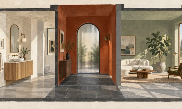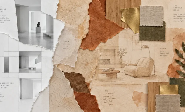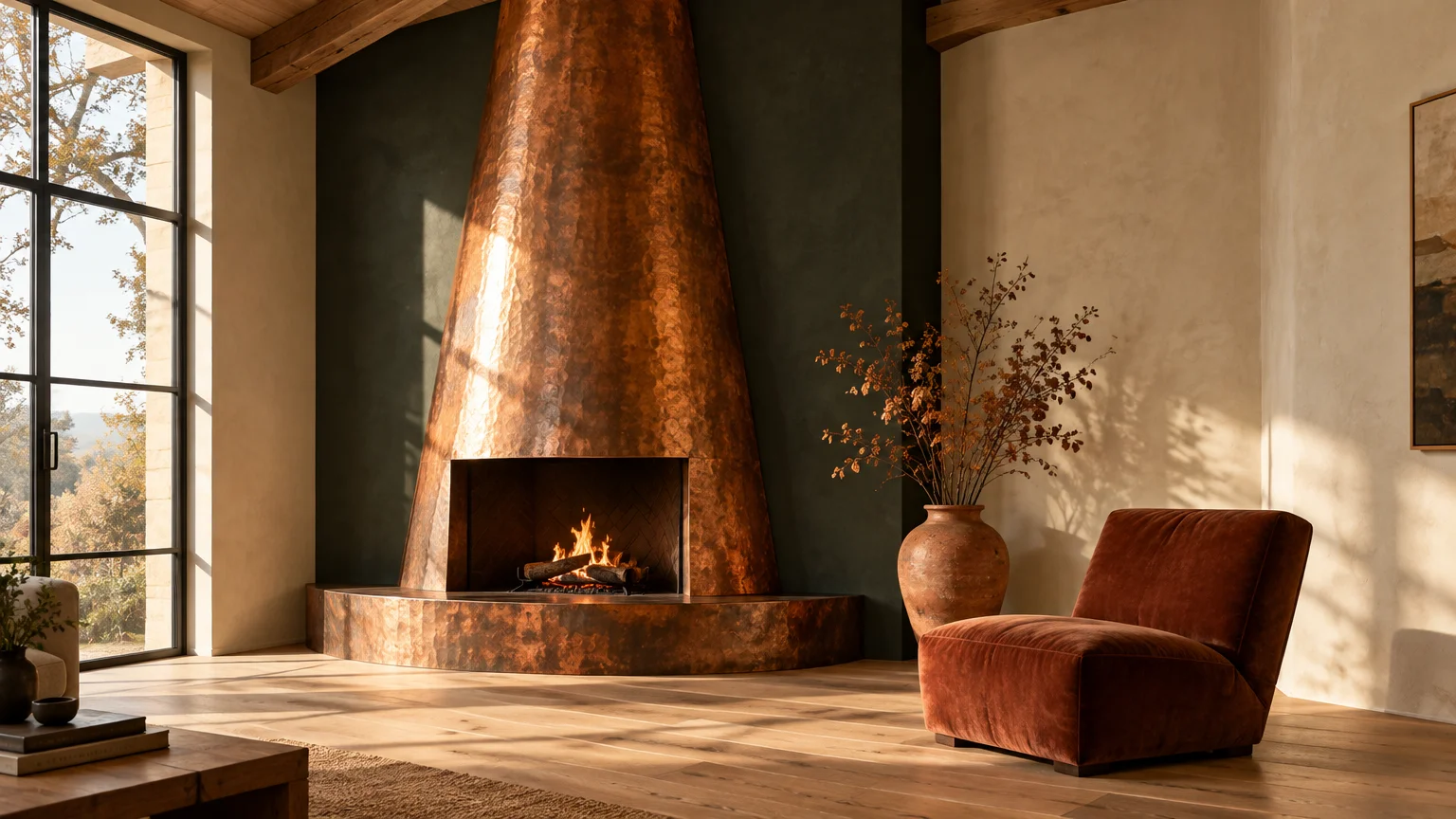
Metallic finishes and earthy undertones instantly transform modern interiors into layered, tactile sanctuaries. Pairing copper accent decor and weathered rust with deliberate wall shades establishes visual depth while anchoring expansive living spaces.
Whether your aesthetic leans toward quiet luxury or bold biophilic drama, complementary hues elevate burnished metals from rustic accents into intentional architectural centerpieces.
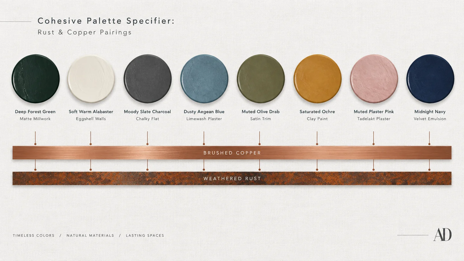
Choosing the right backdrop magnifies the luminosity of copper while tempering the heavy warmth of saturated rust. Here are eight sophisticated paint colors that frame these rich tones with enduring poise.
Trend #1: Deep Forest Green
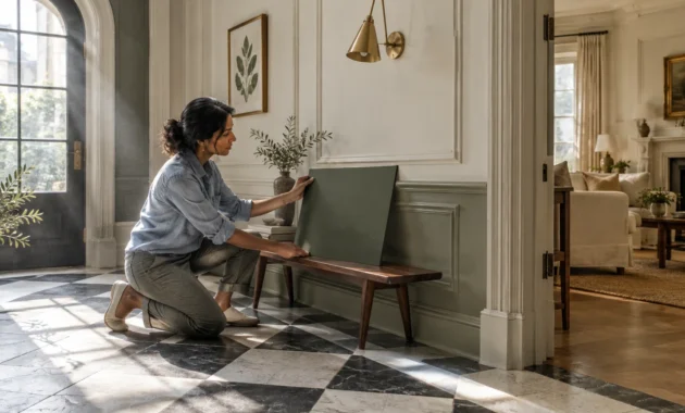
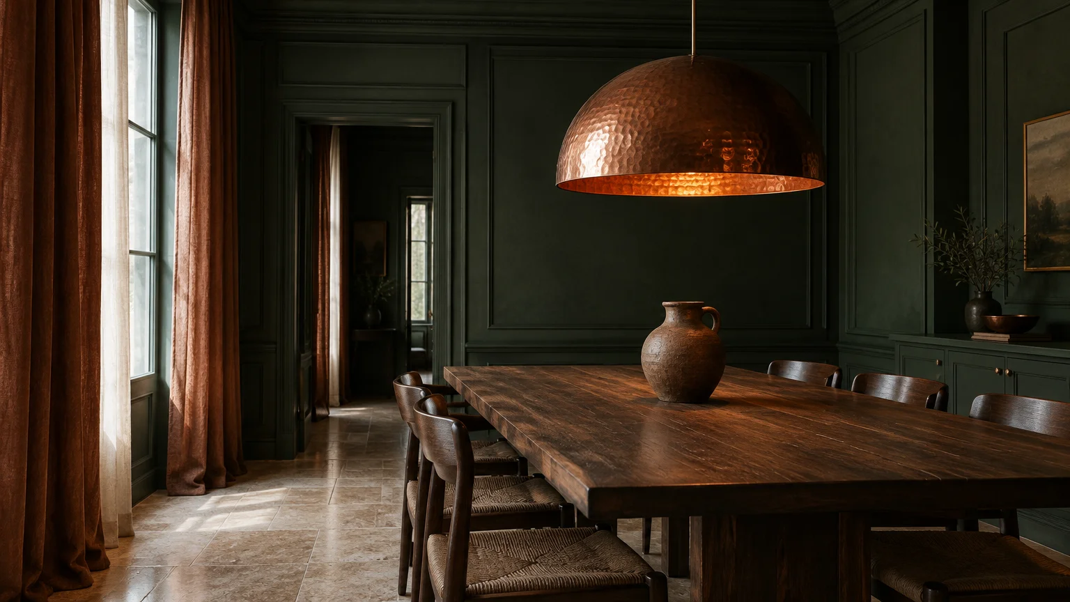
Deep forest green introduces a biophilic grounding effect when juxtaposed against fiery rust and lustrous copper. This pairing draws inspiration from natural woodland canopies where oxidized minerals rest against rich foliage.
Because green sits directly across from reddish-orange on the traditional color wheel, it creates an arresting complementary dynamic. The cool, verdant backdrop makes copper fixtures sing with heightened brilliance.
In a dining room, apply a velvety matte forest green across perimeter millwork. Position hammered copper pendant lighting directly above an aged walnut table to capture ambient light.
Layer in rust-toned linen drapery to bridge the architectural envelope with your soft furnishings. The earthy textile softens the boundary between deep paint and reflective metal.
For optimal depth, select a green with subtle charcoal undertones rather than bright emerald hues. This prevents visual fatigue while creating an enveloping, library-like sanctuary.
Balance the pairing with light natural stone flooring or travertine accents to maintain spatial brightness. The mineral texture anchors the dark paint without suffocating the room.
Matte finishes work best here because high-sheen greens produce distracting glares next to polished copper. A chalky emulsion absorbs sunlight, highlighting the warm luster of your metal accents.
Consider incorporating rust velvet throw cushions on an upholstered bench along the wall. This repetition weaves the contrasting elements into a unified, deliberate composition.
Trend #2: Soft Warm Alabaster
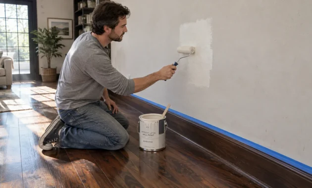
If your design philosophy favors quiet luxury, soft warm alabaster offers an immaculate canvas for burnished metals. Unlike sterile clinical whites, alabaster carries subtle yellow and beige undertones that welcome warmth.
This off-white shade prevents high-contrast shock, allowing copper accent decor to feel integrated rather than starkly isolated. It establishes an open, luminous environment that flatters organic textures.
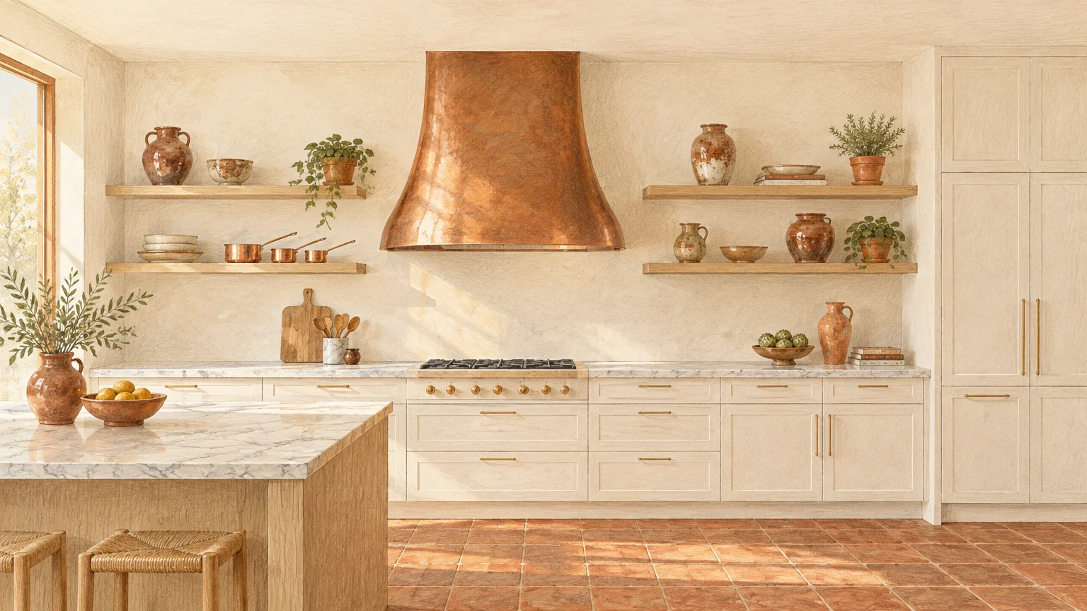
In kitchens, coat cabinetry or perimeter walls in creamy alabaster to showcase a custom copper range hood. The warm paint colors gently reflect daytime sunlight across the metal surface.
Introduce rust-glazed ceramic vessels and terracotta floor tiles to ground the expansive light. These textural materials inject artisanal soul into a clean, modern envelope.
Avoid paints with blue or gray undertones when decorating with warm metals. Cool whites clash with the amber radiance of copper, making the metal appear overly brassy.
Use flat paint finishes on ceilings and eggshell sheens on walls to gently disperse incoming illumination. This subtle gradation enhances the dimensional qualities of your rust color palette.
Pair this aesthetic with light white oak millwork and unlacquered hardware for a Scandinavian-inspired retreat. The restraint allows each copper piece to stand as a sculptural work of art.
Trend #3: Moody Slate Charcoal
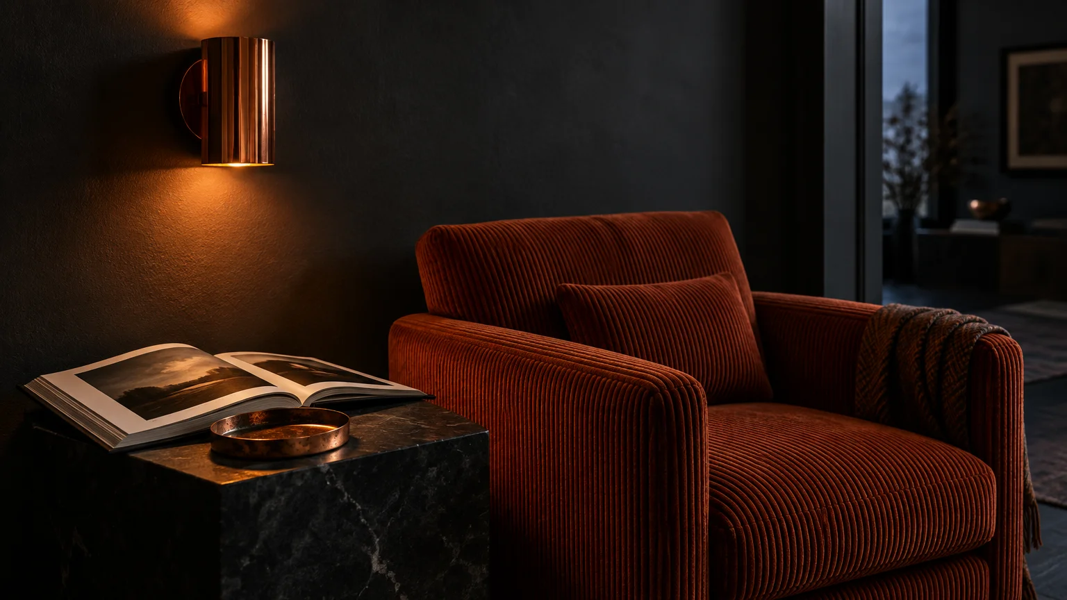
Moody slate charcoal creates dramatic chiaroscuro when styled alongside reflective metal finishes. The smoldering, near-black backdrop absorbs ambient light, forcing copper and rust accents to project forward.
This color choice leans into modern industrial aesthetics while retaining a sultry, residential intimacy. It converts sterile rooms into moody, cocktail-lounge environments brimming with character.
Paint your powder room walls and ceiling in slate charcoal to generate immediate architectural drama. Install a patinated copper vessel sink to serve as the glowing centerpiece of the space.
Rust-colored wall sconces or burnt orange towels soften the severe gray tones. The warm textile intervention prevents the charcoal paint from reading as uninviting or cold.
Opt for a mineral-based lime wash or dead-flat emulsion when applying dark slate tones. The velvety texture diffuses harsh shadows and complements aged copper patinas seamlessly.
Slate charcoal also provides an exceptional backdrop for displaying oxidized copper decor. The subtle green verdigris found on vintage copper contrasts exquisitely against deep slate surfaces.
Ground the space with dark hardwood or charcoal slate flooring to maintain the moody envelope. Keep lighting low and directional to emphasize the metallic glow throughout the room.
Trend #4: Dusty Aegean Blue
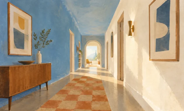
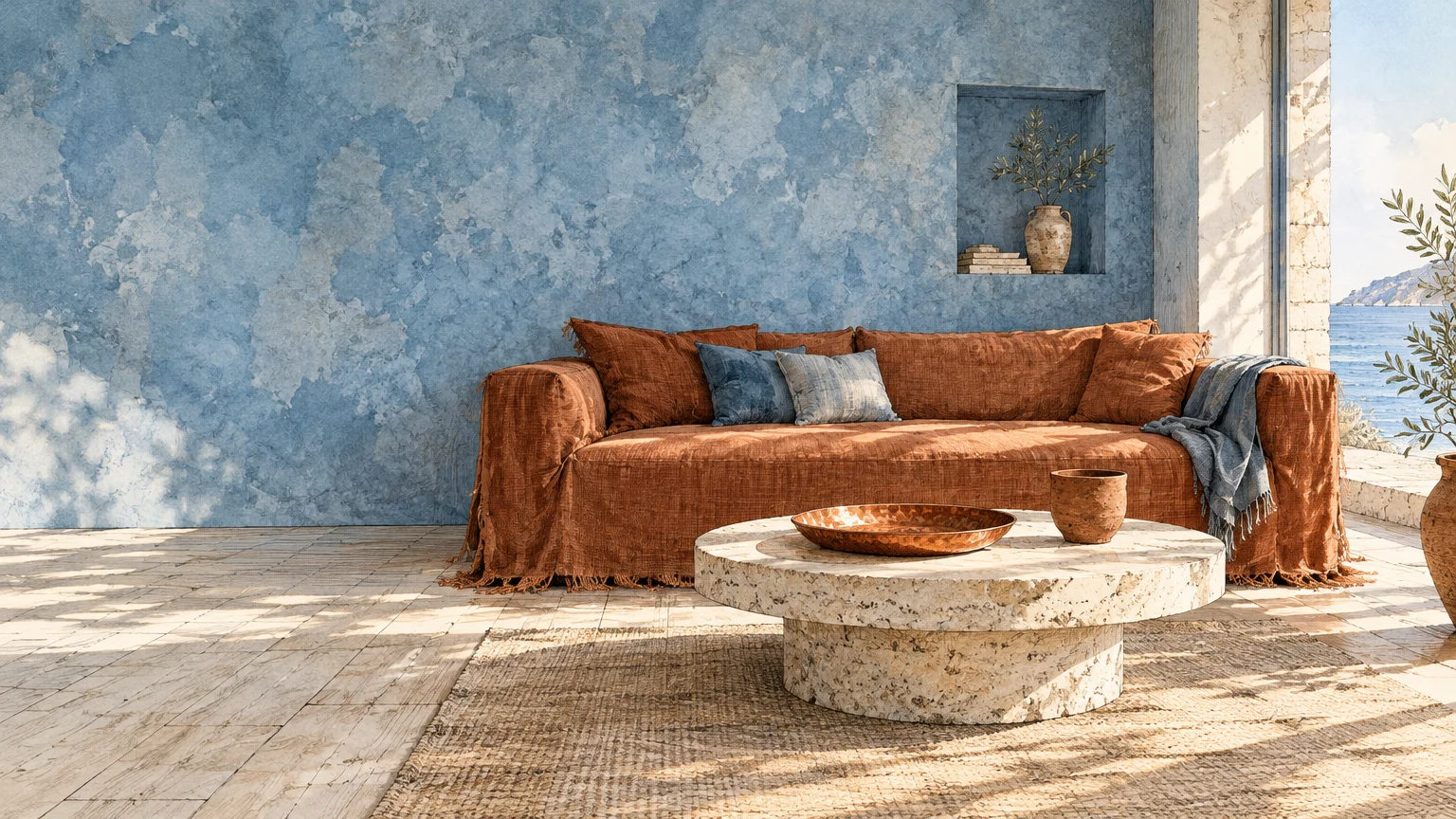
Dusty Aegean blue pulls from classical Mediterranean palettes, offering a soft, desaturated contrast to copper accents. It mimics the natural verdigris hue that forms on aged copper over decades.
By selecting a blue with gray undertones, you prevent the space from feeling overly nautical. Instead, the atmosphere evokes relaxed coastal villas and historic stone courtyards.
Apply Aegean blue to your living room walls to offset a heavy rust leather Chesterfield sofa. The cool paint balances the leather’s warm patina, achieving immediate chromatic equilibrium.
Scatter brushed copper side tables and hand-thrown rust pottery throughout the room. The reflective surfaces bounce light off the dusty blue walls, making the space feel airy and collected.
This palette excels in rooms with abundant southern or western daylight exposure. The natural sunlight warms the blue tones, keeping the interior cozy throughout the afternoon.
Use satin trim paint in the same blue family to envelop the room in seamless color. Monochromatic millwork enhances architectural detailing while highlighting freestanding copper accessories.
Anchor the seating arrangement with a faded vintage Persian rug containing navy, terracotta, and cream. The woven pattern harmonizes the wall paint with your metallic elements effortlessly.
Trend #5: Muted Olive Drab
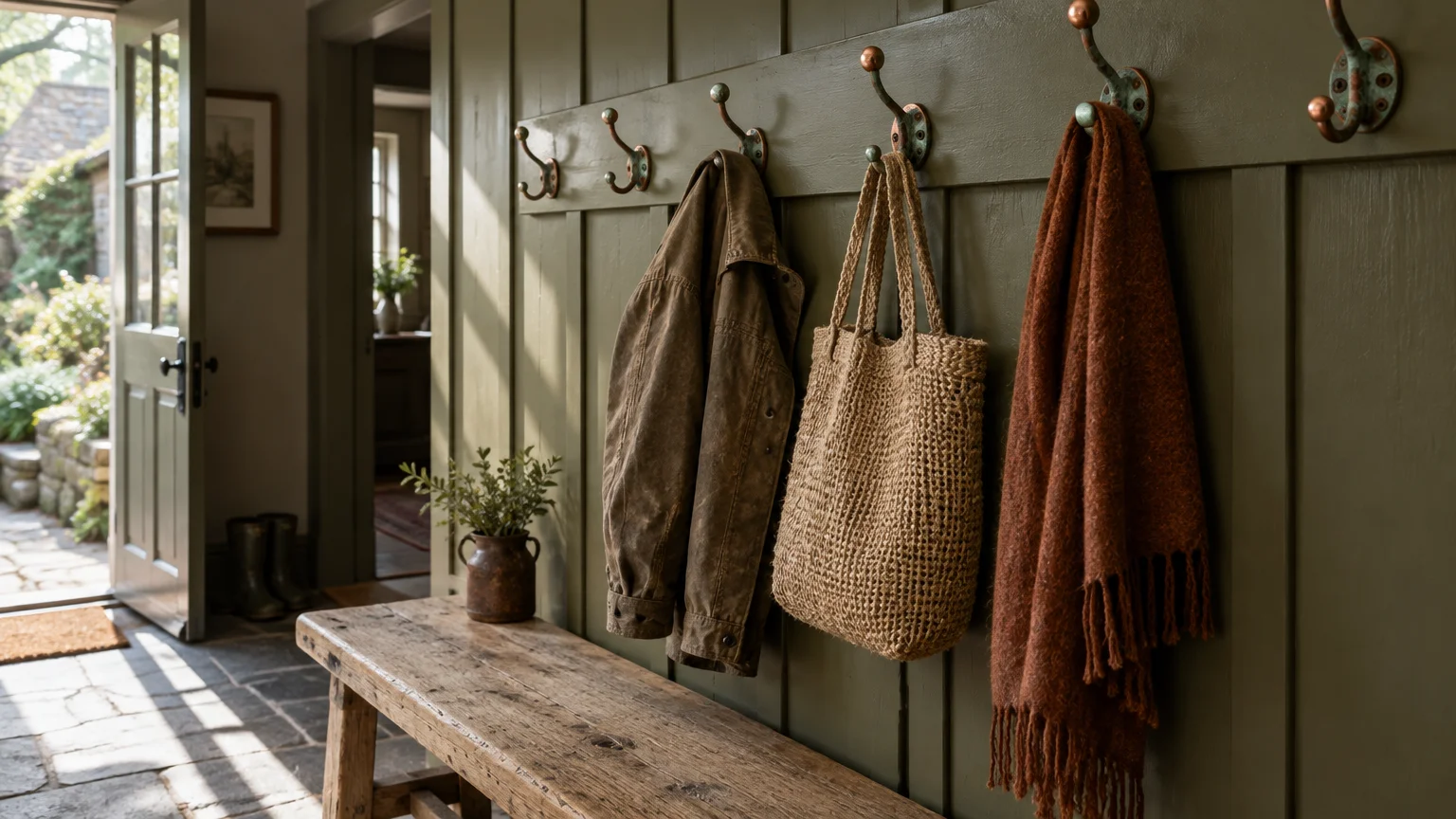
Muted olive drab bridges the gap between earthy green and golden yellow, creating natural harmony with copper. It provides an organic foundation that feels sophisticated, historic, and deeply comforting.
This hue shares underlying warmth with rust, creating a low-contrast, tonal environment. The gentle transition between wall paint and decor promotes relaxation and visual calm.
Transform a home library or study by wrapping bookcases and walls in rich olive paint. Integrate raw copper desk accessories and rust mohair armchairs for timeless tactile luxury.
Olive paint excels at softening the high-shine reflective glare of polished copper pendant lights. The muted wall absorbs excess brightness, producing an inviting, amber-tinged glow.
When choosing an olive shade, avoid neon greens and lean toward muddy, brown-influenced pigments. These complex formulations adapt gracefully to shifting natural light conditions throughout the day.
Complement the olive surfaces with dark walnut cabinetry or vintage parquet wood flooring. Natural wood grains flatter both the green paint and your copper accent decor.
Introduce cream linen lamp shades and travertine coasters to break up the rich saturation. Subtle neutral accents keep the earthy palette fresh, contemporary, and balanced.
Trend #6: Saturated Ochre
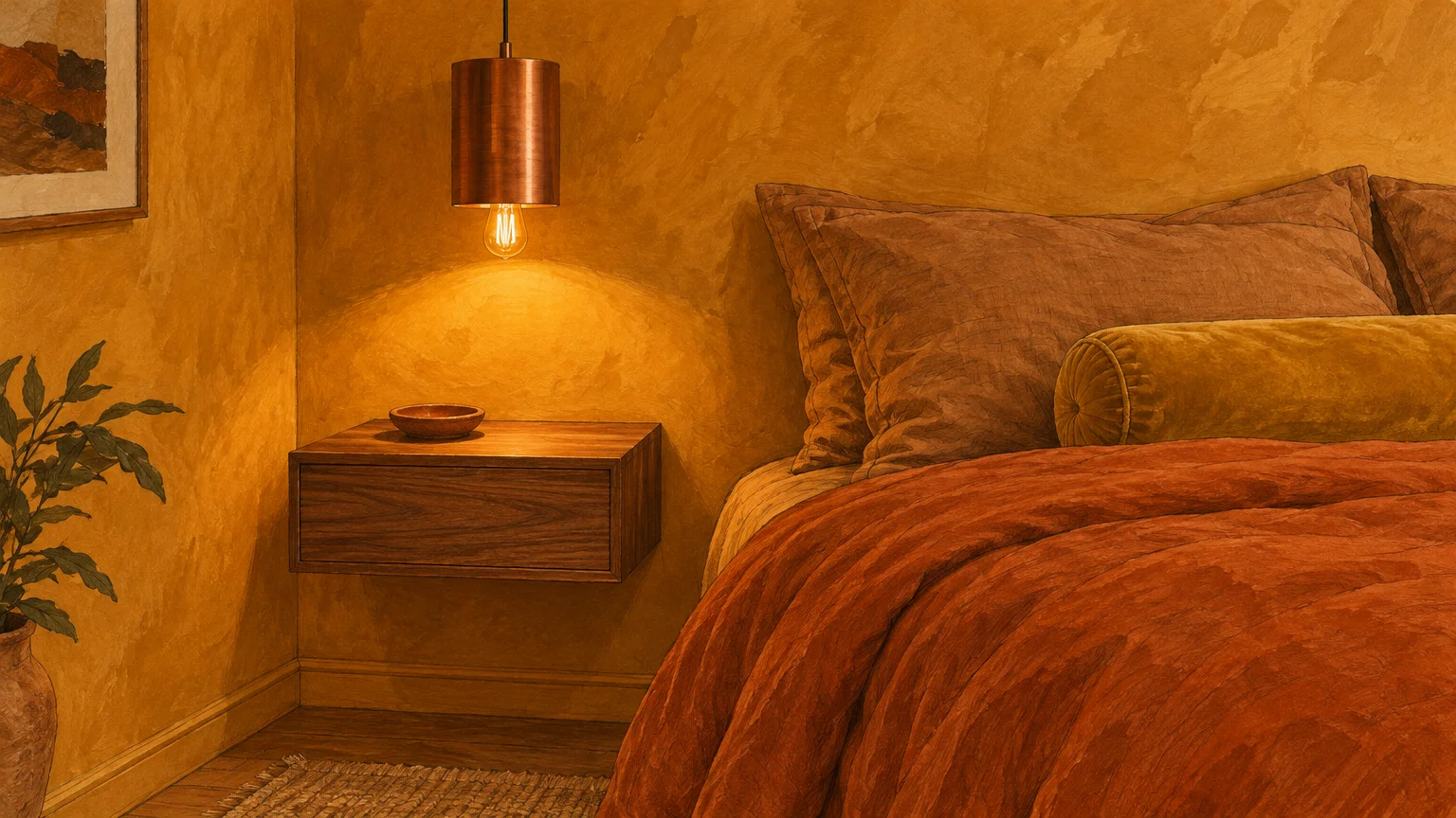
Embracing rich terracotta or saturated ochre produces an immersive, analogous color story that celebrates warm paint colors. This technique envelops the room in golden-hour warmth, blurring the lines between walls and furnishings.
Rather than relying on stark contrast, this approach utilizes tonal gradation to achieve design sophistication. Copper fixtures and rust decor melt into the walls, creating a seamless, monochromatic retreat.
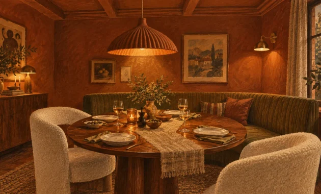
Use an earthy ochre paint in a formal dining room to stimulate conversation and intimate gatherings. The rich yellow-red pigment glows warmly when illuminated by evening candlelight.
Hang a polished copper chandelier above the table to mirror the ochre paint’s golden highlights. Pair the fixture with rust linen napkins and terracotta serving platters for curated cohesion.
To prevent monochromatic fatigue, introduce diverse tactile materials across the interior landscape. Combine matte chalky walls with polished metal, rough woven jute, and supple aged leather.
Choose an ochre with earthy brown undertones rather than acidic lemon accents. A grounded mineral pigment ensures your rust color palette remains timeless rather than overwhelming.
Install white oak flooring or neutral sisal rugs beneath the furniture to anchor the saturated envelope. A pale foundational floor reflects light back into the warm, glowing space.
Trend #7: Muted Plaster Pink
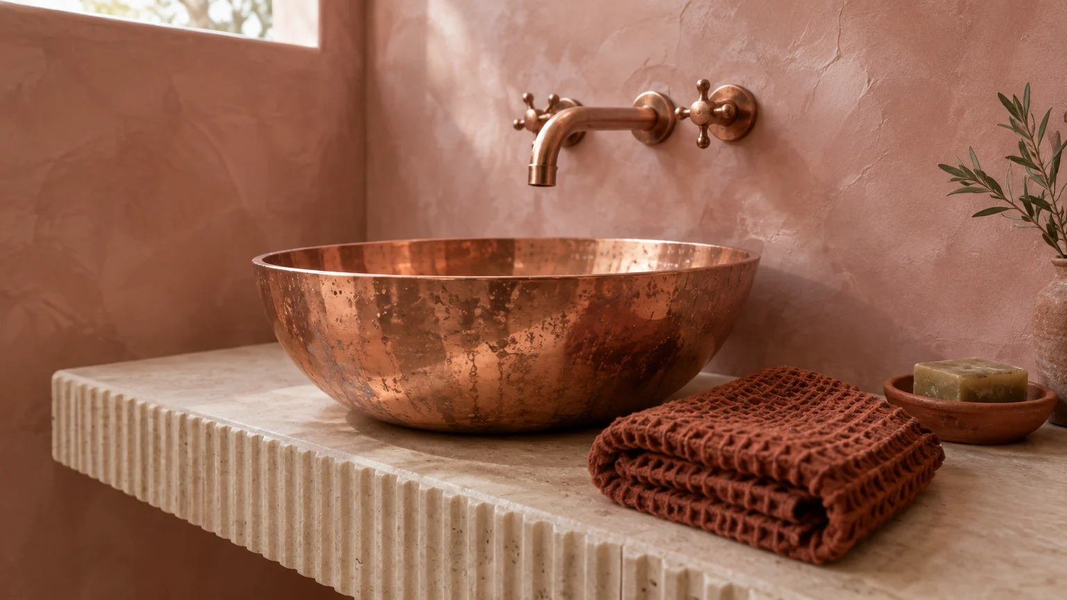
Muted plaster pink delivers an unexpected, sophisticated alternative to traditional neutral wall backdrops. Infused with beige and gray undertones, this mineral pink exudes quiet confidence without feeling juvenile.
Pink and copper share warm undertones, allowing them to harmonize naturally within contemporary residential settings. The soft wall tone flatters polished copper finishes, tempering their metallic bite.
Coat primary bedroom walls in chalky plaster pink to cultivate a serene, restorative sanctuary. Position spun copper reading lamps on bedside tables to reflect a soft, flattering radiance.
Introduce a rust velvet duvet or terracotta bolster pillow to ground the light pink backdrop. The deep rust hue anchors the bed while preventing the room from appearing overly airy.
Seek out paint shades inspired by natural Moroccan tadelakt plaster or Italian mineral washes. These formulations offer subtle movement across the surface, mirroring the organic qualities of hand-beaten copper.
Avoid sugary pastel pinks with cool magenta undertones that fight the warm metallic sheen. Muted, dusty rose pigments maintain an architectural, editorial aesthetic throughout the room.
Pair the walls with brushed brass, unlacquered copper, and raw linen drapery for a layered finish. The combination celebrates raw materiality, elevating everyday spaces into tactile works of art.
Trend #8: Midnight Navy
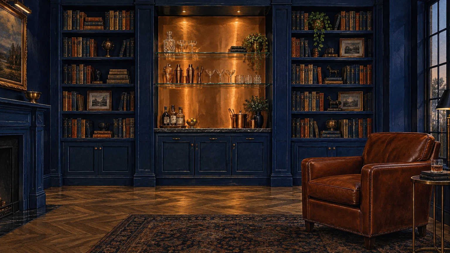
Midnight navy provides classic, regal contrast against luminous copper accent decor and weathered rust textiles. The deep oceanic hue acts as a dramatic stage that amplifies metallic warmth.
This pairing draws on high-contrast color theory, pitching cool nocturnal blue against fiery red-orange metal. The dynamic tension brings instant sophistication and tailored refinement to any room.
Consider navy cabinetry in an upscale kitchen paired with solid copper bar pulls and bridge faucets. The gleaming metal creates a captivating counterpoint against the rich, dark joinery.
In a lounge, set a rust velvet sectional against midnight navy walls to anchor the seating zone. The fiery upholstery cuts through the cool blue paint, producing balanced visual warmth.
Select a navy paint with true black undertones rather than royal blue or indigo bases. True midnight blue provides the gravitas needed to support heavy, saturated rust accents.
Utilize high-gloss navy paint on architectural trim or doors to bounce light around the interior. The reflective millwork pairs beautifully with the shimmering highlights of hammered copper decor.
Incorporate warm natural fiber rugs, such as chunky jute or woven sisal, to keep the room grounded. The organic texture softens the high-contrast drama between the blue walls and copper accents.
The Big Picture: Weaving These Trends into Your Home
Successfully pairing paint colors with copper and rust hinges on deliberate balance and material hierarchy. Instead of spreading metal accents evenly, group copper objects to create intentional visual focal points.
Pay close attention to paint sheens when selecting colors that go with copper. Flat or eggshell wall finishes prevent distracting glare, allowing the polished metal surfaces to hold center stage.
Integrate varied textures to soften the transition between solid walls and reflective hardware. Layer nubby bouclé, slubby linen, and distressed leather across the space to add tactile richness.
Evaluate your home’s natural lighting conditions before finalizing your chosen rust color palette. South-facing rooms magnify warm copper tones, while north-facing rooms may require deeper, richer pigments.
Don’t hesitate to mix metals alongside your copper fixtures for a collected, lived-in aesthetic. Antique brass, blackened iron, and oil-rubbed bronze integrate naturally with copper and rust elements.
Focus on the architectural bones of your space by painting interior doors or window mullions in accent tones. Framing a view with deep navy or olive drab enhances adjacent copper decor.
Ground your palette with natural flooring materials like white oak planks, tumbled limestone, or terracotta pavers. These authentic surfaces reinforce the organic, artisanal narrative created by rust and copper.
By approaching these trends through the lens of longevity, you create interiors that outlast fleeting fads. Trust cohesive color harmony and authentic craftsmanship to guide your design transformation.
For the latest color forecasts, consult industry leaders like Pantone and paint companies like Benjamin Moore. For professional design standards, refer to the American Society of Interior Designers (ASID).
Disclaimer: This article reflects design trend analysis and predictions. Personal taste and timeless design principles should always guide your decorating choices.
Frequently Asked Questions
How do you keep copper and rust accents from looking overly rustic?
Pair your copper and rust elements with contemporary silhouettes and clean architectural lines. Modern flat-panel cabinetry and sleek minimalist lighting keep the overall aesthetic crisp and refined.
Opt for high-contrast paint colors like midnight navy or slate charcoal. These dramatic, tailored backgrounds instantly shift the design narrative toward modern quiet luxury rather than rustic farmhouse.
Can you mix copper with brass and other metallic finishes?
Mixing metals creates a curated, collected interior rather than a sterile showroom appearance. Pair warm copper accents with blackened steel or matte black iron to establish intentional contrast.
Keep your metals within similar finish sheens, such as combining brushed copper with unlacquered brass. This common thread provides harmony while allowing individual metallic personalities to shine.
What sheen of paint works best with warm metals like copper?
Flat, matte, or eggshell finishes perform best behind reflective copper accent decor. Matte textures absorb ambient light, allowing the gleaming metal surfaces to stand out without competing glares.
Reserve higher sheens exclusively for architectural millwork or doors when you desire deliberate contrast. High-gloss trim framing a matte wall creates an elegant, layered architectural statement.
Are rust and copper color palettes timeless or just a passing trend?
Earthy rust and metallic copper are foundational design elements rooted in classical architecture and nature. Their enduring warmth and artisanal provenance ensure they transcend short-lived cyclical decorating fads.
By pairing these tones with enduring wall colors like alabaster, olive, or navy, you secure longevity. The resulting palette feels authentic, grounded, and perpetually stylish across generations.